
Today, in the face of fierce competition, a tech company logo design is more than just a visual identity. It’s a symbol, an embodiment of a company’s spirit and innovation.
Designing a tech company logo demands a fusion of creativity, strategic thinking, and a deep understanding of the industry.
If you are starting a new tech company or looking to rebrand your existing tech startup, we can help you decode logo ideation. Let’s get started.
Essential Elements of Successful Tech Company Logo Designs
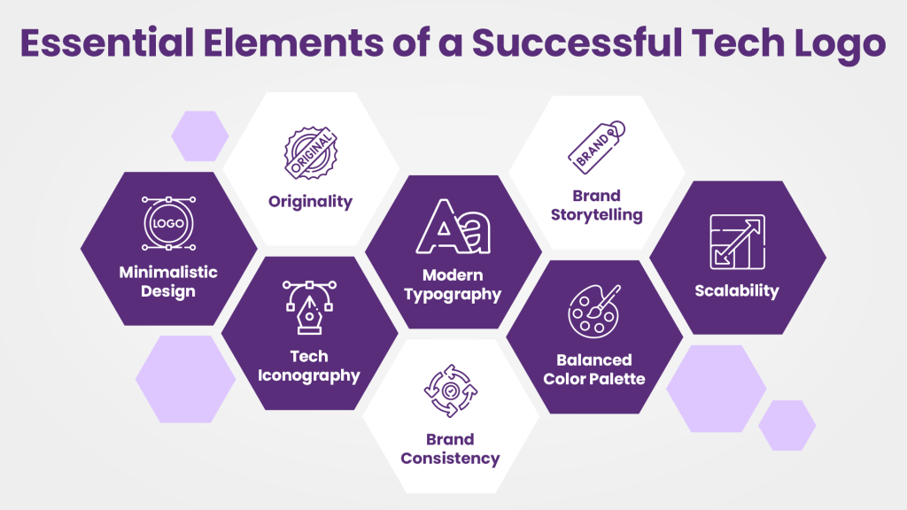
Minimalistic Design
When it comes to tech logos, less is often more. Minimalistic design is a symbol of elegance, expressing the essence of simplicity and clarity. An effective logo for a tech company cuts through the noise and reduces its message into a clean, focused image.
This approach ensures that the logo remains memorable and instantly recognizable amidst the crowded digital landscape.
Tech Iconography
In terms of tech logos, icons speak for themselves. A well-crafted tech icon is an instant trigger, stimulating the viewer’s connection to cutting-edge technology.
It communicates a company’s tech-savvy nature and offerings. In many cases, these icons represent the company’s core products or services, revealing the innovation that drives the business.
Modern Typography
Typography is the voice of a logo. Fonts aren’t just letters in the tech world; they’re sleek, modern, and dynamic.
Modern typography is forward-thinking, aligned with the progressive nature of the technology world. This logo enhances the brand’s identity and positions it as a digital pioneer, adding to its aesthetics.
Balanced Color Palette
Colors are more than a visual treat; they are a strategic choice. A balanced color palette in a tech logo combines hues that resonate with the brand’s essence and appeal to the target audience.
Each color carries a message – be it trust, innovation, or reliability. The right balance of colors sets the tone for the brand and cultivates a lasting impression.
Scalability
A logo’s true strength lies in its adaptability across various platforms and sizes. Scalability ensures that the logo remains crisp and impactful, whether it’s on a mammoth billboard or a tiny app icon.
A successful tech company logo design is scalable, allowing it to retain its essence and readability, regardless of the medium or size.
Originality
In a world buzzing with new logos every day, originality is the north star. A tech company’s logo must be distinctive, standing out in the vast digital landscape.
It should reflect the brand’s unique identity and values, carving its own path rather than following trends. Originality is the DNA of a memorable logo, making it a true representation of the brand it embodies.
Brand Consistency
Consistency is the glue that holds a brand’s identity together.
A tech logo should seamlessly align with the brand’s overall visual language, creating a harmonious brand identity.
It’s not just about the logo; it’s about integrating it cohesively with the brand’s website, marketing materials, and every touchpoint where the brand interacts with its audience.
Brand Storytelling
A tech logo is a chapter in the grand narrative of a brand. It should convey a story, a journey, and a promise.
Successful tech logos are storytellers, encapsulating the brand’s history, vision, and aspirations in a visual tale.
It’s the art of merging design with the brand’s essence, leaving an enduring impression on those who experience it.
Top Tech Company Logo Designs for Inspiration
Minimal Tech Company Logo Design
The Jivsy tech company logo is a study in elegant simplicity and minimalism, showcasing a “J’ at its core, gently nestled within a square frame featuring rounded edges and surrounded by a sleek black backdrop. This design exudes a sense of approachability and modernity.
Design enthusiasts looking for inspiration can appreciate the thoughtful use of rounded edges in the square, which adds a softer touch to the overall logo. This imparts a sense of friendliness and approachability, essential qualities in the tech industry, promoting user-friendliness and ease of use.
Furthermore, the clear contrast emphasizes the design, making it visually striking and easily recognizable. This interplay of colors teaches designers the importance of contrast for achieving a memorable and impactful logo.
Futuristic Tech Company Logo Design
The biotech company’s logo is a splendid fusion of creativity and symbolism. The gradient-filled ‘B’ creatively mimics the appearance of the number ‘3’, it could be used to show the trinity of elements like innovation, progress, and evolution.
Accompanying the ‘B’ are square dots resembling building blocks, portraying the foundational and progressive nature of biotechnological advancements.
The biotech logo exemplifies the innovative use of gradients, thoughtful color selection, and symbolic representation through typography, offering aspiring designers valuable insights into creating a compelling and symbolic logo for a biotech brand.
Elegant Logo for a Technology Startup
The Tide logo is a stellar example of how modern typography and subtle gradients can come together to create a visually appealing and meaningful brand identity. The sleek and contemporary typography immediately conveys a sense of modernity and innovation, aligning well with the nature of the platform.
It provides valuable inspiration on the integration of modern typography, strategic use of gradients, and symbolic representation to effectively convey the essence and purpose of a brand. It’s a lesson for designers seeking to create a logo that encapsulates a brand’s message and resonates with its target audience.
Eco-friendly Tech Company Logo Design
The Techhouse logo and brand identity ingeniously fuse the concepts of technology and sustainability into a minimalist yet powerful symbol.
The logo features a fusion of two symbols: a roof representing a house and a laptop, embodying technology.
This combination signifies the integration of technology into the home, emphasizing Techhouse’s core focus on eco-friendly, technologically-oriented solutions for households.
Designers can learn valuable lessons about symbolism, color selection, and brand communication strategies from this innovative approach, providing inspiration for their own tech company logo design projects.
Generative AI Product Company Logos
The Type Human logo is a fascinating blend of typography and iconography, communicating a message of inclusivity and diversity. The initial part of the logo features the word “type”, followed by icons resembling humans of varying sizes. This conveys the idea of diversity, humanity, and inclusivity, which is reinforced by the subsequent text “Human.”
Designers seeking inspiration can appreciate the creative use of typography and icons to convey a powerful message. The combination of text and imagery helps to capture the essence of the brand—highlighting humanity and its varied forms and perspectives.
The strategic connection of the letters P and U through a straight line underscores unity and connectivity, further enhancing the theme of inclusivity. This can inspire designers to explore innovative ways to integrate design elements seamlessly, reinforcing the brand’s message and values.
The Tech Talk AI logo is a vibrant representation of conversational innovation and technological advancement. The design cleverly embodies a soundwave in the shape of a conversation bubble, symbolizing communication and dialogue, which is the essence of artificial intelligence in this context.
Aspiring designers can draw inspiration from the ingenious concept of blending technology (soundwave) and conversation (bubble). It showcases the potential to creatively merge symbolic elements to effectively convey the brand’s focus and purpose.
The choice of a colorful palette in the logo is significant. The diverse colors reflect the dynamism and excitement that technology and conversation bring, highlighting the lively and engaging nature of Tech Talk AI’s platform. This can inspire designers to utilize a diverse color scheme to infuse energy and vibrancy into their logo designs, especially when targeting a tech-savvy audience.
Generic Logo for an IT Services Company
This is the most straightforward logo in the list utilizing typography and iconography to communicate the brand name.
Designers can find inspiration in this creative amalgamation, understanding how the fusion of letters can represent the core essence of a brand.
The choice of colors is significant. The gradients of blue and purple symbolize trust, creativity, and progress, reflecting Sijo Solutions’ commitment to innovative solutions. Grey and black, on the other hand, represent professionalism, stability, and sophistication, essential traits for a solutions-based company.
Furthermore, the depiction of an office space in the background subtly reinforces the brand’s focus on providing solutions in a professional way. This element can inspire designers to incorporate subtle, contextual visuals into their logos, enriching the logo’s meaning and connection to the brand.
Data Analysis Company Logo Design
The Sonic logo is a perfect representation of speed, energy, and vibrancy—core attributes for a tech-centric company specializing in data-related services. The word “Sonic” is followed by a visually striking arrow made of colorful dots, effectively communicating the brand’s commitment to fast, efficient, and dynamic data-related solutions.
Designers seeking inspiration can appreciate the clever use of the arrow, which symbolizes progress, direction, and movement—essential elements in the realm of data and technology. The colorful dots add visual appeal and vitality, underlining the brand’s commitment to innovation and a diverse range of data services.
The choice of a dynamic and energetic color palette aligns with the brand’s focus on tech data and related services. Colors like vibrant blues, energetic reds, or futuristic purples can symbolize precision, efficiency, and modernity, which resonate well with the target audience in the tech sector.
Internet Technology Company Logo Design for Inspiration
This design embodies connectivity, network, and technological advancement, making it versatile for various tech-related businesses.
Designers can find inspiration in the concept of interconnected waves, illustrating seamless communication and integration—fundamental aspects in the tech industry. This idea encourages designers to think creatively about how symbols can be abstracted and reimagined to convey complex ideas and messages.
It encourages designers to think beyond conventional representations and allows for flexibility in integrating a company’s unique brand elements.
Inclined Logo
The Inclined logo cleverly incorporates a symbolic icon and the brand name to convey its message effectively. The central focus of the logo is an image that resembles a combination of a big dot and a checkmark, cleverly reminiscent of forward thinking. The use of light and dark shades adds depth and visual interest to the icon.
Designers can draw inspiration from this logo’s creative representation, illustrating the art of blending symbols to create a unique and memorable logo.
The integration of light and dark shades in the icon provides a sense of balance and contrast, enhancing the logo’s visibility and making it visually appealing. Designers looking for inspiration can learn from this use of color and shading to create logos that are both aesthetically pleasing and effectively convey the intended message.
Tech Company Logo Design Made using 2 shapes
Designers can find inspiration in the way this logo plays with shapes and negative space to create a recognizable letter Y. It demonstrates the creative potential of combining seemingly unrelated elements to form cohesive and meaningful symbols.
The capsules and circles, combined in this way, can evoke notions of health, balance, or interconnectedness—depending on the interpretation.
The use of negative space, particularly in forming the letter Y, showcases the importance of utilizing empty spaces effectively in logo design. If you are looking to design a tech company logo, you can learn and understand how negative space can enhance a logo’s visual impact and convey a dual meaning.
Typography-based tech company logo
The incorporation of blue and red circles within the C, along with a red dot, adds depth and visual appeal to the logo.
Designers can derive inspiration from the simplicity and elegance of this design. The usage of circles within a C-shaped structure exemplifies the creative potential of incorporating geometric shapes to enhance a logo’s visual interest and convey the brand’s identity.
The combination of colors—red and blue—offers a visually striking contrast. Red, being a bold and attention-grabbing color, complements the subtler blue hues, emphasizing the importance of color choice in logo design to evoke specific emotions and convey brand attributes.
The placement of a red dot adds a focal point to the design, guiding the viewer’s attention and contributing to the overall aesthetics. This could work as a great idea when you want to use well-placed elements to enhance a logo’s composition and visual impact.
Tech company logos made by Design Shifu
Not enough inspiration? Check out some of the most innovative logo designs Design Shifu has created for clients around the world.
At Design Shifu, we’re experts at creating logos that look super cool, especially for tech companies. For us, a logo is like a special picture that represents a brand creating a unique signature.
Our logos are like eye-catching stamps that scream, “Hey, look at us, we’re awesome!” They use bright and exciting colors, making them fun to look at, especially for people who love tech.
Our designers are like magicians. They take ideas and turn them into these fantastic logos that tell a story about a brand. Every stroke, line, or dot they use is like a magic trick that makes the logo even better.
Looking at our logos, you’ll see all the small details we’ve carefully put together, like solving a puzzle. They’re like a sneak peek into the future, showing what a brand wants to be in the exciting world of technology.
What Makes a Tech Company Logo Standout?
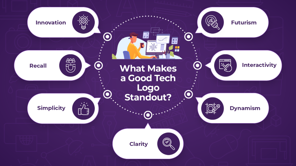
Innovation
A standout tech logo is a canvas of innovation, where creativity intertwines with purpose. It’s a testament to a brand’s forward-thinking ethos, showcasing inventive ideas and novel approaches. Innovation sets it apart, pushing the boundaries of conventional design and inviting the audience to witness the brand’s cutting-edge spirit.
Recall
The hallmark of a remarkable tech logo is its ability to etch itself into memory. It leaves an imprint that resurfaces effortlessly in the minds of the audience. A memorable logo becomes a mental bookmark, associating with a brand’s values and offerings, making it easy to recall amidst the multitude of logos encountered daily.
Simplicity
In the cluttered landscape of logos, simplicity emerges as a beacon of distinction. A great tech logo distills complex ideas into a straightforward visual, ensuring that its message remains clear and unambiguous. Simplicity is the essence that speaks directly to the viewer, allowing for instant recognition and resonance.
Clarity
Clarity is the guiding principle in a standout tech logo. It illuminates the brand’s essence, communicating its purpose and identity without ambiguity. A clear logo doesn’t leave room for misinterpretation; it is sharp and easily comprehensible, conveying the brand’s message crisply and directly.
Dynamism
A tech logo that stands out exudes a sense of energy and dynamism. It isn’t static; it’s alive, embodying movement and progression. The logo is an ever-evolving symbol of a brand’s growth, adaptability, and vitality in a swiftly changing technological landscape.
Interactivity
Interactivity isn’t limited to user interfaces. A standout tech logo engages with its audience, sparking a connection that goes beyond visuals. It invites exploration, curiosity, and a desire to interact with the brand. It’s a digital handshake, initiating a meaningful dialogue between the brand and its stakeholders.
Futurism
The future is the playground of a tech logo that stands out. It’s a glimpse into what lies ahead, an invitation to embrace the unfolding possibilities. A logo infused with futurism resonates with a brand’s vision, projecting the sense of adventure and evolution that awaits those who align with the brand.
Summing up
In this cut-throat competitive atmosphere of the tech industry, the process to success begins with a compelling logo. Innovation in design isn’t just an option; it’s a necessity. Your logo should be a statement of innovation, a symbol that echoes your forward-thinking ethos.
It should be simple, yet impactful; clear, yet dynamic. Your logo needs to tell a story, a story of the future, a story that engages and interacts.
That’s what Design Shifu has been doing for years. We have crafted hundreds of tech company logo designs carrying the brand vision forward. Do you want to get one designed instantly? Book a free demo here to get started.


