

Cool logo designs are becoming increasingly popular. Every brand building journey began with a logo design. Ultimately, logos are like stamps – they go on everything – from the food we eat to the clothes we wear.
Some modern logos are so powerful that they don’t need any context because of their inherent brand value. For example, the two-tailed mermaid in the Starbucks logo is recognisable to anyone who’s ever been a coffee fan (and even to those who aren’t coffee lovers).
It’s no wonder that companies spend millions of dollars designing logos – even though they might seem like the smallest aspects of any design collateral, cool logo designs go a long way in creating a lasting impact on customers. But, did you know that logo designers often add a hidden message to the design?
Here are 10 Easily Recognisable Cool Logo Designs And What They Mean:
1. What Does The BMW Logo Design Really Stand For?
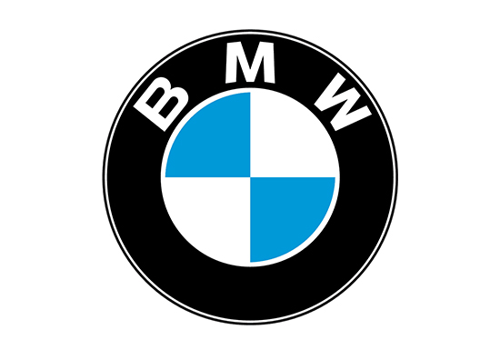
Most people believe that the BMW logo represents a spinning propeller. Why? Because BMW used to make engines for planes. But the brand recently clarified and explained what the cool logo design actually represents.
The company’s classic blue-and-white inner circular quarters are based on the State of Bavaria’s official colors. Interestingly, the pattern within BMW’s logo depicts those colors in inverted order. Because, back when the logo was first created, the local trademark law of the times forbade the use of the state’s coats of arms and other related “symbols of sovereignty” for commercial use. Consequently, to overcome this hurdle, BMW opted to switch colors and came up with its unique logo.
2. The Firefox Logo Design Has A Pretty Cool Hidden Message
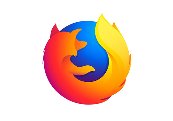
Anyone who looks at the Firefox logo design would immediately assume it’s an image of a fox, right? Well, they’d be wrong! Apparently, it’s a panda that’s named Firefox. Go figure!
3. The Dominos Pizza Logo Seems Like An Obvious Design Choice…But, It’s Not
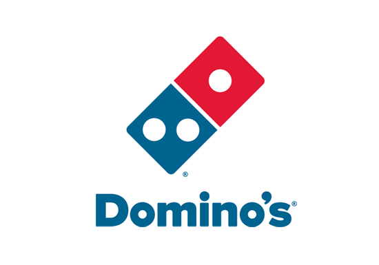
Domino’s logo is based on the classic Dominos game that was super popular a couple of decades ago (before mobile phones took over). But, would you have guessed why there were only 3 dots? It turns out that the founders wanted to symbolise the first three Domino’s locations that had opened at the time.
They planned to add a dot every time a new franchise location opened. As They never expected the pizza chain to become as popular as it is today! They obviously couldn’t keep adding new dots to the logo design every time a new location opened, but kudos to the designers for thinking of such a cool logo design.
4. LG Was Definitely Trying To Be Fun And Cool With Its Logo Design
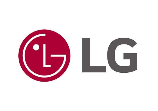
“LG is the brand that is Delightfully Smart. “Life’s Good” slogan, and futuristic logo are a great representation of what we stand for.” This is how LG explains their logo design if you visit their website. One really interesting observation is that the designer embedded a little smiley face in the ‘L’ and ‘G’. That’s definitely an impressive effort to represent the brand ethos in its logo.
While it’s not a modern logo design, LG’s efforts to make its logo as relatable as possible definitely deserves praise.
5. Sony Vaio’s Cool Logo Design Is Quite Clever!
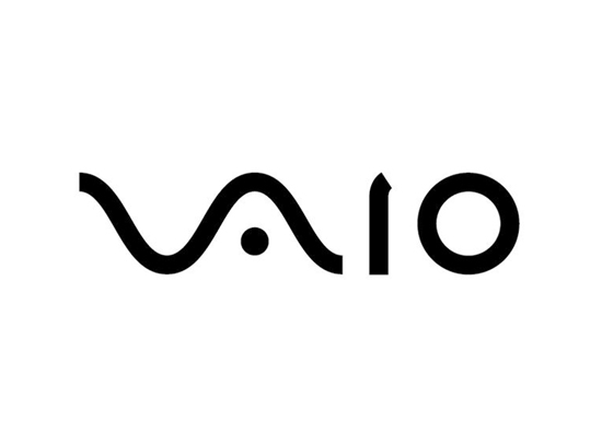
Sony Vaio’s logo is one of the coolest abstract logo designs out there. Since the company is rooted in technology, the logo impressively represents that. It neatly blends analog and digital technology ideas into one, using the V and A to represent an analog wave, and the I and O to represent binary in computer language.
Related Article:
Need help with designing a logo from scratch? Check out this article that will walk you through it step by step
How to Design a Logo: A Step by Step Guide
6. Is The Levis Logo Really ‘Hiding’ Something?
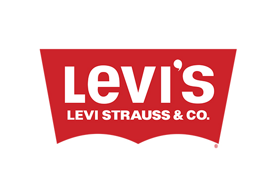
We’re pretty sure everyone has owned a pair of Levi’s jeans at one point or another. In the 150 years that this brand has been around, it’s had 8 logo redesigns. Its very first logo was a ‘Picture Logo’ that included a lot of detail and it was famously called “The Two Horse Brand.”
Over the years, the company transitioned to a modern logo design, with a more simplistic look that represents the shape of a pocket featured on Levis jeans.
7. Have You Noticed The Hidden Message In The FedEx Logo?
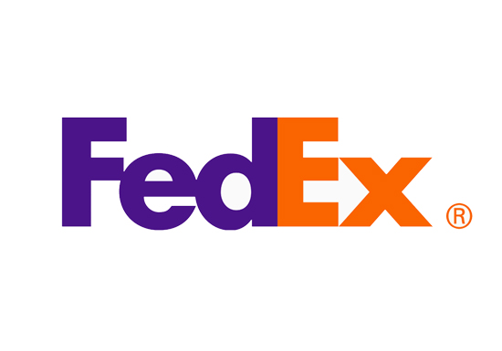
FedEx is one of the most popular logistics and shipping companies in the world. The company has been around for half a century and while the brand’s first logo design was not groundbreaking in any way, the redesign in 1994 was award-winning.
This is probably because of the smartly placed hidden message between the E and the X of the logo. If you look closely, you’ll notice an arrow between the two letters, presumably intended to represent the notion of ‘moving forward’.
8. What’s The Secret In Unilever’s Logo Design?
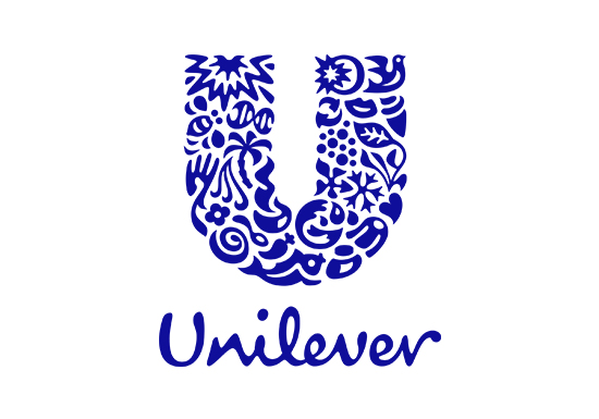
People often don’t realise that many of the everyday products they use are actually produced and sold by Unilever. To represent this multitude of products, they’ve created a cool logo design that’s quite unique.
According to the company’s website, “Unilever is committed to making sustainable living commonplace and our logo is a visual expression of that commitment. Each icon has a rich meaning at its core, and represents some aspect of our effort to make sustainable living commonplace.”
If you look closely at the U, you’ll see it consists of 25 separate symbols, each one representing Unilever’s brand values or sub-brands.
9. You’ve Probably Noticed The Hidden Message In The Toblerone Logo
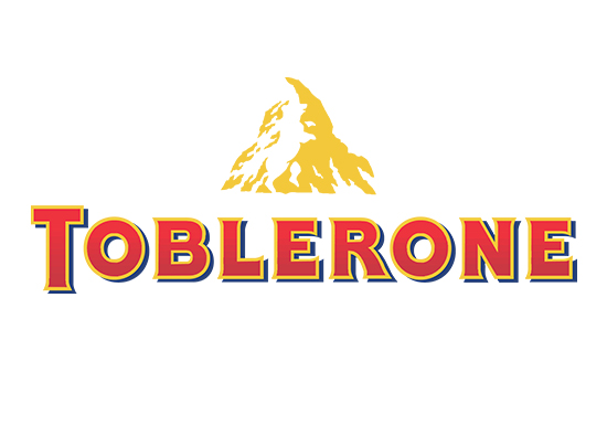
Whether or not you’re a chocolate lover, you have to admit that the unique triangular shape of Toblerone stands out. This swiss chocolate bar is a favourite for many and the cool logo design is timeless. But have you ever noticed the secret inside the logo?
The logo depicts a mountain, symbolizing the Matterhorn Mountain in Switzerland. The mountain hides a bear which signifies the distinct honey flavor found in the chocolate. It also symbolizes the fact that the chocolate is made in the ‘City of Bears’.
10. Amazon Logo: Is It A Smile Or An Arrow?
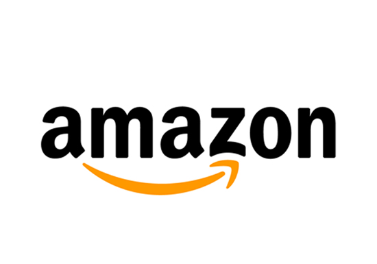
Originally, the Amazon logo design with the smile and arrow was intended to mean “we’re happy to deliver anything, anywhere,” but the company shared a statement to clarify that “a smile now begins under the a and ends with a dimple under the z, emphasizing that Amazon.com offers anything, from A to Z, that customers may be looking to buy online.”
Either way, as far as cool logo designs go, this one is sleek and simple.
If you’re feeling inspired to get a cool logo design for your brand or upgrade your current logo, then you might be looking for an agency to help you create one. You do have the option of working with a boutique agency, but that might end up costing you 1000’s of dollars.
On the other hand, if you know what you want, and you’re sure of the kind of logo design that represents your brand, then consider Design Shifu’s subscription-based design services.
The plans start at only $299 per month. You also get a 100% money-back guarantee just in case the services don’t meet your expectations. Click here to view the pricing plans.


