

Your prospects take 7 seconds to form an impression about you and your brand, out of which 55% of impressions rely heavily on logo and brand colors. As of 2022, more than 3.7 million construction companies are running in the United States, making it difficult for business owners to establish a distinct brand identity. No wonder successful brands and Fortune 500 companies invest millions of dollars in their logo design.
Your logo and visual branding significantly impact customers’ interaction with your brand.
When running a construction company, trust and reputation become the utmost priority for clients. A solid logo helps you build brand recognition and awareness in the market and attract more clients.
Certain questions might cloud your mind if you’re designing your logo for the first time or want to upgrade it. For example, how should I design a logo? Which colors would be perfect? Shall I simply write the company’s name as a logo?
Logos, too, are constructed step by step and layer by layer. Scroll on to find construction logo ideas, examples from domains like housing, road construction, and civil engineering, and extra tips to perfect your logo.
Let’s get started!
Construction company logo ideas
Builders’ and developers’ logo ideas
Use icons, typeface and tagline to convey your brand value. Here, the construction cap icon signifies what the company actually does. The bold white typography perfectly contrasts with the solid color background for emphasis. The tagline further communicates the message.
Or you can play with different tones and shades of the same color. The buildings and the position of arrows demonstrate that the company takes on a large variety of construction work. The typeface and fonts show strength.
General contractor logo ideas
General contractors offer a wider range of services, so they have the advantage of playing with several elements and logotypes. Their purpose is not to emphasize one aspect of their services but to represent a broad picture of the company.
Check out the logo of Korth Construction. Consumers associate blue with integrity and peace, which establishes trust. The icon matches in perfect symphony with the bold typeface, thus maintaining continuity. The word ‘construction’ is spaced to align with the upper layer and tie the logo together
Road construction logo ideas
If you’re running a niche-downed business, use icons to clarify to the audience what you do. For example, use roads and highway symbols. Experiment with placement for visual effects. You may incorporate it with typography.
Or you can boil down the icons to simple shapes like circles and triangles and communicate your brand story with an interesting layout. The circle, in the example, denotes completeness and perfection, while the triangle, forming a road, at the center depicts power, stability and longevity.
Home building logo ideas
Buying homes is a big decision. You must convey safety, comfort, peace and confidence to win your customer’s trust through your construction logo design.
The Walsh logo, for instance, represents an intact structure held together by the letter W. In addition, the color green symbolizes peace and security. The layout is closely packed to convey warmth.
Civil construction logo ideas
Civil construction companies take on large projects and deal with massive architecture. So, their logo must be modern and contemporary to connect with their audience.
The logo for McNiven Construction features a very distinctive style. The initials’ M’ and ‘C’ create a 3-D block-like structure representing a modern architectural look.
Another interesting example is Linha Mestra’s minimal logo, made of three bold orange lines that depict strength and stability.
Modern construction company logo design
Modern construction companies do not prefer to describe everything about their company in a logo. They experiment with abstract and modern minimal logotypes to create a unique identity.
For example, check how Averox Construction logo design tones down the complex elements into simple lines accompanied by shadow to make the icon look like a 3D structure. With just three colors, the logo creates an impressive mark on the viewer.
Another example is Komatsu. Very few logos use black as their background color, but using it can make your logo stand out. In addition, the font seems friendly, and notice how it uses the letter ‘T’ and turns it into blocks.
Vintage construction logo ideas
Vintage might give you an idea of the outdated; however, the design community and several brands love to incorporate several vintage elements in their design and brand identity, primarily when they deal with vintage items.
Check out the logo of Noble Construction, which features mountains representing its roots and origins enclosed in a hexagon.
If your forte is vintage architecture or construction, or you want to represent your long history in the logo, vintage style might be the ideal choice. For example, the one for City Jaylor Construction encloses the company’s name inside a construction tool.
Retro construction logo ideas
There might be some similarities between vintage and retro logos. But unlike vintage, retro style is more common among enterprises. Retro logos use block typefaces and are usually enclosed in circles and polygons.
For example, the logo for E&H Construction uses a combination of retro colors, fonts, and symbols.
Wordmark logos
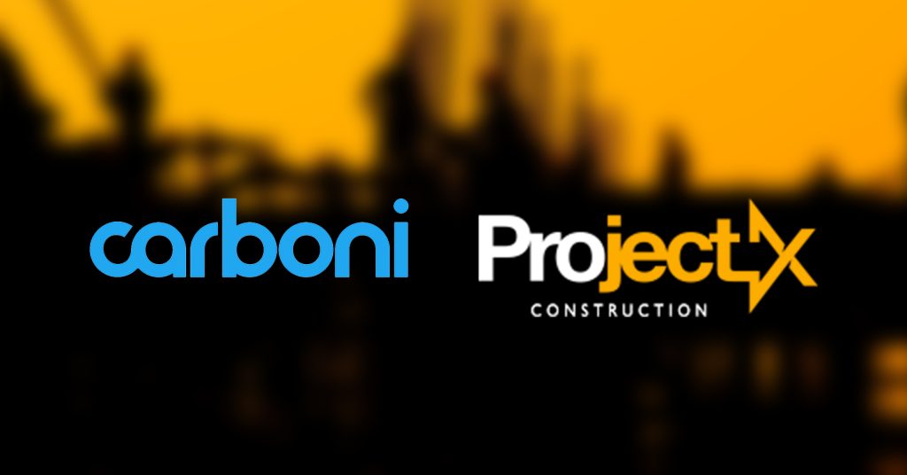
Most construction companies use their names in logos. However, not every logo needs a construction symbol embedded in it. If you also want to showcase your name, your primary design element to experiment with is typography — serif, sans serif or decorative. Ensure that it’s not too stylistic that it loses its legibility. The goal is to spread brand awareness. See these logos from Carboni and ProjectX.
Lettermarks/Monogram logos
Like word mark logos, letter mark logos also emphasize text, usually the initials of the company’s name. Use block typeface to create monogram logos to build confidence among your audience. However, you can take a step ahead by incorporating visual elements in your letters.
Mascot logos
Mascots help you stand out from your competition and give your brand a face. When you use a human face in your logo, you humanize your relationship with your prospects and build lasting personal connections.
The Maflo International logo makes excellent use of the mascot in its logo — a construction worker holding tools and equipment while giving the thumbs-up sign.
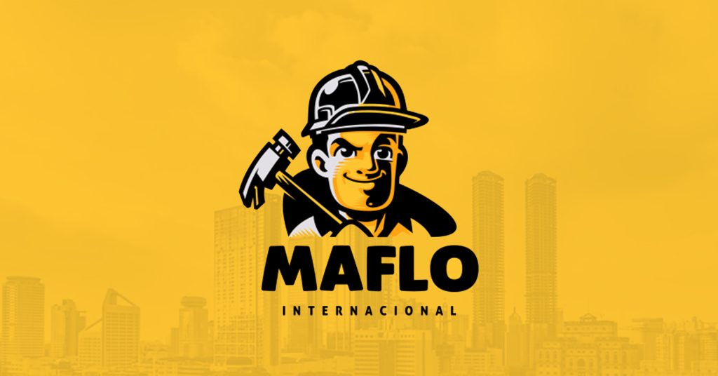
The logo conveys assurance and trust. Moreover, the brand can use the mascot to elevate its overall brand identity and interact with its audience on different channels, like social media, websites, brochures, and other brand assets.
Best construction company logos 2022
Now that we have gone through different logotypes, let’s look at some compelling company logos of 2022 to help you pick on the successful visual traits.
Whiting-Turner
Whiting-Turner’s logo is a typography logo. The bold orange contrasts with white creating an interesting visual. The orange implies warmth, safety, and shelter. The sharp, bold typeface conveys strength, while the white space beneath the text conveys stability.
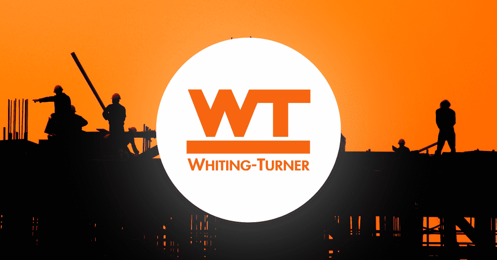
Overall, you can also use typography to convey your core values, like Whiting-Turner’s logo.
Midas Group
We’ve all heard of Midas, the mythical Greek king whose touch turned anything into gold. Midas Group successfully demonstrated its use of modern construction techniques in its logo. The three yellow lines represent prosperity and expansion. The plain white background brings the added advantage of being adaptable in several formats.
PCL Construction
PCL is one of North America’s largest construction company conglomerates. Unlike most construction logos, the logo uses green in the background to represent security and growth. The yellow oval denotes stability and continuity.
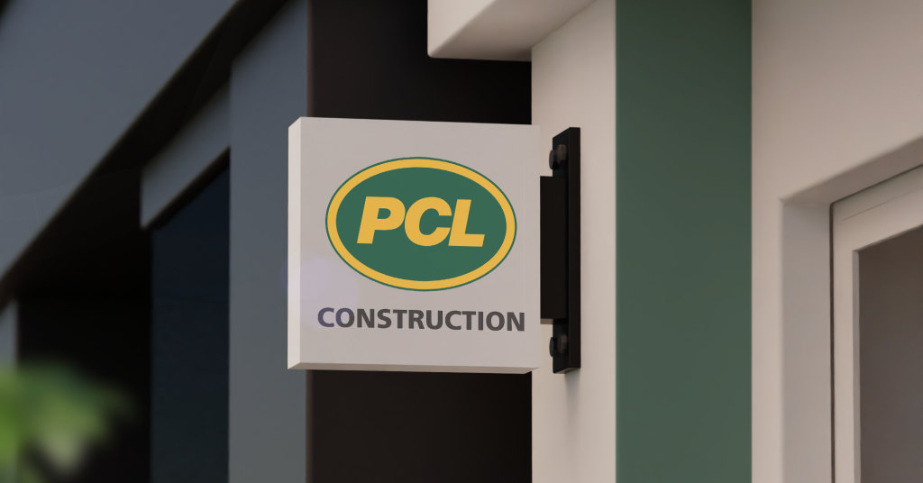
The simple but bold typeface employed in capital letters symbolizes the brand’s promise of strength.
Tutor Perini
Tutor Perini’s logo plays with colors and formatting to create a distinctive logo. The text takes center stage. It’s neat and modern. The Helvetica Neue Black font is easy to read and provides the logo with a timeless appearance. The black and green colors appear highly professional.
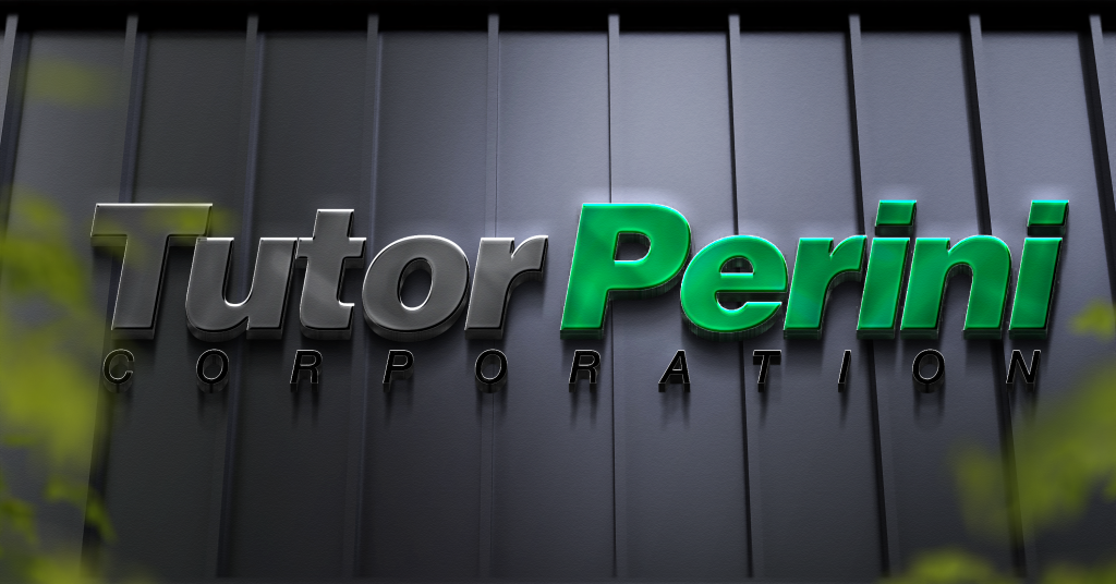
Notice how the word ‘corporation’ has been capitalized and enlarged to align with the top layer.
Perfection Construction Inc.
The logo is truly one-of-a-kind, and to say it stands out is an understatement. Based in Edmonton, Perfection Construction Inc’s logo uses a mountain illustration to represent the company’s beginning. The color scheme is modern and works perfectly with the blues of the mountains, which in turn symbolize strength.
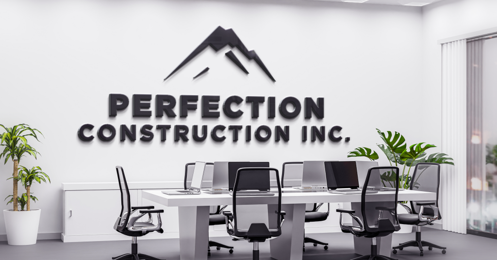
Blue stands for integrity and peace, thus making it a good choice for a construction logo.
How do I create a construction logo?
Now that you have a basic idea of how to create a logo let’s go through the fundamentals of logo design to help you perfect the design.
Choose the right colors.
Study the basics of color psychology to understand how colors impact your brand’s perception — shades of blue and brown work best for construction logos. Alternatively, you can use yellow or green hues.
For example, there is no backdrop color or icon in the Skansam logo, so typography is the primary element. However, they’ve used colors to convey their message. White text and a bold font complement the promise of strength and stability, and the blue color stands for reliability and trust. The design is simple yet attractive.
Find a suitable typeface.
A company’s name is the first thing any customer will look at, so choosing the right font is crucial. You can choose from serif, Sans serif or decorative fonts. However, most companies select serif fonts as they are easy to read and modern. If you want to create a typography logo, be more careful, as it will be the primary design element.
Include an icon (or don’t).
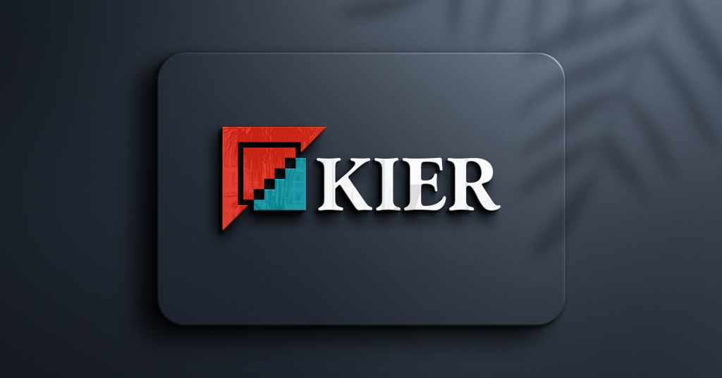
Icons and symbols are not essential; however, they add visual interest and are easy to remember. You can use icons like buildings, construction materials and supplies. Think of how you can tweak them to create an interesting design. For example, the Kier Groups’ logo features a staircase that signifies progress and a red triangle that resembles the roof of a house.
Do not rely on stock images or vectors, as they dilute your brand identity. Always invest in customized illustrations.
Want help with custom designs for your business? Get UNLIMITED GRAPHIC DESIGNS for just $399 per month at Design Shifu.
Keep the layout clean.
The key to a successful logo is an effective combination of typefaces, colors, and icons. Don’t clutter your logo with too many components laced in close proximity. It makes it look clumsy. Instead, use color, white space and size to ensure the elements are visible. If you plan to combine the symbol and text in your logo, check that both parts can be seen from a distance.
Watch out for scalability.
Your logo will be used in digital as well as print formats. It will represent your company in your absence on your brand assets, projects, photographs, social media handles, business cards, proposals and even emails. So, ensure that it is scalable. In addition, create black-and-white variations of your logo.
Wrap Up
A logo is the silent ambassador of your brand, building brand authority and recognition in your absence. Therefore, it’s crucial for every business — big or small — to invest in it. We’ve covered the best construction logo ideas to inspire you and spark your creativity so you can build a unique logo for your business. Follow the tips at the end to create an effective logo.
Creating a logo signifies what you do and builds trust and credibility in prospects’ eyes. Want help designing a logo for your construction business? Get a dedicated designer and unlimited graphic designs for just $399 per month with Design Shifu.


