In this blog

Need a design partner that scales with you?
See exactly how Design Shifu can become your on-demand design team. Book a free demo call.
FAQ
About the author
Sameena is an Organic Growth Specialist and Content Writer at Design Shifu, crafting SEO-driven content that boosts visibility, builds brand authority, and drives meaningful organic growth.
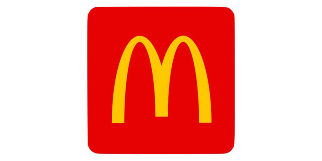
tWhat do you think of when we say McDonald's?
Isn't it the striking yellow color golden arches of the letter 'M' that struck your mind?
And what about Starbucks? Do you recall the mermaid within the green circle?
It's interesting to note that we remember brands through their logos. Logos are an interesting way to imprint your brand in your customers' minds for a longer time.
With more than a million restaurants in the United States, it can take time to establish yourself in an overcrowded market. So how do you become the first restaurant customers recall the next time they want to order?
Besides delivering the best experience to your customers in terms of food and service, you need to have an excellent branding and marketing strategy that makes you visible, reachable, and recallable.
If you're in the branding process, stuck at creating a new restaurant logo for your business because of the repeated ideas on the internet, read on. We've put together enough logo ideas and tips to fuel your mind with creative inspiration so you can design a logo that best represents your restaurant business.
Does your restaurant business really need a logo?
Investing in a logo that sets you apart from your competitors is worth every ounce of your time, effort, and money. A logo is more than a fancy shape on your restaurant's board or menu card. It is a narrative in and of itself.
A logo represents your brand.
When we say sports, do you recall Nike's swoosh or Adidas' three stripes symbol? Or is your sports team's logo that occurred to you? Or, when we say food and beverages, do you think of the golden arches of McDonald's or the eye-catching typography of Coca-Cola?
Logos can help you differentiate your business from your competitors.
A logo attracts attention and customers.
With thousands of stores lined up in a row, a logo could be a unique mark to grab attention. In addition, the logo is generally the first thing an onlooker sees. So, it should be effective enough to stir curiosity or tell your story.
A logo is memorable.
Human beings are visual creatures; we can remember images and symbols easily. Therefore, your logo becomes the visual representation of your brand. Over time, it is the logo that customers remember. Companies also pass on a message through their logos, check out this blog if you want to know about famous logos with a hidden message.
There are millions of restaurants out there. How many restaurant logos can you think of in a minute? Surprisingly, we can only recall a handful of logos. So, what makes a terrific logo?
How do famous logos set themselves apart?
Branding is perceived as a relatively new concept; however, companies have been leveraging it for decades to establish their positions in the market. Brands allocate a significant chunk of their budget and time to design logos.
So why do they invest so much time, money and effort in designing a logo? What makes a logo great?
- A successful logo is timeless.
- It is easily recognizable.
- It is consistent with the brand's voice.
- It represents the brand's mission and values.
How to design your restaurant logo: Ideas & Tips
1. Choose brand colors
Red is to Coca-Cola what green is to Starbucks, a representation of the brand's core values and messaging. Colors appear simple at first glance, but they are rather complex. Every hue has significance. The meaning alters with the context.
For example, the red in the Mastercard logo symbolizes strength and control. But when used in Target's logo, red conveys enthusiasm and vitality.
Understand color psychology. Then, identify what your brand aims to portray and select a color to match. You can also choose a duo color, tricolor, or several shades of one color to create a logo for your restaurant.
TacoRepublica is an excellent example of a color scheme selection. Their logo has a combination of contrary shades of green, a hue representing health.
In the world of food and beverages, yellow and orange are widely used colors. You can see them in well-known food businesses such as McDonald's and Hardee's logos.
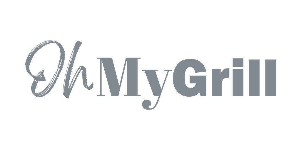
2. Find unique typography.
Sans Serif or Open Sans is no longer the only choices available. Different fonts affect consumers' feelings and behaviors in different ways. Unfortunately, several brilliant fonts have become dull because of overuse. Have fun with typography to set your business apart from the competition and get people to respond.
Tom Hortons logo would be the ideal example. The employees' pencil writing to label the coffee lids inspired the handwritten typeface for this typographic logo. The typeface stands for the warmth that the company guarantees to its customers.
Here are a few savorsome fonts that you can consider for your logo:
- Jonesy — a modern curvy typeface with a vintage touch
- Carlson Script — a handwriting font that defines elegance and luxury
- Wacca - a contemporary font with an organic and wholesome look
- Pitter — a modern, fun font duo for brands seeking something different
- Jelligun — cheerful, upbeat and charming font. Works well for patisseries and bakeries
- Play with text
You do not have to conform to conventional typography. Instead, integrate icons and shapes in your typography. For example, check out this interesting logo concept for a ramen shop. The designer uses lines to turn the letter 'N' into forms of curvy noodles.
3. Tell your story
A logo is instrumental in telling a brand's story. What values do you stand for? How did you start? What motivated you to start this venture?
Write down your story. Highlight the keywords and see how you can embed them in your design.
See how Wendy's does it. The girl in the logo is a stylized portrait of the founder Dave Thomas' daughter, Melinda "Wendy." Wendy's is a place where you get hamburgers and meals that are just like mom's home-cooked meals served with love and warmth. Its logo conveys the core message of the business.
Can you spot the word "mom" in the logo? (It's hidden in the collar)
Or, you can simply illustrate the story.
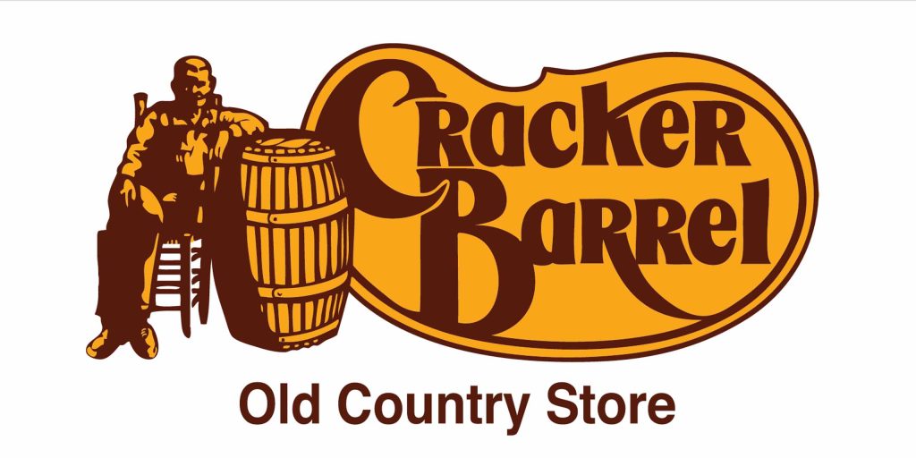
A logo that went viral and left the internet folks curious about its story is Cracker Barrel, an American restaurant and gift shop chain. According to official sources, it is named after the barrels of crackers kept in the country stores.
Take out your notepad and scribble down your ideas. Then, if you need an illustrator or a designer to help you with outputs, check out Design Shifu's services being offered on a flat monthly rate, which also comes with 14 day money-back guarantee to cover for any unforeseen circumstances.
4. Use the negative space
Rather than adding more elements and graphics to your design, give meaning to empty spaces. For example, check out this logo from Pinterest. It carves out a fork and spoon from a leaf. Or, Taco Bell's logo with an enlarged white bell whittled from a rounded square.
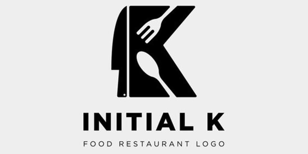
Another example is the mock logo from vector stock that cleverly utilizes the white space of the letter 'K' to embed the fork and knife.
5. Go minimalist
Minimalism has been adopted globally, not only as a philosophy but also as a fashion and style statement. This is because minimalist logo designs are eye-catching and easy to recall. No wonder legendary brands like Apple and Adidas have rebranded their logos. You can also read our blog on modern minimalist logo design and get inspired.
Check out the UberEats logo—a simple black backdrop with nice and consistent typography.
6. Decorate with details
Although minimalism is the talk of the town, you can stand out with details, swirls and curves. Check out these decorative restaurant logo ideas we found on Pinterest.
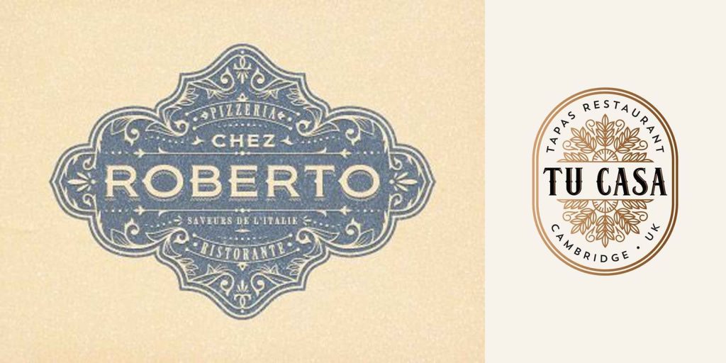
However, be careful while adding in the details. Too many details can get lost when you reduce the size of the logo.
7. Try cartoons & mascots
Remember Mr. Harland Sanders from the KFC logo? If you're a fun and friendly business with cheerful energy, use cartoons or mascots in your logo, just like KFC, Wendy's and Little Caesars. Such logos quickly capture the attention of onlookers and are unforgettable.

8. Go abstract
Line art and abstract shapes best articulate the feelings of a brand. If you want your logo to go beyond the confines of literal meanings, then abstract logos are your choice.

Combination restaurant logo ideas
Though we encourage you to stick to fewer colors, shapes, elements, and styles, some logos break all the rules and successfully make a mark. For example, combine illustration with bold typeface or integrate symbols in empty spaces.
Check out Planet Sushi's logo, which integrates illustration with letters. Both elements share equal weight but are balanced by white space.
By now, you must have ideas to get started. However, if you're looking for ideas for a particular restaurant style, scroll down.
Fancy Restaurants Logo Ideas
Marchesi Antinori is a premium wine brand with roots dating back to the 1300s. They employed beautiful typography, symmetry, and the crown emblem to set it apart from other wine companies, which encapture its elegance and history.
Cafe Logo Ideas
The Cafe Florian's logo has an exquisite calligraphy typeface that extends to form an infinite loop. This is not only visually appealing, but it also represents the general consensus of time and vintage vibe.
Pub Logo Ideas
Home to some of the world's expensive cocktails, The Bar Hemingway of Paris features a logo that signifies royalty and luxury.
Mexican restaurant logo ideas
And looking at the logo of Dulce Patria, the internationally known Mexican restaurant, you'll find how the logo makes excellent use of negative space, text, and background color. The mahogany hue represents wealth and affluence.
How to use your logo effectively?
Keep it on brand
Before designing the logo, determine your target demographic, primary colors, brand voice, tone, personality and how you want to position yourself in the market. Then, select the styles and elements accordingly.
Use it everywhere
Whether it is your website, your Instagram page, or coffee cups, leverage the power of your logo anywhere and everywhere you can. Use it on your social media profile pages, menu cards, coffee mugs, tissue papers, receipts, etc.
Design multiple variations of your logo
You will be using your logo on different assets, be it in print or digital. So have multiple sizes and formats of your logo ready. Also, create white and black versions of your logo.
Things to avoid while designing a restaurant logo
While designing a logo, it's tempting to try various styles and techniques. However, here are a few things that you must avoid to create a successful logo:
Do not use multiple fonts
Do not go beyond two fonts. Multiple fonts can disturb the consistency and clutter the design. As you can see in the below example, which is not recommended.
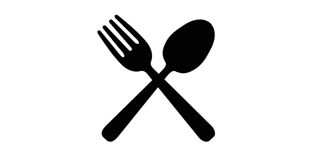
Avoid cliches & overused symbols
Forks, knives, and spoons are overused icons in the restaurant industry. Think of ways to go beyond conventional symbols and icons. Do a competitor's research to see the common elements, colors, and symbols. Find the gap and tap into the hidden opportunity to make an impact. The below example would never help you stand out so restrict using similar visuals in your logo.
Do not add too much text
Although text-based logos are simple and highly effective, do not write down everything in your logo. Keep it simple. Vary the size of the name and tagline to create an interesting visual.
The below example looks like only text and is very boring, you don't want to be that, right?
Restrain from tweaking the logo
If you keep fiddling with your logo very often, it will diminish brand loyalty and undermine customer trust. Your logo should remain consistent so that it builds brand recall. In case, you change your logo, there must be an explanation of what's changing within your restaurant complementing the logo change.
Wrapping Up
Now that we've covered everything from what makes a logo effective to creative logo ideas with examples to Do's and Don'ts, it's time for you to take out your paper and pen and start sketching your own restaurant logo ideas. Do not fear the blank page. You don't have to be perfect on the first attempt. Your job is to flesh out as many ideas as possible.
You can also consider getting a dedicated designer from Design Shifu to enjoy unlimited graphics on a flat, monthly subscription.
If you need more design tips to brainstorm ideas for your logo, read our ten tips to get you started.