Best Illustrative logo design ideas for your inspiration
Why do you need a logo for your company? Think about the most well-known brands; the first thing that comes to mind is their logos; when you see these logos, you already know what items they sell and what kinds of services they provide. This is why you need to invest in a competent designer.
Therefore, investing in a quality logo design is essential if you want your business to succeed over the long haul. A robust logo design will help you attract customers, make an excellent first impression, and serve as the focal point of your brand identity, increasing brand awareness and loyalty over time.
For every person or industry, logo design is an essential component of branding, and a brand’s logo will help it communicate its message and philosophy.
Why is an Illustrative Logo a good choice?
Illustrative logos can significantly influence and increase brand recognition depending on the type of brand, the market segment, and the target market. An illustrative logo can be a fantastic way to build a logo’s brand in a highly competitive market.
The logo’s illustration goes beyond classic representation and includes a very finely detailed logo that would astound the audience.
However, not all logos are created equal, and in this blog post, we will discuss the different types of illustrative logo designs.
Illustrative Logo Design Ideas:
Minimalist Illustrative Logo
The most potent and well-designed corporate identities frequently have a minimalistic aesthetic. Designs with the most straightforward and compelling layouts stand out the most in the corporate world.
Mascot logos feature an illustrated person or character who will represent your company visually; this person or character will also serve as the spokesperson for your brand and will be the subject of most of your company’s advertising.
Mascot logos are a fantastic alternative for a kid-friendly logo. They help your brand connect with your audience and develop distinctive branding, and typically, businesses whose primary target market is families and kids employ these types of logo designs.
To create a new brand image, the brand image and the text bearing the brand name may be placed next, layered on top of one another, or combined.
Combination marks are the most preferred method of logo creation since your brand name can be quickly connected to an image or mascot logo, and they both help to strengthen your brand. Since these types of logos include text and an image, they aid in connecting your business with that image. In the future, these brands can omit their names from the logo and rely solely on a logo symbol.
These logo designs are one-of-a-kind, custom-made symbols to represent your brand. Abstract mark logos are symbols with a pictorial element, but they avoid literal reproduction from any image. Instead, they develop their brand logo through abstract geometric patterns.
This logo design is particularly effective since it condenses your brand into a single image. However, they are distinctive icons because they don’t resemble anything else. The advantage of these logos is that you may symbolically communicate what your firm does and its philosophy without relying on cultural connotations; they do this by utilizing shape, color psychology, and other design elements.
Emblem logos, which incorporate a symbol, font, or icon with seals, crests, and badges, are the traditional form of logo design. The logos are ideal for a classic look and are used by various businesses, including sports teams, schools, government organizations, and the car sector.
Many businesses have successfully upgraded their traditional emblems to match the 21st century despite their classic feel.
Emblem logos can still be less adaptable and flexible than other logo design styles due to their higher level of detail and the fact that the company name and its symbol are rigidly intertwined.
There are Letterforms logo design types and monograms’ more understated letter-based counterparts. Letterform logos only employ one letter, typically the first letter of the company, and these brand identifiers need to be bright and appealing to help viewers associate your logo with this one letter.
Letter logos are ideal for print and digital use because of their responsible and scalable minimalistic anatomy.
Wordmarks or logotypes are font-based logo designs that emphasize a company name with a particular typeface representing the firm’s philosophy and feelings. Many well-known brands and large corporations, including Coca-Cola, Google, and Uber, employ this logo design.
When your business or brand has a memorable name, and you can center your branding efforts around it, this logo design works exceptionally well. The combination of unique naming and powerful typography increases brand recognition. Since the name dominates these logos, the font choice or creation must be perfect for conveying the company’s core.
Where to find an excellent illustrative logo design?
At Design Shifu, we make it super simple for businesses to get illustrative logo designs while saving them money, time, and worry. Design Shifu’s logo designers are devoted to detail when designing your logo.
Design Shifu designers read your design brief and make sure to create a logo that fits your brand perfectly. Also, they strive to make a logo you love. Additionally, you can request a new designer if a designer’s logo doesn’t meet your style!
Give your business an illustrative logo at the get-go. Subscribe to Design Shifu today and try it 100% risk-free for 14 days!
Most Popular Clothing Logo Design Inspiration & Ideas
When you start a clothing line, you start it with a long-term goal. It is not just a few days’ affair; it is for several generations.
Your creativity must be conveyed in the most effective way you can, whether it is subtle or loud.
Logos are designed in a variety of ways to determine their usefulness and lifespan. A logo’s ability to become famous over time depends on a number of design aspects. Your brand identity is greatly influenced by the visual identity you develop, whether you’re a start-up, a prominent fashion brand, or a small store.
We have compiled a great list of brand-building clothing logo design inspiration for your consideration, here you go:
Clothing Logo Design Inspiration
Puma
What exactly is the Puma brand, and why is it so well-known? The fact that Puma is a top brand for sports and lifestyle products is well known.
Rudolf Dassler, the company’s founder, came up with the concept for the logo. He thought that the qualities of a cat, such as speed, endurance, and agility, should be connected to his products. According to him, an athlete’s movement exhibits these same features. Every athlete who sees the emblem is reminded of their tremendous potential and limitless opportunities.
The list of the best fashion labels, including Giorgio Armani and Gucci, is headed by Versace, a company known for producing some of the best haute couture and accessories. The exclusive logo of the high-end clothing line is very well known.
The head of the Greek legendary character Medusa appears in the Versace logo. The ruins’ floor in the region of Reggio Calabria, where the Versace siblings used to play, served as the inspiration for the logo.
In recognition of Medusa’s ability to make people fall in love and leave them unable to escape, Gianni Versace made her the Versace collection’s emblem.
Versace’s logo is a beautiful work of art. One of the solid visual identities in the world, the Versace logo is well-balanced, appealing, and forceful.
The original Hermes logo was aesthetically beautiful and clear, emphasizing the company’s line of business. The most striking aspects of the logo are a fine coach, a clean, tidy horse buckled into the harness & an attractive guy standing next to it.
Underneath it was a brand name and the location of its inception. The Hermes Paris logo hasn’t been modified much over the decades.
The Hermes logo is inspired by the Greek god Hermes, the messenger of the gods and patron of travelers, commerce, and thieves. The logo features a depiction of Hermes’ staff, known as a caduceus, which was a symbol of peace and diplomacy. The logo also includes the brand name “Hermes” in capital letters. The design of the Hermes logo is meant to evoke the brand’s roots in luxury and craftsmanship and its association with Hermes, the god of travel and commerce.
The logo’s overall design is simple and elegant, with clean lines and a classic font for the brand name. The combination of the caduceus and the brand name creates a strong, iconic image that is easily recognizable and associated with luxury and quality.
One of the top and most well-known international brands, Zara, serves both men and women worldwide. Even individuals who have little interest in fashion are drawn to the brand because of the logo’s extensive history.
The Zara logo is a simple, modern design that features the brand’s name in capital letters. The font used is a sans-serif typeface, which gives the logo a clean and contemporary look. The letters are all the same size, with no additional ornamentation or flourishes. The brand name is usually white against a dark background, creating a high-contrast look that makes the logo stand out.
The overall design of the Zara logo is meant to convey sophistication and modernity and to reflect the brand’s focus on fashion and style. The clean, minimalistic design of the logo reflects the brand’s commitment to simplicity and functionality, while the high-contrast color scheme helps to make the logo instantly recognizable.
The H&M logo design is inspired by the brand’s initials, “H” and “M.” The logo features the letters “H” and “M” in capital letters, with the “H” placed above the “M.” The letters are designed in a simple, sans-serif font and are colored in a bright red hue.
The design of the H&M logo is meant to be simple, with a bold and vibrant color palette that is easily recognizable and eye-catching. The logo evokes the brand’s focus on fashion and style, and the red color is often associated with energy, passion, and excitement. Using capital letters in the logo also adds strength and confidence, reflecting the brand’s position as a leading player in the fashion industry. Overall, the design of the H&M logo is meant to be modern and stylish, appealing to a wide range of customers who value fashion and quality.
The new Uniqlo logo is striking and effectively portrays the brand’s character, Japanese design, and craftsmanship. The color scheme and design convey Japanese symbolism. The Japanese flag is represented by the colors red and white. The square shape is reminiscent of the name seals that are customarily applied to items in Japan to signify ownership and validity. Combining Japanese characters and Roman letters also conveys the strong trading ties between the United States and Japan.
The design of the Uniqlo logo is intended to be clean and minimalistic, reflecting the brand’s focus on affordable, high-quality basics.
It is meant to be timeless and versatile, as it can be used in various contexts and paired with different design elements. The logo is often combined with other graphic elements, such as images or patterns, to create a cohesive look for the brand’s marketing materials. The logo’s simplicity allows it to be easily recognized and remembered and helps to communicate the brand’s focus on simplicity and functionality.
Every iconic logo has a connecting design theme. This theme will frequently be related to the brand identity in terms of color scheme, forms, or other elements, such as font choices. Every choice should be consistent with the client’s brand to maintain its strong theme.
Choosing the Right Fonts
The most frequently used fonts for clothing logos are simple straight fonts. This is because it better conveys brand aesthetics rather than complex writing or static lettering. The typeface you use for the clothing is one of the essential components in making it distinctive, which everyone desires.
Relevance
Consider the audience you’re aiming to attract while choosing fonts, colors, and symbols. Your ability to connect with your market will improve if you use the proper balance of these components for your clothes logo design.
Simplicity
Make sure to design a simple and unique logo because your clothing logo will work with limited space. You want to create a clothing logo that briefly yet clearly expresses the character of your brand.
Why Should You Avoid Doing Clothing Brand Logos Yourself?
It may seem simple to understand these concepts for clothing brand logos, but it can be a lot of work to put them together. It is possible to stretch a few dollars by creating your own logos or experimenting with internet logo makers. Although your artistic eye may pass muster, you just need to be able to design a memorable logo that will grow with the company.
Takeaway
If there’s one visual that you need to nail from the start, it’s the logo.
When brainstorming for your logo, ensure it reflects your business’s identity and value proposition. Only then can you create a logo that stands out from the crowd.
If you’re looking for a partner in creating visuals that will appeal to your audience, look no further than Design Shifu. With our flat monthly rate, you can have all the graphic design you need – from logos to ads – for a modest monthly subscription fee.
We offer a 14-day risk-free money-back guarantee so you’ve got nothing to lose! Get started here.
Most Practical Examples of Bakery Logos for Inspiration
Why do some bakeries excel while others don’t? Is it just the flavor of their artisanal pastries, or is there something else going on?
Offering mouthwatering treats is one thing, but creating an eye-catching logo is another. A bakery must distinguish itself in a sea of pastry shops before the clients choose to return for more.
It is possible through a powerful and friendly brand logo. Pastries today need eye-catching graphics to go with the flavor, making the bakery distinctive. A well-designed logo inspires thought and piques your interest.
Ultimately, the logo should be distinctive and tempting, letting the target audience know about the brand.
Examples of Bakery Logos for Inspiration
Creative Bakery Logo
A sophisticated bakery logo requires a lot more effort than just baking. You can come up with alternative visuals to entice the taste buds of your potential clients in place of the traditional cupcake, rolling pin, or cookie icon, or you can choose a script font or another that can substitute for messages and mood.
Consider coming up with a rhyme, and use a simple design to make your brand name stand out in the logo. Why not make your bakery’s logo look like a house or building? You can add a relatable text to your cupcake image or wheat to give your logo a more authentic feel if you want it to inspire a sense of belonging.
Many individuals highly value food aesthetics. The tongue only follows the eye for them. To weigh their appetite, use adorable illustrations and colors while designing a bakery logo. If you offer cakes and other pastries, choose a logo that depicts them. Designers typically use quirky details and pastel colors for adorable bakery logo ideas.
Some adorable logos also feature cartoon drawings! This logo design encourages your items to be prepared uniquely and with love.
Enticing logos help draw in hungry customers; some bakeries add features like bread, wheat grains, windmills, and baskets of baked cupcakes.
The color scheme is yet another crucial component of an awesome bakery logo. Color impacts our emotions and actions; did you know that? Use it now to create a visually appealing bakery logo.
There’s a good reason why certain cupcake businesses identify themselves with pink hues. Pink soothes us and conjures up happy memories.
Why is simplicity in design still essential? It may sound cliche, but when it comes to design, less is more, especially regarding logos. The minimalist aesthetic is still prevalent worldwide; young individuals are becoming less materialistic and choosing it as an aesthetic. It is safe to claim that you can choose a simple style for your bakery logo!
We all know what a typical bread ingredient is, and looks excellent in a simple logo design. Contrary to cakes, pies, cupcakes, and other sweets, wheat is a little less prevalent and has a simple interface.
Your logo should be unique, creative, and simple to comprehend to draw customers. Here are some examples of bakery business logos that you can consider as you choose the name of the company you want your people to remember. It might have something to do with the menu you’ve picked, something personal, or even something to do with you!
Best Bakery Logo Examples
Baked Rituals
Rituals are a solemn sequence of actions carried out in a predetermined order. However, Baked Rituals is a bakery dedicated to creating a line of everything baked! Their logo, which features two wheat grains reminiscent of numerous golden-colored bagels, immediately conveys this.
The logo elegantly conveys the ease with which fresh goods can be made, leaving you to consider the fresh and clean food that Baked Rituals will serve you.
The logo for Homecake calls attention to that forgotten detail, making the baking process homely and enjoyable. You can enter the building and check what delectable goodies they have created with the fun colors and charming graphic style.
In this simplistic logo, a cake is held in the hands of drawn figures, and a light-hearted phrase surrounds the logo. The use of pastel hues aims to express the harmony and sweetness of freshly baked cakes.
CakeDay is a company that specializes in designing and marketing customized desserts, bento cakes, cookies, and other sweet treats.
The logo is a fusion of chic elegance and delectable whipped cream writing. A warm and enduring experience was created by carefully choosing the color palette to convey celebration and emotion.
You can sense the welcoming environment in this bakery from the wooden design and its definitive text. The logo gives a clear picture of what happens in the kitchen and entices you to try some of their freshly baked delicacies.
Is there anything better to enjoy a croissant than a high-end Parisian bakery? PAINPAIN is a self-explanatory brand whose name translates to “bread” in French.
With this logotype, the designers accomplished an excellent job. The golden shadows stylishly complement a straightforward but impactful blue text, highlighting the brand’s elegance.
With a rolling pin and an expressive logotype, this Seattle-based bakery chose to use a clear message for its logo. Customers are transported by the aesthetics back in time to a quiet day at their grandparents’ house, where they may watch them bake pastries and then breathe in the aroma of freshly sweet treats when the oven is opened. Looking at it, you can tell you’re in for a tasty treat.
Do you need to design a brand new logo for your new bakery or update the existing one? In any case, Design Shifu is here to help! You can get your new logo by subscribing to Design Shifu!
Why not subscribe to Design Shifu and get an unforgettable and unique logo? Start your journey with Design Shifu by subscribing here.
16 Modern Construction Company Logo Ideas
Visual branding in the construction industry is overcrowded with logo marks and emblems of buildings and helmets.
For small businesses, it becomes a challenge to create a unique brand identity through their logo that gives them a competitive edge. Business owners struggle to find time and energy to create a logo while handling other administrative tasks.
Learn everything you need to create stunning, modern logos for your small business to represent your brand effectively and stand out from the competition.
What is a modern logo design?
Often, people confuse modernism with minimalism. Modern logo design is a combination of design principles and the latest trends. It doesn’t necessarily mean a monochromatic logo with an abstract shape. From flashy, neon design to abstract line art, it could be anything. The key is the ‘popular’ art form.
While traditional designs emphasized the right colors and shapes, modern designs focus on alignment between the elements. In a nutshell, modern designing is not only about the colors, illustrations, or typography but also about alignment, balance, and symphony between the elements that evoke the intended emotion in the viewer.
A classic and easy-to-understand example is the famous swoosh of Nike, which is impossible to not recognize. A logo born in 1971 can teach a lot about modern design. The swoosh represents action, subconsciously capturing the sense of movement — exactly what Nike stands for. It communicates the brand’s tagline and messaging, “Just Do It.”
Ultimately, modern designs prioritize messaging over decorative design elements. Usually, the aim is to create an easy-to-remember design without compromising brand identity. Let’s explore popular construction logos to understand them in a better light.
Not all logos are enclosed in a solid shape, like a rectangle or square. Experiment with various colors and symbols, or blend the brand initials with a general shape to explore new possibilities.
For instance, the Urbanity logo. The logo appears to play with a solid shape and the brand’s initial letter “U” to find a unique form. The straight lines represent skyscrapers which symbolize urbanism.
How can a logo help you build trust in your customers’ minds? You illustrate exactly what you do and let them see what they can expect. Although the house icons are overused, you can find new ways to distort and recreate them in a new way to communicate.
For instance, check out these logo concepts that blend the commonly used house icons with unique typography to create visual interest.
Yellow is a popular choice in the construction industry. But what distinguishes this logo is the 3D appearance. The three bold lines that give an appearance of an architectural structure with a shadow offer a 3D appeal. Moreover, it uses an unusual combination of bold and regular font, which draws the viewer’s attention to read the company’s name.
You can also experiment with different font combinations for your brand, especially if you wish to focus on typography.
Another combination logo that cleverly uses lines to create a structure and engulf the company’s initials inside it. Many modern designs use word art to stand out. The reason is that it incorporates text and icons into a single imagery. Customers can easily identify your company with these unique logo designs.
Dexson Construction’s logo is a combination logo with a geometric shape and Sans-serif font. If you look closely, you would see a house carved out of a square. The clean lines and squares denote strength, authority, and elegance.
While many would argue whether mascots can be modern, it truly relies on how you wish to portray your brand and establish yourself in the market. Mascots are notoriously difficult to remember and comprehend at first glance and take time to build a reputation among your audience, but they are excellent choices for establishing a distinct identity.
Design a character with the right tools to convey what you do. To keep it modern, simplify the details like eyes and nose. Why not take help from Design Shifu to design a mascot for you? You get unlimited graphic designs and a dedicated designer to take care of all your design needs.
If there is one characteristic associated with modernism, it is aesthetics. It is about stylishly presenting complexity. Rather than demonstrating the house and building separately, the logo blends the two symbols together to create a distinct appearance. The design also incorporates the initials of the company’s name, ‘l’ and ‘h’. The colors, lines, and symbols clearly communicate the kinds of construction projects the company undertakes.
Overlays are an excellent way to amplify visual interest. This logo, for instance, plays with straight lines and symmetrical geometric shapes. The color palette comprises just one color to maintain minimalism in the design.
While silver color is associated with steel and other construction materials, it also evokes a sense of mystery and exclusivity. This logo creates relevance and familiarity using clean silver beams that appear like a row of buildings inscribed in a circle. According to shape psychology, a circle illustrates stability and completeness, thus building on trust with its audience.
Designed by Nikas Geisleris, Konstruct’s logo is a combination of symbols and typography. The symbol constructed from straight lines resembles the letter ‘k’, the building plan, and the beams. It would also work as an effective brand mark for the company.
Ferry Construction’s logo is a monogram with block lines. The letters ‘F’ and ‘C’ are positioned such that the final output resembles a construction plan. The logo accompanies the company’s tagline, clearly communicating its core values to its audience.
Pyramid Builders
Pyramid Builders logo is an elegant, minimal logo made of a triangular shape. It conveys the brand tagline and its literal and metaphorical values. Besides being a symbol for the pyramid, the triangle pointing up denotes stability, power, strength, and uniqueness.
You can also use triangular shapes in your logo or position your elements in a triangular layout to convey similar values.
Another typography logo that uses colors, slants, and positioning to win customers’ trust. The modern typeface Helvetica Neue Black font, with no swoops and superfluous details, gives it a neat touch. The green color creates distinct highlights drawing the viewers’ attention.
Modern logos usually experiment with typography, like Whiting-Turner’s logo. The bold and vibrant orange color of the bold typeface contrasts with the white background. While orange conveys warmth, safety, and shelter, white communicates firmness, balance, and steadiness.
Skanska is one of the world’s largest construction companies. The logo is well-known for its stunning blue color and plain typography that joins k and A. The logo conveys modern thinking, and authority trust. The reason why Skanska gets away with a simple typography logo is its wide popularity and reputation. The purpose of the logo, then, becomes to build a brand recall rather than communicating its brand messaging.
Structure Tone is one of the premier interior and renovation companies. And its minimal logo conveys its values. The rhombus with a solid color on one side and lines on another makes up a nice brand mark logo that can be easily scaled to fit different brand assets like business cards and social media profiles. The straight lines depict honesty, trust, and uniformity. Additionally, they also create a sense of moving forward.
How to modernize your construction company logo?
If you’re not a designer, it is normal if you don’t know how to design a logo. Unlike trends, logos do not change with recent fades. You have to create a timeless logo that stays even after the trend fades for years to come. However, logos for big brands like Google and Facebook too undergo changes to stay relevant to their audience.
If you are creating the logo for the first time or have a logo that looks outdated and irrelevant, here are a few tips to help you update your logo:
Limited bold colors
Limit your color palette to one or two bold colors paired with black or white. If you wish to have more colors, tone down other elements to create clean impressions.
Clean Typography
Modern design cherishes clean lines of Sans-serif fonts with no swirls and twirls. Check out typefaces with different weight, space, size, and slant to find the best match.
Minimal symbols and icons
While many modern logos drop the visual icons to simplify their design, you can opt for minimal icons and geometric patterns if you wish to include symbols in your logo.
Simply layout
With the ever-reducing attention span, keep the layout of your construction company logo clean, spacey, and simple so a viewer can memorize it within a glance. Avoid intricate details.
While bold lines and colors can easily grab attention, design your logo such that it can scale to fit any medium, from digital to print, like business cards and giant billboards.
Wrap Up
Being relevant and creative is no longer an option for brands they may neglect. To build strong brand recall and recognition, invest in your visual identity and create a logo that is appealing, timeless, and memorable. A logo that establishes your credibility and attracts new business. Define your brand messaging, values and guidelines, and determine the type of logo you want. Use our list of modern construction logos to design your own. Experiment with a few designs before selecting one. And flaunt it proudly on every document, marketing material, flyers, and card to have maximum impact.
If design is not your strongest suit, consider professional services like Design Shifu to share the load. Get a dedicated designer and unlimited graphic designs for just $399 per month from Design Shifu.
15 Practical Financial Services Company Logo Design Ideas
Struggling to create a logo for your finance business?
Successful companies invest millions of dollars in their brand identity to develop strong brand recognition and association. Logos act as the “face” of the business because they are memorable and recognizable. We have covered several logotypes along with examples to unblock your creativity and get you designing.
Scroll down to find our list of financial services company logo design ideas.
Financial services company logo design ideas
Financial Monogram Logo Design Ideas
A monogram logo combines the initials of the business name to create an interesting design, which may or may not form a new shape or an icon. The advantage of a monogram logotype is it is device responsive, which means it can be placed on a medium of any size effortlessly.
The logo created for the Bank of Cashton is the perfect example of a monogram design idea. This logo is the integration of two alphabets B and C. It has a solid font and subtle color palette, which goes well with the motto of any financial service provider. It appears robust and professional.
Financial Brand Mark Logo Design Ideas
A brand mark logo combines image and text for quick identification of the business. By simply removing all letters, phrases, and other information from a logo, brand marks allow your business to visually communicate its meaning to audiences. Just like the MasterCard logo.
The MasterCard logo is a vibrant geometric design made up of two overlapping orange and red circles. The color scheme of the sign stands for growth, vitality, and mobility, while the circles represent collaboration and unity.
ING, a global financial institution of Dutch origin, incorporates its Dutch heritage and culture — the national animal of the Netherlands (lion) and the nation’s official color (orange) — into its logo. The lion used in the logo denotes power, bravery, and force. ING promotes its brand through its emblem, which features a lion icon to demonstrate that they have a firm foundation.
The Chase Bank logo has one of the best financial logos. The brand mark is a blue geometric pattern, which depicts cash flow. In a world, which is becoming increasingly digital, the logo still thrives because of its presence on almost every business asset and merchandise.
Customers are familiar with it via online and mobile platforms, as well as from millions of credit and debit cards and thousands of ATMs and locations. Chase adopted the solid blue color octagon in 2004; it continues to be a strong, instantly recognizable sign for the Chase brand.
Financial Wordmark Logo Design Ideas
Wordmark logos prioritize text and typography. Usually, the organization’s name is the only element included; no mascots, symbols, or badges.
The Berkshire Hathaway logo is a simple wordmark logo in New Times Roman typeface. It is both straightforward and effective. The logo has a professional air to it and is comprehensible, trustworthy, and memorable.
The mobile bank, Allies logo, is another wordmark logo. Despite being straightforward, the fun circular curve in the letter “a” is an interesting detail.
Deloitte has a custom sans-serif typeface with some of its corners chopped diagonally. Along with the bold title case, the solid lime-green dot provides distinction to the black logotype and symbolizes growth, riches, and advancement.
Financial Combination Logo Design Ideas
A combination mark is just a logo that combines both the logotype and the logomark. Combining text and image or icons improves the branding message and makes it clearer what a company is all about.
Just like in the case of the Bank of America logo. Changes to the American flag represent the bank’s affiliation with American ideals. In addition, the rectangles resemble a farmer’s field, which communicates directly to their primary audience of farmers.
Similarly, an English business called Prudential focused on offering financial and insurance services. A simple, classy emblem is the central focus of the design, which is surrounded by a wordmark. The woman seems gazing into a mirror in her hand.
A coiled serpent on the left is an ancient symbol of wisdom. The woman’s face, as the company’s website claims, humanizes the company in the faceless world. The emblem symbolizes core values: Prudence, Justice, Fortitude and Temperance. It also stands for understanding of the past, present, and future.
Emblem Logo Design Ideas
Financial institutions adopt emblem logos to convey a vintage feel and to appear dignified and well-established. This kind of logo is a great option for organizations today who wish to portray assurance, dependability, tradition, and legacy.
Some emblem logos also include text inside the symbol. You can also consider badges, seals or crests if you want to accentuate the history and legacy and design a vintage logo for your finance business.
The UBS logo consists of a three-key emblem in black next to the red lettering “UBS.” The intricate design of the keys stand for the core values of the business — confidence, security, and discretion. The decorative components at the lower ends of the keys are reminiscent of old coats of arms, while those at the upper ends of the keys demonstrate a higher level of security. The UBS emblem therefore symbolizes the long history and tradition of the bank.
Liberty Mutual Insurance plays around with the Statue of Liberty as its emblem in the logo. The company’s trustworthiness and accountability are reflected in the emblem, which gives clients a sense of security. The use of such a powerful symbol in a company’s visual design communicates trust, experience, professionalism and responsibility.
Mascot Logo Design Ideas
Mascot logos often have comical exaggerations. They portray the personality of the brand with interesting faces and characters. Brands like Duolingo have extended their mascots into other aspects of their marketing to establish their position in the industry. Mascots add a touch of personalization to your brand.
Understand your audience, brand messaging and mission while designing your mascot. For example, this mascot logo template, with a man holding a bag of cash, would resonate well with an Indian audience.
Captain cash is another example of a perfect mascot logo design. Captain Cash presents itself as a personal company by having an upbeat-looking mascot in their logo. They aim to reduce the fear associated with borrowing money.
The fact that Captain Cash incorporated humor and enjoyment in its financial logo sets it apart from other online cash loan providers in Canada.
Abstract Logo Design Ideas
The versatility of abstract logos makes them a popular choice among firms who have a lot to say. Abstract designs enable businesses to convey more ideas and emotions through one sign. These logos may be minimalist with a line-drawn image that conveys a brand’s message or have complex non-literal imagery using symbols, forms, patterns, or pictures.
Abstract logos that stand out are simpler to recall like the logo of Airbnb. If you use a basic or well-known symbol, your logo will be easy to forget and blend in with thousands of others. So, play with shapes and typography to create an original symbol.
For example, the MJM logo has an umbrella that is saving the letter from lightning. This is such a clear message to showcase the business ideology. This is what an abstract logo is all about. It speaks a ton for your business.
Deutsche bank’s logo is also a great example of abstract logo design. The emblem draws attention to the distinctive position that the Deutsche Bank occupies. Even in a difficult economic climate, the diagonal line suggests that Deutsche Bank is committed to executing its own line and competing in the financial sea. The square represents steadiness.
Illustrative Logo Design Ideas
Logos with illustrations often have intricate design components. Typically, pictures of a small segment of what the business does, a picture of the company name, or even a mascot or figure that is used to symbolize the nature of the business.
To expand the brand internationally, Nova Scotia bank changed its name to Scotiabank in 1975. A logo with this term and the recognizable symbol of a stylized “S” simultaneously appeared. A globe, a representation of the fact that the global corporation has a network of branches all over the world, was placed in front of the letter.
White was the secondary color, and red was the dominant color. This illustrative logo design made various headlines back in the days.
Two blue and green vertical spirals make up the renowned Standard Chartered logo. The spirals, which are intertwined to create a three-dimensional impression, represent a strong and dependable cooperation between the bank and its clients. The bank stands out because of its distinctive, easily recognizable illustrative spiral Standard Chartered logo.
Best practices to create a financial services company logo
A creatively balanced logo design draws positive attention and makes a great first impression. A well-designed company logo will bring all the elements of your brand together and spark dialogue with your clients and customers. Here are some design components you must consider while designing your logo:
Color
Colors evoke different emotions. Several meanings are attached to each color. Many financial institutions choose one color in their logo, leaving the remaining elements in either black or white. You certainly don’t have to use just one color.
You can combine more than one color to create a cohesive brand color story. A good practice is to pick your brand colors. If you don’t have defined your brand identity yet, observe your company assets, materials and social media pages.
What colors do you majorly use? Define the emotions you want to evoke. Create a palette out of those colors. Stick to 2-3 colors.
Symbol
Our brain takes only 13 milliseconds to process an image. Using icons and symbols that illustrate what you do enables your target audience to decipher your business message quickly. A corporation that specializes in long-term investment may select a tree or mountain, while an international finance company might use a globe or map.
Design a symbol that captures what makes your organization unique rather than the overused coins, dollar signs, and charts icons. Avoid using stock illustrations.
If it’s overwhelming for you, consider professional help. Subscribe to Design Shifu and get your logo designed at a flat rate.
Layout
A well-designed logo communicates professionalism, trust, and credibility encouraging visitors to stick around and contact you in times of need. A cluttered layout may speak otherwise. Ensure that the elements are balanced and have uniformity. Do not cram elements into your logo that your audience is unable to decode it.
Typography
If you use typography in your logo design, be careful of the typeface, font size, and colors. You can download new fonts from websites or create an original font too. Financial institutions can choose from sans-serif to serif range of fonts depending on your brand messaging.
While companies with a long history opt for serif fonts, newer tech-led financial companies go for sans-serif fonts like Futura to communicate their modernity and futuristic vision.
Lastly, prioritize fundamentals over design trends because your logo will stick with your business for years to come, unlike a trend that fades away within months.
Wrap Up
A company’s logo encapsulates the brand’s complete story a visual, forming a crucial aspect of the company’s brand identity. People start recognizing your logo as your brand expands, and familiarity promotes trust and credibility in your business. So, invest your energy and time wisely to create a memorable visual identity for your business.
Follow the tips and create an instantly recognizable logo that distinguishes you from your competitors. Want help designing a logo for your finance business? Get a dedicated designer and unlimited graphic designs for just $399 per month with Design Shifu.
Best Vintage Logo Design Inspiration for your Brand
Not every brand needs to adopt modern design trends while weaving its corporate strategy. Who said vintage and retro wouldn’t tie in with your audience?
As industries expand and more players enter the market, businesses need to play on different specialties. One can be its long history and years of experience; the other can be its relevance with culture and belongingness. Vintage logos allow brands to connect with their history to attract the right audience.
The first move for a brand to successfully tell its story starts with its logo. Each design trend represents an era. You’d be surprised when you notice how, for example, psychedelics brsing you back to the sixties and bubble letters look like seventies signage, whereas pixel art will transport you straight to the eighties and nineties.
Retro design and vintage logos give the brand a classy look and uplift its originality, advocating a history of experience and expertise and instilling trust in customers. In this blog, we’ll learn more about vintage logo design inspiration, its types, needs, and how you can design a vintage logo for your business.
Let’s get started.
Why Vintage Logo Design? Is It A Good Choice For Your Business?
“Vintage design is highly emotional because it belongs to the history of each of us. It evokes nostalgia in people of all ages,” says Olimpio, a 99designer.
Brands usually decide on going for a vintage design for their logos either to position themselves as an experienced player in the market or to provide the customer with the experience of a specific era.
If a barbershop wants to capture the essence of a 20th-century tonsorial parlor, or if a theater company wants the customers to remember drive-in theaters of the 60s, all they need to do is go back to the design trends of that era and incorporate them into their brand design.
Choosing vintage for your business depends on the feelings you want to evoke in your potential and existing customers. A vintage logo is not just about selecting an old design. You must go back to your research zone and learn about the colors, media, print prowess, visuals, and design details popular back in the day.
Vintage logos tap into nostalgia to create instant emotional connections with your audience. While legacy brands stick to familiar designs for consistency, modern brands can use retro visuals to spark trust and familiarity—like hearing a favorite old song.
Before choosing a vintage logo, know your audience, clarify your brand story, and decide if nostalgia aligns with the emotions you want your brand to evoke.
Vintage logo design inspiration
Texture logos
A textured logo uses visual interest from elements that resemble a surface such as wood, metal or fabric; which adds depth and personality to the logo. Textured logos can achieve similar aesthetic results to flat logos, but while flat logos are limited to clean lines and solid colour, textured logos are able to create something deeper and can assist in igniting emotions similar to those you later want affiliated with your brand.
Textures add depth to the design, which automatically evokes the touch sensation. Customers are attracted to the images you present to them physically and psychologically, and adding even the basic texture grabs the viewers’ focus.
Many F&B and apparel brands that want to provide an immersive experience to the customers incorporate texture into their branding. When it comes to vintage logos, adding a little bit of texture gives them a whole new personality and your customers are immediately drawn to their authenticity.
Take a look at these few examples of vintage logos used by brands.
Dough Works
This vintage logo design of Dough Works highlights muted shades on darker backgrounds, and faded textures in the typography are pretty self-explanatory. The crumb textures on the typeface and the precise detailing on the dough emblem alone convey the message that the brand gives you the best-baked goods in town.
The Farmers Union
Apart from text, detailing certain elements of your vintage logo helps the design pop, much like this logo from Farmers Union Coffee roasters. It has textures in the leaf element of the coffee plant drawn behind the typography as well as in the animal character.
Compared to a flat design, it adds a unique touch to the logo especially because of subtle color tones and textures to bring out the brand vibe.
Handwritten typeface logos
Handwritten typeface logos bring out simplicity and authenticity. Adding only text to your brand face is indeed a bold move because, as easy as it looks, the most minute details are examined to ensure effective communication with the audience.
Handwriting typeface logos were widely popular in the 60s, 70s, and 80s — be it in 3D, flowy serifs, heavy chunks of content, etc. If you want to picture it, think about 60s pop album art in flashy colors. Although some brands have adapted a flatter version of the logos, you can see that they have retained the handwritten format and structure. The best example is Coca-Cola.
Revolution Roasters
Carrying forward the grove, this 70s-inspired vintage typeface logo for Revolution Roasters sends out an immense hippie vibe. The custom hand lettering shaped like a coffee bean brings out the progressive, quirky and dynamic nature of the brand — something that truly defines Revolution Roasters and inspires you and other businesses to design vintage logos.
Typography Vintage Logos
If you are not a designer yourself, typography logos are the best and the simplest type of logos to create. All you need is a bold, progressive brand that does not require intricate details to convey its message and choose a typeface that resonates with this message.
Vintage logos are the epitome of typographic logo inspiration. Several brands opt for typography to highlight the brand name.
Cabela’s vintage logo design inspiration
Cabela’s logo screams Canadian, and we might as well call it the Canadian icon. This vintage logo gives us the 70s vibe of a perfect summer retreat, wooden porches, iced tea, and all-you-can-do outdoor activities. The subtle font, bright yellow color palette, and cursive typography give the brand the vintage feel it deserves.
Frankowitsch Delikates Seit 1932
Pastel palettes have found their way to the current design trends. Back in the 40s; however, when the actual use of these subtle shades originated, it captured a joyous picture for the brands and their existing audiences.
The simple red cursive font combined with pastel shades of green, blue, red, white, and stripes gives the grocery brand, Frankowitsch, the perfect European summer vibe. If you are thinking about opening a European-themed cafe or retail store, check similar vintage logos like Frankowitsch, to get inspired.
Illustration Vintage logos
Custom illustrations and typography add character to your brand logo. They bring out the liveliness in the design and encourage your audience to form a connection that prompts them to buy from you. Illustrative logos ignite visual triggers.
You can go for minimal illustrations, mascots, or cartoon-style illustrations while retaining the vintage aesthetics. It all depends on the products and brand guidelines. Why not take help from Design Shifu to design custom illustrations for you? You get unlimited graphic designs and a dedicated designer to take care of all your design needs.
Hes Burger’s vintage illustration logo inspiration
The cartoon-style illustration for Hes Burger triggers nostalgia. The character design of the hamburger with a welcoming face and hands that cover up the length of the typography and the use of white and red without overpowering the design together attracts its targeted customers, who are probably toddlers, teens, and young adults.
Cartoon illustrations are a great way to attract a younger crowd especially if you are a fast food joint.
Pictures Animation Studio’s logo is based on a vintage character — Pipa, who originated at the beginning of the animation industry. The use of bright color palettes provided with white brings out the contrast in the design. The cartoon illustration gives the brand a perfect retro feeling. The typography is consistent with other elements of the logo and ensures readability.
Noise logos
Adding noise to designs has been the mark of retro. It is a kind of imperfection that adds details and depth to the design. Old-fashioned films/videos, and designs are famous for having speckles and pieces of various colors in places where they should not be. But this imperfection is something that was adapted by design trends nonetheless.
The detailing of Century Coffee Club’s vintage emblem logo is impeccable. In the 70s and 80s, the medium of marketing was primarily print. Since print technology was evolving, it had grains and imperfections in color.
Newer brands imitate the print style to reflect the printing style of the time. Notice the pixels on the negative space of the emblem. You can also add noise to your vintage brand logo to give it a retro feel.
Hand-crafting your vintage logo design gives a traditional touch to your business and product portfolio. The noisy texture behind the hand-drawn monogram; gives it an intentional 3D effect, a perfect example to show how flaws in designs actually accentuate their personality.
Scout badges vintage logo designs
Imagine you are a tour & travel company specializing in taking teams on adventurous hikes. What is better than designing your brand logo shaped like a scout badge? Connecting certain design elements to the core USP (unique selling point) of the brand helps the audience decode brand communication effortlessly.
Scout badge logo designs enclose elements in your logo. You can choose from a plethora of badge shapes. Check out a few examples of Scout badge vintage logos.
This authentic badge-style logo from Yellowstone National Park originates from the old Jurassic Park themes. The gothic colors and the silhouette of the wolf adds to brand authenticity. The park became one of the three recovery areas for the Northern Rocky Mountain wolf, a species almost on the verge of extinction.
This utterly beautiful golden embossed logo will remind you of an 80s Hollywood party, where the room is filled with the icons of the century drinking champagne and stories of glory. This chic vintage look goes very well with luxury brands much like the premium eatery V-House Steak and Bar.
Retro mascots Vintage Logo Design
Using characters and mascots in logos and branding develop a unique brand personality. It has been a long-standing tradition in marketing. Look at Duolingo and KFC. More brands are experimenting with mascots to amplify personalization and customer engagement.
Nellie represents a simplistic way of clean living with the mascot of a cleaning lady. Take note of the vintage color palette — blue outlines and bright yellow color gives it a television commercial look from the 1950s. The use of a simple cursive font and the cleaning Nellie mascot will do the vintage trick for your brand.
Observe this mascot representing the 1947 brand ISRO which recently developed the Gaganyan, which makes India the fourth space superpower to independently carry out manned space flight. The mascot transports us back to the arcade and the era when NASA had just launched the Apollo program.
Using mascots for brands and projects creates a sentimentality in the customers, which is beneficial in terms of marketing and sale.
Designed by Jacob Light, Plush logo gives us a glimpse of minimalism in the 80s design. It uses serif fonts and an illustration of a dog, all designed using one color.
You can give your brand the perfect artisanal look much like the vintage brand logo by Ben & Jerry’s. This rugged hand-crafted logo communicates the brand’s authenticity and promises to deliver world-class ice cream from their homemade recipe and ingredients that grow in their own backyards.
Jasper ‘Jack’ Newton Daniel’s famous charcoal-mellowed whiskey will transport you to heaven with its product and brand design. This Jack Daniel’s logo looks like a simple pen illustration, yet it successfully represents the brand.
The retro logo of Red Wagon Diner combines vintage fonts, color palettes, imagery, and shapes to create an old harmony. See how elements combine together for the restaurant brand logo.
The use of the classic red-white and the fishtail sign is something that has remained intact over the years of Coca-Cola’s swirly transformation. Observe the calligraphic typeface used in the logo of Coca-Cola. The edges of the letters pose a similarity to a handwritten calligraphy note. Currently, Coca-Cola has a more minimal logo; however, the roots of the original are easily recognized.
Vintage logos effectively communicate your brand voice and history to your audience and evoke a sense of familiarity. Your logo can be anything from a handwritten mark to a mascot. Decide on the brand voice to find the unique logo that your brand deserves.
Once you have decided on the vintage trend for your brand, figure out how to strike the right balance between the modern and vintage elements in your design. A perfect blend between the two will uplift your visual cues and successfully engage with your existing audience.
Research the design style, color palettes, fonts, and construction associated with your chosen style. Combine custom illustrations, typography, colors, and layout to achieve the look that you are looking for.
Do you want help designing a vintage logo for your business? You can always count on Design Shifu for all your logo design requirements. Not to forget, you can always pick from our subscription packages that best meet your needs and budget. What’s more, these subscriptions come with 24×7 support, unlimited revisions, and a 100%, 14-day money-back guarantee!
30 Best Vintage Logo Design Ideas for Timeless Branding in 2025
Even after decades, vintage logo designs are still admired. However, in this modern era, “Old is the new gold.” Marketing trends too indicate that the craze for retro and vintage logo designs is never-ending.
But what’s the reason for its popularity?
Nostalgia is one of the most robust tools for any designer. As a result, 80s retro logos picked up a boom this decade. In 2025, vintage and retro logo designs are still going strong. With digital brands looking for authenticity and emotional connection, nostalgia continues to drive logo trends across industries.
Many popular cafes and automobile brands stick to vintage logo designs. Read this blog to learn more about vintage and retro logos for businesses. We have gathered inspirations and examples of vintage logos to help you design a unique logo. Let’s get started!
TL;DR
Vintage logo designs remain a top choice in 2025 for brands seeking authenticity, timelessness, and emotional connection.
From 70s-inspired typefaces to steampunk aesthetics and emblem logos, this guide shares 30+ vintage logo design ideas to spark inspiration for your next branding project.
What is Vintage Logo Design
Vintage logo design is one of the most effective ways for brands to create a sense of nostalgia, communicate their heritage, and maintain timelessness, it is also a popular pair in general logo discussion!
Vintage logos refer specifically to design styles from the early to mid-20th century, infused with classic typography, harmonious colour palettes, or traditional shapes. Having a vintage vibe generally gives brands the chance to establish a unique identity and make an impression on customers!
Retro vs. Vintage Logo Design
Retro and vintage designs are used interchangeably. They are cousins from the same family; however, they are different from each other. While retro refers to unique design trends of the 1970s and 1980s, vintage represents design trends of an era starting from the 1800s. By definition, retro means something that imitates the recent past, whether dance, fashion or design.
Decades ago, logo designers used to create geometric art using simple shapes like triangles, rectangles, and hexagons. As a result, you’ll notice many vintage logo designs are based on primary shapes. Several companies adopt the vintage design to convey their long history: to communicate that they hold decades of experience.
Vintage Logo Design Inspiration
Great ideas might hit you out of nowhere; however, often, you might get stuck and need the inspiration to get your creative juices flowing. So, scroll down to find various retro and vintage logo design ideas to get the wheels churning.
By the end, you will hopefully get an idea of the concept that will suit your business and discover the design styles you like.
70s Vintage Logo Designs
The 70s were a great time for worldwide evolution, and one such development was seen in the design industry. Designers were influenced mainly by Psychedelic graphics and groovy logos on a large scale in the 70s.
In the 1970s, design styles represented a happy and uplifting vibe. Typography combined with photography and the colors used were bold and bright. Fonts from 1970s logo designs included plenty of bubble-style fonts and reverse contrast characters.
Do you all know swoosh? Yup, that Nike one! The original logo of Nike for the first time was designed by Carolyn Davidson for $35 back in 1971, and here’s how it looked:
Look at the following vintage design ideas from the 70s.
Design patterns in the 1980s were famous for bold graphics, bright colors, and new geometric shapes than the primary ones. Sci-fi was a popular genre in the 80s retro logo designs. Pixelated fonts and neon-colored lines attracted people.
However, some designs from the 70s evolved in the next decade; 1980s retro logo designs were influenced by Cyberpunk and tropical Miami involving hyper-stylized aesthetics. MTV logo is the perfect example of an iconic 80s retro logo.
Look at the following examples to see what logos from the royal 80s looked like.
Emblem logos are symbolic of elegance, class and aesthetics. These logos are the first to exist together with royal monograms and sigils. Here are some good ideas for emblem logos and badges.
Mascots give brands a memorable face that people can easily recognize anywhere, whether on television, in a stadium or a magazine. Businesses have been enjoying mascots for a long time now. Take care of the lines and colors to give a vintage look. If you already have a mascot, use a unique angle to add to your logo.
If you’re planning to design one, remember to develop a character that encompasses the essence of your brand and can be active on all your channels. Need help designing a mascot? Let Design Shifu take care of it. Get unlimited logo design requests—including vintage styles—with Design Shifu, starting at just $399/month
The bulky and blocky typography used a few decades back has returned as a decorative style used on quotes, posters and wallpapers. Many 3D styles and groovy flowy serifs were nouveau back then. Businesses and designers still employ a few of those typefaces today to make a statement. Designers have been experimenting with bringing modern typefaces by using the same techniques. To bring back the old vibes in their vintage logos. Check out the following logos:
Besides hipster lettering, which can be designed in software and design software, several businesses invest in hand-drawn designs to add another layer of personalization. Rough lines, slight imperfections in the design, and a touch of pencils and crayons exude warmth and familiarity.
For organic and DIY businesses, it’s a great style to consider. You don’t have to be a designer to create one. A professional designer can assist you in executing your idea.
Inspired by the Victorian period, which spanned over 60 years, Victoriana offers a wide range of decorative fonts and elements to incorporate into the logo. It employs small details and decorative swirls and twirls to add a premium feel. Modern designers use circus-style fonts, sometimes heavily textual designs coupled with military objects like uniforms, to portray Victorian style in their logo.
Steampunk logos portray 19th-century industrialism. This style is considered fictional work and gives a unique twist to the overall tone. Rich colors and metallic textures are the perfect mixes to create steampunk vintage logos.
Baroque style primarily centers on details and ornaments, comprising intricate decorative elements such as shells and plants. Embed ornate fonts and French elements to create this style.
Vintage logos have been adopted by almost every industry. Now that we’ve covered different styles let’s look at designs for each type of business. See if you can find your industry:
Vintage Clothing Logo Ideas
Most fashion brands have been serving and transforming the industry for decades, and their logos have become vintage. This is because they embed their origin story and values into their logo.
Food & Beverages businesses employ hipster lettering and block typeface type for their logos accompanied by simple illustrations. In addition, they often mention the year of launch to highlight their experience in the industry. Some brands also use mascot logo designs.
Streetwear brands emphasize making a statement and conveying their message to the audience and the outside world. They’re mostly fearless, bold and loud. Typography vintage logos, therefore, provide them the medium to express themselves. However, several streetwear brands employ modern minimalist logos too.
Farm logos combine several vintage logo design principles like bold typeface, hand-drawn illustrations, borders and rusty colors to evoke homely feelings in their customers.
As the brands scale up, their identity also evolves over the decades. They invest and update their visual brand identity to communicate their new message and beliefs to their prospects, customers and fans. Let’s look at some effective and successful vintage logos to get some inspiration:
The original logo highlights the company’s name IBM, i.e., International Business Machines, and incorporates it into the shape of a globe to convey their motto,
Coca-cola has undergone multiple changes in its logo, but one can easily recognize the brand by its unique font. Coca-cola always used a complex script. Could you believe Coca-cola created this logo way back in the 1890s? A simple yet powerful vintage logo!
Disney’s clean, simple, and powerful logo uses a distinctive font with half serifs to convey its magic.
What makes a good vintage logo?
When you look at a vintage logo, you instantly realize it differs from the rest. But, ever wondered what makes it unique and different from others? Like great artists and designers who differentiate themselves from others by their peculiar characteristics, vintage logos also have a few notable sub-characteristics.
The main features of logo design are typography, brand color schemes, and graphics. Let’s discuss how these features are used in a vintage logo design.
Typography: When text is integrated into a logo, it looks better. Decorative and funky typefaces are typical in vintage logo designs. For a clear vintage look, you can use the decadent cursive font.
Illustration: Brands use illustrations in their logos to demonstrate their history or evoke nostalgia among people, reminding them of their childhood days. Look for objects and imagery that evoke emotions in your audience.
Who should create a Vintage Logo?
Undoubtedly, vintage logos have such a powerful hold on customers that they look familiar yet distant every time they see them. Therefore, they can be seen in almost any industry; however, a few enjoy their impact to a greater extent. Let’s look at them:
Music: Garage bands, jukebox owners, and even bars with record players use vintage logos.
Cafes and restaurants: Vintage logos give a sense of familiarity, assurance and lineage, exuding comfort and care.
Interior design: Elegance and expertise in this industry could be easily seen using vintage logos.
Bars and Breweries: Aged beer is a quality beer, and connecting your brewery with the past using a vintage logo gives the impression of the best beer beating the competition.
How can I make my logo look vintage?
What if you already have a logo? While keeping your audience, brand story, and personality in mind, you can tweak these design elements to turn your existing logo into a vintage:
Color palette
Choosing colors that give a vintage feel is essential. Traditional vintage colors are often natural tones such as brown, olive green, or pale blue. Colors that are rusty and faded give an overall vintage look. Additionally, use sharp contrasts.
Typography
Use the retro script, monoline or vintage wedding font and pixel typeface for a vintage look. Select from serif and Sans serif fonts depending on your industry and the emotions you want to evoke. For example, Disney uses a stylistic font with serifs, while several beer brands use block typeface and hipster lettering.
Icons & Symbols
Using icons and symbols that remind someone of their past represents your business to the audience. The vintage designs are also given intricate textures and patterns. Unlike the icons giving a flat and simple look, vintage logos are highly detailed. You can also add a frame around your logo to enclose it — most vintage logos are enclosed in circles, ovals and polygons.
Noise Effect & Animation
All hail to technology that now businesses can make their logos multidimensional and add sound effects. You can add a noise effect to your logo with a few simple clicks. In addition, you can outshine the competition by adding a little animation to your logo. Movement instantly grabs eyeballs; since it is uncommon, you gain a competitive advantage.
Key Takeaways: Vintage Logo Design in 2025
Design Shifu offers unlimited vintage logo designs with dedicated designers starting at $399/month.
Vintage logo designs remain a powerful trend in 2025, offering emotional depth and brand trust.
Key styles include retro 70s/80s, emblems, hand-drawn designs, Victoriana, steampunk, and baroque influences.
Vintage logos thrive on nostalgia, bold typefaces, and detailed craftsmanship.
Popular among industries like food & beverages, fashion, music, interior design, and breweries.
A well-designed vintage logo can help brands stand out in a saturated digital landscape while telling a story of heritage.
Now it’s on you!
For decades, vintage logo designs have been in trend enabling businesses to establish trust and credibility among their customers. If you want to celebrate your history and beginnings, a vintage logo design is ideal for your business. Consider the design principles and elements we have covered in the various vintage logo design ideas we have shared to perfect your business logo. Reach out to us if you have any questions.
Want a vintage-inspired logo that tells your story and stands out? Get a dedicated designer and unlimited graphic designs for just $399 per month from Design Shifu. Start your design journey today.
FAQs
1. What makes a vintage logo look? Vintage logos incorporate nostalgic design features like old-school fonts, earthy or washed-up color schemes, hand-drawn images, and vintage emblems to create an ageless charm.
2. Are vintage logos trendy in 2025? Yes! Retro logo designs are still trending in 2025 as companies want to call up nostalgic feelings, emphasize originality, and develop lasting brand identities.
3. What is the difference between retro and vintage logos? Retro logos look back to design of the 1970s–1990s, and vintage logos draw inspiration from periods even further back, such as the 1800s–1950s. Retro is nostalgic-modern; vintage is historic-classic.
4. Which industries benefit most from vintage logos?
Cafes, breweries, fashion, interior design, music, and handmade/organic businesses often use vintage logos to convey trust, heritage, and authenticity.
5. Can I modernize an existing logo to make it vintage?
Absolutely. You can tweak typography, color palette, texture, and iconography to give your current logo a vintage flair while retaining your brand’s identity.
Construction logo ideas and tips to design your own
Your prospects take 7 seconds to form an impression about you and your brand, out of which 55% of impressions rely heavily on logo and brand colors. As of 2022, more than 3.7 million construction companies are running in the United States, making it difficult for business owners to establish a distinct brand identity. No wonder successful brands and Fortune 500 companies invest millions of dollars in their logo design.
Your logo and visual branding significantly impact customers’ interaction with your brand.
When running a construction company, trust and reputation become the utmost priority for clients. A solid logo helps you build brand recognition and awareness in the market and attract more clients.
Certain questions might cloud your mind if you’re designing your logo for the first time or want to upgrade it. For example, how should I design a logo? Which colors would be perfect? Shall I simply write the company’s name as a logo?
Logos, too, are constructed step by step and layer by layer. Scroll on to find construction logo ideas, examples from domains like housing, road construction, and civil engineering, and extra tips to perfect your logo.
Let’s get started!
Construction company logo ideas
Builders’ and developers’ logo ideas
Use icons, typeface and tagline to convey your brand value. Here, the construction cap icon signifies what the company actually does. The bold white typography perfectly contrasts with the solid color background for emphasis. The tagline further communicates the message.
Or you can play with different tones and shades of the same color. The buildings and the position of arrows demonstrate that the company takes on a large variety of construction work. The typeface and fonts show strength.
General contractor logo ideas
General contractors offer a wider range of services, so they have the advantage of playing with several elements and logotypes. Their purpose is not to emphasize one aspect of their services but to represent a broad picture of the company.
Check out the logo of Korth Construction. Consumers associate blue with integrity and peace, which establishes trust. The icon matches in perfect symphony with the bold typeface, thus maintaining continuity. The word ‘construction’ is spaced to align with the upper layer and tie the logo together
Road construction logo ideas
If you’re running a niche-downed business, use icons to clarify to the audience what you do. For example, use roads and highway symbols. Experiment with placement for visual effects. You may incorporate it with typography.
Or you can boil down the icons to simple shapes like circles and triangles and communicate your brand story with an interesting layout. The circle, in the example, denotes completeness and perfection, while the triangle, forming a road, at the center depicts power, stability and longevity.
Home building logo ideas
Buying homes is a big decision. You must convey safety, comfort, peace and confidence to win your customer’s trust through your construction logo design.
The Walsh logo, for instance, represents an intact structure held together by the letter W. In addition, the color green symbolizes peace and security. The layout is closely packed to convey warmth.
Civil construction logo ideas
Civil construction companies take on large projects and deal with massive architecture. So, their logo must be modern and contemporary to connect with their audience.
The logo for McNiven Construction features a very distinctive style. The initials’ M’ and ‘C’ create a 3-D block-like structure representing a modern architectural look.
Another interesting example is Linha Mestra’s minimal logo, made of three bold orange lines that depict strength and stability.
Modern construction company logo design
Modern construction companies do not prefer to describe everything about their company in a logo. They experiment with abstract and modern minimal logotypes to create a unique identity.
For example, check how Averox Construction logo design tones down the complex elements into simple lines accompanied by shadow to make the icon look like a 3D structure. With just three colors, the logo creates an impressive mark on the viewer.
Another example is Komatsu. Very few logos use black as their background color, but using it can make your logo stand out. In addition, the font seems friendly, and notice how it uses the letter ‘T’ and turns it into blocks.
Vintage construction logo ideas
Vintage might give you an idea of the outdated; however, the design community and several brands love to incorporate several vintage elements in their design and brand identity, primarily when they deal with vintage items.
Check out the logo of Noble Construction, which features mountains representing its roots and origins enclosed in a hexagon.
If your forte is vintage architecture or construction, or you want to represent your long history in the logo, vintage style might be the ideal choice. For example, the one for City Jaylor Construction encloses the company’s name inside a construction tool.
Retro construction logo ideas
There might be some similarities between vintage and retro logos. But unlike vintage, retro style is more common among enterprises. Retro logos use block typefaces and are usually enclosed in circles and polygons.
For example, the logo for E&H Construction uses a combination of retro colors, fonts, and symbols.
Wordmark logos
Most construction companies use their names in logos. However, not every logo needs a construction symbol embedded in it. If you also want to showcase your name, your primary design element to experiment with is typography — serif, sans serif or decorative. Ensure that it’s not too stylistic that it loses its legibility. The goal is to spread brand awareness. See these logos from Carboni and ProjectX.
Lettermarks/Monogram logos
Like word mark logos, letter mark logos also emphasize text, usually the initials of the company’s name. Use block typeface to create monogram logos to build confidence among your audience. However, you can take a step ahead by incorporating visual elements in your letters.
Mascots help you stand out from your competition and give your brand a face. When you use a human face in your logo, you humanize your relationship with your prospects and build lasting personal connections.
The Maflo International logo makes excellent use of the mascot in its logo — a construction worker holding tools and equipment while giving the thumbs-up sign.
The logo conveys assurance and trust. Moreover, the brand can use the mascot to elevate its overall brand identity and interact with its audience on different channels, like social media, websites, brochures, and other brand assets.
Best construction company logos 2022
Now that we have gone through different logotypes, let’s look at some compelling company logos of 2022 to help you pick on the successful visual traits.
Whiting-Turner
Whiting-Turner’s logo is a typography logo. The bold orange contrasts with white creating an interesting visual. The orange implies warmth, safety, and shelter. The sharp, bold typeface conveys strength, while the white space beneath the text conveys stability.
Overall, you can also use typography to convey your core values, like Whiting-Turner’s logo.
Midas Group
We’ve all heard of Midas, the mythical Greek king whose touch turned anything into gold. Midas Group successfully demonstrated its use of modern construction techniques in its logo. The three yellow lines represent prosperity and expansion. The plain white background brings the added advantage of being adaptable in several formats.
PCL Construction
PCL is one of North America’s largest construction company conglomerates. Unlike most construction logos, the logo uses green in the background to represent security and growth. The yellow oval denotes stability and continuity.
The simple but bold typeface employed in capital letters symbolizes the brand’s promise of strength.
Tutor Perini
Tutor Perini’s logo plays with colors and formatting to create a distinctive logo. The text takes center stage. It’s neat and modern. The Helvetica Neue Black font is easy to read and provides the logo with a timeless appearance. The black and green colors appear highly professional.
Notice how the word ‘corporation’ has been capitalized and enlarged to align with the top layer.
Perfection Construction Inc.
The logo is truly one-of-a-kind, and to say it stands out is an understatement. Based in Edmonton, Perfection Construction Inc’s logo uses a mountain illustration to represent the company’s beginning. The color scheme is modern and works perfectly with the blues of the mountains, which in turn symbolize strength.
Blue stands for integrity and peace, thus making it a good choice for a construction logo.
How do I create a construction logo?
Now that you have a basic idea of how to create a logo let’s go through the fundamentals of logo design to help you perfect the design.
Choose the right colors.
Study the basics of color psychology to understand how colors impact your brand’s perception — shades of blue and brown work best for construction logos. Alternatively, you can use yellow or green hues.
For example, there is no backdrop color or icon in the Skansam logo, so typography is the primary element. However, they’ve used colors to convey their message. White text and a bold font complement the promise of strength and stability, and the blue color stands for reliability and trust. The design is simple yet attractive.
Find a suitable typeface.
A company’s name is the first thing any customer will look at, so choosing the right font is crucial. You can choose from serif, Sans serif or decorative fonts. However, most companies select serif fonts as they are easy to read and modern. If you want to create a typography logo, be more careful, as it will be the primary design element.
Include an icon (or don’t).
Icons and symbols are not essential; however, they add visual interest and are easy to remember. You can use icons like buildings, construction materials and supplies. Think of how you can tweak them to create an interesting design. For example, the Kier Groups’ logo features a staircase that signifies progress and a red triangle that resembles the roof of a house.
Do not rely on stock images or vectors, as they dilute your brand identity. Always invest in customized illustrations.
Want help with custom designs for your business? Get UNLIMITED GRAPHIC DESIGNS for just $399 per month at Design Shifu.
Keep the layout clean.
The key to a successful logo is an effective combination of typefaces, colors, and icons. Don’t clutter your logo with too many components laced in close proximity. It makes it look clumsy. Instead, use color, white space and size to ensure the elements are visible. If you plan to combine the symbol and text in your logo, check that both parts can be seen from a distance.
Watch out for scalability.
Your logo will be used in digital as well as print formats. It will represent your company in your absence on your brand assets, projects, photographs, social media handles, business cards, proposals and even emails. So, ensure that it is scalable. In addition, create black-and-white variations of your logo.
Wrap Up
A logo is the silent ambassador of your brand, building brand authority and recognition in your absence. Therefore, it’s crucial for every business — big or small — to invest in it. We’ve covered the best construction logo ideas to inspire you and spark your creativity so you can build a unique logo for your business. Follow the tips at the end to create an effective logo.
Creating a logo signifies what you do and builds trust and credibility in prospects’ eyes. Want help designing a logo for your construction business? Get a dedicated designer and unlimited graphic designs for just $399 per month with Design Shifu.
Tempting New Restaurant Logo Ideas to get inspired
What do you think of when we say McDonald’s?
Isn’t it the striking yellow color golden arches of the letter ‘M’ that struck your mind?
And what about Starbucks? Do you recall the mermaid within the green circle?
It’s interesting to note that we remember brands through their logos. Logos are an interesting way to imprint your brand in your customers’ minds for a longer time.
With more than a million restaurants in the United States, it can take time to establish yourself in an overcrowded market. So how do you become the first restaurant customers recall the next time they want to order? Besides delivering the best experience to your customers in terms of food and service, you need to have an excellent branding and marketing strategy that makes you visible, reachable, and recallable.
If you’re in the branding process, stuck at creating a new restaurant logo for your business because of the repeated ideas on the internet, read on. We’ve put together enough logo ideas and tips to fuel your mind with creative inspiration so you can design a logo that best represents your restaurant business.
Does your restaurant business really need a logo?
Investing in a logo that sets you apart from your competitors is worth every ounce of your time, effort, and money. A logo is more than a fancy shape on your restaurant’s board or menu card. It is a narrative in and of itself.
A logo represents your brand.
When we say sports, do you recall Nike’s swoosh or Adidas’ three stripes symbol? Or is your sports team’s logo that occurred to you? Or, when we say food and beverages, do you think of the golden arches of McDonald’s or the eye-catching typography of Coca-Cola?
Logos can help you differentiate your business from your competitors.
A logo attracts attention and customers.
With thousands of stores lined up in a row, a logo could be a unique mark to grab attention. In addition, the logo is generally the first thing an onlooker sees. So, it should be effective enough to stir curiosity or tell your story.
A logo is memorable.
Human beings are visual creatures; we can remember images and symbols easily. Therefore, your logo becomes the visual representation of your brand. Over time, it is the logo that customers remember. Companies also pass on a message through their logos, check out this blog if you want to know about famous logos with a hidden message.
There are millions of restaurants out there. How many restaurant logos can you think of in a minute? Surprisingly, we can only recall a handful of logos. So, what makes a terrific logo?
How do famous logos set themselves apart?
Branding is perceived as a relatively new concept; however, companies have been leveraging it for decades to establish their positions in the market. Brands allocate a significant chunk of their budget and time to design logos.
So why do they invest so much time, money and effort in designing a logo? What makes a logo great?
A successful logo is timeless.
It is easily recognizable.
It is consistent with the brand’s voice.
It represents the brand’s mission and values.
How to design your restaurant logo: Ideas & Tips
1. Choose brand colors
Red is to Coca-Cola what green is to Starbucks — a representation of the brand’s core values and messaging. Colors appear simple at first glance, but they are rather complex. Every hue has significance. The meaning alters with the context. For example, the red in the Mastercard logo symbolizes strength and control. But when used in Target’s logo, red conveys enthusiasm and vitality.
Understand color psychology. Then, identify what your brand aims to portray and select a color to match. You can also choose a duo color, tricolor, or several shades of one color to create a logo for your restaurant.
TacoRepublica is an excellent example of a color scheme selection. Their logo has a combination of contrary shades of green, a hue representing health.
In the world of food and beverages, yellow and orange are widely used colors. You can see them in well-known food businesses such as McDonald’s and Hardee’s logos.
2. Find unique typography.
Sans Serif or Open Sans is no longer the only choices available. Different fonts affect consumers’ feelings and behaviors in different ways. Unfortunately, several brilliant fonts have become dull because of overuse. Have fun with typography to set your business apart from the competition and get people to respond.
Tom Hortons logo would be the ideal example. The employees’ pencil writing to label the coffee lids inspired the handwritten typeface for this typographic logo. The typeface stands for the warmth that the company guarantees to its customers.
Here are a few savorsome fonts that you can consider for your logo:
Jonesy — a modern curvy typeface with a vintage touch
Carlson Script — a handwriting font that defines elegance and luxury
Wacca – a contemporary font with an organic and wholesome look
Pitter — a modern, fun font duo for brands seeking something different
Jelligun — cheerful, upbeat and charming font. Works well for patisseries and bakeries
Play with text
You do not have to conform to conventional typography. Instead, integrate icons and shapes in your typography. For example, check out this interesting logo concept for a ramen shop. The designer uses lines to turn the letter ‘N’ into forms of curvy noodles.
A logo is instrumental in telling a brand’s story. What values do you stand for? How did you start? What motivated you to start this venture?
Write down your story. Highlight the keywords and see how you can embed them in your design.
See how Wendy’s does it. The girl in the logo is a stylized portrait of the founder Dave Thomas’ daughter, Melinda “Wendy.” Wendy’s is a place where you get hamburgers and meals that are just like mom’s home-cooked meals — served with love and warmth. Its logo conveys the core message of the business.
Can you spot the word “mom” in the logo? (It’s hidden in the collar)
Or, you can simply illustrate the story.
A logo that went viral and left the internet folks curious about its story is Cracker Barrel, an American restaurant and gift shop chain. According to official sources, it is named after the barrels of crackers kept in the country stores.
Take out your notepad and scribble down your ideas. Then, if you need an illustrator or a designer to help you with outputs, check out Design Shifu’s services being offered on a flat monthly rate, which also comes with 14 day money-back guarantee to cover for any unforeseen circumstances.
4. Use the negative space
Rather than adding more elements and graphics to your design, give meaning to empty spaces. For example, check out this logo from Pinterest. It carves out a fork and spoon from a leaf. Or, Taco Bell’s logo with an enlarged white bell whittled from a rounded square.
Another example is the mock logo from vector stock that cleverly utilizes the white space of the letter ‘K’ to embed the fork and knife.
5. Go minimalist
Minimalism has been adopted globally — not only as a philosophy but also as a fashion and style statement. This is because minimalist logo designs are eye-catching and easy to recall. No wonder legendary brands like Apple and Adidas have rebranded their logos. You can also read our blog on modern minimalist logo design and get inspired.
Check out the UberEats logo—a simple black backdrop with nice and consistent typography.
6. Decorate with details
Although minimalism is the talk of the town, you can stand out with details, swirls and curves. Check out these decorative restaurant logo ideas we found on Pinterest.
However, be careful while adding in the details. Too many details can get lost when you reduce the size of the logo.
7. Try cartoons & mascots
Remember Mr. Harland Sanders from the KFC logo? If you’re a fun and friendly business with cheerful energy, use cartoons or mascots in your logo, just like KFC, Wendy’s and Little Caesars. Such logos quickly capture the attention of onlookers and are unforgettable.
8. Go abstract
Line art and abstract shapes best articulate the feelings of a brand. If you want your logo to go beyond the confines of literal meanings, then abstract logos are your choice.
Combination restaurant logo ideas
Though we encourage you to stick to fewer colors, shapes, elements, and styles, some logos break all the rules and successfully make a mark. For example, combine illustration with bold typeface or integrate symbols in empty spaces.
Check out Planet Sushi’s logo, which integrates illustration with letters. Both elements share equal weight but are balanced by white space.
By now, you must have ideas to get started. However, if you’re looking for ideas for a particular restaurant style, scroll down.
Fancy Restaurants Logo Ideas
Marchesi Antinori is a premium wine brand with roots dating back to the 1300s. They employed beautiful typography, symmetry, and the crown emblem to set it apart from other wine companies, which encapture its elegance and history.
Cafe Logo Ideas
The Cafe Florian’s logo has an exquisite calligraphy typeface that extends to form an infinite loop. This is not only visually appealing, but it also represents the general consensus of time and vintage vibe.
Pub Logo Ideas
Home to some of the world’s expensive cocktails, The Bar Hemingway of Paris features a logo that signifies royalty and luxury.
Mexican restaurant logo ideas
And looking at the logo of Dulce Patria, the internationally known Mexican restaurant, you’ll find how the logo makes excellent use of negative space, text, and background color. The mahogany hue represents wealth and affluence.
How to use your logo effectively?
Keep it on brand
Before designing the logo, determine your target demographic, primary colors, brand voice, tone, personality and how you want to position yourself in the market. Then, select the styles and elements accordingly.
Use it everywhere
Whether it is your website, your Instagram page, or coffee cups, leverage the power of your logo anywhere and everywhere you can. Use it on your social media profile pages, menu cards, coffee mugs, tissue papers, receipts, etc.
Design multiple variations of your logo
You will be using your logo on different assets, be it in print or digital. So have multiple sizes and formats of your logo ready. Also, create white and black versions of your logo.
Things to avoid while designing a restaurant logo
While designing a logo, it’s tempting to try various styles and techniques. However, here are a few things that you must avoid to create a successful logo:
Do not use multiple fonts
Do not go beyond two fonts. Multiple fonts can disturb the consistency and clutter the design. As you can see in the below example, which is not recommended.
Avoid cliches & overused symbols
Forks, knives, and spoons are overused icons in the restaurant industry. Think of ways to go beyond conventional symbols and icons. Do a competitor’s research to see the common elements, colors, and symbols. Find the gap and tap into the hidden opportunity to make an impact. The below example would never help you stand out so restrict using similar visuals in your logo.
Do not add too much text
Although text-based logos are simple and highly effective, do not write down everything in your logo. Keep it simple. Vary the size of the name and tagline to create an interesting visual.
The below example looks like only text and is very boring, you don’t want to be that, right?
Restrain from tweaking the logo
If you keep fiddling with your logo very often, it will diminish brand loyalty and undermine customer trust. Your logo should remain consistent so that it builds brand recall. In case, you change your logo, there must be an explanation of what’s changing within your restaurant complementing the logo change.
Wrapping Up
Now that we’ve covered everything from what makes a logo effective to creative logo ideas with examples to Do’s and Don’ts, it’s time for you to take out your paper and pen and start sketching your own restaurant logo ideas. Do not fear the blank page. You don’t have to be perfect on the first attempt. Your job is to flesh out as many ideas as possible.
If you need more design tips to brainstorm ideas for your logo, read our ten tips to get you started.
21 Creative Photography Logo Ideas & Design Tips
So you’re in the photography business…
The logo is required, so people remember the face behind those awe-inspiring photographs. You were determined to stick with that logo forever; however, it doesn’t speak to you anymore. Now, you are prompted to rebrand every few years because you’re dubious about whether it does the trick. Or, you have just started out, assembled an excellent portfolio, and now need a logo to get started.
Either way, you’re looking for a photography logo idea that bedazzles and stands out. You know that a camera icon doesn’t make the cut. Isn’t it what everyone is using? It’s like paving your path to getting lost.
The thing is, you want to be remembered, and for that, you want something you can stick to in the long run. In addition, you want your viewers to identify it’s you every time they see your work. This is why you need to design a logo that stands out from the noise, is memorable, and is easily identifiable.
Here’s a good thing.
We’ve done the homework for you and curated a list of the best photography logo ideas, design tips, and tricks that will help you go beyond the same old cliche logos, so you create one that strikes your viewers without being obtrusive.
Let’s get on to making them remember the face behind the camera!
But before we start, let’s narrow down a few parameters. Why? Because it will help us eliminate the unnecessary and focus on the right elements saving us time and effort.
Take out a notebook or open a note-taking app and answer the following questions:
What is your business?
What is the name of your brand and studio?
What feelings do you want to inspire in your audience?
How do you want them to remember you? What do you want them to say about you when you’re not around? Write down 3-5 words.
Remember, a museum is not about what’s on the wall but more about what’s not on the wall. It is a perfectly curated space to evoke a certain wave of emotions. Similarly, you need to eliminate and zero down on the essentials to create the perfect logo design you aspire to make. External factors do not distract you when you know what you want.
Now, it’s time to explore some ideas to spark your inspiration.
Simple photography logo ideas
Since the dawn of time, photographers have used their names in handwriting as their watermarks and logos. If you like nice and simple, then the best photography logos are acronyms and handwritten name logos.
Think of ways to create a compelling visual with your initials or grab your tablet, scribble your name, and adjust a few lines. Bold, soften or tighten, as per your preference, and Voila! It’s done.
You can also use script fonts; however, they’re not unique to you. In case you want to turn your handwriting into a font, but if it’s too overwhelming a task for you or you’re on time constraints, seek professional help.
Bordered photography logo ideas
Borders give a nice finished touch to the logos. A border plays with a viewer’s perceptual priorities. It creates a sense of separation from other surrounding elements and increases the visual impact. In a way, borders offer a neat dedicated space to the logo and allow ease of interaction with the viewers.
Go for inorganic shapes like rectangles, triangles, and circles to add reliability and stability.
Are you an outdoor photographer? Landscape photographer? Wildlife photographer? Or even a wedding photographer?
A nature-inspired logo truly captivates the essence and aesthetics of your business. It instantly communicates what you do. Think of branches, leaves, flowers and animal icons. For instance, logos that incorporate laureates, wreaths and rounded shapes enclose the enthusiasm and vibe of weddings.
If you’re a specialized photographer working in a niche-down industry, you can think of integrating the visuals that represent your industry. This helps you cut to the chase and attract the right prospects. Think of creative ways to combine photography and your industry to capture your elevator pitch.
You can also add a text or tagline to the visual. However, a visual representation is more memorable and creates a lasting impact.
A logo is the face of your brand. It is the representation of you and your business. So, you can mix ‘n’ match several ideas to create something completely unique. There are no blanket rules in design. So, if you have time and creative juices flowing, go crazy.
Now that we’ve looked at the ideas and designs, let’s cover design principles that will elevate your photography logos.
Color of a photography logo
You’ll use your logo as a watermark on photographs in print and digital media. It will be present everywhere, fighting for attention with your work. So your logo should be bedazzling, but at the same time, not obtrusive such that it deviates the viewer’s attention. Instead, it should subtly bring attention to itself.
Therefore, a minimalist palette works the best. Stick to black and white and pair it with a striking color — drawing just enough amount of attention. When choosing the bold color, consider the emotions you want to convey. Then, select the color that aligns with your brand tone and voice.
Photographers can select from a wide range of fonts. There is no one font style or typeface you have to stick to. Your work, industry and brand personality will determine the font for you. For example, decorative and serif fonts kindle beauty and work well for wedding photographers and agencies. Bold clean Sans serif fonts fit in with logos for wildlife photographers. Moreover, some photographs choose their own handwriting as a font.
Like any industry, the photography industry also has a set of overused icons and symbols. The most popular one that popped into your mind was the camera, wasn’t it? Google “photography logo ideas”, and you’d be bombarded with hundreds of logos with cameras. So your job is to go beyond the camera symbol. Avoid cliches at all costs. If you have seen it, hundreds of others have seen it too, and a few have incorporated it. So ditch the common and be creative. Think of ways you can tweak and twist an ordinary icon into an engaging visual
Look how Guitar studio uses negative space and letters to visualize a guitar in its logo. You can take a similar approach. Think of other common objects associated with photography, such as lens, shutter film, tripod stand, images, beams etc. See what fits the best.
Shapes of a photography logo
Shapes are powerful visuals. They are versatile elements that evoke emotions in our minds. Go with inorganic shapes — circles, rectangles and triangles.
Circles indicate compassion, love and completeness. In addition, they work great as social media profile pictures. Rectangles and squares convey stability, professionalism and efficacy. Triangles imply creativity and power. What is the first emotion you want to incite in your prospects? Select the shape that aids you in fulfilling the goal.
You’ll use the logo on many content formats and business documents — portfolio, photographs of varied sizes, social media accounts, website, business cards, and proposals. While designing, ensure that no details are lost in scaling. Also, it is good to have black and white versions of your logo.
Every brand asset, document and component of your business should convey the same emotions and message. While designing your logo, select elements like shapes, lines, icons and types that align with your brand voice. If it doesn’t align, it invokes a sense of distrust among prospects. So keep it consistent throughout.
Avoid clutter
A good logo is not about too many tiny little details but its ability to communicate. So try to boil your logo down to its core components without stripping away the aesthetics and visual interest. In our modern design logo ideas, we discuss how to create a logo with minimal elements. Scrutinize every element. If you need it, keep it and don’t, remove it. If you can twist it into something more creative, feel free to do so.
Never use stock images and clip art for your logo. It reflects how serious and dedicated you are to your work. As a creative, you should have a unique logo. If you need a designer for custom symbols, contact Design Shifu. We have designers available 24/7.
We hope we have sparked creativity with our list of photography logo ideas.
As they say, ‘Inspiration is perishable.’ So get your pen and paper out and flesh out your ideas.
Use design software to craft it. Many free and paid design tools are available online. Or you can also use a logo maker; however, it constrains you with limited elements, icons and typography. The best photography logos are not made with stock elements. So, an efficient option is to subscribe to a subscription design service like Design Shifu’s, where you get prompt results from professionals.

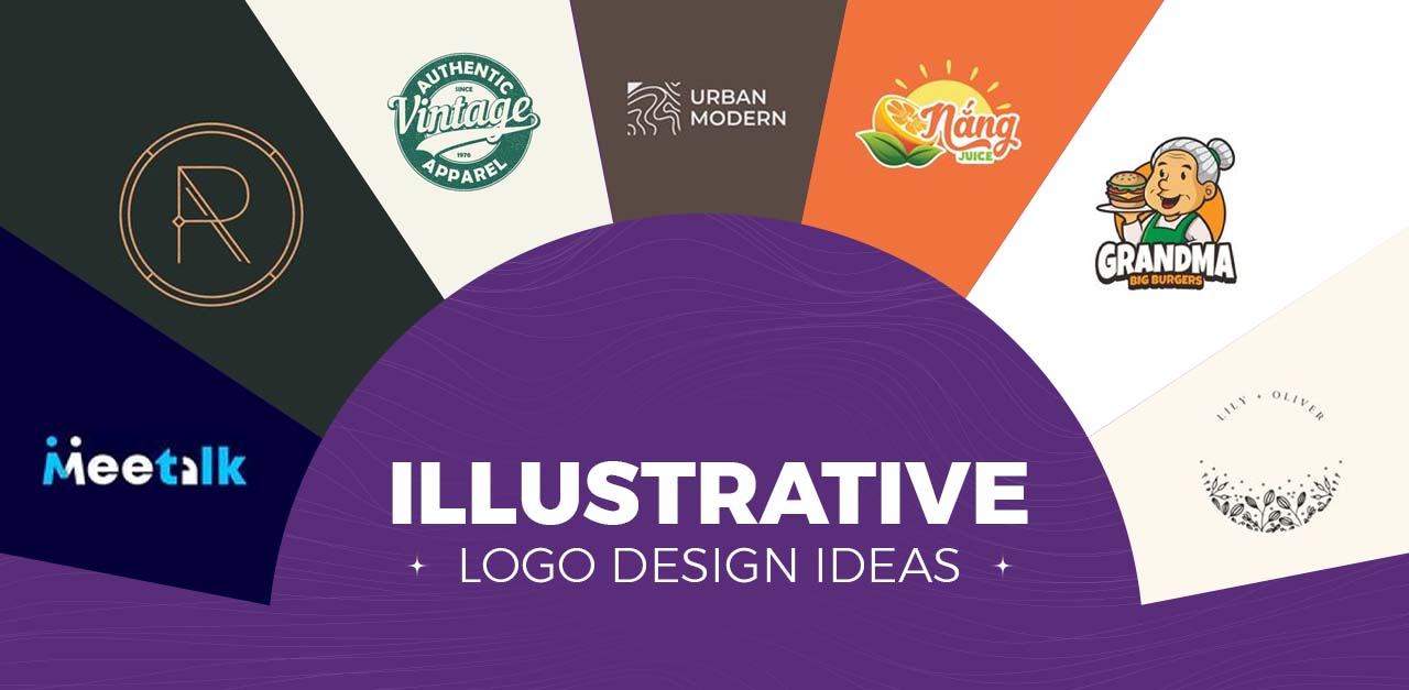
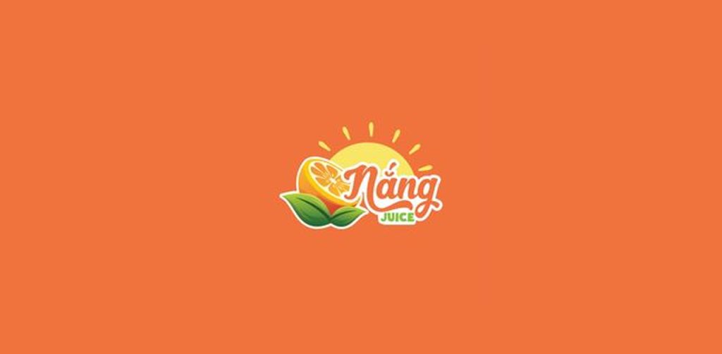
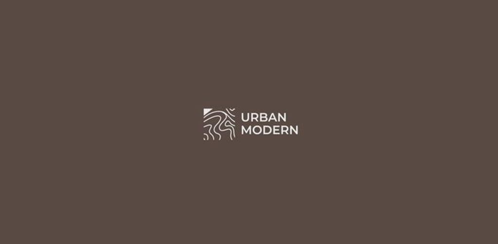
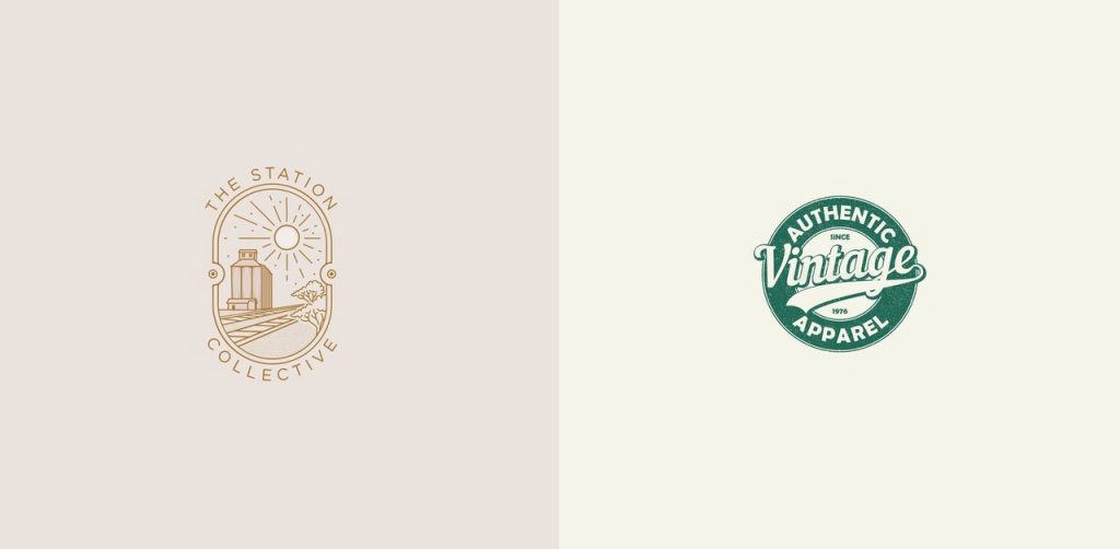

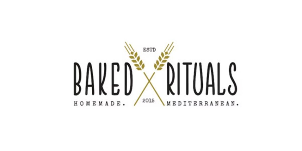
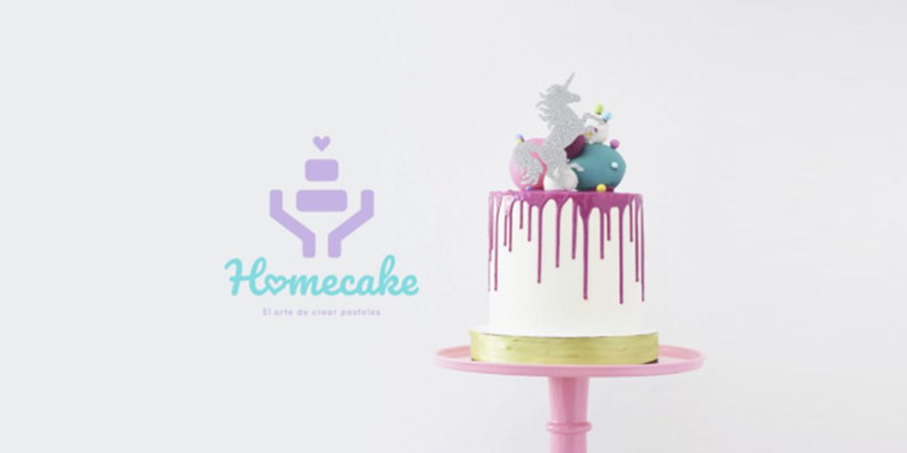
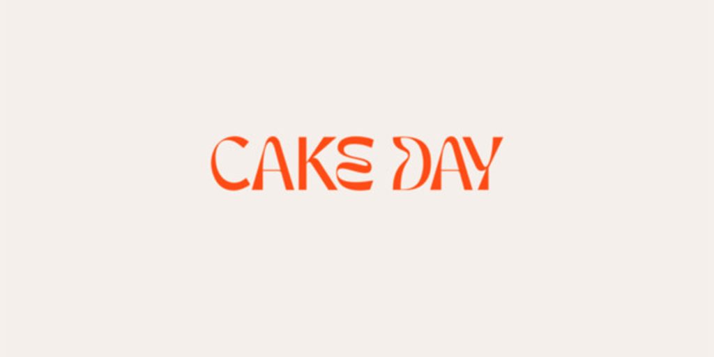
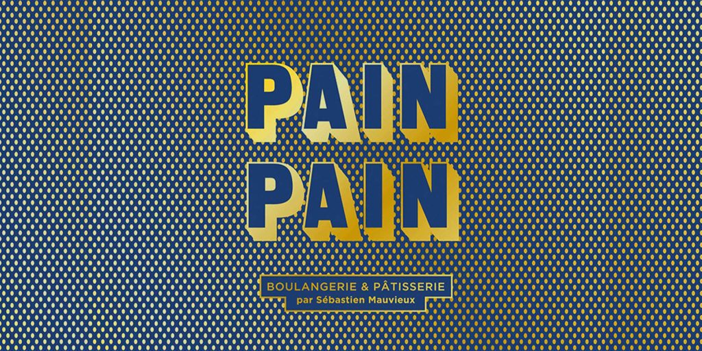
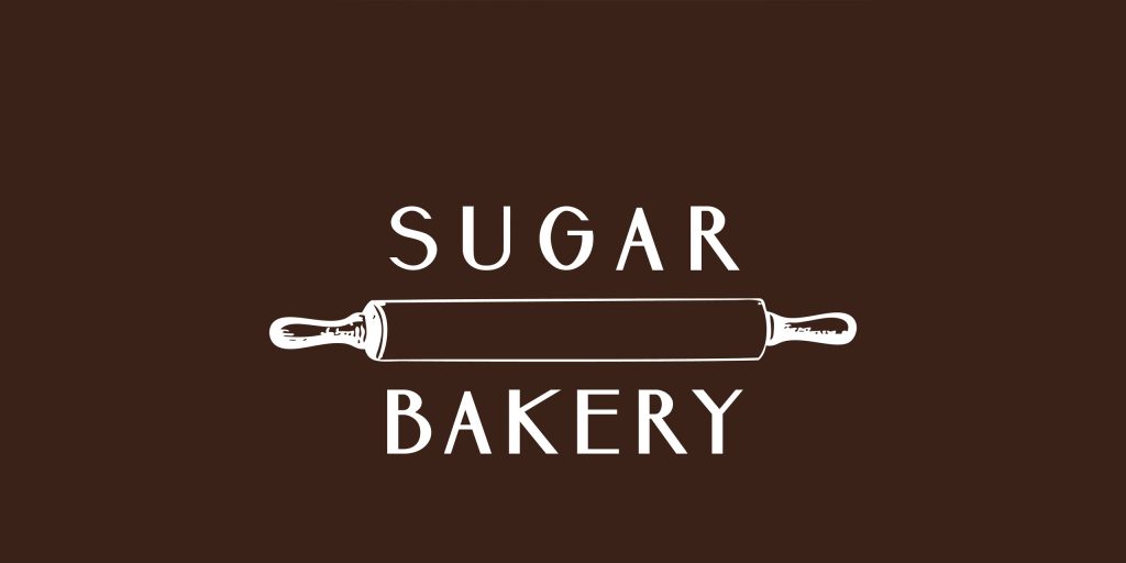
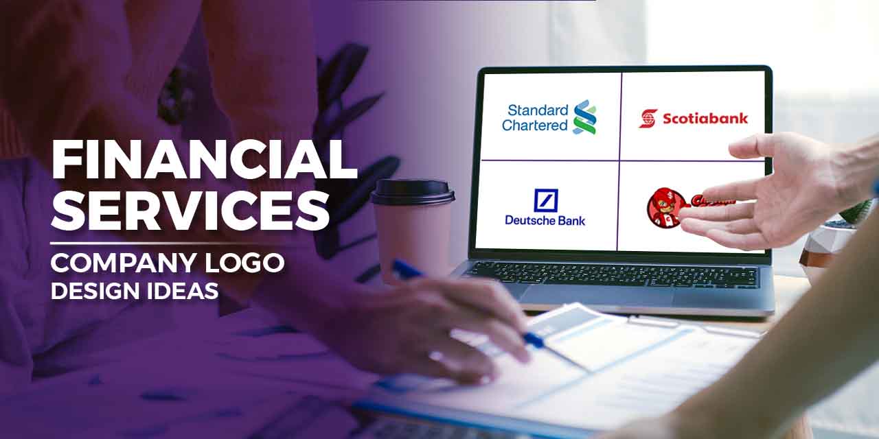

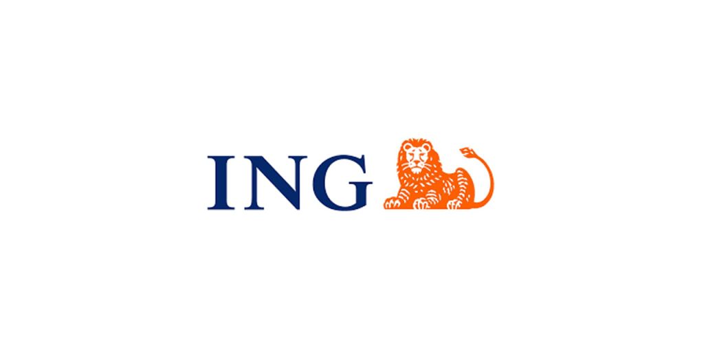
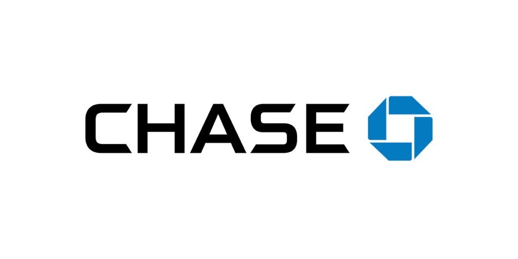
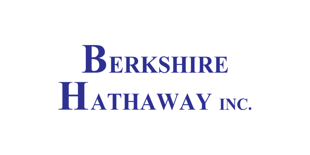
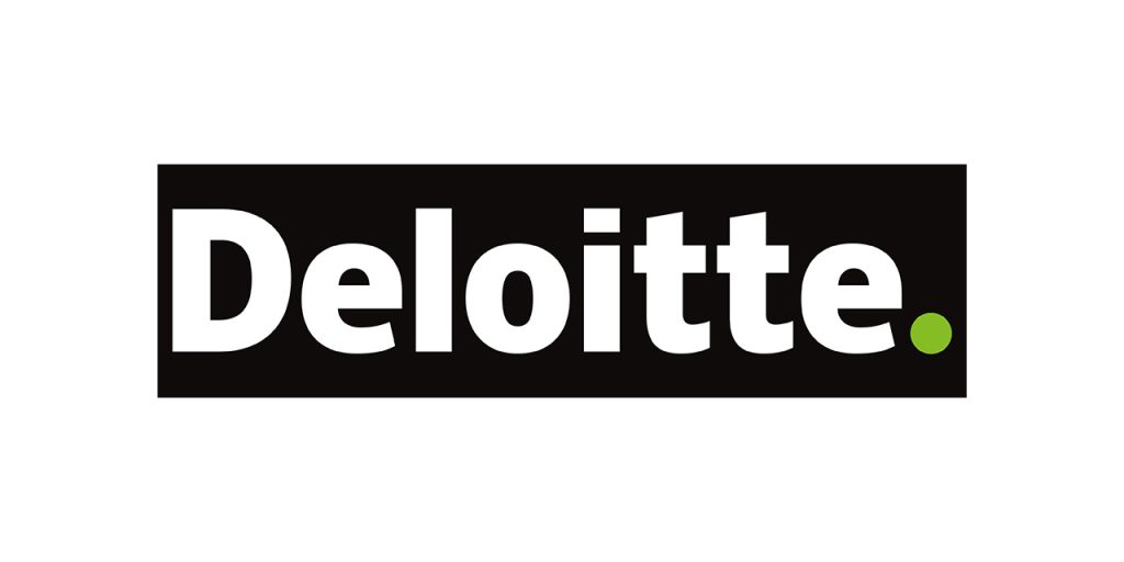
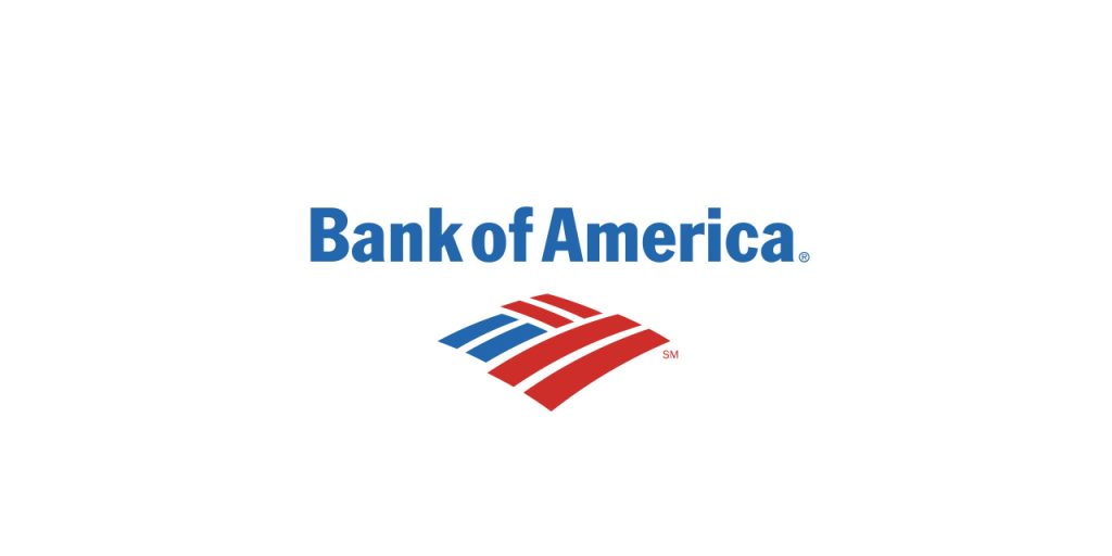
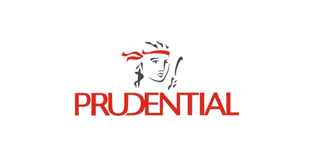
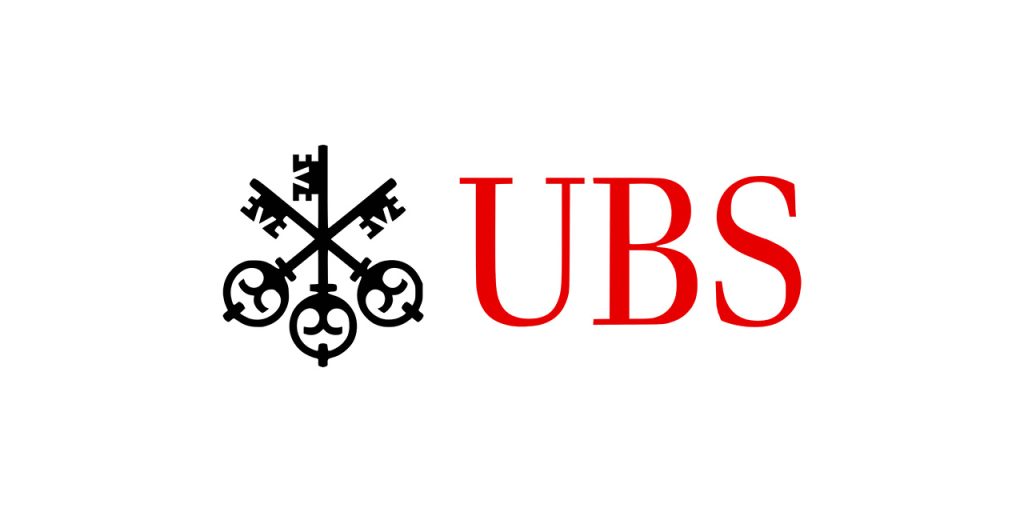
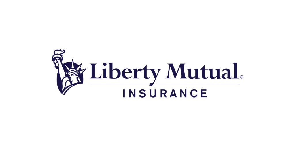
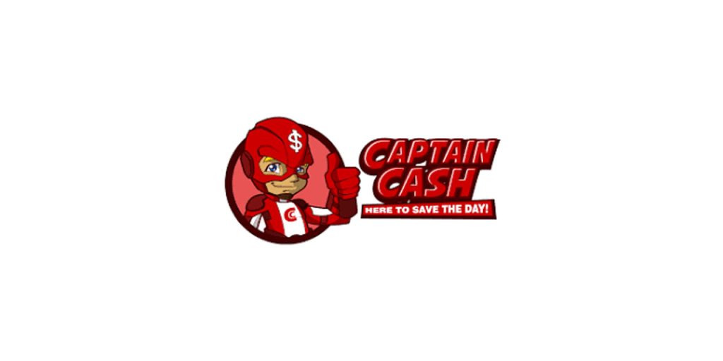
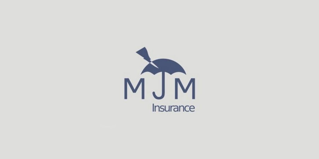
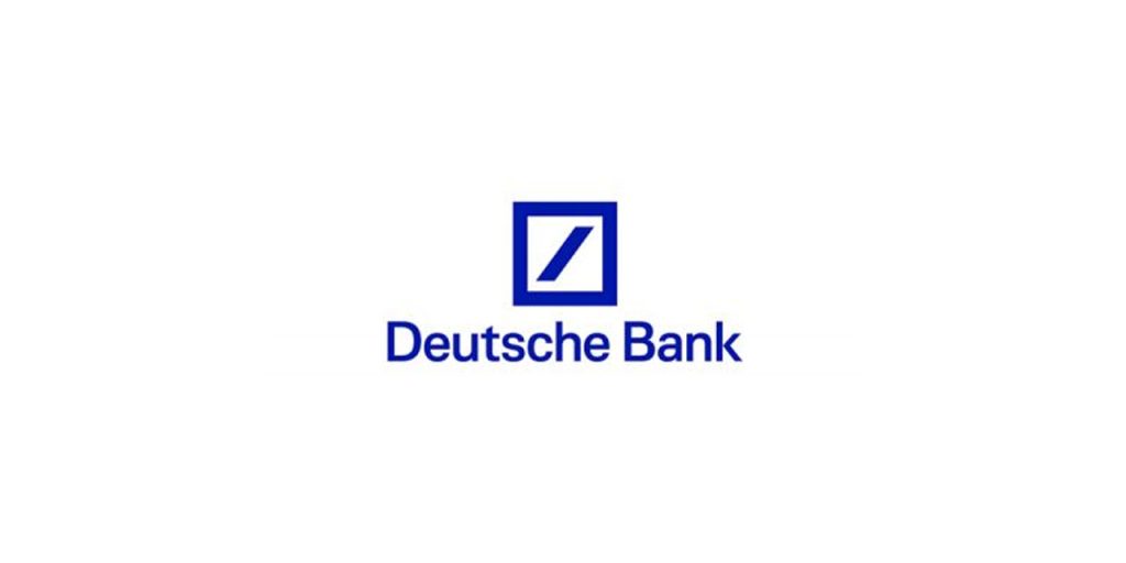
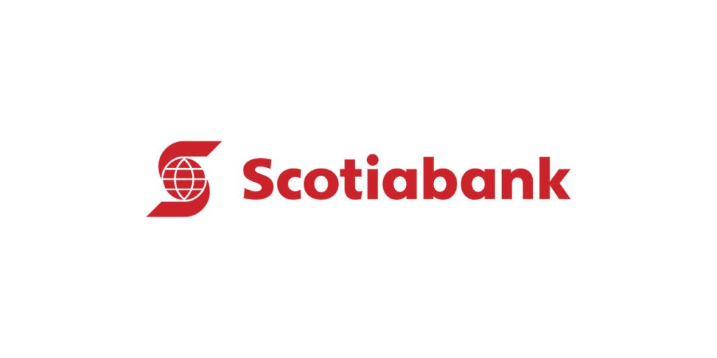
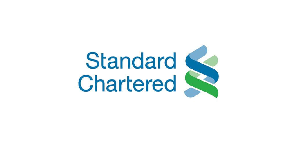
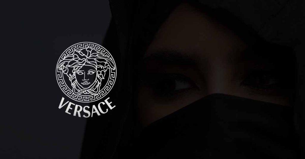
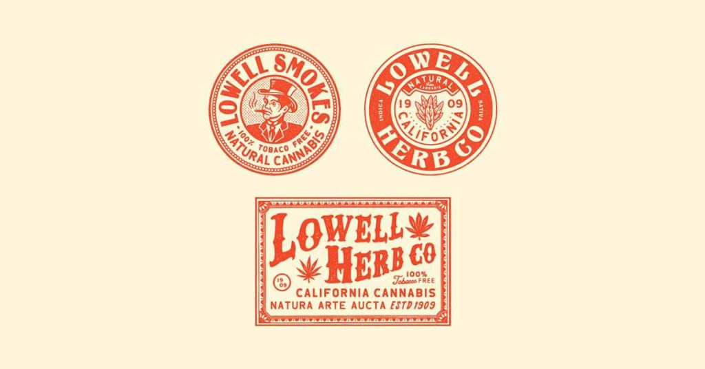
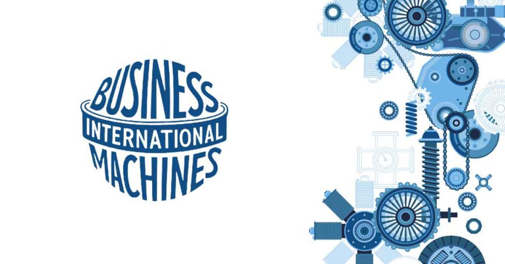

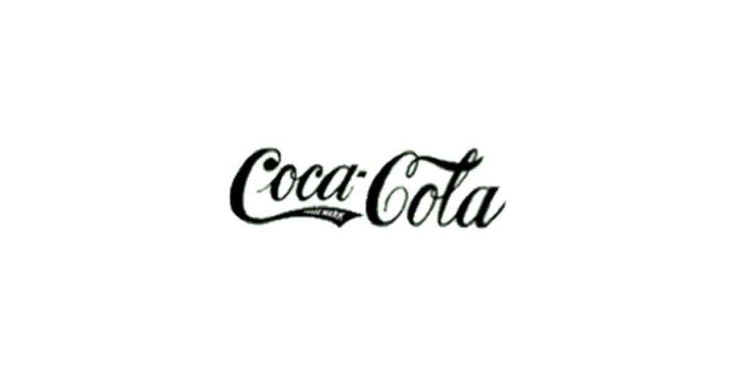
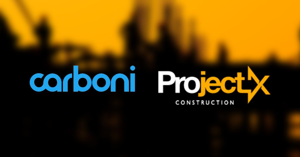
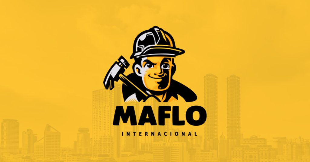
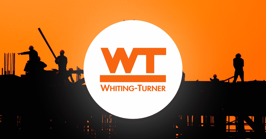
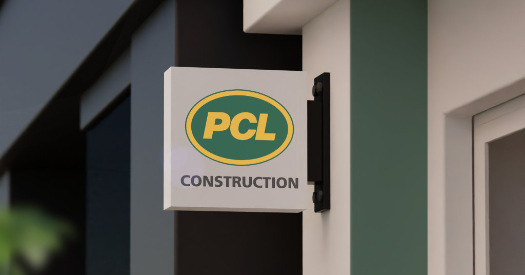
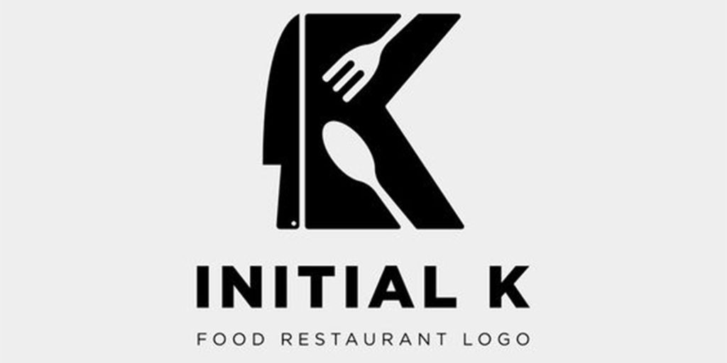