

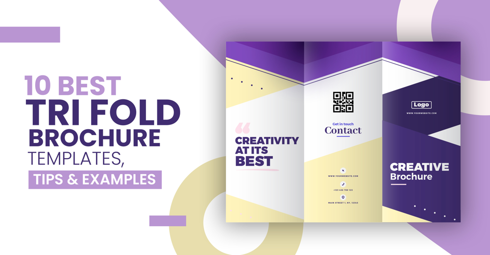
In this blog

Need a design partner that scales with you?
See exactly how Design Shifu can become your on-demand design team. Book a free demo call.
There is no better way to showcase your business than through a brochure. Every marketing campaign, whether offline or online can use a brochure as a tool for their business.
From digital files to print, brochures are versatile marketing tools. Two common formats are bi-fold and tri fold brochures. A tri fold brochure is one of the most common brochure templates that is used.
What is a tri fold brochure
A basic brochure that unfolds into three panels, advertising your business, your offers, and images relevant to your business is a trifold brochure. Tri fold brochures can be used as an introductory brochure for your business or advertising an event, upcoming offer, and much more. The range with which a tri fold brochure can be used as a marketing tool is quite huge and if implemented right, it can do wonders for your campaign and your business.
Z fold vs Tri fold brochures
Z fold and tri fold brochures may seem similar, but their application is quite different. Z-fold brochures open into three panels, usually horizontally. This type of brochure creates a large impact but requires a bit more effort than tri fold brochures.
For marketing purposes, tri-fold brochures are ideal when you want to utilize less space while narrating a strong advertising message.
Typically, Z-fold brochures are used by larger companies with a broader client base. In addition to product descriptions, staff profiles, and contact information, they also provide a brief history, vision, and mission of the company.
As tri-fold brochures fit on standard 8 1/2"x11" paper, they can be used by any size business. Also, tri fold brochures tend to be more cost effective because printing is reduced from three times to two times that of a z-fold brochure.
Clearly, tri fold brochures are more relevant for small businesses, so we will discuss tri fold brochure examples in more detail.
Also Read: What is a pamphlet? Pamphlet vs Brochure explained [With Examples]
Here are 10 of the best trifold brochure templates and examples that you can take inspiration from:
1) Image centric tri fold brochure example

An image-centric brochure template for your restaurant is the best way to showcase your business and make the best use of the space you have. Extend high-quality images across folds and make your copy concise.
For example, as a restaurant owner, you can use a trifold brochure to promote your restaurant. You can create a brochure with pictures of your signature dishes alongside a small description of each dish. Get creative with the folds. Select the color scheme, font style, and layout of the content that best matches your restaurant, and voila! You have a great brochure that will bring people knocking on your door.
2) Color palette based tri fold brochure

Take for example this trifold brochure by a nutritionist clinic that raises awareness about the benefits of healthy eating. The way they use a pastel color palette that is easy on the eyes is an old trick in the book of color psychology. Pastel color palettes are meant to induce a sense of comfort. This has been topped with some fun yet healthy food images, creating a perfect balance between the content and the visuals.
Related
Brochure Design in 2021 – The Ultimate Guide
3) Information based tri fold brochure example
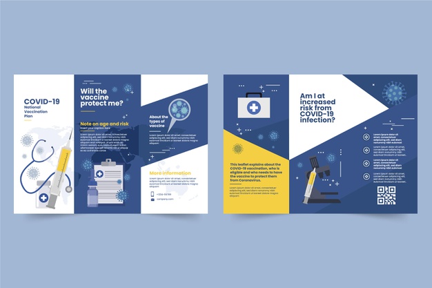
Take a look at this COVID 19 vaccine brochure. The neutral tones of blue emit a sense of safety appropriate for the industry that the brochure represents. While the brochure is information-centric, it does not necessarily have to be wordy. With well-designed vector images to go with your concise copy, your brochure will do the job of spreading the correct information in a more visually appealing manner.
4) Brand color based tri fold brochure
A brochure idea that can be considered is customizing the brochure with your brand colors. Brand colors and elements are often memorable when repeated consistently in your marketing efforts. Let your brochure speak for itself, and represent your brand identity through the brand colors and elements of your business. Use vectors, icons, and images that are your brand’s signature style. This brochure will not eat into your budget and will also be a great yet simple way to introduce yourself to clients.
If you’re looking to design your own brochure and need some guidance, take a look at our latest blog for the best tips on designing a business brochure that caters to your design needs.
5) Minimalistic tri fold brochure example
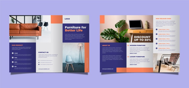
Taking a cue from this furniture business brochure. If you’re looking to advertise your products with style, then a chic and minimalist approach would work for you. You can go all out with the color or stick to a palette depending on the industry your product belongs to. For example, if you sell antique furniture, then an elaborate design with lots of colors would be a better approach as it grabs more attention through its aesthetic. A good brochure can make your business stand out from your competitors and help drive your business.
6) Modern tri fold brochure example
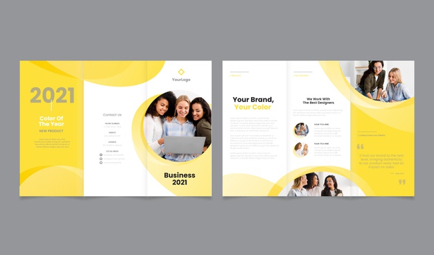
Taking a minimalist approach may suit your brand if you are portraying your brand as modern and up-to-date with all the latest trends. Light pastel colors such as yellow or baby pink will work great if your primary target group is millennials or younger audiences. A brochure idea incorporating such a design and layout in mind can greatly increase your chances of forming a youth connect with your brand and thereby growing your business.
7) Abstract Design tri fold brochure example
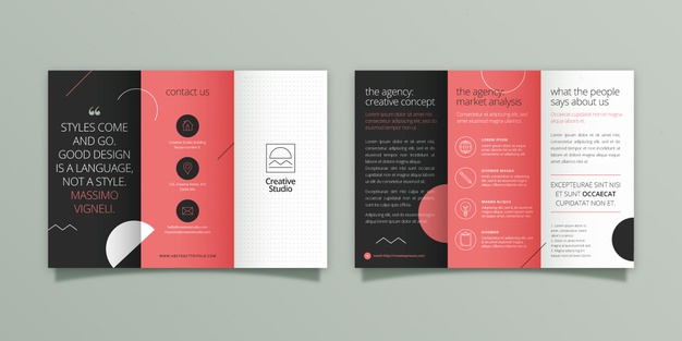
If your brochure idea revolves around the layout, then an abstract design can work if your business and advertising efforts. You can get contrast without the eye-hitting effect with your brochure design. You can introduce abstract shapes, elements, and layout designs in your brochure as shown above. Using a contrasting color scheme, with muted colors, and an abstract mood induced through the overlapping shapes on the folds like shown above ensures that it stands out, but at the same time is soft on the eyes, and also ensures a flowy pattern for the eyes to follow.
8) Shapes and layout based tri fold brochure
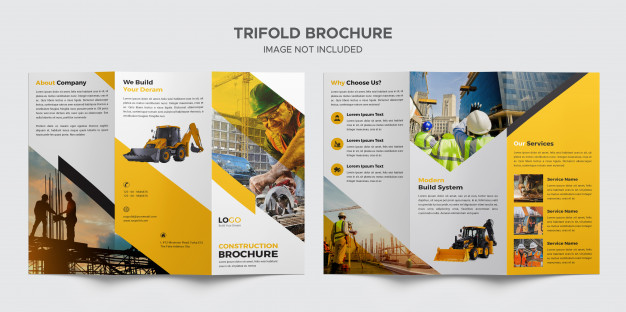
Take a look at how well this construction based brochure has been structured (pun intended) The sharp folds in the design layout with the images, the cutout images, the color, as well as the content complimented with the right icons next to them, create a perfect layout for a tri-fold brochure. Stick to a light color palette consisting of colors such as mustard, white, grey, and black. Images of your past projects will also help enhance the look of your brochure.
9) Creative layout tri fold brochure
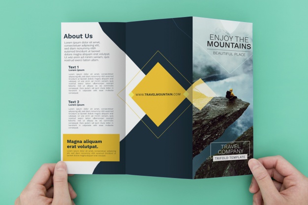
Selecting a layout should depend on the audience you cater to. A more abstract layout could work if your primary target audience is younger. A more traditional layout would be better suited if your offer is directed to corporate setups. If you specialize in tours to the hills for example, then earthy colors such as navy blue, brown, olive green, and white would enhance your brochure, while pastel colors would suit brochures designed for corporate tours.
Similarly choosing the right layout for your brochure is essential and is based on your target audience, but you can get creative with it. For example, the closing fold of the brochure above simply holds a minimalistic yellow diamond-shaped icon with the website URL. It not only draws focus to the website, but it also works as a great CTA for the reader, along with the design contrast the colors provide. This could be one of the best travel brochure examples you can look at if you have a travel business.
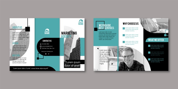
10) Simple tri fold brochure

You don’t always need colors from the opposite spectrum on the color wheel to create contrast in your brochures. The mockup above very elegantly creates a contrast with a bright white and a teal green color combination. It’s a unique way to create a contrast in the design without a lot of effort, while also maintaining the simple and neat design element in the brochure.
Tips to design a tri fold brochure
Designing a trifold brochure is the part where most people get stumped. Keep the following pointers in mind and you shouldn’t face any issues:
1) Color Scheme
Keep a color scheme that reflects the mood of your brand. A brighter color palette works if you’re an FMCG brand. Earthy colors would enhance your trifold brochure if your brand were in the finance sector. Don’t go overboard with colors. Stick to 2-3 maximum.
2) Layout
Select a layout that resonates with your target group. If your business primarily targets the youth, then you can be more experimentative and go for a more abstract look. On the other hand, if your business caters to more elderly folk, then a traditional grid-like layout would be better suited for your brochure.
3) Consistency
Don’t use more than 3 different font styles and keep a consistent color palette. Doing so will maintain the professional look of your trifold brochure, which could translate into more business for your brand.
If you’re looking to get a brochure designed in 24-48 hours, Design Shifu can help. With an in-house team of a pool of talented designers, Design Shifu works around the clock to offer you the best of designs that cater to your needs with a quick turnaround time, and the best part? there is a 14-day money-back guarantee if you’re not satisfied with the service. Take a look at the pricing plans and the portfolio to get a gist of Design Shifu’s previous work.
FAQ
About the author
Sameena is an Organic Growth Specialist and Content Writer at Design Shifu, crafting SEO-driven content that boosts visibility, builds brand authority, and drives meaningful organic growth.

.webp)


