
Have you ever dreamt of giving your fashion brand a unique identity without constantly being vocal about the same to your audience? Be it through visuals or words; every business aims to be out of the box.
Brand logos are the perfect example of expressing your brand identity in its most accurate form, as we prefer visual representations over others. It elicits a strong connection between a brand and customers with the correct ratio of trust, integrity, and excellence.
Considering a recent study by Statista, the fashion industry is set to be valued at over 2 trillion US dollars by 2027. Through this constantly growing scale, brand owners seek ways to stay healthy in the overcrowded fashion industry. Following the footsteps of industry giants like Nike, Lacoste, and Adidas whose logos are constantly raising the bar for others to follow, businesses have started to invest in their brand identity.
So if you too want to upgrade your brand, discover the best clothing brand logos of all time to get inspired to design your own logo and add soul to your business.
Should You Invest In A Logo For Your Clothing Business?
A logo comprises images, words, and colors that best describe your product or brand. As per Paul Rand, the father of graphics design,
“A logo doesn’t sell (directly); it identifies.”
Every clothing brand, big or small, dreams of being a social influence over its customers. Having a logo your customer sees, memorizes, recognizes, and gets influenced to spend for is the ultimate selling point for every business. Adding character to your brand ensures one doesn’t fall short of being the best in the industry.
For those looking to introduce a new brand in the market, logos help to portray a strong brand identity. One can envision success by investing in sync with fashion trends and being unique and distinctive. Paying for newer designs and styles to better your business is rational. A good logo helps add the finishing touch to your brand and make you visible.
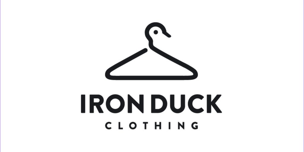
What Makes a Good Clothing Brand Logo?
Having an extraordinary yet memorable brand logo is vital to make your clothing business come alive. With the urge to be more artistic and creative, your logo should reflect the same from every aspect. Creating a logo for a clothing company isn’t challenging if one has mastered these simple steps.
Know your brand from head to toe.
Those who think a clothing store logo follows the “one for all states” are in for a surprise. Every business has its unique identity, and being different does not cause any harm to the brand.
For example, being simple and elegant is key to catering to an affluent audience. However, being colorful while using funky fonts and design elements works like a brand magnet for a youth-centric brand.
Be on-brand with the correct elements
With the urge to shape just the right business identity, having complete freedom to be creative ensures you get noticed for good reasons. However, one should also pay attention to the audience. After decoding the correct business language, play the role of a customer to judge which elements attract your eyes.
Picking the right colors, shapes, and typeface gives the brand the identity it seeks. Along with adding versatility to its design, it portrays a more robust brand connection with its target audience. Select design elements that align with your brand’s core values to evoke emotions.
Make it memorable
A brand that caters to the constantly growing market trends needs to choose logos that are easy to remember. A good logo offers a win-win situation — from giving a positive vibe to being as simple as possible.
To dig more into detail, let’s look at the successful logo ideas in varied categories that have made a mark in the fashion industry.
Clothing Brand Logo Ideas for Inspiration
Everyone loves variety. And clothing brand logo ideas deliver just that. Keeping in mind the brand tonality and target audience, here are a few clothing brand logos and ideas to take inspiration from.
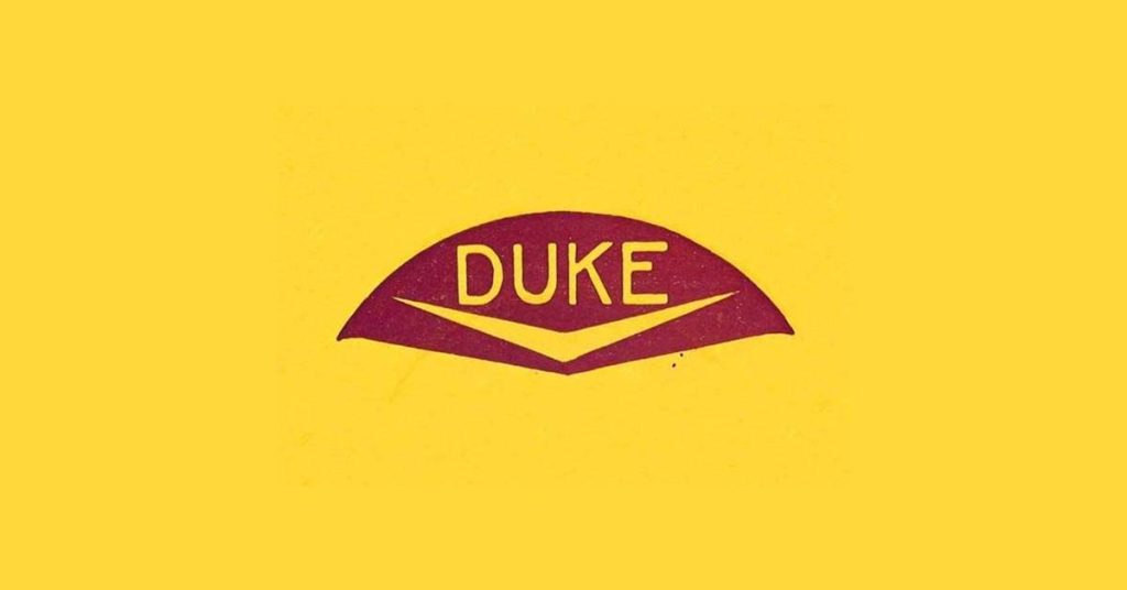
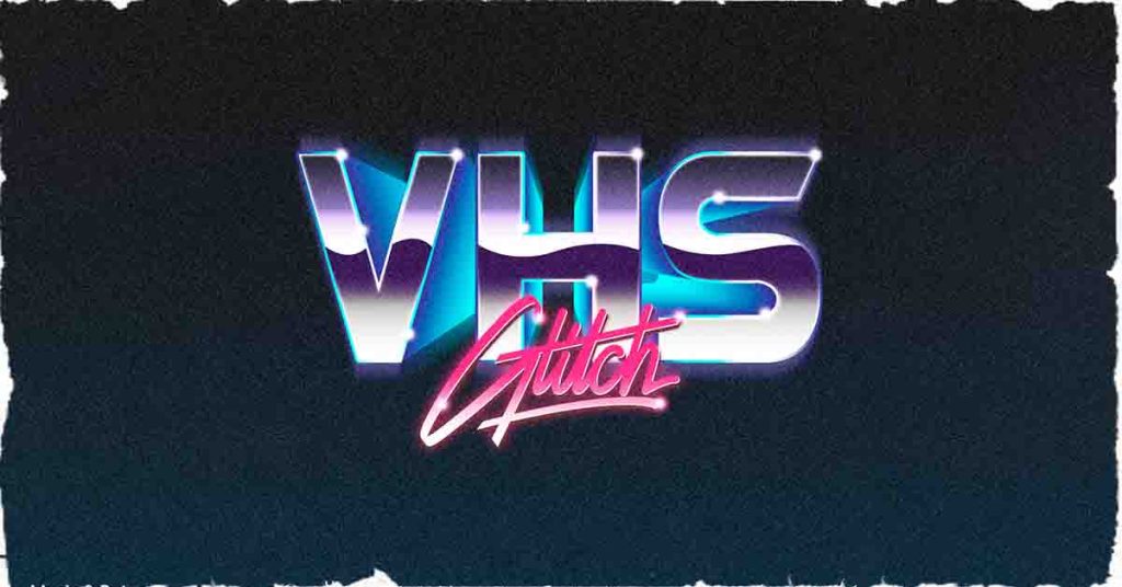
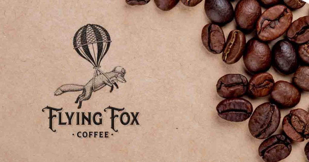
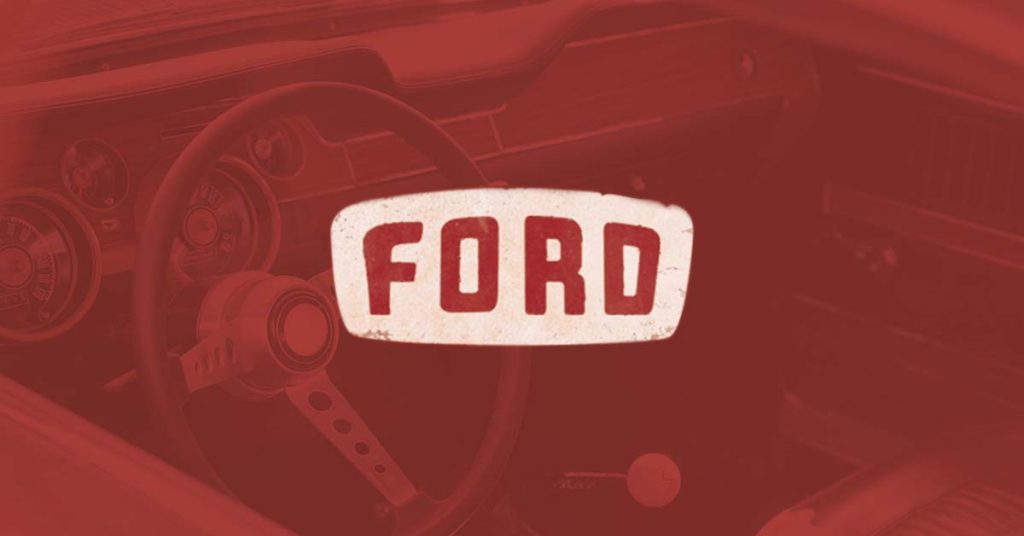
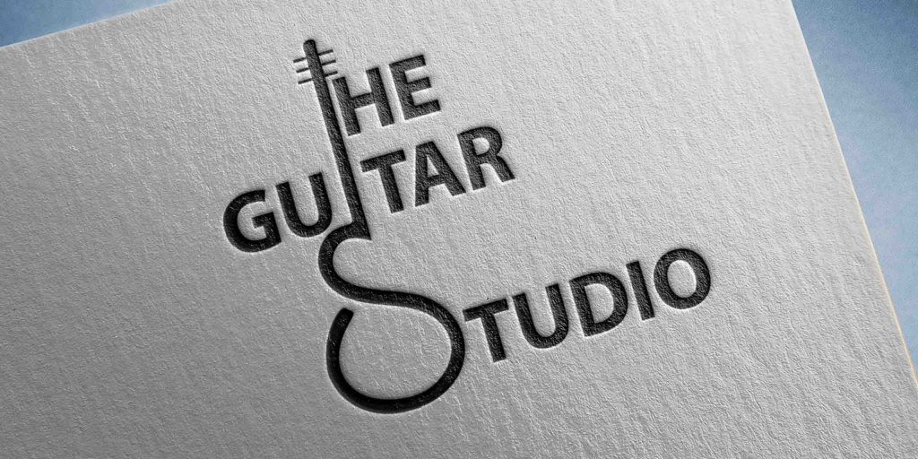
Vintage Clothing Brand Logo Ideas
As the famous saying goes, “Classic never goes out of style.”
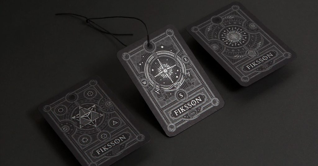
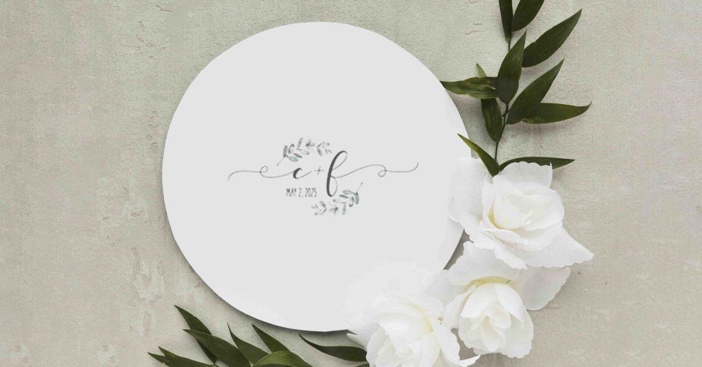
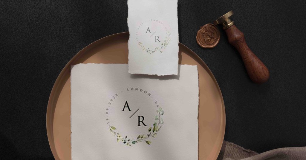
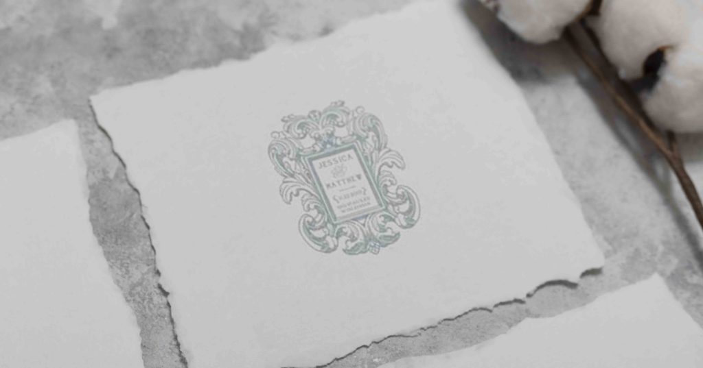
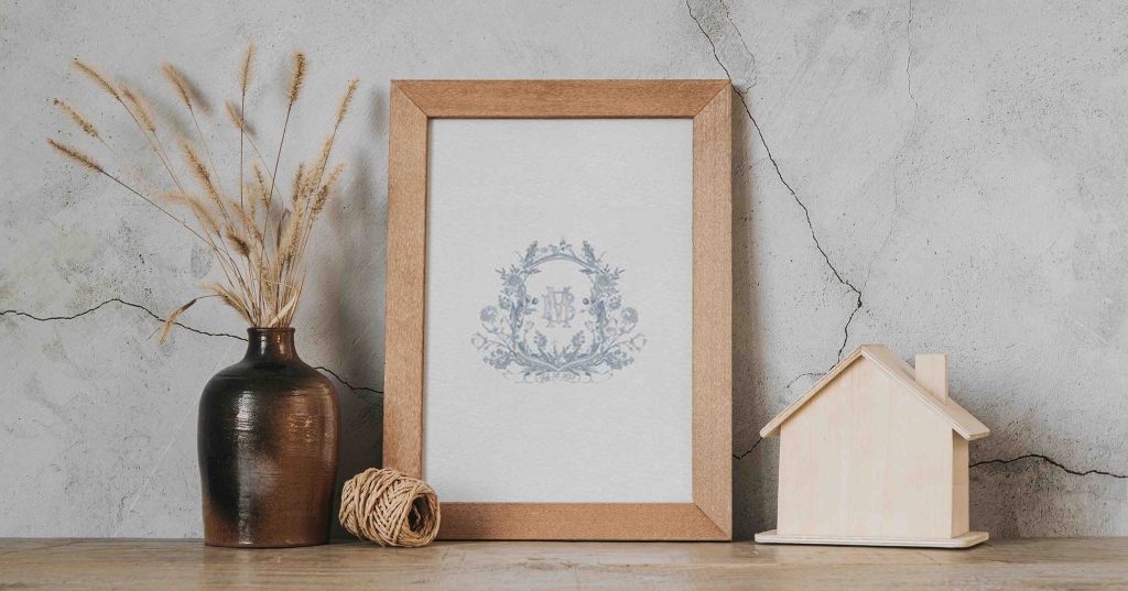
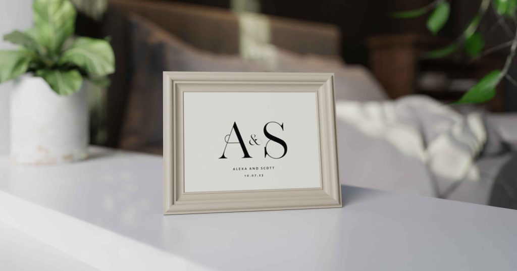
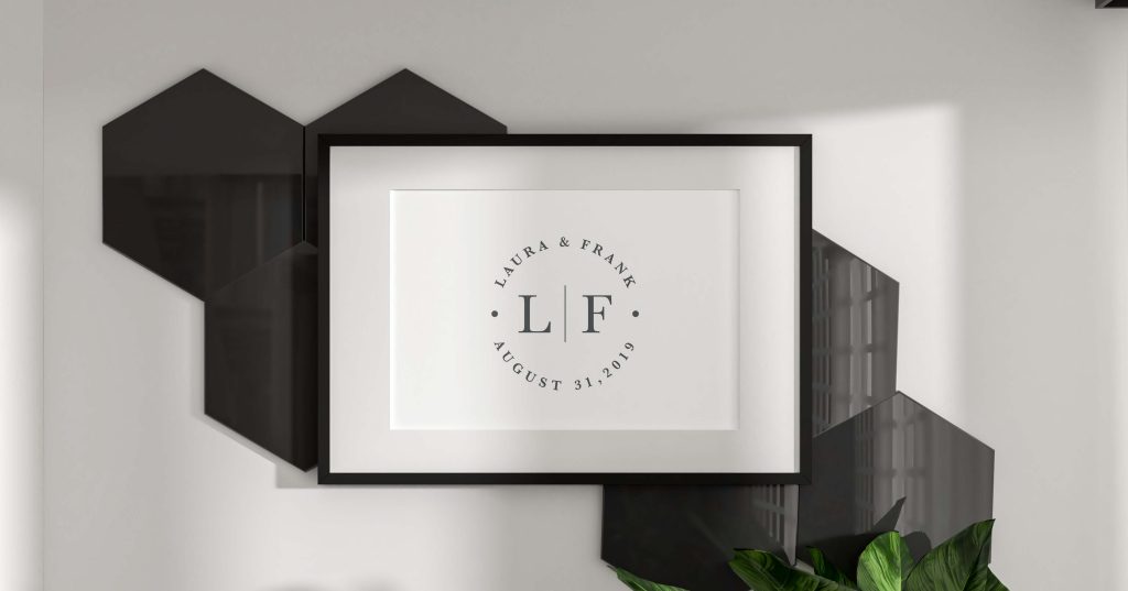
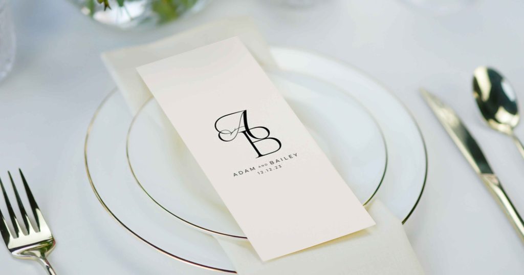
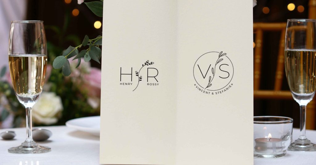
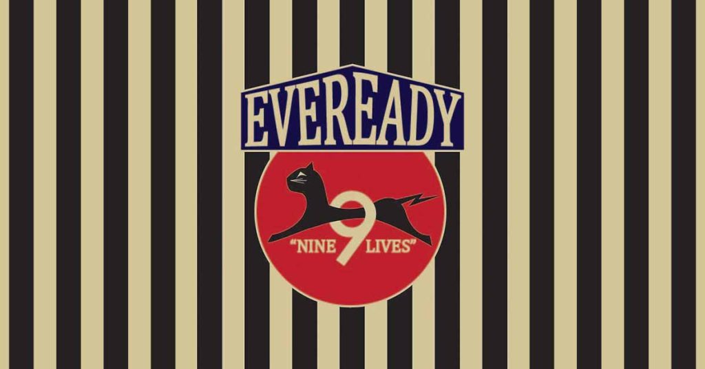
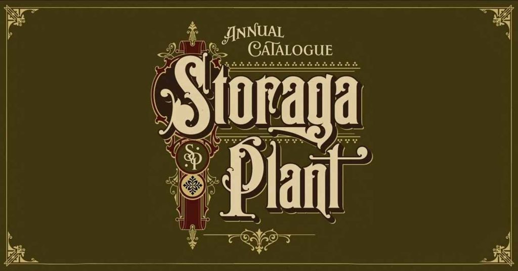
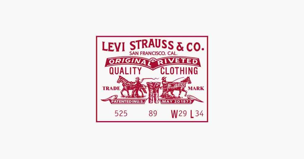
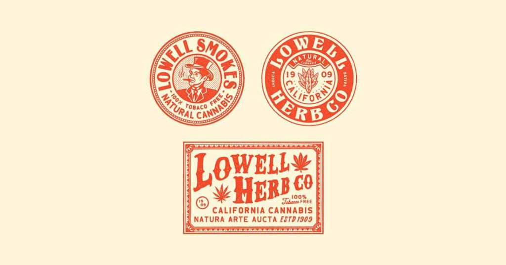
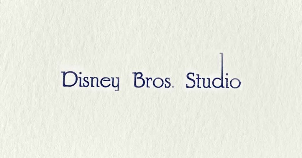
As much as old-fashioned styles rule the industry to date, their logos are surprisingly still alive and leading the market. When we discuss having a vintage look and feel, classy and exclusive are the first two words that come to mind. Showcasing dark hues, generally dark brown, vintage logos usually consist of a monogram emblem followed by block typeface fonts.
For vintage clothing brands, strong storytelling ensures one engages with their audience on a more personal note. These logos showcase one or more themes that can be
- Adventurous
- Nostalgic
- Inspiring
- Homegrown
Source
Source
If your clothing store deals in vintage clothing, consider using these top 5 vintage fonts to date back to the past yet attract customers seeking newer styles every day:
- Holiday Vintage Font
- Rumble Brand Vintage Font
- Whiskey Font Collection
- Vintage Queens
- Braton Composer
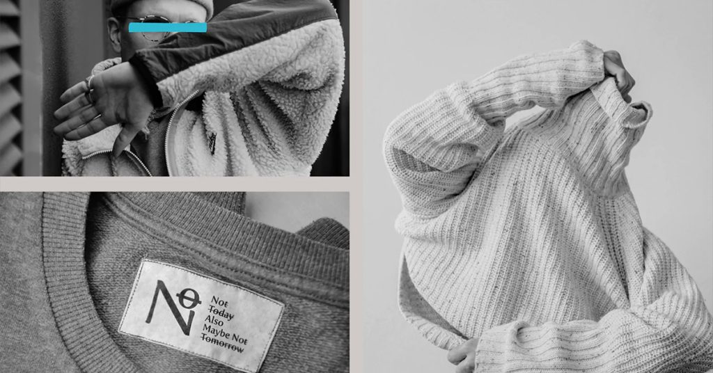
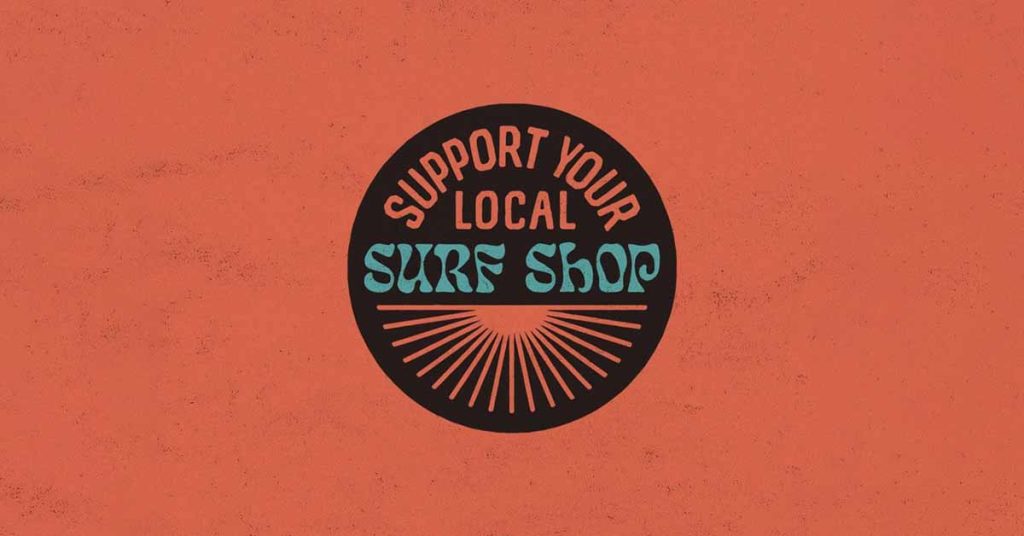
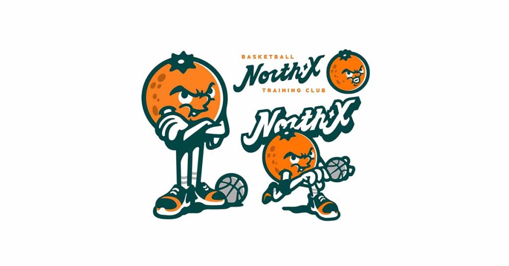
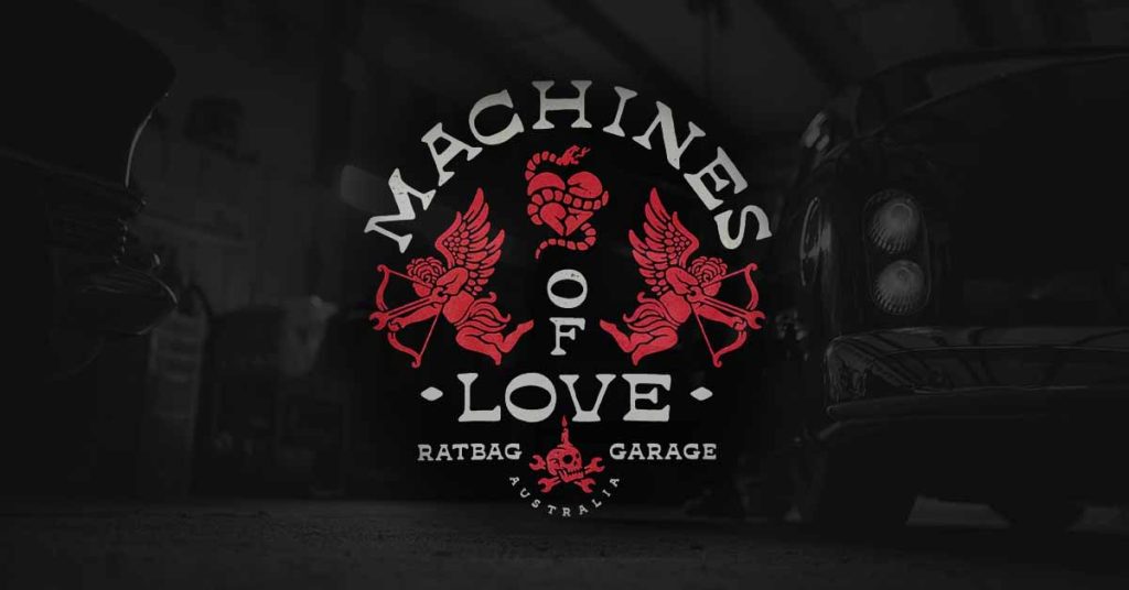
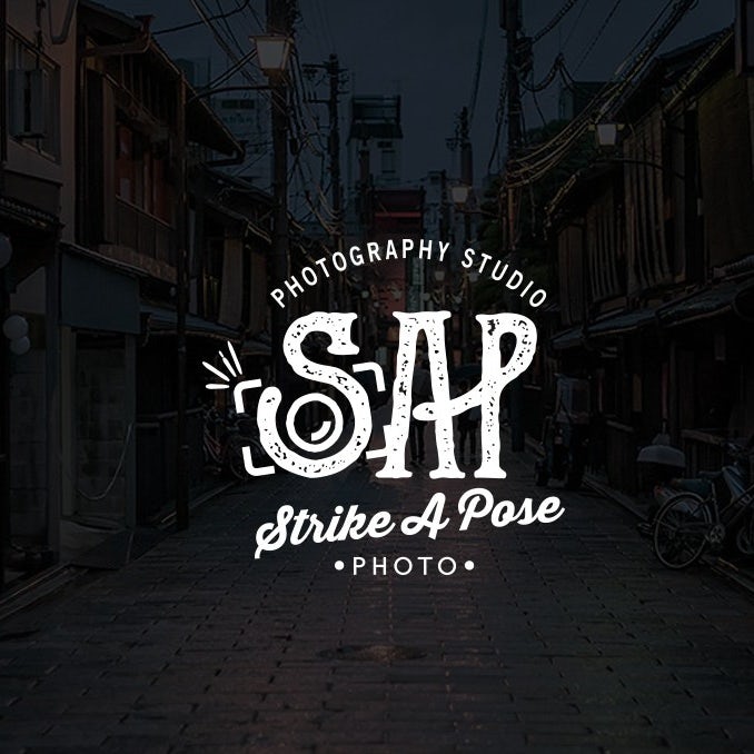
Streetwear Brand Logo Ideas
In a world where fashion is constantly evolving, streetwear has become a giant in the fashion industry, giving birth to newer styles every day. Streetwear clothing stores can be hip, artistic and fresh in the market. As a result, brands invest in developing unique and eye-catchy clothing brand logos. Here’s a list of styles that define streetwear logo ideas at their best.
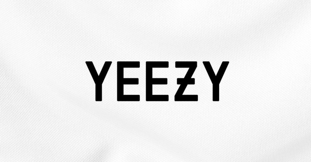
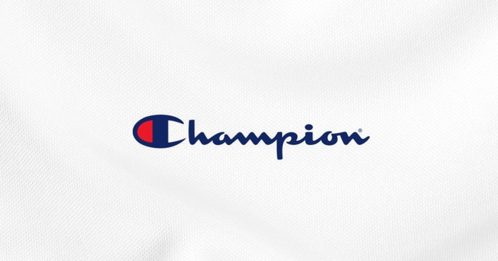
- Logotype: Being heavy on typography with minimal or no traces of icons and symbols like Yeezy and Champion.
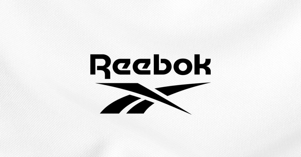
- Illustration: While some keep it simple, others prefer making it as loud as possible. For example, Nike, Reebok, etc.
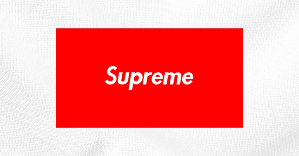
- Enclosed designs: Adding shapes behind brand names has been a widespread practice over time. It also adds a stamp of authenticity to every design created and gives the brand a funky touch. Example: Supreme.
The most popular fonts among streetwear brands include:
- Asther Fashion Font
- Math line Bold Script Font
- Silly Goose-Handwritten Font
- Petersburg Fashionable Font
You can even choose from other distinct fonts depending on your brand personality.
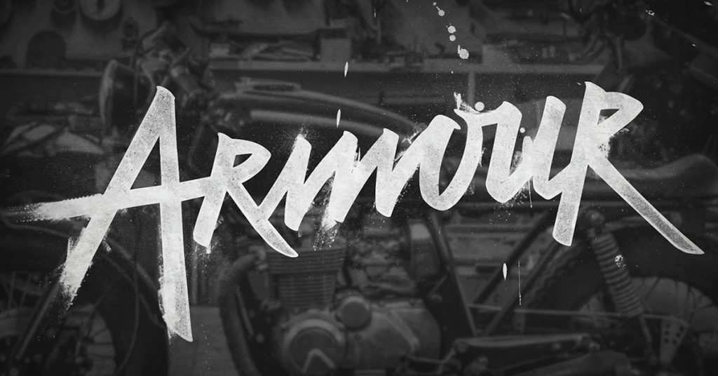
Men’s Clothing Logo Ideas
Talking about men’s clothing logos, mixing men’s personality traits with your brand tonality speaks directly with your potential customers and boosts your overall presence. Masculinity is a key factor that needs to be in the spotlight, and choosing the right elements brings ideas to reality.
While creating a logo for a men’s clothing store, you can experiment with several design elements. For example, you can choose from letter marks, emblems, wordmark combinations, illustration logotypes and round, circular, spiral, elliptical, vertical, or horizontal shapes. Popular colors include purple, white, black and blue.
However, successful men’s clothing store logos are letter marks and wordmarks, vertical shapes, and white or blue.
Here are a few examples:
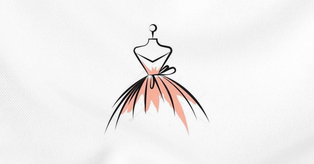
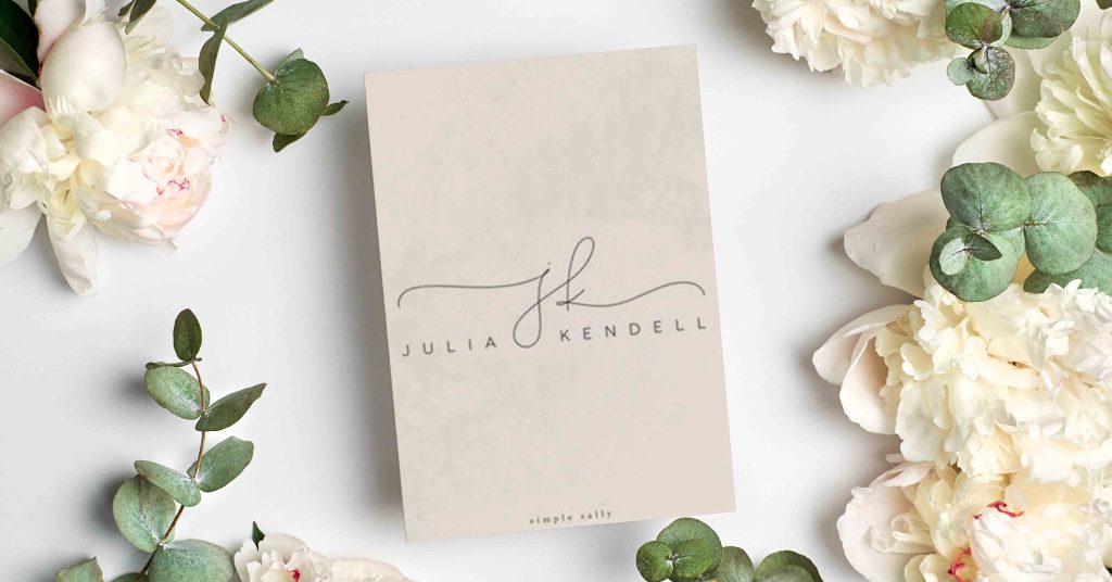
Women’s Clothing Logo Ideas
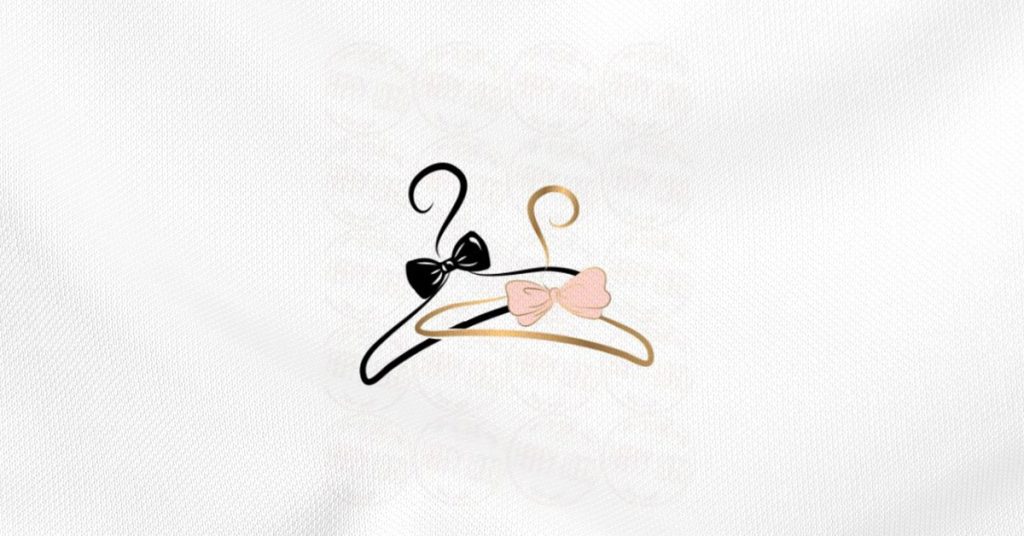
These logos reflect the most authentic essence of femininity with colors/shapes that are aesthetic and customer-friendly. With style and fashion constantly evolving, young teenagers and middle-aged women look for brands that match their personalities, wardrobe, and choice. Therefore, preferring a particular brand that showcases a mix of women-centric elements (for example — hair, models, bags, hearts, etc.) with the right color palette (for example — pink, beige, white, yellow) guarantees the fact that customers stick to that brand for years.
For example, brands such as Pepe Jeans, Lucy Claire, and La Femme have defined their brands with flashy logos that not only set a particular style statement but add the right mix of women’s elements and colors to make the apparel hard to resist.
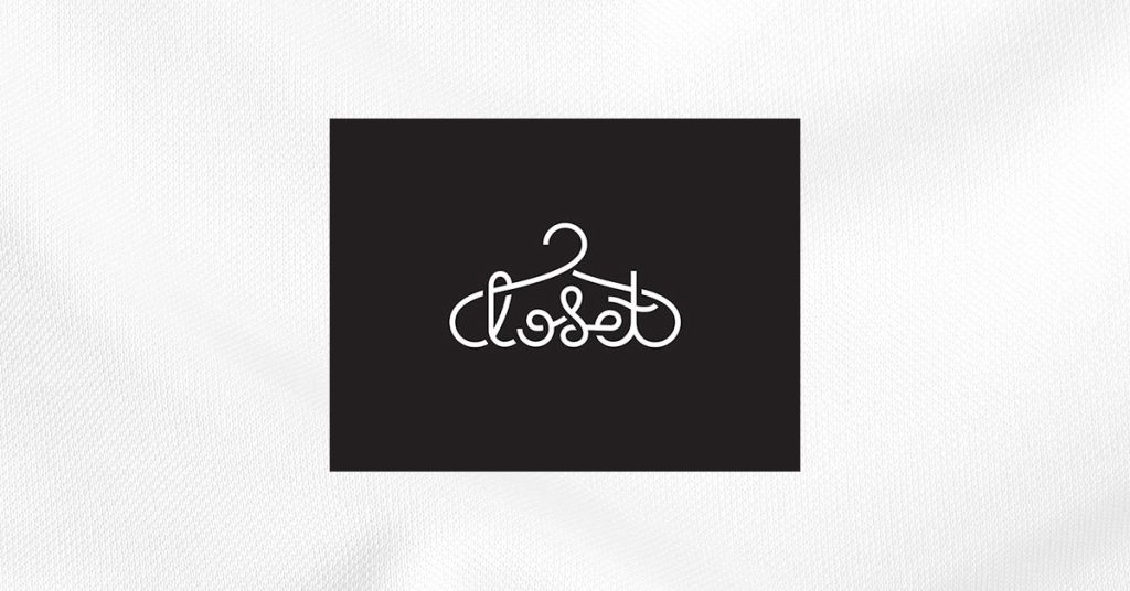
Showcasing more typography with minimal shapes and icons boosts one’s factor, making it more customer-friendly, inspirational, and favorable over other competitive brands that top one’s wishlist. Here are three popular logotypes among women’s clothing brand logos:
Unisex Fashion Clothing Brand Logo Ideas
Everyone believes in the saying, “Fashion has no gender.” In an era that focuses on maximizing sales and expanding its customer base, unisex brands seek results by catering to a larger audience. As a result, the ratio of unisex clothing brands has been overflooding the market, providing the best, trendy clothing styles that go well on them irrespective of gender.
Most unisex clothing brand logos are neither loud nor too plain. There is usually a blend of geometric or abstract elements, blue, green, white, or grey colors, and Resalaty, Crystal Sky, or Ballpen fonts. We suggest you go for a pastel color palette that ensures you hit the jackpot, win the hearts of probable customers and attract them with a visual and textual masterpiece.
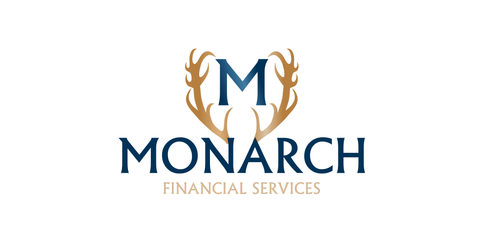
Luxury Fashion Logo Ideas
Dreaming of taking your luxury brand to newer heights? Owning a sophisticated logo calls for half the battle won. To showcase elegance and reach out to high-end customers, certain elements hit the right note.
- Monograms: Monograms designed taking inspiration from the brand/owner’s initials give that seamless typographic feel that highlights many luxury brands, such as Gucci and Louis Vuitton.
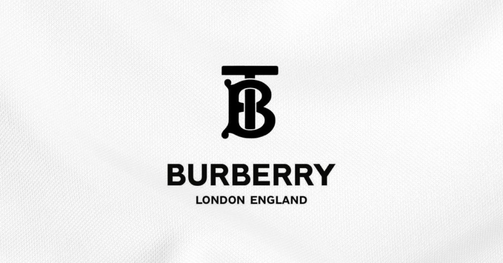
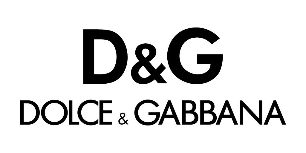
- Minimalism: Being too loud differs from what this category is fond of. Keeping it simple, subtle yet compelling through eye-catchy minimalist logos defines simplicity and clarity. For example, Burberry and Dolce & Gabbana.
- Emblems: Adding a mark of success to your logos is a route one should consider exploring. Adding symbols gives visual context to what your business does and advocates. You can consider professional design services like Design Shifu to get uniquely designed symbols for your logo and other unlimited graphic designs for just $399 per month.
- Fonts: Taking inspiration from luxury brand giants, using the right fonts amplifies your logo’s value. Serif and script fonts add style and character to your logo, making it feel less of an essential and more of a luxury.
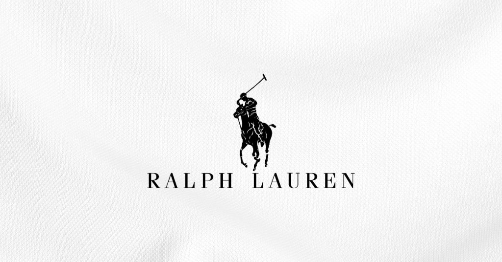
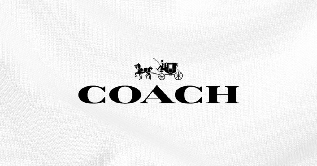
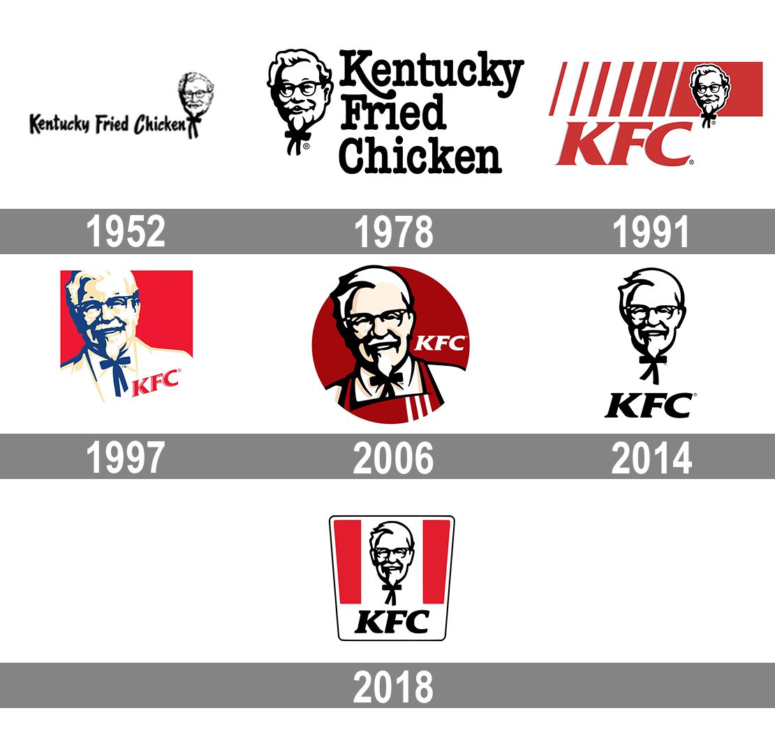
Most Iconic Fashion Brand Logos
Being an icon in the fashion industry calls for investing in your brand identity. Check out these three most outstanding clothing store logos to help you ideate and develop your own unique logo design by observing the special details that catch one’s eye.
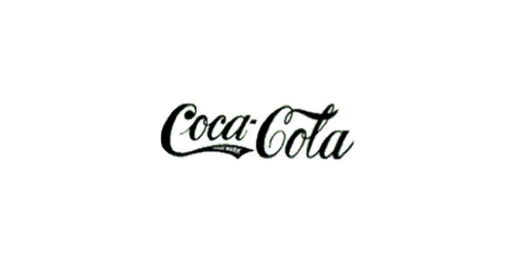
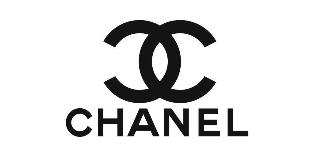
Being the perfect example of simple yet effective, this brand logo says it all. Having a distinctive wordmark with bold Sans serif font, the monochrome color scheme creates an interesting visual effect that defines both style and sophistication.
Known for its apparel and fashion accessories, this brand’s logo was designed by Coco Chanel. With intelligent usage of the brand’s key selling points, i.e., chic and classy, their logo is one of the most recognized.
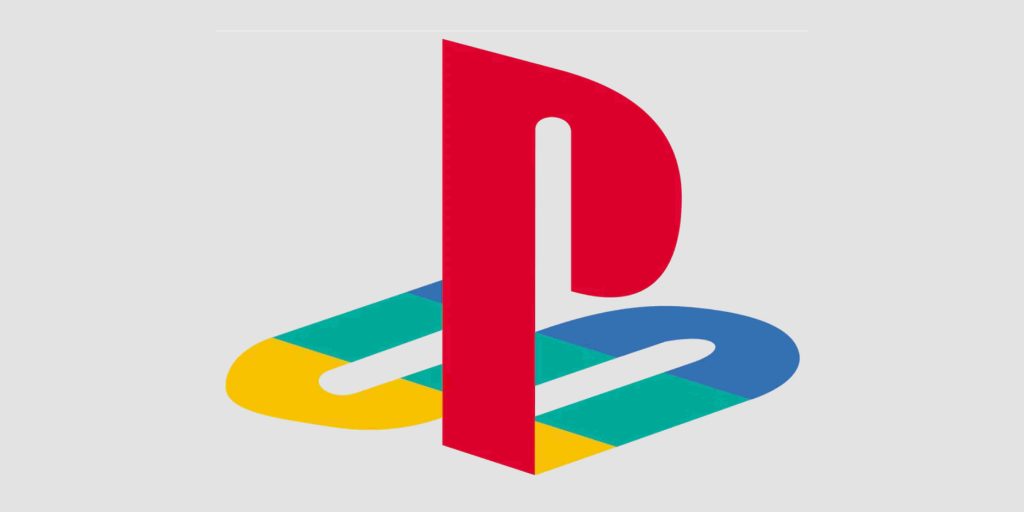
The tick mark, popularly termed “swoosh” has been an icon to admire. Designed by Carolyn Davidson in 1971, this logo represents perfection in the streetwear and sportswear business.
Thus, a logo does signify the power of rightly chosen elements to create a visual masterpiece.
How to Design an Effective Clothing Store Logo?
Everyone’s goal is to make the right impression on their target audience. With chances of endless possibilities, following predefined steps ensures that your store logo is well-defined and impressive to grab eyeballs. Here’s what one needs to pay attention to:
- Choose icons that are relative to the fashion industry. Adding a mixture of silhouettes, accessories, and text logos with simple fonts is effective. While popular trends overcrowd the market, the logo needs to be distinctive enough to speak for itself.
- A neat yet eye-catchy color scheme is what attracts the eyes. Colors do have the power to play with the audience’s perception of your business. Colors boost your brand and highlight your identity to the audience. If you choose bright colors to grab attention, add a toned-down base color to balance your logo. Red, pink, yellow, and black are stapled colors for every successful logo.
- Assuring legibility in easy-to-read fonts, balance to compliment your logo and icons, and minor elements for a finishing touch — fonts are crucial. If finding the right font is overwhelming, start looking for fonts similar to Souvenir, Micra, and Ageone Serif.
- Lastly, consider the layout. Having the perfect elements and placement sets a strong base for any distinctive logo, but do not go overboard. Designing it to perfection, yet not overdoing it with many elements and icons, creates a work of art you’re seeking to bring out to your customers.
You can also consider seeking professional help if you’re under time constraints and want it designed ASAP.
Think Logo. Think Perfection
Powerful logos speak directly to your audience and establish your position in the market. So you must spend time designing a clothing store logo to build an identity that sells. Take out your pen and paper, and start creating. Check out the ten best tips to brainstorm ideas for your business.
Think of the kind of business you are, take inspiration from the successful clothing brand logos we have shared with you, pick interesting elements and see how you can stand out at the very first glimpse. With so many competitors in the industry, there’s nothing better than creating a well-designed logo to develop brand recognition.
Do you want help designing a unique logo for your clothing business? Get a dedicated designer and unlimited graphic designs for just $399 per month from Design Shifu. Reach out to us and let us create an identity that not only sells but has a vital recall factor and identity that speaks for itself.


