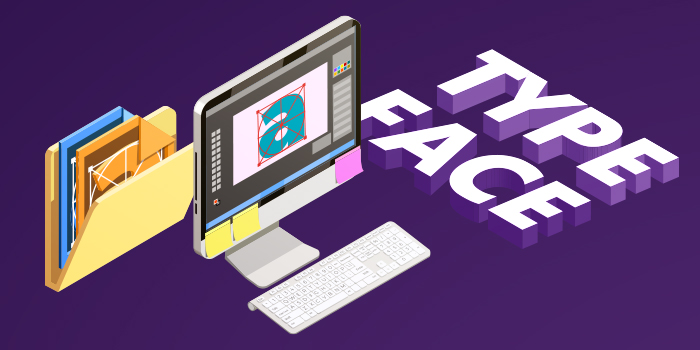
A great logo is more than a pretty graphic—it’s your brand’s visual handshake.
It communicates who you are, builds trust, and sticks in people’s minds. Whether you’re launching a startup or refreshing your brand, Adobe Illustrator gives you the professional tools to design a logo that’s sharp, scalable, and timeless.
In this step-by-step guide, we’ll walk you through everything—from planning and sketching to mastering Illustrator’s key tools, applying color psychology, and exporting your logo in every format you’ll ever need. No fluff—just actionable advice to help you create a logo that works everywhere, from business cards to billboards.
And if DIY design feels overwhelming, tools like Illustrator pair perfectly with unlimited design services like Design Shifu, where professional designers can bring your vision to life—on demand.
Let’s dive into how to design a logo in Adobe Illustrator like a pro
TL;DR
- Designing a logo in Adobe Illustrator gives you the precision, scalability, and control required for professional branding.
- This step-by-step guide covers everything—from planning your brand identity and setting up your Illustrator workspace, to mastering vector tools, applying color theory, testing, exporting, and creating logo variations.
- Whether you’re a beginner or building your design skills, this guide ensures your final logo is polished, scalable, and impactful across all platforms.
Why Use Adobe Illustrator for Logo Design?
Adobe Illustrator offers several key advantages for logo creation
- Vector Graphics: Unlike photos that pixelate when enlarged, vector logos maintain crisp edges at any size. This ensures your logo looks professional whether printed on a pen or displayed on a building.
- Professional Tools: Illustrator provides precise design tools including the Pen tool for custom shapes, advanced typography controls, and color management systems used by professional designers worldwide.
- Universal Compatibility: Most printers, web developers, and marketing agencies expect logos in Illustrator format, making it the standard choice for professional delivery.
Step 1: Plan Your Logo Before Opening Illustrator
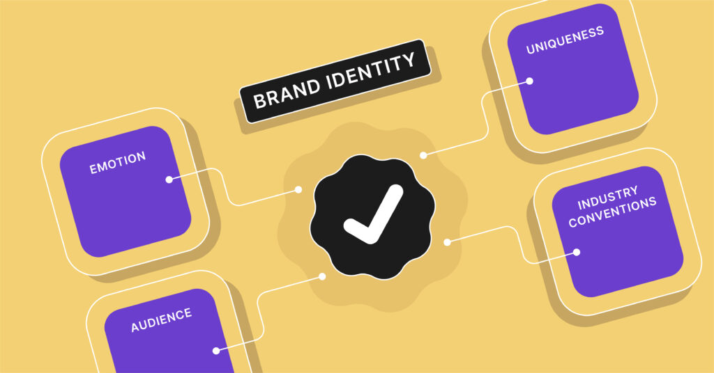
Define Your Brand Identity
Before touching any software, answer these critical questions
- What emotions should your logo evoke?
- Who is your target audience?
- What makes your brand unique?
- What industry conventions should you follow or break?
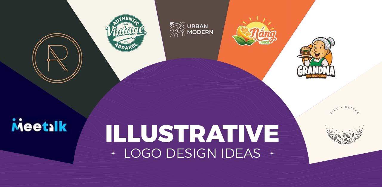
Choose Your Logo Type
Before jumping into design, it’s crucial to choose the right type of logo for your brand. Each logo type communicates differently—wordmark highlight your brand name, while pictorial marks and abstract logos are more symbolic and scalable.
If your business name is short and catchy, a lettermark or wordmark may be ideal. But if you want to build strong visual recall, a combination mark or mascot logo could work better.
Knowing your logo type early helps streamline design decisions like layout, typography, and iconography—ensuring a more cohesive and effective final result.
- Wordmark: Text-only (Google, Coca-Cola)
- Lettermark: Initials/abbreviations (IBM, CNN)
- Pictorial: Recognizable images (Apple, Twitter)
- Abstract: Unique geometric shapes (Pepsi, Adidas)
- Mascot: Character-based (KFC, Mailchimp)
- Combination: Text + symbol (Burger King, Lacoste)
- Emblem: Text inside symbols (Starbucks, BMW)
Sketch Your Ideas
Draw 10-15 rough concepts on paper first. This helps you think through ideas without getting distracted by software features. Focus on simple, memorable shapes that will work at small sizes.
2: Set Up Your Illustrator Workspace
Create a New Document
- Open Adobe Illustrator
- Click “Create New”
- Choose “Print” document type
- Set artboard size to 10″ x 10″ (provides ample working space)
- Set Color Mode to RGB for digital logos or CMYK for print
- Set Raster Effects to “High (300 ppi)”
- Click “Create”
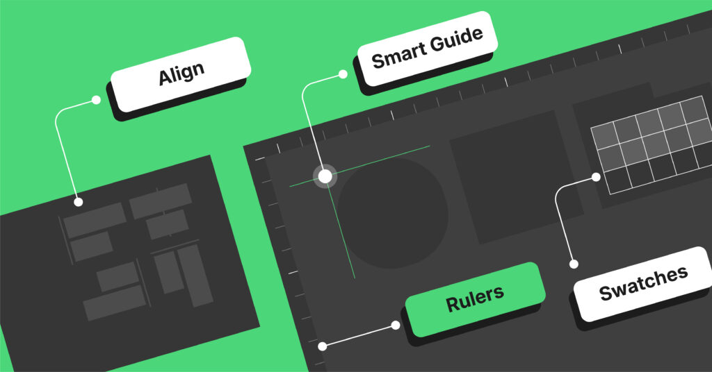
Optimize Your Workspace
- Go to View > Rulers > Show Rulers
- Enable View > Smart Guides for automatic alignment
- Keep these panels open: Tools, Layers, Color, Swatches, Transform
- Save your workspace: Window > Workspace > Save as New Workspace
3: Master Essential Logo Design Tools
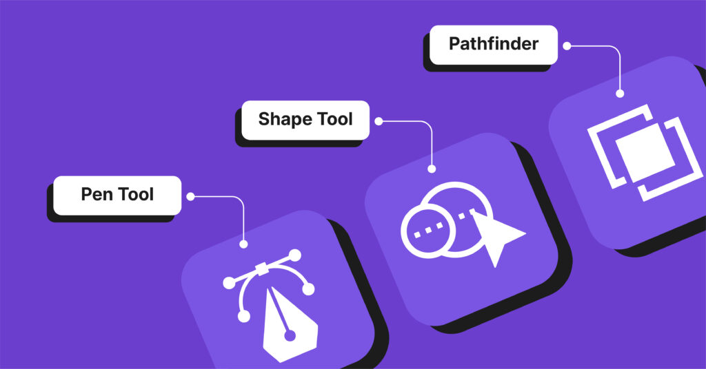
The Pen Tool (Most Important)
The Pen tool creates precise custom shapes
- Click to create straight lines
- Click and drag to create curves
- Hold Alt while dragging to adjust curve direction
- Use Direct Selection tool to edit points after creation
Shape Tools for Quick Building
- Rectangle Tool (M): Perfect for badges and geometric logos
- Ellipse Tool (L): Essential for circles and organic shapes
- Polygon Tool: Creates stars, hexagons, and multi-sided shapes
- Star Tool: Useful for ratings, badges, and decorative elements
Shape Builder Tool
Combine shapes easily
- Select multiple overlapping shapes
- Press Shift + M to activate Shape Builder
- Drag across areas to combine them
- Hold Alt and drag to subtract areas
4: Design Your Logo Step-by-Step
Creating Text-Based Logos
- Select the Type Tool (T)
- Click on your artboard to create a text cursor
- Type your company name
- Choose your font from the Character panel
- Adjust typography settings:
- Font size for readability
- Kerning (space between letters)
- Leading (space between lines)
- Tracking (overall letter spacing)
Converting Text to Vectors
- Select your text with the Selection tool
- Go to Type > Create Outlines
- Warning: You can’t edit text after this, so finalize typography first
- Use Direct Selection tool to adjust individual letters if needed
Adding Shapes to Your Logo
- Select a shape tool from the toolbar
- Click and drag to create your shape
- Hold Shift while dragging to maintain proportions
- Use multiple shapes and combine them with Shape Builder tool
- Adjust curves with the Direct Selection tool
Working with the Pathfinder Panel
Access advanced shape combinations
- Unite: Combines shapes into one
- Minus Front: Subtracts front shape from back
- Intersect: Keeps only overlapping areas
- Exclude: Removes overlapping areas
5: Apply Colors Strategically
Color Psychology for Logos
Choose colors that match your brand personality
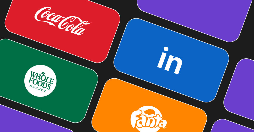
- Blue: Trust, professionalism (Facebook, LinkedIn)
- Red: Energy, urgency (Coca-Cola, Netflix)
- Green: Growth, nature (Spotify, Whole Foods)
- Purple: Creativity, luxury (Twitch, Hallmark)
- Orange: Enthusiasm, friendliness (Home Depot, Fanta)
Adding Color in Illustrator
- Design in black and white first to ensure it works without color
- Select the object you want to color
- Open the Swatches panel
- Click a color to apply it to your selection
- Use the Color panel for custom colors
- Limit to 2-3 colors maximum for professional results
Creating Color Variations
- Duplicate your artboard: Artboard tool > drag to copy
- Create these versions:
- Full color version
- Black and white version
- Single color version
- Reverse (white on dark) version
6: Test Your Logo Design
Size Testing
Your logo must work at all sizes
- Scale your logo to 1 inch wide – can you still read it?
- Scale to 0.5 inches – does it still look clear?
- Create a favicon version (16×16 pixels) – is it recognizable?
Background Testing
Test your logo on different backgrounds
- White backgrounds
- Dark backgrounds
- Colored backgrounds
- Photographic backgrounds
Application Testing
Visualize your logo in real contexts
- Business cards
- Website headers
- Social media profiles
- T-shirts and merchandise
- Vehicle graphics
7: Save and Export Your Logo Professionally
Save Your Working File
- Click File > Save As
- Choose “Adobe Illustrator (.ai)” as file type
- Name it descriptively: “CompanyName_Logo_Master.ai”
- Keep this file for future edits
Export Essential Formats
Create these file formats for professional delivery:
For Print Use
- File > Export > Export As
- Choose EPS format for universal print compatibility
- Choose PDF format for easy sharing and proofing
For Digital Use
- File > Export > Export for Screens
- Choose PNG format with transparent background
- Export at 1x, 2x, and 4x for different screen densities
- Choose SVG format for scalable web graphics
Professional File Organization
Create this folder structure
CompanyName_Logo_Package/
8: Advanced Logo Design Techniques
Creating Professional Gradients
Gradients add depth and sophistication when used properly
- Select your logo element with the Selection tool
- Open the Gradient panel (Window > Gradient)
- Choose gradient type
- Linear: Straight color transition
- Radial: Circular color transition
- Set your colors
- Click gradient slider endpoints
- Choose colors from Swatches panel
- Keep transitions subtle (avoid rainbow effects)
- Adjust gradient angle using the Gradient tool
- Test readability – ensure logo works without gradients
Pro Tip: Always create a flat color version alongside your gradient version.
Using Pattern Fills for Texture
Add sophisticated textures to your logo
- Create or select a pattern
- Use built-in patterns: Swatches > Pattern Libraries
- Create custom patterns: Object > Pattern > Make
- Apply to your logo
- Select logo element
- Click pattern swatch in Swatches panel
- Adjust pattern scale
- Object > Transform > Scale
- Check “Transform Patterns” only
- Adjust percentage for desired effect
- Blend with colors
- Use Transparency panel to adjust opacity
- Experiment with blending modes
Creating Negative Space Effects
Design logos where background shapes create hidden imagery
- Plan your design – sketch how positive and negative spaces interact
- Create your main shape using shape tools
- Add secondary shapes that will become “holes”
- Use Pathfinder panel
- Select all shapes
- Click “Minus Front” to subtract top shapes
- Refine edges with Direct Selection tool
- Test visibility – ensure both positive and negative elements are clear
Famous Examples: FedEx arrow, Amazon smile, NBC peacock
9: Create Logo Variations
Essential Logo Versions
Every professional logo package needs
- Primary logo – main version for most uses
- Secondary logo – simplified version for small applications
- Logo mark – symbol only, without text
- Horizontal layout – for website headers
- Vertical layout – for business cards
- Monochrome versions – black, white, and grayscale
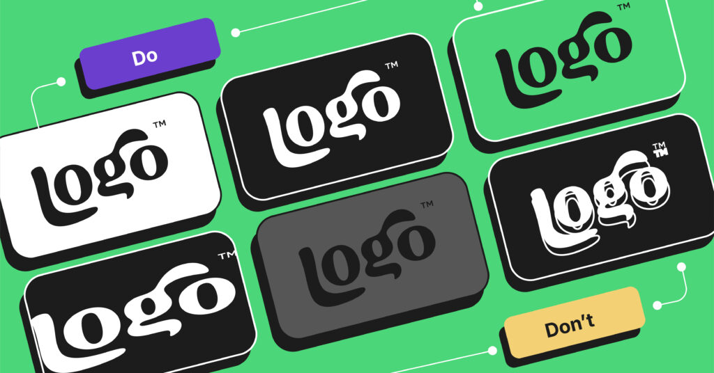
Logo Usage Guidelines
Document these specifications
- Minimum size requirements (usually 1 inch wide)
- Clear space around logo (typically equal to logo height)
- Approved color combinations
- What NOT to do with your logo
Common Logo Design Mistakes to Avoid
Design Mistakes
- Too complex: Simple logos are more memorable
- Too trendy: Aim for timeless design
- Too many colors: Limit to 2-3 colors
- Poor contrast: Ensure visibility on all backgrounds
- Inconsistent spacing: Maintain visual balance
Technical Mistakes
- Using raster images: Always work in vector format
- Not testing at small sizes: Your logo must work everywhere
- Forgetting file backups: Save multiple versions
- Ignoring color modes: Use CMYK for print, RGB for digital
Key takeaways
- Start With Strategy: Establish your brand identity before navigating to Illustrator
- Sketch it Out First: Sketching on paper will help to clearly define your ideas before aligning them to some kind of “distraction.”
- Get Comfortable with the Pen Tool: Vector paths enable you to create precision and move points at any time.
- Limit to 2-3 Colors: Limit your colors based on simplicity and color psychology.
- Use All Sizes: A great logo should be able to go from a favicon to a billboard seamlessly.
- Export Properly: Export in both screen, print and developer files.
- Create Different Versions: In addition to your main logo, create an alternate logo (vertical/or horizontal) and an icon-only version, also upside down, inverted, or monochrome.
- Don’t Follow Trends: Maintain a more permanent feel, rather than a temporary fad.
- Organize Files: Develop a simple file structure in your logo package for multiple versions.
- Document Guidelines: Incorporate rules on how to properly use your logo or mark!
Conclusion
Designing a logo in Adobe Illustrator is not just about making something pretty. It is about creating a brand mark that communicates your values, scales well on different platforms, and remains timeless through the years.
A mix of strategy, creativity, and technical know-how leads to logos that scale with your brand. The best logos don’t just look great—they work everywhere.
Do the work, follow these steps, and you will create an asset that will serve your brand for a long time.
FAQs
1. What is the best way to design a logo in Adobe Illustrator?
The best way to design a logo in Adobe Illustrator is to start by planning your brand identity, sketching rough ideas, and using vector tools like the Pen Tool, Shape Builder, and Pathfinder. Keep your design simple, scalable, and consistent across different applications.
2. Is Adobe Illustrator good for logo design?
Yes, Adobe Illustrator is the industry standard for logo design because it creates vector graphics. These are resolution-independent, making your logo scalable without losing quality—perfect for everything from websites to billboards.
3. Do I need to know how to draw to create a logo in Illustrator?
No, you don’t need drawing skills to design a logo in Illustrator. Tools like shapes, grids, and the Pen Tool help you build professional logos using clean lines, even if you’re not a traditional artist.
4. What file formats should I export my logo in Illustrator?
You should export your logo in formats like SVG and PNG for web, and PDF or EPS for print. Always save your master file in AI format for future edits. This ensures your logo is usable across all platforms.
5. How do I make my logo scalable in Illustrator?
To ensure your logo scales properly, use all vector-based software and tools (Pen Tool, Shape Builder, etc.). Work with outlines of your text, avoid raster images, and use SVG or EPS files for infinite scaling capabilities.
6. What are the most common mistakes to avoid in Illustrator logo design?
Common logo design mistakes in Illustrator include using too many colors, working in raster instead of vector, skipping small-size testing, and not saving in multiple formats. Avoid trendy styles that won’t age well.