

In this blog

Need a design partner that scales with you?
See exactly how Design Shifu can become your on-demand design team. Book a free demo call.
Did you know that a marketer changed just one word, which led to an increase in a company's sales? John Caples, the legendary direct marketer, changed the word 'repair' to 'fix' in one of his ads. The results were a 20% increase in the campaign’s response. This proves something we often forget: small details matter. And nowhere is this more obvious than in bad flyer design, where even minor mistakes can make or break your marketing results.
Things that don't seem trivial are trivial after all. The same is true for all your marketing strategies and campaigns, including flyers. While designing and distributing flyers, you might believe some errors don't matter; however, these lousy mistakes mark the difference between successful and failed flyer campaigns. From the colors you add to the strokes you remove, everything must be carefully planned.
This blog covers the common mistakes in flyer designs and how you can avoid them to increase the response rate for your business.
Bad Flyer Design Examples & Common Mistakes
Overloading information
What you do matters to YOU, not other people, including people who receive your business flyers. The brutal truth is people don’t care about your business or what you do; they want to know what’s in it for them. So, make it easy for them to find out the catch.
You have limited space on a flyer to make a sale. Use every cm and pixel of it wisely. Go through the content twice or thrice. See if there’s a word, a sentence, or a section that you can do without. And remove it. People want to know how your business products and services can help them out. What is in it for them? Highlight it.
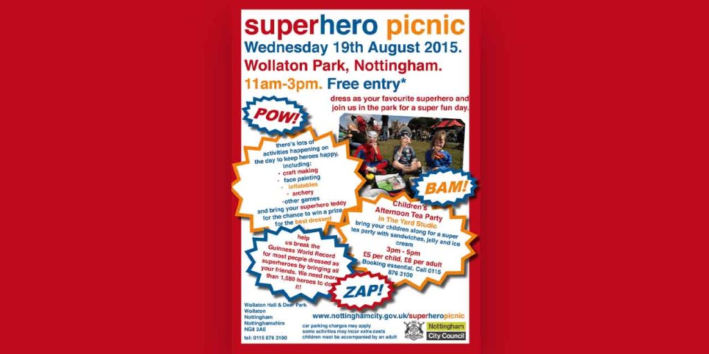
Another common mistake business owners make is packing their flyers with fancy features. They might get impressed by the features of your product and services, but how will it help them? Will it save time, money, or energy? Will it help them go out on vacations? Show how those features will make their life more happening.
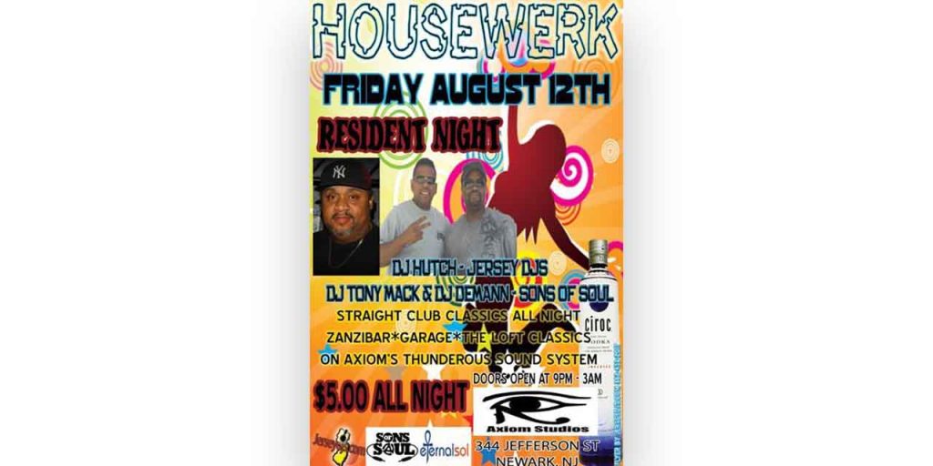
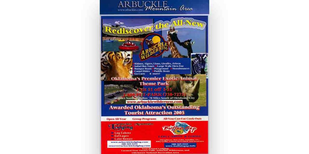
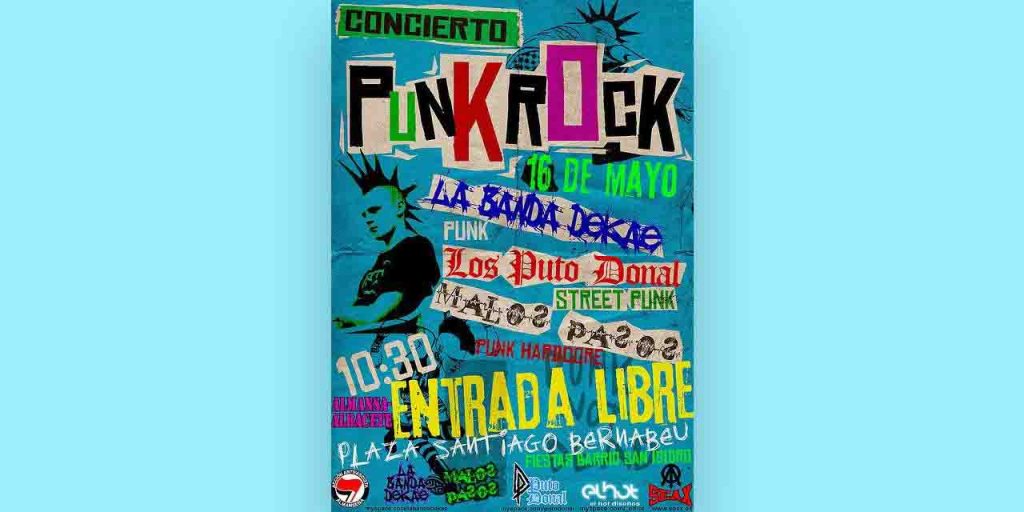
Making flashy colors and elements the spotlight
Too many colors can create a vibrant monster. Use design to complement and invite your audience. While tools like Canva make it easy for you to create designs, there are fundamental design principles you must know to create attention-grabbing designs. Understand design elements like color psychology, proximity, balance, symmetry, shapes, and visual hierarchy to create eye-catchy designs.
If designing is not your best suit, hire a professional who has spent years crafting their skill.
Why not take help from Design Shifu to design a flyer for you? You get unlimited graphic designs and a dedicated designer to take care of all your design needs.
Printing low-quality/ free images & illustrations
A pet peeve of viewers and a sin for designers and marketers is poor-resolution stock images and illustrations. After spending hundreds of dollars on your flyer marketing campaign and distributing those flyers to your audience, adding free images dilutes your effort. Using stock images may look economical at first glance, but it costs you more.
Stock photos are shared by thousands of people across the planet. Students and businesses use them alike, which is why they might not have the same impact on viewers as an original image since they have already seen it several times. Moreover, stock images question your credibility. Would your product or service really look like this? Are people in your company actually that happy? So, add real images.
If you do not have pictures, hire a photographer or click them by yourself. Get a designer to edit them for you, and you are good to go. The same goes for illustrations. Always use custom illustrations that align with your brand voice and personality.
Do you want help designing illustrations for your business? Get a dedicated designer and unlimited graphic designs for just $549 per month from Design Shifu.
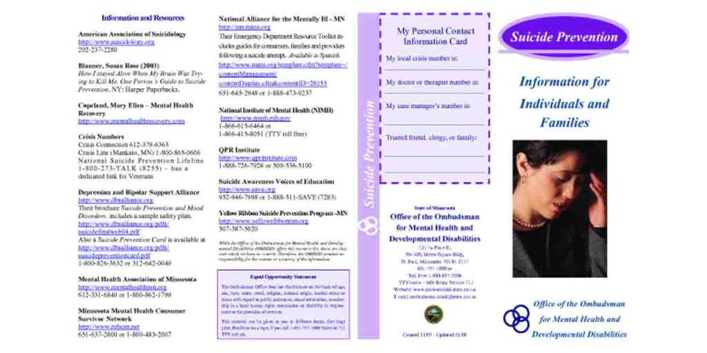
Eliminating contact information
You might have amazing products, services, and images to show off to your prospects. But how do they get in touch with you? Do not forget the primary purpose of your flyer is to book calls and make sales. Give considerable space to contact information. Include the business name, logo, contact number, office address, website, and email address. If you have active social media pages, include icons or links. Include a QR code to directly send your audience to the landing page.
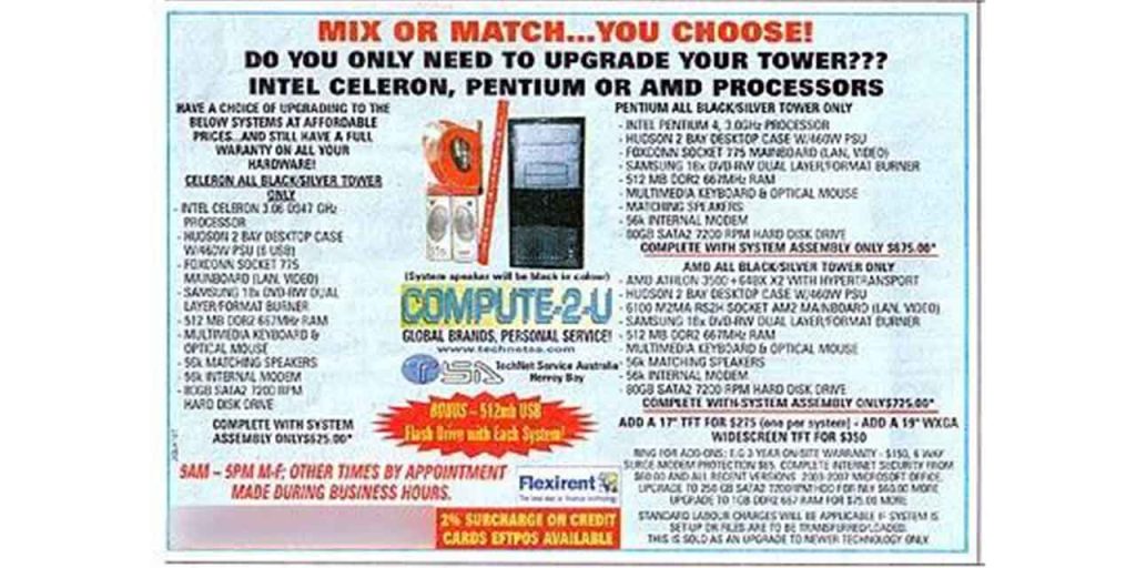
Cramming the layout
While adding colors, typography, and images are all good graphic design practices, using too many can clutter your flyer design. Create a structure that is easy to read. Identify the crucial information and elements you want to emphasize: its contact number, services, and address. Add space between things to give breathing room.
How Bad Flyer Design Hurts Your Brand Image
The first thing a prospect will read is the headline. So give it respectful space and emphasis to catch attention and entice your customers' curiosity. Use colors that evoke the intended emotions and legible typography.
With an attention span of less than a goldfish, your prospects are unlikely to make it through your offer if you do not tell it straightforwardly. Keep your headline crisp and short. Don't be vague.
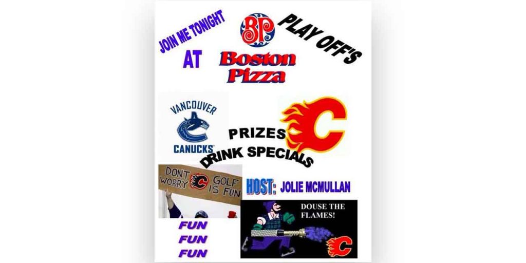
Adding large blocks of text
A flyer with no formatting and a large block of text demands effort on the reader’s part. Flyers receivers are barely interested in sparing minutes, let alone seconds, on your sales pitch. So, format the content to make it pleasing to read. Use white space and bullet points to break down the paragraphs. Highlight important information using color, italics, and bold. Create a visual hierarchy among information. Make reading flyers worth their time.
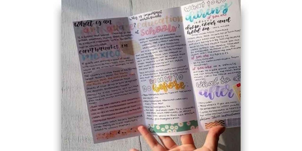
Having too much or no typography at all
Ever came across a flyer with a 12-point font throughout? Did you read it?
Adding space and formatting is one thing; making it scannable is another. People don’t read, they skim. Create a visual hierarchy to guide the reader’s attention and make it easy for them to pick the main points. So use typography, font, and highlights to help them. Bold and italicize keywords.
Do not go overboard with fonts. Stick to two fonts. Fonts with superfluous details are just as bad as an Open Sans at 9-points size, impossible to read on print. The key is to keep it legible.
Choosing clever over clear elements
Clever is good as long as it doesn’t hurt your audience’s sentiments. Choose your message and elements carefully while designing your flyer. Avoid controversial statements or messages that contradict your brand values.
For instance, this ad successfully created a buzz around the town but not exactly in the company’s favor. Although Burger King enjoys a following for its entertaining ads, this might have offended its long-term customers. As a small business owner, you have limited chances to build a reputation, unlike Burger King. So, spend more time planning out your message. It is wise to avoid sexual innuendos and discriminatory messages.
Choosing a wrong size
Most business owners distribute 8.5 × 11 in. size flyers, which are, generally, A4 size. However, flyers come in various sizes. Consider your audience, message, and content before selecting the size.
Where will you be distributing your flyers? Would it be easy for your receivers to carry it with them? For example, many visitors won’t appreciate you giving them an A4 size hard paper flyer, hard to fold at the entrance of a fair. They might throw it in the first trash can they spot. So, determine the size after considering the environment, audience, and messaging.
Not proofreading before publishing
42.5% of customers would not buy from a business if they see a spelling or grammatical error. Imagine the number of sales you may lose because of a letter or a comma. So get your it and it’s and you’re and yours right.
Run your content through online grammar-checking tools like Grammarly, or get it proofread by your friend or colleague. Double-check before sending your flyer off for print. Additionally, check that the information is factually correct.
Having a vague or no CTA
What are you trying to achieve with your flyers? What should your reader do if they choose to read your flyer? Should they book a call? Fill out a form? Explore your website or visit your store?
What is the next step? State it clearly.
Adding contact details and address is not enough. Shine a spotlight on it and have a clear call to action to direct them. You can also add a QR code to simplify their journey.
So what makes a flyer design good? We have covered 10 tips to design an effective flyer in greater detail in our blog.
How to Design a Professional Flyer (Step-by-Step Guide)
Now that you’ve seen the common flyer design mistakes, here’s how to design a professional flyer that actually attracts attention and drives action.
1. Start With a Clear Purpose
Could you define what the flyer should do to promote an event, sell a product, or build awareness? Your message, layout, and visuals must support a single, strong objective.
2. Use a Clean, Hierarchical Layout
Divide the flyer into logical sections, use grid alignment, and ensure the primary message stands out. A strong visual hierarchy helps readers quickly understand the key information.
3. Choose Readable, Professional Fonts
Stick to 1–2 font families. Use bold or larger sizes for headings and ensure all text is legible from a distance. Avoid overly decorative fonts unless they match the theme.
4. Keep the Color Palette Consistent
Use brand colors or 2–3 complementary colors. High contrast improves readability and ensures important elements pop.
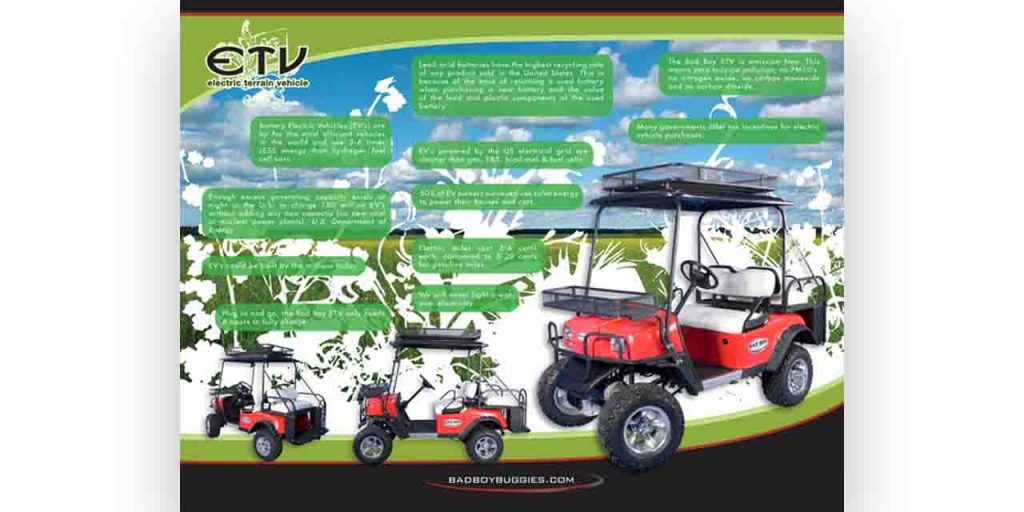
5. Add High-Quality Images or Illustrations
Blurry, low-res visuals instantly make a flyer look unprofessional. Use HD photos, vector icons, or custom illustrations that elevate the design.
6. Include a Clear Call-to-Action (CTA)
Tell readers exactly what to do next call, visit, RSVP, sign up, or scan a QR code. Make the CTA visually distinct.
7. Maintain Proper Spacing
Give your design breathing room. Crowded layouts are overwhelming, while balanced spacing makes your flyer more premium and easier to read.
8. Proofread and Print-Test
Check for typos, alignments, and print colors. Always print a sample before final production to ensure everything looks clean and professional.
If you want a professionally designed flyer that stands out, Design Shifu can create high-impact flyer designs with fast turnaround and unlimited revisions.
Key Takeaways
- Bad flyer design happens when your layout is cluttered, unreadable, or visually inconsistent.
- Overuse of colors, poor typography, and low-res images immediately reduce trust.
- Flyers with no CTA or missing contact details fail to convert even if they look good.
- A professional flyer uses clean spacing, readable fonts, high-quality visuals, and strong hierarchy.
- Avoiding key flyer design mistakes can dramatically improve engagement and response rates.
- Print-test the flyer to ensure colors, alignment, and readability are correct before finalizing
Ready to add the “zing”?
Flyers are an underrated cost-effective marketing strategy that helps small business owners expand their visibility and reach, possibly making them the talk of the town.
Our bad flyer examples will help you distinguish between good and bad flyers and avoid blasphemies, so you can create a successful flyer design for your business.
Now, pull out your flyers and identify the spots you can update. If you don’t want to repeat any bad flyer practice, reach out to Design Shifu. We will help you with a consistent brand identity while keeping up with the latest flyer trends and best practices.
FAQ
What makes a flyer look unprofessional?
A flyer looks unprofessional when it has poor layout, cluttered design, hard-to-read fonts, and low-quality images. Too many colors, inconsistent spacing, or missing hierarchy also make the flyer confusing. A clean design with clear messaging instantly looks more polished.
What are the common mistakes to avoid in flyer design?
Common mistakes include using too many fonts, overcrowding the layout, adding blurry images, weak call-to-action, and ignoring alignment. Many flyers also fail because the design doesn’t match the brand or the message is not clear.
How do I design a professional-looking flyer?
To design a professional flyer, start with a clear purpose, use a balanced layout, choose readable fonts, and stick to a consistent color palette. Add high-quality visuals, keep spacing clean, and include a strong call-to-action. Always proofread and test-print before finalizing.
What size should a professional flyer be?
Standard flyer sizes include A5 (5.8" × 8.3"), A6 (4.1" × 5.8"), and US Letter half-sheet (5.5" × 8.5"). The best size depends on your distribution method; handouts can be smaller, while posters or event flyers often use larger formats like A4.
Which fonts are best for flyer design
Use clean, modern, and highly readable fonts such as Montserrat, Poppins, Helvetica, or Lato. Pair one strong heading font with a simple body font for the best visual clarity. Avoid decorative fonts unless they fit the theme.
How many colors should a flyer have?
Stick to 2–3 main colors. Too many colors can make the flyer look chaotic and unprofessional. Use high contrast to highlight important elements and maintain brand consistency throughout the design.
What should a good flyer always include?
A good flyer should include a clear headline, a short message, high-quality visuals, essential details (date, time, venue, contact), and a bold call-to-action. QR codes or website links can improve engagement and tracking.
About the author
Sameena is an Organic Growth Specialist and Content Writer at Design Shifu, crafting SEO-driven content that boosts visibility, builds brand authority, and drives meaningful organic growth.
.webp)


