March 2021 - Design Shifu

Top 10 Facebook Advertising Challenges And How To Tackle Them

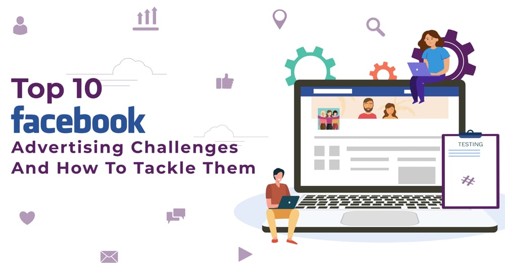
To get the right engagement and appropriate CPC on Facebook advertising, you must learn how to effectively market and advertise your products and services. This article will talk about the common Facebook advertising challenges and how to tackle them.

1. Wrong target audience

For a successful Facebook advertising campaign, you need to target the audience who would be interested in whatever product or services you are offering. For instance, if you have a product that would help someone who is in their 20s, you need to ensure that your ad gets displayed on accounts of all those users who fit this profile. In addition to targeting the right audience, you also need to make sure that the ad you post needs to be compelling enough for these young individuals not only to take notice but also take the desired action such as “Register” on your website, “Click” on the product etc.

Unfortunately, there are several businesses that end up targeting the wrong group of individuals. They sometimes even fail to set certain parameters for where they want their Facebook ad to appear. As a result, such Facebook ads fail to elicit the desired response from the audience.

2. Failure to comply with Facebook rules

When it comes to Facebook advertising, there are certain sets of rules for the kind of content that you can post in your ads, how you mention Facebook’s name in the ad, how much text your ad contains, and other such specifications. If you fail to follow these rules, there is a chance that Facebook will reject your ad. A lot is also dependent on the size of your creatives and videos, you want to learn about Facebook ad dimensions in detail, you can read our blog on the same.

Many companies fail to understand these rules completely while devising their Facebook advertising campaign as a result of which they struggle during the process to get their Facebook ad approved.

3. Repetitive or diminished audience response

If the content you post on Facebook ads is similar and repetitive, you will keep getting the same result as before. The change on social media is pretty constant which means that whatever worked for you in a particular month may not work in the following months. 

To stay ahead of your competition you will need to revamp your Facebook ads by continuously changing and evolving your Facebook advertising strategy. If this is not done the results you expect from your Facebook ads would become stagnant or even decline.

Rather than focusing on content that just fulfills your business goals, try deviating your attention to content that is informative, helpful, and interesting. Always keep a track of what Facebook advertising strategy works and push your efforts in that direction.

4. Inability to connect with your followers

If you still are not sure about what kind of content your followers are interested in, try running a Facebook poll on your business page or post a question to find out what your followers like seeing and reading about.

Also Read: Instagram post size ultimate guide 2022: Updated story, reels & photo dimensions

You can even directly message your followers asking them for their suggestions in return for an incentive. If you feel you are not getting enough response this way, you can try asking them again for a better incentive in return.

5. Skipping the crucial step of A/B testing 

Since every Facebook ad has distinct pictures, messages, designs, and other elements, each ad will get a unique response from the target audience. One of the problems which several businesses encounter while handling their Facebook ad campaign is that they refrain from testing their ads for the audience response. This way they miss out on all the business they could have earned, had the ads been good enough to get the maximum response from the audience.

You can avoid such an issue by conducting A/B tests on your ads. You can do this by running two Facebook ads developed by you simultaneously and compare the response for each of the ads. This way you can know which ad has the capability to get you the best results, and as a result, maximum profit.

6. Low conversion rate

You are getting excellent engagement on Facebook, your followers are commenting on, liking, and sharing your Facebook posts, but the conversion rate is still pretty low. Sounds familiar? Engaging content on Facebook is of no use if it is not eventually improving the conversion rate for your business. 

When trying to market your products or services on Facebook, the content you post needs to be relevant enough for getting a high conversion rate. Every piece of content you post needs to have a specific goal and must fulfill both your business goals and the needs of your audience.

If the content you post is already working great, ensure that you do not make any drastic changes too quickly. Try and maintain the personality and integrity of your presence while also putting out the message your business needs to deliver.

7. Difficulty in retargeting interested users

Engaging content on Facebook without an effective marketing strategy in place can ruin your Facebook advertising and marketing efforts. All the users from different stages of the funnel can be targeted effectively using Facebook ads.

If you have a website for your business, you need to have Facebook Pixel. There may already be several people being driven to your website, by using Facebook Pixel you can retarget all those users who visit your website and who have visited certain pages containing targeted messages.

8. Frustrated audience

Users disliking your posts, unfollowing your business page, and giving negative comments, reactions, or messages is a very common problem. However, such behavior from your users indicates that you need to modify your Facebook advertising strategy.

When you do not acknowledge the comments and queries posted by your followers or when you do not address their concerns with individually tailored answers, they can start getting frustrated. You can solve such issues with help of comprehensive community management. This process would include,

i) FAQ document that can be changed for different users specifically to address their needs and questions.

ii) A well-set escalation process to help you in taking action when the questions start spiraling out of control.

iii) A dedicated employee who can look after the management of your business page and give timely responses to most of the queries posted there.

9. Absence of compelling images

The success of your Facebook advertising campaign depends largely on the images you use in the ads. More often than not, the images are the reason why some users may view and click on your ad. This is exactly why it is crucial to use compelling images for your Facebook ads. 

Avoid using stock photos and try including uniquely vibrant images that capture your brand’s efforts appropriately.

10. Trolling

Moderating the Facebook page of your business, hiding inappropriate conversations, and blocking users who do not abide by the Facebook guidelines, is your responsibility. If you ever feel that your business page is being targeted by hackers, trolls, or any other groups, you can block them straight away.

This action needs to be followed through immediately when you notice a particular user using derogatory, discriminative, and offensive language on your page. You need to set certain guidelines for your page and ensure that all the users are reacting and commenting appropriately within the set guidelines.

Conclusion

Creating an effective Facebook ad that perfectly translates your Facebook advertising efforts to definitive results is not really easy. Tackle some of the most common Facebook ad posting challenges by making use of the tips given above. For creating the most interactive ads for Facebook advertising, it is best to approach professionals like Design Shifu. Design Shifu offers various graphic design plans to choose from as well as unlimited revisions free of cost, just in case you aren’t satisfied with the work. Not to forget, the 14-day 100% money-back guarantee! 


Illustration And Graphic Design: What’s the difference why does it matter?

Digital design and art have started developing at a much quicker rate than anticipated. With time, both these mediums in the digital world are becoming more accessible than ever before. This often leads to confusing one medium for the other. Similarly, when we talk about graphic design and illustration, people often wonder how the two differ. 

These mediums are often misunderstood since they both offer vital visual communication means that involve the use of similar skill sets and tools.

When you start presenting an idea for new and unique visuals, it can be challenging to describe your idea and categorize it accurately. When you understand the prime differences between graphic design and illustration, it becomes easier to communicate your idea to art directors and designers.

So what makes graphics design and illustration different from each other? Let us dig deep into this and find out all about the differences between the creative fields of graphic design and illustration.

Illustration

Illustration Example
Source

Illustrations are basically used to tell a story, elaborate, or explain an idea by interpreting and portraying the available text with visuals. Let us learn more about this in detail.

What is an illustration?

A graphic illustration can be simply described as an explanation of a text. While being an interpretation of text or decoration, it can also elaborate on a concept or process. Generally, illustrations are integrated with published media forms like books, magazines, animations, posters, flyers, teaching materials, films, and video games.

Also Read: All about custom illustration - Guide to get started

An illustrator’s job is to use an associated idea or text and represent it visually in the form of an illustration. To put it simply, we can associate an illustration with a picture or a drawing. It perfectly displays the act of drawing or creating visuals to explain or prove an idea. For instance, the pictures used in a magazine article are categorized as illustrations.

What is the role of an illustrator?

An illustrator is responsible for creating images. However, these created images don’t require any special attention from the viewers for a particular object depicted on the canvas.

The viewers basically would perceive the entire illustration as a whole and not just a specific object or picture. All the individual images and objects are designed to work with something specific.

An illustrator needs to take sufficient care to create the visual illustration in such a way that the viewers do not get completely distracted by the illustration. Although the illustrator needs to add a certain amount of unique character to the illustration, the sole intention while creating such an illustration needs to be focused on only making it seem a bit noticeable.

Graphic design

Graphic Design Example
Source

Graphic design is a broader and more commonly known form of design. Graphic design mainly has to do with layout organization, composition, images, and texts. Given below is a detailed explanation of the graphic design.

What is graphic design?

Graphic design is the act of projecting and planning ideas and experiences. The graphic designer generally projects their ideas with visual and textual content. This is one of the reasons why graphic design is sometimes referred to as communication design. In order to communicate, physical and virtual communication tools like graphic forms, images, and words are used by graphic designers.

Basically, graphic design is an elaborate expression of a purpose disguised as art. This form of art mainly focuses on creating images that intend to grasp the viewer’s direct attention. A graphic designer works towards bringing the entire focus of the viewer to the object drawn in the design. For this purpose, all the elements of design are employed.

Every single element integrated into a graphic design competes for the attention of the viewer. This is where creative expertise comes into play. An experienced graphic designer would know which specific elements of the design must get attention first and which ones should draw attention towards the end.

What is the role of a graphic designer?

The main aim of a graphic designer is to convey a message directly to the audience. In order to do this, the designer needs to carefully select different design elements like typefaces, colors, symbols, and images, among others.

For instance, in order to evoke emotions like aggression and passion among the audience, the designer may include a red color element in the design. The design elements are carefully selected by the designer to target a particular group of audience and this is why they focus a lot of their efforts on understanding the target audience.

The difference between graphic design and illustration

A graphic designer is generally concerned with composing different graphic bits and promotional marketing materials like text, layout, images, arranging fonts, and illustrations. On the other hand, graphic illustrations are more focused on drawing. They are generally created using different concepts, ideas, themes, and art.

Graphic designing focuses more on creating marketing materials, making logos, and promoting branding. Their services are needed mainly in the advertising and marketing field, where the end pieces created are intended towards increasing sales and generating brand recognition. Illustrations are used to effectively communicate a particular emotion or form a representation of an ongoing trend. You can also read our blog on the latest illustration trends to get inspiration for your next custom illustration.

Graphic designers do not generally need to know how to draw but illustrators need to have certain drawing skills as a must. While illustrators create commercial art pieces for companies, they can solely be fine artists too.

Graphic designers use digital mediums along with the other available mediums to bring brand awareness to the target audience. They have all the skills needed for creating enriching interactions among apps, users, and games. The main intent of a graphic designer is to deliver brand messages appropriately. Alternatively, illustrators are involved in the creation of things similar to magazine spreads, graphic novels, book cover illustrations, and infographics.

The difference between graphic design and illustration can be simply explained in the following words. When you come across an advertisement with a logo, photo, and lines of striking text, you are seeing a graphic design. On the other hand, if you see sketches or an illustration artwork, it is an illustration.

What is the best way to incorporate Illustration in Graphic Design?

Graphic designers often use illustration to enhance logos, create mood boards, develop marketing materials, or even improve user interfaces. This can make a design stand out and increase brand awareness while adding an aesthetic touch. Additionally, illustration helps in communicating ideas in an engaging and visually appealing way – something that is essential when trying to reach a wide audience.

Illustrations are the best way to enhance graphic designs for marketing collaterals. For instance, you can use caricatures or sketches to depict characters and scenes from a product or service. Alternatively, you could render landscapes or cityscapes with minimalist lines as they would be interesting to show off on a mood board. You can also go ahead with real-life items such as furniture, cars, and clothing to add an extra layer of realism.

Illustrations are widely used by small businesses in their marketing collateral. For example, a graphic designer might create a mood board with illustrations of different product types and then use this as the foundation for designing flyers, advertisements, or website graphics. Small business owners can also teach their customers about their products by illustrating recipes or how-to guides.

Conclusion

Both graphic design and illustration mediums are directly related to similar art forms and this is why people often confuse one for the other.  We hope this article has helped you understand and differentiate graphic design and illustration better. 

If you are ever stuck with a graphic design and illustration request and need expert help, you can approach Design Shifu. Design Shifu can deliver unlimited graphic design and illustration options with multiple revisions at no extra cost. To avail of the services, you can pick any suitable budget-friendly plan that comes with a 14-day money-back guarantee. Contact now and get started on getting your brand recognized through innovative and unique graphic design and illustration options!


10 Innovative Tri fold Brochure Examples & tips for small businesses

There is no better way to showcase your business than through a brochure. Every marketing campaign, whether offline or online can use a brochure as a tool for their business. From down files to printed brochures, they are versatile and handy when it comes to making an introduction, and this means that its design has to always be on point. Typically there are two fold brochures and tri fold brochures.  A tri fold brochure is one of the most common brochure templates that is used.

What is a tri fold brochure 

A basic brochure that unfolds into three panels, advertising your business, your offers, and images relevant to your business is a trifold brochure. Tri fold brochures can be used as an introductory brochure for your business or advertising an event, upcoming offer, and much more. The range with which a tri fold brochure can be used as a marketing tool is quite huge and if implemented right, it can do wonders for your campaign and your business.

Z fold vs Tri fold brochures

Z fold and tri fold brochures may seem similar, but their application is quite different. Z-fold brochures open into three panels, usually horizontally. This type of brochure creates a large impact but requires a bit more effort than tri fold brochures.

For marketing purposes, tri-fold brochures are ideal when you want to utilize less space while narrating a strong advertising message.

Typically, Z-fold brochures are used by larger companies with a broader client base. In addition to product descriptions, staff profiles, and contact information, they also provide a brief history, vision, and mission of the company.

As tri-fold brochures fit on standard 8 1/2″x11″ paper, they can be used by any size business. Also, tri fold brochures tend to be more cost effective because printing is reduced from three times to two times that of a z-fold brochure.

Clearly, tri fold brochures are more relevant for small businesses, so we will discuss tri fold brochure examples in more detail.

Also Read: What is a pamphlet? Pamphlet vs Brochure explained [With Examples]

Here are 10 of the best trifold brochure templates and examples that you can take inspiration from:

1) Image centric tri fold brochure example

Image centric tri fold brochure
Source

An image-centric brochure template for your restaurant is the best way to showcase your business and make the best use of the space you have. Extend high-quality images across folds and make your copy concise.


For example, as a restaurant owner, you can use a trifold brochure to promote your restaurant. You can create a brochure with pictures of your signature dishes alongside a small description of each dish. Get creative with the folds. Select the color scheme, font style, and layout of the content that best matches your restaurant, and voila! You have a great brochure that will bring people knocking on your door.

2) Color palette based tri fold brochure

Color palette based tri fold brochure
Source

Take for example this trifold brochure by a nutritionist clinic that raises awareness about the benefits of healthy eating. The way they use a pastel color palette that is easy on the eyes is an old trick in the book of color psychology. Pastel color palettes are meant to induce a sense of comfort. This has been topped with some fun yet healthy food images, creating a perfect balance between the content and the visuals.

Related


Brochure Design in 2021 – The Ultimate Guide

3) Information based tri fold brochure example

Information based tri fold brochure
Source

Take a look at this COVID 19 vaccine brochure. The neutral tones of blue emit a sense of safety appropriate for the industry that the brochure represents. While the brochure is information-centric, it does not necessarily have to be wordy. With well-designed vector images to go with your concise copy, your brochure will do the job of spreading the correct information in a more visually appealing manner. 

4) Brand color based tri fold brochure

A brochure idea that can be considered is customizing the brochure with your brand colors. Brand colors and elements are often memorable when repeated consistently in your marketing efforts. Let your brochure speak for itself, and represent your brand identity through the brand colors and elements of your business. Use vectors, icons, and images that are your brand’s signature style. This brochure will not eat into your budget and will also be a great yet simple way to introduce yourself to clients.

If you’re looking to design your own brochure and need some guidance, take a look at our latest blog for the best tips on designing a business brochure that caters to your design needs. 

5) Minimalistic tri fold brochure example

Taking a cue from this furniture business brochure. If you’re looking to advertise your products with style, then a chic and minimalist approach would work for you. You can go all out with the color or stick to a palette depending on the industry your product belongs to. For example,  if you sell antique furniture, then an elaborate design with lots of colors would be a better approach as it grabs more attention through its aesthetic. A good brochure can make your business stand out from your competitors and help drive your business.

6) Modern tri fold brochure example

Taking a minimalist approach may suit your brand if you are portraying your brand as modern and up-to-date with all the latest trends. Light pastel colors such as yellow or baby pink will work great if your primary target group is millennials or younger audiences. A brochure idea incorporating such a design and layout in mind can greatly increase your chances of forming a youth connect with your brand and thereby growing your business.

7) Abstract Design tri fold brochure example

If your brochure idea revolves around the layout, then an abstract design can work if your business and advertising efforts. You can get contrast without the eye-hitting effect with your brochure design. You can introduce abstract shapes, elements, and layout designs in your brochure as shown above. Using a contrasting color scheme, with muted colors, and an abstract mood induced through the overlapping shapes on the folds like shown above ensures that it stands out, but at the same time is soft on the eyes, and also ensures a flowy pattern for the eyes to follow.

8) Shapes and layout based tri fold brochure

Take a look at how well this construction based brochure has been structured (pun intended) The sharp folds in the design layout with the images, the cutout images, the color, as well as the content complimented with the right icons next to them, create a perfect layout for a tri-fold brochure. Stick to a light color palette consisting of colors such as mustard, white, grey, and black. Images of your past projects will also help enhance the look of your brochure.

9) Creative layout tri fold brochure

Selecting a layout should depend on the audience you cater to. A more abstract layout could work if your primary target audience is younger. A more traditional layout would be better suited if your offer is directed to corporate setups. If you specialize in tours to the hills for example, then earthy colors such as navy blue, brown, olive green, and white would enhance your brochure, while pastel colors would suit brochures designed for corporate tours.

Similarly choosing the right layout for your brochure is essential and is based on your target audience, but you can get creative with it. For example, the closing fold of the brochure above simply holds a minimalistic yellow diamond-shaped icon with the website URL. It not only draws focus to the website, but it also works as a great CTA for the reader, along with the design contrast the colors provide. This could be one of the best travel brochure examples you can look at if you have a travel business.

10) Simple tri fold brochure

You don’t always need colors from the opposite spectrum on the color wheel to create contrast in your brochures. The mockup above very elegantly creates a contrast with a bright white and a teal green color combination. It’s a unique way to create a contrast in the design without a lot of effort, while also maintaining the simple and neat design element in the brochure.

Tips to design a tri fold brochure 

Designing a trifold brochure is the part where most people get stumped. Keep the following pointers in mind and you shouldn’t face any issues:

1) Color Scheme 

Keep a color scheme that reflects the mood of your brand. A brighter color palette works if you’re an FMCG brand. Earthy colors would enhance your trifold brochure if your brand were in the finance sector. Don’t go overboard with colors. Stick to 2-3 maximum.

2) Layout

Select a layout that resonates with your target group. If your business primarily targets the youth, then you can be more experimentative and go for a more abstract look. On the other hand, if your business caters to more elderly folk, then a traditional grid-like layout would be better suited for your brochure.

3) Consistency

Don’t use more than 3 different font styles and keep a consistent color palette. Doing so will maintain the professional look of your trifold brochure, which could translate into more business for your brand.

If you’re looking to get a brochure designed in 24-48 hours, Design Shifu can help. With an in-house team of a pool of talented designers, Design Shifu works around the clock to offer you the best of designs that cater to your needs with a quick turnaround time, and the best part? there is a 14-day money-back guarantee if you’re not satisfied with the service. Take a look at the pricing plans and the portfolio to get a gist of Design Shifu’s previous work.


How To Get A Custom Logo Designed ASAP for your Business

The logo is often the first step in the process of building your brand identity. This is exactly why investing in a custom logo design is crucial. It must represent what your company stands for, while simultaneously setting you apart from your competitors.

The very first impression your consumers will have of your company is greatly affected by your logo and this is exactly why you need to put your best foot forward. Through this article, you will learn all about designing a custom logo design.

How important is a custom logo for a small business?

If you are a small business with limited funds to spare, you would be apprehensive about investing in a custom logo design. However, you must remember that a good brand logo can be the stepping stone to put your brand on the next trajectory.

Not only for promotional purposes but a custom logo design would give your company an edge over the others and make your brand identity stronger than ever. Such a logo would solidify your branding and marketing strategy as well which would, in turn, drive the success of your business.

Where can you get custom logos done ASAP?

These days there are plenty of ways in which you can get custom logos designed for your business, a few of them are mentioned below.

1. DIY custom logo makers

There are several platforms available online where you can yourself create custom logo designs for your business. The process of designing a logo may seem easy on the outside, but the fact remains that expertise is the key to creating a design that actually makes a difference to your brand.

On such platforms, you can pick the template which suits your choice the best and then make all the necessary additions and omissions. Although such online services may help you in creating fairly presentable logos, they fail to help you create impactful and unique logo designs for your business.

Canva is one such platform where you can design your DIY custom logo maker. You can also look at tools like Design Wizard, Stencil, etc.

2. Freelancers / Logo designing contests

To make the task of logo designing much simpler, you can try conducting logo designing contests. This is a great way to get truly unique logo designs for your company as there will be plenty of graphics designers from across the world who would be submitting their designs.

This way you would get many different viewpoints and options compared to just a few when it comes to DIY logo makers online. However, this option would not be suitable for you if you need the logo design ASAP. You can approach individual freelancers in the field of graphic designing for this purpose and request them for early delivery of logo design.

3. Use flat rate subscription-based graphic design services

The above methods of logo designing are indeed very effective, but they do come with their own drawbacks. If you wish to get a powerful logo designed in the minimum amount of time, you can contact a professional graphic designing service like Design Shifu.

If you are a startup, investing in a professional logo designing service can be a big decision to make. However, Design Shifu has multiple subscriptions that are pretty affordable. Get unlimited graphic designing requests and unlimited revisions at no extra cost.

The best part about subscribing to Design Shifu is the 14-day money-back guarantee if our services do not seem satisfactory for you.

How to design a logo for your business?

Given below are some of the important steps involved in creating a custom made business logo:

1. Designing the brief

Before you start with logo designing, you need to understand your business, industry, audience, competition, and your ultimate goal in depth. 

2. Research further

Once you have a brief idea about the needs and requirements of the business, you need to dig deeper before you start designing the logo. You need to have answers to questions like:

  • What sets you apart from your competitors?
  • What type of services or products do you offer?
  • Who is your target audience?
  • What are the types of demographics you plan to target?

3. Try out different logo designs

You can now look for inspiration and try out rough logo designs in black and white. This is the time to try out different word associations, sketch a few logo concepts, and draw multiple mind maps.

4. Refine the logo

After this, digitize your logo, refine it by making a few edits here and there, pick a symbol for the logo and choose an appropriate color.

Conclusion

Businesses don’t always have the expertise to make logos themselves, so why go through the grind when you can outsource the work to experts without spending a bomb. 

Get unlimited logos custom-made to your specific requirements by our in-house graphic designers within 24-48 hours. Click here to view our subscription plans and get your very own custom logo design now!

Instagram Ad Specs and Sizes in 2023 – The Ultimate Guide

When it comes to marketing, a single strategy will never be enough. If you want to consistently succeed in marketing your products and services, keep up with the latest algorithms and trends. Currently, Instagram ad campaigns are trending as the most powerful way to market your brand, which makes it pertinent for you to know the right Instagram ad sizes. When done right, Instagram ads can help you stand out among your competitors, for all the right reasons.

To nail Instagram ads, it is important that you follow the Instagram ad size and dimension requirements. This article will tell you about the latest Instagram ad specs and sizes for 2021.

Here Are All The Instagram Ad Sizes You Need!

Instagram Single Image Ads

Instagram single image ads are quite effective as they take up the user’s entire phone screen. You can create ads using both vertical as well as horizontal images. To make your ad stand out, opt for photos taken in portrait mode and post them in the vertical format. Here are a few other Instagram ad sizes to be mindful of for Instagram single image ads.

Instagram Single Image Ad Size

Instagram Video Ads

With the current digital advancements, Instagram video ads have become more and more popular. Just like with Instagram images, when it comes to Instagram video ads, you can use a square, vertical, or landscape layout. The recommended Instagram ad size for Instagram video ads is given below.

File type.mov, .mp4
ResolutionHighest resolution
Maximum video ad size30 MB
Minimum video ad dimension500 pixels
Source ratio1.91:1 – 4:5
Minimum video ratio400 X 500
Maximum video ratio191 X 100
Text limitTwo rows
Video captionsOptional

Instagram Carousel Ads

Instagram Carousel Ad Size

The best way to spot an Instagram carousel ad is by noticing the small dots below an ad image or video. These dots indicate the number of ad images and videos present in that particular post. You can use up to 10 images or videos in a single Insta carousel ad. Instagram carousel ads are perfect when you want to introduce or market more than a single product.

These ads are also useful when you’re looking to promote your product by showcasing it from different angles. Here are the Instagram ad size and dimensions to be mindful of when creating Instagram carousel ads.

File type.jpg, .png, .mov, .mp4
Maximum video size4 GB
No. of cards2-10
Video durationUp to 60 seconds
Carousel ratio1:1
Image resolution1080 X 1080 pixels
Text limitOne row for headline Two rows for description

Instagram Stories Carousel Ads

Instagram Stories Carousel Ad Size

There are two types of Instagram stories carousel ads to choose from,

  • Native stories carousel: Here a maximum of 3 cards can be automatically displayed, covering the full screen.
  • Expandable stories carousel: Although the cards here get displayed automatically, it also gives the option of “Keep Watching” to the interested viewers to continue watching the ad further.

To create the best Instagram stories carousel ads, adhere to the recommended Instagram ad size and dimensions given below.

TypeNative stories carouselExpandable stories carousel
Minimum cards21
Maximum cards310
Ratio9:16Similar to Instagram news feed
Resolution1080 X 1920 pixels
Maximum video duration15 seconds60 seconds

Instagram Slideshow Ads

Instagram Slideshow Ad Size

Instagram slideshow ads can be created using multiple images and videos with a musical background. If you use a musical track for such an ad, ensure that you have obtained all the legal rights to use the track. To create a looping video in Instagram slideshow ads, you can use a maximum of 10 images. Take care of the below Instagram ad sizes while creating Instagram slideshow ads.

File typeImages: .jpg, .png Audio track: .mp3, .wav, .m4a, .ogc, .flac
Text limitTwo rows of text
Minimum image width600 X 600 pixels
Maximum image width1080 X 1080 pixels
Image durationMaximum 50 seconds per image

Instagram Ad Sizes For Stories And Videos

Instagram Image Ads Sizes For Stories

Instagram Stories Image Ads Size

Instagram stories have emerged as the star of this social media platform and this is why Instagram has approved the use of stories to post promotional ads. When it comes to Instagram stories image ads, you can enhance the image used by adding appropriate GIFs, stickers, and filters. These story ads are visible for 5 seconds or till the viewer swipes across the ad. Here are the recommended Instagram ad sizes for Instagram stories image ads.

File type.jpg, .png
Image size1080 X 1920 pixels
Maximum file size30 MB

Instagram Video Ad Sizes For Stories

Instagram Video Ads Sizes For Stories Size

Instagram stories video ads take it up a notch, by including all the benefits of Instagram stories image ads with the added advantage of grabbing additional attention through interactive videos. Even sound clips can be added to Instagram stories video ads. The video length can be up to 120 seconds and users can view the entire video by selecting the option of “Continue Watching”. The recommended Instagram ad size for Instagram stories video ads is given as follows.

File type.mov, .mp4
Image size1080 X 1920 pixels
Maximum file size4 GB
Resolution720p
Video length15-120 seconds
Source ratio1.91:1 – 4:5

For all types of Instagram ad sizes mentioned above the most important thing to note is that, if the text in these images is greater than 20%, the delivery will be negatively affected.

Need help with creating professional-looking Instagram ads? Pick a graphic design plan at Design Shifu and get started! Design Shifu offers a 14-day money-back guarantee, in case you do not like what we design for you. Schedule a Demo with Design Shifu now, to know more!


5 Cool Logo Design Ideas You Can Use For Creating Striking Logos

With time, businesses have realized how important it is to invest in branding for establishing trust and integrity with their customers. Visual components play a major role in creating a strong brand identity for your business. Having a cool logo for your brand is the starting point of a strong brand identity.

This is why you will see several marketing experts emphasizing the use of striking logo designs everywhere. Your business is defined by how well you represent it through your brand logo. So, ensure that it is unique and stands out among your competitors.

Here are some cool logo design ideas that you can use for creating a striking logo for your company.

1. Avoid excessive use of excessive visual effects

A striking logo needn’t have many special effects. In fact, simple and cool logos are the ones that are perceived better by the target audience. If your brand logo needs a lot of special effects to look remotely decent, then the logo design is faulty.

When a logo is well designed, there is no need to rely on special effects to make it look impactful. As a rule, try making your logo look as amazing as possible in black and white colors. After this, you can add a few special effects here and there.

2. Incorporate vector graphics in your logo

Your brand logo needs to be designed keeping in mind the fact that it could be used online on your website, social media, etc., and also offline, on T-shirts, mugs, caps, brochures, and other print material. Your cool logo will, therefore, need to be resized from time to time, depending on the need. Most designers resort to using tools like Clipart or Photos for designing a logo.

However, these tools do not use vector graphics, as a result of which the dimensions of your brand logo may seem off when resized. When you opt for a professional logo design service from Design Shifu, we ensure that we use high-end software with vector graphic controls, making it easier for you to resize your brand logo, whenever necessary.

3. A cool logo refrains from visual cliches

When you see the brand logo of Nike, the first thing that you observe is the tick mark that swipes across the brand name. When Nike first introduced this cool logo, there was no other brand that used the tick mark symbol in their logo design. This is why it works perfectly well to build and maintain Nike’s brand image. 

However, several companies these days can be seen using this tick mark symbol in their brands in a variety of different ways. Although their brand logo may seem attractive, it won’t make the same impact as Nike since such a design is already in use by a popular brand. Verizon is one such brand that has been criticized for using such a cliched design in its brand logo.

4. Use a simple color scheme

While designing a cool logo, you might be tempted to add several colors. However, you must refrain from doing so, since it makes the logo seem unappealing. Moreover, people will be unable to correlate a particular color with your brand.

You must first focus on the shape of your logo, and only after this step is complete, play around with the color scheme. Ensure that you stick to a color combination that is simple yet effective in terms of enhancing the brand appeal. The best example is the Samsung logo where only a single color is used to make the logo, yet it makes for a great logo design.

5. Say ‘no’ to copying  logos

There are several brands whose logos seem very similar in design. For instance, the logos of Pepsi logo and Korean Air bear a striking resemblance. Although Korean Air might not have copied the logo, it still does not seem to exude originality.

If you wish to build a strong brand identity, stealing, copying or even borrowing the idea behind some other company’s logo would be an unwise thing to do. Doing so will adversely impact your brand.

Conclusion

These tips are very effective in helping you create cool company logos that would define your brand appropriately. But remember, when it comes to well-made logos it is always better to hire an expert for the task. 

Design Shifu is an on-demand flat-rate subscription-based graphic design agency that can help you with this. Design Shifu provides creative solutions that are custom-made to your specific design requirements. Pick any of the multiple subscription plans offered, at a flat rate. Still reluctant?… No worries! Design Shifu offers a 14-day money-back guarantee if you are not satisfied with the design services. Click here to get started!

10 Best Types of Modern Logo Design for 2023

In a world that is constantly saturated with content and where your audience is perpetually distracted, keeping your brand relevant is essential. Strong branding is the key to establishing your business as relevant in the eyes of your audience, and to begin the process you can always start with a modern logo design.

A logo is more often than not, the first point of contact between your brand and your audience. It is the factor that establishes your brand identity visually for the audience. Needless to say, a logo has to be good enough to get imprinted in the mind of an onlooker. Modern logo designs can help in this aspect.

In this blog, we will take you through logos that are not only memorable but also teach you why they have been extremely impactful and relevant. But first, if you want to brush up on the concept of a modern logo and top modern logo designs in 2021, you can read about it in our recent blog here

The deal with modern logos is that no matter what style they are rooted in, they have to have certain qualities to make them impactful.

Why are some logos better than others?

Let’s look at some of the most common characteristics of modern logo designs

– Modern logo designs are impactful

Think about the time you were hungry on a long road trip, driving on an endless highway, and then… Voila, you see a yellow M sign at the corner of the road far ahead! You guessed it right. McDonald’s!

The moment of recognition of the brand is the moment when you subconsciously realize how ingrained the logo has been in your mind. That’s how impactful a good logo is. 

– Modern logo designs are versatile and adaptable

One of the most important qualities of a good logo is its versatile nature. It can be used in creative ways for campaigns, ads, inclusivity, and more depending on the idea, and yet remain recognizable enough for the audience.

Take for example the way Google doodles with its logo. The adaptability that comes with the simplistic word logo of Google is unparalleled.

– Modern logo designs are representative of the brand message

Logos don’t really have to say anything, but they also have to! Modern logo designs are the art of being articulate without necessarily having to be. 

The right visual representation is what helps the audience have its eureka moment in which they connect the brand’s message with the name of the brand.  

Take for example the way the idea of a domino that is incorporated in the Domino’s Pizza logo. 

So having established the basics of logo making, what are some of the styles that you can incorporate while you create your modern logo design.

10 Types of Modern logo designs for 2021 that you can experiment with

Here we are going to give you the 10 best modern logo design examples but with logos that you can recognize so that we can dissect the ideas behind them, and learn from their styles! 

1. Gradient Styled logo

Look at Instagram’s rebranded logo design and the way it incorporates the gradient style perfectly. It is neat, and the blend of colors is a bold statement for a color palette, creating a visual theme for the audience to remember.

instagram logo

2. Geometric logo

Another modern logo design that caught our attention this year was the creative geometric logo. 

For example, this BTS logo that uses geometric shapes for a neat and classy effect. It is so versatile that it can be printed on merchandise or apparel even without the background and it would be still recognizable.

 Another great example would be Avicii’s logo that is a combination of geometric and text

This brings us to the next type.

3. Text-based logos

Now we’re sure most of us can think of these off the hat, so we’re just going to go right ahead into examples. 

Coca Cola has experimented with a cursive style of writing that we can recognize in our sleep.

Similarly, Vans is a great example of text-based logos to understand how a name can be incorporated into a modern logo.

letter based logo
Source

Another recognizable example is the Canon logo

4. Symbol-based logos

Symbol-based modern logo design can go in many ways. 

  • Simple

The logo of Target literally the symbol of a target, how much more recognizable can it get, right? It’s simple, memorable and the use of the color red is clear a jab at the audience’s attention.

  • Artistic

We all know how aesthetically pleasing the Starbucks logo looks. The branding through the logo is so strong that every picture of a cup from #Starbucks on Instagram is basically an ad campaign for the coffee brand in itself. 

  • To the point

How much more obvious can it get when we see the logo of apple as well, an apple? It is not only a no-nonsense logo, but it is also as impactful as it is simply due to its straightforward style. Apple’s branding is so strong that the logo is very well established as a premium, elite brand.

5. Portraiture or Caricature based modern logo

This one will bring back memories and hunger pangs.

Yes! The Kentucky Fried Chicken modern logo is a portraiture-styled logo that is based on the founder of KFC, Colonel Sanders, created in 1952, and it has been modified time and again since, although the portraiture concept always stays. 

6. Cartoon styled logo

Remember Looney Tunes? Yeah, that’s one of the most famous cartoon-styled logos. Logo Designs that are based on cartooned characters or personas bring a fun element to the brand identity and induces a level of comfort with the audience.

Design Shifu had a lot of fun creating a cartoon-styled modern logo recently. Take a look.

If you’re looking for a designer to create a fun-looking, yet professional logo for your brand, try Design Shifu. You can get your logo in 48 hours maximum. 

7. Minimalistic logo

Airbnb’s minimalistic word-centric logo is quite creative. The A is curved into an infinity kind of loop to represent the inclusivity that the venture brings. It moves away from the typical wordmark concept to show how minimalism can bring in just as much creativity. 

8. Perspective based logo

Getting creative with lines and adding perspectives to a logo is the new cool. Take a look at how the thirty-three has been represented by manipulating the perspective in this modern logo design. It gives off an effect that is 3D while being line art as well. 

perspective logo
Source

9. Cut-out logo

Incorporating shapes and text as a combination into a logo is a challenging task but once you pull it off, it brings great impact in your branding. This CAT logo creatively uses shapes inside the typography, playing with perspective. 

letter and perspective logo
Source

And lastly

10. Abstract

Abstract logos are versatile enough to be either literal representations of the brand or visually vague representations of the brand identity. The good part is that if you pull off a great abstract modern logo design, it gets imprinted into the minds of the audience even without the contextual cue of the name of the brand.

Just like how we easily recognize the Adidas logo, the one with the tree lines or the leave like symbols

Source

or even the Pepsi logo

We hope you found this helpful. If you want to look at some more trends and you want to know what exactly is trendy right now in logo designs, take a look at the article we just published here

Designing a logo can be a tedious task if you’re new to it or don’t have a designer. If you want the perfect logo and you don’t want to wait a long while, just give Design Shifu a good brief and get your logo designed in 24-48 hours.

Our designers have created different types of logos for clients that you can check out here. With the range of experience and creativity, they have to offer, you can get a logo that is exactly how you envisioned it. Check out our pricing page here to know more.


Contemporary Logo: 10 Best Tips to Design a Creative and Professional Logo

In a world full of distracted minds and a myriad of services and products, wouldn’t you want your business to stand out? Branding is one of the many ways to achieve this. If you wish to stay relevant while driving the success of your business, a contemporary logo can do wonders to the reputation and image of your brand.

Contemporary logo design is considered to be one of the most basic yet trickiest areas in the world of graphic designing. When designed appropriately, a contemporary logo design would reflect and communicate the true essence of your business’s identity and can act as strong tools for marketing and advertising a product or service. When such a logo is executed professionally, your business credibility gets rightly conveyed to your potential customers. 

This article will give out all the crucial tips and tricks to design a contemporary logo that tells people what your business is and why they need you.

RELATED:


What is Modern Logo Design and Top Modern Logo Design Trends in 2021

Ideas to Create a Contemporary Logo

1. Keep it minimal

Contemporary logos are best perceived when they are designed in a clear and simplistic manner. Minimally designed logos have been in trend for a while and they can still be seen acing the graphic designing world. Such minimal logos look great in big as well as small sizes. A great idea would be to merge geometric designs with minimal designs to create an elegant and conceptual brand logo.

2. Pay attention to minute detailing

Many business owners ignore the importance of logo designing. Surprisingly there are still some businesses that simply incorporate a few lines, letters, and shapes and call it a logo. Although these elements are what make a logo, the placement, and designing of each of these elements are really crucial. Every detail in a contemporary logo design needs to be looked into before introducing it as your brand logo.

3. Try out geometric shapes

Geometric logos look good in all sizes and seem even better when different geometric shapes are used in combination. Each geometric shape carries a unique meaning and can be used according to the brand requirement.

4. Get the message across without words

The main goal of a company’s logo is to put the point across without having to use any words. Brands these days are taking this concept to a whole new level by omitting even the letters in the logo. For instance, if you own a mountaineering company, you can depict this activity through images of peaks instead of using words to do the same.

5. Drop fat letters

When it comes to designing logos, you need to keep up with the current trends in the industry. These days, many companies can be seen redesigning their logos by dropping fat letters and using thin sleek lines instead. All the enlarged and rounded images in different logos have recently been taken out from some of the major brands to make the logo seem simple and elegant.

Related


How to Design a Logo: A Step by Step Guide

6. Design distinctive badge logos

Badge logos are currently ruling the contemporary logo design trends and are characterized by oval, circle, and triangle shapes that have been arranged distinctively. Such logos have dark-colored elements with defined lines running along the border of the logo. Moreover, they have a bold appearance since thick defining lines with bold capitalized letters are used.

7. Add authenticity by using vintage logos

Another type of logo design that is currently trending is the vintage logo. Just like the name suggests, in vintage logos, the contemporary logo design inspiration is taken from several elements that were used in the past. Make the most of these logos by combining them with contemporary spirit and style. Such logos have their own way of accentuating the image of your business brand.

8. Use overlapping designs

One of the most dynamic approaches to take with a logo is by using overlapping elements in the logo. Not only does it add duality, but the extra layers also maximize the attractiveness of the brand logo. The best way to utilize such an innovative idea is by blending different colors.

9. Make use of bright colors

Bright colors always seem to be the best to attract attention. Different bright colors can be easily adapted to the needs of a variety of brands. The vibrant nature of bright colors can instantly grab the attention of your target audience. You can combine the bright colors with other trending ideas given here to create the best contemporary logo.

10. Include metallic effects

Logos with metallic effects have been trending for quite a few years now. However, more emphasis is being given to them currently. The use of such an element in logo designs is no longer limited to jewelry company brands. A metallic effect in a logo can bring a sense of luxury and elegance to the logo design.

Conclusion

The type of logo you require generally depends on the taste and needs of the target audience. Although there are several logo makers online, it is always a great idea to hire a professional for logo designing since they are experienced in blending different designs to create the most unique logo for your brand.

Design Shifu specializes in taking up unlimited graphic designing requests and executing the designs as per your specific needs and requirements in just 24-48 hours. Don’t like the logo we designed? No problem! Design Shifu offers unlimited revisions at no extra cost. Find a suitable subscription plan here and get a logo that makes your competitors go green with envy!


10 Best Tips to Create High-Quality Business Brochure for Your Company

Your brochure isn’t just paper—it’s a pitch, a brand ambassador, and sometimes your first impression. To cut through a crowded market, you need to create high-quality business brochures that not only look great, but also convert.

A well-designed and compelling brochure is an effective promotional tool and offers a powerful way to reach out to your potential customers. A detailed, informative, and vibrant representation of what you have to offer, business brochures can be used to keep existing customers updated and also introduce your business to new clients.

Highly versatile, brochures offer endless possibilities. They can be used to support an existing marketing campaign, distributed to interested customers during exhibitions, or shared during business events. Even though the current marketing landscape is more online, brochures continue to be an integral component of any campaign.

Whether you are a start-up or an established brand, brochures can be the key to keep the communication flowing with your audience. If you are keen to create an excellent business brochure design that grabs attention, it is vital to design it meticulously.

There are several factors that require consideration to come up with a professional business brochure that stands out and keeps recipients engaged. Read on to discover design tips and business brochure ideas to create something that sets a lasting impression.

Related


Brochure Design in 2021 – The Ultimate Guide

What is a Business Brochure?

A business brochure offers summarized information about a company, its offerings, or the launch of a new product or service. It is used to introduce a business to prospective clients or to inform existing customers about new aspects of the service. It serves as a guide to raise awareness and boost the visibility of a brand. 

Business brochures are of different types like single fold or tri-fold, depending on the amount of information that needs to be conveyed. A business brochure must adhere to the voice of your brand and exude a professional finish to elevate the image of your brand.

Tips for Designing High-Quality Business Brochures

Exploring business brochure designs to come up with the right one for your brand? When creating a business brochure, it is essential to abide by certain key principles and best practices to create one that enables you to accomplish your business goals. Let us look at some of the business brochure ideas to simplify it for you.

Identify the Purpose of the Brochure

Unsure about the company brochure content? The first step is to identify the information that you intend to communicate through the brochure. This will help you determine the amount of content that the brochure will include. Drawing a preliminary strategy for the brochure is important and will give you an idea about what the finished product will look like. The brochure needs to align and be in harmony with your brand. Taking the time out to organize your ideas and have a vision for a brochure will make the designing process easier.

Company Brochure Content

A vital initial step is to plan the content that goes into the brochure. This includes images, copy, or infographics. Creating a basic draft will help in designing a layout that is clear and has every piece of information that you want to communicate.

Know Your Audience

The next step is to figure out your audience. Keeping your target audience at the forefront will enable you to create an effective brochure. By gathering information about the demographics, you can craft a business brochure design and create content that engages your audience.

If you wish to share the brochure with existing customers, you can have a brochure with minimal content and a lot of attractive images and offers. However, if you are introducing your business, you may want to add details that will encourage readers to find out more about your company.

Understand the Business Brochure Styles

After you have an idea about the amount of content, you can determine the brochure style. You can choose to opt for a bi-fold or tri-fold brochure. If you are considering a tri-fold brochure, you can add an element of surprise in the final panel. You can also span the content across the panels to create a unique look. 

Choose the Right Font

When designing high-quality business brochures, ensure that you have the same font that is used by your brand in the logo or in other promotional materials. Maintaining consistency is important and makes a huge difference in the way your brand is perceived by customers. The choice of color and font must make sure that the copy is legible. 

Create a Comprehensive Design

By unifying the different elements of the design, you can add the perfect professional finish to the brochure. From planning the flow of content, the color palette or the images, every component needs to be in line with the voice of your brand. This phase is vital and perfecting the design at this point will ensure that the brochure rolls out smoothly.

Maintain a User-Friendly Flow for your Business Brochure

The purpose of the brochure is to engage, inform and invoke curiosity. This implies that creating a brochure design that has the perfect balance of visuals and text will help accomplish your purpose. View the flow of content from the perspective of the reader and ensure that the information is arranged in a way that the readers would want to receive. With unique business brochure ideas, you can give your business the edge it needs.

business brochure design
Source

Use Bullet Points and Headlines

Readers usually skim content to look for relevant information. You can make it easy for your readers by including headlines and bullet points. The fact that the brochure is easy-to-read and attractive will generate interest in your business. By including captivating headlines, you can hold the attention of your readers and guide them to the action that you want them to take.

Use High-Quality Images in your Business Brochure

Visuals are an indispensable part of brochures but often overlooked. Not only will images make your brochure attractive, but also offer a quick way to convey your message. After you have picked the right image, ensure that the resolution is high and will not lead to pixelated prints. The overall quality and design of the brochure impact the image of your brand.

Add a Call to Action

The final step is to include a clear call to action and guide your readers. Make this section of the brochure bold and difficult to miss. Offer your readers a reason to act right away. Readers may have doubts or would be interested in knowing more about your products. By adding the website, email, phone number, social media pages, you can direct them to online channels and build trust. 

After you have perfected the design, you need to choose the right material and printing company to ensure that the professional look is maintained. Designing a brochure that your recipients would want to keep is a challenging task. However, with an emphasis on even the smaller details and putting the needs of your readers first, you can design brochures that get the message across and give you the best return on your investment.

Exploring business brochure ideas?

Creating a well-thought-out business brochure design is a time-consuming task. If you are unsure about the creatives and need help, feel free to get in touch with us at Design Shifu. We can assist you with unlimited design requests with a turn-around time of 24-48 hours. Check out our pricing page to pick a plan that works for you.

How to get your design for print-on-demand t-shirts?

T-shirts are a staple of every wardrobe, and the t-shirts we choose to wear often show our personalities, interests, and our style. Some people like to pick up custom t-shirts based on their favorite fandom superhero, or some witty catchy line that they liked. There is a wide range of options that one can choose from when it comes to t-shirts, etc due to the popularity of such custom t-shirts on demand. This is why selling print on demand t-shirts online has become a popular business. 

Needless to say, the market is competitive for something this popular, but we are here to help you understand how to build your brand for your specific audience so that you can sell t-shirts online successfully. 

In this blog, we will walk you through the process of getting your designs for print on demand t-shirts, but also some other factors that you should consider if you want to take your print on demand t-shirt business to the next level. 

But first, let’s talk about print on demand. 

How print on demand typically works

Print on demand is an e-commerce business model that allows you to sell your custom-made products online, but your merchandise only goes into production when an order has been placed by the buyer. 

Companies like Merch by Amazon, Redbubble, Printify, etc offer to print designs on physical products for a fee for the cost of production, as they handle the production, shipping, and delivery of your customized product. 

A lot of people have based their online stores on this model and have succeeded in building their brand of customized products online. The customized t-shirt market is booming and if you’re looking to sell custom shirts on demand, let us take you through the basics of getting started. 

Find your niche

One of the most important things in the graphic design industry and specially print on demand t-shirts is to stand out, which is where your niche comes in. The more specific you are, the better. Catering to a specific group or a target audience allows you to attract the audience that is interested in your product/design 

Generalizing your design might seem like a good idea if you’re going by the logic that the more generic your design, the more people it will attract because well, it’s generic right? We assure you, it’s quite the opposite. Don’t you think people would rather google “t-shirts with Darth Vader dialogues” instead of “Star wars t-shirt”?

There are different ways of deciding your niche. Look at the popular trends on social media, the budding interests around your niche. Go through subreddits of the particular communities you want to build your niche around and check the level of engagement. A little bit of scouring through can help you decide, and build up your groundwork.

Design your t-shirt

Here’s the actual work. You begin designing for your t-shirt. Keep in mind, your design does not need to be complex. It can be something simple and minimalistic if you choose to go down that path. What’s more important is that your custom design needs to be unique. 

Don’t forget the technical bits. A design that is meant to be printed will generally at least need to be 300 DPI, will need to have a transparent background, and be large enough to cover the area of the t-shirt. 

Validate your design 

It’s always great to have feedback. You can check with platforms like Reddit where discussions take place amongst designers, or communities looking to build similar business models. It is vital that you receive unbiased feedback in order to make significant improvements in your designs. 

Source your products 

It is very important that you maintain a standard of quality for your brand when you’re selling print-on-demand t-shirts. No one wants to buy from a seller whose t-shirt prints chips off after a few washes, or whose t-shirt cloth material is very poor quality. 

Read about your print on demand service providers quality of t-shirts, and even order a sample t-shirt to check the quality yourself. Your product quality is a major factor in the decision-making process of a buyer. You also have to consider the method of printing that your print on demand company chooses. Whether it is heat transfer, screen printing, or DTG, you have to ensure you are not only aware of these technicalities but how they bode for your design.

Print your designs

Like we said before, quality is of utmost importance. Getting your t-shirt designs printed is a process that is full of trial and error if you’re working with local printing businesses. However, with print on demand service providers, the risk here is reduced, as you can almost always order a sample of your printed t-shirt and cross-check the quality, and even research the printing quality of the t-shirts with people who have used the service before. 

There are various print on demand companies that offer their services, along with other features like integrations of different apps on one e-commerce platform, etc. We came up with a list of the top 10 print on demand companies for 2021, you can check it out here. 

Setup your online presence

Once you’ve charted out the pros and cons of your print on demand company of choice and made your final decision, it is time to set-up your online presence. Starting a business online is a tricky business, but if you have your bases covered, you’re good to go. Research your market, your audience, as well as your competition. This will ensure that you are present on the right platforms to target your desired audience. 

Setup your store 

Now that you have your designs created, and validated, and you have an idea of the market and your competition, it’s time to set up your store. Create your store on the print on demand site that you choose. There is a wide range of service providers like Redbubble, Printiful, Printify. 

Customers often want to see how the final product will look rather than just a design. Create mockups of your print on demand t-shirt designs, set your profit margin, and you’re good to go. Some print-on-demand service providers allow you to create your mockup on the site itself. If Photoshop is not your best friend, you can use some of the following web-based software.

E-commerce platforms like Shopify also make it easily accessible to directly integrate your print on demand apps with their platform. These services will print and ship your t-shirts to the buyer on your behalf every time you receive an order. You get to avoid the hassle of shipping and inventory and the problem of excess stock. If you want to use your t-shirt designs on other printable products such as mugs, phone covers, etc, you can try that too. If you’re interested, check out how to sell print on demand products on Shopify

If you’re looking for someone to handle the design bit of your t-shirt printing business idea, we can be the brawn and you can be the brain. Design Shifu has worked with various independent print on demand t-shirt sellers and creators who work with Merch by Amazon, Printiful, Shopify, etc to help them materialize their ideas into printable designs that they require. If you’re interested, take a look at our portfolio for our previous work, and our pricing page.