December 2022 - Design Shifu

Unique Business Card Examples for Every Small Business

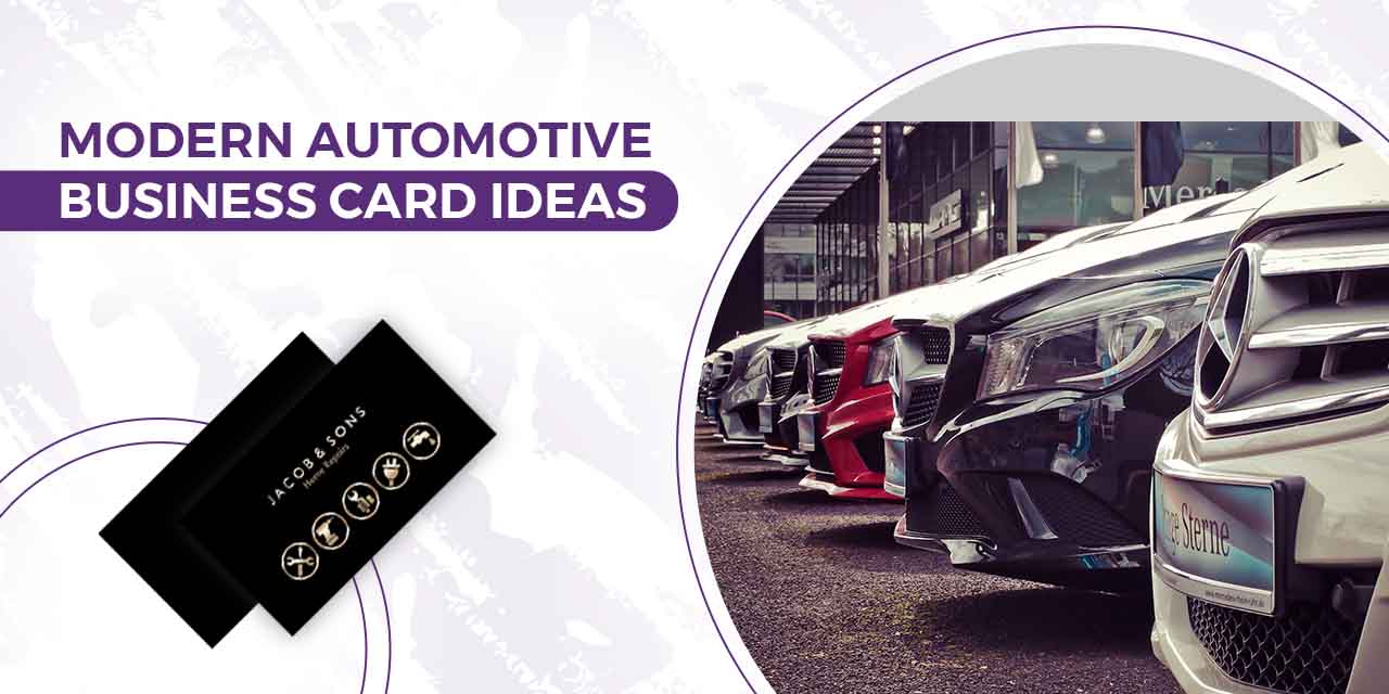
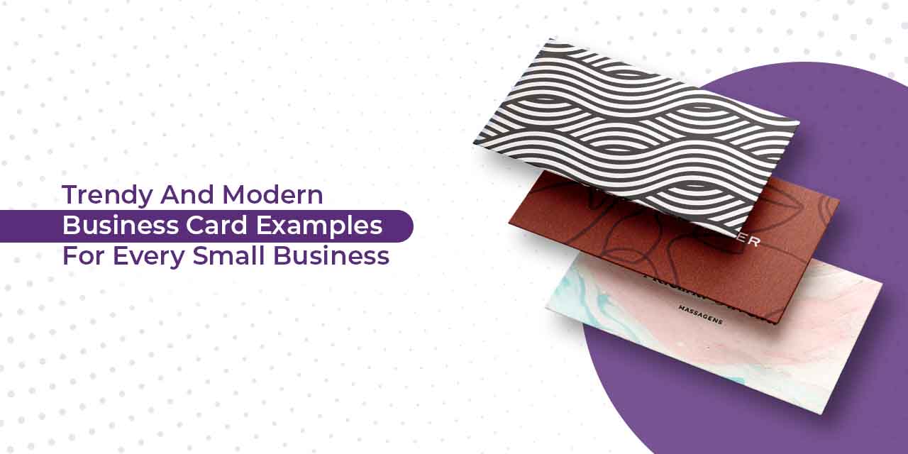
Despite being in the modern digitization age, where the first thing you would share with the other person is your Instagram handle, the tradition of exchanging business cards has not died out. Indeed, social media sites and web pages add another dimension to your brand, but the first ever impression or communication of your brand to the potential customer is always through a business card. 

A business card represents the owner, employee designation, contact information, and other essential details to the interested person or a potential customer. It is a concept drawn out of 15th century China when “visiting cards” were popular and acted as self-promotion brochures. Nothing much has changed since then, and the importance of business cards remains intact. 

Brands, these days, often get confused with what kind of design would suit best for their brand. Be it striking visuals or a bold color palette, the design you choose must resonate with your brand personality. In this blog, we have listed down a few modern business card examples and approaches you can consider while designing your business card.

Business cards examples for every business

There are endless possibilities and designs to explore that will inspire you toward your perfect business card. Check out these 23 modern design examples for various types of businesses that will win you clients and calls.

Retail businesses

As of 2022, more than 1 million brick-and-mortar retail stores run in the United States, selling a wide range of products to consumers. The result is saturation and more competition. However, with smart marketing tactics and genius branding, your storefront can become the talk of the town.

Grocery store business cards

Think about your audiences when you design business cards for your grocery store. For example, this bright yet minimal print card that judiciously used its brand colors exudes a fun-friendly neighborhood grocery store vibe. 

More than direct consumers these cards would benefit the networking of suppliers who may want to sell through your store, thereby expanding your inventory. Use the back of business cards to fill in essential information like the store address, email, phone number, or link to any social media community you may have. Highlight key USPs of the store, such as free home delivery, discounted pricing, etc. to attract more customers.

Drug-store business card examples

Source

Source

Look for modern templates with enough negative spacing to jot down essential details. For a drug-store brand, use primary shades of blue and white as they convey healing energy to customers. Keep the fonts lighter with minimal typography. Restrict to precise information. Most drug stores avoid quirky content to highlight the important details in their cards. 

Auto detailing business cards 

Source

Do you want your auto detailing business to stand out? Then use different materials other than paper or cardboard for your business cards. This fantastic card by Garage Culture combines a cotton paper stock base with its logo in the center of the card. You can use other materials that are used in automobiles, like tiers, seat fabrics, etc. to show your brand and services. Check out more auto-detailing business card ideas here.

Massage therapist business cards 

Source by Adelina Oliveria

Use similar patterns and color schemes as this muted pastel color business card which is bold yet elegant in terms of design. The intricate patterns and soothing typography looks creative and balances out the complexity of the background. These patterns can be compared with calming stones and rocks, which are an essential part of massage therapy. Such a beautiful design will assure your customers that they are in for a relaxing session at your store.

Plumbing business cards

Source

Think fair and SQUARE with your new plumbing store business cards. There is no hard and fast rule or standard size for business cards. It can be any shape or size, as long as it complements your brand aesthetics. 

This modern and minimal square business card by Crane Plumbing is a perfect example of how you can add a simple twist to your visiting card designs. The front of the card highlights the company logo/monogram, while the back of the business card has the complete information your customer requires.  

Roofing business cards

roofing business card examples

Source

There are more interesting ways to showcase your roofing business than a plain rectangle business card. Try out perforated cards that split or fold in half and form the shape of a roof. It provides a fun activity for the customer and allows you to spell out your brand without giving textual details. Keep one side of the card plain with only a roofing textured background and include details on the other side of the card. 

Paparazzi business cards

Source

Get on your paparazzi game starting from your business card. You can use these cards to create a mini portfolio of your work to ignite interest in the potential customer. Create a collage of your previous work to show off your photography skills. Win hearts from the first interaction. 

Moreover, using your work on your business cards will give you an edge to stand out from other photographers.

Floor and decor business cards

Source

As a flooring business, you must have plenty of materials to design your business card, then why not take the more sustainable route and develop wooden material business cards? 

They are sleek, modern, and extremely creative. You can opt for various typography options and experiment with text as well. Get your brand name carved out on the wood, or simply, get it printed or embossed, the possibilities are endless, and the material will give your customer a glance at the quality you offer. 

Creative professionals

Source

Provide an interactive visual experience to your customers through your business cards. If you are a freelance creative professional, use icons and illustrations to map your brand vision. Line art on a pastel background gives your design depth and meaning that receivers of your card will spend time exploring. 

The more artistic ability you show in your business card design, the higher the chances are for your potential customers to take your work seriously. You can weave your design story in your cards and create a lasting impression.

Daycare business cards 

Source

Use bright colors and cartoon illustrations to tie up with the core values of a daycare business and establish trust with your potential customers. Maybe take out the most popular painting from the last children’s competition and print it out on your cards with playful fonts. If you want your daycare business card to be a hit amongst the parents, ensure playfulness, trust, love, and care in each interaction.

Architect business card examples

Source

This subtle and minimal card design from Alana Cooke Architecture shows exemplary branding, exactly what an architecture business needs. The use of translucent plastic material instead of paper and clean fonts elevates the brand’s level of elegance. Since the initials of the brand are actually the logo itself, they cleverly blurred out the rest of the letter to highlight the logo. 

Business cards for pet grooming 

Pet grooming centers can try out illustrations, images, or quirky typography, depending on your business voice. The illustration of the dog on the business card is so large that it actually wraps around the front of the card to the back. This funky illustration provides an unexpected look to your pet grooming business card. 

Personal trainers & fitness industries

Source

Most businesses would avoid using black since the color overpowers the design. However, with an ever-evolving profession, using various shades of black complements the brand tonality. 

Use the darkest shade of black in the background and create the logo with a shinier material of a lighter shade of black. Here the blend and the difference in texture create the contemporary effect. You can use the back of the business card to share business details. 

Bakery business cards

Source

Bakeries should evoke the senses of the receivers through their cards. Use images, textures, and typography to attract customers. 

If you are a home baker, opt for minimal illustrative logos and fonts which look more handwritten than printed. Use edgy materials like craft papers that look recycled, to give your business a rusty and homely edge. Let the creases and crooked corners of the material provide a textural finish to the business cards. 

Fast food restaurant business cards

Source

Think about your customers and the food you serve. Is it teenagers or adults or school-going kids? Do you serve Chinese or Italian? Highlight these aspects in your business card.

For example, the business card of Toko Downtown in Dubai, one of the best Japanese restaurants, spells out the culture and modern art that the interiors of the restaurant carry. The marbling painting technique and modern subculture create a bright and rich visual for the restaurant brand. You can use a similar approach for your high-fashion store.

You can also use custom-made flat illustrative designs with peppy colors to make them look more tempting. Don’t know how to design illustrations? Get a dedicated designer and unlimited graphic designs for just $399 per month from Design Shifu. Don’t shy away from funky-looking graffiti that resonates with your audience. Most brands stick with red and yellow because these colors evoke hunger.

Photography business cards

Source

Use a gold foil business card for your professional photography business. Using canvas material gives depth to the textures you print on these cards. 

This business card is a great example of how textures and patterns can marry each other to create simplicity and style. The middle of the card has a clean cut to create a blank canvas for the contact information. 

Real Estate Business Card Examples

real estate business card examples

Source

The design output of the business cards completely depends on what persona you create for the brand. For something as versatile as real estate, you can opt for a clean, sleek, and professional-looking card that depicts luxury and finesse. Or you can stand out with an unusual cut-out business card just like the ones from King of Condos to leave a mark on your potential customers.

Personal Business Card Examples

Source

Source

If you are an independent creative professional, such as a florist, photographer, designer, decorator, or baker, your business card must depict your style. Add personalized messages or content on your business card to create a first-person interaction with your consumer. You can add depth to these visit cards by creating a repeating background with your logo. Give a glimpse of your talented portfolio to build more trust. When you design a personal business card, make sure to include your name.

Professional Business Card Examples

Source

Welcome your customers to the new age of digital business cards. Stand out from the rest and create a customized digital card that will take your marketing game to the next level. These cards are easy to design. The best part is you can change them anytime you want without discarding a batch. Add a QR code and showcase your social media pages or an existing online portfolio for potential customers’ reference. 

Artist Business Card Examples

Source

Create dramatic and eye-catching designs in your preferred genre of art to wow your potential customers. Give them a taste of your work by making your business card one of your masterpieces. 

Boutique business card examples

Source

You would be surprised to see what two contrasting colors can do to a design. The mix of the soft pastel pink with the deep earthy green gives a Yin-yang element to the design and makes it look more cohesive. The synergy of the color pairing is unreal. You can adopt the approach to create your own color combinations and templates.

Business Card Etiquette

You cleared the first step in communicating your brand’s message to your potential customer, however, the several seconds you spend while sharing the business card and the actions you take in this tiny span of time, speak volumes about the kind of impression you want to leave. 

A lot of things can be taken into consideration and not a lot of preparation is required, but following some basic etiquette while sharing or receiving business cards, can help you build an excellent rapport and network.

  • Always carry extra: While trying to expand your business you never know when the opportunity strikes, hence make sure you don’t embarrass yourself in a situation where you might actually be introducing yourself to a potential network/customer but you forgot your business card at home!
  • Keep the cards within reach: You must be swift and smooth while exchanging cards. You don’t want to fumble or rifle through a dozen things looking for your business card. It hampers your positive and confident impression.
  • Have fresh cards: Do not share cards that have faded out, are crinkled, or are old. Your business cards are the sole communicator of your brand/store; hence they need to look fresh and new. A little attention to detail can take you a long way.
  • Maintain eye contact and don’t interrupt: You are likely to have a conversation with the person you exchange your business cards with. A good rule of thumb is 50/70 where you keep eye contact 50% of the time that you speak and 70% when listening. Do not interrupt the other person’s line of thought or speech. It is considered rude. 
  • Send cards with products: If you are to hand over certain samples of your products or other brand materials to a client, make sure you always include the business card in the package.

How can you design your own business card?

It is not rocket science to develop your own business card designs. However, a few tips can amplify the design:

Design a template

Several online design software are available for free. You can create your own template or edit an existing one from the software library to design your business cards. However, we recommend you design your own templates to keep them unique.

  • Choose an appropriate font for your business card. The endless number of options can be overwhelming but always stick to your brand bible.
  • Include imagery/graphic elements/illustrations etc depending on your brand aesthetics, services, and products.
  • Include essential details like the name, contact information, address, email, logo, and social media page links.
  • If you are confused, do not have much time, and require help, connect with professional brand designers and digital artists. These professionals will analyze your brand from top to bottom and provide you with the best creative solution and design for your business cards. 

Alternatively, you can also subscribe to Design Shifu and get unlimited graphic designs made by a dedicated designer to take care of all your design needs. 

Wrap Up

Making your business card personal to you and your branding is one of the unique ways of leaving powerful and memorable impressions in your first interaction. Before you pick and choose from the plethora of business card examples, brainstorm and define your brand. 

You can keep it as simple as you want or go crazy with the design; it depends on the message you wish to deliver to your audience. We have done our part by providing you with the best possible examples of the designs that are in trend. The next step is yours!

Best Vintage Logo Design Inspiration for your Brand

Not every brand needs to adopt modern design trends while weaving its corporate strategy. Who said vintage and retro wouldn’t tie in with your audience?

As industries expand and more players enter the market, businesses need to play on different specialties. One can be its long history and years of experience; the other can be its relevance with culture and belongingness. Vintage logos allow brands to connect with their history to attract the right audience.

The first move for a brand to successfully tell its story starts with its logo. Each design trend represents an era. You’d be surprised when you notice how, for example, psychedelics brsing you back to the sixties and bubble letters look like seventies signage, whereas pixel art will transport you straight to the eighties and nineties. Retro design and vintage logos give the brand a classy look and uplift its originality, advocating a history of experience and expertise and instilling trust in customers. 

In this blog, we’ll learn more about vintage logo design inspiration, its types, needs, and how you can design a vintage logo for your business.

Let’s get started.

Why Vintage Logo Design? Is It A Good Choice For Your Business?

“Vintage design is highly emotional because it belongs to the history of each of us. It evokes nostalgia in people of all ages,” says Olimpio, a 99designer.

Brands usually decide on going for a vintage design for their logos either to position themselves as an experienced player in the market or to provide the customer with the experience of a specific era. If a barbershop wants to capture the essence of a 20th-century tonsorial parlor, or if a theater company wants the customers to remember drive-in theaters of the 60s, all they need to do is go back to the design trends of that era and incorporate them into their brand design. 

Choosing vintage for your business depends on the feelings you want to evoke in your potential and existing customers. A vintage logo is not just about selecting an old design. You must go back to your research zone and learn about the colors, media, print prowess, visuals, and design details popular back in the day. 

For example,

“If you want an Americana feel,” says Lippard, referencing early 20th-century American design, “there’s a dirtiness to it. 

When your customer is familiar with a product or design, they immediately establish an existing relationship with it. You, as a business owner, can capitalize on this evoked nostalgia. The vintage design establishes a positive association between your product and your consumer. While certain brands are stuck with their decade-old design because they don’t want to ‘mess with success,’ newer brands want to create successful marketing burrows in the consumer’s mind through vintage designs. 

When you listen to a song on repeat a hundred times, you develop a relationship with it. It comforts you and you tend to play that song often. Similarly, adopting a design from the past makes the viewer feel like they are walking through their favorite parts of the past hence creating a positive nostalgic association. But to what extent nostalgia works for your brand depends on your targeted niche and the nature of your product/services. 

So, you must know your audience first, figure out the story you want to weave, remember the value you create and want to impart, visualize your identity and then figure out if you want to invest in this certain emotion for the brand. 

Vintage logo design inspiration 

Texture logos

Textures add depth to the design, which automatically evokes the touch sensation. Customers are attracted to the images you present to them physically and psychologically, and adding even the basic texture grabs the viewers’ focus.

Many F&B and apparel brands that want to provide an immersive experience to the customers incorporate texture into their branding. When it comes to vintage logos, adding a little bit of texture gives them a whole new personality and your customers are immediately drawn to their authenticity. Take a look at these few examples of vintage logos used by brands.

Dough Works

Vintage logo design inspiration 

This vintage logo design of Dough Works highlights muted shades on darker backgrounds, and faded textures in the typography are pretty self-explanatory. The crumb textures on the typeface and the precise detailing on the dough emblem alone convey the message that the brand gives you the best-baked goods in town.

The Farmers Union 

Apart from text, detailing certain elements of your vintage logo helps the design pop, much like this logo from Farmers Union Coffee roasters. It has textures in the leaf element of the coffee plant drawn behind the typography as well as in the animal character. Compared to a flat design, it adds a unique touch to the logo especially because of subtle color tones and textures to bring out the brand vibe.

Handwritten typeface logos

Handwritten typeface logos bring out simplicity and authenticity. Adding only text to your brand face is indeed a bold move because, as easy as it looks, the most minute details are examined to ensure effective communication with the audience. Handwriting typeface logos were widely popular in the 60s, 70s, and 80s — be it in 3D, flowy serifs, heavy chunks of content, etc. If you want to picture it, think about 60s pop album art in flashy colors. Although some brands have adapted a flatter version of the logos, you can see that they have retained the handwritten format and structure. The best example is Coca-Cola.

Revolution Roasters

Vintage logo design inspiration 

Carrying forward the grove, this 70s-inspired vintage typeface logo for Revolution Roasters sends out an immense hippie vibe. The custom hand lettering shaped like a coffee bean brings out the progressive, quirky and dynamic nature of the brand — something that truly defines Revolution Roasters and inspires you and other businesses to design vintage logos.

Typography Vintage Logos

If you are not a designer yourself, typography logos are the best and the simplest type of logos to create. All you need is a bold, progressive brand that does not require intricate details to convey its message and choose a typeface that resonates with this message. Vintage logos are the epitome of typographic logo inspiration. Several brands opt for typography to highlight the brand name.

Cabela’s vintage logo design inspiration

Cabela’s logo screams Canadian, and we might as well call it the Canadian icon. This vintage logo gives us the 70s vibe of a perfect summer retreat, wooden porches, iced tea, and all-you-can-do outdoor activities. The subtle font, bright yellow color palette, and cursive typography give the brand the vintage feel it deserves.

Frankowitsch Delikates Seit 1932

Pastel palettes have found their way to the current design trends. Back in the 40s; however, when the actual use of these subtle shades originated, it captured a joyous picture for the brands and their existing audiences. The simple red cursive font combined with pastel shades of green, blue, red, white, and stripes gives the grocery brand, Frankowitsch, the perfect European summer vibe. If you are thinking about opening a European-themed cafe or retail store, check similar vintage logos like Frankowitsch, to get inspired.

Illustration Vintage logos

Custom illustrations and typography add character to your brand logo. They bring out the liveliness in the design and encourage your audience to form a connection that prompts them to buy from you. Illustrative logos ignite visual triggers. 

You can go for minimal illustrations, mascots, or cartoon-style illustrations while retaining the vintage aesthetics. It all depends on the products and brand guidelines. Why not take help from Design Shifu to design custom illustrations for you? You get unlimited graphic designs and a dedicated designer to take care of all your design needs. 

Hes Burger’s vintage illustration logo inspiration

Vintage logo design inspiration 

The cartoon-style illustration for Hes Burger triggers nostalgia. The character design of the hamburger with a welcoming face and hands that cover up the length of the typography and the use of white and red without overpowering the design together attracts its targeted customers, who are probably toddlers, teens, and young adults. Cartoon illustrations are a great way to attract a younger crowd especially if you are a fast food joint.

Pictures Animation Studio illustration logo

Source

Pictures Animation Studio’s logo is based on a vintage character — Pipa, who originated at the beginning of the animation industry. The use of bright color palettes provided with white brings out the contrast in the design. The cartoon illustration gives the brand a perfect retro feeling. The typography is consistent with other elements of the logo and ensures readability.

Noise logos

Adding noise to designs has been the mark of retro. It is a kind of imperfection that adds details and depth to the design. Old-fashioned films/videos, and designs are famous for having speckles and pieces of various colors in places where they should not be. But this imperfection is something that was adapted by design trends nonetheless. 

Century Coffee Club

Source

The detailing of Century Coffee Club’s vintage emblem logo is impeccable. In the 70s and 80s, the medium of marketing was primarily print. Since print technology was evolving, it had grains and imperfections in color. Newer brands imitate the print style to reflect the printing style of the time. Notice the pixels on the negative space of the emblem. You can also add noise to your vintage brand logo to give it a retro feel. 

The Brewski Textured by Kurt Harahap

Source

Hand-crafting your vintage logo design gives a traditional touch to your business and product portfolio. The noisy texture behind the hand-drawn monogram; gives it an intentional 3D effect, a perfect example to show how flaws in designs actually accentuate their personality.

Scout badges vintage logo designs

Imagine you are a tour & travel company specializing in taking teams on adventurous hikes. What is better than designing your brand logo shaped like a scout badge? Connecting certain design elements to the core USP (unique selling point) of the brand helps the audience decode brand communication effortlessly. 

Scout badge logo designs enclose elements in your logo. You can choose from a plethora of badge shapes. Check out a few examples of Scout badge vintage logos.

Yellowstone National Park

Source

This authentic badge-style logo from Yellowstone National Park originates from the old Jurassic Park themes. The gothic colors and the silhouette of the wolf adds to brand authenticity. The park became one of the three recovery areas for the Northern Rocky Mountain wolf, a species almost on the verge of extinction. 

V-House Steak bar scout logo design inspiration

Source

This utterly beautiful golden embossed logo will remind you of an 80s Hollywood party, where the room is filled with the icons of the century drinking champagne and stories of glory. This chic vintage look goes very well with luxury brands much like the premium eatery V-House Steak and Bar.

Retro mascots Vintage Logo Design

Using characters and mascots in logos and branding develop a unique brand personality. It has been a long-standing tradition in marketing. Look at Duolingo and KFC. More brands are experimenting with mascots to amplify personalization and customer engagement. 

Nellie’s

Source

Nellie represents a simplistic way of clean living with the mascot of a cleaning lady. Take note of the vintage color palette — blue outlines and bright yellow color gives it a television commercial look from the 1950s. The use of a simple cursive font and the cleaning Nellie mascot will do the vintage trick for your brand. 

ISRO mascot logo

Vintage logo design inspiration 

Source

Observe this mascot representing the 1947 brand ISRO which recently developed the Gaganyan, which makes India the fourth space superpower to independently carry out manned space flight. The mascot transports us back to the arcade and the era when NASA had just launched the Apollo program. Using mascots for brands and projects creates a sentimentality in the customers, which is beneficial in terms of marketing and sale.

Most Popular vintage logos

Plush

Source

Designed by Jacob Light, Plush logo gives us a glimpse of minimalism in the 80s design. It uses serif fonts and an illustration of a dog, all designed using one color. 

Ben and Jerry’s

Source

You can give your brand the perfect artisanal look much like the vintage brand logo by Ben & Jerry’s. This rugged hand-crafted logo communicates the brand’s authenticity and promises to deliver world-class ice cream from their homemade recipe and ingredients that grow in their own backyards.

Jack Daniel

Source

Jasper ‘Jack’ Newton Daniel’s famous charcoal-mellowed whiskey will transport you to heaven with its product and brand design. This Jack Daniel’s logo looks like a simple pen illustration, yet it successfully represents the brand. 

Red Wagon Diner

Source

The retro logo of Red Wagon Diner combines vintage fonts, color palettes, imagery, and shapes to create an old harmony. See how elements combine together for the restaurant brand logo

Coca Cola

Vintage logo design inspiration 

Source

The use of the classic red-white and the fishtail sign is something that has remained intact over the years of Coca-Cola’s swirly transformation. Observe the calligraphic typeface used in the logo of Coca-Cola. The edges of the letters pose a similarity to a handwritten calligraphy note. Currently, Coca-Cola has a more minimal logo; however, the roots of the original are easily recognized.

We have another list of 30 Vintage logo design ideas you cannot miss out on for you to check out for more inspiration.

It’s time to change your logo!

Vintage logos effectively communicate your brand voice and history to your audience and evoke a sense of familiarity. Your logo can be anything from a handwritten mark to a mascot. Decide on the brand voice to find the unique logo that your brand deserves.

Once you have decided on the vintage trend for your brand, figure out how to strike the right balance between the modern and vintage elements in your design. A perfect blend between the two will uplift your visual cues and successfully engage with your existing audience. 

Research the design style, color palettes, fonts, and construction associated with your chosen style. Combine custom illustrations, typography, colors, and layout to achieve the look that you are looking for. 

Do you want help designing a vintage logo for your business? You can always count on Design Shifu for all your logo design requirements. Not to forget, you can always pick from our subscription packages that best meet your needs and budget. What’s more, these subscriptions come with 24×7 support, unlimited revisions, and a 100%, 14-day money-back guarantee!

Modern Automotive Business Card Ideas & Examples

The US automotive industry ranks third in the world. Even though the overall sales have decreased, it contributes 3% to the GDP

Every interaction and every sale count in the automotive industry. Therefore, business owners and professionals willingly run the extra mile to secure business and client relationships. Designing a unique on-brand business card is one such run. 

For an automotive business with a wide variety of services and selections, a business card or a visiting card offers an overview of your services to your potential customers. Apart from giving out your contact details, your business card reflects the persona of your automobile store, whether you are cool, bold, strong, or funky. Brands are constantly thinking out of the box in terms of design, colors, typography, and even material while developing their cards. 

We have curated a list of modern and impactful design ideas for your automotive business cards that will work no matter what kind of business you own.

Automotive business cards design inspiration

Think of your business card as a medium to introduce yourself as a potential service provider and remind them continuously of your automotive business every time they have a requirement. Let’s dive in.

Car Accessories Automotive Business Card Design

Source

If you are a car accessories brand, mention your offerings on the business card. Make sure the visiting card highlights your areas of expertise. Add your logo, design elements, and text. 

Since car accessories are mostly upgrades and customers tend to look for premium quality, go for a bold color palette, preferably lighter shades paired with black to reflect luxury. Include social media handles to direct your customer to your social portfolio. You can also add an email id and create an emailer database to send the portfolio to your existing customers and start your own newsletter. This establishes trust and credibility, increasing the chances of conversions.

Rent-a-car Automotive Business Card Design

Source

If you meet someone dealing in rental cars, wouldn’t you want to know about the range of vehicles their company offers for rent? What if you made the information available on cards. 

So, go ahead and pick out your best-selling car(s)/brand(s) and print them on the visiting cards to attract your audience. Instead of contrasting colors, try to use shades similar to the image and add drop shadows for a 3D effect. 

You can also include offers in text bubbles and keep changing them as and when required. However, keep the design intact while doing so to maintain brand recall.

Car Dealer Visiting Card

Funky Automotive business cards

Go for a funky neon look for your car dealership business. Pick a bright, flashy neon color palette and add it to your graphic element in the center of the card on a dark background. Bright colors on automotive business cards radiate optimism toward the customer looking for a big purchase, potentially from your brand. You can also fill the negative space with a bright color to add energy and evocativeness. To give it a modern touch, bid adieu to the traditional horizontal business cards and welcome the edgy vertical designs. 

Minimalist automotive business cards

Source

Minimalist designs are widely used. The concept of ‘less is more’ is very much applicable to business cards because the scope of extensive messaging is limited by size. A minimalist design allows your potential customer to focus on the crucial message without getting distracted by irrelevant elements. Include an enlarged logo at the center of the card, and add your name, title, and contact information.

Make-your-car Visiting Cards

These fun card cutouts can be rearranged to make miniature versions of car models. Being a car dealership business, make your customers feel that they are making the right choice by giving them exactly what they want. Who knows your miniature model car might just make it to the customer’s object collection!

Auto consultant visiting Card

What is the best way to be transparent with your customers? A sleek and solid transparent business card (pun intended). 

If your initial message to the customer is as clear as your business card, they are likely to avail of your services. A clear frame will allow you creative freedom with colors and typography. A transparent card also fulfills the minimalist criteria because precision in messaging and design is essential to put your communication through if you are choosing such an intricate material. Add some pop of color to make a truly one-of-a-kind automotive business card for your business.

Car Detailing Automotive Business Cards 

Car-shaped automotive business cards

Source

Think out of the box with your business. Get customized cut-out cards instead of conventional rectangles. They are interesting to look at and functional. These cards speak volumes about your brand. You can choose any material for the cards to keep them sturdy and long-lasting; however, preferred textures are metal and wood. If you are worried about whether they are foldable or can fit in a pocket or wallet, you can select paper or thin cardboard.

Textured metallic cards

Source

Car detailing services allow customers to upgrade their automobiles; hence, premium and good quality services are automatically expected from your brand. Make your business card as unique as your store, and spell out your services literally by investing in metallic textured business cards. You can customize the detailing on these cards as per your brand aesthetics. Choose a contrasting color for textual details. A 0.5 mm thick black metal template with red spots and a prism finish can provide your visiting card with a luxurious look.

For more business card ideas for an auto-detailing business, check out our blog here.


Mechanic Business Cards


Wrench business cards

Source

Think utility when you are a business that provides repair services. What unique things can you do with a business card that would be useful to your potential customers? This thought would allow you to take regular business cards a step further. You can use a metallic base for your business card and give away inserted wrenches or screws. Giving your customers something functional makes you memorable and offers a competitive edge. Now, whenever they see a wrench, they remember your business card and your business. 


Illustrative mechanic business cards 

Source

We have talked about modern and out-of-the-box ideas for automotive business cards, but sometimes keeping it simple might just be equally effective. Illustrative prints with elemental graphics, which talk about your brand and its services, are very much in trend. It gives your brand a young and creative personality; something that a niche audience will resonate with. If illustrations are not your strongest suit, why not let Design Shifu take care of it? With a monthly subscription, you get access to an expert designer who can handle all of your design needs.

Auto repair business cards

Source

Some of the best marketing tactics go viral through quirky content marketing. These tactics can also be incorporated into your brand visiting cards. Something as simple as ‘ No Job Too Big Nor Too Small’, right below your store name conveys your brand values. 

Add your brand tagline or values on your card to tell your audience what you stand for. You can also think of a quirky conversational message that makes them interact with your card. 

Car wash automotive business cards

Capture motion in your visiting cards

Source

Usually, millennials and youngsters who like to keep things clean and updated are the target consumers for car washing stores, hence your business card must reflect their values. One way to show your excellent service is to capture the action of car washing on your card. Get it clicked and edit the photo for highlight and contrast. You can even add a before and after image of the car.

Splash visiting cards

Source

It could be deceiving at first but this genius business card might just become the talk of the town. “ You’ve dirtied the car? Don’t worry we will fix it “, these splash business cards are a guaranteed crowd-pleaser. It is not only smart but delivers the message to your potential customer in a unique fun way. Put it up like a parking ticket (in adherence to the law) and see the reaction, use both ends of the card — one for the illusion and the other for the call to action. 

A car wash ticket

Source

Tickets create a sentimental impact on the customers, if you are not going for sentimentality; think convenience for your customers. Add instructions and directions on these ticket-shaped business cards and ask them to hand them over when they come for a car wash. You can add incentives for customers who complete the process by offering them discounts so that they visit back to the store. Adding little tasks for the customers gives them an immersive experience that they are bound to remember. 

Motor Vehicle Insurance Visiting cards

Gold emboss cards

Source

Embossed business cards are a class apart. You may choose to make the card completely golden or just add intricate designs and detailing. These foiled embossed cards provide a luxurious touch. A motor vehicle insurance company has to be trustworthy and credible; gold embossing elevates the overall look and feel of the brand.

Cut out cards

Source

Subtracting material from the card gives it an unexpected depth and interesting detail. Cut-out cards are a valuable addition to minimalist designs. Many business owners create cut-outs of their logos on the business cards to highlight the business name. You can also make cut-outs of your brand logo on the business card and add your contact details in the form of plain text. 

Do’s & Don’ts for designing automotive business cards

You may have a flashy store, an immaculate website, and brilliant marketing gimmicks up your sleeves, but having an attractive business card is equally important. Business cards will always be one of the greatest tools for networking and acquiring new clients. It is the face of your brand and the first impression your potential customer gets. Hence you need to ensure that the design you choose is effective to hit the right spot. Here are some dos and don’ts you must follow while designing your automotive business cards:

Do’s for automotive business cards

Do not settle for generic card designs. Your layout does not have to adhere to formal aesthetics, but it can help you position elements in a better way. 

  • Prioritize readability

The purpose of a business card is to pass on information. While creativity is important, do not let the information get lost in the design. Take care of the font size, color, and space to make it effortless to read information. 

  • Choose proper color schemes.

Color schemes are important for brand recall, being an automotive business, you can use two or three shades of contrasting colors in the cards. If you want to keep it bright and bold or mellow, it completely depends on the brand but makes sure to remain consistent with the color palette

  • Select visuals carefully. 

While being abstract is not a crime, you must use relevant visuals that make sense to your customers, since business cards have limited space. For example, using traveling cars instead of accessories may misdirect the customer. 

Don’ts for automotive business cards

  • Information cramping

A common mistake that business owners make is to cramp the list of their services on the business card which leaves the customers confused and overwhelmed. So restrict to the basic questions (Who? What? Where? Why?) and most relevant services. 

  • Stay away from the glossy finish

It can be tempting to use a glossy finish business card especially if you are a car wash or detailing business. However, information on these cards is often not readable in direct sunlight because the light bounces off of the design.

  • Avoid clutter. 

If your business card does not have a proper layout and is overpowered with text and graphics, it becomes difficult to read and may irritate the customer to the point of discarding it.

  • Never underestimate negative space

Proper use of the negative space in any business card design is equally important as limited information. The judicious use of white space will create a proper balance in your business card and make it look more appealing.

How can you design your automotive business card?

You might be a brilliant automobile consultant, dealer, business owner, or mechanic. But you may not be a brilliant designer for your business card just because you know the brand better. So, we advise you to invest in professional designers to help you make a memorable and profitable automotive business card.

However, if you wish to design it by yourself, follow these tips for better results:

  • Imagery

Images add depth to automotive business cards, sometimes even more than text. You can choose pictures of a car, truck, or minivan and convey the same message effectively. A bunch of stock images is available online that you can download at a menial subscription fee. Avoid free images. Nothing is better than original photographs clicked in your store.

  • Online Software 

You can find user-friendly design software online with countless features. You can customize your logo, font, and color palette as per brand guidelines and choose multiple graphic elements for free. Do not copy the available templates because it will hamper the trust and uniqueness of your brand.

  • Professional design consultant 

Even if you design on your own, you can ask a design consultant to analyze your automotive business and suggest designs that synergize with your brand. Professionals know exactly what to include and avoid for effective communication with their audience.

Wrap Up

Once you are satisfied with your automotive business cards, you can start circulating them to potential customers via email, and social media. Keep a stack available in-store for regular distribution. Remember that no matter what design you pick, the main objective of your business card is to convey your brand message to compel the customers to choose you as their service provider. 

Do you want help designing such compelling business cards for your automotive business? Check out the flexible plans at Design Shifu and get an automotive business card made as per your brand requirements. These plans come with unlimited revisions at no added cost. Not to forget, there’s a 14-day money-back guarantee, just in case you aren’t satisfied!

Best Roofing Business Cards to get Inspired in 2023

As long as there are buildings and houses, people will want roofs on them. The roofing business is excellent, but competition is fierce, so you must stand out from the crowd. A smart yet contemporary business card can help you make an impactful first impression. Stay with us through this blog if you want to set yourself apart from the card. 

Roofing Business Cards Examples 2022

Minimal Roofing Business Cards

You can opt for a business card that appears clean and contemporary despite its simplicity. When it comes to business cards, in particular, branding is everything. This type of business card speaks professionalism.

Put the Concept to Use

Give the card a brand-friendly hue. Place your logo in white on top of a dark, “brand-friendly” colour. The colour scheme should be reversed on the card’s opposite side, and the brand typeface should be used with centered text. Make the company’s name more prominent, implement the brand’s tagline in a secondary font, and use a straightforward sans-serif font for other information. You can use simple house illustrations to add to your card design.

Best Roofing Business Cards

Source

Vertical Layout Roofing Business Cards

‘Think Out of The Box’; we often hear this phrase. Well, it’s time to put that to use. Usually, business cards are made in a horizontal format.

Companies sometimes use a vertical layout to get people’s attention in their business card design.

Put the Concept to Use

Change the layout from vertical to horizontal. Try to incorporate artistic designs and geometric lines for a contemporary look. Stick to minimal illustrations and crisp fonts. Opt for only two colors in the card design.

Source

Metal Roofing Business Cards

Metal Business cards have a unique design that you can choose from. This business card will make you stand out among your competitors.

Metal business cards should be your first preference if you want to impress people.

Put the Concept to Use

These cards cost at least $3 to $4 each, so your customer lifetime value (CLV) should be high if you spend that much per card. However, if you believe in having an impact and are prepared to go to extreme lengths, this may be the perfect opportunity for you. This business card seems like polished brass, but it’s not. 

Best Roofing Business Cards

Source

Folding Shingle Business Cards

One of the more creative business card designs you can try is a Folding Shingle Business Card. Basically, a business card folded into the shape of a house and had shingles printed on it. 

Put the Concept to Use

Consider how your business card can be more than just a printed piece of paper. How can you encourage recipients of your business card to actually notice its layout? You’ve enhanced the association with your firm above the ordinary if you can get them to play with it or talk about it for longer than 15 seconds. Never undervalue the impact of “REMARKable.”

Source

Sustainable Business Card

In 2022, businesses are getting more environmentally friendly everywhere. Why not print business cards using ecologically friendly materials like recycled paper because most of them are thrown away? Or, if it works for your company, choose cork or recycled cardboard. You’ll still be able to design whichever you want, but with the benefit of sustainability.

Any business that values sustainability and incorporates it into every aspect of how they conduct business should consider adopting this business card trend.

Put the Concept to Use

The roofing business can customize the card design. To make sustainable cards, newspapers, paper cups, paper shopping bags, etc., can be recycled. Business cards are available in the market that can be planted in the soil also called plantable business cards. Such measures by the business can build customers’ confidence to opt for your services.

Best Roofing Business Cards

Source

Do’s & Don’ts of Designing Roofing Business Cards

DO’s

Highlight Important Information

When designing your business card, highlighting the right information is essential. Always remember that the customer will focus on the information you showcase on the business card. Therefore, Company’s Name and Phone Number should be the primary focus and be mentioned on the card’s front side. Adding the company’s website, OR code, and social media handles to the roofing business card is also vital. Add this information to the back side of the business card.

Use Clean, Modern Fonts

Fonts play an essential role in any design. Always use the appropriate font style in the business card. Choosing a font depends on several factors, such as the type of business, the message’s nature, and design types like logos, brochures, and many more. Arial, Times New Roman, Helvetica, etc., have become outdated font styles. For the Roofing business card design, use stylish and modern font styles which define the business and convey the correct message to the audience. Fonts such as Impact, Raleway, Lato, etc., can be chosen for the card design.

Use Periods and Bullets

A clean, minimal design looks more attractive than a sloppy, cluttered card design. Listing information in points helps the reader decode the message quicker and more efficiently. Use bullet points to record information on the card to make the format appear smart and classy.

A good tip is to exclude words such as web, fax, and email and remember that you don’t need to put the old “www.” or ‘https’ before your website address anymore. This will help you decrease the information on the card too.

Keep the Color Scheme Legible

One of the most crucial factors to keep in mind while designing a business card is the number of colours used in the card design. Always use a maximum of three colours in the business card design. The design colours also depend on many factors, such as the brand’s core values, the nature of the business, design type, and many more. Using colours based on these factors will add a more meaningful story to your design. 

DON’Ts

Overcrowding Information

When you add too much information to the card, it looks unprofessional. Avoid adding unnecessary information to your business card. Use a tent card(double-sided card) to make more space for your text.

No White Space

Less is always more. White space is your best friend when it comes to chic and classic designs. You can make your card look clean by adding less content and designs to your business card. Try to decrease the font size to 8-9 points rather than 12. The business card is too small for a big font. Give the smaller font enough white space so your information can still stand out.

Skimp on Quality

Your target niche has fading eyesight customarily. A small font size creates a negative Moment of Truth if THEY CAN’T READ THE INFORMATION! Therefore, it is vital to imprint high quality business cards. Use at least 12 pt. card stock, also referred to as 100 lb. card stock. Customers will use the quality of your card as a defining factor to judge the quality of your service.

Scattered Text & Typing Errors

A strong right or flush left is much more potent than a centred alignment. On the other hand, a typo in your card can create a poor image in the customer’s mind. It is advised to set proper alignment to the text and check for any typing errors before printing the business card.

What to include in Your Roofing Company’s Business Cards?

Contact Information

The business card’s basic function is to provide important information about the company. A simple logo and the company’s name on the card will not do the job. Make sure to add the following information so that your potential customers can reach you easily:

  • Phone number (direct and business, if separate)
  • Email address
  • Physical address (if any)

Website

In the digital era, every business has its website to make the user shopping experience convenient, but not all are vigorously updated. Therefore, you can take advantage by adding a URL and a QR code of your company website to your business card, instantly differentiating you from your competition.

Social Media Handles

Almost everyone nowadays has access to social media such as Facebook and Instagram nearly every day. To verify credibility, customers, most of the time, check the social media of any company. Indeed, you don’t want to miss the opportunity to connect with your potential customers on social media platforms if you aren’t connected already. Here are a few ways to display the social media channels of your new business cards:

  • Complete URLs featuring your usernames or social media page titles (e.g., www.facebook.com/designdshifu)
  • Usernames for profiles (e.g., Instagram: @designshifu)
  • Add social media platforms icons where you have profiles

Takeaway

We hope that this read was worthwhile! Want to create such trendy roofing business card designs for your roofing business? Why not consider Design Shifu? You get a dedicated designer to take care of all your design needs on a monthly subscription. Additionally, your subscription also comes with a 100%, 14-day money-back guarantee.

Best Plumbing Business Cards: Ideas & Examples

As soon as you enter the market, it is crucial to establish your identity! To establish that identity, ads and social media presence become necessary.

Despite the way the world is turning towards virtual space, traditional forms of marketing will not die, they still have a place in business.

Out of them, one is a business card.

Business cards are a low-cost investment that can help you build brand visibility and brand identity.

Plumbing business cards will help your plumbing brand stand out in this crowded market.

The use of marketing collaterals is an effective way to increase brand consistency and awareness. With your business card in their hands, customers can learn more about you and contact you easily.

Why is important to have plumbing business cards?

Handy to use

One can carry the business card in the pockets where one goes which could help in giving to whoever you meet. Because you never know who would turn out your next client.

Depicts Reputation

You should not tell someone to write down your number on paper. There is an indication of unprofessionalism here. It is possible to hand the card to prospects if you carry it directly.

Cost Efficient

Business cards are one of the most affordable forms of marketing material available for your company.

What should be included on the plumbing business card?

Here is a list of a few details you should add to your business card:

Name

On your card, include your entire name and your title. To let potential clients know about you, mention both.

Logo

Logos are important on business cards as they represent your business and are the first thing clients see. So design the logo in such a way it could depict your company. Having trouble designing such a logo? Don’t worry!

You can always trust Design Shifu to provide you with exceptional designs at on a monthly subscription..

Tagline

Due to the fact that they capture consumers’ attention, taglines are crucial. Customers clearly understand the advantages of your product when they hear your catchphrase.

Contact Details

A contact number is the most important piece of information on any business card. Include your active phone number. Email is also equally important. Don’t forget to mention your official email.

Check out these incredible business card examples to get started:

Inventive Plumbing Business Cards

Source

A creative and inventive background can make a business card appealing and attractive. The flaming background on a business card can indicate a creative mindset. Any creative business can use this type of card, such as fashion design, interior design, etc. If you like this kind of business card design you can explore multiple designs here as well.

Modern Twill Grid Business Card

Plumbing Business Cards

Source

Instead of using old-fashioned designs that people will find unappealing, use a modern and attractive business card design. Using a twill grid, the information is displayed in a light-shaded grid in the background. On the front side of the card, there would be the twill grid and on the backside a plain background.

Metal Plumbing Business Card

Plumbing Business Cards

Source

An interesting idea for designing a business card! Instead of using paper, using metal would look unique and of course, would be more durable.

Retro Look Business Card

Plumbing Business Cards

Source

With a retro theme design on the front of the card and detailed information on the back, your card will have a unique look.

Textured Plumbing Business Cards

Plumbing Business Cards

Source

If you are designing the business card, you might want to consider adding a textured background to the front with the name of the company. This would give a brand-new look to the business card.

Minimal Designed Business Card

Source

Keep the design of a card minimal, it gives an elegant look and eliminates all the unnecessary elements. It also adds to the professionalism of the design.

Sum-Up…!!

Personalize your business card and use a legible font with your contact information in bold. A business card is a physical representation of your company that outperforms an impersonal email. With the help of a professional plumbing business card and a meaningful conversation, you can close the deal more effectively than with an impersonal email. Keep your layout clear, consistent, and prominent so that your contact information stands out.

You can use these templates if you want to create an impressive, stylish business card in a way that is different from your competitors. You can choose from a minimally designed business card if you want a less flashy business card. When you want a minimalistic look, metal business cards look great. For expert design services, subscribe to Design Shifu’s monthly unlimited plans for getting great designs on a subscription. You get a dedicated designer to take care of all your design needs These plans include unlimited revisions at no extra cost. Not to mention, there is a 14-day money-back guarantee on every plan.

Passing out Flyers Made Easier: Best Practices to Follow

Flyers remain one of the most cost-effective ways to increase your visibility, attract new customers and establish your brand identity.

In the era of digital marketing, small business owners can leverage flyers as a marketing strategy to gain a competitive advantage. However, a lot of flyers end up in the trash because of bad practices and undeveloped strategies. While fleshing out an attention-grabbing flyer is essential, distributing it to the right audience requires a full-fledged strategy. That includes the passing out flyers strategy as well.

We have curated a list of best practices related to handing out flyers physically. Now, maximize the results of your advertising campaign while passing out flyers by using the following tips and strategies.

Tips to start Passing out Flyers

Know your target audience 

Distributing flyers to everyone on the street might get you some attention, but it is useless if you do not attract your potential buyers. 

Define your audience’s age and interest, which will in fact, help you design the flyer even more effectively. Distribute flyers where the percentage of your target demographic is more. 

Consider the weather 

passing out flyers

A few drops of rain is enough to ruin your campaign. It is rare for people to be outside when it is hot, and they rush to get inside when it is windy. Ensure you are distributing your flyers at the right time and weather. Pick a bright sunny day when the weather is pleasant, moderate and cool to have a successful flyer campaign. The goal is to reach as many potential buyers as you can.

Person-to-person flyer advertising

Passing out Flyers

Many businesses leave flyers hanging in stores, on benches or on tables. While it is okay to leave them on countertops so that they advocate your business in your absence; do not forget that person-to-person holds a distinct place as people respond to flyers more quickly because they find it hard to say directly ‘No.’ 

When you pass out flyers by hand, try a friendly, memorable conversation so that people remember you and your brand. Avoid being too pushy. 

Multi-Drop Flyer Distribution 

Passing out Flyers

The most convenient and hassle-free way to distribute flyers is through newspapers and magazines. This method might cost you extra money, but a lot of time and effort can be saved if you are running short of time and have a lot on your plate.

B2B Flyer Distribution

Passing out Flyers

Establishing local relationships with small businesses in the same industry will foster growth and opportunities for both sides. Find out the businesses and stores that complement your services and products. Reach out to the owners to see if they’d be willing to help you out. While passing out flyers for pedestrians, take a small stack out for distributing it to other businesses. 

What to say when passing out flyers?

When you’re handing out flyers, what you say and how you say it is important to leave an impression. First impressions are mostly the last. Go for a personal connection that compels your audience to check out your products and services. 

The first step is to greet them with a smile. Talk about your brand and product. Too much information will confuse your potential customers. Keep it short and simple. Explain what value your brand can bring to your customers. 

Most importantly, speak up. Your flyer might have everything about your services, but it cannot replace the human connection. Do not let your presence go to waste. Here are a few tips to help you out:

Exchange a smile 

Handing out flyers can be daunting especially when you face rejection and denial. Go out with preparation and stay humble. Approach your potential customers with a genuine smile and enjoy the time. Make your first interaction warm and friendly so they feel free to ask you questions.

Practice beforehand 

If you are doing it for the first time or if you fear public interaction, you may become anxious and forget your pitch. So, practice before the big day. Ask your friends and family to help you. Prepare for common questions you may get asked.

Dress well 

As we said earlier, your first impressions matter! So dress nicely to appear friendly, approachable and professional. If you have a t-shirt or a hoodie with your business name on it, excellent! Wear and flaunt it. If not, choose an outfit with your brand colors or something that aligns with your band’s personality.

Best places to distribute flyers

The most neglected part of any campaign is choosing the right location. Many businesses spend a huge budget on printing out flyers and distributing them to the wrong audience. So, list down the places where your customers hang out. 

Your promotion can skyrocket by choosing popular gathering locations such as public transportation, business gatherings, and libraries. People are more receptive to looking at what you offer there. Over time, it will help you narrow down the favorite places of your target audience. Consider the following locations to distribute your flyers:

Bus stops & metro stations 

Public transportation hubs like bus stops and metro stations are always crowded. There are more chances that people waiting there would glance at your flyers. Make your contact information and CTAs bold and clear so people can easily find you.

Shopping Centers

People in shopping centers are already buyers and they are more likely to respond to your offers. Select places where people looking for similar services will hang out. Ask store owners to let you display your flyers on their receptions. Design flyers that align with the atmosphere. Pay attention to visual hooks, eye-catching hues, and a clear call to action.

Offices & Waiting Areas

Corporate waiting areas and offices make great advertising venues where people aren’t in a hurry. Most people pick up books and magazines while waiting. Slide your flyers inside.

Parks

People are already in a good mood whether they are strolling or sitting on a park bench. Choose a time when more people visit parks. Select a day when the weather is favorable.

Community Centers and Town Halls

Since community centers, town halls, and events are places in which people hang out, you can distribute your flyers there.

Remember to check out the list of events happening in your city.

Tips to make your flyer distribution campaign a success

Go Door to Door

If you are trying to target the local audience and welcome local customers, door-to-door distribution is the best and most effective way to go with. 

Work on the Hook

A viewer takes not more than five seconds to decide whether they wish to read or not. So pay attention to the visual appeal. Get the consumer’s attention with a hook. Add bright colors and overlays.

Mention accurate details

Have multiple rounds of revision to avoid any grammatical or factual errors. Your buyers want to experience a smooth journey. Make it happen for them. Include your logo, website URL, profile handles and contact details. 

Do you want help designing flyers for your business? Subscribe to Design Shifu and get a dedicated designer on a flat monthly fee to work on your flyers and other marketing collaterals. 

Keep it short and simple

Passing out Flyers

If you cannot explain to your prospects instantly who you are and what you do, you put them off. Keep your pitch and messaging crisp. Avoid long winding sentences and fluff. Stick to how you can make their lives simpler with your services/products.

Prepare a pitch beforehand

People remember how you make them feel. Wear proper attire and prepare a proper sales pitch you are going to present to your prospects. Prepare for the various questions beforehand and be approachable.

Leverage business gatherings

Festive and weekend gatherings are great locations to distribute your flyers. You can leave a bundle or two in a public place and the people will take it themselves. 

Teamwork makes dreamwork

Having a team for your campaign will keep you motivated. Ensure that everyone is on the same page. Create an optimistic environment and encourage them to have fun. 

How to ruin your flyer distribution campaign?

A slight mistake can ruin your days of effort. We don’t want your distribution campaign to be ruined by mistakes that could have been prevented by following some simple guidelines. 

Printing too many flyers

Although having extras on hand is a good sign, it might not be a good idea to spend too much money on leaflets. You might need to test an alternative design if one isn’t working effectively and is attractive to customers. But is that even possible with bundles of leaflets with you? So, keep room for experimentation.

Being unaware of the law

You might not know that in the United States, the government has the authority to control the circulation of flyers when necessary. Flyers are a type of commercial speech, and we have the right to distribute them under the First Amendment.

If there is any location where you are about to distribute your flyers that is not private property, doing a little research is the best approach to avoid any issues. Secondly, avoid noise or loud displays that may annoy passersby. 

Passing out flyers to everyone

You may want your flyers to reach out to practically anybody you can find on the streets, but doing so will render the campaign unsuccessful. Be tactful while distributing your flyers and do not be too pushy. Research the place where you will be distributing the flyers. Try to blend in with your prospects.

Having no sales pitch

What happens when a passerby who receives the flyer asks questions about your offering and your business? You do not want to sound confused or bore your listener with long-winded sentences. So, prepare responses to every question you anticipate people might ask. The secret to pursuing your customers is to not try being pushy. Your conversation should direct them to the next stage of your campaign.

Not letting them go

Don’t take it personally if a passerby doesn’t like your work or declines to accept the flyer. Simply proceed. Forcing them will damage your company’s reputation or land you in problems.

Standing still

Avoid wasting opportunities by remaining still. If one location does not yield any worthy leads, consider walking a few blocks or driving to a different location. As a result, it is always advisable to research more than one area to find fresh opportunities.

Not leveraging social events

Social gatherings are the best places to distribute flyers and advertise your brand. Mark the upcoming events and find out places where people will be willing to accept flyers. Weekends are another great opportunity.

Some frequently asked questions

Here are a few commonly asked questions that business owners and marketers have during their flyer campaigns. 

Is passing out flyers illegal?

Handing out flyers is not illegal, whether you distribute them manually, display them as posters, or slide them in magazines. Under the First Amendment, we have free access to speech, and there are no constraints on how it is conveyed. However, when it comes to private property, the owners may not be accommodating. Therefore, seeking permission is needed. 

Do I need a permit to distribute flyers?

Distributing flyers on private property is legal and hassle-free but you must speak with the owner and get their approval to hand out flyers and promote your business on public property or in other government-owned areas. When delivering flyers door to door, it is best to be aware of local rules and ask for permission from the authorities.

Can I leave flyers under car windshield wipers?

When you own the property, it is lawfully acceptable to place flyers under the windshield wipers. You must obtain permission from the property owner it is not yours. Make sure no flyers are placed under the windshield wipers of vehicles parked in the street or a public parking lot since this could land you in hot water with the law.

Wrap Up

Passing out flyers is an effective marketing strategy that business owners and enterprises can use to raise awareness about their services and offers in their locality. With the right distribution techniques, you can make every campaign a success. 

Follow our tips and strategies to be prepared, smile and be confident while handing out flyers to your audience and always aim to direct them to the next step of your buyer’s journey. However, a great campaign will still require a carefully crafted flyer design. 

Design is the linchpin of your marketing effort. Invest in quality design and printing material to reflect your business values and brand image. We have created some impressive flyers across industries for our clients, you may check out the portfolio here. Book a free demo today to get started and get a 100%, 14-day money-back guarantee on all the plans.

Best Clothing Brand Logos of all Time

Have you ever dreamt of giving your fashion brand a unique identity without constantly being vocal about the same to your audience? Be it through visuals or words; every business aims to be out of the box. 

Brand logos are the perfect example of expressing your brand identity in its most accurate form, as we prefer visual representations over others. It elicits a strong connection between a brand and customers with the correct ratio of trust, integrity, and excellence. 

Considering a recent study by Statista, the fashion industry is set to be valued at over 2 trillion US dollars by 2027. Through this constantly growing scale, brand owners seek ways to stay healthy in the overcrowded fashion industry. Following the footsteps of industry giants like Nike, Lacoste, and Adidas whose logos are constantly raising the bar for others to follow, businesses have started to invest in their brand identity. 

So if you too want to upgrade your brand, discover the best clothing brand logos of all time to get inspired to design your own logo and add soul to your business.

Should You Invest In A Logo For Your Clothing Business?

A logo comprises images, words, and colors that best describe your product or brand. As per Paul Rand, the father of graphics design, 

“A logo doesn’t sell (directly); it identifies.” 

Every clothing brand, big or small, dreams of being a social influence over its customers. Having a logo your customer sees, memorizes, recognizes, and gets influenced to spend for is the ultimate selling point for every business. Adding character to your brand ensures one doesn’t fall short of being the best in the industry. 

For those looking to introduce a new brand in the market, logos help to portray a strong brand identity. One can envision success by investing in sync with fashion trends and being unique and distinctive. Paying for newer designs and styles to better your business is rational. A good logo helps add the finishing touch to your brand and make you visible.

What Makes a Good Clothing Brand Logo?

Having an extraordinary yet memorable brand logo is vital to make your clothing business come alive. With the urge to be more artistic and creative, your logo should reflect the same from every aspect. Creating a logo for a clothing company isn’t challenging if one has mastered these simple steps.

Know your brand from head to toe.

Those who think a clothing store logo follows the “one for all states” are in for a surprise. Every business has its unique identity, and being different does not cause any harm to the brand. 

For example, being simple and elegant is key to catering to an affluent audience. However, being colorful while using funky fonts and design elements works like a brand magnet for a youth-centric brand.

Be on-brand with the correct elements

With the urge to shape just the right business identity, having complete freedom to be creative ensures you get noticed for good reasons. However, one should also pay attention to the audience. After decoding the correct business language, play the role of a customer to judge which elements attract your eyes.

Picking the right colors, shapes, and typeface gives the brand the identity it seeks. Along with adding versatility to its design, it portrays a more robust brand connection with its target audience. Select design elements that align with your brand’s core values to evoke emotions.

Make it memorable

A brand that caters to the constantly growing market trends needs to choose logos that are easy to remember. A good logo offers a win-win situation — from giving a positive vibe to being as simple as possible. 

To dig more into detail, let’s look at the successful logo ideas in varied categories that have made a mark in the fashion industry.

Clothing Brand Logo Ideas for Inspiration

Everyone loves variety. And clothing brand logo ideas deliver just that. Keeping in mind the brand tonality and target audience, here are a few clothing brand logos and ideas to take inspiration from. 

Vintage Clothing Brand Logo Ideas

As the famous saying goes, “Classic never goes out of style.” 

As much as old-fashioned styles rule the industry to date, their logos are surprisingly still alive and leading the market. When we discuss having a vintage look and feel, classy and exclusive are the first two words that come to mind. Showcasing dark hues, generally dark brown, vintage logos usually consist of a monogram emblem followed by block typeface fonts. 

For vintage clothing brands, strong storytelling ensures one engages with their audience on a more personal note. These logos showcase one or more themes that can be 

  • Adventurous
  • Nostalgic
  • Inspiring
  • Homegrown 
Vintage Clothing Brand Logo Ideas

Source

Vintage Clothing Brand Logo Ideas

Source

If your clothing store deals in vintage clothing, consider using these top 5 vintage fonts to date back to the past yet attract customers seeking newer styles every day:

  • Holiday Vintage Font
  • Rumble Brand Vintage Font
  • Whiskey Font Collection 
  • Vintage Queens 
  • Braton Composer 

Streetwear Brand Logo Ideas

In a world where fashion is constantly evolving, streetwear has become a giant in the fashion industry, giving birth to newer styles every day. Streetwear clothing stores can be hip, artistic and fresh in the market. As a result, brands invest in developing unique and eye-catchy clothing brand logos. Here’s a list of styles that define streetwear logo ideas at their best.

Streetwear Brand Logo Ideas
  • Logotype: Being heavy on typography with minimal or no traces of icons and symbols like Yeezy and Champion.

Streetwear Brand Logo Ideas
  • Illustration: While some keep it simple, others prefer making it as loud as possible. For example, Nike, Reebok, etc.
Streetwear Brand Logo Ideas
  • Enclosed designs: Adding shapes behind brand names has been a widespread practice over time. It also adds a stamp of authenticity to every design created and gives the brand a funky touch. Example: Supreme

Streetwear Brand Logo Ideas

 The most popular fonts among streetwear brands include: 

  • Asther Fashion Font
  • Math line Bold Script Font
  • Silly Goose-Handwritten Font
  • Petersburg Fashionable Font

You can even choose from other distinct fonts depending on your brand personality.

Men’s Clothing Logo Ideas

Talking about men’s clothing logos, mixing men’s personality traits with your brand tonality speaks directly with your potential customers and boosts your overall presence. Masculinity is a key factor that needs to be in the spotlight, and choosing the right elements brings ideas to reality. 

While creating a logo for a men’s clothing store, you can experiment with several design elements. For example, you can choose from letter marks, emblems, wordmark combinations, illustration logotypes and round, circular, spiral, elliptical, vertical, or horizontal shapes. Popular colors include purple, white, black and blue. 

However, successful men’s clothing store logos are letter marks and wordmarks, vertical shapes, and white or blue. 

Here are a few examples:

Men's Clothing Logo Ideas

Smart Master

Men's Clothing Logo Ideas

FIKSSON 

Men's Clothing Logo Ideas

Not Today

Men's Clothing Logo Ideas

Armour 

Women’s Clothing Logo Ideas

These logos reflect the most authentic essence of femininity with colors/shapes that are aesthetic and customer-friendly. With style and fashion constantly evolving, young teenagers and middle-aged women look for brands that match their personalities, wardrobe, and choice. Therefore, preferring a particular brand that showcases a mix of women-centric elements (for example — hair, models, bags, hearts, etc.) with the right color palette (for example — pink, beige, white, yellow) guarantees the fact that customers stick to that brand for years. 

For example, brands such as Pepe Jeans, Lucy Claire, and La Femme have defined their brands with flashy logos that not only set a particular style statement but add the right mix of women’s elements and colors to make the apparel hard to resist.  

Showcasing more typography with minimal shapes and icons boosts one’s factor, making it more customer-friendly, inspirational, and favorable over other competitive brands that top one’s wishlist. Here are three popular logotypes among women’s clothing brand logos:

Women's Clothing Logo Ideas

Minimalistic 

Women's Clothing Logo Ideas

Element-centric

Women's Clothing Logo Ideas

Typographic

Unisex Fashion Clothing Brand Logo Ideas 

Everyone believes in the saying, “Fashion has no gender.” In an era that focuses on maximizing sales and expanding its customer base, unisex brands seek results by catering to a larger audience. As a result, the ratio of unisex clothing brands has been overflooding the market, providing the best, trendy clothing styles that go well on them irrespective of gender. 

Most unisex clothing brand logos are neither loud nor too plain. There is usually a blend of geometric or abstract elements, blue, green, white, or grey colors, and Resalaty, Crystal Sky, or Ballpen fonts. We suggest you go for a pastel color palette that ensures you hit the jackpot, win the hearts of probable customers and attract them with a visual and textual masterpiece. 

Unisex Fashion Clothing Brand Logo Ideas 

Source

Luxury Fashion Logo Ideas

Dreaming of taking your luxury brand to newer heights? Owning a sophisticated logo calls for half the battle won. To showcase elegance and reach out to high-end customers, certain elements hit the right note.

  • Monograms: Monograms designed taking inspiration from the brand/owner’s initials give that seamless typographic feel that highlights many luxury brands, such as Gucci and Louis Vuitton. 

Luxury Fashion Logo Ideas
  • Minimalism: Being too loud differs from what this category is fond of. Keeping it simple, subtle yet compelling through eye-catchy minimalist logos defines simplicity and clarity. For example, Burberry and Dolce & Gabbana.

Luxury Fashion Logo Ideas
  • Emblems: Adding a mark of success to your logos is a route one should consider exploring. Adding symbols gives visual context to what your business does and advocates. You can consider professional design services like Design Shifu to get uniquely designed symbols for your logo and other UNLIMITED GRAPHIC DESIGNS for just $399 per month. 
  • Fonts: Taking inspiration from luxury brand giants, using the right fonts amplifies your logo’s value. Serif and script fonts add style and character to your logo, making it feel less of an essential and more of a luxury. 

Most Iconic Fashion Brand Logos

Being an icon in the fashion industry calls for investing in your brand identity. Check out these three most outstanding clothing store logos to help you ideate and develop your own unique logo design by observing the special details that catch one’s eye.

Most Iconic Fashion Brand Logos

Hugo Boss

Being the perfect example of simple yet effective, this brand logo says it all. Having a distinctive wordmark with bold Sans serif font, the monochrome color scheme creates an interesting visual effect that defines both style and sophistication. 

Most Iconic Fashion Brand Logos

Chanel 

Known for its apparel and fashion accessories, this brand’s logo was designed by Coco Chanel. With intelligent usage of the brand’s key selling points, i.e., chic and classy, their logo is one of the most recognized. 

Most Iconic Fashion Brand Logos

Nike 

The tick mark, popularly termed “swoosh” has been an icon to admire. Designed by Carolyn Davidson in 1971, this logo represents perfection in the streetwear and sportswear business. 

Thus, a logo does signify the power of rightly chosen elements to create a visual masterpiece. 

How to Design an Effective Clothing Store Logo?

Everyone’s goal is to make the right impression on their target audience. With chances of endless possibilities, following predefined steps ensures that your store logo is well-defined and impressive to grab eyeballs. Here’s what one needs to pay attention to:

  • Choose icons that are relative to the fashion industry. Adding a mixture of silhouettes, accessories, and text logos with simple fonts is effective. While popular trends overcrowd the market, the logo needs to be distinctive enough to speak for itself. 
  • A neat yet eye-catchy color scheme is what attracts the eyes. Colors do have the power to play with the audience’s perception of your business. Colors boost your brand and highlight your identity to the audience. If you choose bright colors to grab attention, add a toned-down base color to balance your logo. Red, pink, yellow, and black are stapled colors for every successful logo. 
  • Assuring legibility in easy-to-read fonts, balance to compliment your logo and icons, and minor elements for a finishing touch — fonts are crucial. If finding the right font is overwhelming, start looking for fonts similar to Souvenir, Micra, and Ageone Serif.
  • Lastly, consider the layout. Having the perfect elements and placement sets a strong base for any distinctive logo, but do not go overboard. Designing it to perfection, yet not overdoing it with many elements and icons, creates a work of art you’re seeking to bring out to your customers. 

You can also consider seeking professional help if you’re under time constraints and want it designed ASAP.

Think Logo. Think Perfection

Powerful logos speak directly to your audience and establish your position in the market. So you must spend time designing a clothing store logo to build an identity that sells. Take out your pen and paper, and start creating. Check out the ten best tips to brainstorm ideas for your business.

Think of the kind of business you are, take inspiration from the successful clothing brand logos we have shared with you, pick interesting elements and see how you can stand out at the very first glimpse. With so many competitors in the industry, there’s nothing better than creating a well-designed logo to develop brand recognition. 

Do you want help designing a unique logo for your clothing business? Get a dedicated designer and unlimited graphic designs for just $399 per month from Design Shifu. Reach out to us and let us create an identity that not only sells but has a vital recall factor and identity that speaks for itself. 

Cookbook design ideas and examples for your new restaurant

What makes a successful cookbook? Is it recipes, authors, photography, writing, or storytelling? 

For some restaurants and cookbook authors, it’s a blend of all the above. Cookbooks are treasured not only for their recipes but also for their nostalgia.

Cookbooks that offer an in-depth journey into a culinary culture with unique recipes and gorgeous photographs allow cooks to travel to another part of the world and explore and experience regional styles and tastes. Moreover, your cookbook is a brand asset that represents your business to your readers. Therefore, it has to draw attention and establish your identity.

Check out these design ideas to get inspired for creating an engaging, colorful, and pleasing cookbook for your business.

Cookbook design ideas for inspiration

We’ve categorized our carefully curated cookbook design ideas under different styles, forms and businesses. Scroll down to unfold inspiration:

Graphic cookbook design ideas 

Graphic cookbooks take a step further from conventional cookbook format and combine text and visuals to create visual interest. Some books mimic the visual layout of graphic novels, while others include hand-drawn guidelines for recipes and colorful pictographs. 

Graphic cookbook design ideas 

Len Deighton’s graphic cookbook is one great example of a graphic cookbook. In 1965, the British espionage writer released a compilation of the black-and-white “cook strips,” which he had written for the newspaper, Observer. Since then, new contributions to the genre have surfaced occasionally.

Graphic cookbook design ideas 

Source

Minimalist Cookbook Design

Minimal cookbooks evoke interest and visual appeal with as few elements as possible. Every color, text, shape and symbol is carefully selected and included to evoke emotions. 

Minimalist style is ideal if you run an upscale fine and dine or want to exude luxury. 

Minimalism uses simple shapes, illustrations, and white space to drive attention to recipes. Colors are usually black, white, and gray tones, accompanied by a solid bright color for contrast and emphasis. Avoid decorative and cursive typefaces. 

Minimalist Cookbook Design

Source

Photo-centric cookbooks 

Adding authentic images of food like fresh lemons or steamy pasta positively impacts readers. Photographs will help your readers to visualize the end product — how the food will look which will entice their senses and ignite their curiosity.

You can use full-page images and glossy pages to delight your readers or play with varying image sizes throughout the book. The trick is to take pictures from unique angles and capture a movement to tickle the senses. You may also take a different approach and include images at each step. 

Photo-centric cookbooks 

Source

Notebook Design in a Cookbook

Does your restaurant’s food remind your customers of grandma’s cooking? 

A notebook design is traditional, packed with homely warmth. Instead, try a rustic and improvised journal cookbook design to list your recipes. 

Use ring-binding and lined graph paper to make it appear more like a notebook. Select a handwriting-style typeface to add a human touch. You can add sticky notes and ripped bits of paper here and there to create a handcrafted recipe book.

Notebook Design in a Cookbook

Source

Storytelling-infused Cookbooks 

Many cookbook fans love the backstory of the recipe. In addition, people are interested in reading about a dish with a traditional or personal connection.

You may also include storytelling about the dish’s origin or ingredients to create and satiate the curiosity of your readers. 

If you don’t want to add storytelling for every recipe, you can keep it for the book cover. Design a good textured hardback cover, use the cursive script, add images to show origins, and unite the entire recipe book.

Storytelling-infused Cookbooks 

Source

Illustrative Cookbook Design

Like graphic cookbooks, illustrative cookbooks rely heavily on hand-drawn or digital illustrations. You can keep it black and white or colorful. Select Choose the style that aligns with your brand personality. You can even use quirky typefaces and other design elements. 

Illustrative cookbook designs work great for drinks and desserts cookbooks as readers already have a strong visual image of how the end product looks like. So, illustrations elevate the look and create a distinct representation of your business. 

Illustrative Cookbook Design

Source

Magazine-inspired cookbook designs

Many restaurant owners opt for magazine-inspired cookbook designs because of the professional look. Such cookbooks follow a magazine’s design and layout principles and give a similar experience as when a reader turns the pages of a Vogue or a coffee table book. You can elevate the style by using similar paper in print. 

Photography is another essential aspect of magazine-style cookbooks. 

Source

Dessert cookbooks designs 

Even if you’re not running a patisserie, you may design a dedicated dessert cookbook for your business. These come in handy during holidays such as Thanksgiving, Christmas, Halloween, and New Year. You can be vibrant, cute, minimal or decorative with your dessert cookbook. 

Best dessert cookbooks 2022 

Best dessert cookbooks 2022 

A photo-centric cookbook that evokes the reader’s senses and interest using high-resolution pictures capturing the movements. The author also appears several times, creating a personal connection with the readers. The book also documents Lomas’ life experience and major success as a baker. 

Best dessert cookbooks 2022 

‘Middle Eastern Sweets’ combines recipes, travels, and the author’s life history. It effectively uses illustration, photographs, storytelling, and rustic background color to tap into readers’ emotions. 

Best dessert cookbooks 2022 

If you want to create a minimalist dessert book, Dorie’s cookbooks are a great place to get inspired from. They use minimal visual elements, plain fonts, and white space to maximize visual appeal and create a stunning design. 

Best dessert cookbooks 2022 

Another excellent dessert cookbook that integrates storytelling and plays with the layout to engage readers. This book also honors the accomplishments, life experiences, and history of the enslaved Black laborer, the author’s great-great-great grandmother Hannah Queen Grubbs, to whom she dedicates the book. Besides her amazing recipes and backing techniques, you can smell the freshness of unique design and visual perfection. 

Cocktail Recipe Book Design

Got an enticing list of cocktail recipes? Consider developing a distinct cocktail recipe book to show your expertise and enthrall the viewers. You can mix up various cocktail and mocktail recipes inside it. Use graphics and a vibrant background to design a page-turner. 

Cocktail Recipe Book Design

Source

How to design a cookbook?

Your restaurant’s style and vibe will determine your cookbook’s design. You can start by following these steps:

1. List down all the details about your business. 

Start with noting down the restaurant name, type of food, target market, location and other details. 

2. Determine the goal of your cookbook.

What is the end goal of the book? Who is the target audience? Is it for other businesses? Stockholders or customers? What kind of recipes are you planning to add?

Be clear about your purpose.

3. Select the style

Do you want to incorporate storytelling? Is it illustrations or quirky graphics? Do you want to embrace minimalism?

Think of your core values and other business assets to tie them to your business. If you like a design that you may not create by yourself, consider professional help. 

You can always subscribe to Design Shifu for your design needs including a cookbook design. You get unlimited graphic designs and a dedicated designer to take care of all your design needs. 

4. Gather materials

Collect the various components of your book — recipes, graphics, images etc. Before designing, have all the materials in place to make it a smooth process and avoid getting stuck in the middle. 

5. Start designing!

Experiment with multiple layouts. You can even mix several styles. There are no hard and fast rules in design. So be creative. Avoid outdated and bad graphic design trends to create a timeless design.

More cookbook design tips:

Add white space for notes

Leave space for chefs to scribble notes on pages. A thumb rule is to add a thumb space at the bottom of the page and a wide inner margin. 

Take care of typography

Ensure that fractions in your ingredient lists are visible without a magnifying lens. You may ask your colleagues and friends for second opinions. If required, increase their size.

Consistency is the key

Remain consistent in your layout. For example, put the number of servings in the same location throughout the book. Always number your steps, or don’t number them at all. 

Keep it comprehensible

Make sure it’s readable. Fancy fonts and typography will be useless if readers cannot comprehend the book. Add titles above the ingredient lists for distinct sections, such as “Cake” and “Icing,” for clarity.

Ideas for the recipe book cover design

First impressions matter. The cover of the recipe book decides whether your prospects want to open the book. The cover should entice your reader’s senses and activate tastes and a sense of aromas. Here are some tips and cookbook cover design ideas with example templates to help you speed up your cover design process:

Get the typography right.

The typefaces you use for the title, subtitle, and other features on your cookbook cover will help you develop a brand image. Maintain consistency inside out. Your cover design’s typography must correspond to the tale within. You may choose sans serif, serif or decorative fonts. Bold or cursive — it depends on the style, details and environment you want to build. 

Choose no more than three fonts and avoid font explosions and extraordinary formatting, which makes it difficult to read.

Choose relevant images

Cover images help capture readers’ attention by offering them a preview of what’s inside before they even flip a page. Use pictures of food and ingredients. Many cookbooks have the image of chefs to humanize and strengthen the association. You can also add photos of the chefs in action on the cover page.

Pick complementary colors

Colors play an important role in evoking emotions and conveying your message. For example, red and yellow colors trigger hunger. The green color signifies health and freshness. So, determine the feelings you want your audience to feel, and refer to the color wheel to pick the colors. Select colors that are pleasing to the eye. Use neutral hues such as white, black, and gray.

Other Design Elements

Lines, forms, text frames, and icons, among other design components, all add to the cover’s appearance. You don’t have to add everything you like because it will clutter the design and dilute your expression. In addition, excessive usage of design components might divert attention away from your book’s title and subtitle.  Do not forget to include your restaurant logo and tagline.

Let’s look at a few layout ideas to understand 

How to pick the right cookbook layout? 

Before putting up the pages and cover of your book, you must determine the physical dimensions most suited to your project. You can choose from several book orientations and formats. The most suitable cookbook layouts are:

Portrait 

A cookbook with a portrait orientation has a width dimension less than its height size. Books with dimensions of 6″ wide x 9″ high or 8.5″ wide x 11″ high are common examples of portrait orientation.

Portrait orientation offers a vertical format and is, by far, the most common layout for printed cookbooks. If you visit any bookshop, most books are in portrait orientation. Additionally, it is cost-effective since most printing and binding equipment are designed for portrait layouts.

Landscape

A book in landscape orientation has a width dimension greater than its height size. The standard sizes are 9″ wide x 6″ high and 11″ wide x 8.5″ high.

Landscape orientation is ideal for displaying horizontal photos and artwork because it gives more lateral space. In addition, the broader dimension makes it easier for the reader to access the book’s content, whether spread across the lap or put on a table.

Square 

Books in a square shape are generally 7″ wide x 7″ height or 8.5″ wide x 8.5″ high. A square layout can be both visually appealing and functional. You may find only a handful of books designed in a square format, which makes them different from the pile. Moreover, the layout is symmetrical and uniform, giving a neat and clean look. 

Happy Designing!

So, how would you design a cookbook? The answer depends on the items the book will contain, the restaurant and the brand voice. By now, we hope you have an idea of how you want to design your cookbook. You must play with several cookbook layouts and designs to get started. Do not be afraid to experiment. Or take help from professionals. 

Do you want help designing cookbooks for your business? Get a dedicated designer and unlimited graphic designs for just $399 per month from Design Shifu.

Best Christmas Business Card Ideas for this 2023

It is that time of the year! When you can smell cinnamon and baked products on every corner of your streets and the market is filled with buzz. Every shop around you, be it big or small, is pulling out its Christmas decorations. It is also that time of the year when you have to scratch your head to figure out unique ways to send holiday greetings. 

Wishing your friends and family is a given, but you can use this opportunity to show appreciation to your employees and partners who collectively help your company grow and thrive. Don’t shy away from using that group photo in your messages. Call it old-fashioned, but those photographs foster the spirit of the community during the holiday season. This time, personalize your greetings.

Let us explore more unique Christmas business card ideas that can restore the enthusiasm to celebrate with your team members.

Why Send Christmas Business Cards?

Holiday greetings should be sent to all your employees and business network contacts; it is a spectacular way of acknowledging their hard work, humanizing your relationship and strengthening the bond. 

Industries these days allocate specific budgets for the holiday season to circulate gifts and greetings within the organization, which has been a long-standing tradition in the corporate work culture. 

Why Send Christmas Cards?

Source

Your holiday cards remind prospective customers that the company appreciates their loyalty and creates a lasting impression on the employees as they feel recognized and appreciated. A warm, friendly card also indicates you have a strong marketing strategy for the season without pinching your pockets. 

With so many fun and easy Christmas card ideas available, you don’t have to allocate a huge budget to create a memorable remark.

Why Personalized Christmas Business Cards?

Customizing your business holiday cards as per the brand’s aesthetics and design unites your interaction with your brand. 

It creates a subtle recall in the minds of your customers and network. Pick attractive colors, textures and fonts for your holiday cards and synergize with your brand. 

You can also find many industry-specific easy Christmas business card ideas in this blog and on the internet. Whether you are an F&B business, real estate firm, FMCG business, or operating in a service sector industry, design and send personalized cards to your colleagues and customers. 

Christmas Business Card Ideas for 2022

As we look ahead to the holiday season in 2022, it’s never too early to start thinking about Christmas business cards! There are so many fun and festive ideas out there. We’ve rounded up our favorite Christmas business card ideas for 2022. 

From traditional designs to modern takes on the classic holiday greeting, there’s something for everyone. So if you’re looking for the perfect card to send to your loved ones, check out our list of favorite Christmas business cards to get inspired.

Folk Art cards

Give an edge to your holiday cards with folk art that ties back to your and the company’s culture. These cards have a minimalistic look and have practical utility, hence being one of the best X-mas card ideas for your business.

For example, check out the card designed by Amy Louise Baker:

Folk Art cards

Source

Photo Christmas Business card ideas

Pop-out a photo of your office celebration and let your clients know what a successful team you have. Photo cards are the best way to make and share memories.

Photo Christmas card ideas

Source

Handmade cards

Handmade greetings are the most popular Christmas card ideas. All you need is some craft paper, glue, and colored pens, and you are good to go!

Handmade cards

Source

Cute and easy Christmas card ideas

Content Christmas card ideas

If you don’t wish to use too much design and colors, consider sending out classic monochromatic cards with personalized messages. 

This gives you the freedom to articulate different messages for different people. Do not forget to mention the receipt’s name.

Content Christmas card ideas

Source

Typographical Christmas cards

Typographical cards emphasize typeface and can be elegant and quirky depending on your brand voice. These cards are simple to execute within tight budgets. 

Search for unique decorative or block typefaces and try different angles and shapes.

Typographical Christmas cards

Source

Offer alert card ideas

Share promo codes and announce business offers and collections along with your greeting. Combine the Christmas elements with your existing brand design.

Offer alert card ideas

Source

Image and text overlay cards

If you’re running out of time, one of the simplest x-mas card ideas to execute is to select a good picture and add a textual overlay. 

It’s simple, personal and cute. Do not pick stock images. Instead, scroll through your events and find a cheery photograph. Or, make some time to click one.

Image and text overlay cards

Source

Minimalist Christmas business card ideas

Minimal cut-out cards

You can buy white and colored papers, preferably Christmas colors and make cute cut-outs on the white paper using a puncher. Then, stick it on the colored paper, and your card is ready!

Minimal cut-out cards

Source

Doodle Xmas card ideas

Get on the minimalist trains by picking up sketch pens and doodle Christmas characters on the greeting card. Then, finalize the sketch, digitize it and send it out for bulk production.

Doodle Xmas card ideas

Source

Minimally engraved invitations

Got a Christmas party? Create party invites with dates engraved at the center of the card in big fonts and a clean background for an appealing look with minimal effort.

Minimally engraved invitations

Source

Sign only, please

Use fonts and punctuation to create Christmas symbols. These minimal designs need not have any text and work very well as business cards as well.

Sign only, please

Source

3D Christmas business card ideas

Em-BOSS it out

Color on color paper can be achieved with 3D embossing that adds texture to the Christmas business card. Emboss your logo or a Christmas element, and wing it like a boss!

3D Christmas card ideas

Source

3D pop-out cards

One of the trendiest Christmas card ideas in town. It is super easy to make and adds a surprising element to the holiday car. Make an open and pop-out card or write hidden messages on the cover — you have unlimited ideas to try. 

3D Christmas card ideas

Source

3D Art and craft Xmas card ideas

If you are a product-based brand, you can showcase your products in a fun way on gift cards. For example, make a reindeer out of beans, or use popcorn kernels to remind your customers to go to a movie. It will give your employees and customers a major craft class nostalgia.

3D Christmas card ideas

Source

Linocut Christmas business card ideas

Graffiti-inspired Christmas card ideas

Give a pop of color to the greeting, and move away from the usual red to a graffiti-inspired lino print.

Graffiti-inspired Christmas card ideas

Source

Linocut collage

Give a peppy look using the lino print for your Christmas card. Double the print to the front and back of the card and make a collage.

Linocut collage

Source

Christmas card handprint ideas

Team wreath handprint card

Use two shades of green and ask your team members to place their hand prints one by one and make a wreath. It’s a great team exercise to enliven the holiday team spirit.

Team wreath handprint card

Source

Handprint Santa

Use some white paint and make an upside-down handprint to make a beard. Sketch Santa’s face and hat. Add any other detailing required to make a fun handmade Christmas card for your employees and customers. This works great for small, artsy businesses. Think of different ways to create handprints.

Handprint Santa card

Source

Funny Christmas card ideas

Xmas card ideas for drinkers

Do you have employees who always need an excuse to drink, or are you sending premium alcohol to your clientele? Send customized cards with graphics and alcohol puns to celebrate the Christmas spirit.

Xmas card ideas for drinkers

Source

Pop culture references and memes

Have you all been discussing the same Netflix show in the office? Relatable memes and references are a great way to roll out Christmas card ideas this year.

Pop culture references and memes

Source

The millennial card

A lot of the budget can be saved in holiday greetings if you just pick out a simple template on Canva and put elements and use language for the millennials. 

The millennial card

Source

Types of employees Xmas cards

Every employee has a trait he/she is famous for. For example, someone is a picky eater, another is always on a diet, or one can’t stop eating. Create a shoutout for your coworkers with a fun, personalized Christmas card.

Types of employees Xmas cards

Source

Christmas Puns

Who doesn’t love a good old Christmas pun? Are you a workplace comedian? Then, go ahead and make everybody laugh at your lame Christmas jokes.

Christmas Puns

Source

Creative Christmas cards

Send an Information

Creative Christmas cards

Source

Hosting a Christmas potluck in the office? Send out creative invites with important information about the event, such as instructing to wear Joey pants for the turkey.

DIY Sustainable Christmas card ideas

Use any random scrap material, say cotton, paper, used pens or even tape and repurpose them to make a Christmas tree. It’s called creativity and sustainability packed in one. 

DIY Sustainable Christmas card ideas

Source

Caroling out Christmas cards

Are you a big fan of Christmas carols? Bring out the inner poet in you and invent fun and modern Christmas carols for your greeting card instead of a standard message.

Caroling out Christmas cards

Source

Gift card, Literally!

Integrate a small gift box, an actual Christmas card, or hide small presents inside your card. Is it a gift? Is it a card? Who knows?

Gift card, Literally!

Source

Junk Journal Christmas card

Obsessed with journaling and stickers? Use your office stationary, buy some stickers from the locals and give a vintage feel to the greeting cards.

Junk Journal Christmas card

Source

Ornamental Christmas cards

The Christmas tree is not the only place for ornaments; you can create a beautiful DIY Christmas greeting in the shape of a decoration or by adding small embellishments to the card.

Ornamental Christmas cards

Source

Christmas card illustration ideas

Angular Patterns

Christmas card illustration ideas

Source

Patterns create a design harmony and add a graphical tint to cards. These patterns can easily make any shape, whether a Christmas tree or a snowflake. Adding multiple closures to the patterns accentuates the design even further.

Flat modern illustrations

Designers who prefer minimalistic illustrations prefer flat designs with bold colors and minimal details, much like this abstract Christmas girl illustration by Olga Semklo. Check out trending illustration styles of 2022 to find a style that aligns with your brand voice and is perfect for your Christmas greetings.

Flat modern illustrations

Source

Pop art illustration 

The pop-art culture uplifts the design, and contrasting colors add more fun elements to the art. You can try this illustration style on your Xmas cards.

Pop art illustration 

Source

Cartoon style illustration

The design and facial features of the characters evoke a sense of deep affection within the readers. So if you are a fun brand that caters to a diverse niche, adding a friendly cartoon illustration to your greeting card is an excellent idea. You can even use this in festive product packaging as well. Or if you have a brand mascot, why not use them?

Cartoon style illustration

Source

Abstract Christmas tree illustration

The Christmas spirit doesn’t have to come through a traditional pine tree. Instead, you can demonstrate it through your wild imagination. Set your abstract meter depending on your brand identity.

Abstract Christmas tree illustration

Source

You can also consider professional help from Design Shifu for custom illustration and Christmas card design. Our subscription offers UNLIMITED GRAPHIC DESIGNS for just $399 for the entire month. 

Cricut Christmas card ideas

Wooden cards

Got a Cricut machine? Use it to carve out shapes in pieces of wood, as well as print your message. It gives a very unique and sleek aesthetic to the cards.

Cricut Christmas card ideas

Source

Paper cut Cards

Cricut products are precise and can be used to carve shapes and letters perfectly. So what is better than spreading love and joy with elegant messaging?

Paper cut Cards

Source

Hand lettered cards

Hand lettering cards are simple yet stylish. Add a Merry Christmas to the cover, and you’re good to go with a spectacular DIY Christmas card using Cricut.

Hand lettered cards

Source

Layered paper cut cards

These cards have a depth of design and look complicated but are super easy to make, especially with the help of the Cricut machine. 

Layered paper cut cards

Source

DIY Snowman Christmas cards

If you have time, love crafts and are looking for a fun and festive way to spread some holiday cheer, why not make your own snowman Christmas cards? This is a great project for kids and adults alike, and it’s sure to put a smile on the faces of everyone who receives one.

You’ll need some white cardstock, scissors, glue, and markers or crayons to get started. First, cut out two circles from the cardstock – these will be the snowman’s head and body. Then, use markers or crayons to draw a face on the head circle.

Next, cut out three small circles from the cardstock – these will be the snowman’s buttons. Glue them onto the body circle in a row.

DIY Snowman Christmas cards

Source

Now it’s time to assemble your snowman! First, glue the head circle onto the body circle, lining up the bottom edges. Then, glue on the arms – we just used small strips of paper folded in half.

Finally, add any other finishing touches you like, for example, holly leaves, berries and a scarf using the scraps of leftover paper. Once your cards are complete, write a festive message and send them to friends and family!

Home-alone Christmas card ideas

Home-alone Christmas card ideas

Source

You can try something different this holiday season with home-alone Christmas cards for movie lovers. You can even go for other of your favorite Christmas movies. They are perfect for leaving a memorable impression on recipients.

Yard Christmas card ideas

Yard Christmas card ideas

Source

Use old recycled Christmas cards to make a fun and unique collage. Tie some yarn or string around the card, then add a button or other small decorations to create a mini snowman.

Turn a white sheet of paper into a snowy scene by adding cotton balls and other simple materials. Then, top it off with a cut-out snowman for a festive look. 

Make your own photocopies of family or team photographs and turn them into adorable frozen moments by drawing on some extra frosty details.

Christmas tree handprint card

Christmas tree handprint card

Source

Making a handprint Christmas tree card is a fun and easy way to create a special Christmas card for your friends, family, colleagues and customers. All you need is some construction paper, scissors, glue, and markers.

To make the tree:

  1. Start by tracing your hand with your thumb, and pointing to a piece of green construction paper.
  2. Cut out the handprint.
  3. Cut out a small triangle from the top of the handprint to be the tree’s point.

Now you can decorate your tree! 

Glue on some glitter or sequins for ornaments. You can also use markers or crayons to draw on decorations like presents under the tree or lights around the edge of the paper.

Once you’re finished decorating, write a message on the back of the paper and sign your name. Then give your beautiful handprint Christmas tree card to someone special!

Making your Christmas cards is a great way to add a personal touch to your holiday greetings. Plus, it’s a fun activity for the whole family to enjoy. With just a few simple supplies, you can create beautiful and festive cards that will bring smiles to the faces of your loved ones. So gather up your supplies and get creative! Or, open a design tool like Canva or Illustrator, and create custom illustrations and patterns to design personal digital cards that you can print later and send in your newsletters. 

If you’re running out of time, why not subscribe to Design Shifu to design customized Christmas Cards for you? You get unlimited graphic designs and a dedicated designer to take care of all your design needs.