
Even after decades, vintage logo designs are still admired. However, in this modern era, “Old is the new gold.” Marketing trends too indicate that the craze for retro and vintage logo designs is never-ending.
But what’s the reason for its popularity?
Nostalgia is one of the most robust tools for any designer. As a result, 80s retro logos picked up a boom this decade. In 2025, vintage and retro logo designs are still going strong. With digital brands looking for authenticity and emotional connection, nostalgia continues to drive logo trends across industries.
Many popular cafes and automobile brands stick to vintage logo designs. Read this blog to learn more about vintage and retro logos for businesses. We have gathered inspirations and examples of vintage logos to help you design a unique logo. Let’s get started!
TL;DR
- Vintage logo designs remain a top choice in 2025 for brands seeking authenticity, timelessness, and emotional connection.
- From 70s-inspired typefaces to steampunk aesthetics and emblem logos, this guide shares 30+ vintage logo design ideas to spark inspiration for your next branding project.
What is Vintage Logo Design
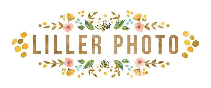
Vintage logo design is one of the most effective ways for brands to create a sense of nostalgia, communicate their heritage, and maintain timelessness, it is also a popular pair in general logo discussion!
Vintage logos refer specifically to design styles from the early to mid-20th century, infused with classic typography, harmonious colour palettes, or traditional shapes. Having a vintage vibe generally gives brands the chance to establish a unique identity and make an impression on customers!
Retro vs. Vintage Logo Design
Retro and vintage designs are used interchangeably. They are cousins from the same family; however, they are different from each other. While retro refers to unique design trends of the 1970s and 1980s, vintage represents design trends of an era starting from the 1800s. By definition, retro means something that imitates the recent past, whether dance, fashion or design.
Decades ago, logo designers used to create geometric art using simple shapes like triangles, rectangles, and hexagons. As a result, you’ll notice many vintage logo designs are based on primary shapes. Several companies adopt the vintage design to convey their long history: to communicate that they hold decades of experience.
Vintage Logo Design Inspiration
Great ideas might hit you out of nowhere; however, often, you might get stuck and need the inspiration to get your creative juices flowing. So, scroll down to find various retro and vintage logo design ideas to get the wheels churning.
By the end, you will hopefully get an idea of the concept that will suit your business and discover the design styles you like.
70s Vintage Logo Designs
The 70s were a great time for worldwide evolution, and one such development was seen in the design industry. Designers were influenced mainly by Psychedelic graphics and groovy logos on a large scale in the 70s.
In the 1970s, design styles represented a happy and uplifting vibe. Typography combined with photography and the colors used were bold and bright. Fonts from 1970s logo designs included plenty of bubble-style fonts and reverse contrast characters.
Do you all know swoosh? Yup, that Nike one! The original logo of Nike for the first time was designed by Carolyn Davidson for $35 back in 1971, and here’s how it looked:
Look at the following vintage design ideas from the 70s.
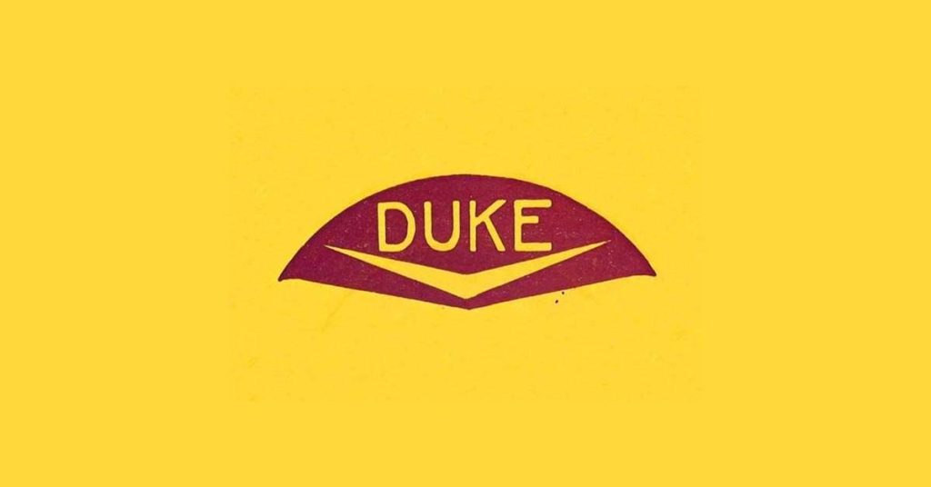
Record Label Logos from the 70s
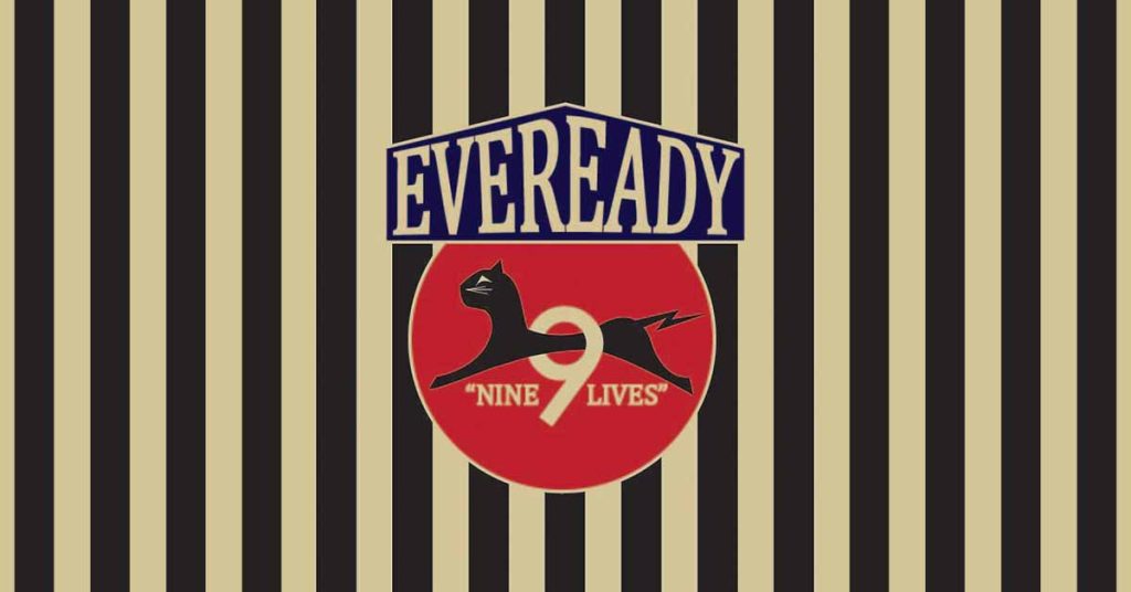
Eveready Battery
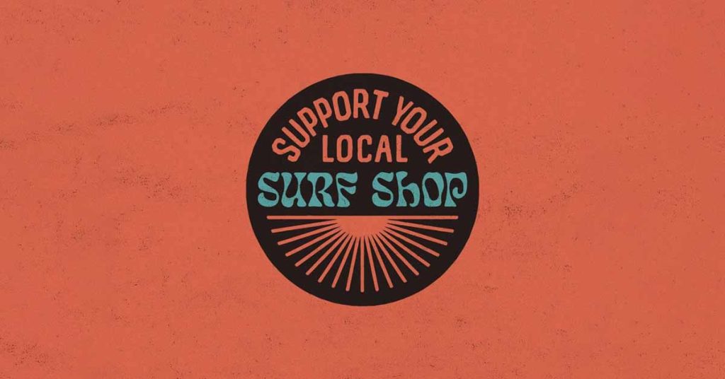
Support your local surf shop
80s Retro Logo Designs
Design patterns in the 1980s were famous for bold graphics, bright colors, and new geometric shapes than the primary ones. Sci-fi was a popular genre in the 80s retro logo designs. Pixelated fonts and neon-colored lines attracted people.
However, some designs from the 70s evolved in the next decade; 1980s retro logo designs were influenced by Cyberpunk and tropical Miami involving hyper-stylized aesthetics. MTV logo is the perfect example of an iconic 80s retro logo.
Look at the following examples to see what logos from the royal 80s looked like.
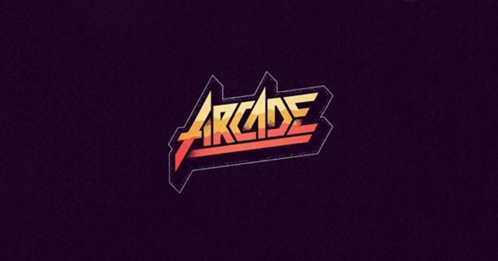
Arcade
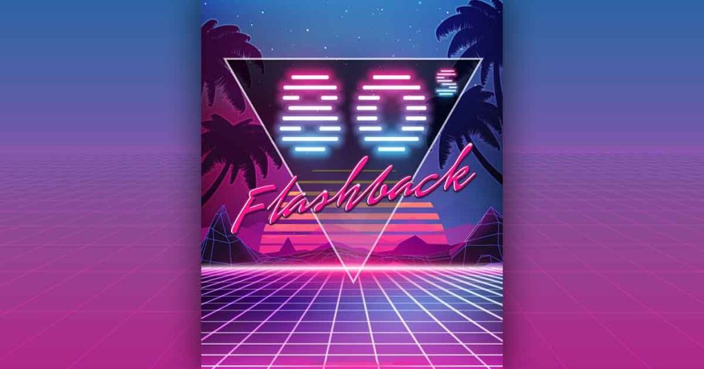
Flashback
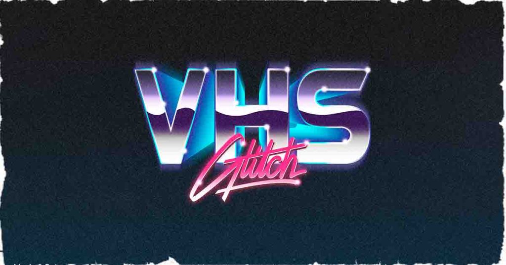
VHS Glitch
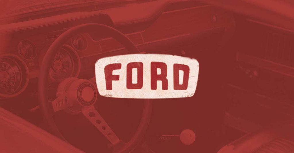
Emblems and Badges
Emblem logos are symbolic of elegance, class and aesthetics. These logos are the first to exist together with royal monograms and sigils. Here are some good ideas for emblem logos and badges.
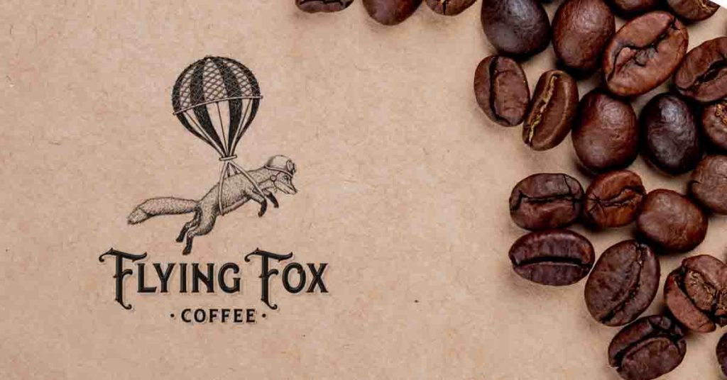
Flying Fox Coffee
Ford
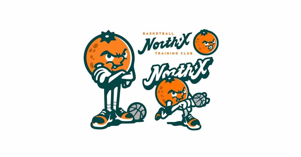
Mascot-embedded Vintage Logo Designs
Mascots give brands a memorable face that people can easily recognize anywhere, whether on television, in a stadium or a magazine. Businesses have been enjoying mascots for a long time now. Take care of the lines and colors to give a vintage look. If you already have a mascot, use a unique angle to add to your logo.
If you’re planning to design one, remember to develop a character that encompasses the essence of your brand and can be active on all your channels. Need help designing a mascot? Let Design Shifu take care of it. Get unlimited logo design requests—including vintage styles—with Design Shifu, starting at just $399/month
Basketball Training Club.
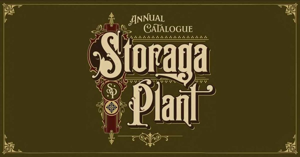
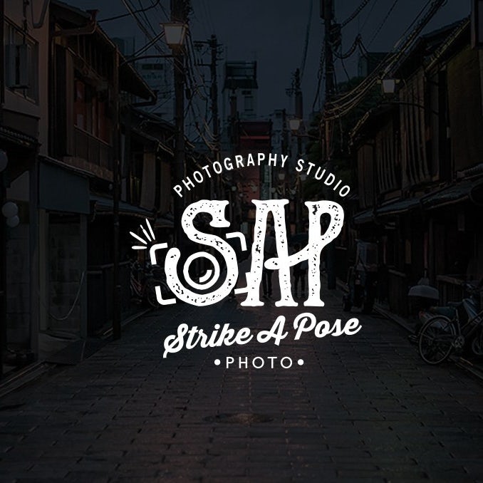
Hip Lettering Vintage Logo Ideas
The bulky and blocky typography used a few decades back has returned as a decorative style used on quotes, posters and wallpapers. Many 3D styles and groovy flowy serifs were nouveau back then. Businesses and designers still employ a few of those typefaces today to make a statement. Designers have been experimenting with bringing modern typefaces by using the same techniques. To bring back the old vibes in their vintage logos. Check out the following logos:
Storage Plant
Hand-drawn Vintage logo design ideas
Besides hipster lettering, which can be designed in software and design software, several businesses invest in hand-drawn designs to add another layer of personalization. Rough lines, slight imperfections in the design, and a touch of pencils and crayons exude warmth and familiarity.
For organic and DIY businesses, it’s a great style to consider. You don’t have to be a designer to create one. A professional designer can assist you in executing your idea.
Victoriana Logo Designs
Inspired by the Victorian period, which spanned over 60 years, Victoriana offers a wide range of decorative fonts and elements to incorporate into the logo. It employs small details and decorative swirls and twirls to add a premium feel. Modern designers use circus-style fonts, sometimes heavily textual designs coupled with military objects like uniforms, to portray Victorian style in their logo.
Steampunk Logo Designs
Steampunk logos portray 19th-century industrialism. This style is considered fictional work and gives a unique twist to the overall tone. Rich colors and metallic textures are the perfect mixes to create steampunk vintage logos.
Baroque Logo Designs
Baroque style primarily centers on details and ornaments, comprising intricate decorative elements such as shells and plants. Embed ornate fonts and French elements to create this style.
Vintage Logo Ideas for your Business
Vintage logos have been adopted by almost every industry. Now that we’ve covered different styles let’s look at designs for each type of business. See if you can find your industry:
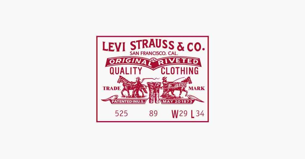
Vintage Clothing Logo Ideas
Most fashion brands have been serving and transforming the industry for decades, and their logos have become vintage. This is because they embed their origin story and values into their logo.
Levi Strauss
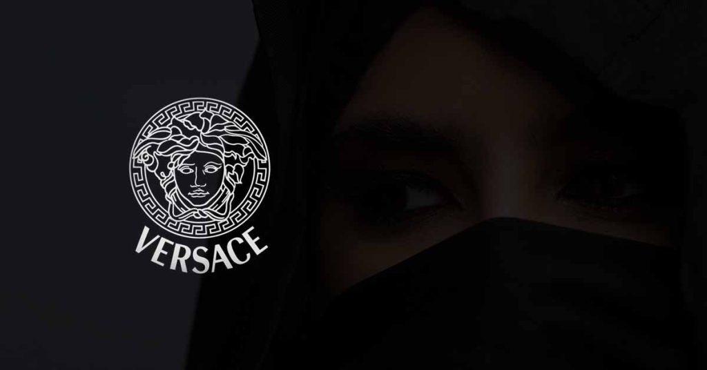
Versace
Vintage Food & Beverages Logo Ideas
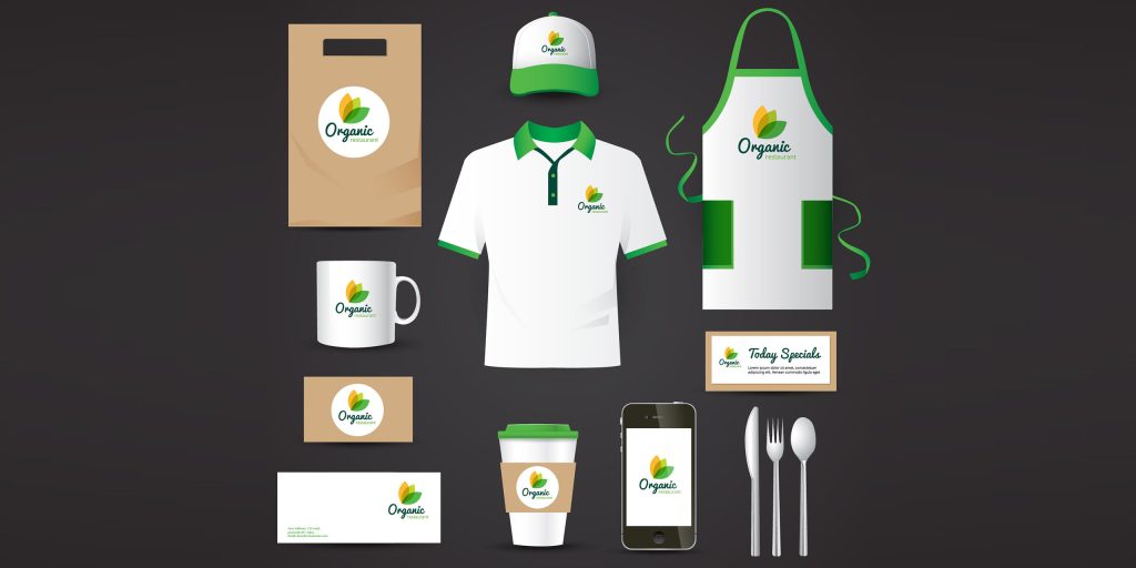
Food & Beverages businesses employ hipster lettering and block typeface type for their logos accompanied by simple illustrations. In addition, they often mention the year of launch to highlight their experience in the industry. Some brands also use mascot logo designs.
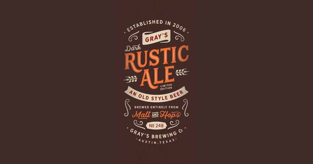
Rustic Ale
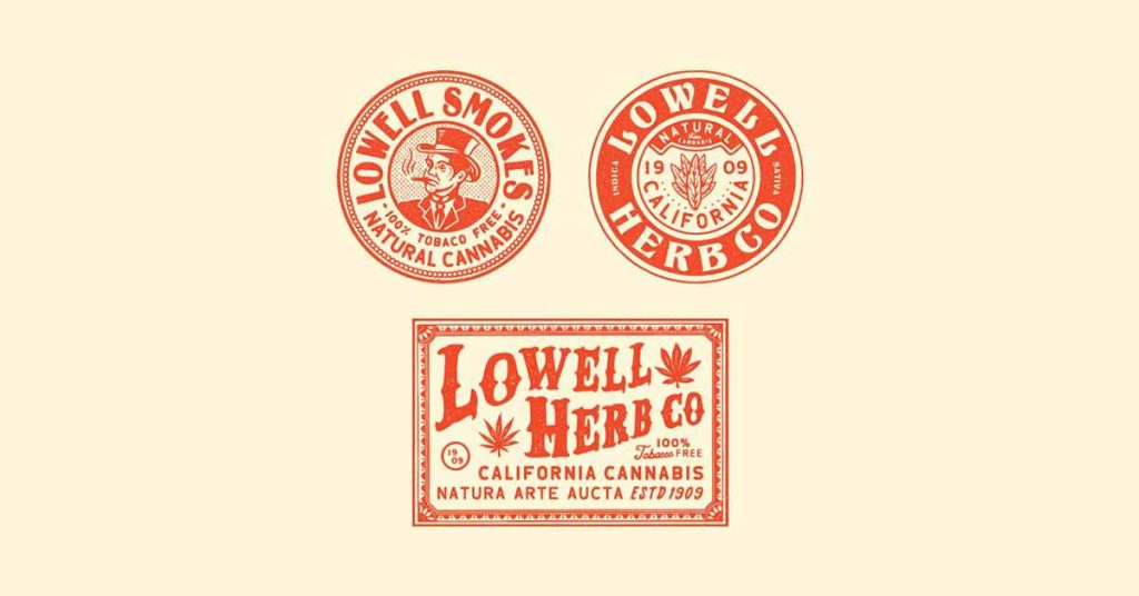
Lowell Herb. co
Vintage Streetwear Logo Ideas
Streetwear brands emphasize making a statement and conveying their message to the audience and the outside world. They’re mostly fearless, bold and loud. Typography vintage logos, therefore, provide them the medium to express themselves. However, several streetwear brands employ modern minimalist logos too.
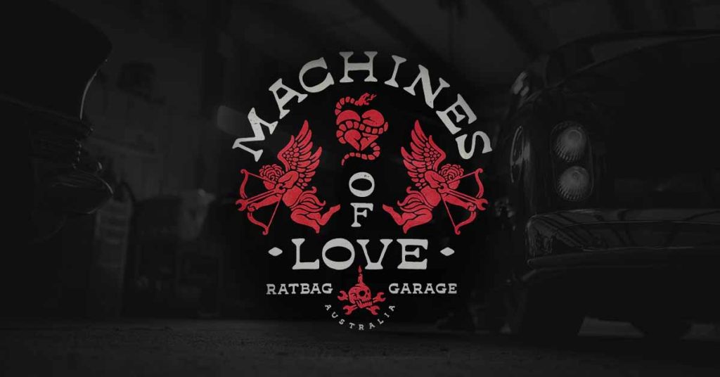
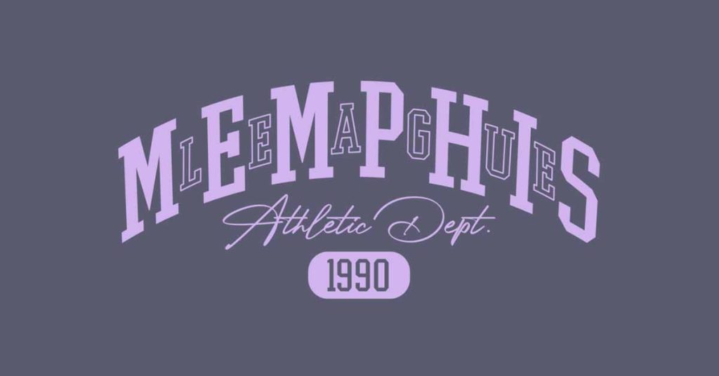
Machines of Love
Memphis
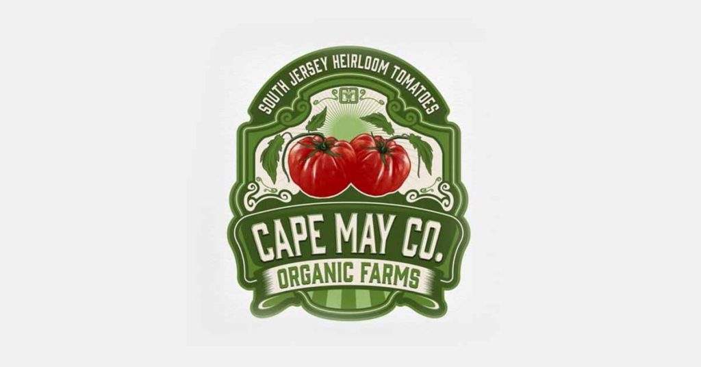
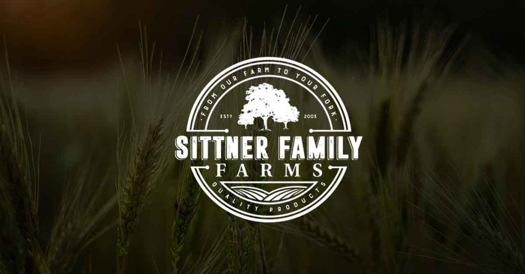
Vintage Farm Logo Ideas
Farm logos combine several vintage logo design principles like bold typeface, hand-drawn illustrations, borders and rusty colors to evoke homely feelings in their customers.
Organic Farms
Shimanek Bridge Farm
Sittner Family Farms
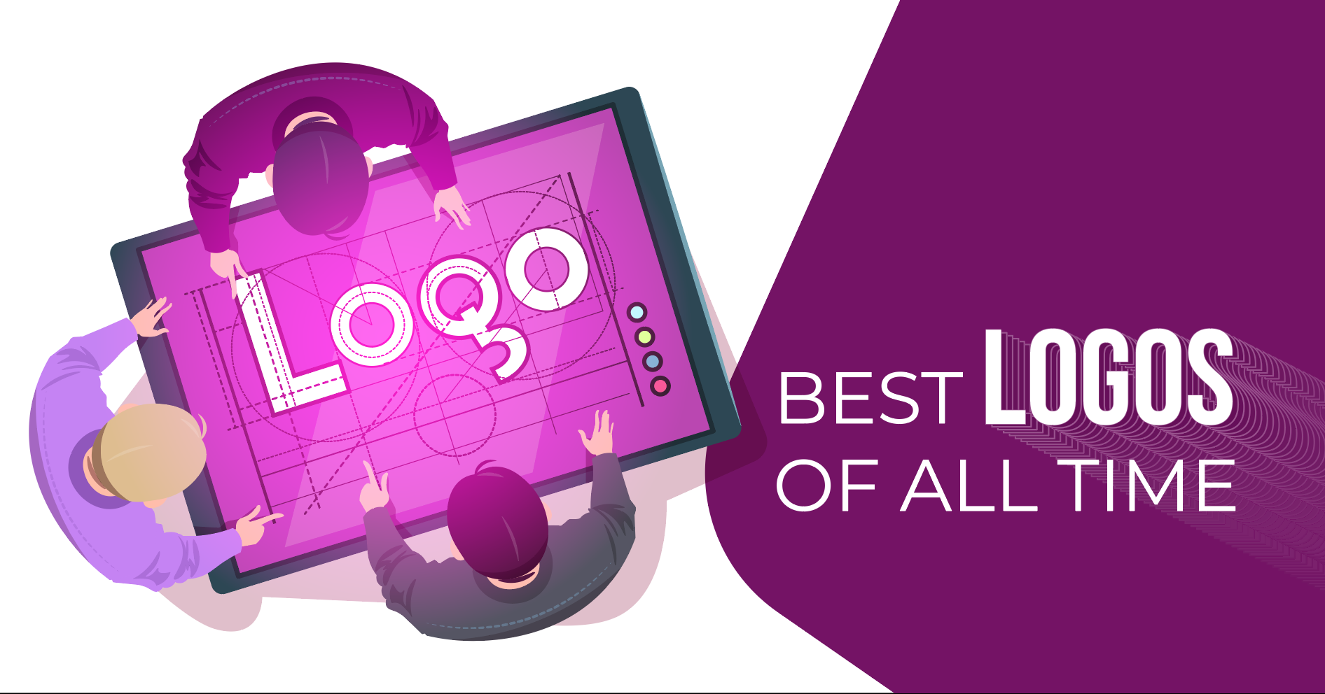
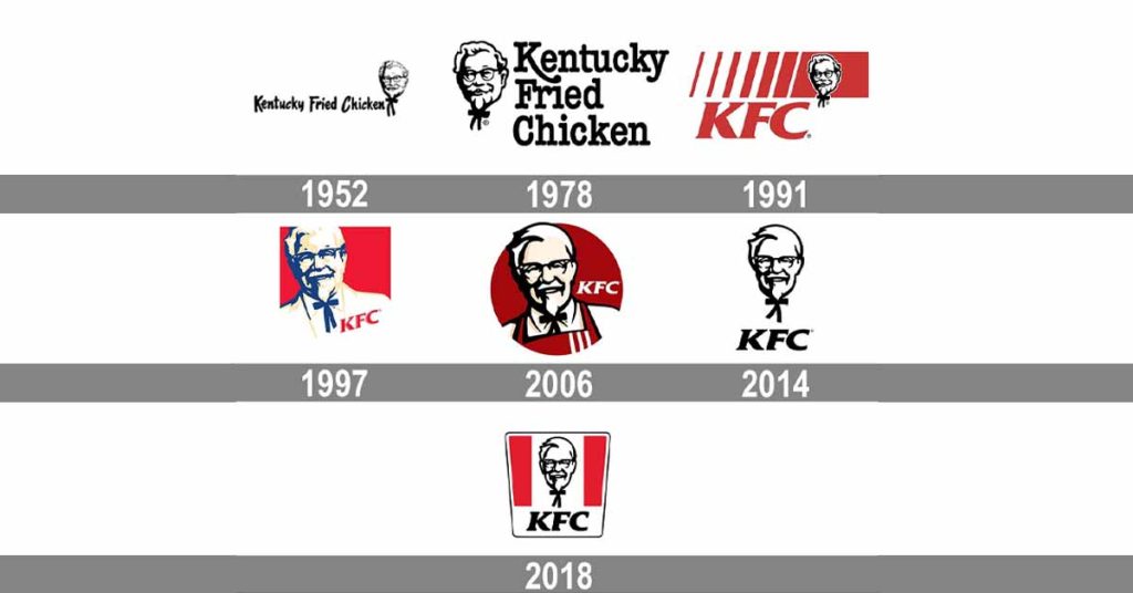
Best Vintage Logos of All Time
As the brands scale up, their identity also evolves over the decades. They invest and update their visual brand identity to communicate their new message and beliefs to their prospects, customers and fans. Let’s look at some effective and successful vintage logos to get some inspiration:
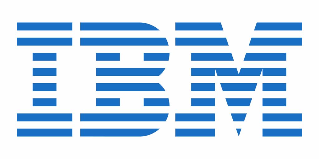
IBM
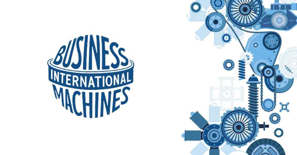
The original logo highlights the company’s name IBM, i.e., International Business Machines, and incorporates it into the shape of a globe to convey their motto,
Walmart

Walmart’s original logo gives the classic vintage vibe with its country-style font.
Coca-Cola
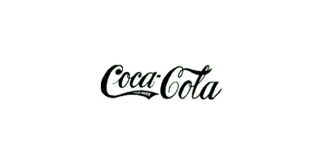
Coca-cola has undergone multiple changes in its logo, but one can easily recognize the brand by its unique font. Coca-cola always used a complex script. Could you believe Coca-cola created this logo way back in the 1890s? A simple yet powerful vintage logo!
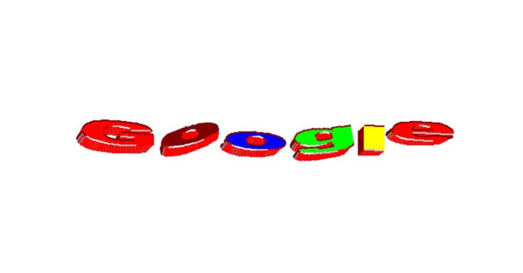
No one can imagine that this is the logo of the top technology company in the world! The original logo gives the old-era vibe.
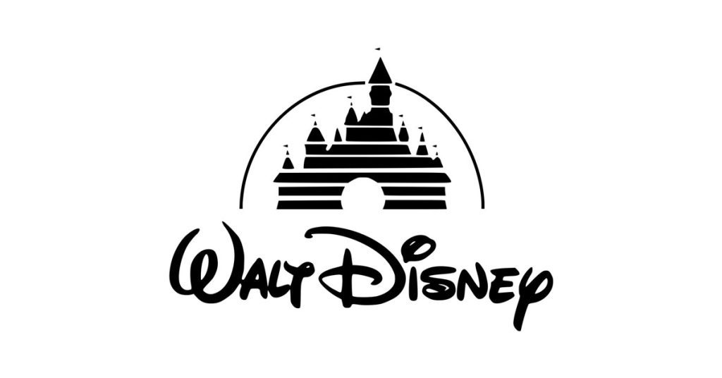
Disney
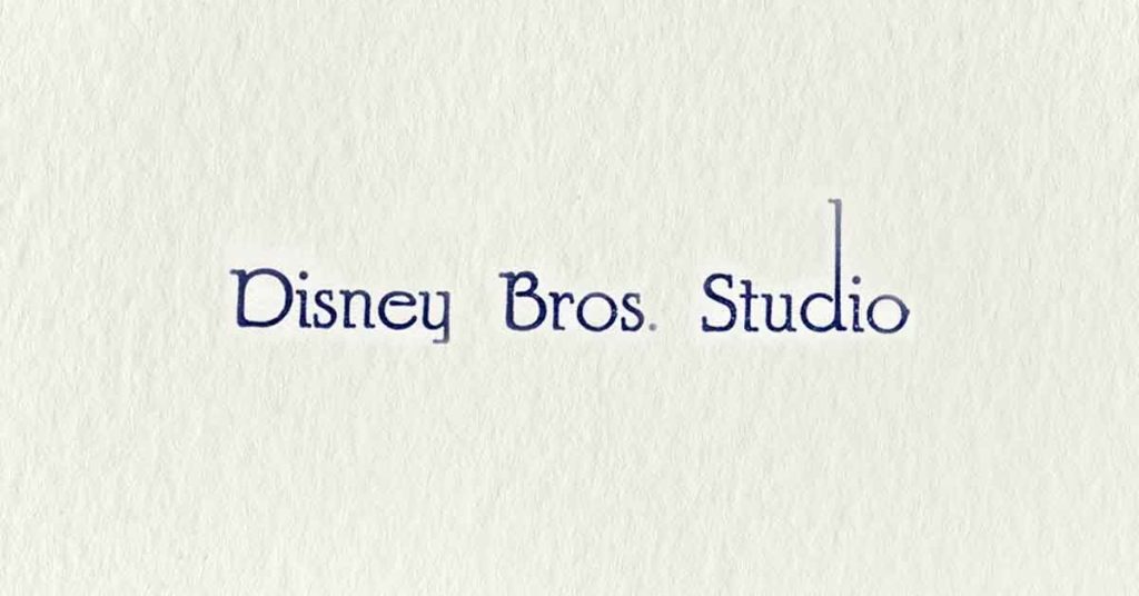
Disney’s clean, simple, and powerful logo uses a distinctive font with half serifs to convey its magic.
What makes a good vintage logo?
When you look at a vintage logo, you instantly realize it differs from the rest. But, ever wondered what makes it unique and different from others? Like great artists and designers who differentiate themselves from others by their peculiar characteristics, vintage logos also have a few notable sub-characteristics.
The main features of logo design are typography, brand color schemes, and graphics. Let’s discuss how these features are used in a vintage logo design.
- Typography: When text is integrated into a logo, it looks better. Decorative and funky typefaces are typical in vintage logo designs. For a clear vintage look, you can use the decadent cursive font.
- Illustration: Brands use illustrations in their logos to demonstrate their history or evoke nostalgia among people, reminding them of their childhood days. Look for objects and imagery that evoke emotions in your audience.
Who should create a Vintage Logo?
Undoubtedly, vintage logos have such a powerful hold on customers that they look familiar yet distant every time they see them. Therefore, they can be seen in almost any industry; however, a few enjoy their impact to a greater extent. Let’s look at them:
Music: Garage bands, jukebox owners, and even bars with record players use vintage logos.
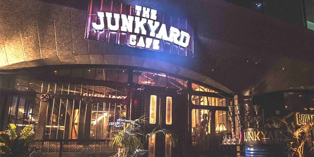
Cafes and restaurants: Vintage logos give a sense of familiarity, assurance and lineage, exuding comfort and care.
Interior design: Elegance and expertise in this industry could be easily seen using vintage logos.
Bars and Breweries: Aged beer is a quality beer, and connecting your brewery with the past using a vintage logo gives the impression of the best beer beating the competition.
How can I make my logo look vintage?
What if you already have a logo? While keeping your audience, brand story, and personality in mind, you can tweak these design elements to turn your existing logo into a vintage:
Color palette
Choosing colors that give a vintage feel is essential. Traditional vintage colors are often natural tones such as brown, olive green, or pale blue. Colors that are rusty and faded give an overall vintage look. Additionally, use sharp contrasts.
Typography
Use the retro script, monoline or vintage wedding font and pixel typeface for a vintage look. Select from serif and Sans serif fonts depending on your industry and the emotions you want to evoke. For example, Disney uses a stylistic font with serifs, while several beer brands use block typeface and hipster lettering.
Icons & Symbols
Using icons and symbols that remind someone of their past represents your business to the audience. The vintage designs are also given intricate textures and patterns. Unlike the icons giving a flat and simple look, vintage logos are highly detailed. You can also add a frame around your logo to enclose it — most vintage logos are enclosed in circles, ovals and polygons.
Noise Effect & Animation
All hail to technology that now businesses can make their logos multidimensional and add sound effects. You can add a noise effect to your logo with a few simple clicks. In addition, you can outshine the competition by adding a little animation to your logo. Movement instantly grabs eyeballs; since it is uncommon, you gain a competitive advantage.
Key Takeaways: Vintage Logo Design in 2025
- Design Shifu offers unlimited vintage logo designs with dedicated designers starting at $399/month.
- Vintage logo designs remain a powerful trend in 2025, offering emotional depth and brand trust.
- Key styles include retro 70s/80s, emblems, hand-drawn designs, Victoriana, steampunk, and baroque influences.
- Vintage logos thrive on nostalgia, bold typefaces, and detailed craftsmanship.
- Popular among industries like food & beverages, fashion, music, interior design, and breweries.
- A well-designed vintage logo can help brands stand out in a saturated digital landscape while telling a story of heritage.
Now it’s on you!
For decades, vintage logo designs have been in trend enabling businesses to establish trust and credibility among their customers. If you want to celebrate your history and beginnings, a vintage logo design is ideal for your business. Consider the design principles and elements we have covered in the various vintage logo design ideas we have shared to perfect your business logo. Reach out to us if you have any questions.
Want a vintage-inspired logo that tells your story and stands out? Get a dedicated designer and unlimited graphic designs for just $399 per month from Design Shifu. Start your design journey today.
FAQs
1. What makes a vintage logo look?
Vintage logos incorporate nostalgic design features like old-school fonts, earthy or washed-up color schemes, hand-drawn images, and vintage emblems to create an ageless charm.
2. Are vintage logos trendy in 2025?
Yes! Retro logo designs are still trending in 2025 as companies want to call up nostalgic feelings, emphasize originality, and develop lasting brand identities.
3. What is the difference between retro and vintage logos?
Retro logos look back to design of the 1970s–1990s, and vintage logos draw inspiration from periods even further back, such as the 1800s–1950s. Retro is nostalgic-modern; vintage is historic-classic.
4. Which industries benefit most from vintage logos?
Cafes, breweries, fashion, interior design, music, and handmade/organic businesses often use vintage logos to convey trust, heritage, and authenticity.
5. Can I modernize an existing logo to make it vintage?
Absolutely. You can tweak typography, color palette, texture, and iconography to give your current logo a vintage flair while retaining your brand’s identity.
