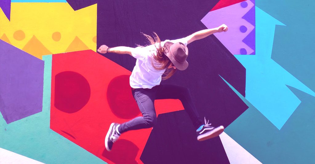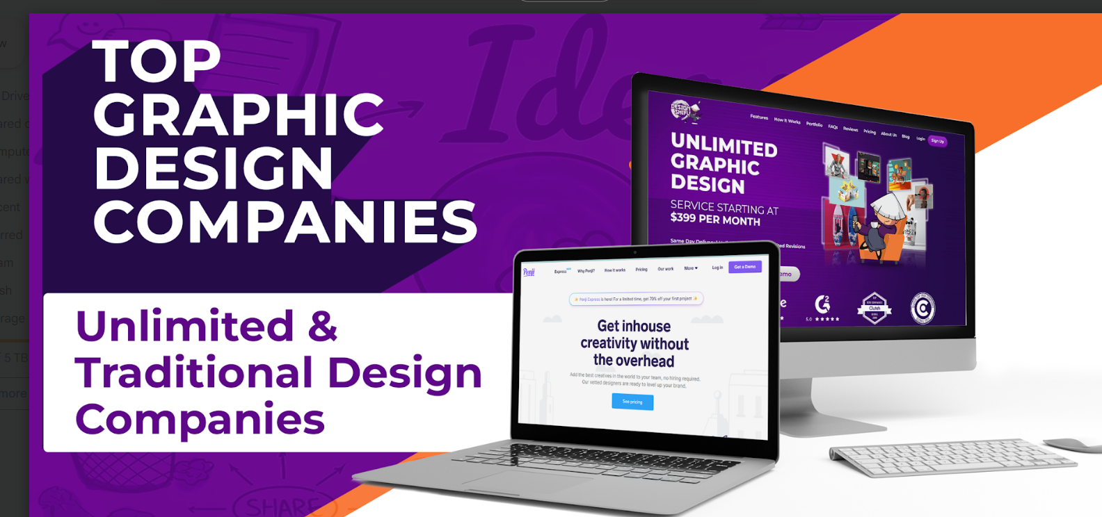
In today’s fast-moving digital space, having the right creative partner isn’t just helpful—it’s crucial. Whether you’re building a brand from scratch or scaling fast, your design needs can vary wildly. That’s why understanding the top unlimited graphic design companies in 2025—from traditional, project-based agencies to flexible, unlimited design services—is key to making smart decisions.
This blog breaks down both approaches, helping you decide which model best fits your goals, workload, and budget. Whether you need one-off deliverables or round-the-clock creative support, we’ve got you covered.
Let’s explore what each has to offer.
TL;DR
- Choosing the right graphic design service in 2025 depends on your creative needs, budget, and turnaround expectations.
- Traditional design companies operate on a per-project basis with custom quotes, ideal for one-off or high-end work.
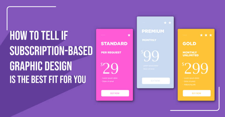
- Unlimited design companies offer a subscription model with unlimited design requests for a flat monthly fee—perfect for businesses with ongoing needs and fast deadlines.
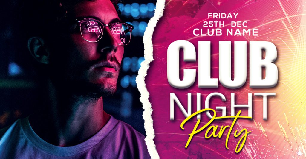
What is Unlimited Graphic Design?
Unlimited graphic design A subscription service where clients can submit unlimited graphic design requests each month for a flat, fixed fee. Unlike the traditional project-centric model, where clients approach design agencies with specific one-off projects, unlimited graphic design operates on a subscription-based structure.
In this model, clients pay a fixed monthly fee to access an array of design services without any limitations on the number of requests or revisions.
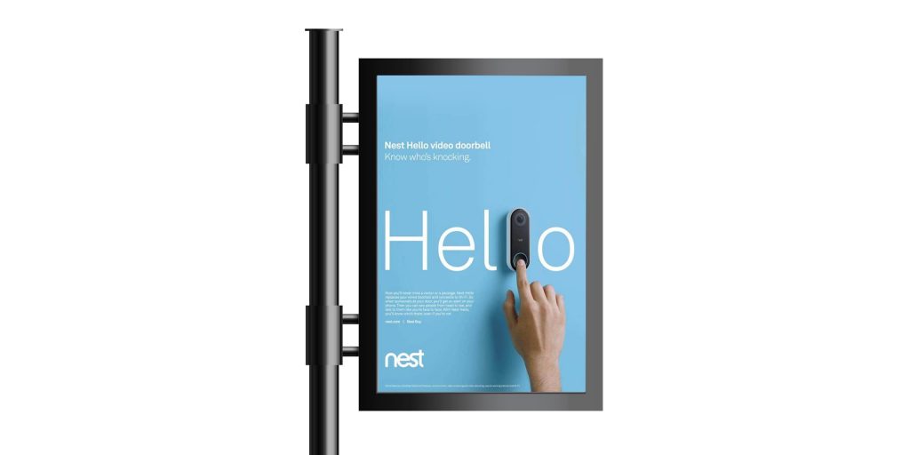
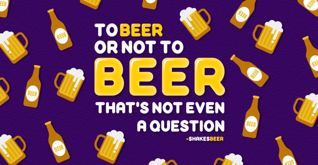
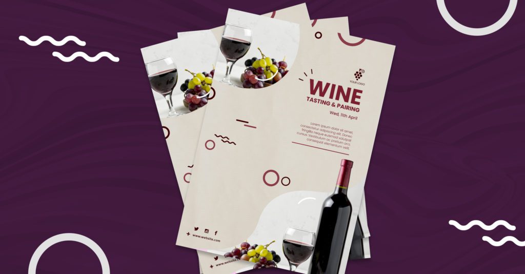
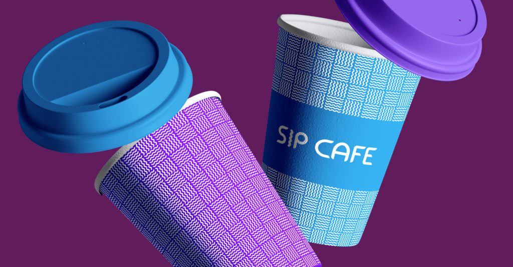
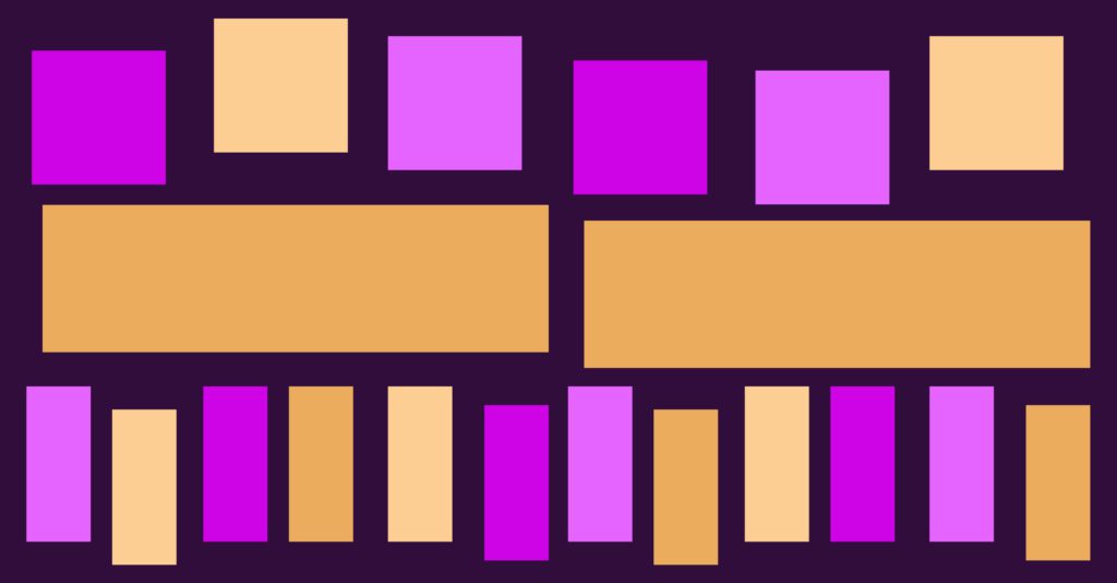
The essence of unlimited graphic design lies in providing a seamless and continuous design workflow. Clients can request various design tasks, from social media graphics and marketing collateral to website elements and branding materials, throughout the subscription period.
Moreover, the model emphasizes collaboration and communication between the client and the design team, ensuring a clear understanding of design requirements and preferences. This model is particularly appealing to businesses and individuals with consistent design needs or agencies looking for white-labeling solutions.
How is Unlimited Design Different from Traditional Design?
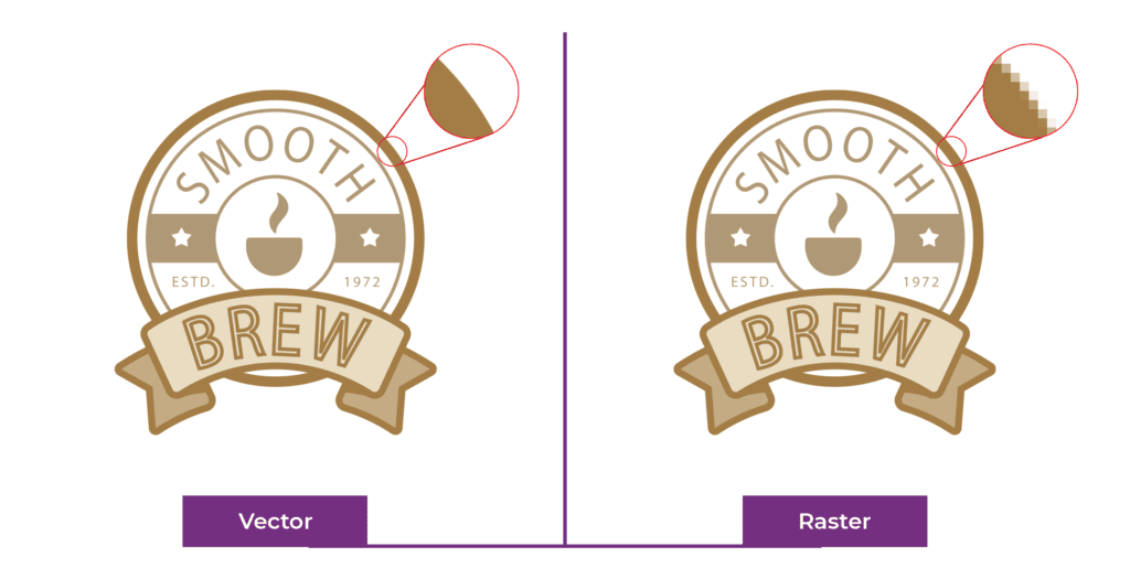
Traditional Graphic Design: It operates by creating visual materials (often for print-based applications) using analog tools, materials and processes. Traditionally graphic designer’s right tools and materials were paper, ink, and paint and the processes they used were screen print or letterpress printing on paper. Also, unlike digital design, traditional graphic design creates physical, tangible products through clear and evident handcrafted processes.
Unlimited Graphic Design: A subscription service where clients can submit unlimited graphic design requests each month for a flat, fixed fee. This subscription model facilitates ongoing collaboration and a continuous workflow, enabling clients to request an unlimited number of design tasks and revisions without additional costs.
| Feature | Traditional Design Agencies | Unlimited Graphic Design Services |
|---|---|---|
| Pricing | Per project, custom quotes | Flat monthly subscription |
| Design Volume | One project at a time | Unlimited requests (handled one or more at a time) |
| Turnaround Time | Varies—longer due to back-and-forth | Faster—daily or 24–48 hour delivery |
| Ideal For | One-time or high-value branding projects | Businesses with ongoing or high-volume creative needs |
| Revisions | Often limited, may incur extra cost | Unlimited revisions included |
| Team Structure | Multi-disciplinary creative teams | Dedicated designer or design pod |
When Should You Choose Unlimited Design?
Consider an unlimited graphic design subscription if:
- You prefer flat-rate pricing with no surprise costs
- You need daily or weekly creatives for social media, ads, or marketing
- You handle multiple brands or clients (e.g., agencies, startups)
- You want budget-friendly design with consistent turnaround
- You lack in-house design resources or want to scale design on demand
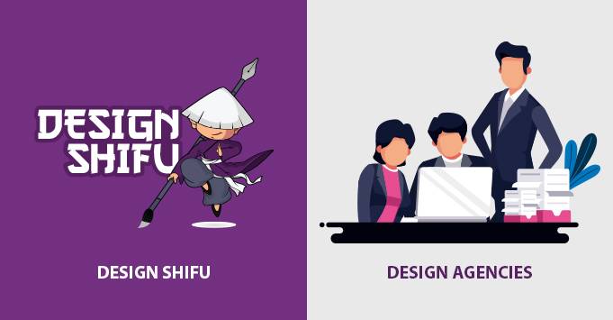
Top Unlimited Graphic Design Companies
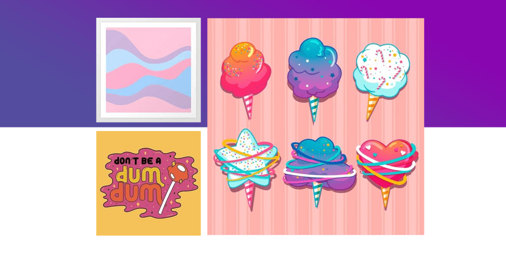
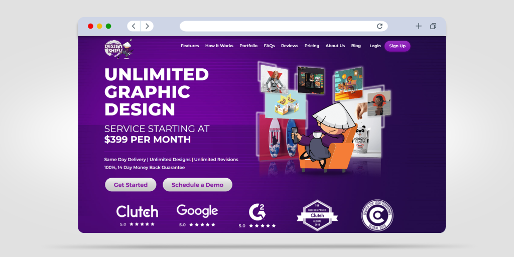
Design Shifu
Plans:
- Unlimited – $199/month
- Unlimited Plus – $399/month
- Unlimited Pro – $599/month
Pros:
- 100% 14-day money-back guarantee.
- 24-hour support.
- Dedicated designer.
- Option of multiple active requests up to 5 at the same time.
Cons:
- Motion graphics are not included in any of the plans.
- Currently, only English-speaking designers are available.
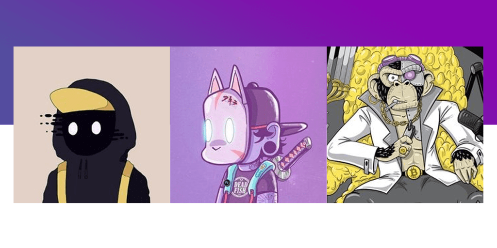
Design Pickle
Plans:
- Graphics – $499/month
- Graphics Pro – $995/month
- Graphics Premium – $1695/month
Pros:
- Unlimited graphic design services.
- Quality output.
- Advanced features like Canva file delivery.
- Dedicated designer in $995 & $1695 plans.
Cons:
- Pricing is on the higher side.
- A dedicated designer is not offered in the $499 plan.
- The $499 plan offers very limited design services.
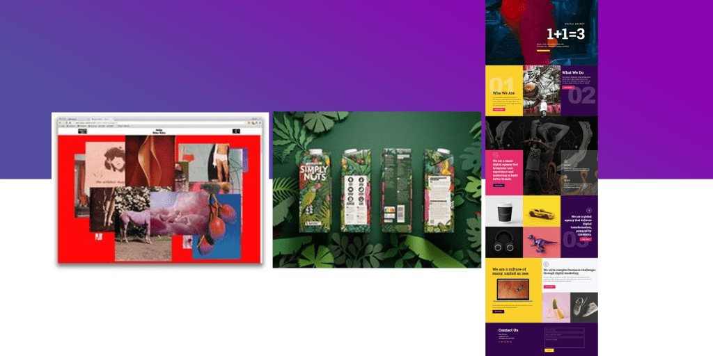
Penji
Plans:
- Pro – $499/month
- Team – $699/month
- Unlimited Graphic Design Services Daytime – $999/month
Pros:
- 30-day money-back guarantee.
- USA daytime designers (Only in the top $999/month plan).
- Dedicated art director (Only in the top $999/month plan).
- AI feature to choose the most appropriate designer according to your industry & needs.
Cons:
- No option of getting a one-off request done.
- They don’t offer motion graphics.
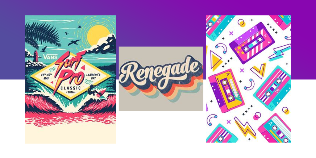
Many Pixels
Plans:
- Advanced – $549/month
- Business – $899/month
- Designated Designer – $1199/month
Pros:
- Small feedback loop.
- Strong team.
- Quick turnaround.
- 100% 14-day money-back guarantee.
Cons:
- Crucial features like a dedicated designer and Slack communication are only offered in the top $1199 plan.
- They don’t deal with motion graphics, UI/UX design, etc.
Kimp
Plans:
- Graphics – $599/month
- Video – $699/month
- Graphics + Video – $995/month
Pros:
- The video plan is great in case you have a video-only requirement.
- Team of 250+ members.
- Dedicated design team.
Cons:
- No dedicated designer.
- Mixed reviews about the quality of the designs.
Top Traditional Graphic Design Companies
Sagmeister & Walsh
Distinctive Design Philosophy:
Sagmeister & Walsh, under the creative leadership of Stefan Sagmeister and Jessica Walsh, is celebrated for its avant-garde designs that challenge conventional norms. Their approach often intertwines surrealism and vibrant aesthetics, pushing boundaries to create designs that evoke emotions and provoke thought.
Unconventional Strength:
A unique aspect of Sagmeister & Walsh is their periodic sabbaticals—every seven years, they shut down their studio for a year to rejuvenate creatively. This practice, while unusual, reflects their commitment to constant evolution and redefining creativity.
Pentagram
Legacy and Influence:
Pentagram, a renowned design consultancy, is notable for its collaborative and interdisciplinary approach. Founded by five designers, each with distinct design expertise, it continues to be a symbol of design excellence with a global influence.
Diverse Design Perspectives:
With a vast team of partners, each bringing their unique design perspective, Pentagram ensures a dynamic range of design styles and approaches. This diversity enables them to cater to a broad spectrum of clients and projects.
Glitschka Studios
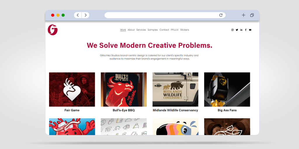
Creative Versatility:
Glitschka Studios, led by Von Glitschka, is known for its versatility in design styles. From bold and modern to intricate and vintage, their adaptability allows them to craft designs that resonate with various brand identities and target audiences.
Emphasis on Authenticity:
One of their distinctive traits is the emphasis on authentic, handcrafted designs. Their commitment to infuse authenticity and personal touch into their work sets them apart in the traditional design landscape.
Duck. Design
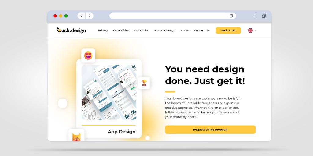
Human-Centric Design:
Duck. Design, with a mantra of “Design for Humans,” prioritizes empathy and understanding people’s needs in their design approach. Their human-centric design philosophy ensures that their creations are not only aesthetically pleasing but also functional and user-friendly.
Craftsmanship and Attention to Detail:
Known for their meticulous attention to detail and craftsmanship, Duck. Design places a strong emphasis on delivering polished and refined designs, making them a sought-after choice for clients who value precision.
Burst Digital
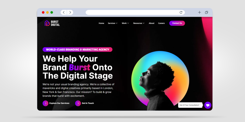
Integrated Digital Design:
Burst Digital stands at the intersection of traditional graphic design and the digital landscape. They seamlessly blend traditional design principles with modern digital techniques, creating a unique design proposition that resonates with the digital age.
Agility and Innovation:
A standout quality of Burst Digital is its ability to swiftly adapt to evolving trends and technologies. Their agility allows them to provide innovative solutions in the fast-paced and ever-changing digital landscape.
Key Takeaways
- Businesses should evaluate their volume, budget, and design complexity before choosing.
- Unlimited design services are ideal for fast-moving, content-heavy brands needing ongoing design at scale.
- Traditional design agencies are great for deep, strategic branding, one-off campaigns, or high-end design direction.
Wrapping Up
When it comes to finding the ideal graphic design solution for your needs, both traditional graphic design companies and innovative unlimited graphic design providers have their merits. Traditional firms bring years of experience and expertise, crafting designs with meticulous detail. On the other hand, unlimited graphic design companies like Design Shifu offer a modern and efficient approach, providing a constant stream of designs without the need for a hefty budget or hiring multiple designers.
At Design Shifu, we pride ourselves on revolutionizing the design process, offering unlimited design solutions that not only meet but exceed expectations. If you’re ready to elevate your design game and experience the advantages of limitless creativity, start by booking a free demo today. Let’s create an experience that transforms your vision into exceptional visuals.
Click here to book your demo and take the first step towards stunning, unlimited graphic design.
FAQs
What is the difference between unlimited and traditional graphic design services?
Unlimited graphic design services offer a flat monthly subscription allowing you to submit unlimited design requests and revisions. Traditional services work on a per-project basis, with custom quotes and timelines for each task.
2. Who should choose unlimited graphic design services?
Unlimited services are best for businesses with frequent design needs—like startups, marketing teams, or agencies. They offer predictable pricing, quick turnarounds, and consistent creative support.
3. Are unlimited design services really “unlimited”?
Yes and no. You can submit as many requests as you like, but most services handle one or a few active tasks at a time, depending on your plan. It’s more about consistent volume than all-at-once delivery.
4. When is traditional graphic design a better fit?
Traditional design is ideal for one-time projects, high-budget branding, or when you need a very specialized creative approach. It’s also preferred for clients who value deep creative exploration and handcrafted aesthetics.
5. What should I consider before choosing a design company?
Consider your monthly design volume, project types (print, digital, motion, etc.), budget, required turnaround time, and whether you need a dedicated designer or flexible team support.
6. What’s the best unlimited graphic design company in 2025?
Design Shifu, Penji, and Design Pickle are top contenders. Design Shifu stands out for its affordable plans, 14-day money-back guarantee, and fast turnaround—great for startups and growing businesses.