In this blog

Need a design partner that scales with you?
See exactly how Design Shifu can become your on-demand design team. Book a free demo call.
Brochure designs have perpetually been the tool for marketing your services. In many cases, they are the primary introduction a potential client will have to your brand. Both printed and digital brochures have evolved over time in the past decade, in terms of style, patterns, etc. Each year newer trends emerge influencing the preferences of designers time after time.
If you’re looking to design a brochure, make sure it is as impressive as it is informative, because we have the latest trends documented for you. Stay on top of your marketing game with these ten brochure design trends that we have put together for you.
RELATED:
Canva's Brochure Design Guide- A comprehensive guide on creating brochures with design tips and templates.
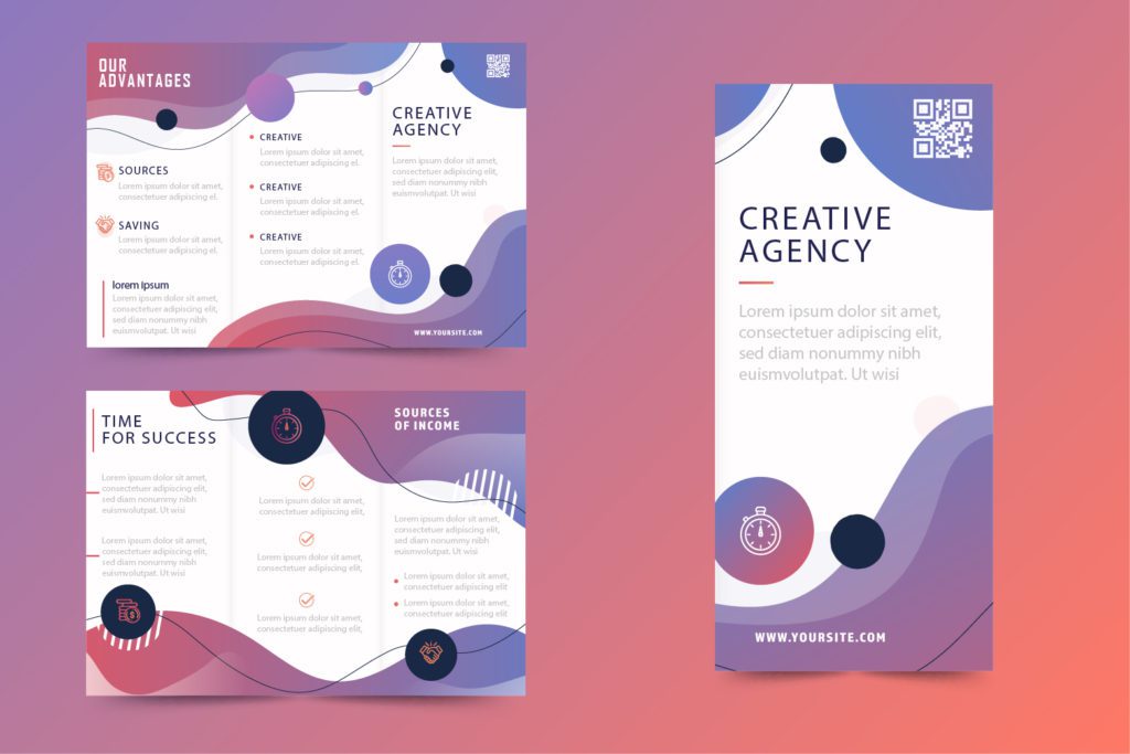
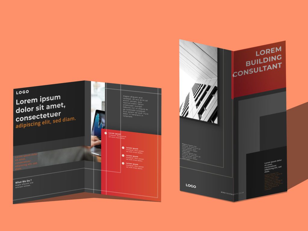
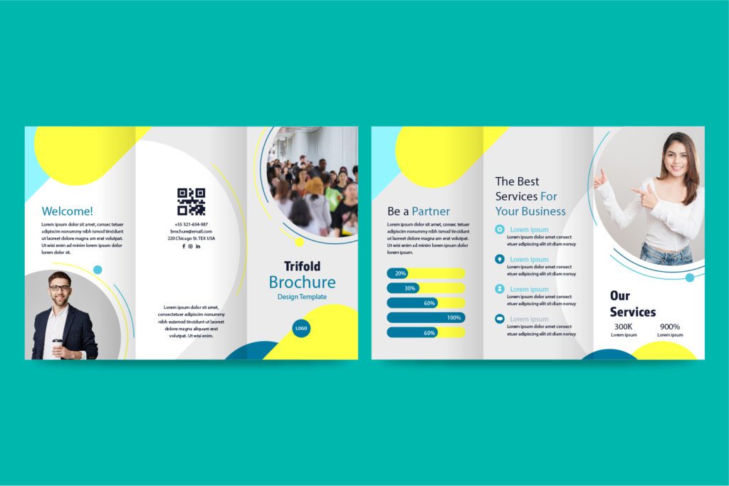
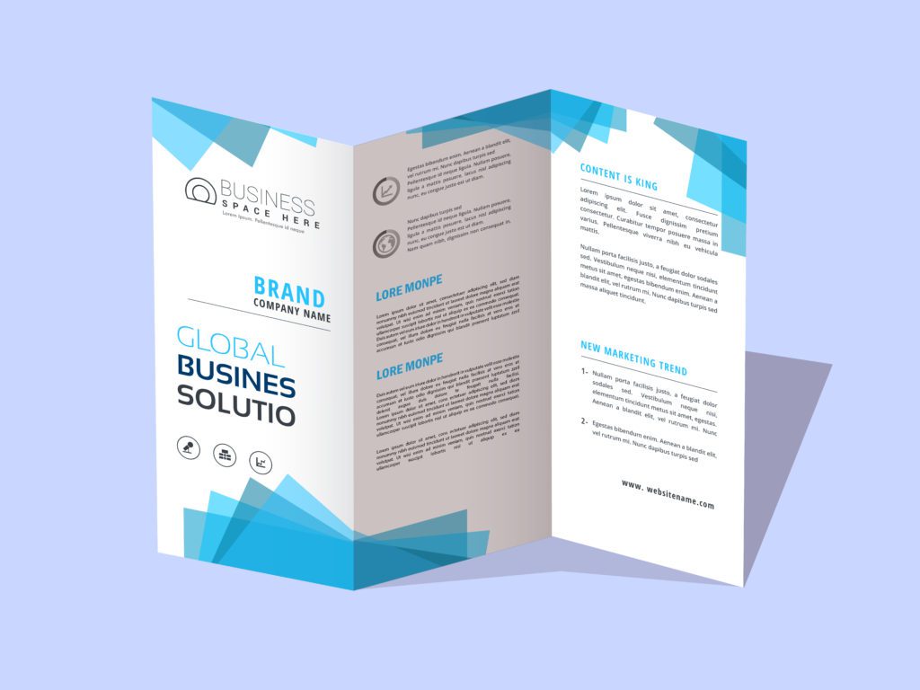
1. Unfold with style
Two-fold and tri-fold brochure designs have been the trend for quite some time now. But there is always scope for style. Make the fold on your brochure design angular and give the audience a sneak peek to make your design brochure standout. Or try the Die-cut brochure design with cut out panels and shapes for a unique and sleek look.
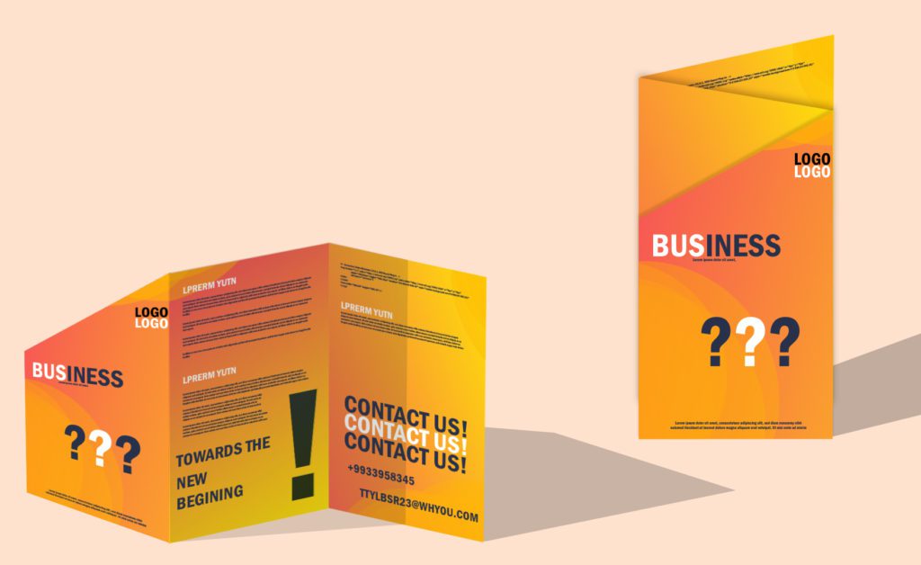
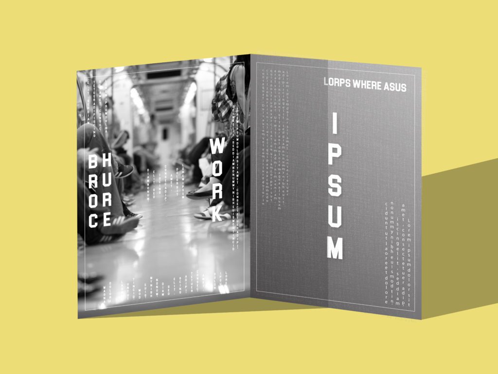
2. Let Typography take over
Many brochure design services are now designing brochures with “no image” and this trend is picking up fast. Utilizing typography to the fullest is the new cool. Use oversized lettering or create breaks between letters per syllable for visual and readable impact. Or use different angles, alignments, and colors to make the lettering visually quirky, making it stand out from the other elements of your design. You can take a look at some of the brochure designs for inspiration.
3. Use line art to your advantage
Line art is basically the use of clean bold lines against a background, making a starkly elaborate contrast. Line art has been trending for a while now and is still widely preferred. Clearly designers don’t want their designs to be out of line (Get it? Get it?)
Line art can be used on one panel to create visual contrast from your text. Be clever with the folds on your brochure design and use them to your advantage. Try using line art across panels to send a message that is broken up between folds to add intrigue with creativity. Line art is usually geometrical and with the right alignment, can make your brochure look satisfying.
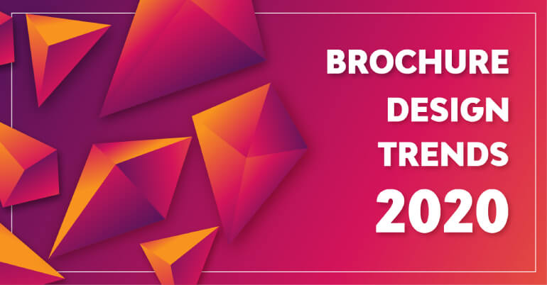
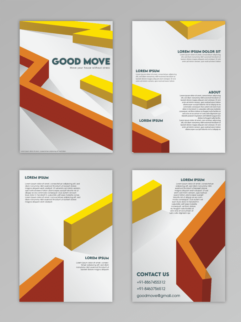
4. Stand out with 3D graphic elements
Stand out! No, we mean literally. 3D graphic elements are an impressive new trend that’s promising as compared to 2D brochure designs. Make elements of your brochure design stand out by adding 3D graphics to them, which makes them pop out when the brochure is opened. It is a creative and futuristic presentation of your business as it elevates certain elements for the reader to pay attention to.
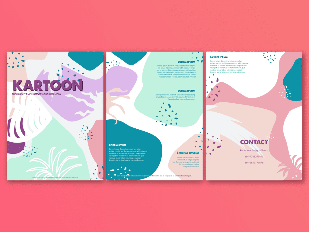
5. Go soft with Muted colors
Although some online brochure designers choose softer colors, vivid colors are not completely out of the picture. Designers prefer muted colors because they are easy on the eyes of the audience and establish a sense of comfort for the reader. Organic brands use earthy colors for a more natural and calm look.
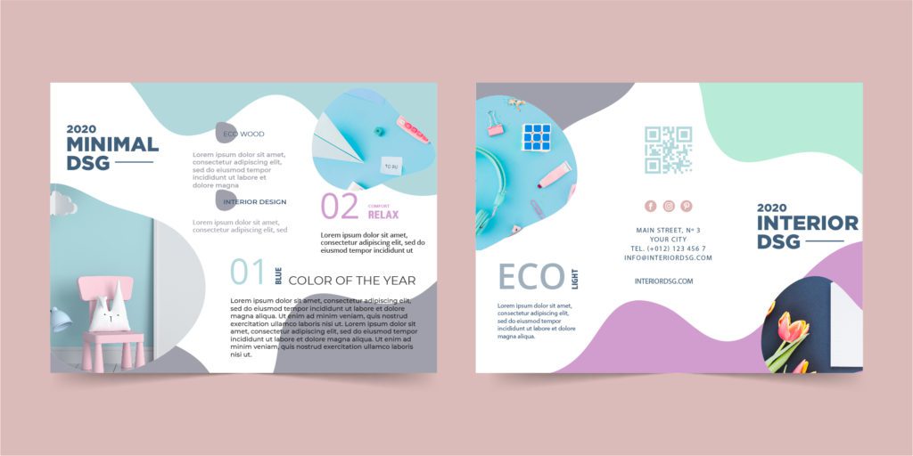
If your brand character is eccentric and loud, be eccentric through those vibrant colors. Vivid colors, if executed right, are the bold pop that some brochure designs need, to make a statement. You can also use gradients of vibrant colors in your brochure design to highlight the parts that you want to.
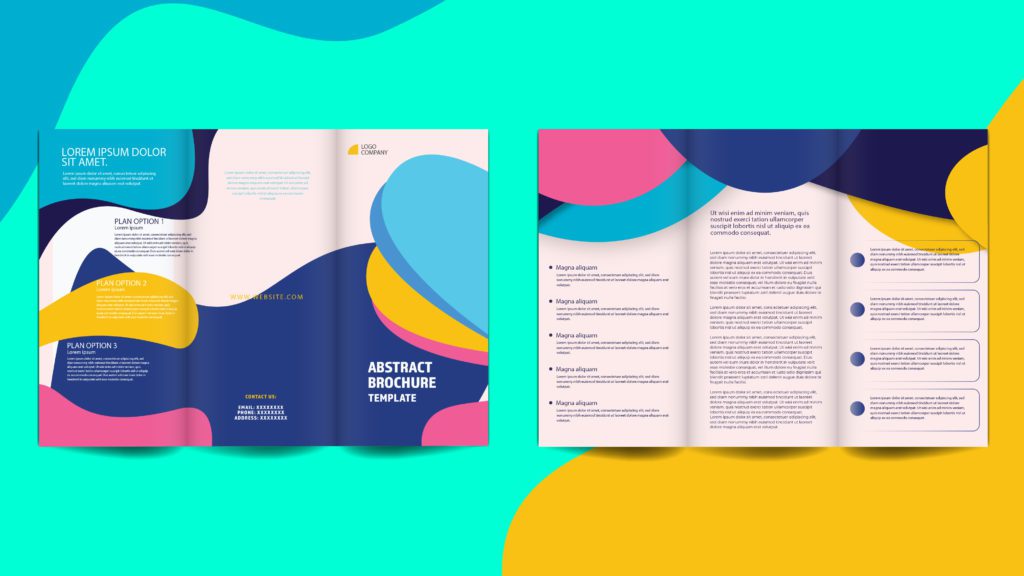
6. Be trendy with illustrations
Your brochure does not necessarily have to have images. For visual impact and relatability, create illustrations for your panels and place them in linearity. Get artistic, create characters, people, or tell a story.
7. Set the mood with Neutral Photos
The pictures you add to your design set the mood and the tone of your brochure. Choose neutral stock photos that look like they’re from a daily routine. The point of stock photos is that they are ambiguous enough for every situation. Photos with neutral tones and faces are trendy and they add the element of familiarity in your design that helps your audience develop comfort with your brand.
8. Create an impact with accents
Too much information can be a turn-off to your potential customer. Give them a break by adding accents as a design element, in the pages between folds in your brochure design so that they can process information one at a time.
Accents can make your typography even more attractive. Use letter cut-outs to create a word on the front panel, with an eye-catching image, related to the words, on the second panel, so as to give the audience a sneak into your brochure.
9. Focus on your materials
Focus on your materials for printing the brochure design. Using recycled paper not only gives your brochure a rusty and earthy feel but also makes your brand look like an environmentally responsible one.
Enhance the feel of your brochure by adding subtle changes to it. Curved edges on your brochure design can make your audience feel more warm and comfortable as compared to sharp edges.
10. Remember the Color Model
Pro tip: If you’re planning to design your own brochure with an online brochure maker tool, don’t forget to create your brochure design in CMYK and not in RGB. RGB color mode is perfect for digital designs and CMYK is meant for printing. This way, when you design in CMYK your printed design will turn out just how you view it on your screen.
If you are looking for a brochure design service at an affordable rate and quick turnaround time, Design Shifu is the place for you. Our designers handle daily design requests for various graphic design needs from various clients and deliver within 24 to 48 hours. We also offer a 14-day money-back guarantee so there is no risk. Check out our subscription plans here.
FAQ
About the author
Sameena is an Organic Growth Specialist and Content Writer at Design Shifu, crafting SEO-driven content that boosts visibility, builds brand authority, and drives meaningful organic growth.