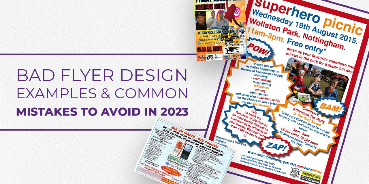

In a world where digital ads, social media posts, and email blasts flood our screens daily, flyers might seem old-school—but don’t be fooled. Flyers are still one of the most effective marketing tools in 2025, both online and offline. The key? Design them right.
Whether you’ve got a new product launch, a sale announcement, an event to promote, or are just trying to get your brand noticed, a flyer can do a lot of work for your business. But with one caveat—people don’t want pretty anymore; they want design with purpose that communicates value and inspires action.
We’ll help you create flyers that speak directly to your audience and inspire them to act.
TL;DR
- Flyers are still one of the most effective marketing tools in 2025—if done right.
- A successful flyer isn’t just pretty—it’s clear, compelling, and calls your audience to action.
- Focus on both your messaging and design: craft a bold headline, write a strong CTA, stay on-brand, and use modern design techniques like minimalist layouts, smart use of shapes, and high-quality images.
- Whether print or digital, always optimize your flyer for repurposing and audience engagement
Why Flyers Still Matter in 2025
Flyers remain one of the most affordable and versatile promotional tools in 2025. Whether printed for events and street marketing or designed digitally for email campaigns and social media, flyers are a cost-effective way to spread your message fast.
But if you’re new to designing flyers, it can feel overwhelming. That’s why we’ve broken it down into simple, actionable steps to help you create a flyer that’s creative, professional, and results-driven from marketing strategy to visual design, so your next flyer isn’t just beautiful—it’s effective.
Flyer success comes down to two key aspects:
- How attractive it looks
- How effectively it sells your message
Let’s dive into both, starting with the marketing mindset.
The Marketing Perspective
1. Define the Purpose and Message
Before you jump into designing, know what your flyer is about, who it’s for, and what you want it to achieve. Are you promoting a product? An event? A grand opening?
Create a brief outlining:
- Your target audience
- Your key message
- The action you want readers to take
Highlight important copy using bold fonts, brighter colors, or increased size to create a hierarchy of information.
Once you have your concept and copy ready, the next thing to look at is…
2. Use a Strong Call to Action (CTA)
Your CTA should be impossible to miss. It tells your audience what to do next—visit your website, call a number, scan a QR code, or use a discount code. In 2025, QR codes and clickable CTAs for digital flyers are essential tools.
For printed flyers:
“Call now,” “Visit us,” or “Show this flyer in-store for 10% off.”
For digital flyers:
“Tap to shop,” “Scan to RSVP,” or “Use code FLYER25 online.”
3. Reflect your brand character
Consistency in your design makes your brand familiar and recognizable. Incorporate the identity of your brand into the design for your flyer. Use your brand color scheme or your style in the flyer design to make it your own. You can place your logo strategically, enough for it to stand out, but also be balanced with the other elements of your design.
Now that we’ve gone over the concept, aim and the copy of the flyer. Let’s look at the design aspect.
The Designing Perspective
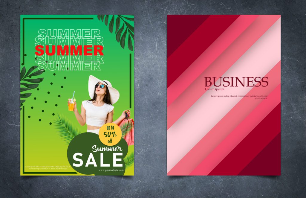
4. Keep Colors Simple and Strategic
Stick to 2–3 complementary or contrasting colors that align with your brand. Bold colors are eye-catching—but use them intentionally. Too many bright shades will compete for attention.
2025 Trend: Color gradients and duo-tone backgrounds are on the rise for flyer designs. Use these for subtle depth without clutter.
5. Choose Readable Fonts (And Limit Them)
Stick to 2 or 3 fonts max. Pair a headline font with a readable body font. Don’t use script or novelty fonts for important info.
Also
- Keep font size readable even from a distance (for printed flyers)
- Use proper line spacing
- Leave negative space around text for better legibility
6. Select Quality Paper for Print
If you’re printing, quality matters. Choose durable stock paper and finish it with a matte or gloss layer depending on your aesthetic. This instantly elevates how professional your flyer feels.
Pro tip: Leave a 0.125″ bleed margin on all sides to avoid trimming essential parts of your design during printing.
7. Use High-Resolution Images
Whether your flyer is printed or digital, crisp images are non-negotiable. For print, use images at 300 DPI. For digital, optimize image resolution without compromising clarity.
Align visuals with the flyer’s layout and maintain balance between imagery and copy. Use visual hierarchy to draw the eye to the most important areas.
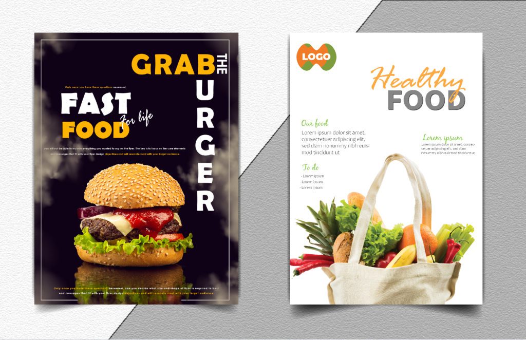
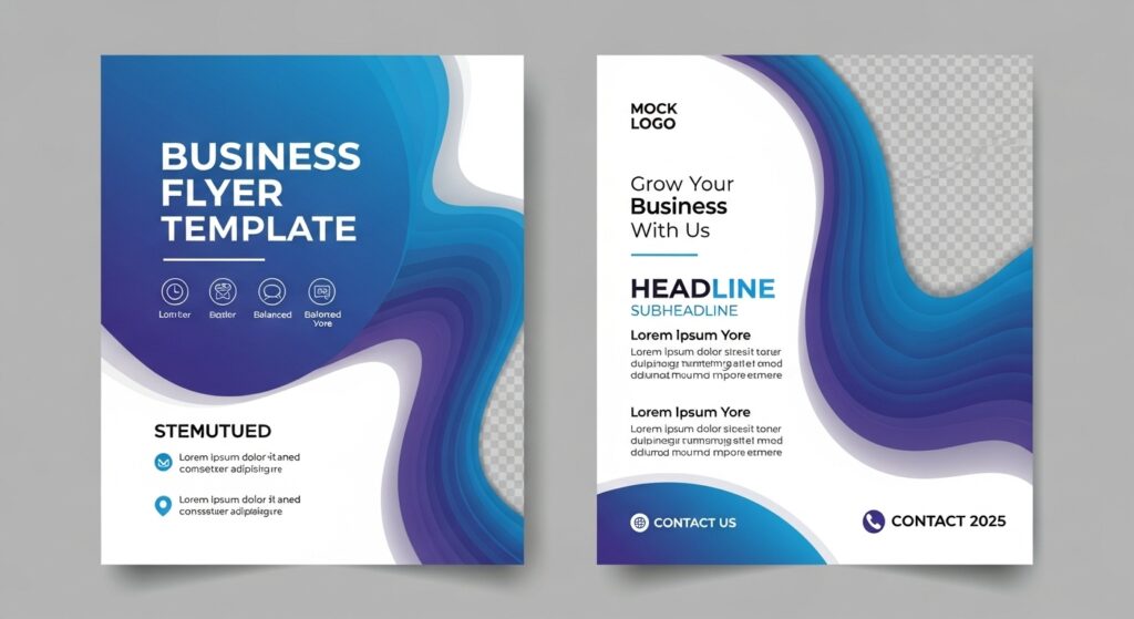
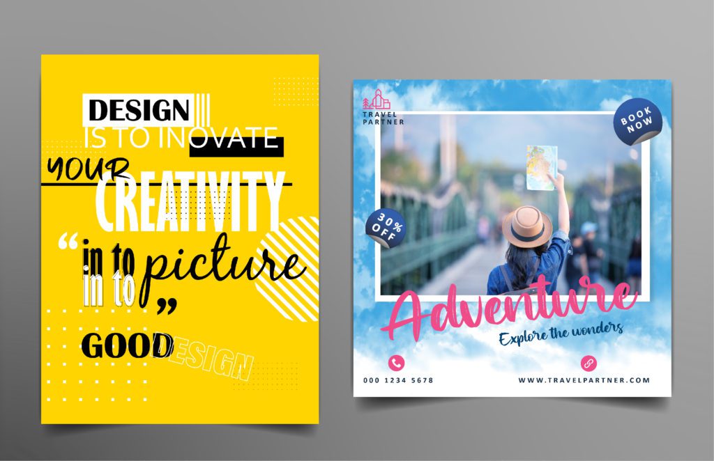
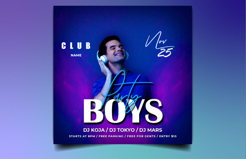
8. Pick a Style That Reflects You
In 2025, minimalism and bold maximalism are both trending—so pick one that matches your brand vibe.
- Minimalist: Clean layouts, neutral colors, lots of white space.
- Bold: Vivid colors, layered illustrations, playful fonts, experimental shapes.
Either way, keep your content digestible. Avoid overwhelming visuals. Your style should support your message, not distract from it. You can take a look at our portfolio to understand different styles for different designs, for inspiration.
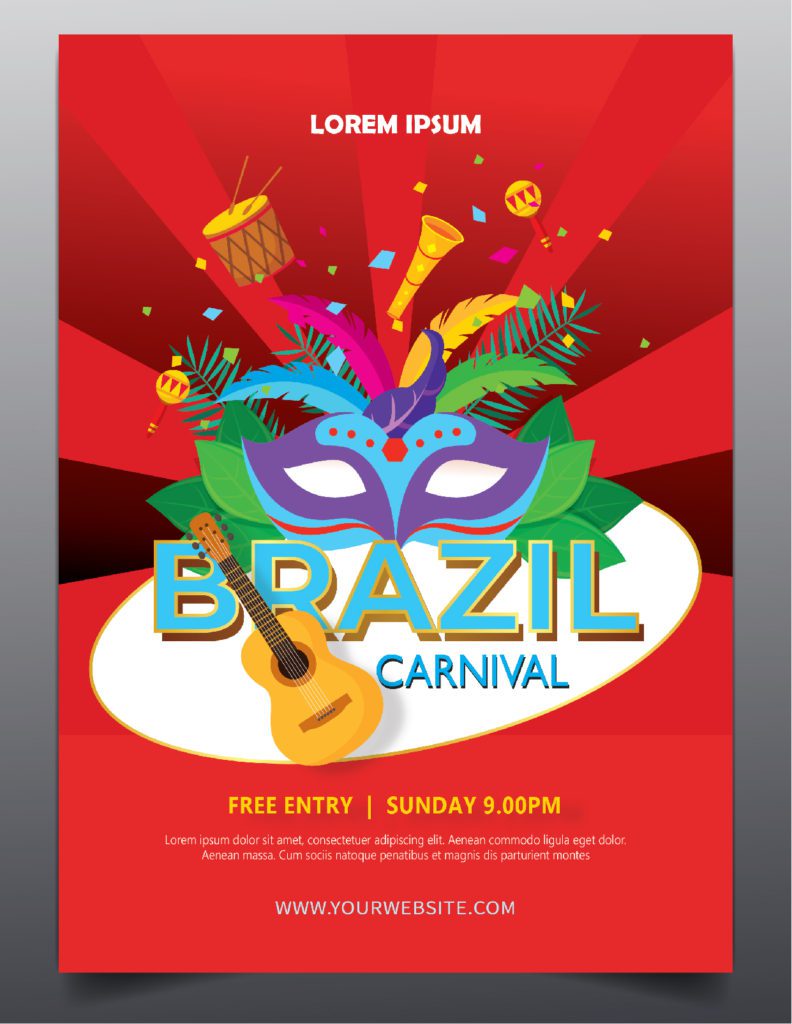
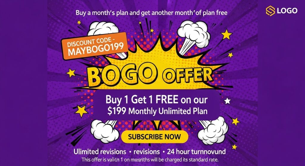
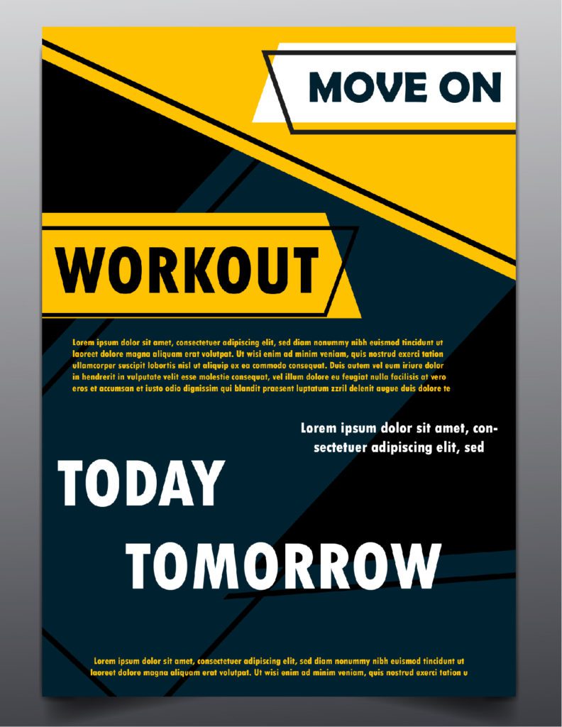
9. Leverage Shapes and Leading Lines
Use shapes—like circles, rectangles, or overlays—to highlight text and structure your design.
Apply leading lines to guide your reader’s eyes to your CTA or key offer. You can also wrap text inside shapes or position them creatively to keep the flyer visually engaging.
10. Use Patterns Creatively
Patterns can add visual rhythm and energy. Try:
- Soft gradients or abstract patterns in the background
- Geometric patterns to separate sections
- Illustrated textures for artistic flyers
Make sure the pattern doesn’t overpower your content—use it as a supporting design element.
Bonus Tip: Repurpose Your Design
In 2025, content repurposing is a smart move. Always save a digital version of your flyer in multiple dimensions for reuse in
- Website banners
- Email newsletters
- Instagram Stories or Reels
- Facebook Ads
Key Takeaways
- Repurpose smartly: Save your flyer in multiple formats for use across platforms.
- Start with strategy: Define your flyer’s goal, audience, and message before designing.
- Use a strong CTA: Encourage your audience to act—click, visit, scan, or shop.
- Stay on-brand: Use consistent fonts, colors, and logo placement for recognition.
- Limit colors & fonts: Stick to 2–3 of each for clean, professional design.
- Choose print wisely: Use high-quality paper, proper bleed margins, and DPI settings.
- Design for clarity: Use shapes, negative space, and visual hierarchy to guide the eye.
- Style matters: Choose a design direction—minimalist or bold—and stick to it.
Ready to Design a Flyer That Works?
With these handy tips, designing your own flyer is now easy. However, if you’re looking to give your flyer a professional touch. at Design Shifu, our designers aka Shifu’s handle daily design requests from businesses of all sizes at affordable prices, with quick turnaround time and a 14-day money-back guarantee. Check out our subscription plans here.
FAQs
1. Are flyers an effective marketing medium in 2025?
Yes flyers are an active medium for both print and digital marketing. Flyers can be effective at getting your marketing message across as well as compelling your target audience to act using good messaging strategies with appealing design.
2. What size should my flyer be?
You can find flyers in several sizes in 2025, including: 5.5” x 8.5”, which is half-size 8.5” x 11”, which is the regular size 4” x 6”, which is the postcard size Select your flyer size based on how you plan to distribute it or how much content you have to work with.
3. What resolution should I use for my images?
If you’re printing your flyer, use images at 300DPI. If you’re going digital with your flyer, as low as 72 DPI or 150 DPI should work, but always test to make sure it looks clear on all devices.
4. How can I make my flyer stand out visually?
Use:
- High-contrast colors
- Eye-catching headlines
- Strategic shapes and patterns
- A clear layout with lots of negative space
5. Can I use QR codes on flyers?
Yes, and you should! QR codes are great for linking to websites, events, coupons, or contact forms—especially in 2025 where mobile-first interaction is key.
6. Should I design flyers myself or hire a professional?
DIY works for simple needs, but for professional polish, faster results, and stronger ROI, working with a service like Design Shifu can save time and elevate your brand.