You have got to give your customers a taste of your restaurant and you can’t do it better than by making a stunning brochure that not only reflects the heart and soul of your business but also tempts the customers with its content.
Give it a professional feel or retain the funky USP of your food truck. We have plenty of tips and tricks up our sleeves to help you design your food product brochure. So, let’s get started.
A single-fold menu is a great way to concise the content of your food product brochure. You can create fun borders inside, play with two or a single background color and highlight your specials inside the menu. Add images of the dishes category-wise or simply insert the best ones to evoke the sensory organs of your audience.
A booklet design gives you enough space and freedom to add content extensively. Although you must keep in mind not to add huge chunks of content, add professionally shot pictures and use a minimal font to describe each product artistically. If you own a bakery or bar, this style could be great to show your catalog to the receivers.
The tri-fold designs are the most common brochures in fast food joints and takeaway restaurants. It gives your customer a glance at the product you are selling and allows you to add pictures of popular savers and combos. Keep the front page enticing with bright colors, a logo, and a tagline.
A clean, image-based, minimal font and subtle colors are the right choices for your bar menu. Add text hierarchy to direct the readers, and make judicious use of the space because your goal is to keep a lot of negative space in the design. You can use abstract imagery such as this design if it matches the brand tonality.
You can see menu boards in front of many food joints that cater to a single cuisine. If you are a food joint that sells limited food items, add essential details about the brand and food products. Make large easels with this menu board and place it at the front door to intrigue customers.
Take a look at this inspirational design for a food truck menu. Illustrations are a fun way to engage with a younger crowd. The food items on the menu are placed on the map as per their region of origin. Get creative with your designs.
“The sophisticated” food product brochure
If you own a Sushi place or a fancy restaurant, a clean, minimalist food product brochure with decorative font is just the thing you need. Align the layout and elements with the brand voice and personality. For instance, a restaurant with a vintage vibe can pick typography, colors, and visuals from vintage graphic design trends.
A food product brochure can have a lot of details, but there are a few you must include:
Keep it consistent.
Your brochure should contain the brand logo, colors, and name because these are a part of your promotional tool. All the pages of the brochure must have your restaurant branding to establish identity.
Elements and photos
Add elements that are relevant to your brand. You can add your best-clicked photos, which can be a dish/chef/outlet etc. Make sure you use high-resolution photos to attract customers.
Highlight your USP.
The USP of any restaurant is the cuisine they serve and the environment they offer. Highlight what you specialize in. Describe the important elements of your outlet – the dough used in our pies comes straight from Italy.
Keep your services clear.
Let your customers know what services you offer — whether you do delivery, take-out, dine-in, or all three.
Mention business information.
Include contact information, address, social media handles, or any other important information on the menu to guide them to the next step.
How can you design a food product brochure?
Open any design tool that is available to you, like Canva, Adobe, PicsArt, etc.
Design your layout or Browse and choose a template from their search interface.
Although we do not recommend templates, you can search for product brochure examples for inspiration and guidance.
Explore the various features that are available on the design tool. See what is available at your disposal and work accordingly.
Add text and elements to your design to make it attractive and informative.
Personalize it according to the brand. Add your brand colors, logos, and other important information that establishes the brand identity and makes people aware of your presence.
Download the desired file type/format and share it on any platform. Or, get it printed and distributed to visitors and potential customers.
Make your food product brochure today!
Using brochures as a medium to engage with the customer is a technique used by businesses for centuries to give customers a visual feel of your food and beverage company. A stunning food product brochure is a great way to market your brand. But, designing a professional brochure does not need to be complicated.
In fact, at Design Shifu, we have made the process simple with our unlimited graphic design services. Subscribing to us will give you unlimited access to the world’s most talented and professional design team. Let’s get started here.
4 Panel Brochure Examples & Tips to Get Started
In this growing digital world, is a brochure still important? Yes, if you ask us. A brochure is an integral part of the company’s branding process. It is a resume of the company if put in simple words. It should contain all the important information related to the company like services, details about founders, CTA, etc.
A 4-panel brochure is a good brochure size for a start-up to begin with. Since it is a fairly new business, not too much information would be available to put down in the brochure. Also, to acquire new clients, it is better to start by giving out only the necessary information. Know all about brochures here.
As per a quote, “Design should never say, Look at me; Design should say, Look at this.” It is important to make the best-looking brochure. Since it is going to be the first impression about the company to a prospective customer, it has to tick all the boxes. What should the boxes be? Let’s find out:
The brochure should not overstate information about your company.
The brochure should be made with high-quality images and should be grammatically accurate.
The brochure, if printed, should be printed on high-quality paper.
The brochure should be able to provide a solution to the prospective customer’s current issues.
A simple design and less jazz is the key to a good brochure.
If all these points look overwhelming to you, why not reach out to Design Shifu for making your 4 panel brochure? We are convinced, you won’t be disappointed.
Examples of 4 panel brochures:
Uniform colored 4 panel Brochure
A same colored 4 panel brochure is the simplest form of a brochure. The colors to be used should be brand colors or from the family of the brand color. Images and text can be used as per the design finalized by the brand. Like this.
This reference has examples of brochures with text and images and 1 with only images. The examples look clean and aesthetic with the pastel colors used in the brochure.
If you are a start-up that doesn’t want to use too many images and would like to use illustrations in your brochure, these are some ideas that you can use for illustration-based designs. These are simple and doable and yet look very beautiful and classy.
Story-Telling 4 panel Brochure
What is a brochure without some good storytelling? We as humans have always loved stories and stories have been our comfort zone. And what if a business creates a good story in its brochure? Wouldn’t it grab the eyeballs and interest of its prospective customers? Yes, we think it would. Like this.
Though this is a bit text-heavy, not much to our liking, it has a story plastered all over the brochure. The colors and imagery used also adds to the interest of the reader and they would be keen to know what this business has to provide. And that’s a job done well.
Another example of a storytelling brochure is this.
Using cute illustrations and a curiosity-driven cover, this brochure also serves as a good starting point for your prospective customer to know about you.
It requires a lot of skill and designing ability to make a good storytelling brochure. You need an expert like Design Shifu to create your story into beautiful designs. Get a dedicated designer and unlimited graphic designs for just $399 per month from Design Shifu.
Interested in a few custom illustrations for your brand? Then refer to this for some inspiration.
Text-Heavy 4 Panel Brochure
There are a lot of brochures that rely more on text than on images. Like this.
Such brochures are for businesses that rely on data and information more than pictures. Or where the end customer is looking to find a solution for a business problem. However, it can also be created by a museum, which invites patrons to visit their facility for sightseeing and learning. These brochures have information, which if not displayed properly could make it cumbersome for the reader to read. Hence, a lot of precision is required while the curation and arranging of the data in the brochure.
Look how beautifully and aesthetically has the brand arranged the images and the text so that the design doesn’t look cluttered and pleases the naked eye.
Tear Away 4 Panel Brochure
This type of brochure uses 4 panels, however, the last panel can be used as a form for prospective customers to fill out. Companies doing surveys, events, etc. use this type of brochure. Like this.
The company can add the form, social media icons, and a QR code to track the customer’s interest in the brand. The 4th side can be torn from the brochure and can be either retained by the customer or filled details can be kept with the brand. The details filled in can be used by the brand to reach out to the prospective customer with their latest offerings and also follow-ups.
Are you still wondering whether Design Shifu is the best fit for your design needs? Have questions that need to be addressed. Let us help you. Refer to this article and get all your queries addressed. If still confused, reach out to us and we shall help you resolve your concerns.
Conclusion
In the above examples, you must have gained a lot of inspiration for creating your own four-panel brochure. Although creating a 4-panel brochure is not that tricky, it does require a certain amount of detail and skill to convey the necessary information. Otherwise, the whole exercise of creating a brochure will be futile.
Design Shifu’s designers focus on every detail and make sure that information gets across effectively. If you want your brochures designed, Design Shifu would be a great choice. You get unlimited graphics and unlimited revisions for a flat monthly fee. And you get a 14-day money-back guarantee. So what’s stopping you?
6 Panel Brochure Examples & Tips to Get Started
Imagine a situation: You have a lot of information to talk about your product. But you are confused that how to put all of it in a brochure, without making it too cluttered. And then you stumble upon a 6-panel brochure of a brand and you experience a moment of euphoria. Because: Now you can display your humungous information systematically and effectively. Also, aren’t you happier that the messaging that you wanted your end customer to listen to is communicated clearly? However, if you are not looking for 6-panel brochures, here are some examples that you can refer to for other brochure ideas.
Elements of a 6 Panel Brochure
Before looking at some great examples of 6-panel brochures, what should a good brochure contain?
Effective title
The first page of the brochure will make the first impression about the company in front of the reader. And hence that can’t go wrong. Look at this example:
Isn’t this putting out the messaging straight? If you have a solid idea in mind on how to crack a good brochure, but falling short of a designer, why not reach out to Design Shifu for some great designs? Check out our portfolio. We shall also give you unlimited designs at only 399$ per month.
Content
Of course, this is important, because that will decide whether the end customer is interested in your offering or not. Just ensure that the content you give is crisp and clear and provides a solution to the problem of the end customer. Also ensure that the CTA is displayed at the most accurate place of the brochure, and which cannot be missed by the customer.
Layout
Just because you have a 6-panel brochure doesn’t mean that the information can be displayed haphazardly. Ensure a good layout is kept in mind before the brochure is designed. Avoid these mistakes in your designs.
If you look at the brochure, the brand has dedicated 3 sides entirely to the pictures and the remaining 3 sides to content. This type of brochure looks sleek and very elegant. Because it is a car brand, visual delight is a must apart from technical specifications. So the brand has driven home the point through their car. Such types of brochures can be also made by beauty companies who can use model pictures applying the products on one side of the page and the content used in the beauty products on the other side. The only care that needs to be taken here is that the images used should be hi-res and look very appealing and justify the dedication of an entire side of the brochure to it.
An advantage of this kind of brochure is that the brand can give a lot of pictorial references to the content used in the brochure.
Text Centric 6 panel Brochure
Such a type of brochure has a lot of content written. Those brochures may or may not have too many images. Such type of brochures requires a lot of detailing and content curation because any excess content can make it unreadable and might miss the attention of the end customer.
It’s like a microsite about the company with the company information, services, achievements, and CTA. One should ensure that the text should be arranged properly with a lot of emphasis given to bullet points and sub-headings etc. Images can be added or completely avoided too in such types of brochures.
Such types of text-heavy brochures should also concentrate on the color schemes used. The same color family should be used to ensure uniformity in text and design.
Restaurant menus, mall visit documents, etc. can be made using Text-Centric 6 panel Brochure.
Here, images aren’t used but this is a text and illustration-heavy brochure. Looks clean and aesthetic and also doesn’t become too bulky for the reader. Like this.
Too many text-heavy brochures will lead to a drop in customer interest and will not lead to solid conversions.
By the way, do not get confused between a pamphlet and a brochure. Refer here to know the exact difference.
Also, if you want help designing a brochure for your business, then get a dedicated designer and unlimited graphic designs for just $399 per month from Design Shifu.
Story Based 6 panel Brochure
Such types of brochures create a story through imagery or content. When you open the 6 folds, it looks like a storybook reading and that makes it very interesting and a hit with the audience. Like this.
This brochure has a scenery picture spread throughout the 6 folds with some content written on each fold. Though it’s a sample brochure, you can create your own story that can tug the hearts of your end customers and that will lead to more eyeballs. These types of brochures can be explored with travel companies and décor companies who are out to provide an experience of a lifetime to their customers. The stories have to be unique to the brand and make the customer fall in love with the brand.
Merch brands have a very good opportunity to create stories for their products. So, do try out story-telling brochures. And if you want to create your merch ideas, then refer to this.
Conclusion
Creating a 6-panel brochure requires a lot of skill and understanding of your business. Even if one of the virtues is missing, it would lead to a bad brochure design and that is something none of us want, don’t we? So, hire a design partner like Design Shifu to create a beautiful brochure for you and make your life easier.
Design Shifu is an unlimited graphic design service that can help you create not only professional-quality designs but the best brochures for you. Our services are at a fixed monthly rate of as low as $399 per month.
11 Creative Handmade Brochure Ideas for Inspiration
In today’s world of 8 billion people, there is an influx of brochures and pamphlets in our daily lives. In the digital world, one single document can be produced in mass within seconds. How would you then ensure that your brochure holds a special space on their desks and not lurking around in the waste areas? One of the ideas is through Handmade Brochures. Now before you get worried as to how will this be accomplished, refer to this for some inspiration.
Characteristics of Handmade Brochures
Some characteristics should be considered before you plan on making a handmade brochure. Those are as follows:
You cannot make thousands of brochures in a limited time. That’s a given, considering the amount of effort that goes toward making one.
You cannot expect 100% accuracy in all the handmade brochures, since there is a human touch.
Plan your materials and designs well in advance so that the brochure-making process is smooth without too much of breaks.
Less is more. Even though your handmade brochures exude a lot of creativity, being minimalistic and aesthetic will go a long way in impressing your end customer.
If you have a design in mind or still thinking of one, get a dedicated designer from Design Shifu.
Now, let’s explore some beautiful handmade brochure examples and you can choose one that’s best for your business.
1.Travel Handmade Brochure
The travel brochure should be designed so that it entices the reader to visit captivating locations around the world.
This image-only brochure with the names of places to visit is a very simple yet classy design that you can make. The pictures used are real pictures of the places and the names are hand-written.
Another version is drawing sketches of the places to visit in a particular location.
In this design, the team members’ pictures are pasted in a creative way along with text, which makes these types of brochures an instant hit with the target audience. Instead of the regular square and rectangle-shaped brochures, unique shapes like hexagons, pentagons, and number shapes would also require less space and more creative output.
Another example of a geometrically shaped brochure is this.
The brochure is given the shape of a bottle, with each layer loaded with information. One more good option for your brochure.
3.Job Recruitment Brochure
A company that wants to recruit candidates usually would update the job section of its website or probably mention it on its social media handles. How about a company that creates a brochure headlining the best things one can get by working in the company?
Quite a unique way of recruiting candidates. Here, they have mentioned how their company has an open-door policy, which is one of the key factors looked at by a candidate before he applies for a job.
This type of brochure can also be made by restaurants, schools, etc. where the combination of creativity and benefits are distributed equally.
Check this out for some ultimate brochure design ideas in 2023.
4.Flip Book Handmade Brochure
A flip book brochure is an accordion-style brochure that is detailed and yet, acquires less space on your shelf. You can flip through the book and check out the image change from page to page.
This isn’t a handmade brochure example, but it can be replicated into one. There are many creative ways to replicate the flipbook style. One example is:
Though this suitcase style looks elaborate in design and would require a lot of effort, once made, this would most definitely create a lasting impact on the minds of the target audience. A unique combination of images, text, and design would make this handmade brochure a permanent place on your target audience’s shelves.
We, at Design Shifu, can help you create one at affordable prices. Check out our price range.
5.Single Paper Brochure
The simplest and the easiest to execute is a single-paper brochure. You can define the brand’s vision, and mission through text or illustrations, without making it too cluttered and cumbersome to read.
It can be folded into 2 or 3 folds, basis the brand preference, but such kinds of brochures are quite cost-effective too. Also, for a start-up who do not have too much information to showcase in the beginning, this kind of brochure is a good start for introducing oneself to the target audience.
Also, these are the various ways through which one can fold a single-page brochure.
Who said brochures have to be in a book format? Who said brochures have to be perfectly shaped and should be in a spiral bind? Have you ever thought that why not create a brochure in a tag-shaped design? Yes, it’s possible.
Use of colors, information, images, and creative illustrations can be done concisely and yet look creative and pass out necessary information too. Also, since it is tag shaped, it is quite handy and doesn’t require too much space.
In case you are very traditional and still want a spiral-bound brochure, you could easily stuff these tags in a spiral bound and make it look like this.
A handmade brochure will not only creatively satisfy the target audience, but will also break the clutter. We are loaded with information and it’s very difficult to stand out. Hence, a little bit of hard work is required to ensure our voice is heard by the target audience. However, if the design isn’t your strongest point, source your designs to Design Shifu. We offer unlimited designs for $399, which also comes with a 14-day money-back guarantee. So what’s stopping you?
33 Product Brochure Examples to get Inspired in 2023
As a small business owner, you must leverage every marketing medium to spread the word about your business, product, and service. Even though digital marketing has simplified advertising and you can get to masses within budget, some old tried, and tested communication tools like brochures, flyers, and pamphlets still work to date and are a business’s best friend.
The challenge is how to create a brochure that communicates, appeals to, and lands clients.
How can you be confident about your design? We have pulled together a list of successful brochure examples that you may take inspiration from to create a product brochure for your business.
Types of product brochures
The first thing to determine before designing is the layout of your brochure. There are primarily three types of brochures: three-panel, four-panel, and six-panel.
We’ve discussed them in the next section to help you decide the best fit for your small business.
3-panel product brochure
Most businesses use tri-fold brochures for their marketing. It has three front pages and three back pages. Tri-fold brochures have several benefits, including convenience and adaptability. They are not only inexpensive, but they also fit into standard-size envelopes and pockets.
You can assign one page to your contact information, one to the services you offer, one to client testimonials, and so forth. Or you can merge two pages together to focus attention on a certain feature or image.
While bifold and 3-panel brochures are perfect for general purposes, if you have more information to share or wish to include a glimpse of your product catalog, 4-panel brochures, with an extra page, allow you to include more information without cramming space so you can include a creative product catalog design.
Six-panel brochures are a practical and affordable replacement for booklets for your company’s marketing, training sessions, and trade shows. You can also include step-by-step processes or tutorials in these brochures.
Be creative with the layout and folds to create something unique for the receivers. The most crucial thing is to understand what your company needs. For example, a cafe might only require a tri-fold brochure, whereas a pharmaceutical company might require a 6-fold. Define the content and the parts you want to highlight to determine the number of panels you need.
Now, let’s explore the product brochure design ideas you can use inspiration:
Product promotion brochure
Launching a new product? Create a buzz about it in your town, store, and even online. Use a brochure to highlight benefits and features. Add high-resolution product images to entice your customers. A good way to spread your reach is to notify store visitors about the launch and give them brochures as a giveaway so they can go through it in their spare time. Use visual hierarchy to highlight information and direct your audience’s attention the way you desire.
The attention span of consumers is really short. So, the first glance should communicate the value to your potential consumers. If you’re having a limited discount offer or sale for your customers, keep it bold and bright. Let them see it at the first glance to arouse curiosity.
You can use a monochromatic scheme or contrasting color palettes to create visual harmony. If you have more than three products or services to discuss, have enough space between them to make it clear for the reader. Apart from the details of the product launch and exclusive offers, make sure you include a clear CTA. Clutter-free call-to-actions can increase your conversion rate by 232%.
An electronic business deals with technology. Since technology is ever-evolving, the store should exude an innovative and futuristic vision in all its marketing assets. Therefore, the brochure for electronic products must have a cutting-edge design.
Using overlays, newer fonts, and solid and abstract shapes is a great way to market your goods. You can also convert your product images to icons which you can use in other assets too like social media posts, websites, email campaigns, and business cards.
In contrast to how most people market their products, you can identify the doubts and queries of your potential customers and address them in your brochure. If you already have customers, include testimonials and reviews.
Most construction companies’ logos, brochures, and other marketing materials have black, yellow, and white colors. The bright yellow adds cheer to the strength that black conjures up. Give prospective customers a complete picture of your brand. Include pictures of your team in action to give a glimpse of your process.
Since green signifies health and generosity while blue color establishes trust and safety, most pharmaceutical and healthcare brochures and centers have blue and green as their primary colors. Include photographs of doctors to spread positivity and assure visitors they are at the right place.
Highlight what you specialize in, your experience, your list of doctors, extra benefits and facilities you offer, and any other detail that would build trust and credibility.
In medical brochures, you can dedicate an entire page of the brochure to contact details.
Paint company brochures can be colorful, playful, and cheerful. Add a dash (or more) of color to your brochure. You can experiment with typography, before and after images, and custom illustrations. Include examples of your prior work, testimonials from clients, and the promises you make to them.
Although most small businesses and corporations opt for formal tones, ice cream businesses can experiment with creative brochure designs. Use your brochure to tap into their senses and showcase your products.
You can choose a minimalist design or a colorful layout. Be sure to use cheery and vivid colors. Some brochure designs use custom illustrations and abstract shapes to give a cute look.
Wine businesses aspire to establish themselves as luxury brands and create an exclusive customer base for their products. Using a minimal layout with dark color themes with a bright highlight delivers the desired tone. It’s a good idea to go with black, silver, or gold. You can also have a creative product catalog design to feature your best-selling products. Businesses also dedicate separate pages for each product to give them a more unique and opulent appearance.
Skincare businesses emphasize aesthetics in their branding. Warm colors like peach, orange, and even skin tones invite readers. Include pictures of your products and how they are used. A picture is worth a thousand words, and more so for skincare brands.
Beauty brands are more about appearance. This is why you should focus on images and visuals. Let customers visualize the end results through quality images.
Aesthetics are the main consideration for customers when they consider purchasing furniture for their homes. A company dealing in furniture should design a brochure that aligns with its brand personality. If you sell and renovate vintage furniture items, use design elements that inspire vintage feels and make a brand statement.
For example, every year IKEA launches a new brochure that features its new collection while keeping it consistent with brand guidelines.
You can also play with the layout. Use a square layout to give a uniform and symmetrical look.
Define the type of jewelry you primarily deal with. Is it handmade jewelry, high-end jewelry, or artificial accessories? What emotions do you want to evoke in your costumes? Pick the layout and style that aligns with your brand messaging. Silver, gold, and black colors are great to use for highlights. Use creative compositions to construct a set for your jewelry pieces in your brochure.
Who is your ideal audience? What are their likes and preferences? What type of food do you sell? Is it a takeaway or a dine-in?
Select colors and typography accordingly. You can use mouth-watering illustrations and product images to tickle their taste buds. Give a glimpse of your menu. If you are running discounts, reward programs, or offering extra services that make you stand out from the crowd, accentuate it.
If you’re artsy, why not hand-design your brochure? Use your drawing skills to personalize your brochure and build a warm connection with your first-time visitors.
Anything handmade adds warmth and familiarity. You can create simple pencil or pen sketches, drawings, and illustrations to draw viewers in or create a unique typeface for your brand to distinguish it from your competitors. You can also try cutouts and pop-ups to turn your brochure into 3D.
Wrap up
It may seem that product brochures are expensive! While creating one, you have to go through several quality checks and do justice with your brand language, but that doesn’t mean you have to spend a fortune.
Using services like Design Shifu, you can add product brochures to your marketing plan whether you’re just starting out or want to expand your business. We offer unlimited graphic design starting at $399 per month that comes with a risk-free 14 days money-back guarantee. Let’s get started.
Company Brochure Examples & Ideas to make one for yourself
How does a company recruit the right candidate? They look at the CV of the candidate. Similarly, when a customer wants to choose whether they would like to go for a particular brand, the best way to judge is: Look at their marketing collaterals, like the Brochure. Also, a brochure and a pamphlet both serve different purposes, to comprehend the difference between a pamphlet and a brochure, refer to this blog.
Let’s start with some understanding of company brochures and then we will move on to company brochure examples so that you can make one for yourself.
Contents of a Company Brochure
A good company brochure needs to take into consideration the following points:
Headline
A powerful headline captures the reader’s attention immediately and offers the user a solution to his problem. Nonetheless, the headline should be brief and prompt the reader to read the rest of the article. Check this headline by Four Points by Sheraton’s brochure: Always A Great Stay!
Source
Looking at the headline, the reader knows that he will have a great stay in this hotel, albeit a stylish one. The reader is prompted to move on to the next page by this word with style.
If you have already decided on a great headline and want it to be implemented beautifully in a brochure, take help from Design Shifu to design it for you.
Content
The content includes the company name, details about the product like features, benefits, product specifications, pricing charts; founder names (if it’s a high-end product), and of course, the CTA. One major point to note here is that the brochure shouldn’t be more than 4-5 pages and the information provided in it should be brief. Too much information will exhaust the reader and will take away their attention. Check out this example of a fishing company where too much information is disseminated in the brochure.
After keeping in mind the headline, content, and CTA, PLEASE use only hi-res images. Internet images or pictorial representations of the products wouldn’t do justice either to the reader or your company. Also, if you plan to print the brochure, please use high-quality paper (matte or glossy is a personal choice) for printing.
To make your company brochure, let’s delve into some company brochure examples.
McDonald’s Franchisee Brochure
The brochure is a bit long for inviting the readers to have a McDonald’s franchisee, but the design, the way of content representation, advantages for the readers, and a clear CTA.
The best way to make the world happy is through food and entertainment. Disney has been topping the entertainment charts for more than 50 years now, they have presented their dining brochure in a very delectable way. So, for the parents who bring their kids to Disneyland and want some good food to give themselves an added incentive to join the kids in the wonderland, here’s an interesting take on their dining experience.
Company Brochure examples and Ideas
After looking at good company brochure examples, let’s comprehend some ideas for a company brochure.
Fold-type brochure
Folding the brochure into 2 or 3 equal parts is one of the common ways of creating a brochure. It is usually found in restaurants, spas, or multi-product businesses. Check this trifold brochure example which is sleek, structured, and commonly found.
Similar to fold-type brochures, this one has more pages, similar to an accordion. It gives the company more space to present its content.
Die-cut Brochure
A creative brand will always look for creative ways to present its ideas. As they say, the chef pays equal, if not more amount of attention to the presentation of the food he is serving. Similarly, die-cut brochures are very attractive to look at. However, those are not always cost-effective, due to the unique ways of presenting them. Check out one example.
The pandemic has changed the way we look at the world. And marketing is no different. A digital brochure is interactive with the addition of many design elements. It can be kept up to date, cost-effective, and can reach the masses. So, this is a must now for a company.
But, before you decide on the type of brochure you wish to design for your company, check out the brochure design trends of 2022
Advertising Company Brochure Examples
An ad agency will have too many company brochure examples to present to their client. But what should an ad agency brochure look like?
It should have different creative elements. It is the first impression of the agency for prospects and that should be quite impressionable. So the creativity has to be stupendous.
It should have an excellent copy. Ad agencies thrive on good copywriting. That should reflect how effective the communication has been in the brochure to the readers.
It should have testimonials and some of the major clients the agency has worked with. That earns the agency some brownie points.
Finally, these printing design errors have to be kept in mind while designing your brochure. Since if the agency falters in messing with its brochure printing, how would it do a good job for its clients?
Architecture company brochure
An architect is responsible for setting your mood for the next few years. And to ensure your dwelling matches your temperament, it is important to choose the right architect. So, it’s a huge responsibility of an architect to present their best work in the most suitable way to their clients. Some tips that an architect can follow to make a good impression through their brochure:
Content should be relevant to the current trends
Less is more: Show more pictures and less text
How environmentally friendly is your thought process?
Testimonials from brands
Create different types of brochures for clients looking for apartments, commercial spaces, etc.
A brochure for a software company has to be technically sound along with being aesthetically good-looking. The points mentioned in the subheading Contents of a Company Brochure have to be included, in addition to the below tips:
Create a sense of urgency in the copy. Business processes are complex and hence they need a system to be addressed properly
Case studies on how the solution provided by you arising other companies
Use phrases that promise a better future with the solutions
Give a time limit by when the problem will be solved
Check out this Cisco Evolved Services Platform Brochure. The headline is crisp and uses words like automating and new class. So the target audience knows what problem this particular solution by Cisco will provide.
Brochure for an interior design company
The toughest job is to find that perfect mix of hues for your furnishings coupled with the feng shui tips that you want in your personal space/ commercial spaces. To achieve this, the interior designer must be able to satisfy the reader’s tastes and preferences. So the brochure has to be excellent.
Some of the good corporate brochure examples of interior designing firms are:
The headline of this brochure is catchy, that shows collaboration and not authority, which instantly makes the reader warm up to the idea of vetting this particular interior designer.
Conclusion
A brochure is a carefully designed document that serves as your case study in front of prospects. It can’t be done by just anyone. You got to have a brilliant internal design team or a design partner like Design Shifu to create a beautiful brochure for you, just like the various company brochure examples we referred to in the article.
Travel brochure examples to get inspired in 2023
One of the best ideas to tempt people into beautiful travel destinations is to captivate them with attractive travel brochures. Travel brochures can amp up the business of any travel company irrespective of their size. In spite of trending content on platforms such as Instagram, they are not dead!
Brochures (both physical and digital) are an excellent addition to your travel content to attract more visitors. In this blog, we have included plenty of travel and holiday brochure examples to inspire you to create that perfect design.
A travel brochure is marketing material (printed or digital) to promote a trip itinerary, tourist spot, holiday destination, resort, or any other travel-related business. You should keep both printed and digital brochures handy since some clients prefer visiting your office to get more details while others prefer getting every information from the comfort of their homes.
Why do you need a holiday brochure for your business?
A holiday brochure can help your business in the following ways:
To educate the existing customers more about the trip and destination (itinerary, food, places to explore)
To create more awareness around your small business by incorporating your company logo and colors into the brochure.
To provide an immersive experience to your target audience that gives them a taste of the real-world travel experience with engaging features like flip effects, pop-up images, videos, GIFs, and outbound links (in the case of digital brochures)
To help you share the content on your digital travel brochure (if you have any) directly through links or QR codes. You can embed these links or QR codes on your business’s social handles or website.
How to make a travel brochure?
Creating a travel brochure from scratch can be quite a task if you do not have a strategy in place. We have outlined the perfect strategy for you to create a travel brochure in eight simple steps.
1. Research Travel Brochure examples of popular fellow competitor businesses
What designs and formats are other businesses in your niche using for their brochures? Which highlight features add to the uniqueness of the brochures? What are some of the elements lacking? Research and analyze the best travel brochures to understand what things you should add to your brochure and which elements should be skipped.
2. Brainstorm a USP of your travel brochure
Once you get a fair idea of the travel brochures in your industry, you need to strategize how your brochure can stand out from all of them. Identify anything you can do better – copy, design, presentation of content, etc. For instance, this travel brochure has listed the best places to visit in the location, which can easily help attract the attention of the target audience since it is a valuable piece of information for them.
How pocket-friendly or grand do you want your brochure to be? While the A4 size can give an elegant look, it can be a little inconvenient for your client to carry it around. The best idea is to make it big enough to fit all the important information but not so big that it becomes impractical to carry it around. The industry standard for a travel brochure’s size is ideally 4” x 9”.
Another crucial aspect of a brochure is its paper quality. The physical feel of the paper contributes to the user experience, so using high-quality printing paper is a must. Using glossy paper might be a great idea.
4. Choose a font
The font in your brochure should align with the tone of your brand and the brochure design. The font should stand out enough to be easily spotted, harmonizing with the overall design. Go with the font that hits that sweet spot. The font style, size, and every other nuance will work together to decide the visual tone of your brochure.
Some of the best font choices for travel brochures are Playfair Display, Avenir Next, Freight Sans Pro, Poppins, Helvetica Neue, Proxima Nova, etc. The font sizes for travel brochures should ideally be 14 for the content body and 16 for the headings (but it will also depend on the font style).
Tips for choosing the font for your travel brochure:
Limit your brochure font usage to two or three fonts in total. Adding any more font style than this will create visual confusion.
Maintain uniformity in font usage. Use the same fonts for headlines throughout your brochure and the same font for the rest of the text. Introduce a third font style only if you need to highlight anything specifically.
Pair fonts complementary to each other to create a compelling aesthetic together. Some of the perfect complementary font pairs can be Alegreya Sans SC and Source Sans Pro, Libre Franklin and Libre Baskerville, etc.
5. Include images
It’s a no-brainer that images are the most important aspect of any travel brochure. Make sure your brochure’s written content is enhanced with high-quality images that capture the essence of the destination. The images should blend with the overall aesthetics of the brochure. For instance, this brochure has incorporated high-definition images to attract the audience’s attention. Since it is visually attractive, it will tempt people to read about the packages and go ahead with their tour plan.
Tips for choosing photos for your travel brochure:
Make your target audience feel the emotions of the destination through pictures, be it of sandy beaches or the grand mountains.
If you don’t have the budget to hire a professional photographer, make sure the images you download from the internet are as accurate as possible.
Include a variety of sights in your brochure. Some might be more interested in the natural beauty of the destination, while some are in the itinerary. The pictures of luxurious interiors might appeal to some, while the cuisine they will be served might entice others.
For instance, the brochure features images of luxurious interiors, making it stand out.
Don’t just include pictures of the destination, but also of people on their solo trips, families, or friends enjoying themselves. Your target audience will be more engaged if they are able to visualise the kind of they will spend on the trip. For instance, this brochure shows images of people enjoying different activities during the trip.
The color scheme you choose for your travel brochure will hugely influence the vibes, mood, and feel of your brochure. It will create the initial impression on your target customers, so you need to think it through. The color scheme needs to be coherent with the destination concept. For instance, using bright blue, green, and yellow shades for tropical destinations can be a good idea, whereas subtle, calm, and pastel colors for museums or cafes.
In this travel brochure, for instance, the predominant colors are blue and green, since this is a beach location.
Tips for selecting the color scheme for your travel brochure:
If the travel destination is peaceful, like a beach or mountains, and your target audience is looking for a relaxed vibe, use comforting colors like light blues to create a calming effect.
The color scheme of your brochure should blend in with the color scheme in your photographs. Together, they should complement each other.
For instance, for a playful yet calm vibe, use shades like blue, green, pink, white, etc. Whereas, for a rugged and adventurous vibe, make use of yellow, red, orange, black, etc.
7. Write a descriptive copy
Your travel brochure’s written content/copy should be descriptive enough to paint a clear picture of the destination and the experience. The copy should both educate your audience as well as inspire emotion. Research your target audience and tailor your content accordingly. Are they adventure seekers, history buffs, or pop culture fans? Write the content emphasizing what connects with your target audience.
Tips for writing a killer copy for a travel brochure:
Share local tips about the destination, like the best sightseeing spots, sunsets, local cuisines, and must-visit cafes and shops. Insider tips will make your travel brochure content more unique and interesting for the readers. It can be an important differentiator point from your competitors.
Highlight the USPs of traveling to that destination with your agency. What additional experiences or benefits will you give your tourists that your competitors won’t? It can be anything from a compelling discount to exclusive entertainment.
Share the real testimonials and reviews from your clients in your brochure copy. It will help you earn the trust of your potential customers. Using snappy, positive quotes in your copy can create a better impression.
Incorporate user-generated content (UGC) in your brochure to bring in more authenticity. Also, clients connect better to content from other clients, which is a win-win.
Keep your headlines and initial lines super catchy and attention-grabbing. It will determine whether your readers will read your copy at all. The tone of the content should be super engaging. For instance, instead of “Enjoy the Beautiful Mountains of Switzerland” go for “Escape in the breathtaking Mountains of Switzerland“.
Your target audience should find your copy valuable and relevant. It should provide them with almost all the necessary information and more so that they don’t need to research any further. Give details of all the facilities, amenities, food, views, etc.
Create a sense of F.O.M.O among your target audience with your brochure copy. For instance, exclusive discounts for early birds, missing out on the views during a particular season, or limited spots for the trip.
Have a compelling CTA in your travel brochure that inspires your brochure reader to take action (book the trip). It should be persuasive and clear enough. For instance, “Book Now! Experience a relaxing escape from the city hustle‘.
You can add a QR code for physical brochures. They are interactive and help the audience get more information without cluttering the brochure.
8. Decide the layout
Now that you have everything ready for your travel brochure – the content, images, color palette, etc., it’s time to bring everything together seamlessly. Select a neat layout with a flow that does not interrupt the reader’s attention. Scattering too many images or too much text randomly on your brochure is a recipe for disaster. Prepare a rough draft beforehand on how you want the entire thing to look and develop. For instance, your brochure can have a bi-fold or a tri-fold layout.
But what if, even after pre-planning all these steps, you do not achieve the brochure design you had in mind? Maybe, the text got cut on the edges, or the color palette looks entirely different. Here is a guide on how to fix these design mistakes.
Do you want help designing that “perfect travel brochure” for your business? Get a dedicated designer and unlimited graphic designs for just $399 per month from Design Shifu.
What to include in a travel brochure?
These are the key components that any travel brochure should contain:
A section on what to do at the destination, basically the trip itinerary, which should include day trips, tours, and activities that are popular with visitors to this destination
Food and lodging details
Information on the ideal time to visit and what clothing is recommended for each season
A map connecting a nearby city or hometown to the travel destination
All your brand’s contact details like phone number, email ID, website, etc
Here are some bonus tips on how to make your travel brochure more attractive:
Choose fonts that are edgy yet minimalistic. Do not be too loud with your font choice, but keep it bold enough to appeal.
Keep enough white space in between texts.
Create custom-made shades for your brochure that are unique and attention-grabbing.
Experiment with different layouts for different purposes.
Use attractive downloadable templates on different paid or free sites to create your brochure if you cannot afford to hire a professional designer.
9 Travel Brochure Examples with different color palettes to fuel your creative inspiration
For so many people, planning a trip is half the fun! A creatively designed and well-written travel brochure can add to the excitement of the customers. Here are 9 travel brochure examples of different color palettes to help you hit your creative inspiration:
1. Blue and white
This brochure has a classic blue and white palette, which is perfectly complementing the beachy location theme.
Picture credit
2. Pink and white
This travel guide has a pink and white color palette which looks great with the colorful picture on the brochure.
This brochure has a dreamy look. The solid brown color palette of the brochure looks aesthetic with the pictures. The “starry theme” is further accentuating the look.
A subtle, pastel pink shade has been combined with Fuschia pink in this brochure to capture the beautiful charm of the location. The pictures, colors, fonts- everything complements each other and makes the brochure look elegant.
A neat combination of this brochure’s purple and white color palette gives it a crisp and sharp look. The text is well formatted in small pointers. The images add to the aesthetics of the brochure.
This brochure uses a bright, monochrome orange paired with a lightly textured screen-printed look. It gives a contemporary and retro vibe to the brochure.
This brochure has a green and white color palette which gives it a professional look. If you need to design a travel brochure that should cover a lot of information, this is the brochure to take inspiration from. The brochure has tons of text but is still well-readable and looks neat.
The solid red color palette of this brochure highlights the pictures on the brochure and makes them stand out. All the details about the packages have been condensed with small fonts without ruining the aesthetics.
Picture Credit
9 Holiday Brochures Examples with different themes
Here are some exciting holiday brochures examples to look at:
1. Nostalgic theme
The brochure has been crafted with desaturated peach paper, and the black and white photos add to the nostalgic vibe. Even the vintage grotesque font is used, which further accentuates the vibe.
Stunning photos of beaches and sunsets are the focal points of the brochure, which accurately represents the destination. The brochure’s blue color palette and greenery highlight the destination’s natural elements.
This brochure depicts a classic theme with its understated white and dark gray color palette. The modern serif font further adds to the classy feel of the brochure.
The pictures of this location’s stunning white beaches are used to create the backdrop of the brochure. The minimal text has been used to let the photos speak for themselves.
The visual theme of this travel brochure is based on the culture of the destination. The picture on the brochure signifies the local dance culture of the place.
The desert-friendly color palette and font of the brochure strike that perfect combination of old-school and rustic. This authentically replicates the feel of the location. The font color scheme and the background are beautifully blended to create cohesiveness.
This travel brochure uses bright photos, loud text, and blocks of colors to create a pop of vibrant splash. The brochure’s peppy, lively, colorful theme captures the essence of the destination well.
5 Best digital travel brochure examples to take creative inspiration from
Some of the best digital travel brochure examples that can fuel your creativity:
1. Nelson The Great Design Studio
This brochure created byFlyer by Nelson The Great Design Studio has bold, HD prints that bring alive the playful, fun vibe of the place. The font choice is also quite peppy.
2. National Geographic Lindblad Expeditions Family Expeditions
The travel brochure has a simple cover of a girl enjoying her holiday destination. It beautifully captures the beauty of the place. The copy describes fresh daily sights, wildlife, undersea wonders, and activities for every age and fitness level.
The stunning images of this travel brochure capture the beauty of the actual destination, which is bound to lure visitors. The text gives the most details about how to explore beautiful landscapes.
4. Micato Safaris
The cover of this brochure speaks for itself due to the visual aspect. You can see the leopards evoking adventure and your imagination. The text is minimal because the pictures are loud in itself.
5. Beachbound
This digital travel brochure leaves a lasting impression in your mind of tranquility, with a place where you can spend quality time with your partner. The aesthetics are complementing the imagery along with the text to pass on a clear message here.
After browsing through all these travel brochure examples, you might have a fair idea of how to design a high-quality travel brochure that stands out and captures the attention of your potential clients. All these holiday brochure examples are perfect for inspiring your creative imagination.
What is a pamphlet? Pamphlet vs Brochure explained
Many words in the printing world, such as pamphlets and brochures, can be confusing for a layman. They are often used interchangeably in everyday conversation. This is because the layouts for pamphlets and brochures are similar and share a common goal as marketing material. But if you look closer, you will spot the dissimilarities. So now let’s answer the pamphlet vs. brochure question in detail, along with the key differences.
To understand the difference, you first need to know what is a pamphlet and a brochure separately. This write-up is a complete guide for all your queries about both terms.
What is a pamphlet?
A pamphlet is a small, unbound booklet or leaflet that provides information or arguments about a specific issue or topic. Pamphlets are often used for educational, promotional, or advocacy purposes. A pamphlet is generally characterized by its brevity, focused content, and concise messaging.
Variously a pamphlet may be handed out, placed in a rack for others to pick up, or used as an insert in a direct mailing campaign.
The purpose of the pamphlet is to give detailed information. They are not used to sell or advertise. Typically, pamphlets are used non-commercially, but you can use them to promote local businesses and create a brand identity as they are economical to print.
It can either be inserted with the newspaper, dropped in the mailboxes, or distributed publicly on roads. Also known as flyers and handouts, pamphlets are called polyeto in Tagalog.
Let’s look at a few pamphlet examples to clarify the characteristics. You must have encountered them while visiting the hospital or talking with your doctor about a disease or procedure. Similarly, educational institutions can share course information.
Pamphlets are also commonly used by political parties to share their manifesto during polls. A short printed item that makes any data easier to understand, pamphlets can also be in digital form for a wider reach.
Now that we have an idea about what is a pamphlet let us understand brochures in depth.
What is a brochure?
A brochure is a sales document, most commonly a folded booklet, that is used to promote a company, product, service, or organization to prospective customers or the public. A brochure provides a summary of key features and benefits, using a combination of text, images, and design.
Brochures accomplish the goal of attracting interest and attention on the product or service, and tends to convey the most important information about the product in a visually interesting way.
They are formal and modern ways of advertising. Also known as booklets, brochures typically contain detailed information with the intent to sell. It can take the form of a single sheet of paper folded in two, three, or multiple panels, or a bound booklet with several pages.
Designers usually print brochures with eye-catching layouts, high-resolution images, and good-quality glossy paper to enhance their appeal. If you wish to know brochure design in detail, read our detailed step-by-step guide on brochure design.
Marketers consider brochures an essential tool for promoting products, services, or events. They aim to showcase the organization’s products and services in an attractive way to promote the business. They are also a great way to introduce a brand to new customers and increase brand visibility.
Marketers use brochures as advertisements to promote events and share detailed information about them. The relevant images with engaging content make for easy bait to catch the audience’s attention.
Pamphlet vs Brochure – Key Differences
Both pamphlets and brochures are vital promotional tools for any business. Both have different goals and can use them according to the product, target audience and marketing strategy. Listed below are a few significant points that will help you understand pamphlet vs brochure differences in a better way.
Printers typically produce pamphlets on a single sheet of paper, sometimes folding them once (bi-fold) or twice (tri-fold). In contrast, they create brochures as mini booklets, often binding them or adding multiple folds to include detailed content and images.
Small businesses often use pamphlets to raise public awareness or as part of an advertising strategy. In contrast, companies use brochures primarily for promotion and direct selling.
Pamphlets cover information on a single topic in detail, while brochures are a comprehensive analysis of the organization that covers all the products and services offered. It also has relevant pictures to make it look inviting.
Pamphlets are cheap and easy to print, whereas brochures need more resources and planning.
People usually distribute pamphlets along with newspapers or hand them out outside public places like theaters or stadiums. In contrast, businesses typically give brochures to attendees at large-scale events or conferences.
When planning your marketing strategy, you should have the right mix of pamphlets and brochures, as both help build brand recognition. In the next segment, we will focus on the various pamphlets and brochures you can create to present your company’s statistics.
Types of pamphlets and brochures formats
Both pamphlets and brochures have identical drafts, and the beauty is you can use any of them to your advantage to fulfill your company’s marketing goals. Listed below are the different types of pamphlets and brochures.
Gatefold Brochure & Pamphlet Template
A gatefold divides the paper into three parts, with the two outer panels folding inward to meet in the center. The left part is the front, and the right one is the back. A gatefold pamphlet caters to simple product descriptions. The standard size for this type of template is 8.5-x11”.
Trifold Brochure & Pamphlet Template
As the name suggests, a trifold divides a single sheet of paper equally into three sections. This template is suitable for displaying business details and services offered. It is a great printing option to showcase a mix of design and content. The standard size for this type of template should be 8.5”x11”.
Z fold Brochure & Pamphlet Template
A befitting option for general descriptions Z fold has four folds and takes the shape of Z when opened. All the panels overlap each other. You can design Z fold in a single side or double side. The standard size of the template is 8.5”x11” in length and up to 24” in width.
Accordion fold Brochure & Pamphlet Template
In this format, the paper folds into four panels and opens up in shape of an accordion. This is suitable for providing step-by-step instructions. Accordion folds typically have a length of 8.5”x14”.
Bifold Brochure & Pamphlet Template
A bi-fold folds the paper in half. You will get four printable sides; Front, back, and two insides. It is an appropriate option for simple product descriptions or explaining a single subject. You can design this document as a single page or a multi-page booklet.
You can also include pockets inside a bi-fold brochure to insert your business card or other important information.
French bold fold Brochure & Pamphlet Template
Also known as the right angle fold, the french bold fold is applicable for both, pamphlets and brochure. In this, you fold the paper in half two times. The second time has to be perpendicular to the first. This is suitable mainly for travel brochures and event invitations. French bold folds have a standard length of 8.5”x14”.
You can decide on any of the templates mentioned above to advertise or promote your company, institution, shop, or organization. There are a few things to keep in mind.
Generally, pamphlets or brochures have a standard length of 8.5”x11”.
The front page will have the name, logo, and topic heading it aims to cover.
The inside will have the message in detail.
The back panel is for printing contact information or any call-to-action messages.
For pamphlets, you can take any plain inexpensive paper, but for brochures, you should have high quality, preferably glossy paper, to get the most impact.
Once you have zeroed in on the template type, you need to work on the content and images. Read the following section for a step-by-step account of what a pamphlet or brochure should include.
How to design a pamphlet or brochure
Know Your Purpose & Audience Define the goal and who you’re speaking to. This ensures your message stays focused and relevant.
Research Thoroughly Gather accurate info from credible sources to support your content.
Plan the Layout & Headline Decide your structure early. Use a compelling headline—e.g., for real estate: “The High Life.”
Write Short, Clear Content Use simple, impactful language. Keep sentences brief and easy to grasp.
Use Visuals Strategically Add relevant, high-quality images, charts, or icons. Always test print quality.
Craft a Memorable Tagline Think “Just Do It” (Nike) or “Eat Fresh” (Subway). Keep it catchy and brand-aligned.
Include Your Logo & Brand Name Ensure your brand identity is visible and consistent across materials.
Avoid Common Design Mistakes
Don’t clutter with excessive text.
Leave white space to avoid visual overload.
Proofread for typos and run test prints.
Link to Extra Info Use website or FAQ links if you have more to say, instead of overcrowding.
Conclusion
We hope this article has been helpful for you to understand what is a pamphlet and a brochure along with the key difference between pamphlets and brochures, i.e., pamphlet vs brochure. To summarize, pamphlets are ideal when you want to advertise or create awareness about a single topic, and brochures are practical for showcasing comprehensive information for marketing or advertisement.
Whatever you decide, you can always count on experts like Design Shifu for all your graphic design requirements. Not to forget, you can always pick from our subscription packages that best meet your needs and budget. What’s more, these subscriptions come with 24×7 support, unlimited revisions and a 100%, 14-day money-back guarantee!
FAQs
What is a brochure and how does it differ from a pamphlet?
A brochure is a structured, visually appealing printed material that provides detailed information about a product, service, or event. It is usually folded and presents information in an organized layout. While a pamphlet is more concise and informational, a brochure is designed to captivate the reader with its aesthetics and comprehensive content.
How are pamphlets typically used?
Pamphlets are frequently used to disseminate information about a cause, event, or service in a cost-effective and easily distributable format. They are commonly used in public awareness campaigns, healthcare initiatives, and community events to inform and engage a target audience.
What are some examples of pamphlets?
Examples of pamphlets include educational brochures on health topics, event invitations, informational leaflets about local services, and promotional materials for organizations or businesses.
How can a well-designed pamphlet benefit my marketing strategy?
A well-designed pamphlet can effectively grab the reader’s attention and convey important information quickly. It can help increase brand awareness, educate potential customers about your products or services, and generate interest, ultimately leading to higher engagement and potential sales.
How does a brochure enhance marketing efforts?
Brochures enhance marketing efforts by presenting a visually appealing, organized, and comprehensive view of a company’s offerings. They effectively communicate key messages, showcase products or services, and leave a lasting impression on potential customers, ultimately driving brand recognition and attracting business.
What’s the ideal length for a pamphlet or brochure?
The ideal length for a pamphlet or brochure varies based on the purpose and content. Generally, keeping it concise and informative is key. Aim for 1-3 pages for pamphlets and up to 6 panels for a folded brochure, ensuring the content is engaging and easy to read.
Brochure Design in 2023 – The Ultimate Guide
Looking for inventive brochure design ideas that grab attention and get your message across? Brochures are an effective marketing tool and enable businesses to showcase their offerings in a detailed and attractive way. You can create brochures for every purpose you can think of.
Whether you are launching a new product, introducing a new company, or informing prospective customers, a brochure expands your company’s visibility. However, in a competitive marketing landscape, it is vital to come up with brochure designs that stand out and create a lasting impression.
Moreover, the way visual content is consumed changes over time. So, why not do away with outdated ideas and explore ingenious brochure designs for 2021? How about pushing the boundaries and discovering design schemes that give your business an edge?
What is a Brochure Design?
A brochure is a highly-adaptable visual marketing tool and is used to put forth the services or products offered by a company. While there are pdf versions of brochures available, they are also usually printed and distributed at business events, exhibitions, conferences, trade fairs, or promotional events.
Brochures can be designed in all shapes and sizes to convey and reflect the identity of your business. Through impactful and professional brochures, you can create the right first impression and reflect the high standards of your business. By creatively working on every aspect of the brochure design, you can ensure that your message is relevant and memorable. Be it the color, images, or text, every detail counts and can make a significant difference to the way your brand is perceived by your audiences.
In terms of design and function, the possibilities are endless. There are various brochure dimensions and styles like single-fold and tri-fold. Based on the length of information you want to add, you can pick the most appropriate format. If you wish to include information about multiple products or services, you can benefit from opting for more folds. A brochure design can include both text and visual elements in a creative way to spark curiosity and encourage readers to find out more about your business.
Difference between a Pamphlet and Brochure Design
Wondering what makes a brochure different from a pamphlet?
You may have noticed that the terms are often used interchangeably. However, there exists a difference between the two. Pamphlets are single-paged documents and differ from brochures in terms of form and function.
Brochures may consist of multiple pages depending on the amount of information that the business intends to convey. Moreover, while pamphlets are designed to offer information, brochures are created to promote a product or a service. Since brochures consist of several pages, they are bound while pamphlets are unbounded.
How to Create an Attractive Brochure Design
If you are daunted by the thought of how to make a brochure, let’s simplify it for you. First and foremost, let us delve deep to understand the purpose of designing a brochure, the elements that require emphasis, and how you can go about designing a brochure that captivates and boosts the visibility of your business. Let us look at some of the steps to create a brochure.
A brochure must draw attention and invoke the curiosity of your potential audience. On the first page, you can make use of eye-catching images and a headline or crisp copy.
The next challenge is to ensure that the interest level of your audience is maintained. You can do so by adding content that assures that the promise made by you on the first page is maintained. Communicate your message in an easy-to-understand and convincing way.
After your brochure has succeeded in capturing interest, you need to encourage people to take an active interest in what you have to offer. You can do so by offering relevant information along with attractive images. This section of the brochure can be followed by a call-to-action which will include details of your website, store, and e-mail id.
By following the above structure, you can create brochures that give your business a competitive advantage and makes it truly stand out.
Create a Brochure Design That Converts Readers into Customers
Need ideas for a successful brochure design?
When creating a brochure, every aspect of the design requires careful consideration. From the brochure dimensions, images, colors to the text, each element plays a vital role in shaping the final design. If you are exploring ideas about how to make a brochure,the following steps will surely make the process easier for you.
Understand Your Purpose and Target Audience
You need to define the purpose for which you intend to create the brochure. Do you want to sell a new product, promote your service or want to convey the new offers you have come up with?
The next step is to determine the specific segment of the audience you wish to target. You can do so based on age, location, or the buying cycle.
Based on these two parameters, you can pick images and craft a crisp copy to engage and inform. If you want to launch a new product, you can consider adding a coupon for the product that can be redeemed when making a purchase. Similarly, if you want to promote a new website, you can add a promo-code for first-time visitors. With a clear purpose, you can successfully design brochures that enable your business to accomplish its marketing objectives.
Craft a Thoughtful Message for Your Brochure
The next step involves writing the copy. This placement of the copy should be determined by the design and structure of the brochure. You need to figure out what needs to be included in the front, middle, and back of the brochure.
The copy that you frame must directly address your customers and convince them about how your products or services are beneficial. Keep the copy short and choose your words well. You can consider adding questions to make readers feel intrigued. You can support the content by including graphs, charts or images wherever required.
Add Meaningful and Unique Images
To drive visual interest, you can collect relevant and enticing images to add to your brochure. If the brochure is about the products offered by your business, you can include flawlessly captured shots that convey how your products are unique and worth buying.
Design a Brochure that Aligns with Your Brand
When creating a brochure, ensure that you adhere to the guidelines of your brand. This is especially true if the brochure is part of a bigger campaign. Use fonts, colors, and images that are consistent and in line with the brand.
Adjust the Layout of the Brochure
The next step involves scanning through every element of the brochure and making adjustments to add a professional and flawless look. This process includes adjusting colors, cropping images, fixing issues with the content placement, adding background colors if required, defining sections of the brochure, and ensuring that it has an easy-to-follow flow.
Review and Print the Brochure
The final step involves reviewing the brochure by getting a copy printed to see if it is as per your expectations. You can share the copy with team members and see if it is exactly the way it was meant to be.
Still unsure about how to make a brochure design that will set your business above the rest?
At Design Shifu, we have been helping businesses around the globe to make ideas a reality. We can cater to all your design requirements to enable you to create persuasive brochures that inform and inspire.
We are passionate about translating ideas creatively and have worked with businesses of all sizes. Connect with us to get unlimited graphic designs at an affordable monthly subscription fee.
Top Tips For Effective Brochure Design
Looking to create a brochure that takes attention and has an impact? Learning the design tips on making a brochure which balances creativity and functionality is most crucial to create an impact. Be it launching a product or giving your brand a revamp, the given crucial design tips will make it easier to write a brochure not just to impress the senses, but one which can clearly put forward its message. So let’s get it done!
Follow these helpful tips to design a brochure that stands out from the crowd.
1. Define its purpose
The first step is to decide what you want the brochure to do. Is it to highlight a specific product or service? Is it more of a ‘look book’ to visually showcase what you do? Who is your target audience and what information would they expect to see when they open it?
Keep the end purpose in mind and design for the reader, not for yourself. The key is to ensure the brochure design reflects the message you are trying to convey and is not diluted by including too much information.
2. Choose your fonts wisely
Whether you are starting from scratch or using a template, when it comes to brochure design, it is important to keep fonts simple and clear. You do not have to try and find a font that nobody else has used before. If you already have brand guidelines in place, then they will guide your design.
However, if you are designing something completely new, try sticking to just heading, sub-heading, and body copy fonts. Incorporating too many fonts can detract from the brochure design and make it hard for the design to flow throughout the entire publication.
3. Choose your print stock
Once you have your brochure design artwork finalized, you will need to choose what kind of paper it is printed on. There are so many to choose from so it would be a good idea to collect samples of various other brochures and see which one has the right ‘feel’ for your brochure.
You will need to consider several things such as paper density, finishes and color. Your front and back covers can also have different finishes to the internal pages.
Whilst a picture can speak a thousand words, typos and grammatical errors can say a lot about your business too. Good copy is often the most undervalued element in brochure design. If writing is not your strong point, consider getting a copywriter to assist you.
A good copywriter can take your basic ideas and concepts and turn them into a compelling story. Once the copy is agreed, ask a fresh pair of eyes to read it through for you; someone else reading text for the first time can often spot things you might miss.
5. Get to the point
As a business owner, your gut instinct may be to try and tell readers absolutely everything that you do. People very often only skim through the text, so be sure to make a very literal statement about what you want to say.
Strong headings and sub-statements in brochure design should make it easy for the reader to quickly understand what it is you do. Strong images can also accompany the text to get a point across.
6. Do not try to reinvent the wheel
Whilst you may want to make your brochure design distinctive, trying to be too different or unconventional may have an adverse effect. There is a reason why many of the same fonts are used repeatedly in brochure design worldwide; for example, Helvetica and Roboto are popular for body copy whilst Garamond and Rockwell are trusted options for headlines.
7. High resolution images
Poor quality images have the power to undo all your hard brochure design work. Fact. Images should be easy to interpret, sharp and clear. If you cannot afford a photoshoot yourself, then stock images may be your only option. However, try to avoid ones that have been overused by other businesses in the past and focus on those that do not look like staged images.
If designing a brochure from scratch still feels like an uphill task, then why not contact the professional team at DesignShifu? We are ideal for individuals and businesses of all sizes. Our flat rate graphic design service offers affordable, fast, and professional brochure design, supported by a 14-day 100% money-back guarantee.
Click here to find out more about our various
subscription plans.

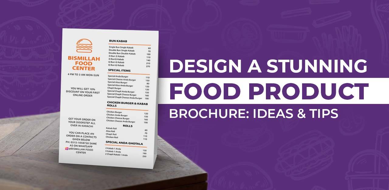
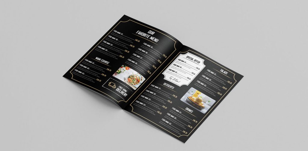
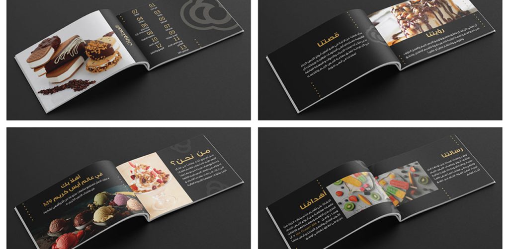
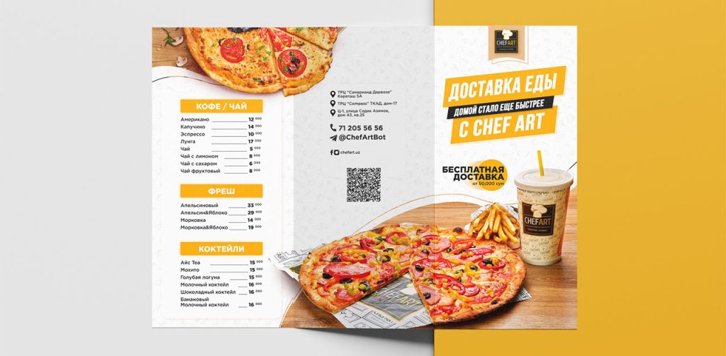
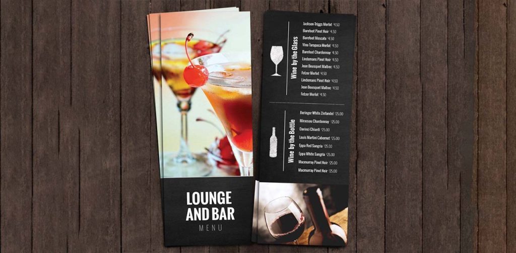
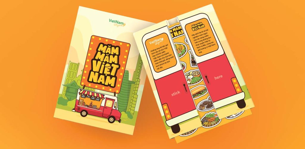
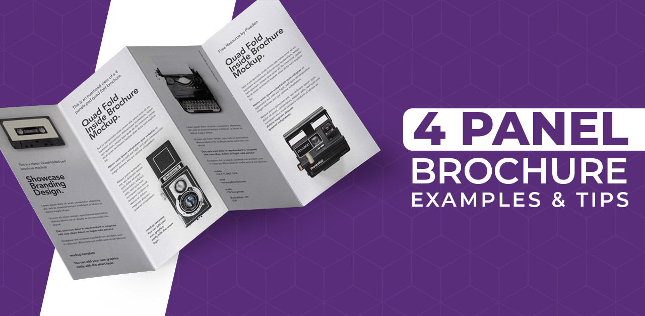
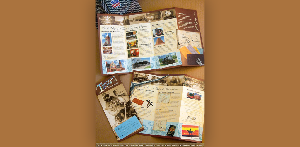
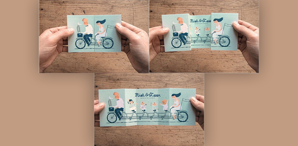
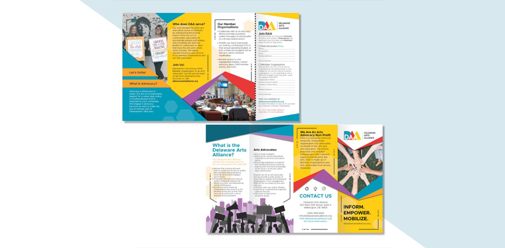
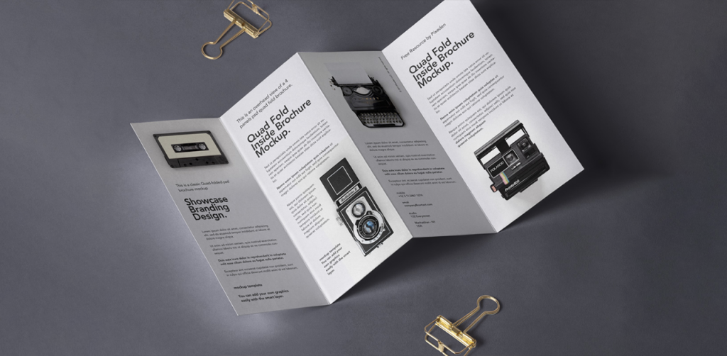
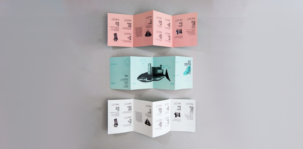
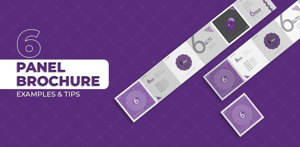
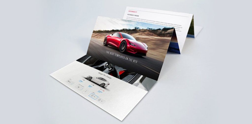
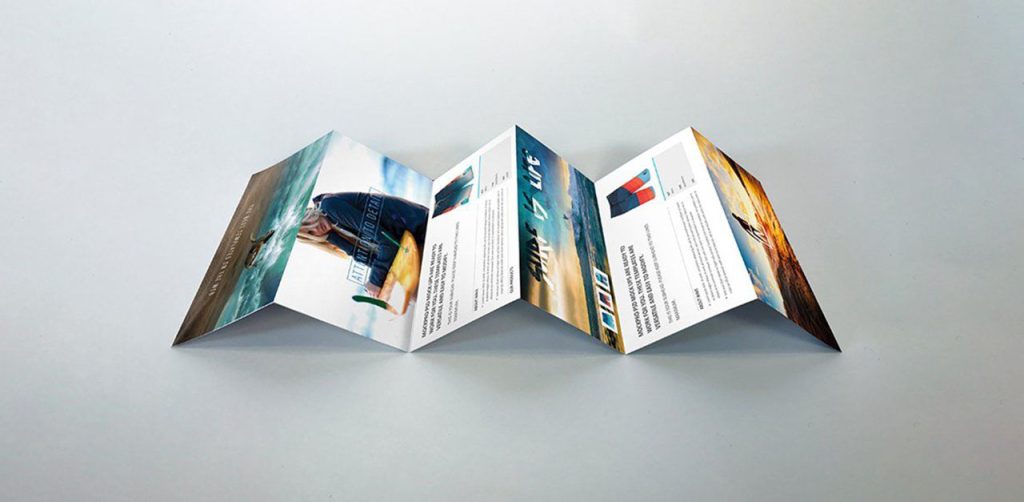
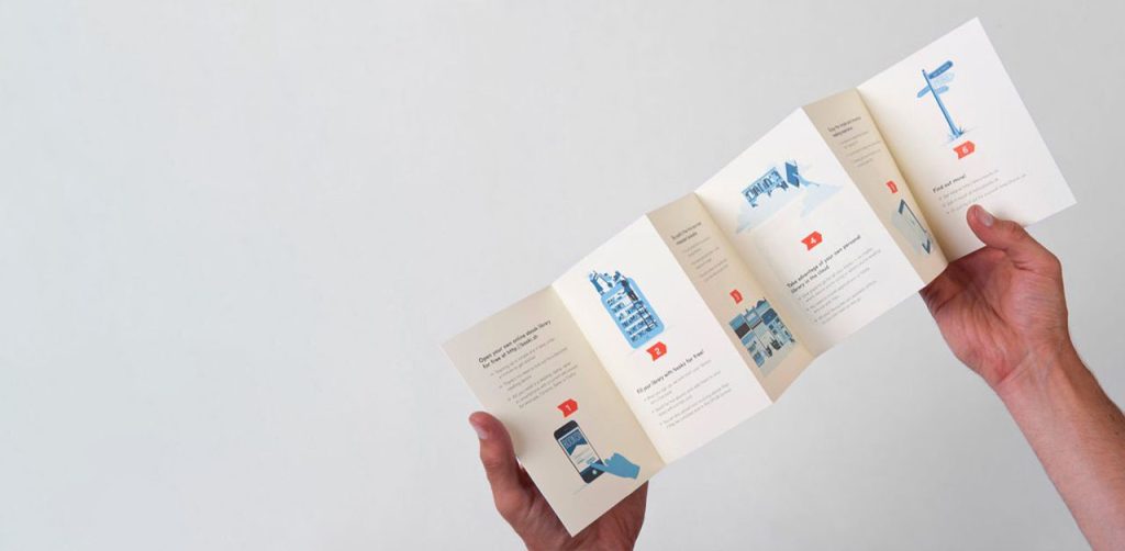
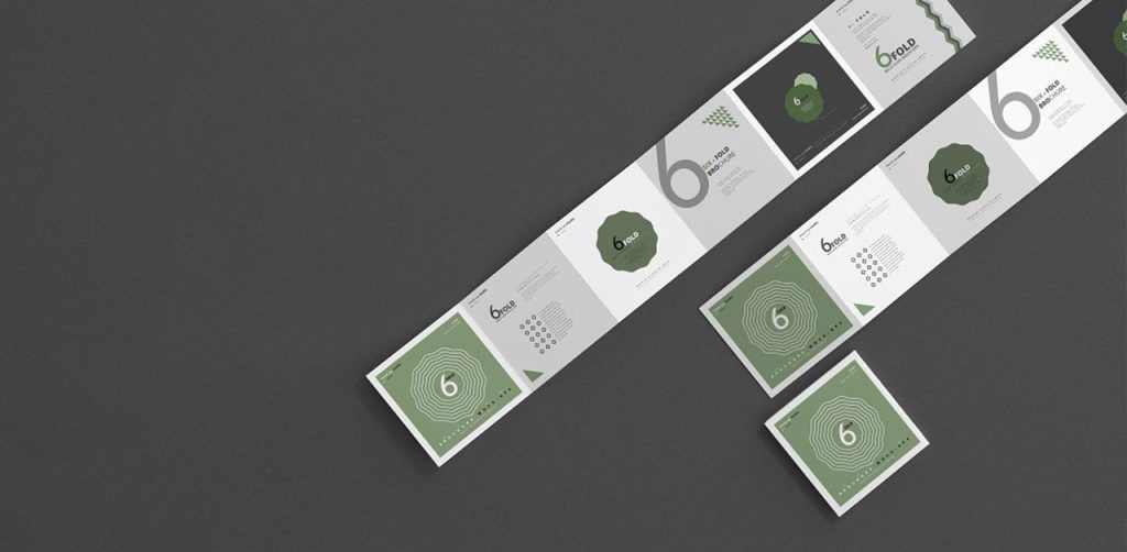
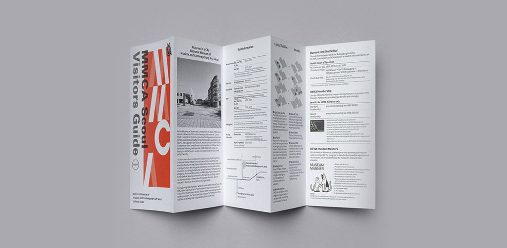
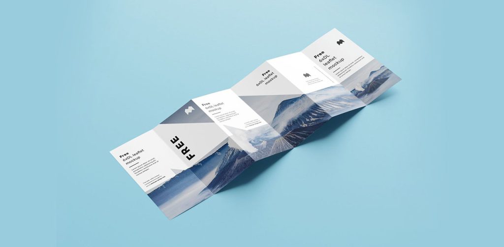
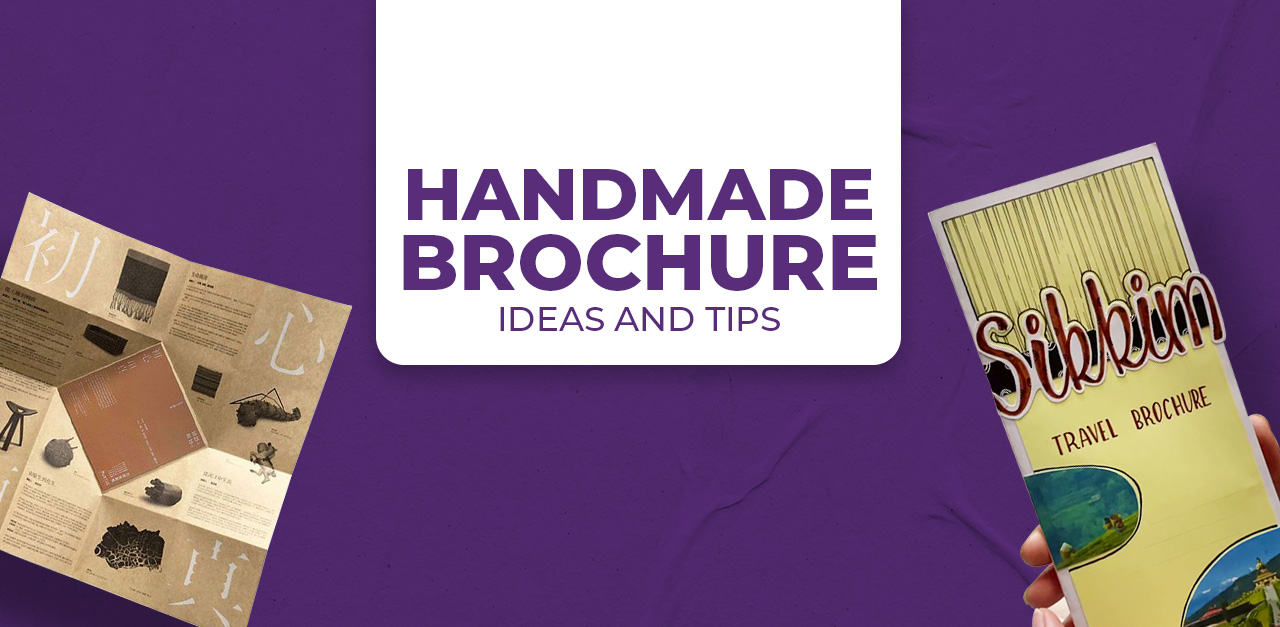
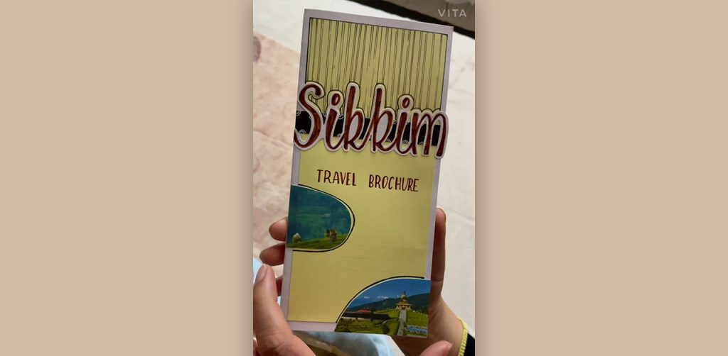
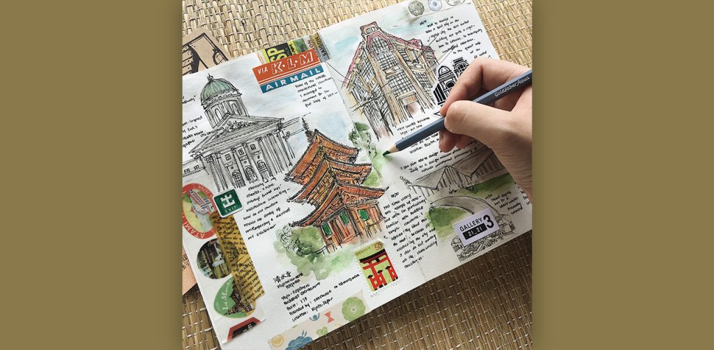
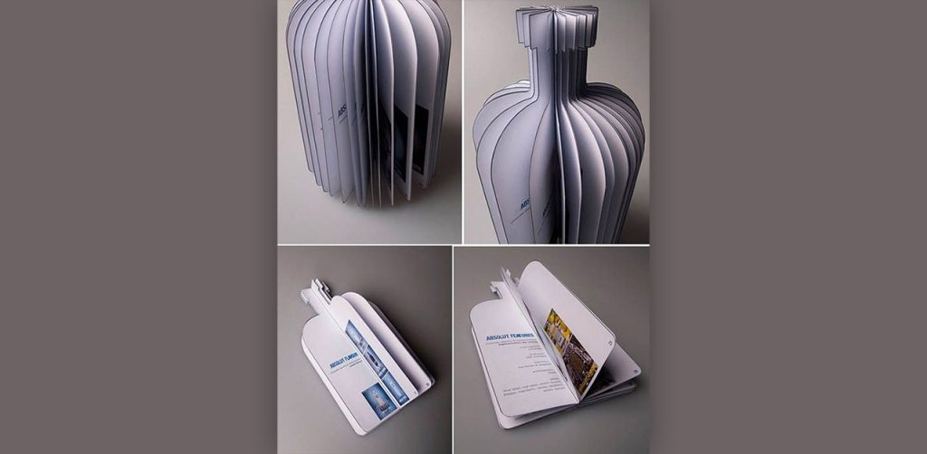
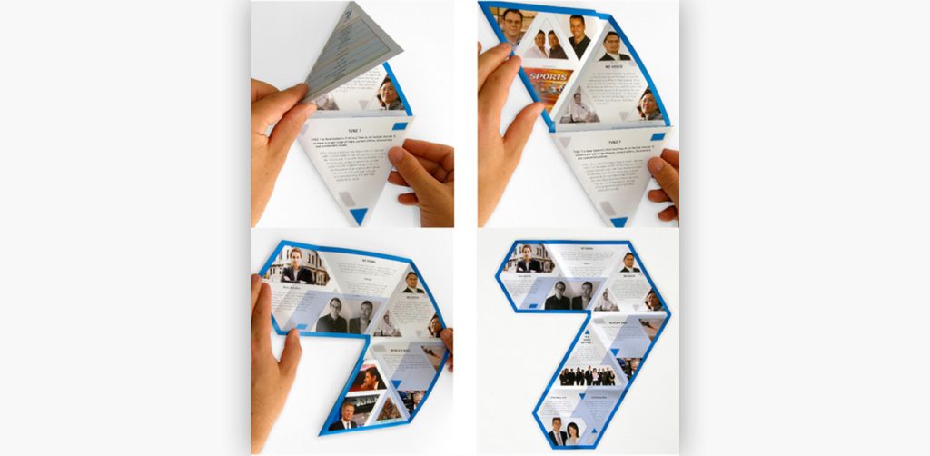
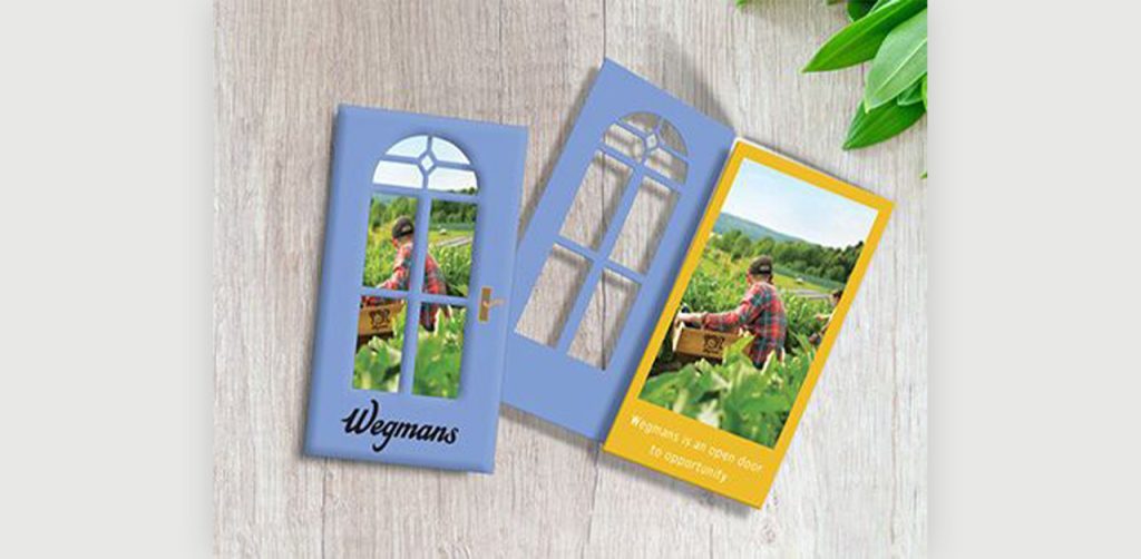
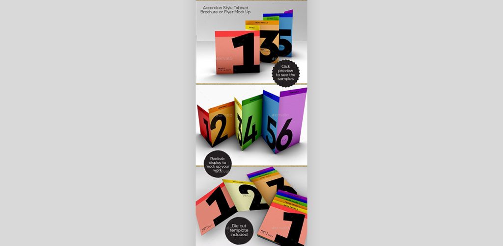
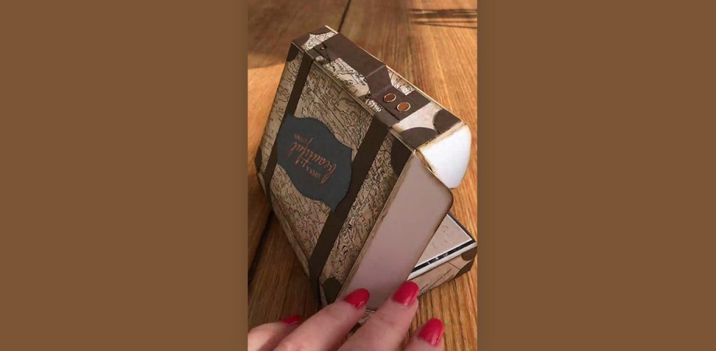
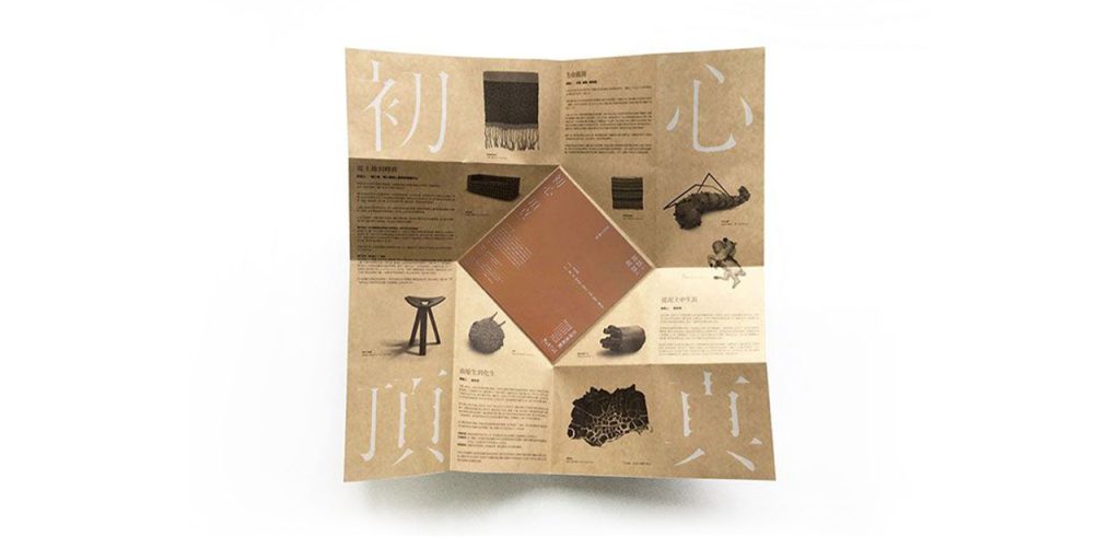
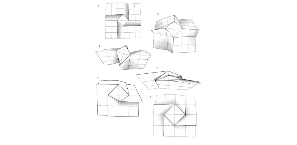
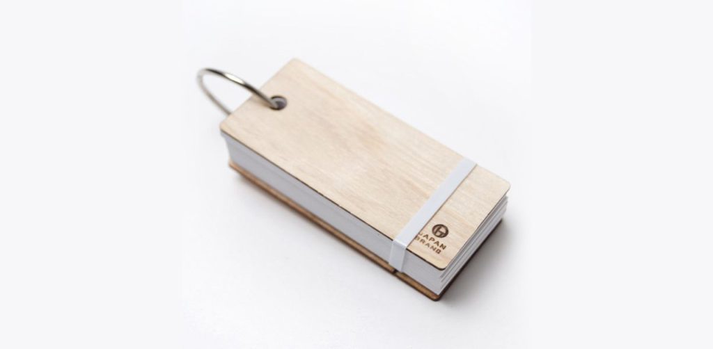
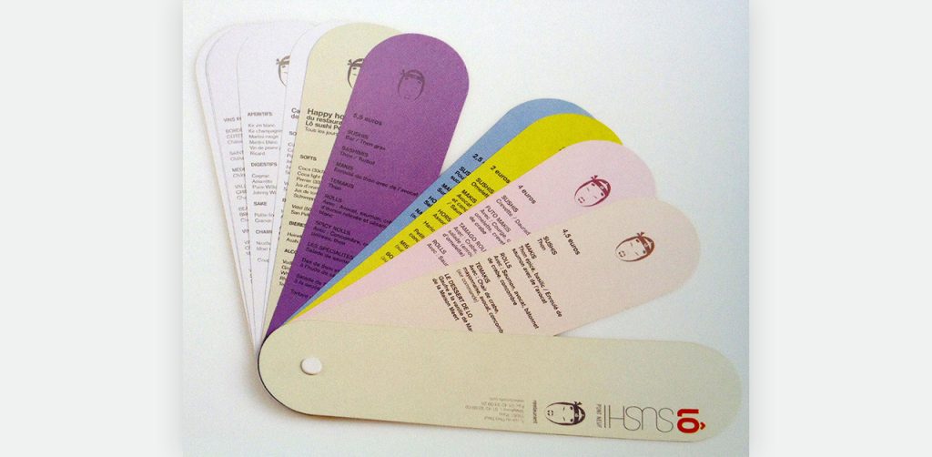
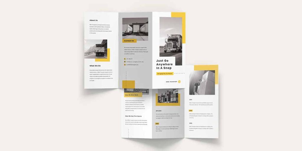
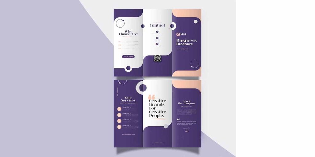
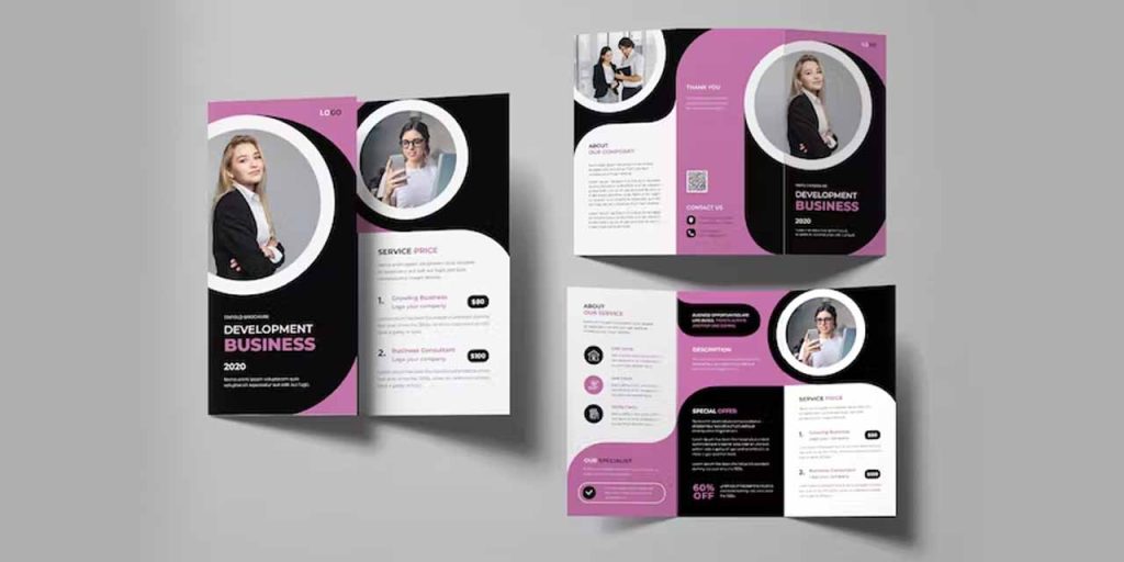
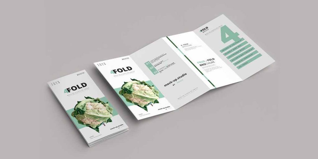
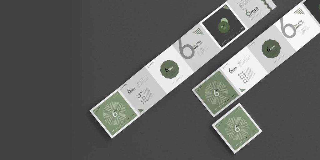
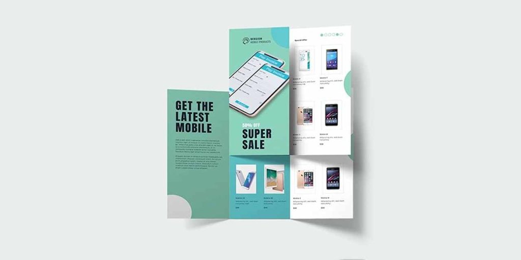
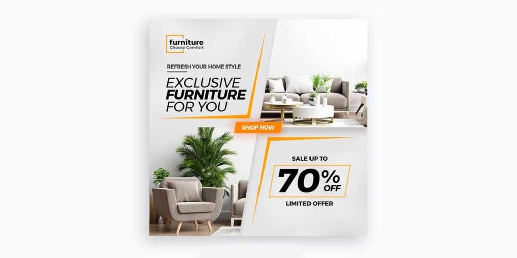
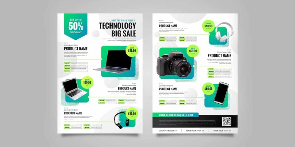
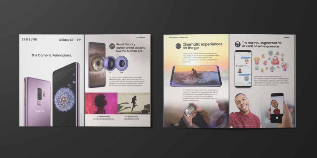
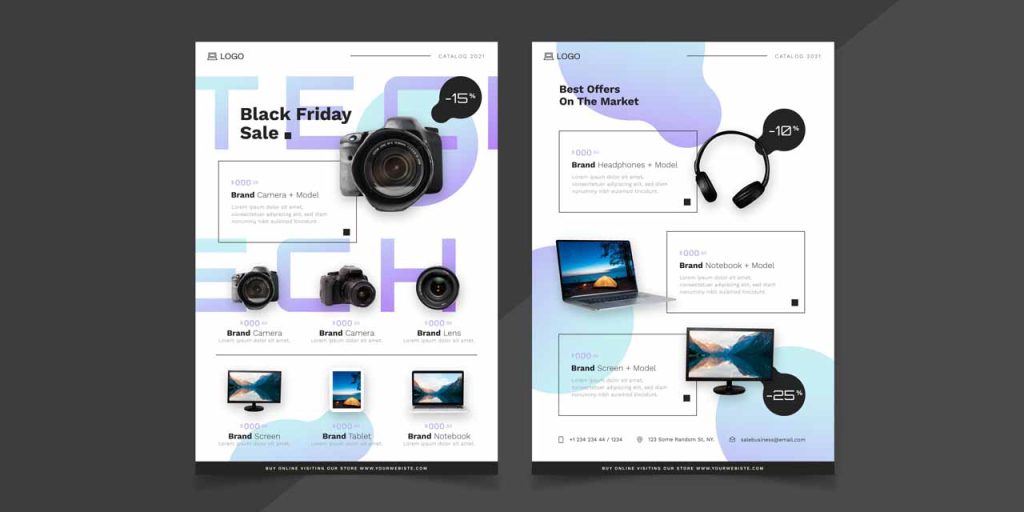
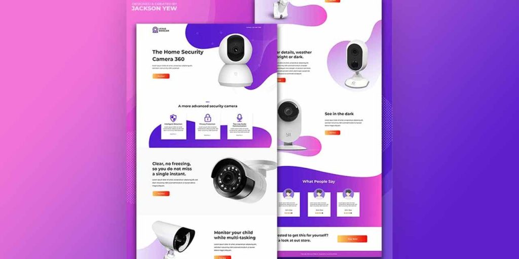
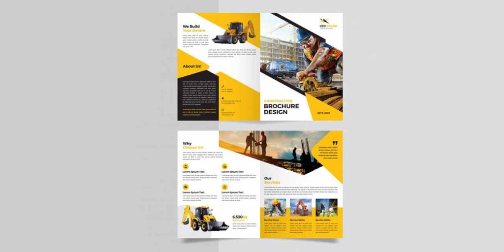
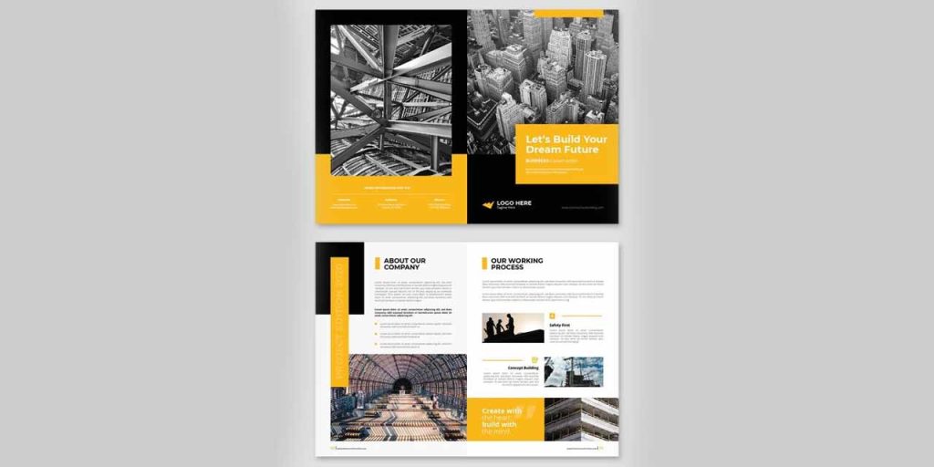
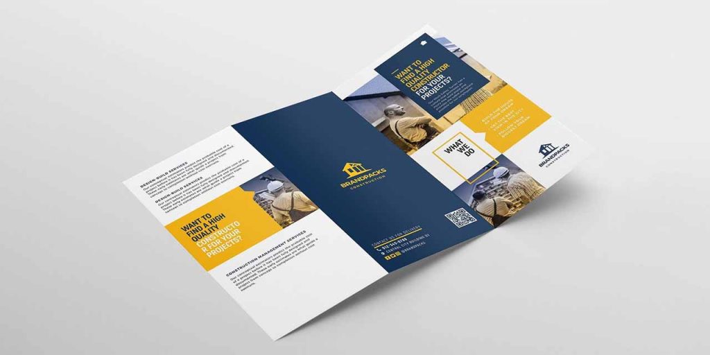
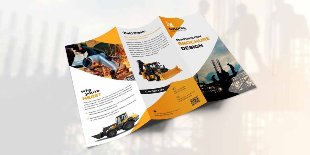
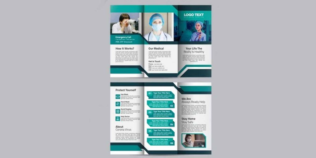
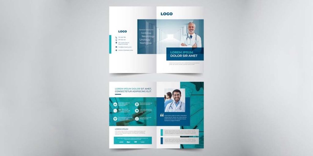
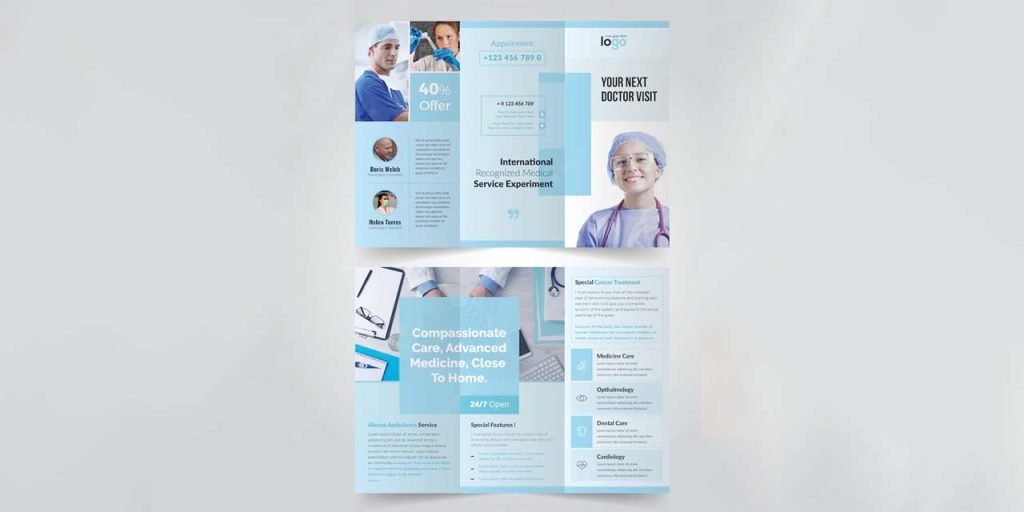
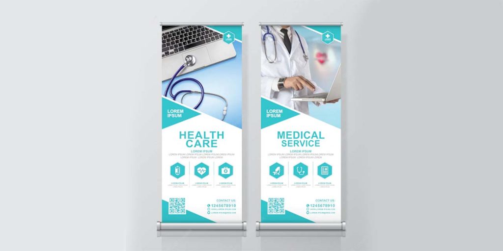
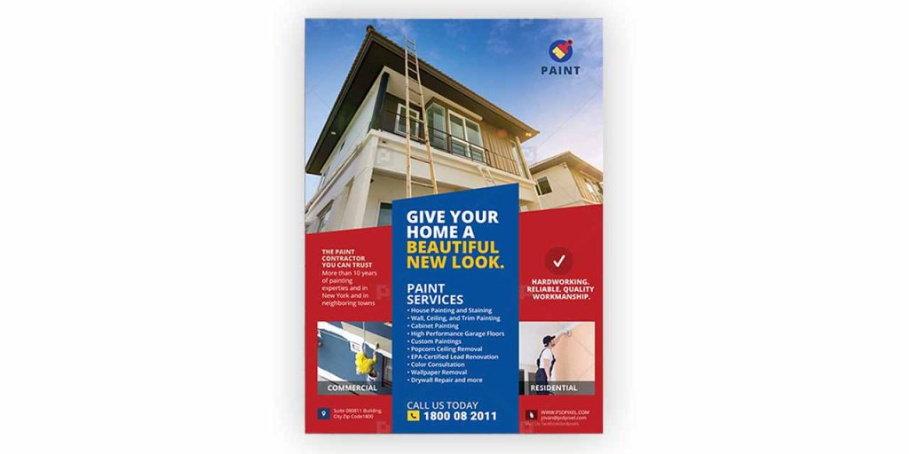
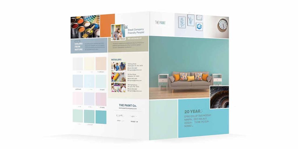
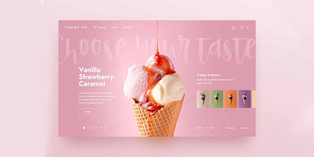
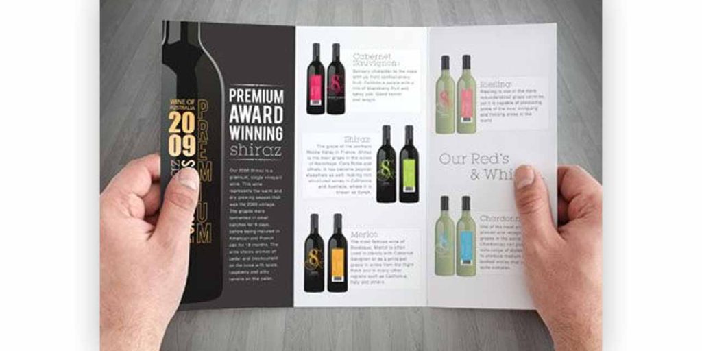
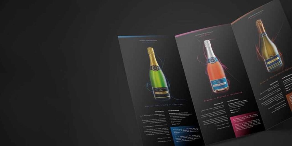
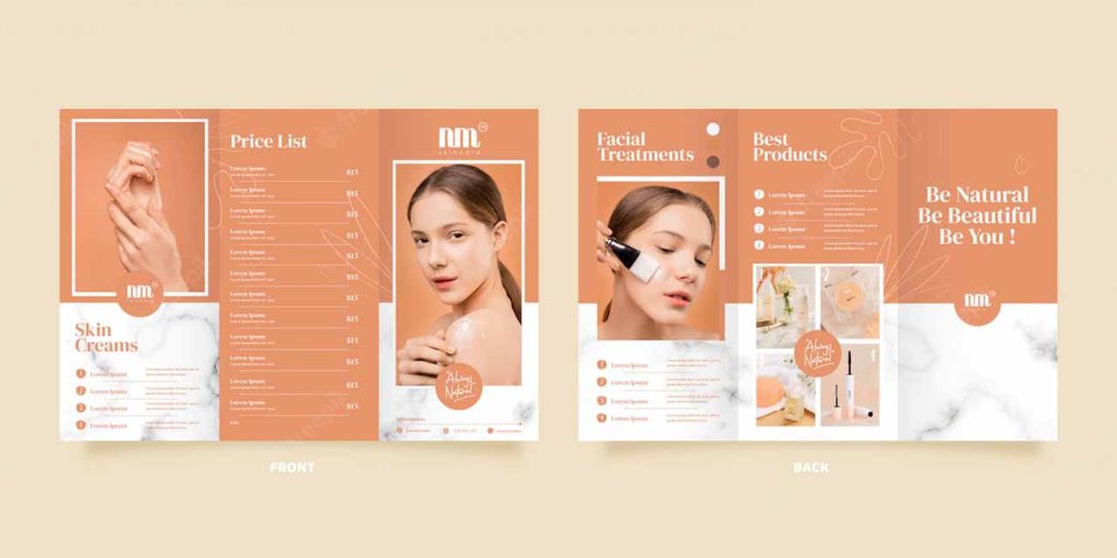
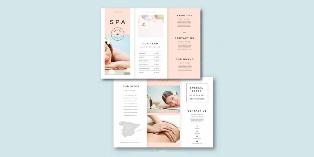
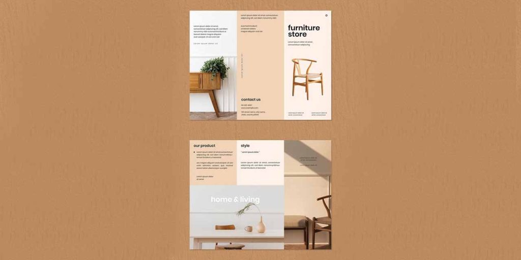
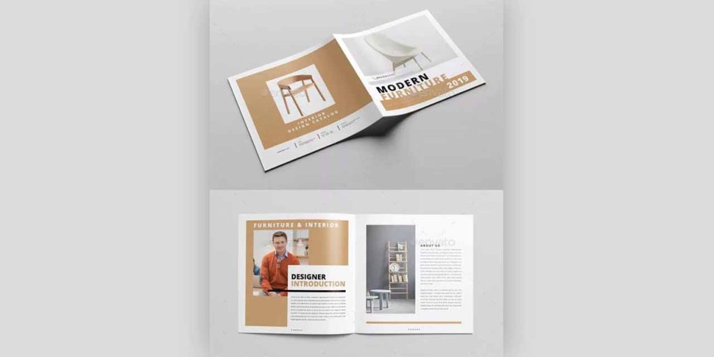
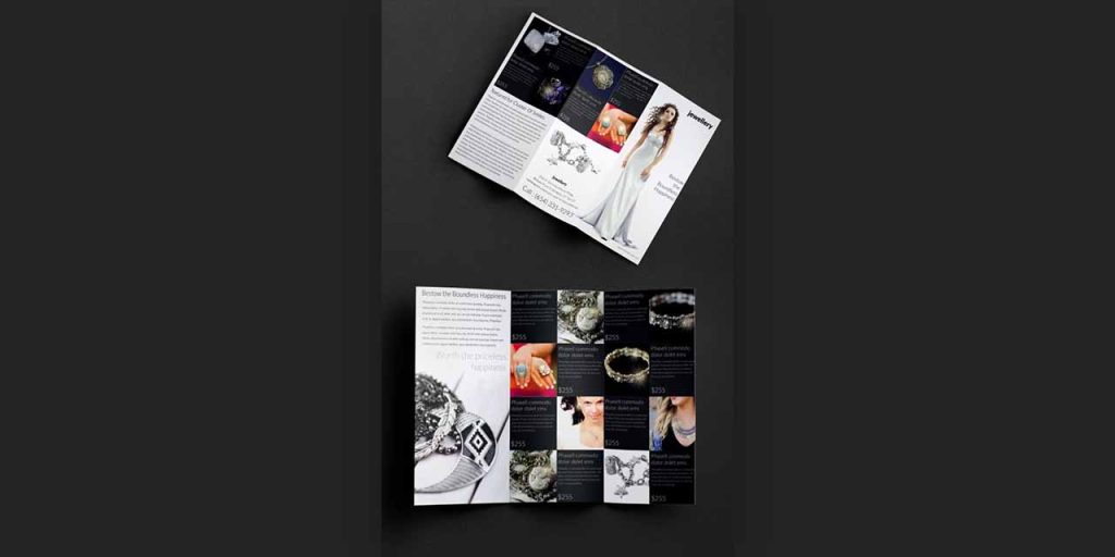
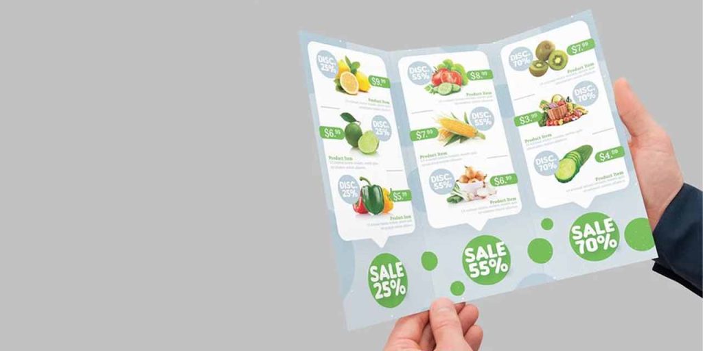
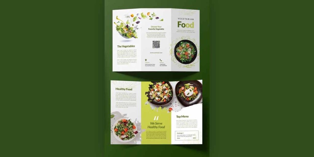
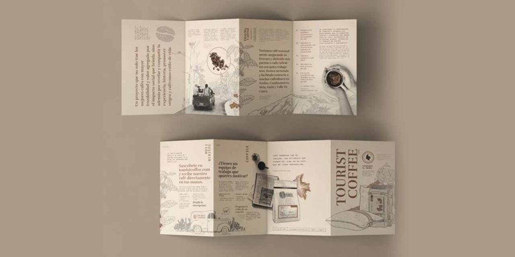
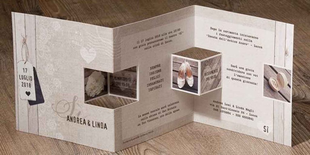
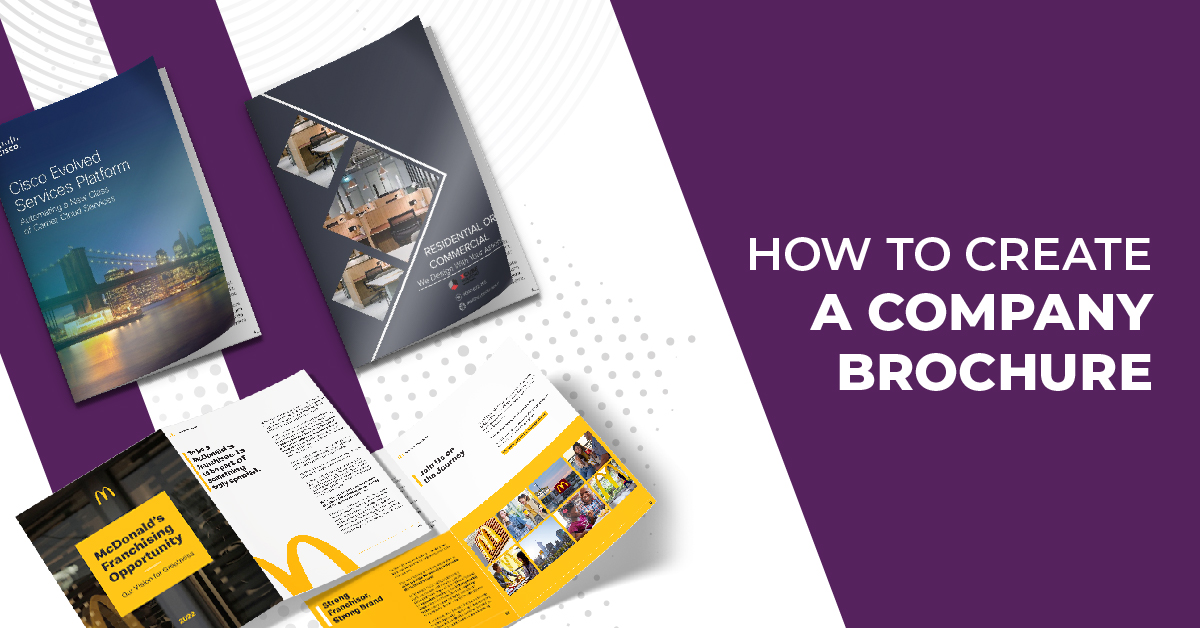
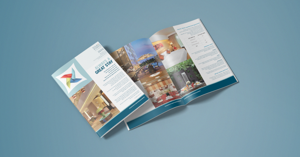
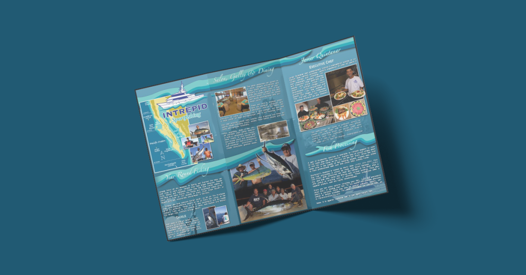
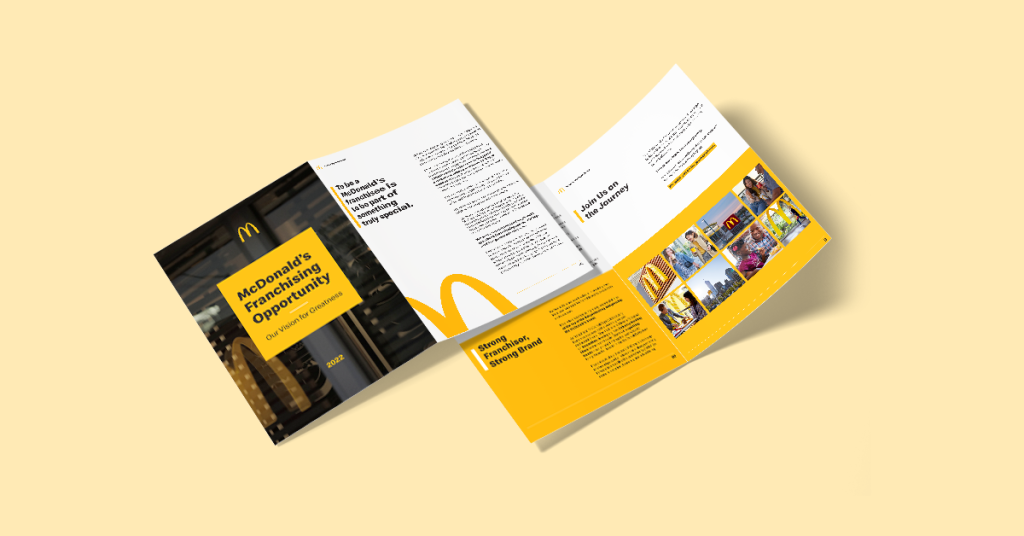
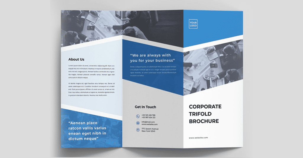
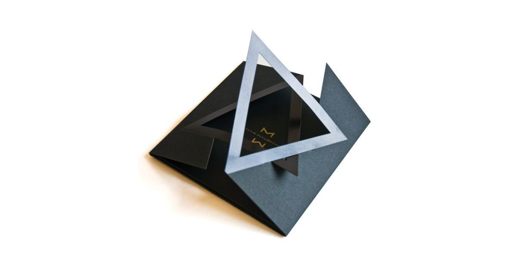
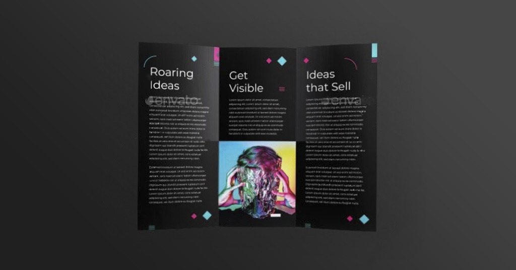
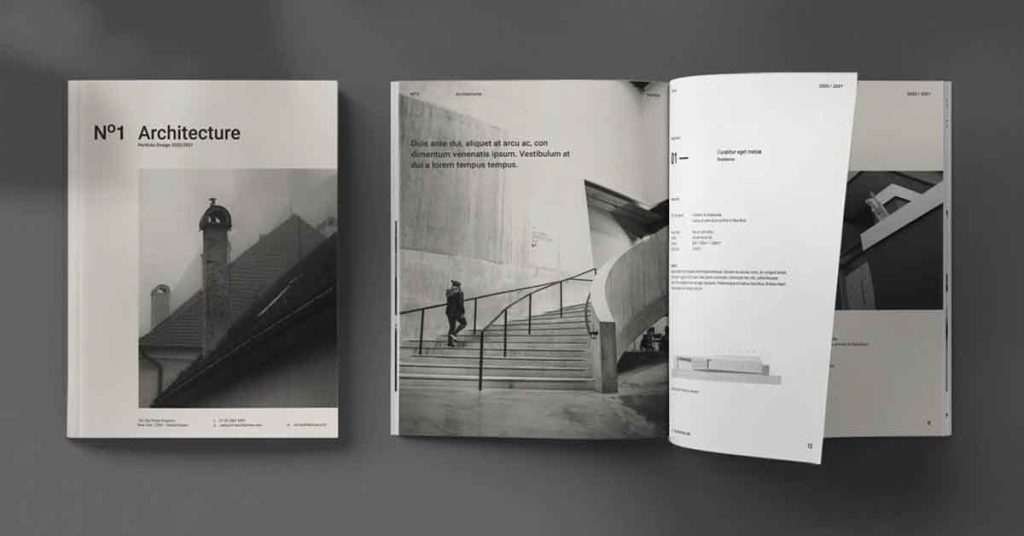
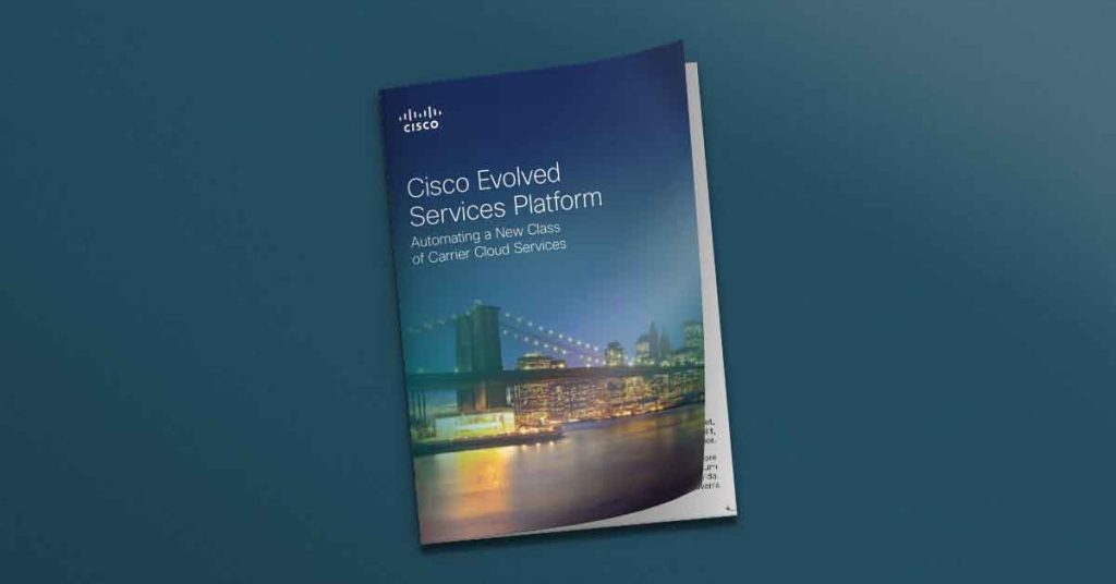
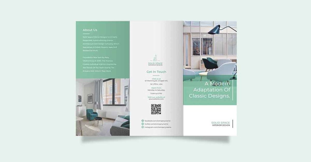
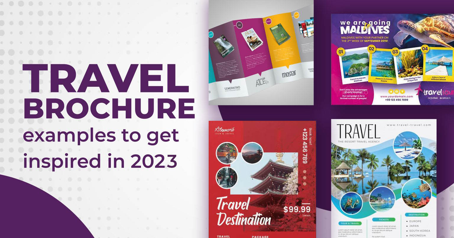
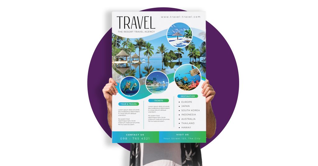
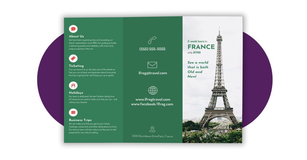
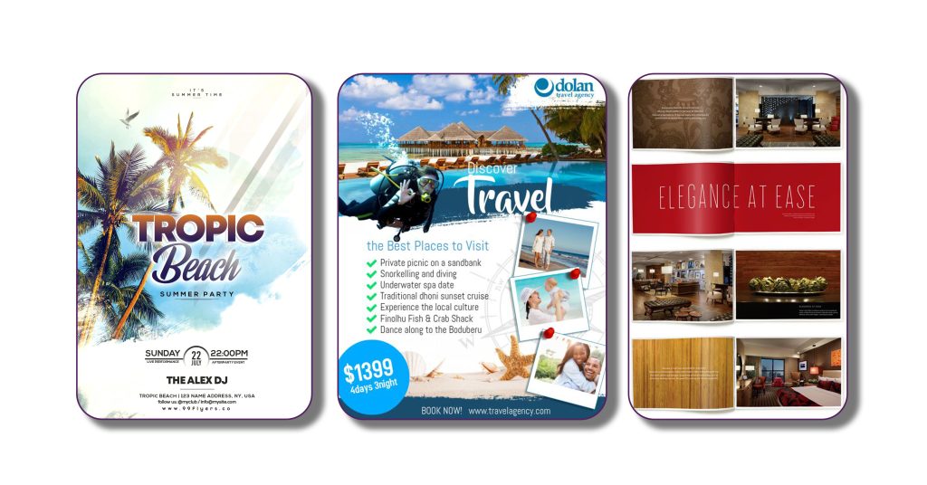
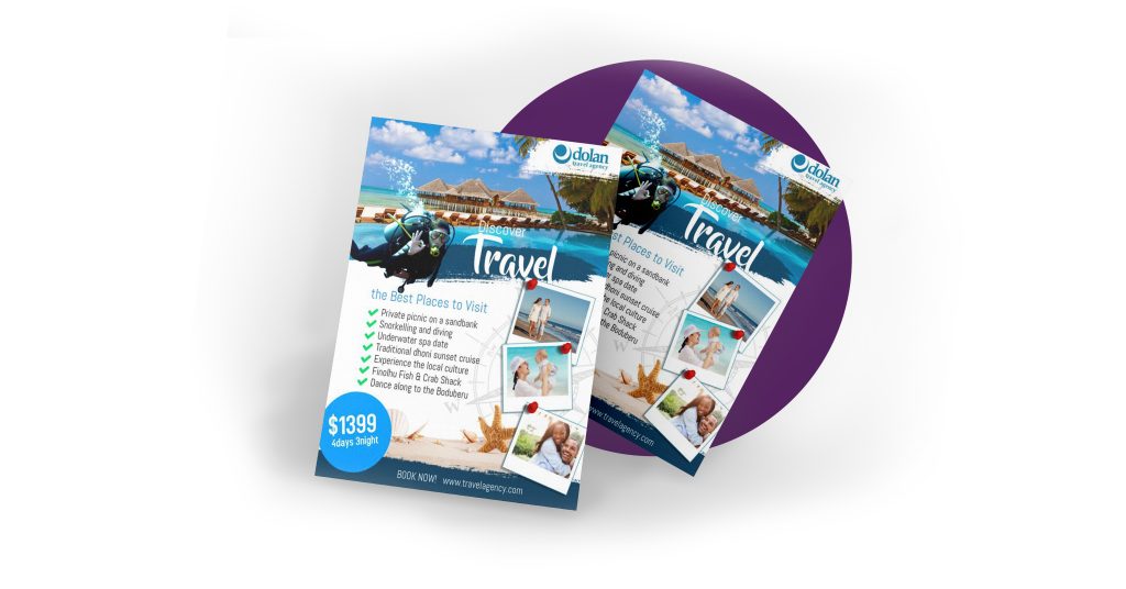
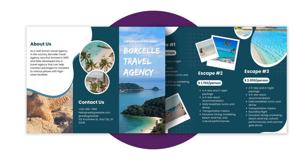
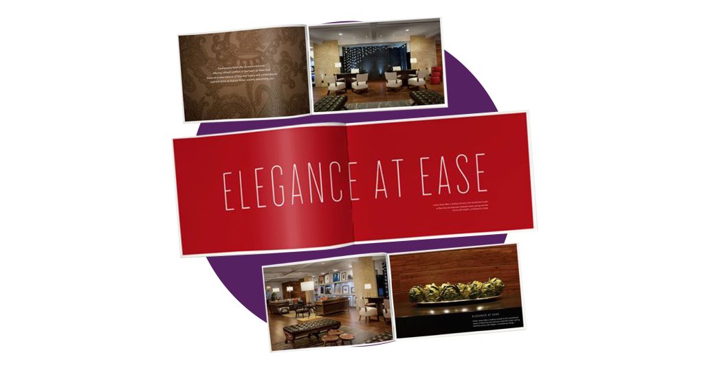
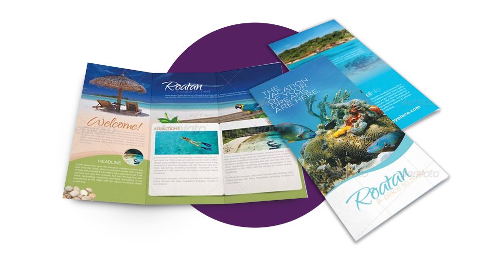
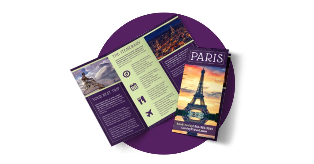
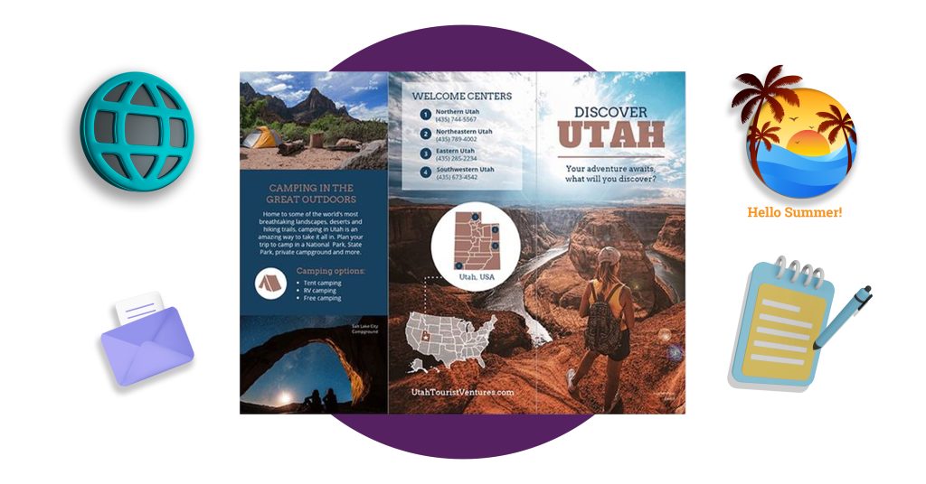
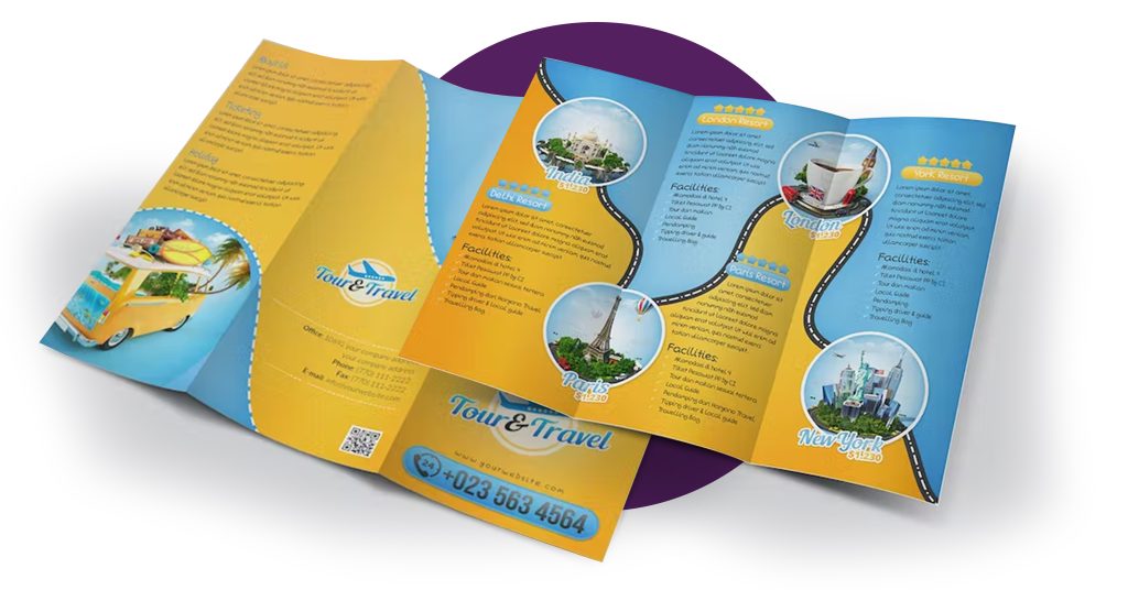
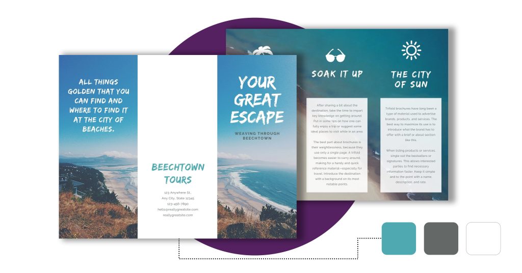
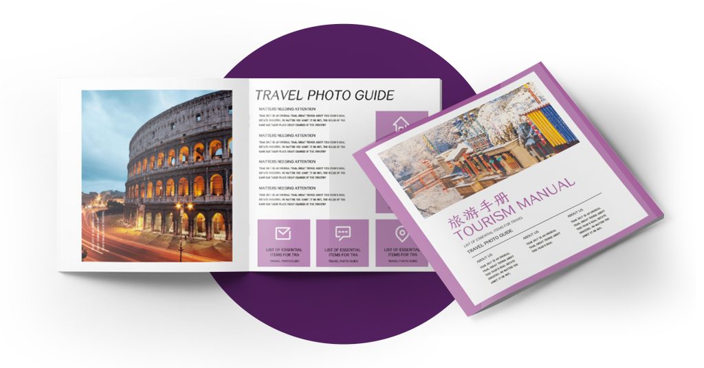
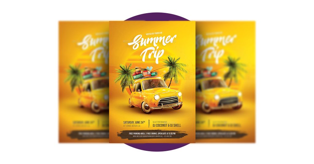
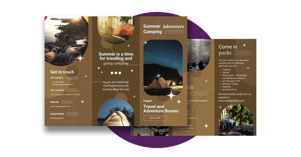
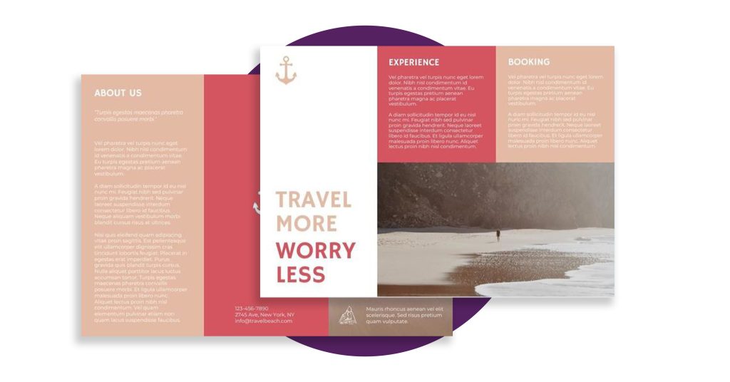
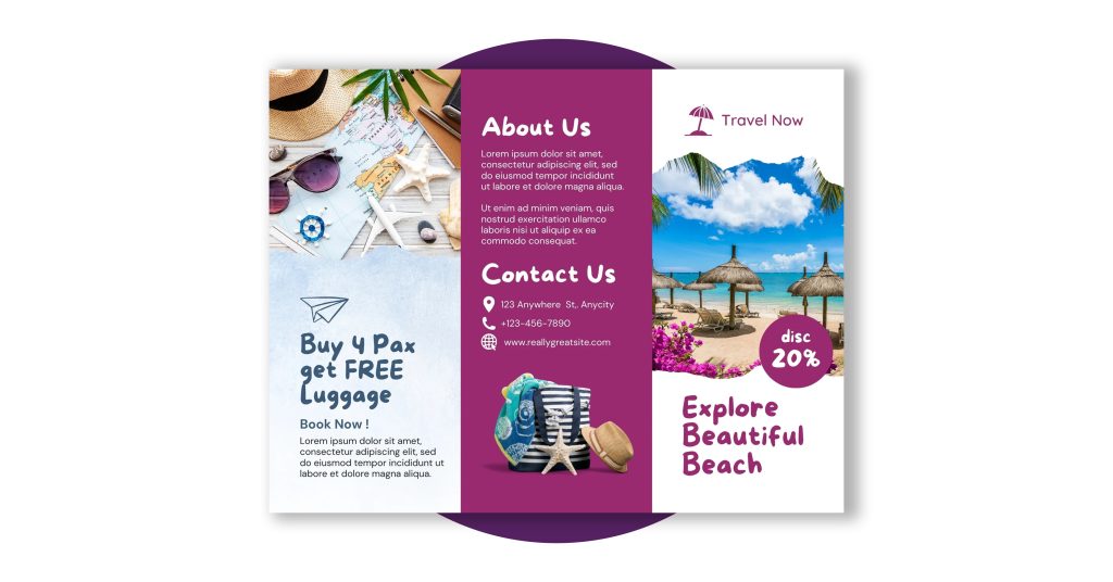
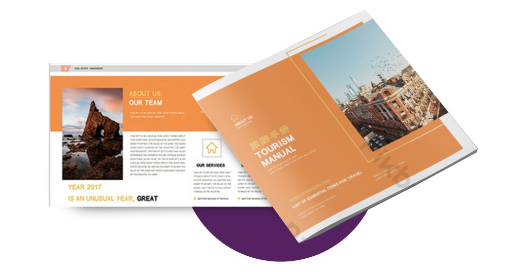
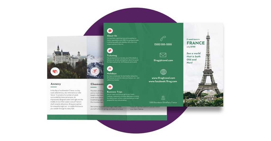
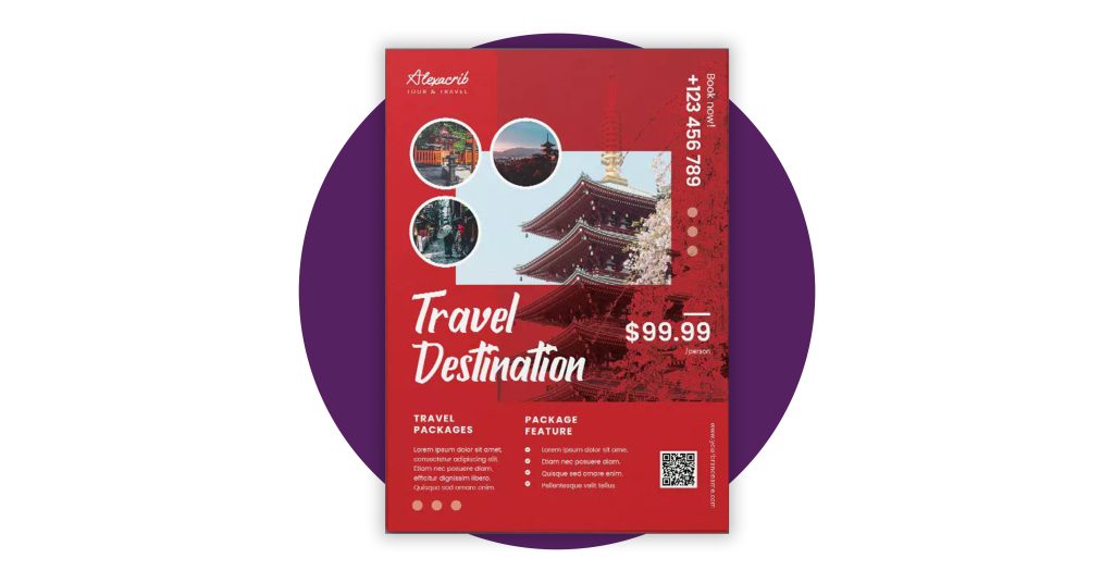
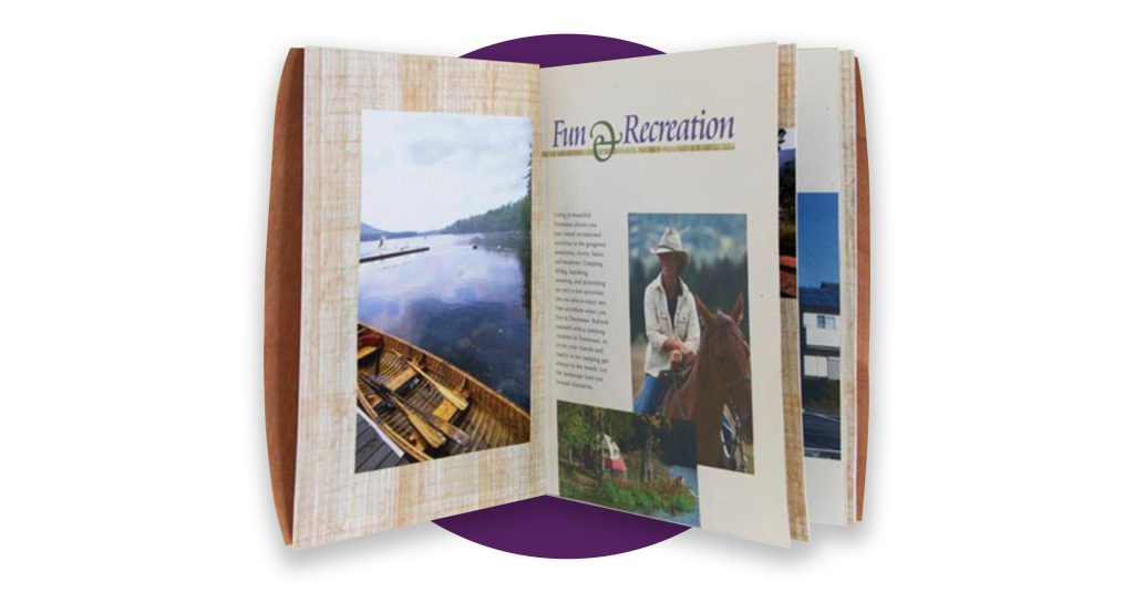
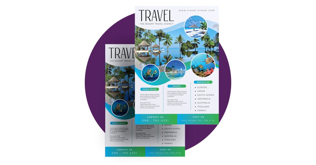
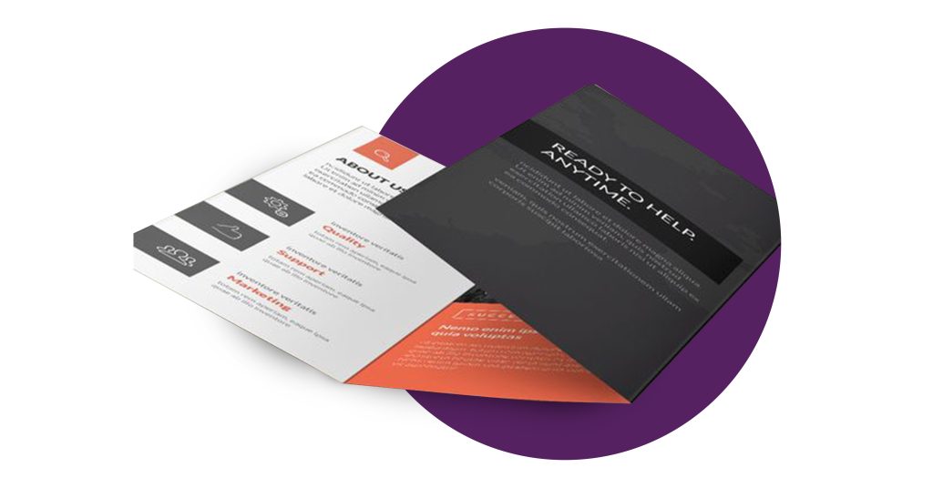
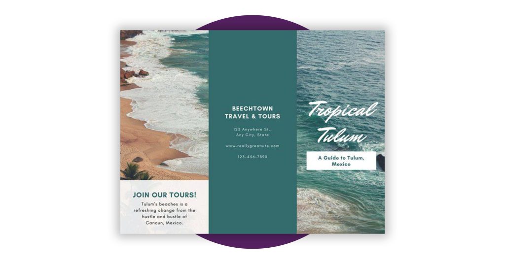
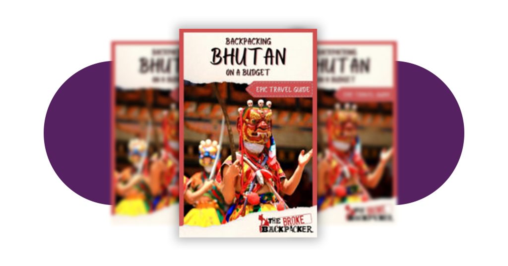
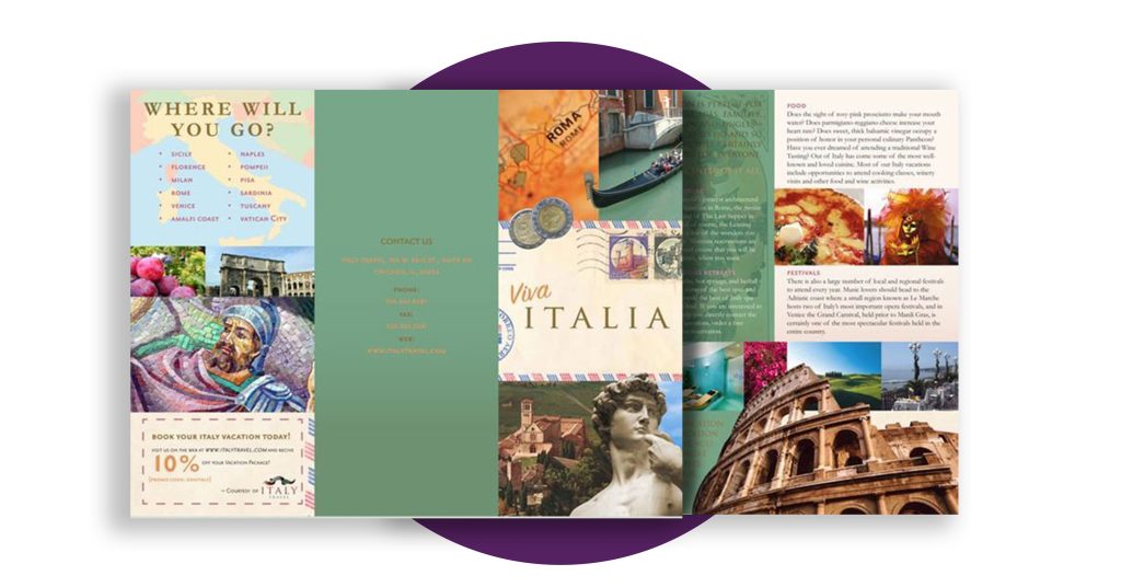
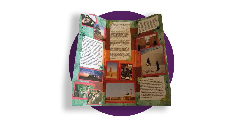
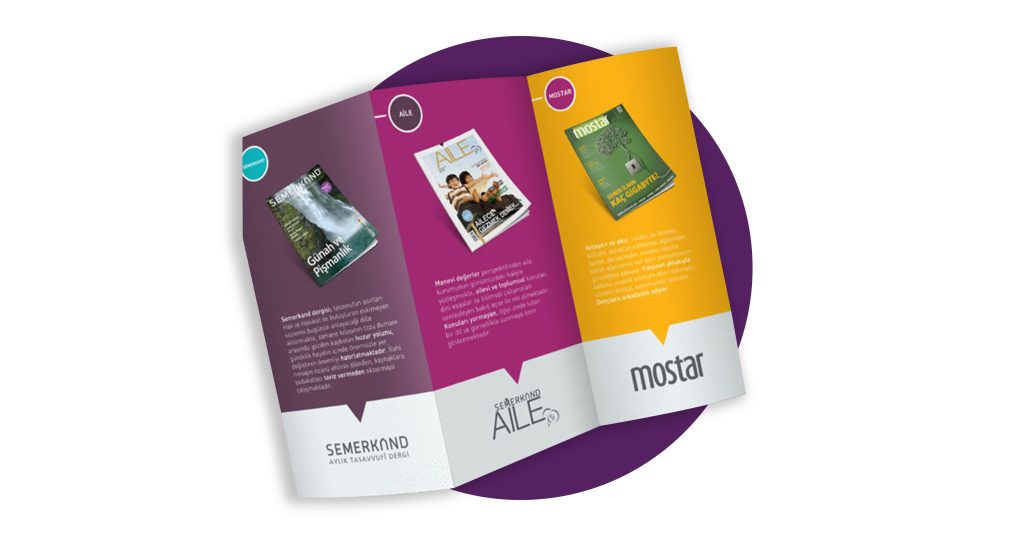
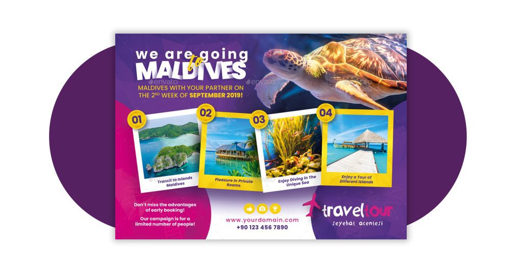
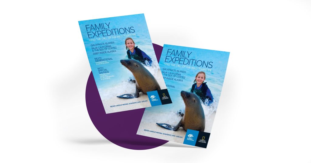
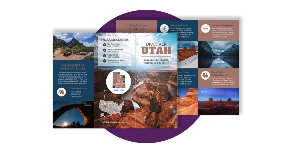
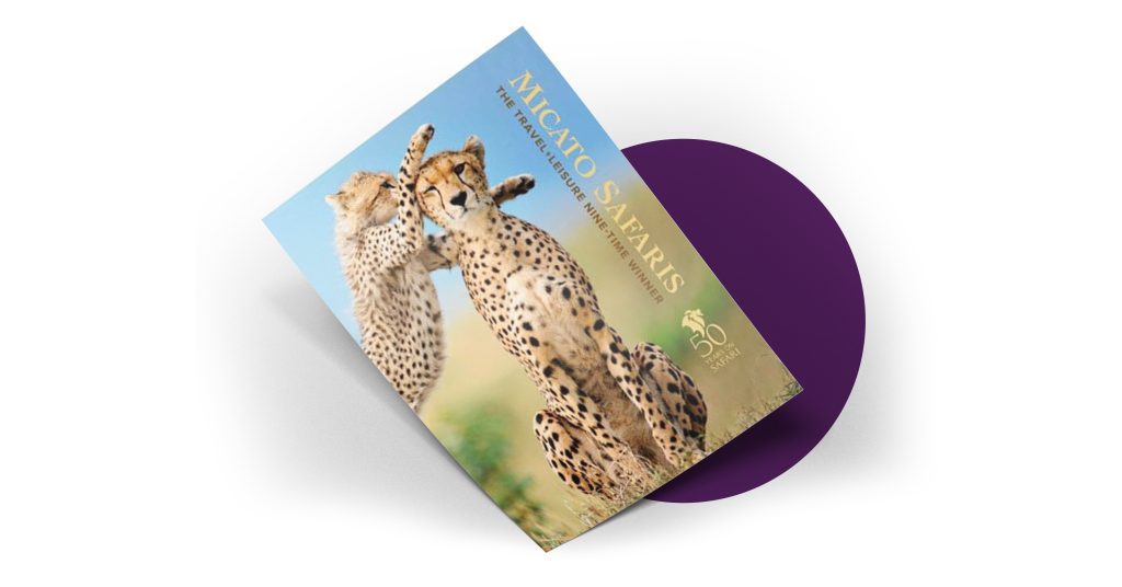
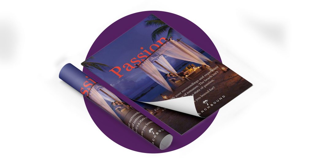
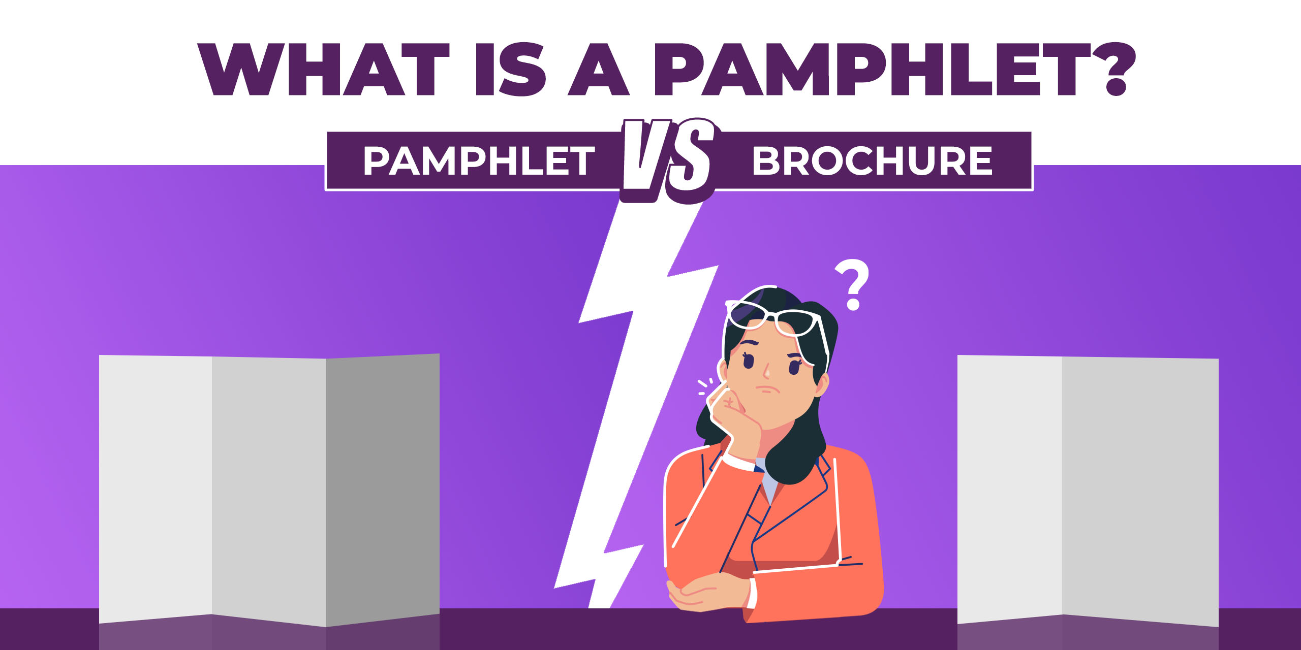
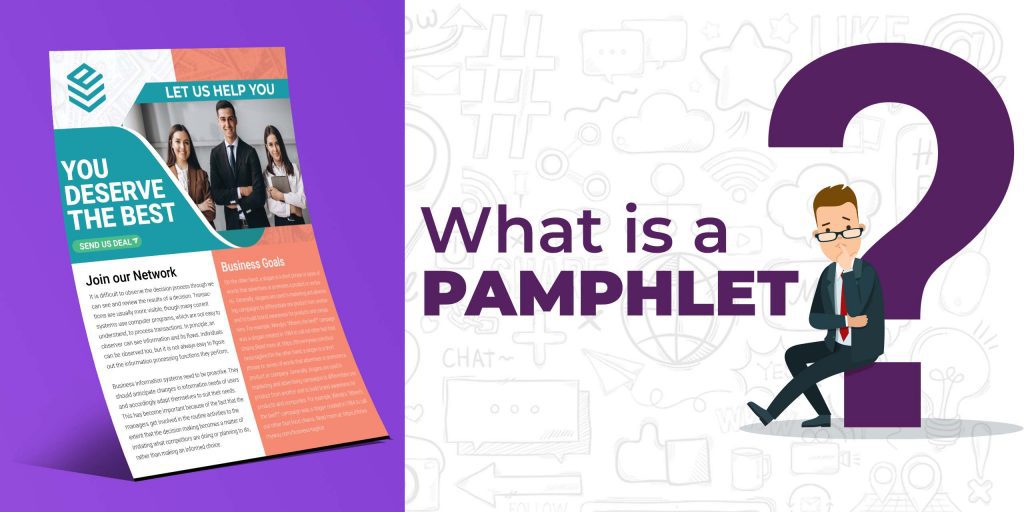
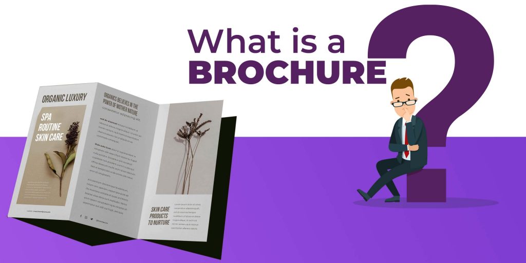
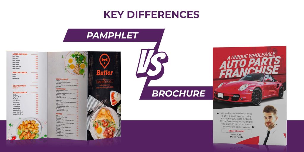
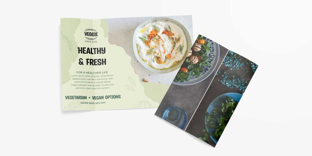
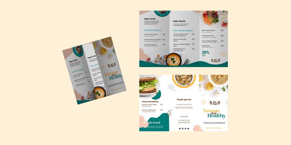
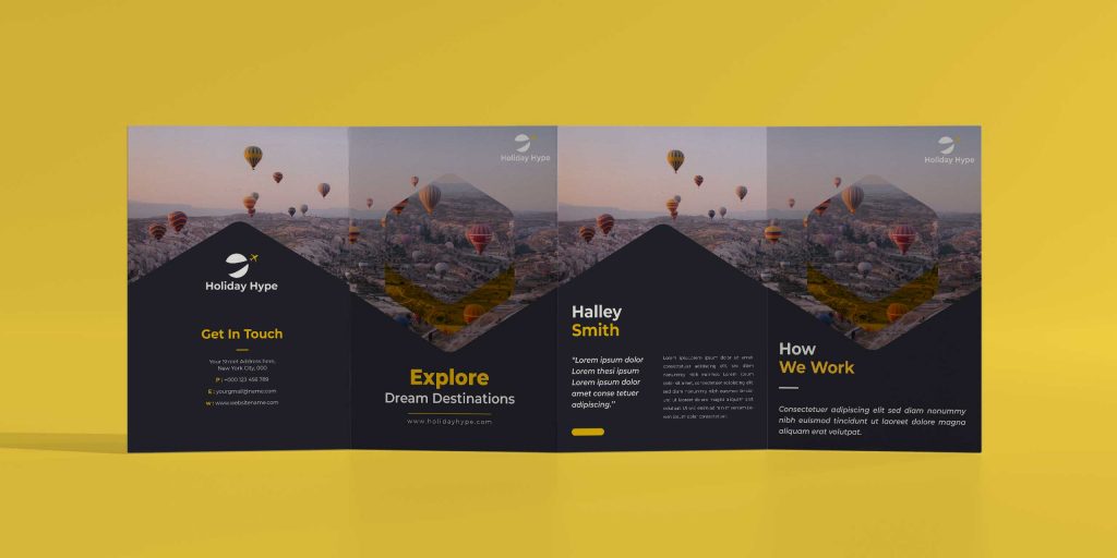
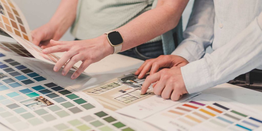
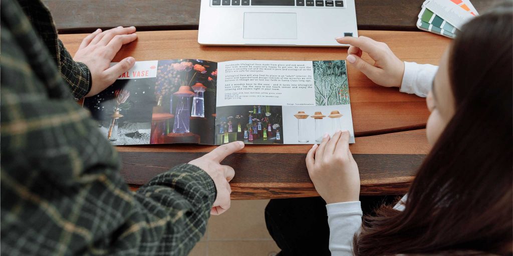
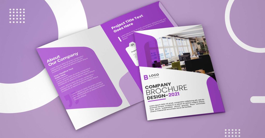
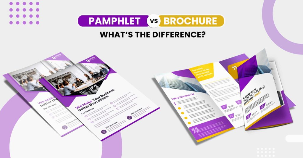
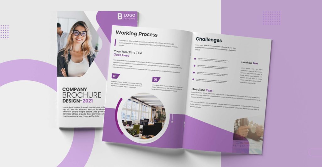
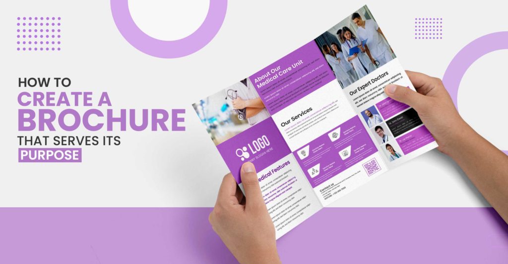
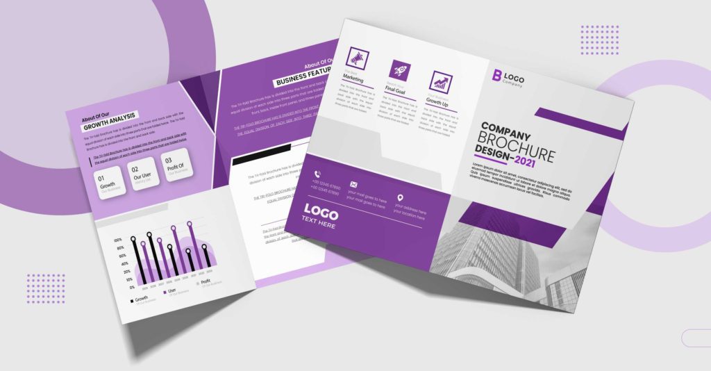
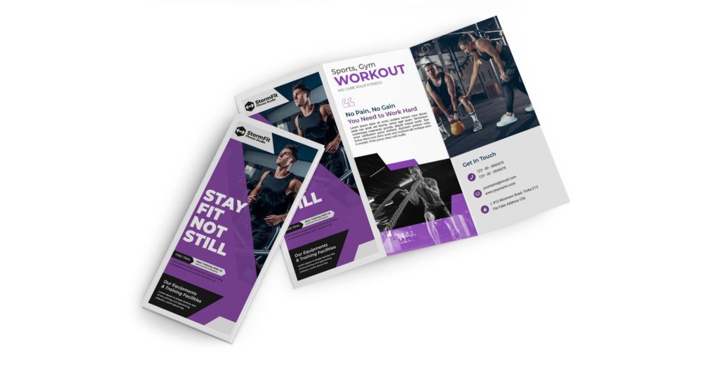
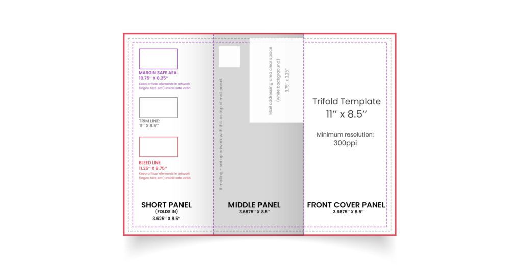
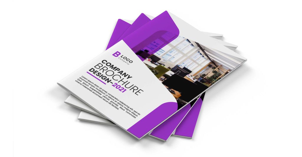
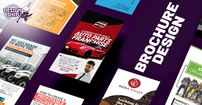