Namisha Lakhani, Author at Design Shifu

10 Best Fonts for Presentations: A Comprehensive List

When delivering effective presentations, the 10 Best Fonts for Presentations: A Comprehensive List may prove to be the difference. Selecting the appropriate font for your slides will help guarantee that your message is clear, professional, and aesthetically pleasing.

Within this blog, we will discuss the best fonts for various presentations depending on whether you are presenting before a boardroom, a classroom, or remote audience. By choosing the proper typeface, you will not only improve readability but also add to the overall design of your slides.

Curious to know which fonts can transform your presentation from ordinary to extraordinary? There are many fonts capable of doing that but you need to choose the best font type for your presentation.

Let’s explore the best fonts that can assist you in making more effective and interactive presentations.

10 Best Fonts for Presentations

Garamond

Garamond, a classic serif font, is renowned for its timeless elegance and readability. With refined serifs and a well-balanced design, Garamond imparts a sense of sophistication to presentations. This font is an excellent choice when you want to convey a traditional and professional tone, creating a visually appealing and polished look for your slides.

Palatino

Palatino, a classic serif font, exudes sophistication and readability. Its well-defined serifs and balanced letterforms contribute to an elegant and timeless aesthetic. Palatino is an excellent choice for presentations where a touch of traditional style and formality is desired, enhancing the visual appeal of your slides.

Proxima Nova

Proxima Nova is a modern sans-serif font celebrated for its clean and versatile design. With a harmonious balance between rounded and straight letterforms, Proxima Nova presents a contemporary and professional appearance. Its adaptability makes it suitable for a wide range of presentation themes, ensuring a sleek and polished visual impression.

Segoe

Segoe, a sans-serif font developed by Microsoft, is known for its clean and modern look. With rounded letterforms and balanced proportions, Segoe offers a friendly and approachable aesthetic, making it ideal for professional presentations. Its versatility and legibility across various screen sizes contribute to a seamless visual experience.

Corbel

Corbel, another Microsoft font, is a clean and straightforward sans-serif typeface. With its minimalistic design and even spacing, Corbel ensures clarity and readability in presentations. Its modern appearance adds a touch of professionalism, making it a reliable choice for a clean and contemporary visual style.

Rockwell

Rockwell, a slab serif font, brings a bold and robust presence to presentations. With its thick and distinctive serifs, Rockwell conveys a sense of strength and impact. This font is an excellent choice when you want to emphasize key points and create a memorable visual impact in your slides.

Bentham

Bentham, a serif font with classical influences, adds a touch of historical elegance to presentations. Its well-defined serifs and balanced letterforms create a refined and sophisticated look. Bentham is a suitable choice when you want to infuse your slides with a sense of tradition and formality.

Fonseca

Fonseca is a contemporary sans-serif font with a geometric influence. Its clean lines, rounded shapes, and generous spacing create a modern and friendly appearance. Fonseca is a versatile choice that brings a sense of freshness and simplicity to your presentation, ensuring both style and readability.

Bell MT

Bell MT, a classic serif font, is characterized by its timeless elegance and refined details. With well-crafted serifs and balanced letterforms, Bell MT adds a touch of sophistication to presentations. This font is an excellent choice when you want to convey a sense of tradition and professionalism.

Tahoma

Tahoma, a sans-serif font designed for on-screen legibility, combines clarity with a modern look. Its sturdy letterforms and even spacing enhance readability, making Tahoma a practical choice for presentations. The font’s neutrality ensures that your content remains accessible and easy to follow.

When it comes to presentations, the right fonts make all the difference. Design Shifu offers not just fonts but a comprehensive suite of graphic design services. Subscriptions start at $399 per month for unlimited designs, same-day delivery, and a 100% 14-day money-back guarantee.

Our dedicated designers, integrated with Canva, Trello, Slack, and more, are here to bring your vision to life. Click here to book a demo and witness the transformation with our expert presentation design services!

10 Most Popular Fonts for Presentations

Raleway

Raleway is a modern sans-serif font known for its clean and elegant appearance. With its thin, sleek lines, it exudes a contemporary and professional vibe, making it ideal for presentations. The minimalistic design ensures clarity and readability, enhancing the visual appeal of your slides.

Lato:

Lato is a versatile sans-serif font recognized for its friendly and approachable style. Its balanced letterforms and open spacing contribute to easy readability, even in small font sizes. Lato’s warmth adds a touch of friendliness to your presentation while maintaining a professional and polished look.

Calibri:

Calibri, a default font in Microsoft Office, is widely chosen for presentations due to its clear and straightforward design. Its rounded shapes and moderate spacing result in a friendly yet professional aesthetic. Calibri is a safe and practical choice, ensuring that your content remains easily accessible to a broad audience.

Verdana:

Verdana is a sans-serif font designed for on-screen readability. Its bold and simple letterforms make it an excellent choice for presentations, especially when projected. The generous spacing between characters enhances legibility, ensuring that your audience can effortlessly follow your content, even from a distance.

Georgia:

Georgia, a serif font, brings a touch of sophistication to presentations. Its robust letterforms and distinct serifs make it suitable for conveying a classic and formal tone. Georgia is an excellent choice when you want to add a bit of traditional elegance to your slides while maintaining readability.

Poppins:

Poppins is a contemporary sans-serif font with a geometric feel. Its rounded letterforms and ample spacing create a friendly and modern look, making it well-suited for a variety of presentation styles. Poppins add a touch of personality to your slides while ensuring clarity and visual appeal.

Coolvetica:

Coolvetica is a stylish and edgy sans-serif font that injects a sense of creativity into your presentations. With its bold letterforms and unique character shapes, Coolvetica is perfect for conveying a modern and unconventional vibe. It’s an excellent choice when you want your presentation to stand out with a touch of artistic flair.

Roboto:

Roboto, designed for Google, is a versatile sans-serif font that combines neutrality with modern aesthetics. Its clean lines and balanced proportions contribute to a professional and contemporary look, making it suitable for a wide range of presentation topics. Roboto excels in delivering a clean and polished visual impression to your audience.

Helvetica:

Helvetica is a versatile sans-serif font known for its clean and modern design. Its neutral and balanced letterforms make it a timeless choice for presentations across various themes. Helvetica provides a professional and straightforward appearance, ensuring clarity and readability in your slides. Its simplicity allows for easy integration into a wide range of design styles.

Avenir:

Avenir, a contemporary sans-serif font, combines elegance with modernity. With its rounded letterforms and well-proportioned design, Avenir offers a sophisticated and approachable look for presentations. The font’s versatility allows it to adapt seamlessly to different visual styles, making it a popular choice for creating polished and professional slides with a touch of modern flair.

Factors to Consider When Choosing Fonts

Clear Legibility:

Ensure your chosen fonts are easy on the eyes. Opt for clear, readable typefaces to prevent any visual hiccups, allowing your content to be effortlessly absorbed by your audience.

Visual Consistency:

Stick to a consistent font style throughout your slides. Choosing a clear distinction between titles and body text maintains a visual uniformity that guides your audience smoothly through your presentation.

Strategic Contrast:

Create visual interest by smartly pairing fonts. Use bold, attention-grabbing typefaces for headers, complemented by more subtle, easy-to-read fonts for the body. Striking the right balance adds a touch of sophistication without overwhelming your audience.

Brand Alignment:

Align your fonts with your brand identity. Consistent use of brand-appropriate typefaces reinforces a professional image and helps with brand recognition, ensuring your presentation resonates with authenticity.

Universal Accessibility:

Prioritize fonts that enhance accessibility for all. Choose designs that are clear and legible, considering factors like color contrast and font size to ensure inclusivity across various devices and audiences.

How to Install Custom Fonts in PowerPoint

Step 1: Download the Custom Font

  • Visit a reputable website offering a range of custom fonts, both free and paid.
  • Explore the font collection and pick the ones that suit your preferences.
  • Download the font files in a compatible format, such as .TTF or .OTF.

Step 2: Incorporate the Custom Font

Both Mac and Windows have different ways of incorporating fonts, let’s see both of the ways:

How to Install Custom Fonts in PowerPoint For Windows:

a. Extract the font files from any compressed folders, such as .zip.

b. Right-click on each font file and choose “Install.”

How to Install Custom Fonts in PowerPoint For Mac:

a. Launch Font Book, the default font management application on macOS.

b. Drag and drop the font files into the Font Book window.

c. The fonts will automatically install, becoming accessible in PowerPoint.

Step 3: Reboot PowerPoint

Close and reopen PowerPoint to ensure the newly installed fonts are recognized and ready for use.

Step 4: Implement Custom Fonts in PowerPoint

  • Open the PowerPoint presentation where you wish to employ the custom fonts.
  • Select the text box or text element you want to format.
  • Navigate to the “Home” tab on the PowerPoint ribbon, and locate the “Font” section.
  • Click on the drop-down menu for “Font” and opt for the custom font you want to apply.

You will be done with installing the custom font in PowerPoint.

Frequently Asked Questions:

What’s the best font for presentations?

The best font for presentations is often considered to be a sans-serif font like Arial or Helvetica. These fonts are clean, easy to read, and work well on slides, ensuring clarity and professionalism.

What is the best font combination for a presentation?

A good font combination for a presentation involves pairing a sans-serif font for titles and headers with a serif font for body text. For example, pairing Arial with Times New Roman can create a visually appealing and balanced look, enhancing readability and engagement.

What is the best font for PowerPoint 2023?

The best fonts for PowerPoint 2023 are Raleway, Lato, Calibri, and Verdana. These fonts are standard choices, providing a modern and clean aesthetic for your slides.

What font matters in a presentation?

The font in a presentation matters significantly as it affects readability and audience engagement. Choosing a clear and professional font ensures that your message is conveyed effectively without distractions, helping to maintain the audience’s focus on the content.

What are some good newspaper fonts?

Some popular newspaper fonts include Times New Roman, Georgia, and Garamond. These fonts are classic, legible, and convey a sense of tradition, making them well-suited for the printed page.

What are some examples of professional fonts?

Professional fonts often include Arial, Helvetica, Calibri, and Garamond. These fonts are widely accepted in business and academic settings for their clarity, readability, and timeless appeal, making them suitable for a variety of documents, presentations, and other professional materials.

Wrapping up

Fonts matter, and so does your presentation! Upgrade your slides with the best fonts and take them up a notch with Design Shifu’s expert touch. Click to book a demo and see how our presentation design services can make your content shine!

35+ Creative Presentation Ideas & Tips for a Captivating Delivery

Whether presenting to an intimate team or massive audience, having the correct approach can make the difference between an excellent and an average presentation. With 35+ Creative Presentation Ideas and Tips for a Captivating Delivery, making an effective and impressive presentation becomes more accessible.

In this blog, we will discuss many innovative strategies and techniques that will make your listeners sit up and notice, so you can present your message confidently and effectively. With these tips in your hands, you’ll be able to hold your audience spellbound right from the beginning until the end.

Imagine stepping onto a stage, the spotlight shining brightly on you, and you’re about to deliver a presentation that will change the minds of your audience.

You’re not just providing information; you’re telling a story, painting a picture, and inspiring action.

But how do you create a truly captivating presentation? How do you make sure your audience is hanging on to your every word, long after you’ve stepped off that stage?

That’s where this guide comes in.

We’ll share with you 35+ creative presentation ideas and tips that will help you craft presentations that are both informative and engaging. You’ll learn how to structure your presentation, use visuals effectively, and deliver your message in a way that resonates with your audience.

So whether you’re a seasoned presenter or a complete novice, this guide has something for you. By the end, you’ll be armed with the knowledge and skills you need to create presentations that will leave a lasting impression.

Let’s get started.

How to brainstorm creative presentation ideas?

There is nothing more important than thinking of presentation ideas before you start creating content. Why? Because a well-planned strategy keeps you on track and restricts you from making mistakes that could hamper your content delivery.

Let us share some tips with you that will help with brainstorming presentation ideas.

  • Find your why: Before delving into specific topics, take a moment to ponder the overarching purpose of your presentation. What do you hope to achieve? Are you aiming to inform, educate, persuade, or entertain?
    Having a clear understanding of your WHY will guide your brainstorming process and ensure your content remains aligned with your goals.
  • Brainstorm your audience: Who are you presenting to? Understanding your audience’s background, interests, and expectations is paramount. Tailor your ideas to resonate with their level of knowledge and capture their attention.
  • Find out what’s trending: Use Google Trends to check if people are interested in your topic by analyzing search volume and trends over time.
    Enter your topic in the search bar and observe the graph showing search volume over time. If the volume is consistently high, people are interested. Scroll down to see related terms and rising queries for insights into specific aspects gaining traction.
  • Harness the Power of Storytelling: Humans are naturally drawn to stories. Infuse your presentation with anecdotes, case studies, or personal experiences to bring your message to life. 
    Stories have the power to connect with your audience on an emotional level
  • Seek Inspiration from Diverse Sources: Don’t limit yourself to a single source of inspiration. Explore books, articles, podcasts, documentaries, and even conversations with experts in your field.
  • Visualize Your Ideas: Sketch out your ideas on paper, mind maps, or digital platforms. Visualizing your thoughts can help you organize your content, identify connections, and uncover new possibilities.

List of Creative Presentation Ideas and Tips to Make a Striking Appearance

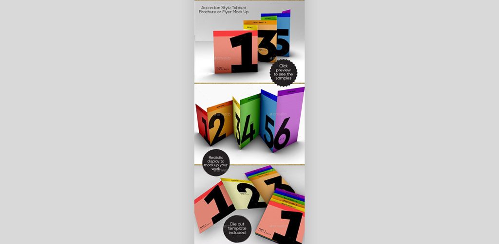
Use your visuals smartly

Consider using high-quality images, infographics, and charts that complement your message. Visuals not only break the monotony but also provide a memorable anchor for your audience. Use them as storytelling tools, guiding your narrative and emphasizing key points. 

Don’t shy away from incorporating multimedia elements, like videos or animations, to add dynamism.

When in doubt, turn to the experts at Design Shifu. Enjoy perks like same-day delivery, unlimited designs, and unlimited revisions, all backed by a 100% 14-day money-back guarantee. 

With a dedicated designer and easy integrations with Canva, Trello, Slack, and more, Design Shifu provides an intuitive dashboard for all your design needs. Elevate your presentations effortlessly – click now to book a demo and discover a world of design possibilities!

Cordinate your presentation with unified visuals corresponding to your theme to provide an effortless, visually stimulating experience for your audience.

Remember, a well-balanced and thoughtfully curated visual presentation can leave a lasting impression and make your message more impactful.

Make use of infographics

Choose vibrant colors and intuitive design elements to make your infographics pop. Whether it’s illustrating statistics, timelines, or comparisons, infographics provide a powerful visual narrative that captivates your audience. Arrange information in a logical flow, guiding your viewers through a seamless understanding of your message. 

This visual aid enhances aesthetics while acting as a memory trigger, ensuring your key points stay with the audience post-presentation.

Incorporate humor

Humor not only breaks the ice but also creates a more relaxed and enjoyable atmosphere. Be mindful of cultural sensitivities and ensure that your jokes align with the context of your message. 

A well-timed quip can not only capture attention but also enhance information retention. Consider using relatable humor that resonates with your audience, turning your presentation into an engaging experience. A hint of humor is enough to give a boring presentation a memorable face, generating an upbeat, accepting mood for your listeners.

Don’t just stick to PPT

There is no rule to using Microsoft PowerPoint while delivering presentations. Explore alternative tools like Keynote or Prezi to inject innovation into your delivery. Keynote, with its sleek interface and unique transitions, offers a seamless experience for Mac users, allowing you to create visually stunning slideshows. 

Alternatively, platforms like Prezi enable dynamic, non-linear presentations, fostering a more interactive and engaging experience for your audience. 

Experiment with these tools to add a layer of creativity and uniqueness to your delivery, steering away from the conventional PowerPoint approach. 

Add maps when discussing locations

Visualize data spatially to provide a clearer understanding of your message. Whether highlighting global reach, regional impact, or specific site locations, maps serve as powerful visual aids. 

Choose clear and concise map designs, and ensure they align with your overall presentation theme. By incorporating maps, you not only make your content more visually appealing but also facilitate a better comprehension of the spatial relationships within your narrative. 

From pinpointing key areas to illustrating trends across different regions, maps can be instrumental in conveying complex location-based information in a way that is both informative and visually engaging.

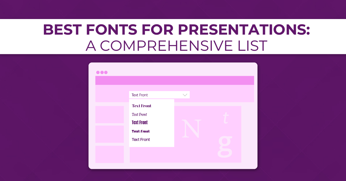
Play with Fonts and Colors

Select fonts that align with your message and theme, experimenting with different styles to create hierarchy and emphasis. Bold headers, italicized quotes, or playful fonts can add dynamism to your slides.

Similarly, leverage a thoughtfully chosen color palette to evoke specific emotions or align with your brand identity. Use contrasting colors for text and background to ensure readability, and employ consistent color schemes for a polished look. 

The strategic use of fonts and colors not only enhances aesthetics but also contributes to the overall cohesiveness of your presentation, leaving a lasting impression on your audience.

Use contrasting colors

Opt for a palette that combines light and dark hues, ensuring clarity and readability. Utilize high-contrast combinations for text and background to enhance legibility, making your content stand out. 

Contrasting colors not only add visual interest but also guide the viewer’s attention to key elements on your slides. Consider incorporating complementary colors to create a harmonious balance or use bold contrasts for a striking effect. 

By thoughtfully employing contrasting colors, you not only enhance the overall aesthetics of your presentation but also contribute to a more engaging and memorable viewing experience for your audience.

Use flow charts

Utilize standardized shapes and connectors to create a clear visual hierarchy, guiding viewers through each stage of the process. Flow charts not only enhance understanding but also provide a logical flow to your narrative. 

Incorporate color-coded elements to emphasize different branches or decision points, adding an extra layer of clarity. By integrating flow charts, you not only enhance the visual appeal of your presentation but also facilitate a more efficient and comprehensible transfer of information, ensuring that your audience can easily grasp intricate details.

Add creativity to your deck

You can consider integrating interactive elements, such as clickable buttons or hyperlinks, to create a more engaging user experience.

For instance, you can design a clickable menu that navigates to different sections of your presentation, adding an interactive twist. 

Experiment with custom illustrations or graphics that align with your content, making your slides visually distinct. 

Infographics, as mentioned earlier, can be creatively designed to convey information in a visually appealing manner. 

Additionally, try incorporating multimedia elements like short video clips, GIFs, or audio snippets to break the monotony and add a dynamic touch. By thinking outside the traditional slide format, you can transform your presentation into a visually stimulating and memorable experience for your audience.

Try themes

Choose themes that align with your message, creating a cohesive and immersive experience. For a presentation on environmental sustainability, opt for a “Green Innovation” theme, featuring eco-friendly colors, plant motifs, and recycled paper textures. In economic discussions, a “Financial Horizon” theme could utilize sleek, modern design elements and currency symbols. 

Addressing health topics, like cancer awareness, a “Hopeful Healing” theme may incorporate calming colors, supportive imagery, and symbols of resilience. 

Tailor your themes to evoke the right emotions and associations, ensuring that your visuals not only captivate but also reinforce the essence of your presentation content.

Use striking colors to get noticed

Opt for vibrant hues that not only align with your brand or theme but also stand out against a background, ensuring visibility. Consider contrasting color combinations to create visual interest and emphasize key elements. 

For example, use a combination of deep blues and bright yellows or rich purples and energetic oranges. Experiment with color psychology, choosing shades that evoke the desired emotions or reactions from your audience. 

Striking colors not only enhance the visual appeal of your slides but also help create a memorable and impactful presentation that commands attention from the moment you begin.

Maintain a consistent presentation layout

Choose a clean and organized template that aligns with your theme or branding. Ensure that fonts, colors, and graphic styles remain uniform across all slides, creating a visually cohesive experience for your audience. 

Consistency in layout helps guide the viewer’s focus and enhances the overall flow of information. Whether it’s the placement of titles, bullet points, or images, a consistent layout provides a visual rhythm that makes your presentation easy to follow. 

By adhering to a unified structure, you not only convey a polished and well-thought-out image but also contribute to a smoother and more seamless delivery of your content.

Try bold and upper-case letters

Bold text commands attention and emphasizes key points, ensuring that your audience doesn’t overlook critical information. Combine this with upper-case letters for a powerful visual impact, making your text stand out with a bold and assertive tone. However, use this formatting sparingly to avoid overwhelming your audience; reserve it for headlines, key takeaways, or impactful statements. 

This combination of bold and upper-case letters can effectively highlight the most crucial aspects of your presentation, leaving a lasting impression and reinforcing the significance of your message.

Use duotones

Duotones involve overlaying two contrasting colors to create a striking and harmonious effect. Select a dominant color for your images and apply a second color to create a cohesive yet visually dynamic look. 

For instance, you can use a combination of deep blue and vibrant orange for a bold and energetic feel. Duotones not only enhance the overall aesthetic but also add a contemporary touch to your presentation. 

Experiment with different color combinations that resonate with your theme or message, and watch as duotones transform your visuals into a visually captivating experience for your audience.

Try handwriting fonts

Infuse a touch of personalization and creativity into your presentation by doing this. Choose a style that aligns with your message and adds a human touch to your slides. 

Handwriting fonts convey a sense of authenticity, making your content feel more relatable and approachable. Whether it’s for headers, quotes, or specific emphasis, using handwritten fonts can break away from the formal tone of standard presentations. 

However, ensure readability by using these fonts sparingly and pairing them with a clean, sans-serif font for body text. Handwriting fonts can add a unique charm to your presentation, making it memorable and fostering a more engaging connection with your audience.

Use memes

Select memes that align with your content and audience, adding a light-hearted touch to break the ice. Integrate memes strategically, perhaps to emphasize key points, provide commentary, or even add a touch of wit to statistics or quotes. 

Ensure the memes are relevant to your message and won’t be misinterpreted. Memes can be a creative way to connect with your audience, making your presentation more enjoyable and memorable. 

Just remember to use them in moderation, as abusing them may detract from the professionalism of your presentation. Choose memes wisely, and watch as they add a fun and memorable element to your delivery.

Bind people using emotions

Share relatable stories, anecdotes, or real-life examples that resonate with the emotions you want to evoke. Whether it’s joy, empathy, or inspiration, appealing to emotions creates a memorable and impactful experience. 

Use visuals that tug at heartstrings, incorporate testimonials that elicit empathy, or narrate personal experiences that convey authenticity. 

By fostering an emotional connection, you not only capture your audience’s attention but also leave a lasting impression. Remember, people are more likely to remember how you made them feel rather than the specific details of your presentation. 

Embrace the emotional dimension to create a presentation that not only informs but also moves and inspires your audience.

Implement storytelling through your slides

Begin with a captivating introduction that sets the stage and grabs your audience’s attention. Structure your content with a clear beginning, middle, and end, guiding your audience through a coherent and engaging storyline. Introduce characters, whether they’re real individuals, case studies, or even hypothetical personas, to humanize your message. 

Use visuals and anecdotes to illustrate key points, creating a sense of connection and resonance. Build suspense, highlight challenges, and conclude with a satisfying resolution or call to action. 

By infusing your presentation with storytelling elements, you not only make your content more memorable but also captivate your audience on a deeper level, fostering a more profound understanding and appreciation of your message.

Try retro visuals and typography

Choose a vintage color palette, featuring muted tones or bold, vibrant hues reminiscent of bygone times. Integrate retro-inspired imagery, such as old advertisements or iconic symbols, to add a touch of nostalgia. 

When it comes to typography, select fonts that reflect the styles prevalent in the retro era, whether it’s the bold and geometric designs of the ’70s or the sleek and streamlined fonts from the ’50s. 

This aesthetic not only adds a unique visual flair to your presentation but also taps into the emotional appeal of nostalgia, creating a memorable and distinctive experience for your audience. 

Experiment with retro visuals and typography to infuse your presentation with a charming and timeless vibe.

Make use of transitions

Thoughtfully chosen transitions can add a dynamic layer to your delivery, creating a seamless and engaging flow. Experiment with subtle fades, slides, or creative animations to transition between key points. 

However, use transitions judiciously, ensuring they complement rather than distract from your content. Align the transition style with the tone of your presentation; for a professional setting, opt for smooth transitions, while a more creative presentation may benefit from playful animations. 

Well-executed transitions not only enhance visual appeal but also contribute to a more polished and professional presentation, keeping your audience focused and intrigued as you navigate through your content.

Use real people

Incorporate images, testimonials, or video clips of individuals relevant to your message—whether it’s satisfied customers, team members, or individuals impacted by your work. 

Humanizing your content fosters a stronger connection with your audience. Share personal stories or experiences to add a relatable touch, allowing your audience to connect emotionally with the real-life aspects of your presentation. 

By showcasing real people and their experiences, you not only build trust but also make your content more engaging and memorable. Remember to respect privacy and seek permission when using personal stories or images to ensure a positive and ethical presentation experience.

Use icons for every pointer

Icons serve as intuitive visual cues, making information easily digestible for your audience. Select icons that align with the content of your presentation—whether it’s data, actions, or concepts—and use them consistently for uniformity. 

For instance, employ a lightbulb icon for ideas or innovation, a calendar icon for timelines, or a gear icon for processes. This approach not only adds a touch of creativity to your slides but also aids in conveying complex information quickly. 

Icons act as visual anchors, guiding your audience through your presentation and reinforcing key points in a visually compelling manner.

Keep 1 topic per slide

Dedicate each slide to a single, clearly defined concept or key point. This strategy helps prevent information overload and ensures that your audience can easily absorb and retain the content. Embrace succinct headlines, supported by relevant visuals or concise bullet points, to convey your message effectively. 

By adhering to a one-topic-per-slide structure, you not only streamline your presentation but also provide a more digestible and engaging experience for your audience. This approach allows each concept to stand out distinctly, facilitating better understanding and retention of the information you’re conveying.

Use only 1 visual per slide

Focus each slide on a single compelling image, infographic, or chart that directly supports your key point. This approach minimizes visual clutter, allowing your audience to absorb and appreciate each visual element without distraction. 

Whether it’s a striking photograph, an informative graph, or an illustrative icon, let each visual take center stage, reinforcing the clarity and effectiveness of your message. 

This streamlined approach not only enhances visual appeal but also ensures that your audience stays engaged and retains the essential information presented on each slide.

Experiment with your design

Play with unconventional layouts, explore asymmetry, or incorporate unique graphic elements to add visual interest. Consider breaking the traditional grid structure and arranging content in unexpected ways to capture attention. 

Experiment with bold color combinations, gradients, or even texture overlays to give your slides a distinct and memorable look. Don’t be afraid to mix and match fonts to create a visually dynamic composition. 

By pushing the boundaries and experimenting with design elements, you not only make your presentation visually engaging but also showcase a sense of creativity and innovation, leaving a lasting impression on your audience.

Build a strong narrative

Progress logically, building tension and anticipation as you delve into key points. Use each slide as a chapter, seamlessly connecting ideas and creating a narrative flow. 

Introduce relatable characters or real-world examples to add a human touch, making your narrative more engaging. Conclude with a satisfying resolution or a clear call to action, leaving a lasting impact on your audience. 

A well-crafted narrative not only makes your presentation more memorable but also ensures that your audience follows a cohesive and compelling journey from start to finish.

Make your presentation interactive

Encourage audience participation through polls, quizzes, or open-ended questions to foster active involvement. Use clickable buttons or hyperlinks to navigate through specific sections, allowing your audience to explore topics at their own pace. 

Consider incorporating interactive multimedia elements such as videos, clickable images, or dynamic charts to enhance engagement. Facilitate discussions by inviting audience input or feedback at strategic points. 

By making your presentation interactive, you not only capture attention but also create a dynamic and participatory environment, ensuring that your audience remains actively engaged throughout the session. This approach fosters a more memorable and impactful experience, turning your presentation into a two-way communication rather than a one-sided delivery.

Use only black and white colors

This simplistic approach can make you stand out. It will go great if your topic is related to the art of photography.

Use contrasting shades to emphasize key points, and leverage the interplay between light and dark for visual impact. This restrained color scheme not only conveys a sense of elegance but also ensures that your audience’s focus remains on the content itself. 

Consider incorporating high-quality images or graphics with strong contrasts to enhance visual appeal. By opting for black and white, you not only achieve a timeless and classic look but also communicate a sense of clarity and professionalism in your presentation.

Add videos to your presentation (In Full Screen)

Utilize videos to add a dynamic and immersive element, capturing your audience’s attention and enhancing overall engagement. 

Whether it’s a product demonstration, customer testimonials, or a narrative sequence, incorporating full-screen videos provides a cinematic experience that complements your message. 

Ensure the videos are high-quality and relevant to the content, seamlessly integrating them into your slides to maintain a professional and polished look. 

By strategically placing full-screen videos at key points, you not only diversify your presentation format but also create a memorable and visually compelling experience for your audience.

Add a timeline to explain event

Use a visual timeline format to provide a clear overview of the sequence of events, whether it’s project milestones, historical developments, or a company’s growth trajectory. 

Place the timeline prominently on a slide, and use distinct markers or milestones to represent significant points in time. Include concise descriptions or visuals alongside each event to provide additional context. 

This visual representation not only aids in comprehension but also helps your audience grasp the temporal progression of your narrative. 

Timelines are versatile tools that can be applied across various themes, making them an effective visual aid for conveying temporal sequences in a presentation.

Use nostalgia

Incorporate elements that bring back memories, triggering familiar experiences and emotions. This could include vintage imagery, retro design elements, or references to cultural touchstones from the past. 

Nostalgia can be a powerful storytelling tool, allowing you to tap into shared experiences and sentiments. Share anecdotes or examples that resonate with a collective sense of nostalgia, making your presentation more relatable and memorable. 

However, be mindful of your audience and ensure that the nostalgic elements align with the overall tone and purpose of your message, creating a presentation that not only informs but also resonates on a deeper, emotional level.

Make your deck mobile-friendly

With an optimized design, recipients can easily view and navigate through the slides on their smartphones or tablets, providing a convenient and seamless experience. 

Whether you’re distributing the presentation via email, cloud storage, or presentation-sharing platforms, a mobile-friendly format ensures that your audience can access and review the content effortlessly, even when on the go. 

This adaptability enhances the overall accessibility and usability of your presentation, making it a practical choice for sharing and collaboration after the initial delivery.

Incorporate your social proof

Showcase testimonials, positive reviews, or endorsements from satisfied clients, customers, or industry experts to validate your message. This could include quotes, statistics, or even visual representations of social media mentions or endorsements. By integrating social proof, you not only add authenticity to your presentation but also build trust and confidence with your audience. 

Ensure that the social proof aligns with the theme and objectives of your presentation, using it strategically to reinforce key points and enhance the persuasiveness of your message. 

Whether it’s a case study, success story, or client testimonial, social proof adds a compelling layer to your presentation, influencing your audience’s perception positively.

Add the QR code of your socials

Place QR codes strategically on your slides, enabling your audience to quickly and easily connect with you on various social platforms. 

This interactive addition allows viewers to scan the code using their smartphones, instantly directing them to your social media profiles. Whether it’s LinkedIn, Twitter, Instagram, or other platforms relevant to your presentation, this integration fosters seamless networking and engagement. 

Including QR codes of your socials not only simplifies the process of connecting with your audience but also encourages post-presentation interaction and collaboration. It’s a modern and practical way to bridge the gap between your presentation and online presence.

Share your slide deck for reference after the presentation

Provide your audience with a downloadable link or a shareable file through email or a cloud storage platform. 

This not only allows attendees to revisit the content for a deeper understanding but also serves as a valuable resource for those who couldn’t attend. Ensure the file format is widely compatible, and consider creating a PDF version to maintain the layout and formatting integrity across different devices. 

Sharing your slide deck post-presentation demonstrates transparency, reinforces key points, and enables your audience to share the information with others, extending the reach and impact of your message.

Frequently Asked Questions

What can I make a slideshow about?

Making a slideshow provides flexibility for different subjects. You may discuss a personal interest, such as a hobby or travel experience, and share the passion. Or, you may display professional accomplishments or career paths through an excellent presentation. For a creative twist, try a pictorial view of historical events, scientific breakthroughs, or even a book or movie critique.

What is a good 5-minute presentation?

A compelling 5-minute presentation balances brevity with substance. Quick tutorials, short stories with lessons, or key points from a larger topic can effectively engage the audience. Asking a thought-provoking question also sparks discussion within the time limit.

What is in a good presentation?

A good presentation contains essential elements: a clear structure with introduction, body, and conclusion, interesting visuals, and appropriate content. Presenting it confidently and enthusiastically guarantees audience attention and comprehension.

What are some interesting topics to talk about for a presentation?

When selecting a presentation topic, consider the interests and preferences of your audience. Engaging topics might include discussions on the impact of technology on society, environmental conservation efforts, or raising awareness about mental health. 
Exploring the future of artificial intelligence, sharing insights into space exploration and discoveries, or promoting cultural diversity and inclusion are also compelling options.

Make Design Shifu your presentation design partner

Revolutionize your design process with Design Shifu, where unlimited graphic design is combined with unmatched convenience. For only $599 per month, experience Same Day Delivery, Unlimited Designs, Unlimited Revisions, and 100% 14-day Money Back Guarantee.
With a dedicated designer at your beck and call and hassle-free integrations with Canva, Trello, Slack, and more, Design Shifu is your one-stop-shop for print and digital graphics, logos, branding, infographics, merchandise, and presentation decks.
Looking to transform your design experience? Click today to schedule a demo and see the Design Shifu difference!

150+ Presentation Topics To Make an Impact Instantly

150+ Presentation Topics To Make an Impact Instantly provides an abundance of ideas to assist you in crafting presentations that people will remember. From business pitches to academic lectures to informal talks, selecting the topic is imperative to inspire and motivate your audience.

Here in this blog, we will be discussing a broad variety of subjects under various categories, ranging from motivational inspiring speeches to informative insights, so you can always find the ideal topic for your next presentation. Let’s go through these powerful topics that will make you leave a lasting impression.

Picture Yourself as the Star of a Presentation.

To really shine, you need a topic that grabs everyone’s attention. It’s more than just speaking well or having cool slides; it all starts with a topic that makes your audience curious.

Imagine standing in front of a group, not just sharing facts, but telling a story that keeps everyone interested. Presentations aren’t only about work or school; they’re a chance to be creative and make things interesting.

Every day, there are 50,000 presentations happening. They’re not all serious business or school stuff; some are about fun and quirky things like a duck on a tricycle or a dog wearing glasses. It’s surprising, right?

Still, half of people get bored during presentations. That’s why it’s crucial to make them exciting. That’s where our ideas come in—over 150 of them! And here’s the cool part: these ideas aren’t just for offices or classrooms; they’re for any time you want to share something in a fun way.

So, get ready to explore 150+ presentation ideas that will help you make an impact instantly.

How to Choose the Best Presentation Topic: Step-by-Step Process

How to Choose the Best Presentation Topic: Step-by-Step Process

Picking the right presentation topic is like winning half the battle before you even begin. After selecting your topic, you’ll focus on content creation and presentation design.

If you need help with presentation designs, consider Design Shifu, offering dedicated designers for your needs. You get unlimited designs for a flat monthly fee, which includes not only presentation designs but also services like infographics, social media designs, logo design, etc.


Here’s a step-by-step guide to help you choose a compelling topic

  • Identify Your Audience: Use surveys or interviews to learn their interests and challenges.
    • E.g., Industry trends for professionals.
  • Leverage Your Strengths: Reflect on your expertise and experiences.
    • E.g., Use your digital marketing background to present on social media strategies.
  • Stay Current: Follow trends and news for timely topics.
    • E.g., The Future of AI in Everyday Life.
  • Offer Value: Focus on solving problems your audience faces.
    • E.g., Overcoming Common Startup Challenges.
  • Make It Relevant: Tie the topic to everyday work or life.
    • E.g., Time Management Hacks for Busy Professionals.
  • Use an Engaging Format: Try storytelling, case studies, or interactive elements.
    • E.g., Share a personal journey instead of listing benefits.
  • Align with Your Goal: Match the topic to your objective—educate, inspire, or entertain.
    • E.g., Unleashing Creativity in the Workplace.
  • Test Your Ideas: Get feedback on a few topics before finalizing.
    • E.g., Ask colleagues which topic excites them more.
  • Add Visuals: Use strong visuals or tools like Design Shifu for design support.
    • E.g., Show data with striking charts.
  • Be Passionate: Pick a topic you genuinely care about.
    • E.g., Talk on Sustainable Living if you’re eco-conscious.

General Presentation Topic Ideas for 2024

General Presentation Topic Ideas for 2024
  1. The Future of Virtual Reality in Education
  2. The Psychology of Decision-Making: Unraveling the Influences
  3. Sustainable Fashion: Balancing Style and Ethics
  4. Blockchain Beyond Cryptocurrency: Real-World Applications
  5. The Art of Storytelling in Marketing: Creating Lasting Impressions
  6. The Impact of Social Media on Mental Health
  7. Innovative Approaches to Urban Planning for a Sustainable Future
  8. Biohacking: Enhancing Human Performance through Technology
  9. The Rise of Remote Work: Challenges and Opportunities
  10. Exploring the Intersection of Art and Artificial Intelligence

Leadership Topic Ideas for Presentation

Presentation Topics to Make an Impact- Leadership
  1. Servant Leadership: A Paradigm Shift in Management
  2. Leading with Empathy in the Corporate World
  3. Adaptive Leadership in Times of Uncertainty
  4. The Role of Emotional Intelligence in Effective Leadership
  5. Leadership Lessons from Unlikely Sources: Animals, Nature, and Beyond
  6. Fostering a Culture of Innovation: Leadership Strategies
  7. The Power of Authentic Leadership in Building Trust
  8. Cross-Cultural Leadership: Navigating Global Teams
  9. Resilient Leadership: Bouncing Back from Setbacks
  10. Balancing Confidence and Humility: The Art of Humble Leadership

Business Communication Topic Ideas for Presentation

Presentation Topics to Make an Impact- business communication
  1. Non-verbal Communication in the Digital Age
  2. Crisis Communication: Strategies for Effective Response
  3. Navigating Difficult Conversations in the Workplace
  4. The Influence of Language on Business Negotiations
  5. The Art of Persuasion: Building Convincing Arguments
  6. Digital Etiquette: Navigating Professionalism Online
  7. The Role of Empathy in Customer Communication
  8. Building a Strong Personal Brand through Communication
  9. Overcoming Communication Barriers in Diverse Teams
  10. Humor in Business Communication: When and How to Use It

Ideas for Controversial Issues

Presentation Topics to Make an Impact for Controversial Issues
  1. The Ethics of Genetic Engineering: Navigating the CRISPR Era
  2. Exploring Both Sides: The Controversy of Universal Basic Income
  3. The Debate on Privacy vs. National Security in the Digital Age
  4. The Morality of Artificial Intelligence: Can Machines Have Ethics?
  5. The Role of Government in Regulating Social Media: Striking the Right Balance
  6. Medical Marijuana: Bridging the Gap between Medicine and Recreation
  7. The Controversy of Fast Fashion: Environmental Impact vs. Accessibility
  8. The Ethics of Animal Testing: Finding Alternatives
  9. Free Speech in the Digital Space: Where to Draw the Line?
  10. The Impact of Cancel Culture: Constructive Criticism or Online Harassment?

Ideas for Designing

Presentation Topics to Make an Impact for Designing
  1. The Psychology of Color in Graphic Design: A Deep Dive
  2. User-Centered Design: Shaping Products Around People’s Needs
  3. Minimalism vs. Maximalism: Finding the Right Design Balance
  4. Designing for Accessibility: Ensuring Inclusivity in Every Interface
  5. The Evolution of Logo Design: From Tradition to Modern Trends
  6. Immersive Experiences in Web Design: Beyond the Screen
  7. The Art of Visual Storytelling: Engaging Audiences through Design
  8. Typography Trends: Balancing Readability and Aesthetics
  9. Environmental Design: Merging Sustainability with Aesthetics
  10. Augmented Reality in Design: Enhancing User Experiences

Presentation Topics Ideas for Marketing

Presentation Topics to Make an Impact for Digital Marketing
  1. The Psychology of Consumer Behavior: Understanding the Purchase Decision
  2. Influencer Marketing: Strategies for Authentic Brand Partnerships
  3. The Power of Emotional Marketing: Creating Lasting Connections
  4. Content Marketing in the Age of Information Overload
  5. Ethical Marketing: Building Trust and Loyalty with Transparency
  6. The Future of Social Media Marketing: Emerging Platforms and Trends
  7. Neuromarketing: Leveraging Brain Science to Drive Engagement
  8. Storytelling in Branding: Crafting Compelling Narratives
  9. Data-Driven Marketing: Turning Analytics into Actionable Insights
  10. Interactive Marketing Campaigns: Engaging Audiences in the Digital Age

Topics Ideas for Entrepreneurship

Presentation Topics to Make an Impact for Entrepreneurship
  1. Bootstrapping vs. Funding: Choosing the Right Path for Your Startup
  2. The Role of Failure in Entrepreneurial Success: Embracing Setbacks
  3. Social Entrepreneurship: Making a Profit with a Purpose
  4. Innovative Business Models: Disrupting Traditional Industries
  5. The Art of Pitching: Capturing Investors’ Attention in 5 Minutes
  6. Balancing Creativity and Structure in Entrepreneurial Ventures
  7. Building a Sustainable Business: Environmental and Financial Considerations
  8. The Future of E-Commerce: Trends and Opportunities
  9. Cultivating a Culture of Innovation in Small Businesses
  10. The Gig Economy: Navigating the Rise of Freelance and Remote Work

Topic Ideas for Personal Experiences

Presentation Topics to Make an Impact for Personal Experiences
  1. Turning Adversity into Strength: Lessons from Personal Challenges
  2. My Journey in [Specific Industry]: Lessons Learned and Insights Gained
  3. The Impact of Travel on Personal Growth and Perspective
  4. Lessons from Parenting: Applying Family Insights in Professional Life
  5. Overcoming Fear of Public Speaking: A Personal Triumph
  6. Navigating Cross-Cultural Experiences: Stories of Adaptation
  7. From Passion to Profession: Pursuing Your Dreams
  8. The Power of Vulnerability in Building Meaningful Connections
  9. Balancing Work and Personal Life: My Successes and Failures
  10. Lessons from a Hobby: How [Specific Hobby] Shaped My Outlook

Topics for Current Trends

Presentation Topics for Current Trends
  1. The Metaverse: Exploring the Next Frontier of Digital Interaction
  2. Decentralized Finance (DeFi): Transforming Traditional Banking Systems
  3. NFTs (Non-Fungible Tokens): Redefining Ownership in the Digital Age
  4. The Evolution of Electric Vehicles: Sustainable Transportation Trends
  5. The Subscription Economy: Shifting from Ownership to Access
  6. Health and Wellness Tech: The Rise of Wearables and Digital Health
  7. Micro-Moments in Marketing: Capturing Attention in Seconds
  8. The Influence of Remote Learning on Education: Challenges and Innovations
  9. Circular Economy: Reducing Waste and Promoting Sustainable Consumption
  10. Productizing the services in 2024

Topic Ideas for Industry Insights

Presentation Topics for Industry Insights
  1. Revolutionizing Healthcare: The Impact of Telemedicine and Health Tech
  2. Smart Cities: Integrating Technology for Urban Development
  3. The Future of Aerospace: Space Tourism and Beyond
  4. Renewable Energy Innovations: Advancements in Solar, Wind, and Beyond
  5. Evolving Trends in the Fashion Industry: Sustainability and Tech Integration
  6. The Changing Landscape of Food Industry: Plant-Based and Lab-Grown Alternatives
  7. Emerging Trends in the Gaming Industry: AR, VR, and Cloud Gaming
  8. Transforming Agriculture: AgTech Solutions for a Sustainable Future
  9. The Future of Transportation: Hyperloop, Autonomous Vehicles, and Drones
  10. Innovations in Construction: Sustainable Materials and Smart Infrastructure

Presentation Topic Ideas for Digital Marketing

Presentation Topics ideas for Digital Marketing
  1. Voice Search Optimization: Adapting to Changing Search Patterns
  2. The Role of Chatbots in Customer Engagement: Enhancing User Experience
  3. Video Marketing Strategies: Creating Compelling Visual Content
  4. Interactive Email Campaigns: Beyond the Click-Through Rate
  5. The Impact of AI on Personalizing Digital Marketing Campaigns
  6. Podcasting as a Marketing Tool: Building Authority and Connection
  7. Virtual Events and Experiences: Engaging Audiences in a Digital Landscape
  8. Data Privacy in Digital Marketing: Navigating Regulations and Trust
  9. The Power of User-Generated Content: Turning Customers into Advocates
  10. Inclusive Marketing: Representing Diversity in Brand Campaigns

For AI (Artificial Intelligence)

Presentation Topics for AI (Artificial Intelligence)
  1. Ethical Considerations in AI: Addressing Bias and Fairness
  2. Explainable AI: Bridging the Gap Between Complexity and Understanding
  3. AI in Healthcare: Diagnosing, Treating, and Preventing Diseases
  4. The Role of AI in Climate Change: From Prediction to Mitigation
  5. AI and Creativity: Exploring the Intersection of Technology and Art
  6. AI in Education: Personalized Learning and Classroom Integration
  7. Robotics and AI in Manufacturing: Transforming Production Processes
  8. AI-Enhanced Cybersecurity: Protecting Against Evolving Threats
  9. Natural Language Processing: Breaking Barriers in Human-Computer Interaction
  10. AI for Social Good: Solving Global Challenges with Technology

Topic Ideas for Sales Consulting

Presentation Topic Ideas for Sales Consulting
  1. Consultative Selling: Building Relationships and Adding Value
  2. Sales Psychology: Understanding Customer Motivations and Objections
  3. Adapting to the Digital Sales Landscape: Strategies for Online Selling
  4. The Art of Negotiation: Techniques for Successful Deal-Making
  5. Sales Automation: Streamlining Processes for Efficiency and Effectiveness
  6. Account-Based Selling: Tailoring Strategies for Targeted Clientele
  7. The Future of B2B Sales: Trends and Technologies Shaping the Industry
  8. Building a Personal Brand for Sales Success: Online and Offline
  9. Customer Retention Strategies: Going Beyond the Initial Sale
  10. Storyselling: Using Narratives to Persuade and Connect with Customers

For Time Management

Presentation Topic Ideas for Time Management
  1. The Pomodoro Technique: Boosting Productivity with Time Blocks
  2. Time Management for Remote Workers: Balancing Flexibility and Structure
  3. Eisenhower Matrix: Prioritizing Tasks for Maximum Impact
  4. Mindful Time Management: Incorporating Meditation and Reflection
  5. Time Blocking for Success: Structuring Your Day for Optimal Performance
  6. Effective Goal Setting: Aligning Tasks with Long-Term Objectives
  7. Technology and Time Management: Tools for Efficiency and Focus
  8. The 2-Minute Rule: Tackling Small Tasks for Immediate Progress
  9. Batch Processing: Streamlining Work by Grouping Similar Activities
  10. Time Management in Leadership: Balancing Responsibilities and Delegation

Presentation Topic Ideas for Technology

Presentation Topic Ideas for Technology
  1. The Evolution of Cybersecurity: Adapting to Emerging Threats
  2. Cloud Computing Trends: From Infrastructure to Platform as a Service
  3. Blockchain in Business: Beyond Cryptocurrency Applications
  4. The Future of Quantum Computing: Revolutionizing Data Processing
  5. 5G Technology: Implications for Connectivity and Innovation
  6. Edge Computing: Reducing Latency and Enhancing Performance
  7. The Role of DevOps in Streamlining Software Development and Operations
  8. Cybersecurity in the Internet of Things (IoT): Protecting Connected Devices
  9. Augmented Reality in IT: Enhancing User Experiences and Workflows
  10. Data Governance and Privacy: Navigating Legal and Ethical Considerations

Presentation Topics Ideas for Corporate Business Leaders 

Presentation Topics Ideas for Entrepreneurship
  1. Agile Business Models: Adapting to Rapid Change and Uncertainty
  2. Creating a Culture of Innovation: Strategies for Fostering Creativity
  3. Business Ethics in the Age of Transparency: Building Trust with Stakeholders
  4. The Future of Work: Redefining the Employee Experience
  5. Strategic Partnerships: Collaborative Approaches to Business Growth
  6. Globalization vs. Localization: Finding the Right Balance in Business Expansion
  7. Intrapreneurship: Nurturing Entrepreneurial Spirit within Large Organizations
  8. Crisis Management in Business: Strategies for Resilience and Recovery
  9. The Impact of Corporate Social Responsibility on Brand Reputation
  10. Business Model Innovation: Rethinking Traditional Approaches for Success

Work-Life Presentation Topic Ideas

Work-Life Presentation Topic Ideas
  1. Remote Team Building: Strategies for Fostering Collaboration and Connection
  2. Embracing a Growth Mindset in the Workplace: Navigating Challenges with a Positive Perspective
  3. Balancing Work and Parenthood: Tips for Working Parents
  4. Building a Culture of Inclusivity: Creating a Supportive and Diverse Work Environment
  5. The Future of Flexible Work: Adapting to Changing Work Structures
  6. Mindful Leadership: Integrating Mindfulness Practices for Effective Management
  7. Navigating Workplace Conflict: Strategies for Resolution and Relationship Building
  8. Workplace Well-being Programs: Enhancing Employee Health and Productivity
  9. The Importance of Continuous Learning: Staying Relevant in a Rapidly Changing Work Environment
  10. Resilience in the Face of Professional Setbacks: Bouncing Back from Career Challenges

11 Creative Handmade Brochure Ideas for Inspiration

In today’s world of 8 billion people, there is an influx of brochures and pamphlets in our daily lives. In the digital world, one single document can be produced in mass within seconds. How would you then ensure that your brochure holds a special space on their desks and not lurking around in the waste areas? One of the ideas is through Handmade Brochures. Now before you get worried as to how will this be accomplished, refer to this for some inspiration.

Characteristics of Handmade Brochures

Some characteristics should be considered before you plan on making a handmade brochure. Those are as follows:

  • You cannot make thousands of brochures in a limited time. That’s a given, considering the amount of effort that goes toward making one.
  • You cannot expect 100% accuracy in all the handmade brochures, since there is a human touch.
  • Plan your materials and designs well in advance so that the brochure-making process is smooth without too much of breaks.
  • Less is more. Even though your handmade brochures exude a lot of creativity, being minimalistic and aesthetic will go a long way in impressing your end customer.

If you have a design in mind or still thinking of one, get a dedicated designer from Design Shifu. 

Now, let’s explore some beautiful handmade brochure examples and you can choose one that’s best for your business.

1. Travel Handmade Brochure

The travel brochure should be designed so that it entices the reader to visit captivating locations around the world.

Source

This image-only brochure with the names of places to visit is a very simple yet classy design that you can make. The pictures used are real pictures of the places and the names are hand-written.

Another version is drawing sketches of the places to visit in a particular location.

handmade brochure

Source

However, this one’s a bit difficult to execute in bulk, but it looks extremely appealing.

If you want more inspiration for travel brochures, refer to this.

2. Creative 3D Handmade Brochures Design

Corporate and handmade brochures seem alien, but why not add some creativity to corporate brochures too?

handmade brochure

Source

In this design, the team members’ pictures are pasted in a creative way along with text, which makes these types of brochures an instant hit with the target audience. Instead of the regular square and rectangle-shaped brochures, unique shapes like hexagons, pentagons, and number shapes would also require less space and more creative output.

Another example of a geometrically shaped brochure is this.

Source

The brochure is given the shape of a bottle, with each layer loaded with information. One more good option for your brochure.

3. Job Recruitment Brochure

A company that wants to recruit candidates usually would update the job section of its website or probably mention it on its social media handles. How about a company that creates a brochure headlining the best things one can get by working in the company?

Source

Quite a unique way of recruiting candidates. Here, they have mentioned how their company has an open-door policy, which is one of the key factors looked at by a candidate before he applies for a job.

This type of brochure can also be made by restaurants, schools, etc. where the combination of creativity and benefits are distributed equally.

Check this out for some ultimate brochure design ideas in 2023.

4. Flip Book Handmade Brochure

A flip book brochure is an accordion-style brochure that is detailed and yet, acquires less space on your shelf. You can flip through the book and check out the image change from page to page.

Source

This isn’t a handmade brochure example, but it can be replicated into one. There are many creative ways to replicate the flipbook style. One example is:

Source

Though this suitcase style looks elaborate in design and would require a lot of effort, once made, this would most definitely create a lasting impact on the minds of the target audience. A unique combination of images, text, and design would make this handmade brochure a permanent place on your target audience’s shelves.

We, at Design Shifu, can help you create one at affordable prices. Check out our price range.

5.  Single Paper Brochure

The simplest and the easiest to execute is a single-paper brochure. You can define the brand’s vision, and mission through text or illustrations, without making it too cluttered and cumbersome to read.

Source

This is a reference to how one can create a handmade brochure using illustrations and text. And here is what a single-page brochure will look like.

Source

It can be folded into 2 or 3 folds, basis the brand preference, but such kinds of brochures are quite cost-effective too. Also, for a start-up who do not have too much information to showcase in the beginning, this kind of brochure is a good start for introducing oneself to the target audience.

Also, these are the various ways through which one can fold a single-page brochure.

handmade brochure

Source

6. Tag-based Handmade Brochures

Who said brochures have to be in a book format? Who said brochures have to be perfectly shaped and should be in a spiral bind? Have you ever thought that why not create a brochure in a tag-shaped design? Yes, it’s possible.

handmade brochure

Source

Use of colors, information, images, and creative illustrations can be done concisely and yet look creative and pass out necessary information too. Also, since it is tag shaped, it is quite handy and doesn’t require too much space.

In case you are very traditional and still want a spiral-bound brochure, you could easily stuff these tags in a spiral bound and make it look like this.

handmade brochure

Source

Conclusion

A handmade brochure will not only creatively satisfy the target audience, but will also break the clutter. We are loaded with information and it’s very difficult to stand out. Hence, a little bit of hard work is required to ensure our voice is heard by the target audience. However, if the design isn’t your strongest point, source your designs to Design Shifu. We offer unlimited designs for $399, which also comes with a 14-day money-back guarantee. So what’s stopping you?

Most Popular Clothing Logo Design Inspiration & Ideas

When you start a clothing line, you start it with a long-term goal. It is not just a few days’ affair; it is for several generations. 

Your creativity must be conveyed in the most effective way you can, whether it is subtle or loud.

Logos are designed in a variety of ways to determine their usefulness and lifespan. A logo’s ability to become famous over time depends on a number of design aspects. Your brand identity is greatly influenced by the visual identity you develop, whether you’re a start-up, a prominent fashion brand, or a small store.

We have compiled a great list of brand-building clothing logo design inspiration for your consideration, here you go:

Clothing Logo Design Inspiration 

Puma

What exactly is the Puma brand, and why is it so well-known? The fact that Puma is a top brand for sports and lifestyle products is well known. 

Rudolf Dassler, the company’s founder, came up with the concept for the logo. He thought that the qualities of a cat, such as speed, endurance, and agility, should be connected to his products. According to him, an athlete’s movement exhibits these same features. Every athlete who sees the emblem is reminded of their tremendous potential and limitless opportunities.

clothing logo design inspiration

Source

Versace

The list of the best fashion labels, including Giorgio Armani and Gucci, is headed by Versace, a company known for producing some of the best haute couture and accessories. The exclusive logo of the high-end clothing line is very well known.

The head of the Greek legendary character Medusa appears in the Versace logo. The ruins’ floor in the region of Reggio Calabria, where the Versace siblings used to play, served as the inspiration for the logo.

In recognition of Medusa’s ability to make people fall in love and leave them unable to escape, Gianni Versace made her the Versace collection’s emblem. 

Versace’s logo is a beautiful work of art. One of the solid visual identities in the world, the Versace logo is well-balanced, appealing, and forceful. 

clothing logo design inspiration

Source

Hermes

The original Hermes logo was aesthetically beautiful and clear, emphasizing the company’s line of business. The most striking aspects of the logo are a fine coach, a clean, tidy horse buckled into the harness & an attractive guy standing next to it.

Underneath it was a brand name and the location of its inception. The Hermes Paris logo hasn’t been modified much over the decades.

The Hermes logo is inspired by the Greek god Hermes, the messenger of the gods and patron of travelers, commerce, and thieves. The logo features a depiction of Hermes’ staff, known as a caduceus, which was a symbol of peace and diplomacy. The logo also includes the brand name “Hermes” in capital letters. The design of the Hermes logo is meant to evoke the brand’s roots in luxury and craftsmanship and its association with Hermes, the god of travel and commerce.

The logo’s overall design is simple and elegant, with clean lines and a classic font for the brand name. The combination of the caduceus and the brand name creates a strong, iconic image that is easily recognizable and associated with luxury and quality.

Source

Zara

One of the top and most well-known international brands, Zara, serves both men and women worldwide. Even individuals who have little interest in fashion are drawn to the brand because of the logo’s extensive history.

The Zara logo is a simple, modern design that features the brand’s name in capital letters. The font used is a sans-serif typeface, which gives the logo a clean and contemporary look. The letters are all the same size, with no additional ornamentation or flourishes. The brand name is usually white against a dark background, creating a high-contrast look that makes the logo stand out.

The overall design of the Zara logo is meant to convey sophistication and modernity and to reflect the brand’s focus on fashion and style. The clean, minimalistic design of the logo reflects the brand’s commitment to simplicity and functionality, while the high-contrast color scheme helps to make the logo instantly recognizable.

clothing logo design inspiration

Source

H&M

The H&M logo design is inspired by the brand’s initials, “H” and “M.” The logo features the letters “H” and “M” in capital letters, with the “H” placed above the “M.” The letters are designed in a simple, sans-serif font and are colored in a bright red hue.

The design of the H&M logo is meant to be simple, with a bold and vibrant color palette that is easily recognizable and eye-catching. The logo evokes the brand’s focus on fashion and style, and the red color is often associated with energy, passion, and excitement. Using capital letters in the logo also adds strength and confidence, reflecting the brand’s position as a leading player in the fashion industry. Overall, the design of the H&M logo is meant to be modern and stylish, appealing to a wide range of customers who value fashion and quality.

clothing logo design inspiration

Source

Uniqlo

The new Uniqlo logo is striking and effectively portrays the brand’s character, Japanese design, and craftsmanship. The color scheme and design convey Japanese symbolism. The Japanese flag is represented by the colors red and white. The square shape is reminiscent of the name seals that are customarily applied to items in Japan to signify ownership and validity. Combining Japanese characters and Roman letters also conveys the strong trading ties between the United States and Japan.

The design of the Uniqlo logo is intended to be clean and minimalistic, reflecting the brand’s focus on affordable, high-quality basics.

It is meant to be timeless and versatile, as it can be used in various contexts and paired with different design elements. The logo is often combined with other graphic elements, such as images or patterns, to create a cohesive look for the brand’s marketing materials. The logo’s simplicity allows it to be easily recognized and remembered and helps to communicate the brand’s focus on simplicity and functionality.

Source

Key Elements of Clothing Logos

Brand Identity 

Every iconic logo has a connecting design theme. This theme will frequently be related to the brand identity in terms of color scheme, forms, or other elements, such as font choices. Every choice should be consistent with the client’s brand to maintain its strong theme. 

Choosing the Right Fonts 

The most frequently used fonts for clothing logos are simple straight fonts. This is because it better conveys brand aesthetics rather than complex writing or static lettering. The typeface you use for the clothing is one of the essential components in making it distinctive, which everyone desires.

Relevance 

Consider the audience you’re aiming to attract while choosing fonts, colors, and symbols. Your ability to connect with your market will improve if you use the proper balance of these components for your clothes logo design.

Simplicity 

Make sure to design a simple and unique logo because your clothing logo will work with limited space. You want to create a clothing logo that briefly yet clearly expresses the character of your brand.

Read here for more logo design  ideas

Why Should You Avoid Doing Clothing Brand Logos Yourself?

It may seem simple to understand these concepts for clothing brand logos, but it can be a lot of work to put them together. It is possible to stretch a few dollars by creating your own logos or experimenting with internet logo makers. Although your artistic eye may pass muster, you just need to be able to design a memorable logo that will grow with the company.

Takeaway

If there’s one visual that you need to nail from the start, it’s the logo. 

When brainstorming for your logo, ensure it reflects your business’s identity and value proposition. Only then can you create a logo that stands out from the crowd.

If you’re looking for a partner in creating visuals that will appeal to your audience, look no further than Design Shifu. With our flat monthly rate, you can have all the graphic design you need – from logos to ads – for a modest monthly subscription fee.

We offer a 14-day risk-free money-back guarantee so you’ve got nothing to lose! Get started here.

Bad Flyer Design Examples & Common Mistakes to avoid in 2023

Did you know that a marketer changed just one word, which resulted in an increase in sales of a company?

John Caples, the legendary direct marketer, changed the word ‘repair’ to ‘fix’ in one of his ads. The results were a 20% increase in the campaign’s response.

Things that don’t seem trivial are trivial after all. The same is true for all your marketing strategies and campaigns, including flyers. While designing and distributing flyers, you might believe some errors don’t matter; however, these lousy mistakes mark the difference between successful and failed flyer campaigns. From the colors you add to the strokes you remove, everything must be carefully planned.

This blog covers the common mistakes in flyer designs and how you can avoid them to increase the response rate for your business.

Bad Flyer Design Examples & Common Mistakes

Overloading information 

What you do matters to YOU, not other people, including people who receive your business flyers. The brutal truth is people don’t care about your business or what you do; they want to know what’s in it for them. So, make it easy for them to find out the catch. 

You have limited space on a flyer to make a sale. Use every cm and pixel of it wisely. Go through the content twice or thrice. See if there’s a word, a sentence, or a section that you can do without. And remove it. People want to know how your business products and services can help them out. What is in it for them? Highlight it.

Bad Flyer Design Examples

Source

Another common mistake business owners make is packing their flyers with fancy features. They might get impressed by the features of your product and services, but how will it help them? Will it save time, money, or energy? Will it help them go out on vacations? Show how those features will make their life more happening. 

common mistake business

Source

Making flashy colors and elements the spotlight

Too many colors can create a vibrant monster. Use design to complement and invite your audience. While tools like Canva make it easy for you to create designs, there are fundamental design principles you must know to create attention-grabbing designs. Understand design elements like color psychology, proximity, balance, symmetry, shapes, and visual hierarchy to create eye-catchy designs.

If designing is not your best suit, hire a professional who has spent years crafting their skill. 

Why not take help from Design Shifu to design a flyer for you? You get unlimited graphic designs and a dedicated designer to take care of all your design needs. 

Bad Flyer Design Examples

Source

Printing low-quality/ free images & illustrations

A pet peeve of viewers and a sin for designers and marketers is poor-resolution stock images and illustrations. After spending hundreds of dollars on your flyer marketing campaign and distributing those flyers to your audience, adding free images dilutes your effort. Using stock images may look economical at first glance, but it costs you more.

Stock photos are shared by thousands of people across the planet. Students and businesses use them alike, which is why they might not have the same impact on viewers as an original image since they have already seen it several times. Moreover, stock images question your credibility. Would your product or service really look like this? Are people in your company actually that happy? So, add real images. 

If you do not have pictures, hire a photographer or click them by yourself. Get a designer to edit them for you, and you are good to go. The same goes for illustrations. Always use custom illustrations that align with your brand voice and personality. 

Do you want help designing illustrations for your business? Get a dedicated designer and unlimited graphic designs for just $399 per month from Design Shifu.

Printing low-quality/

Source

Eliminating contact information

You might have amazing products, services, and images to show off to your prospects. But how do they get in touch with you? Do not forget the primary purpose of your flyer is to book calls and make sales. Give considerable space to contact information. Include the business name, logo, contact number, office address, website, and email address. If you have active social media pages, include icons or links. Include a QR code to directly send your audience to the landing page.

Bad Flyer Design Examples

Source

Cramming the layout

While adding colors, typography, and images are all good graphic design practices, using too many can clutter your flyer design. Create a structure that is easy to read. Identify the crucial information and elements you want to emphasize: its contact number, services, and address. Add space between things to give breathing room.

Cramming the layout

Source

Blending headlines with other elements

The first thing a prospect will read is the headline. So give it respectful space and emphasis to catch attention and entice your customers’ curiosity. Use colors that evoke the intended emotions and legible typography.

With an attention span of less than a goldfish, your prospects are unlikely to make it through your offer if you do not tell it straightforwardly. Keep your headline crisp and short. Don’t be vague. 

Blending headlines with other elements

Source

Adding large blocks of text

A flyer with no formatting and a large block of text demands effort on the reader’s part. Flyers receivers are barely interested in sparing minutes, let alone seconds, on your sales pitch. So, format the content to make it pleasing to read. Use white space and bullet points to break down the paragraphs. Highlight important information using color, italics, and bold. Create a visual hierarchy among information. Make reading flyers worth their time. 

Bad Flyer Design Examples

Source

Having too much or no typography at all

Ever came across a flyer with a 12-point font throughout? Did you read it?

Adding space and formatting is one thing; making it scannable is another. People don’t read, they skim. Create a visual hierarchy to guide the reader’s attention and make it easy for them to pick the main points. So use typography, font, and highlights to help them. Bold and italicize keywords. 

Do not go overboard with fonts. Stick to two fonts. Fonts with superfluous details are just as bad as an Open Sans at 9-points size, impossible to read on print. The key is to keep it legible. 

Punk Rock

Source

Bad Flyer Design Examples

Source

Choosing clever over clear elements

Clever is good as long as it doesn’t hurt your audience’s sentiments. Choose your message and elements carefully while designing your flyer. Avoid controversial statements or messages that contradict your brand values. 

For instance, this ad successfully created a buzz around the town but not exactly in the company’s favor. Although Burger King enjoys a following for its entertaining ads, this might have offended its long-term customers. As a small business owner, you have limited chances to build a reputation, unlike Burger King. So, spend more time planning out your message. It is wise to avoid sexual innuendos and discriminatory messages.

Choosing a wrong size

Most business owners distribute 8.5 × 11 in. size flyers, which are, generally, A4 size. However, flyers come in various sizes. Consider your audience, message, and content before selecting the size. 

Where will you be distributing your flyers? Would it be easy for your receivers to carry it with them? For example, many visitors won’t appreciate you giving them an A4 size hard paper flyer, hard to fold at the entrance of a fair. They might throw it in the first trash can they spot. So, determine the size after considering the environment, audience, and messaging.

Not proofreading before publishing

42.5% of customers would not buy from a business if they see a spelling or grammatical error. Imagine the number of sales you may lose because of a letter or a comma. So get your it and it’s and you’re and yours right. 

Run your content through online grammar-checking tools like Grammarly, or get it proofread by your friend or colleague. Double-check before sending your flyer off for print. Additionally, check that the information is factually correct.

Having a vague or no CTA

What are you trying to achieve with your flyers? What should your reader do if they choose to read your flyer? Should they book a call? Fill out a form? Explore your website or visit your store? 

What is the next step? State it clearly.

Adding contact details and address is not enough. Shine a spotlight on it and have a clear call to action to direct them. You can also add a QR code to simplify their journey. 

Source

So what makes a flyer design good? We have covered 10 tips to design an effective flyer in greater detail in our blog. 

Ready to add the “zing”?

Flyers are an underrated cost-effective marketing strategy that helps small business owners expand their visibility and reach, possibly making them the talk of the town.

Our bad flyer examples will help you distinguish between good and bad flyers and avoid blasphemies, so you can create a successful flyer design for your business. 

Now, pull out your flyers and identify the spots you can update. If you don’t want to repeat any bad flyer practice, reach out to Design Shifu. We will help you with a consistent brand identity while keeping up with the latest flyer trends and best practices. Interested? Let’s get started with a free demo.