
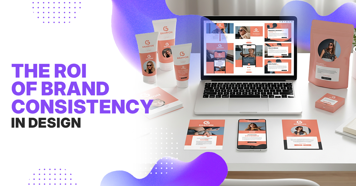
Most founders treat brand style guides like a “someday” task—until the questions start piling up: “What’s our brand voice?” “Which logo should I use?” “Are these our colors?” Without a clear guide, your LinkedIn, website, and pitch deck all tell different stories—and your brand loses impact.
A style guide isn’t just about aesthetics—it’s a scalable system that ensures every touchpoint builds trust and brand recognition.
Let’s break down exactly what a brand style winning guide should include in 2025.
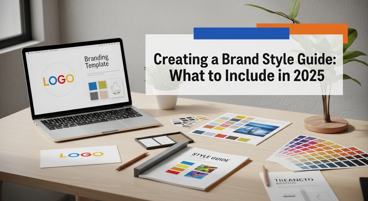
What Is a Brand Style Guide?
A brand style guide (also called a brand book or brand manual) is a document that outlines how your brand should be presented across all platforms.
It covers visual elements, messaging tone, and usage rules. It ensures your brand is cohesive whether it’s being applied by designers, marketers, or external partners.
Why Brand Style Guides Are Your Secret Competitive Advantage
The numbers tell the story: companies with consistent brand presentation increase revenue by 23% (Lucidpress, 2024). But for founders, the impact goes deeper
- Decision Speed: Without a style guide, every design choice requires founder approval. With one, your team can move independently while staying on-brand.
- Professional Credibility: Consistent branding signals maturity to investors, customers, and partners. It’s the difference between looking like a startup and looking like a company.
- Team Alignment: A style guide ensures everyone—from your developer to your sales team—understands what your brand represents and how to communicate it.
- Cost Efficiency: Clear guidelines prevent expensive redesigns and rejected work. Your designers spend time creating, not guessing.
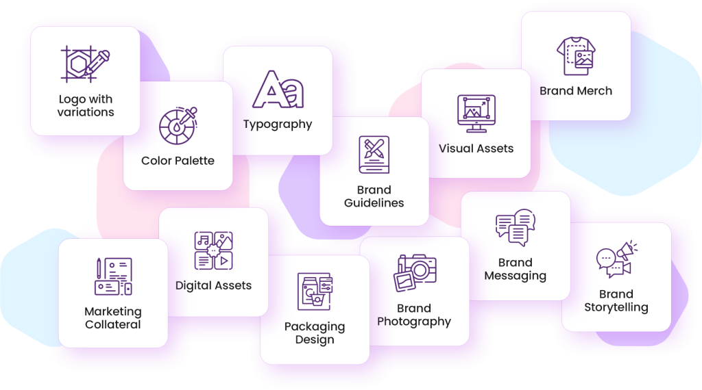
The Anatomy of a Strategic Brand Style Guide
1. Brand Foundation: Your North Star
Before you choose colors or fonts, you need to understand what you’re building. This section anchors every other decision.
- Brand Purpose Not just what you do, but why you exist. Airbnb’s isn’t “we rent rooms”—it’s “we create a world where anyone can belong anywhere.”
- Brand Values Choose 3-5 core values that guide decisions. Make them specific, not generic. Instead of “innovation,” try “questioning assumptions” or “building for the overlooked.”
- Brand Personality Define your brand as a person. Are you the wise mentor (like Salesforce), the rebellious challenger (like Tesla), or the approachable friend (like Mailchimp)?
- Target Audience Go beyond demographics. Include psychographics, pain points, and aspirations. How do they want to feel when they interact with your brand?
Visual Identity: Your Brand’s Face
This is where most guides start, but it should be informed by your foundation.
Logo System Don’t just show your logo—show how it lives in the world
- Primary logo for ideal conditions
- Secondary logo for tight spaces
- Icon/symbol for social media profiles
- Monogram for watermarks
- Minimum size requirements (never smaller than 24px for digital)
- Clear space rules (usually the height of the “x” in your wordmark)
- What NOT to do (stretch, change colors, add effects)
Color Strategy Colors trigger emotions and associations.
Choose colors strategically
- Primary color: Your signature shade (use 60% of the time)
- Secondary color: Complementary shade (use 30% of the time)
- Accent colors: For highlights and CTAs (use 10% of the time)
- Neutral palette: Grays, whites, blacks for text and backgrounds
- Include hex codes, RGB values, CMYK, and Pantone numbers
- Specify accessibility compliance (4.5:1 contrast ratio minimum)
Typography Hierarchy Fonts communicate personality.
Choose 2-3 maximum
- Primary typeface: Usually for headings (serif for tradition, sans-serif for modern)
- Secondary typeface: For body text (must be highly readable)
- Accent typeface: For special occasions (use sparingly)
- Specify font weights, sizes, and line spacing
- Include web-safe alternatives and fallback fonts
Photography Style Your image choices are as important as your logo
- Color palette: Warm/cool, saturated/muted
- Composition: Candid/posed, close-up/wide
- Subject matter: People/objects, indoor/outdoor
- Mood: Professional/casual, energetic/calm
- Include examples of what fits and what doesn’t
Voice and Tone: Your Brand’s Personality
This is where many style guides fail. They describe voices but don’t show how to use them.
Brand Voice Attributes
Choose 3-4 characteristics that define how you communicate
- Authoritative but approachable
- Confident but not arrogant
- Friendly but not overly casual
- Smart but not condescending
Tone Variations by Context
Your voice is consistent, but tone adapts
- Social media: More casual, conversational
- Website copy: Professional, clear
- Email marketing: Personal, helpful
- Crisis communication: Transparent, responsible
Language Guidelines
Specific rules for consistent communication
- We say “customers” not “users” or “clients”
- We use active voice (“We built” not “It was built”)
- We avoid jargon and acronyms
- We write in second person (“You can” not “One can”)
Content Examples
Show, don’t tell. Include before/after examples
- Headlines that work vs. headlines that don’t
- Social media captions in your voice
- Email subject lines that convert
- Error messages that help rather than frustrate
Application Guidelines: Where Your Brand Lives
This section transforms your brand from concept to reality.
Digital Applications
- Website headers, buttons, and navigation
- Social media templates and sizing
- Email signatures and templates
- Presentation slide formats
- Mobile app interface elements
Print Applications
- Business cards and letterhead
- Brochures and one-pagers
- Conference materials and banners
- Packaging and product inserts
Partnership Guidelines
- Co-branding rules and approval process
- Sponsor logo placement and sizing
- Joint marketing material standards
- Third-party usage permissions
Platform-Specific Guidelines
Each platform has unique requirements and opportunities.
- Carousel posts: 1080x1080px with consistent template
- Company page banner: 1192x220px
- Typography: Professional, data-driven tone
- Colors: Use full palette, primary color for CTAs
- Feed posts: 1080x1080px, consistent filter or border
- Stories: 1080x1920px, brand overlay templates
- Reels: Vertical video with branded intro/outro
- Tone: More casual, behind-the-scenes friendly
Website
- Header typography hierarchy
- Button styles and hover states
- Form design and error messages
- Loading states and micro-interactions
- Template layout and typography
- CTA button design and placement
- Signature format and social links
- Responsive design considerations
Your brand voice should remain consistent across channels—from pitch decks to social media design for founders
Common Pitfalls That Kill Brand Consistency
The Perfectionist Trap
Waiting for the perfect brand before launching. Your brand will evolve—start with solid foundations and iterate.
The Committee Approach
Too many opinions dilute your brand. Designate one person (usually the founder) as the final decision-maker.
The Set-It-and-Forget-It Mistake
Brand guides need maintenance. New platforms, team members, and business needs require updates.
The Over-Complicated System
If your team can’t understand it, they won’t use it. Keep guidelines clear and actionable.
The Aesthetic-Only Focus
Pretty colors don’t create strong brands. Strategy and consistency do.
Tools for Creating and Managing Your Style Guide
Design Creation
- Figma : Collaborative design with version control
- Adobe Creative Suite: For professional-grade design control, Adobe Creative Suite remains an industry standard.
- Canva Pro: User-friendly with brand kit features
Documentation
- Notion : Interactive, searchable brand hub. Notion makes it easy to build a searchable, interactive brand hub your team can access anytime
- Confluence : Enterprise-grade documentation
- Google Workspace : Accessible, collaborative editing
Brand Management
- Frontify : Dedicated brand management platform
- Brandfolder : Asset management with usage tracking
- Bynder (Enterprise): Advanced brand governance features
Template Creation
- Keynote/PowerPoint: Presentation templates
- Canva Brand Kit: Social media templates
- Figma Components: Reusable design elements
Real-World Success Stories
Case Study 1: Stripe’s Evolution
Stripe started with a simple wordmark and blue color scheme. As they grew, they systematically expanded their brand system:
- Maintained core simplicity while adding sophisticated elements
- Created extensive documentation for their global team
- Built custom illustrations and icons that reinforce their brand
- Result: Recognized as one of the most consistent B2B brands
Case Study 2: Notion’s Community-Driven Brand
Notion’s style guide balances professionalism with playfulness:
- Clear typography hierarchy supports their product’s clarity
- Flexible color system allows for seasonal and feature-specific variations
- Illustration style reflects their tool’s versatility
- Result: Strong brand recognition in the productivity space
Case Study 3: Mailchimp’s Personality-Forward Approach
Mailchimp’s style guide is famous for its voice and tone section:
- Detailed personality descriptions with examples
- Situation-specific tone guidelines
- Comprehensive writing style rules
- Result: Distinctive brand voice that differentiates them in email marketing
Advanced Strategies for Scaling Brands
The Component System Approach
Instead of fixed templates, create flexible components:
- Modular elements that can be mixed and matched
- Consistent spacing and sizing systems
- Reusable patterns for different content types
- Scalable across new platforms and formats
The Brand Evolution Framework
Plan for growth from the beginning:
- Version control for style guide updates
- Feedback loops from team and customers
- Regular brand audits and refreshes
- Clear process for approving new applications
The Multi-Brand Strategy
If you have multiple products or audiences:
- Master brand guidelines that govern all sub-brands
- Clear hierarchy and relationship definitions
- Consistent application across the portfolio
- Governance process for new brand extensions
Your Brand Style Guide Action Plan
1: Foundation
- Define brand purpose and values
- Research your target audience
- Audit existing brand materials
- Identify your brand personality
2: Visual Identity
- Create or refine your logo system
- Develop your color palette
- Choose typography hierarchy
- Define photography style
3: Voice and Guidelines
- Establish voice and tone rules
- Create content examples
- Write platform-specific guidelines
- Develop approval processes
4: Documentation and Launch
- Create comprehensive style guide
- Build template library
- Train your team
- Implement across all channels
Ongoing: Evolution and Maintenance
- Monitor brand consistency
- Gather feedback and iterate
- Update for new platforms
- Measure impact on business goals
Key Takeaways
- Priorities of Strategy, Not Aesthetics; Establish your brand’s purpose, values, and audience before concerns such as picking color and type styles.
- Establish systems, not rules; Develop flexible, modular design elements which can scale across formats or channels.
- Document everything; Document visual examples, clear dos and don’ts, and usage guides for every platform your brand will use.
- Train your team; A style guide is useless if personnel don’t know how to effectively use it.
- Invest in evolution; Plan a process for regularly updating your brand as it matures and you add channels.
- Measure the outcome; Track how your brand consistency impacts brand awareness, design speed, and ROI.
- Keep things simple; Clear and concise guidelines are always more useful than overly complicated documentation.
- Consistency is greater than perfection; a consistently good brand presence is always better compared to someone being brilliantly inconsistent.
Conclusion
A strategic brand style guide isn’t just a design document—it’s a business tool that creates consistency, builds trust, and empowers your team to make confident decisions.
The strongest brands aren’t accidents; they’re the result of thoughtful strategy and systematic implementation.
Your brand is one of your most valuable assets. Treat it with the strategic thinking and careful documentation it deserves. The time you invest in creating a comprehensive style guide will pay dividends as your company grows.
Start building your brand system today. Your future self (and your team) will thank you.
Frequently Asked Questions
1. How long does it take to create a brand style guide?
Most founders complete a thorough style guide in 2–4 weeks. This includes brand strategy, visuals, tone, and documentation. A basic version can be done faster if your assets are already defined.
2. Do I need a style guide as a solo founder or small startup?
Yes. Even as a solo founder, a guide ensures consistency across social media, pitches, and marketing. It also helps you scale faster when working with freelancers or building a team.
3. How often should I update my brand style guide?
Review it quarterly and make major updates annually or after rebrands, platform shifts, or product launches. It should evolve with your business and team structure.
4. What’s the difference between brand guidelines and a brand style guide?
Brand guidelines typically cover only visuals like logos and colors. A brand style guide is broader—it includes tone of voice, messaging, application rules, and brand strategy.
5. What tools can I use to create my style guide?
Popular tools include Canva, Figma, Notion, and Google Docs. Choose one that’s easy for your team to access and update as your brand grows.
6. How do I get my team to actually follow the style guide?
Keep it accessible, provide real-world examples, and train team members during onboarding. Assign a “brand guardian” to review materials and maintain quality control.