Bad Flyer Design Examples & Common Mistakes to avoid in 2023
Did you know that a marketer changed just one word, which resulted in an increase in sales of a company?
John Caples, the legendary direct marketer, changed the word ‘repair’ to ‘fix’ in one of his ads. The results were a 20% increase in the campaign’s response.
Things that don’t seem trivial are trivial after all. The same is true for all your marketing strategies and campaigns, including flyers. While designing and distributing flyers, you might believe some errors don’t matter; however, these lousy mistakes mark the difference between successful and failed flyer campaigns. From the colors you add to the strokes you remove, everything must be carefully planned.
This blog covers the common mistakes in flyer designs and how you can avoid them to increase the response rate for your business.
Bad Flyer Design Examples & Common Mistakes
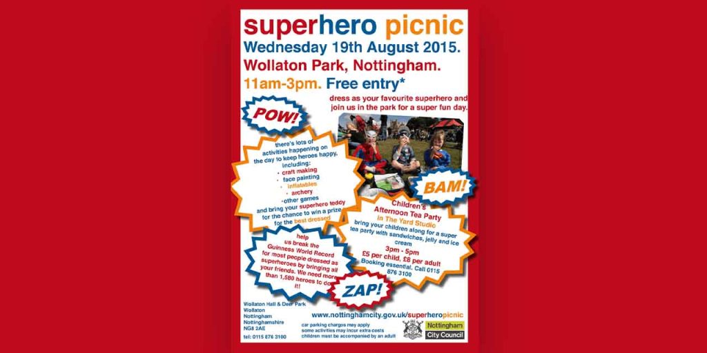
Overloading information
What you do matters to YOU, not other people, including people who receive your business flyers. The brutal truth is people don’t care about your business or what you do; they want to know what’s in it for them. So, make it easy for them to find out the catch.
You have limited space on a flyer to make a sale. Use every cm and pixel of it wisely. Go through the content twice or thrice. See if there’s a word, a sentence, or a section that you can do without. And remove it. People want to know how your business products and services can help them out. What is in it for them? Highlight it.
Another common mistake business owners make is packing their flyers with fancy features. They might get impressed by the features of your product and services, but how will it help them? Will it save time, money, or energy? Will it help them go out on vacations? Show how those features will make their life more happening.
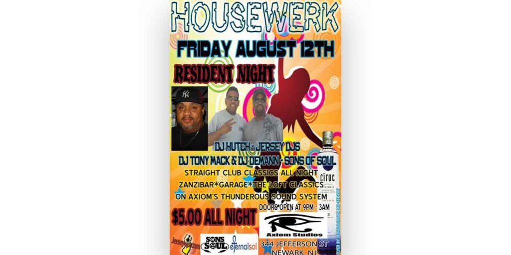
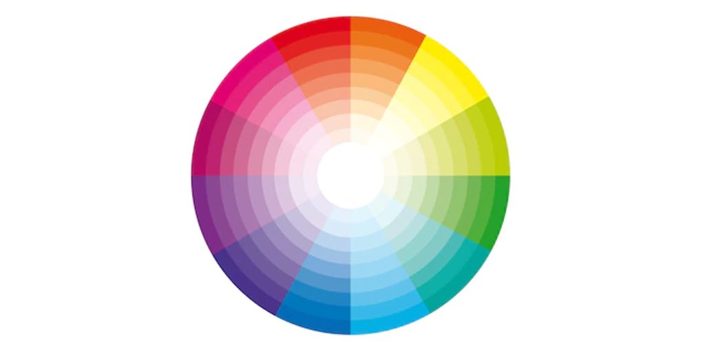
Too many colors can create a vibrant monster. Use design to complement and invite your audience. While tools like Canva make it easy for you to create designs, there are fundamental design principles you must know to create attention-grabbing designs. Understand design elements like color psychology, proximity, balance, symmetry, shapes, and visual hierarchy to create eye-catchy designs.
If designing is not your best suit, hire a professional who has spent years crafting their skill.
Why not take help from Design Shifu to design a flyer for you? You get unlimited graphic designs and a dedicated designer to take care of all your design needs.
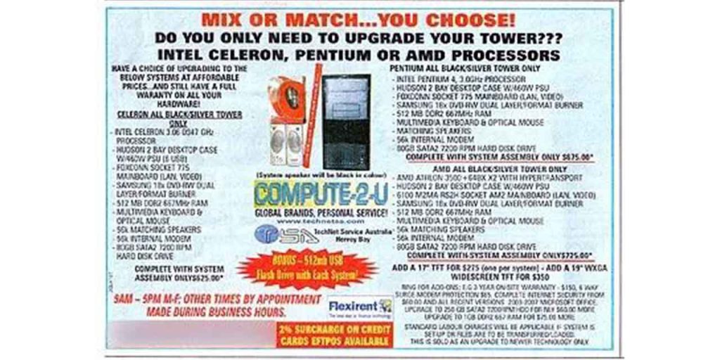
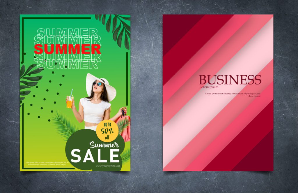
A pet peeve of viewers and a sin for designers and marketers is poor-resolution stock images and illustrations. After spending hundreds of dollars on your flyer marketing campaign and distributing those flyers to your audience, adding free images dilutes your effort. Using stock images may look economical at first glance, but it costs you more.
Stock photos are shared by thousands of people across the planet. Students and businesses use them alike, which is why they might not have the same impact on viewers as an original image since they have already seen it several times. Moreover, stock images question your credibility. Would your product or service really look like this? Are people in your company actually that happy? So, add real images.
If you do not have pictures, hire a photographer or click them by yourself. Get a designer to edit them for you, and you are good to go. The same goes for illustrations. Always use custom illustrations that align with your brand voice and personality.
Do you want help designing illustrations for your business? Get a dedicated designer and unlimited graphic designs for just $399 per month from Design Shifu.
You might have amazing products, services, and images to show off to your prospects. But how do they get in touch with you? Do not forget the primary purpose of your flyer is to book calls and make sales. Give considerable space to contact information. Include the business name, logo, contact number, office address, website, and email address. If you have active social media pages, include icons or links. Include a QR code to directly send your audience to the landing page.
While adding colors, typography, and images are all good graphic design practices, using too many can clutter your flyer design. Create a structure that is easy to read. Identify the crucial information and elements you want to emphasize: its contact number, services, and address. Add space between things to give breathing room.
The first thing a prospect will read is the headline. So give it respectful space and emphasis to catch attention and entice your customers’ curiosity. Use colors that evoke the intended emotions and legible typography.
With an attention span of less than a goldfish, your prospects are unlikely to make it through your offer if you do not tell it straightforwardly. Keep your headline crisp and short. Don’t be vague.
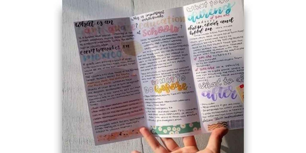
A flyer with no formatting and a large block of text demands effort on the reader’s part. Flyers receivers are barely interested in sparing minutes, let alone seconds, on your sales pitch. So, format the content to make it pleasing to read. Use white space and bullet points to break down the paragraphs. Highlight important information using color, italics, and bold. Create a visual hierarchy among information. Make reading flyers worth their time.
Ever came across a flyer with a 12-point font throughout? Did you read it?
Adding space and formatting is one thing; making it scannable is another. People don’t read, they skim. Create a visual hierarchy to guide the reader’s attention and make it easy for them to pick the main points. So use typography, font, and highlights to help them. Bold and italicize keywords.
Do not go overboard with fonts. Stick to two fonts. Fonts with superfluous details are just as bad as an Open Sans at 9-points size, impossible to read on print. The key is to keep it legible.
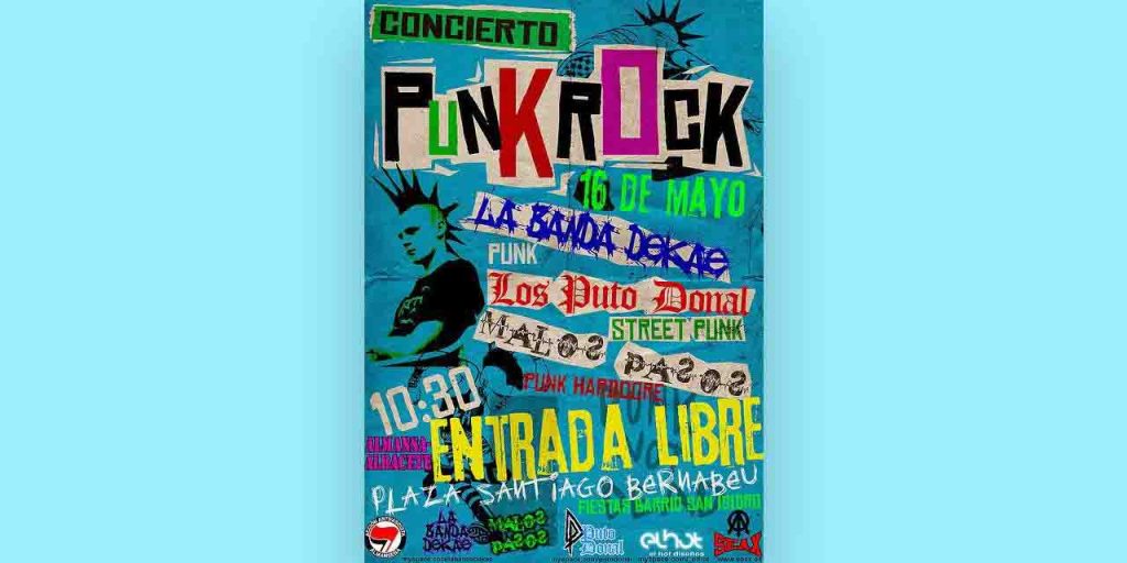
Clever is good as long as it doesn’t hurt your audience’s sentiments. Choose your message and elements carefully while designing your flyer. Avoid controversial statements or messages that contradict your brand values.
For instance, this ad successfully created a buzz around the town but not exactly in the company’s favor. Although Burger King enjoys a following for its entertaining ads, this might have offended its long-term customers. As a small business owner, you have limited chances to build a reputation, unlike Burger King. So, spend more time planning out your message. It is wise to avoid sexual innuendos and discriminatory messages.
Choosing a wrong size
Most business owners distribute 8.5 × 11 in. size flyers, which are, generally, A4 size. However, flyers come in various sizes. Consider your audience, message, and content before selecting the size.
Where will you be distributing your flyers? Would it be easy for your receivers to carry it with them? For example, many visitors won’t appreciate you giving them an A4 size hard paper flyer, hard to fold at the entrance of a fair. They might throw it in the first trash can they spot. So, determine the size after considering the environment, audience, and messaging.
Not proofreading before publishing
42.5% of customers would not buy from a business if they see a spelling or grammatical error. Imagine the number of sales you may lose because of a letter or a comma. So get your it and it’s and you’re and yours right.
Run your content through online grammar-checking tools like Grammarly, or get it proofread by your friend or colleague. Double-check before sending your flyer off for print. Additionally, check that the information is factually correct.
Having a vague or no CTA
What are you trying to achieve with your flyers? What should your reader do if they choose to read your flyer? Should they book a call? Fill out a form? Explore your website or visit your store?
What is the next step? State it clearly.
Adding contact details and address is not enough. Shine a spotlight on it and have a clear call to action to direct them. You can also add a QR code to simplify their journey.
Flyers are an underrated cost-effective marketing strategy that helps small business owners expand their visibility and reach, possibly making them the talk of the town.
Our bad flyer examples will help you distinguish between good and bad flyers and avoid blasphemies, so you can create a successful flyer design for your business.
Now, pull out your flyers and identify the spots you can update. If you don’t want to repeat any bad flyer practice, reach out to Design Shifu. We will help you with a consistent brand identity while keeping up with the latest flyer trends and best practices. Interested? Let’s get started with a free demo.
21 Flyer Design Ideas that will make your brand fly high
Distributing flyers is one of the oldest marketing strategies used by almost every brand – big or small. While the usefulness of traditional forms of marketing is up for debate – flyers are 100% relevant to date. With the least investment in this marketing collateral, the ROI is always great. So how can your small business use flyers to promote and educate about the offerings? In this blog, we have discussed several flyer design and flyer layout ideas for you to take inspiration from.
What are flyers?
It is a single, unfolded sheet of paper with content printed on it on one side. When glossy or high-quality paper is used for it, it is usually called a leaflet. Businesses distribute flyers to attract potential customers to their business so that they end up buying their product or service or attending their event.
What should a flyer include?
Every well-designed flyer has a few key elements that make it a good marketing tool. To answer the question “what should be on a flyer” we have made a small list for you:
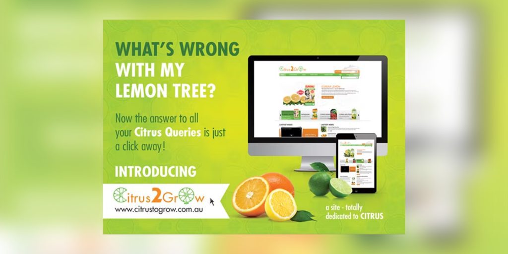
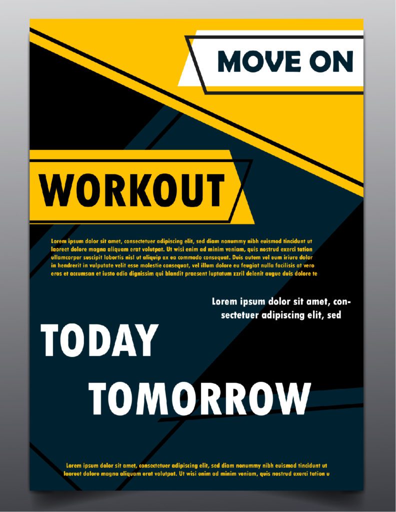
1. Graphics or Images
Loud and bold, eye-catching graphics are the most essential parts of any flyer. Make one bright, big graphic the focal point of your flyer rather than cluttering it with multiple small images. Since the graphic needs to be the main focus of your flyer, place it at the top of the page and extend it throughout its width.
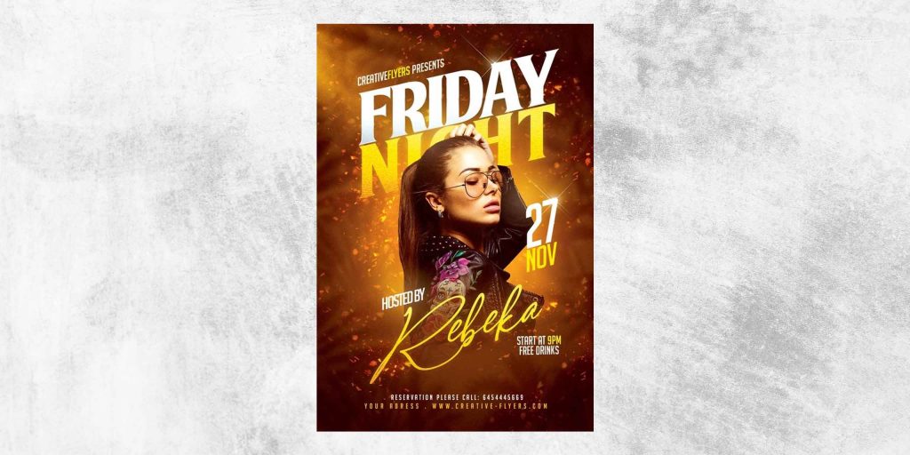
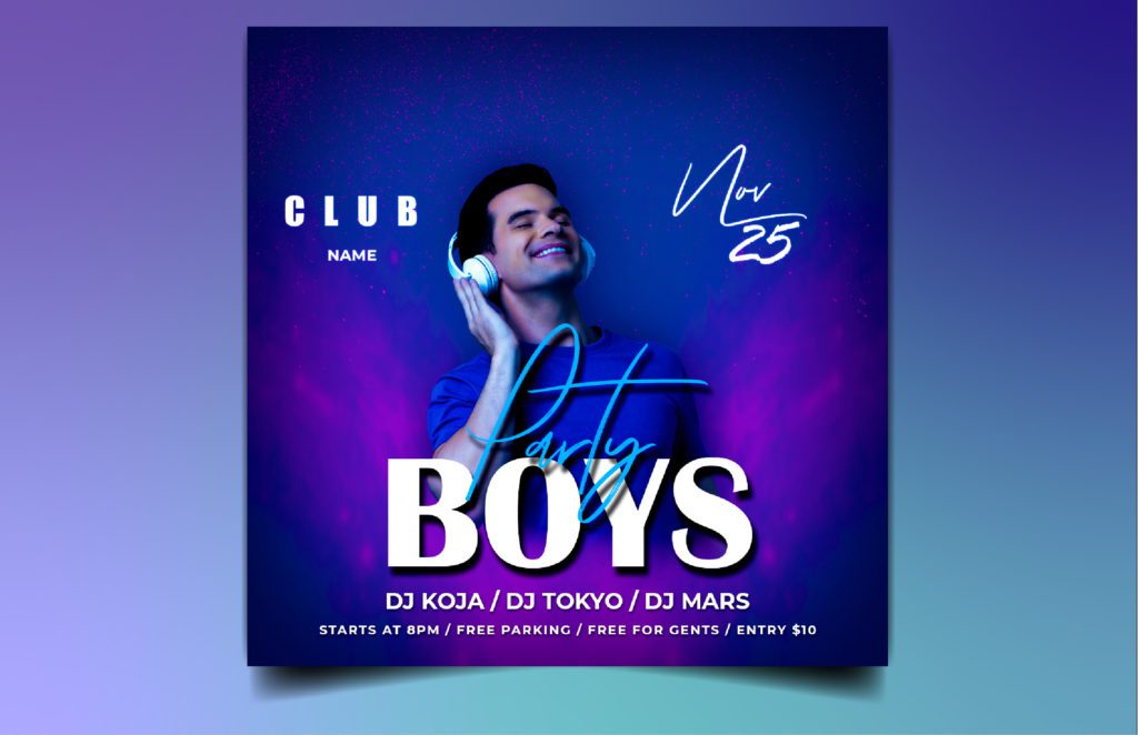
By using visual effects and a real character enjoying the event, this flyer creates a party mood. This is a great example of passing on the vibe through marketing collaterals like flyers.
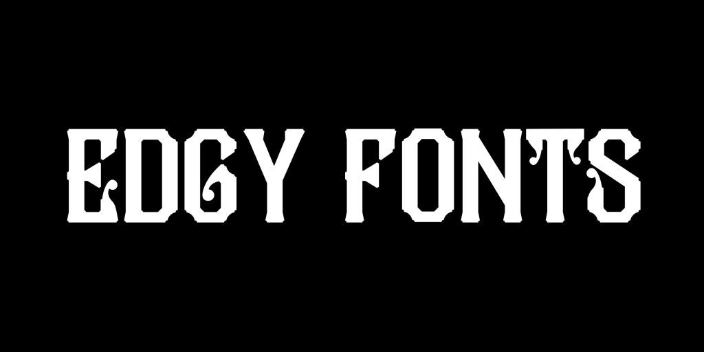
Make sure to place your business logo on the flyer to create brand awareness. You can also make your flyer only text-based if you want to, but in that case, make sure the background is appealing enough. Go for vibrant, unique patterns and edgy, creative fonts. Make sure that the writing pops out and is readable.
2. Headline
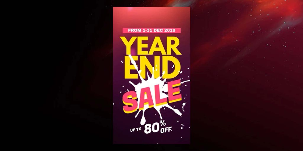
While graphics create the first visual impression of your flyer, the headline will decide if people will read the content on your flyer. Keep the hook short and crisp. Use catchy phrases like “Big Year-End Sale” or “Get 50% Off!” to grab attention.
Tailor the tone of the headline according to your target audience. A more fun and edgy tone if your target audience is younger and a more professional and serious tone if your target audience is older. The headline should also stand out from the rest of the flyer, so use bold text and a different font.
3. Content
The content of a flyer needs to be precise and never descriptive. Include only necessary information like short product and service descriptions or event details (for event promotion flyers). Keep enough spaces between the text, so it does not hide your flyer design.
The text size should be big enough to be readable but not clutter the flyer. Create urgency by placing a compelling CTA on your flyer like “Visit our store today“, “Place your order now” or “Participate in our event“.
See the above example, how clearly they have mentioned the CTA and provided useful information to the candidates. Communication is the key here.
4. Location and contact information
Lastly, your business contact details should always be on the flyer. If you have an offline store, make sure your flyer has the store’s address. If you run an online business, place your website address on the flyer. Also include the email ID and phone number of your business.
What are the features of any professional flyer design?
For a flyer to be good marketing material, it should have the following qualities:
Eye-catching: People usually crush and throw a flyer if it isn’t appealing enough to grab their attention.
Targeted: The language in your flyer should be tailored according to your target audience so that it seems like it’s directly speaking to them.
Informative yet concise: The flyer should precisely promote your product/service/event.
Convincing: The tone of your flyer should excite the readers about your brand.
If you want to learn more about designing the perfect professional flyer for your brand, you can check out our in-depth blog on How to Design a Flyer.
4 flyer ideas for different types of businesses
Different businesses require different flyer designs to create an impression on their audience. Here are some of the flyer design ideas for the most common types of businesses:
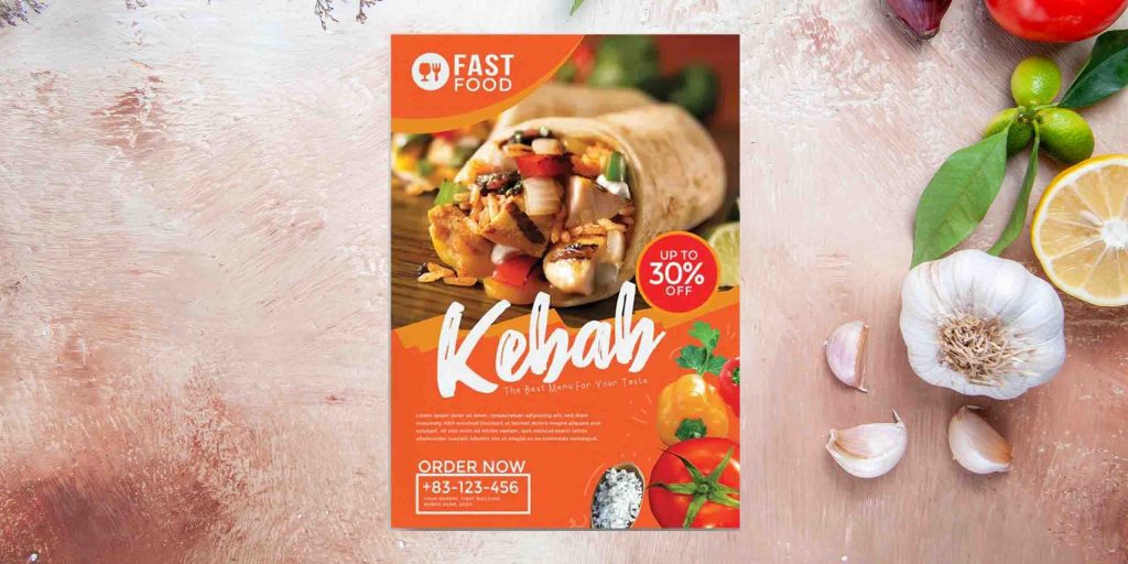
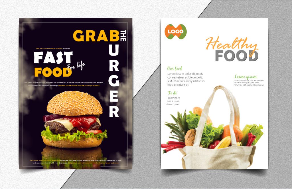
1. Flyer ideas for food business
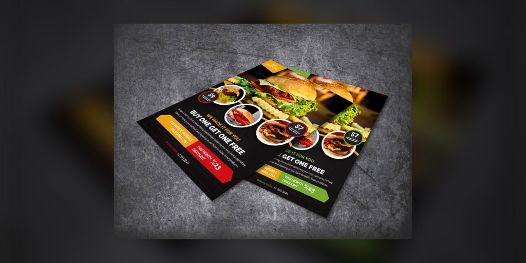
If you are running a restaurant or a cafe, appetizing pictures of food and beautiful interiors should be the main focus of your flyer design. You can also include your food menu (or at least a part of it) so that people can directly order from your flyer.
See this example, the image alone would make you say “yumm” and encourage you to place an order. Food businesses have a lot of scope for creativity resulting in higher visits.
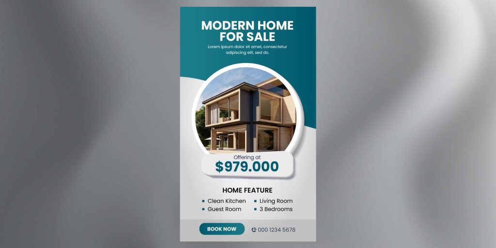
2. Flyer ideas for real estate business
Since this one is a highly professional business, go for a clean, minimalistic aesthetic with a simple font choice. The interior images should be high quality and aesthetically pleasing to attract people into buying the house.
The above flyer example is minimal yet delivering the clear message along with aesthetics, you can also make a similar flyer for your real estate business.
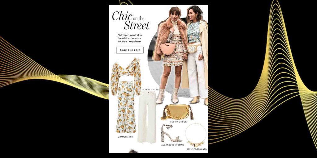
3. Flyer ideas for boutique business
You can either go for a classy, sophisticated design or the “loud and bold” aesthetic, depending on the taste of your target audience.
The focal point of the flyer needs to be models flaunting the best items from your boutique like the one in above example. Pair muted, pastel background with serif and script fonts to add that extra touch of elegance.
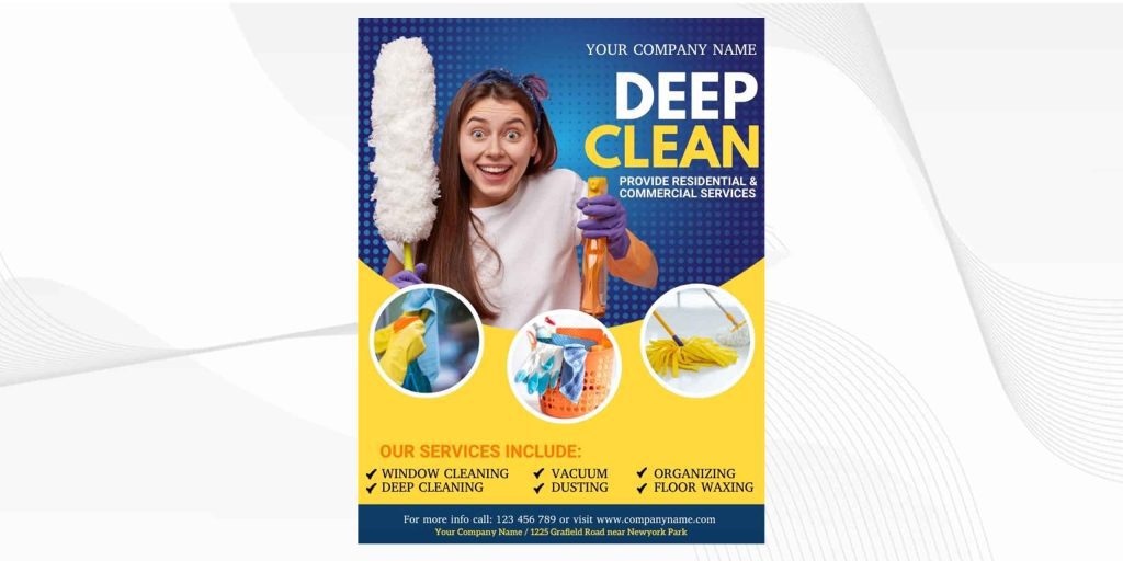
4. Flyer ideas for Cleaning business
Your team of professional cleaners doing their job should be at the center stage of the flyer. It creates a sense of trust and reputation among your target audience. The image should be appealing and catch
Go for solid colors that symbolize cleanliness, such as yellows, whites, greens, and blues. The above example is also emphasizing the same.
How to make a business flyer of yours more attractive?
Here are seven strategies you can apply to make your business flyer more attractive:
1. Use icons
Icons are the simplest way to represent something concisely. So when designing a flyer, use icons to depict different products, services, functionalities, etc. Icons help you create a cleaner design for your flyer.
For example, the above icon set would be great for a flyer of a car washing service
2. Use your brand colors
All your marketing materials, including your flyer, should represent your brand colors to maintain uniformity and create a strong brand presence.
Either the entire background of your flyer can be based on your brand colors, or you can use them as accent shades. In case you are having difficulty incorporating brand colors efficiently in your flyer, why not take help from Design Shifu to design one for you? You get unlimited graphic designs and a dedicated designer to take care of all your design needs.
3. Create a custom illustration
The easiest way to take your flyer design up a notch is to create illustrations using simple elements. You can create an illustration based on what your business does or what your business sells.
The font styles on your flyer can either make or break the game. Use edgier and stylish fonts for the crucial texts and a slightly toned down for the not-so-important content. But even while using decorative fonts, make sure it is readable.
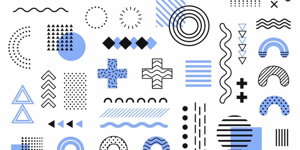
5. Use interesting design elements
Be experimental and fun when it comes to incorporating design elements into your flyer. Make use of different geometric shapes to depict different ideas and emotions. You can use lots of brightly colored shapes (2-3 shades maximum to avoid clutter) to highlight important information—for instance, cloud shape for testimonials and quotes.
6. Use semi-transparent shapes to make text pop out from the background
If you have a flyer background that is too loud, your text might not be easily visible. So for your text to get highlighted, translucent overlay shapes over your background image.
Like, the above flyer template from Pngtree. Adjust the transparency level in a way so that the text is readable and the background still peeps through
6 bonus tips to make your digital flyer design stand out
Go for shading techniques to create photorealistic effects in your flyer images and add more depth.
Nudge people’s senses by adding texture to your flyer surface. You can make it furry or velvety or coarse or silky. It can help in creating an emotional response.
Use text styling techniques to emphasize specific sections and create a flow. You can use different depths, colors, bold, and italics for your text.
Make a statement using some dark humor or making bold claims or dramatic sentences. Go a bit over dramatic with the language.
Don’t just hard sell! Rather, also include some information of value to your target audience. For instance, if you are a car washing company, you can include some car washing tips. This prompts your audience to read further.
State the USPs of your product or service clearly. Don’t just showcase your product or service simply. Highlight the problem your business is solving. For instance, don’t just say you sell outfits. Say that you help people with their fashion problems.
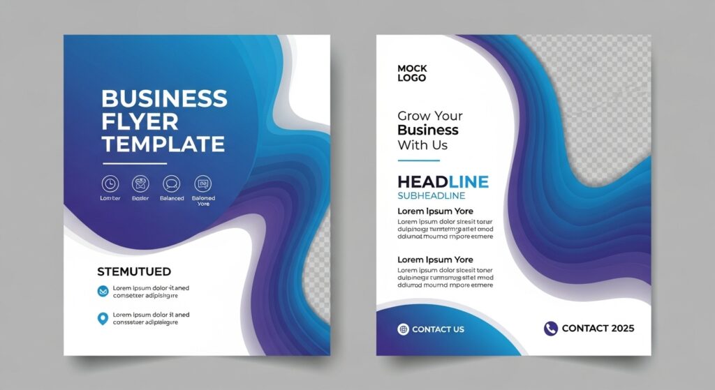
There are a lot of options when it comes to deciding on a layout for your flyer. Some of the most common flyer layout ideas are:
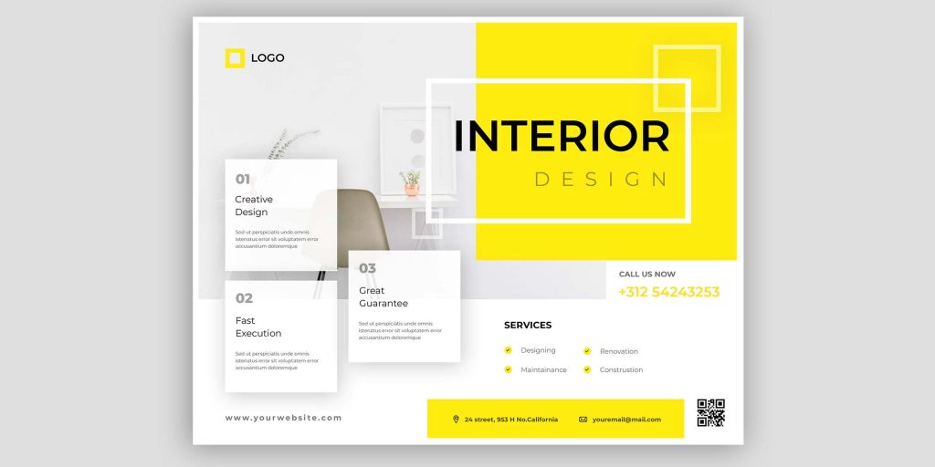
1. Horizontal layout
Horizontal layouts are best for highly professional industries like real estate or car cleaning. This layout allows you to display information in a linear style with clear headlines.
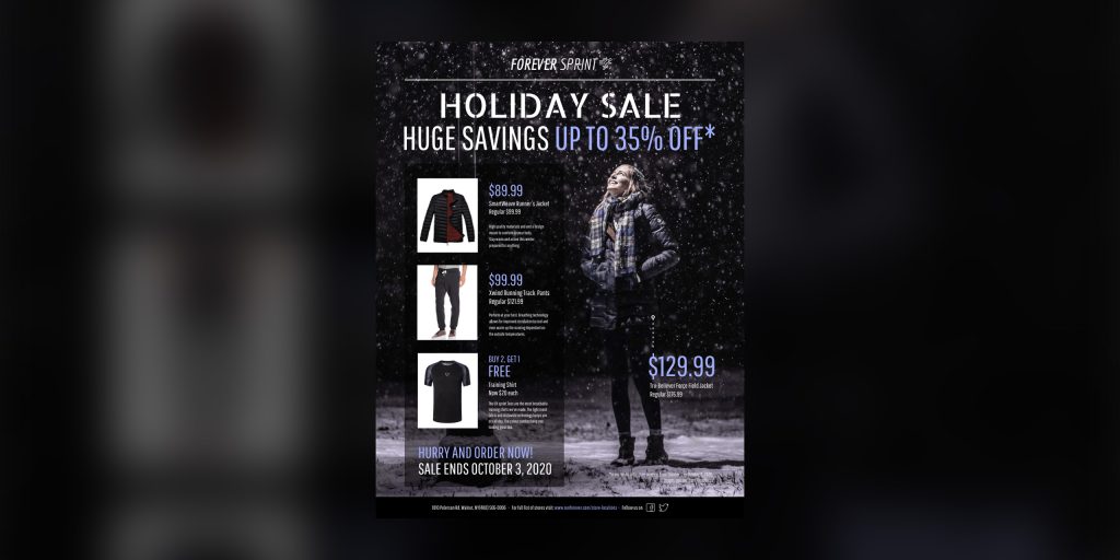
If your business sells multiple products or services, this layout is the best option. This layout contains multiple boxes where you can fit several images with short descriptions.
Or make something similar to the above example, which will help you stand out and grab the maximum attention.
3. Montage layout
If you want a more spacious presentation of the elements on your flyer, using this layout is a good idea. This layout connects the images on your flyer by allowing space between them to create a neat visual.
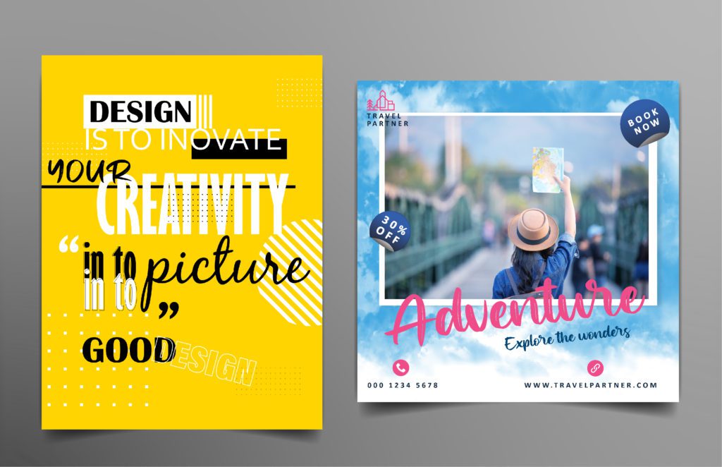
9 creative flyer design ideas to take inspiration from
Different flyers utilize different design elements and strategies to make them visually appealing. Here are some of the most creative flyer design ideas to inspire you to design that perfect flyer for your brand.
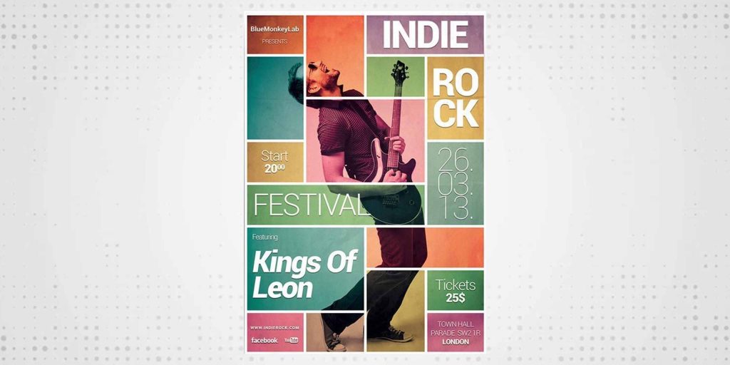
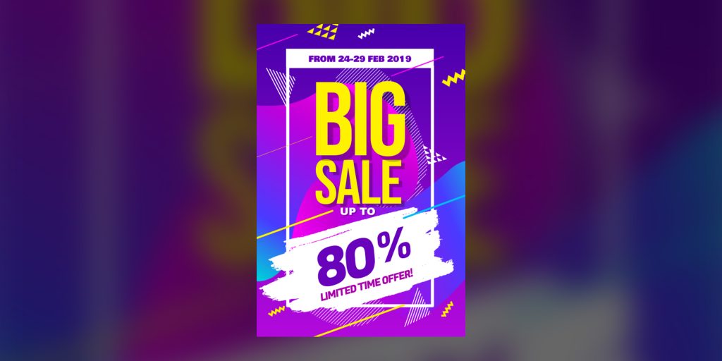
1. Using multiple colors
Though the basic flyer design rule is not to incorporate too many colors, the multicolor palette of this flyer works well. It looks unique and refreshing and has the potential to attract customers. But make sure that the background or the template you use to design your flyer supports a multicolor design. For instance, here, the dark background complements the multicolor element well.
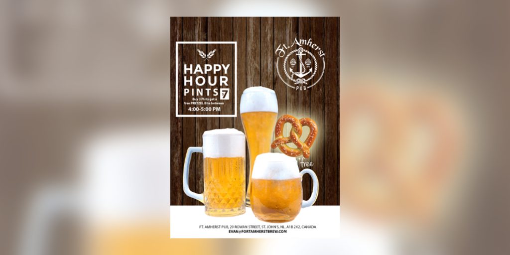
Using a lot of different shapes, like rectangles, circles, diamonds, etc., strategically on your flyer can help attract your audience’s attention. For instance, this flyer design uses beer glasses of different shapes and sizes, cylindrical, circular, etc., to create an aesthetically pleasing effect.
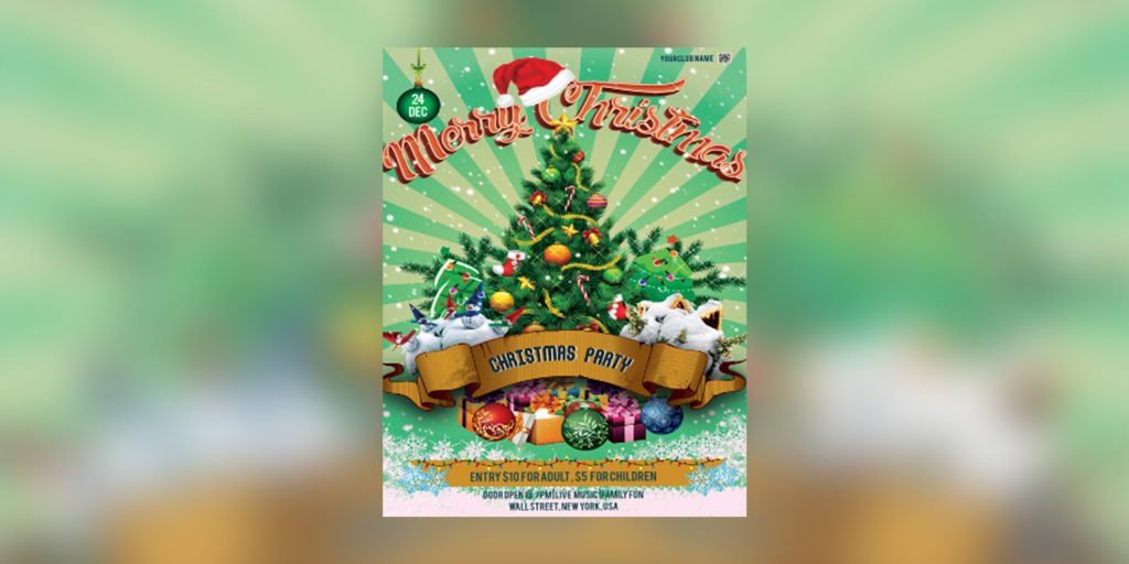
One of the best ideas to promote anything on your flyer is using the backdrop of festivity. If any festival is around the corner – Halloween, Thanksgiving, Christmas, use those festive elements to make your flyer attractive. For instance, this brand flyer is promoted subtly, and the main element of the flyer is Christmas wishes.
If you want to spice up your flyer design with too many bright and loud colors, a good idea can be to use gradients that allow the gradual blending of these shades. For instance, in this flyer, using textured gradients has created a fresh color combination that adds to the uniqueness.
Tip: Make sure the gradients and textures you use on your flyer align with your brand personality. For instance, bold gradients and textures would work well for gyms, sports, energy drinks brands, etc. But a calmer color gradient of basic, neutral colors works well for more serious businesses.
5. Embrace the dark side
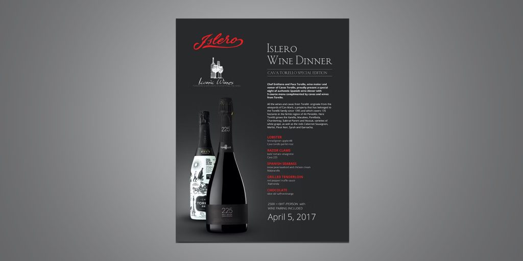
Color doesn’t always need to be loud to get attention. If you are a luxury brand or you somehow want to depict royalty or elegance through your flyer design, using shades like black and gray is an incredible idea. For instance, this flyer promoting a wine dinner event looks like an absolute classic piece of art and captures the sophistication of a wine dinner well.
The old-school 80’s or ’90s vintage aesthetics can take your flyer design to another level altogether. It is bound to evoke an emotional response in your audience. For instance, this flyer looks like a classic piece of art stolen from a ’90s museum.
One of the best ideas to attract attention is to ask a question on your flyer. It can be a rhetorical and fun one or a serious one (depending on your brand’s tone). For instance, if you are selling a gym membership, you can ask a question like “Do you dream of that dream body often?” or if you are a food app, you can ask your audience, “Are your hunger pangs making you crazy?” It makes your target audience think and then read the content like this flyer’s copy does.
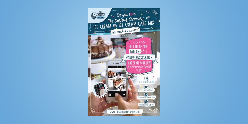
You can make your flyer all about promoting your brand’s social media handles. Include your Instagram, Facebook, and other handles on the flyer, and ask your target audience to follow you. You can even start a contest where you can ask people to share your flyer on their stories with a testimonial and tag your brand with a hashtag for a special offer. This will create a buzz about your brand on social media.
Picture credit
For instance, this flyer creatively showcases the social media handles with a fun and lively aesthetic.
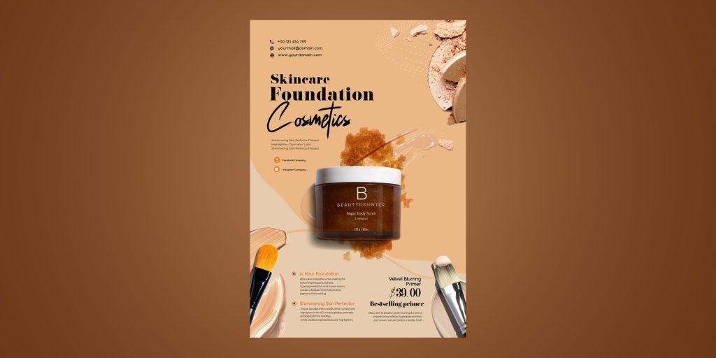
9. Give your product center stage
Sometimes brilliance lies in simplicity. You need not always complicate your flyer with too many elements or design tricks. Your flyer can simply showcase what you sell loudly without being too clever or subtle about it (if that is what works for your business). For instance, this flyer’s main element is the product, with the USPs clearly stated along with the price.
Here are some of the best product flyer design ideas:
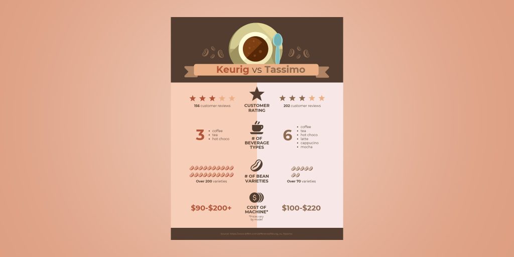
1. Compare your product to a competitor’s model
There are so many brand options in the market right now for any product. Your product flyer can be a perfect opportunity for you to showcase why your product is a better option than the others. For instance, this flyer compares the features of both the competitor models so the audience can decide for themselves.
2. Upsell by showcasing products that can be brought together
If your brand sells complementary items that can be brought together, showcase that on the flyer. Either help them visualize the benefit of buying all those products together with images all clearly state it as text. For instance, this flyer upsells different clothing items by pairing them together as a complete outfit.
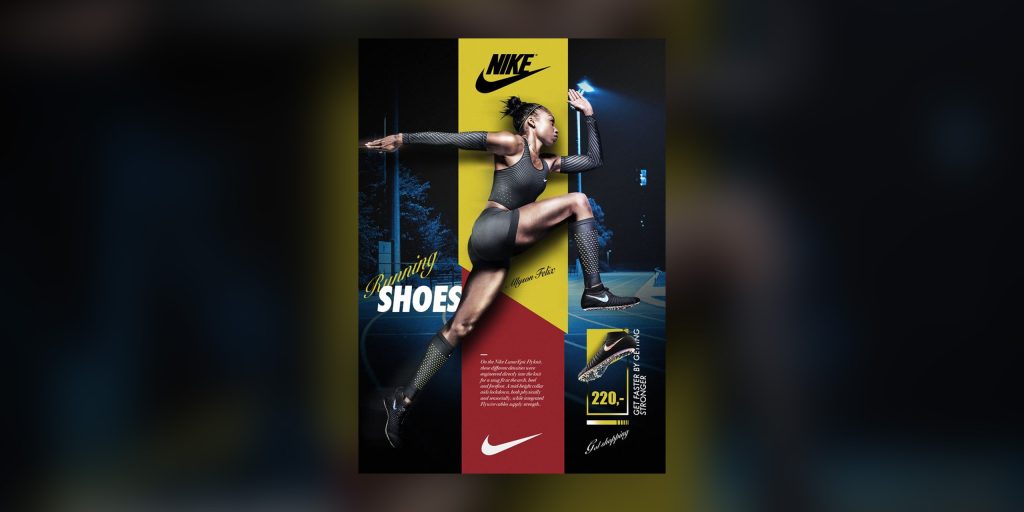
Displaying your product “with context” means displaying it in use or action rather than just showing it. For instance, in every advertisement, Nike always showcases its shoes in association with athletes and never just as a shoe. This evokes emotion in people and helps them connect better to the product. When a person sees an aspirational image of an athlete using their shoe, it urges them to do the same. It also makes your product seem more tangible.
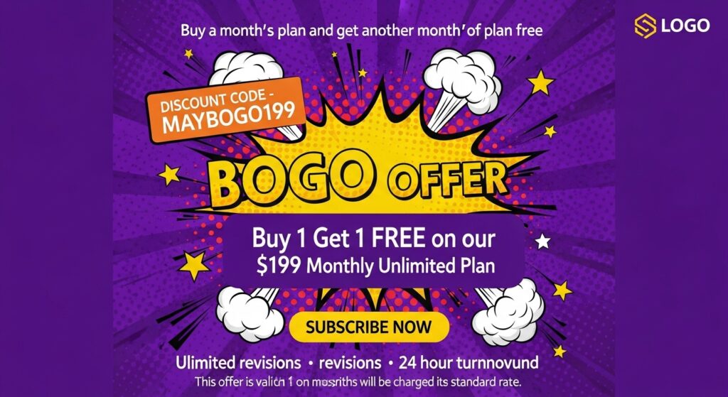
Here are some of the best sales flyer design ideas:
1. Pick colors that reflect the mood of your sales event
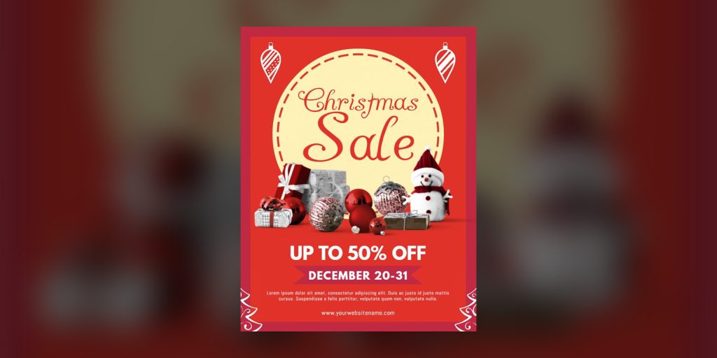
Are you trying to promote a “festive sale” on your flyer? Or is it an exciting flash sale? Or maybe just a “Spring look” sale. Use colors on your flyer wisely to depict the emotional angle of your sale.
For instance, a bright multicolor palette works best on a festive sale flyer. Pastel hues may help you create that vibe for spring or winter sales. For instance, this flyer clearly depicts the Christmas theme.
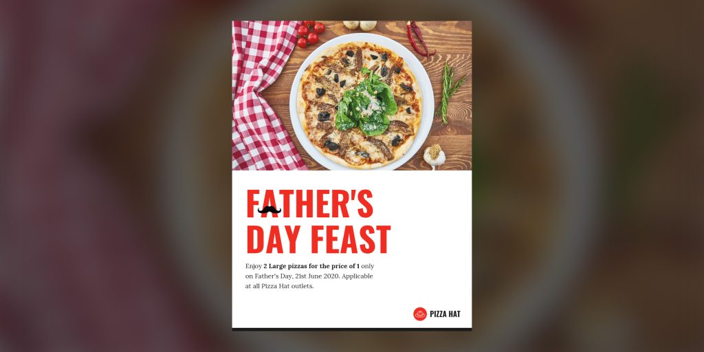
A visual pun (kind of like an inside joke) that goes with the theme of the flyer is a great idea to grab some eyeballs. Incorporating humor into your flyer design can be game-changing if you do it in a way your target audience understands. For instance, this flyer design has incorporated a mustache on the word father as a symbolic pun.
Your sales flyer should scream out loud the discount amount. Use big, highlighting text and place it right at the center to make it the focal point of the design. Even the biggest brands like Zara use this strategy. For instance, this flyer does a great job of highlighting the discount.
Here are some of the best event flyer design ideas:
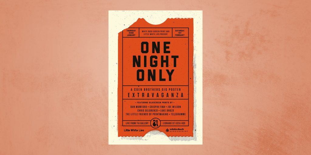
1. Make your event flyer double as a ticket
If you want to give only exclusive invitations to some people for your event, you can hand out your event flyer as a ticket. But make sure to state it clearly on the flyer. You can even design your flyer like a ticket for a better effect, like the one mentioned below.
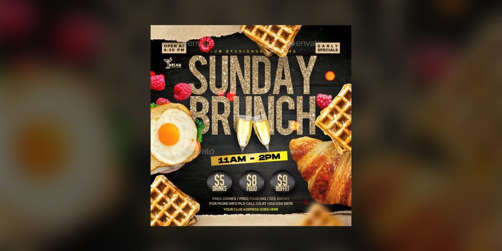
Almost every event has a theme, and it is a great idea for your flyer design to reflect that theme. For instance, if it is a fun event full of glitz and glamor, use peppy shades and quirky fonts on the flyer.
If it is a professional event, go for a more serious presentation with subtle shades and simple font. For instance, this flyer is for a brunch event, and brunches generally have a posh and glamorous vibe reflected in the color palette choice and illustrations on the flyer.
The deciding factor for most people, whether they want to go to an event or not, is the entry price. So make sure to highlight it on your flyer. For instance, you can put ticket prices in a different color font, like in this flyer.
Distributing flyers for your brand is a promotional strategy that works effectively only if done the right way. You can’t expect just a piece of paper without a strategy behind it to generate results. The methods discussed above will help you brainstorm flyer design ideas and flyer layout ideas for your brand.
In case, you want to get a flyer designed from professionals, you can get unlimited graphic designs for just $399 per month. So wait no more, and let’s get you that jaw-dropping flyer now!
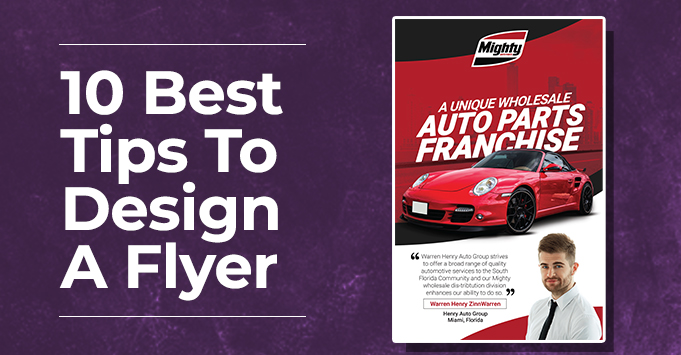
10 Best Tips to Design a Flyer in 2025
In a world where digital ads, social media posts, and email blasts flood our screens daily, flyers might seem old-school—but don’t be fooled. Flyers are still one of the most effective marketing tools in 2025, both online and offline. The key? Design them right.
Whether you’ve got a new product launch, a sale announcement, an event to promote, or are just trying to get your brand noticed, a flyer can do a lot of work for your business. But with one caveat—people don’t want pretty anymore; they want design with purpose that communicates value and inspires action.
We’ll help you create flyers that speak directly to your audience and inspire them to act.
TL;DR
Flyers are still one of the most effective marketing tools in 2025—if done right.
A successful flyer isn’t just pretty—it’s clear, compelling, and calls your audience to action.
Focus on both your messaging and design: craft a bold headline, write a strong CTA, stay on-brand, and use modern design techniques like minimalist layouts, smart use of shapes, and high-quality images.
Whether print or digital, always optimize your flyer for repurposing and audience engagement
Why Flyers Still Matter in 2025
Flyers remain one of the most affordable and versatile promotional tools in 2025. Whether printed for events and street marketing or designed digitally for email campaigns and social media, flyers are a cost-effective way to spread your message fast.
But if you’re new to designing flyers, it can feel overwhelming. That’s why we’ve broken it down into simple, actionable steps to help you create a flyer that’s creative, professional, and results-driven from marketing strategy to visual design, so your next flyer isn’t just beautiful—it’s effective.
Flyer success comes down to two key aspects:
How attractive it looks
How effectively it sells your message
Let’s dive into both, starting with the marketing mindset.
The Marketing Perspective
1. Define the Purpose and Message
Before you jump into designing, know what your flyer is about, who it’s for, and what you want it to achieve. Are you promoting a product? An event? A grand opening?
Create a brief outlining:
Your target audience
Your key message
The action you want readers to take
Highlight important copy using bold fonts, brighter colors, or increased size to create a hierarchy of information.
Once you have your concept and copy ready, the next thing to look at is…
2. Use a Strong Call to Action (CTA)
Your CTA should be impossible to miss. It tells your audience what to do next—visit your website, call a number, scan a QR code, or use a discount code. In 2025, QR codes and clickable CTAs for digital flyers are essential tools.
For printed flyers:
“Call now,” “Visit us,” or “Show this flyer in-store for 10% off.”
For digital flyers:
“Tap to shop,” “Scan to RSVP,” or “Use code FLYER25 online.”
3. Reflect your brand character
Consistency in your design makes your brand familiar and recognizable. Incorporate the identity of your brand into the design for your flyer. Use your brand color scheme or your style in the flyer design to make it your own. You can place your logo strategically, enough for it to stand out, but also be balanced with the other elements of your design.
Now that we’ve gone over the concept, aim and the copy of the flyer. Let’s look at the design aspect.
The Designing Perspective
4. Keep Colors Simple and Strategic
Stick to 2–3 complementary or contrasting colors that align with your brand. Bold colors are eye-catching—but use them intentionally. Too many bright shades will compete for attention.
2025 Trend: Color gradients and duo-tone backgrounds are on the rise for flyer designs. Use these for subtle depth without clutter.
5. Choose Readable Fonts (And Limit Them)
Stick to 2 or 3 fonts max. Pair a headline font with a readable body font. Don’t use script or novelty fonts for important info.
Also
Keep font size readable even from a distance (for printed flyers)
Use proper line spacing
Leave negative space around text for better legibility
6. Select Quality Paper for Print
If you’re printing, quality matters. Choose durable stock paper and finish it with a matte or gloss layer depending on your aesthetic. This instantly elevates how professional your flyer feels.
Pro tip: Leave a 0.125″ bleed margin on all sides to avoid trimming essential parts of your design during printing.
7. Use High-Resolution Images
Whether your flyer is printed or digital, crisp images are non-negotiable. For print, use images at 300 DPI. For digital, optimize image resolution without compromising clarity.
Align visuals with the flyer’s layout and maintain balance between imagery and copy. Use visual hierarchy to draw the eye to the most important areas.
8. Pick a Style That Reflects You
In 2025, minimalism and bold maximalism are both trending—so pick one that matches your brand vibe.
Minimalist: Clean layouts, neutral colors, lots of white space.
Either way, keep your content digestible. Avoid overwhelming visuals. Your style should support your message, not distract from it. You can take a look at our portfolioto understand different styles for different designs, for inspiration.
9. Leverage Shapes and Leading Lines
Use shapes—like circles, rectangles, or overlays—to highlight text and structure your design.
Apply leading lines to guide your reader’s eyes to your CTA or key offer. You can also wrap text inside shapes or position them creatively to keep the flyer visually engaging.
10. Use Patterns Creatively
Patterns can add visual rhythm and energy. Try:
Soft gradients or abstract patterns in the background
Geometric patterns to separate sections
Illustrated textures for artistic flyers
Make sure the pattern doesn’t overpower your content—use it as a supporting design element.
Bonus Tip: Repurpose Your Design
In 2025, content repurposing is a smart move. Always save a digital version of your flyer in multiple dimensions for reuse in
Website banners
Email newsletters
Instagram Stories or Reels
Facebook Ads
Key Takeaways
Repurpose smartly: Save your flyer in multiple formats for use across platforms.
Start with strategy: Define your flyer’s goal, audience, and message before designing.
Use a strong CTA: Encourage your audience to act—click, visit, scan, or shop.
Stay on-brand: Use consistent fonts, colors, and logo placement for recognition.
Limit colors & fonts: Stick to 2–3 of each for clean, professional design.
Choose print wisely: Use high-quality paper, proper bleed margins, and DPI settings.
Design for clarity: Use shapes, negative space, and visual hierarchy to guide the eye.
Style matters: Choose a design direction—minimalist or bold—and stick to it.
Ready to Design a Flyer That Works?
With these handy tips, designing your own flyer is now easy. However, if you’re looking to give your flyer a professional touch. at Design Shifu, our designers aka Shifu’s handle daily design requests from businesses of all sizes at affordable prices, with quick turnaround time and a 14-day money-back guarantee. Check out our subscription plans here.
FAQs
1. Are flyers an effective marketing medium in 2025?
Yes flyers are an active medium for both print and digital marketing. Flyers can be effective at getting your marketing message across as well as compelling your target audience to act using good messaging strategies with appealing design.
2. What size should my flyer be?
You can find flyers in several sizes in 2025, including: 5.5” x 8.5”, which is half-size 8.5” x 11”, which is the regular size 4” x 6”, which is the postcard size Select your flyer size based on how you plan to distribute it or how much content you have to work with.
3. What resolution should I use for my images?
If you’re printing your flyer, use images at 300DPI. If you’re going digital with your flyer, as low as 72 DPI or 150 DPI should work, but always test to make sure it looks clear on all devices.
4. How can I make my flyer stand out visually?
Use:
High-contrast colors
Eye-catching headlines
Strategic shapes and patterns
A clear layout with lots of negative space
5. Can I use QR codes on flyers?
Yes, and you should! QR codes are great for linking to websites, events, coupons, or contact forms—especially in 2025 where mobile-first interaction is key.
6. Should I design flyers myself or hire a professional?
DIY works for simple needs, but for professional polish, faster results, and stronger ROI, working with a service like Design Shifu can save time and elevate your brand.