infographic design Archives - Design Shifu

16 Infographic Design Ideas and Examples for Your Small Business

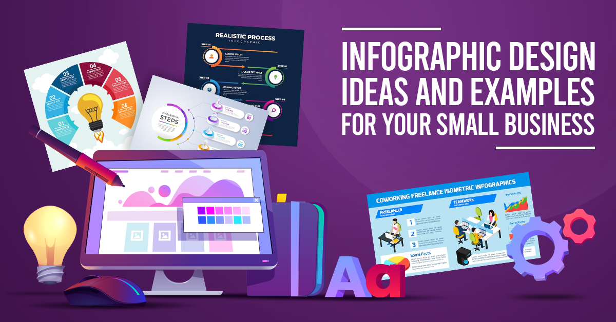
Seeking some innovative ways to display your small business data? Check out these 16 infographic design ideas and examples for your small business that can clearly communicate intricate information in a visually appealing manner.

Infographics not just make your content easier to digest but also facilitate increased engagement from your audience. Whether you are marketing a product, describing services, or revealing industry insights, these design ideas will surely wow you!

As we enter 2025, infographics are emerging as one of the powerful tools reshaping the way information is conveyed. 

As attention spans shorten and the demand for visually compelling content rises, the art of infographic design has gained unprecedented momentum. 

From converting complex data into digestible visual narratives to catering to the diverse needs of small businesses, infographics have become indispensable in marketing and communication.

This surge in popularity is driven by their ability to capture attention, present information with clarity, and align seamlessly with the fast-paced nature of modern content consumption. 

When visual storytelling has become bigger than ever, the intersection of design and data has brought infographics to the forefront, making them an indispensable resource for every marketing collateral, including presentation decks, social media creatives, brochures, and blog images.

Owing to the above notion, let’s jump to the blog that will help you design exceptional infographics in 2025.

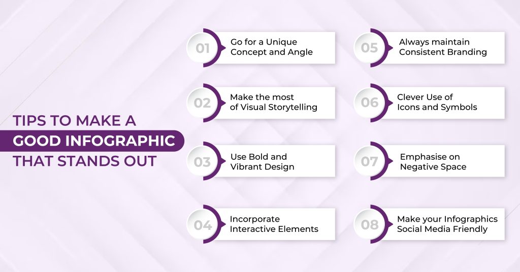
Elements of a Successful Infographic Design in 2025

Elements of a Successful Infographic Design in 2024

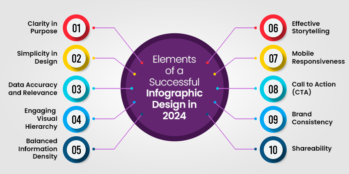
Creating a successful infographic involves a thoughtful combination of design, data, and clarity to effectively convey information.
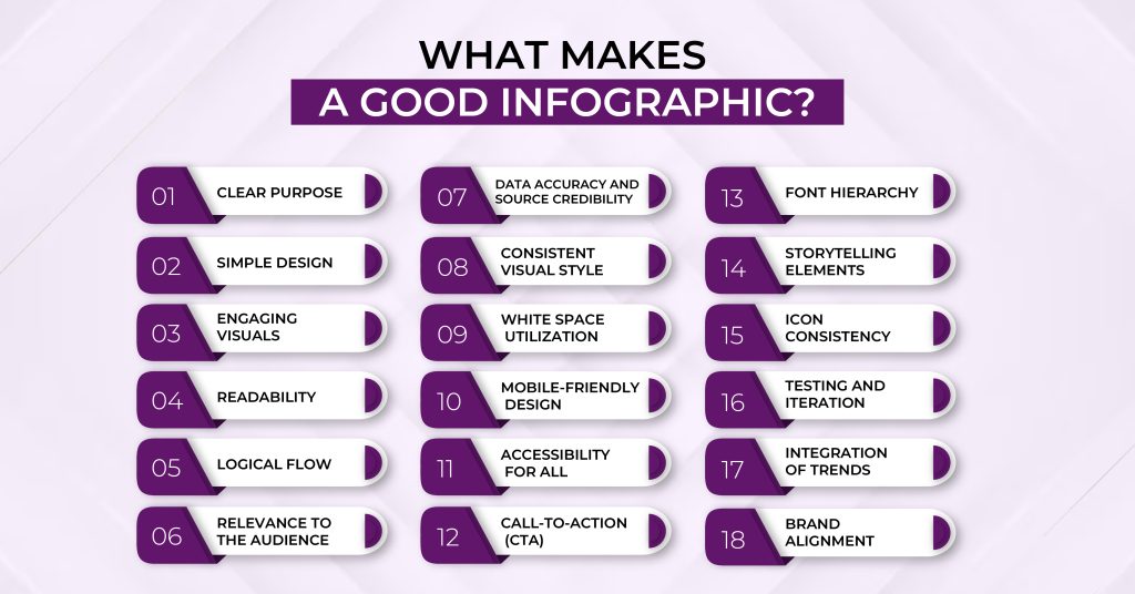
Clarity in Purpose

Define a clear purpose for your infographic. Whether it’s presenting statistics, explaining a process, or comparing data, a focused goal ensures your audience grasps the main message. For instance, an infographic titled “Evolution of Smartphones” should distinctly illustrate the progression of mobile technology over the years.

Simplicity in Design

Opt for a clean and simple design that enhances understanding. Use a cohesive color scheme, legible fonts, and appropriate visuals. An example could be an infographic depicting “Global Climate Change,” where a color gradient represents temperature variations, and clear icons symbolize environmental factors.

Data Accuracy and Relevance

Ensure the data presented is accurate and directly supports your narrative. A “Health Benefits of Exercise” infographic, for instance, should incorporate reliable statistics on how physical activity positively impacts various aspects of well-being.

Engaging Visual Hierarchy

Arrange elements in a logical order, guiding the viewer through the information flow. In an infographic about “The Solar System,” arranging planets by size or distance from the sun provides a natural visual hierarchy, aiding comprehension.

Balanced Information Density

Avoid information overload by presenting key points concisely. For an infographic on “Internet Usage Trends,” focus on highlighting the most relevant statistics, such as global internet penetration rates or popular online activities.

Effective Storytelling

Infographics should tell a story or convey a narrative. “The History of Photography” could follow a chronological sequence, showcasing key milestones with corresponding images to create a compelling visual journey.

Mobile Responsiveness

Design with various devices in mind, ensuring accessibility on both desktop and mobile screens. An infographic on “Smartphone Usage Statistics” should be easily navigable and retain its visual appeal on smaller screens.

Call to Action (CTA)

Encourage further engagement by including a clear CTA. For example, an infographic about “Reducing Carbon Footprint” might conclude with a call to action, urging viewers to adopt eco-friendly practices in their daily lives.

Brand Consistency

Maintain consistency with your brand elements, such as colors and logos. If creating an infographic for a company’s annual report, align the design with the established brand identity for a cohesive presentation.
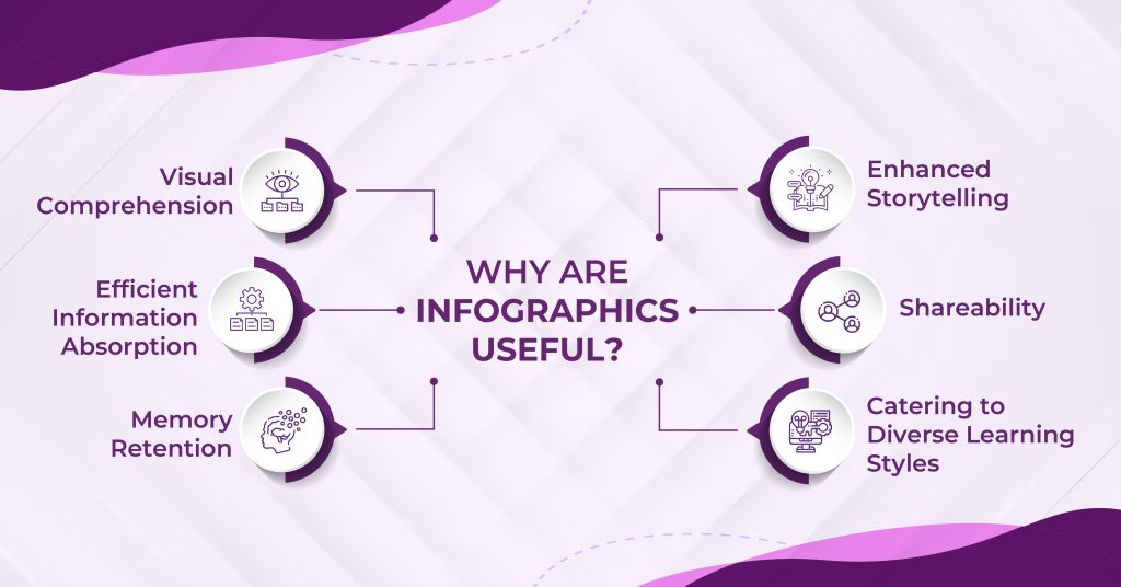
Shareability

Enhance the infographic’s shareability by optimizing it for social media platforms. Consider the dimensions and content to make it easily shareable, fostering a wider reach for topics like “Top Social Media Trends.”

By incorporating these elements, you can craft an infographic that not only captures attention but effectively communicates your message to a diverse audience.

Types of Infographics Suitable for Small Businesses

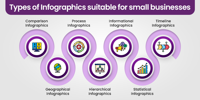
Infographics, versatile visual tools, come in various types, each serving a unique purpose in conveying information effectively.

Comparison Infographics

Source

Comparison infographics highlight the differences or similarities between items, options, or concepts. Side-by-side visual representations make it easy for audiences to grasp distinctions. Businesses use these infographics for product comparisons, feature analyses, or decision-making guides.

Geographical Infographics

Source

Geographical infographics utilize maps and visual elements to convey location-based information. Ideal for presenting regional data, demographics, or distribution patterns, these infographics are common in marketing, demographics studies, and travel-related content.

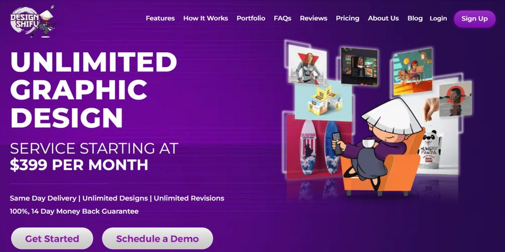
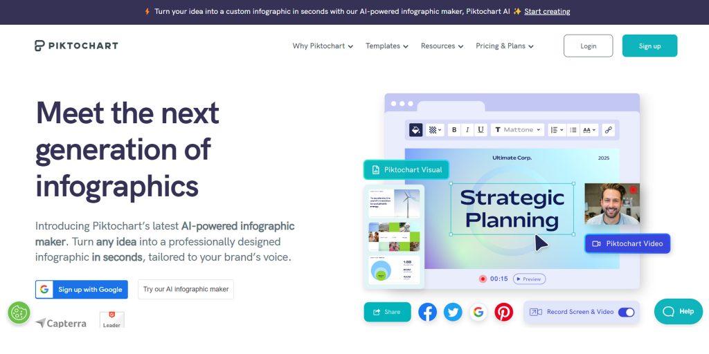
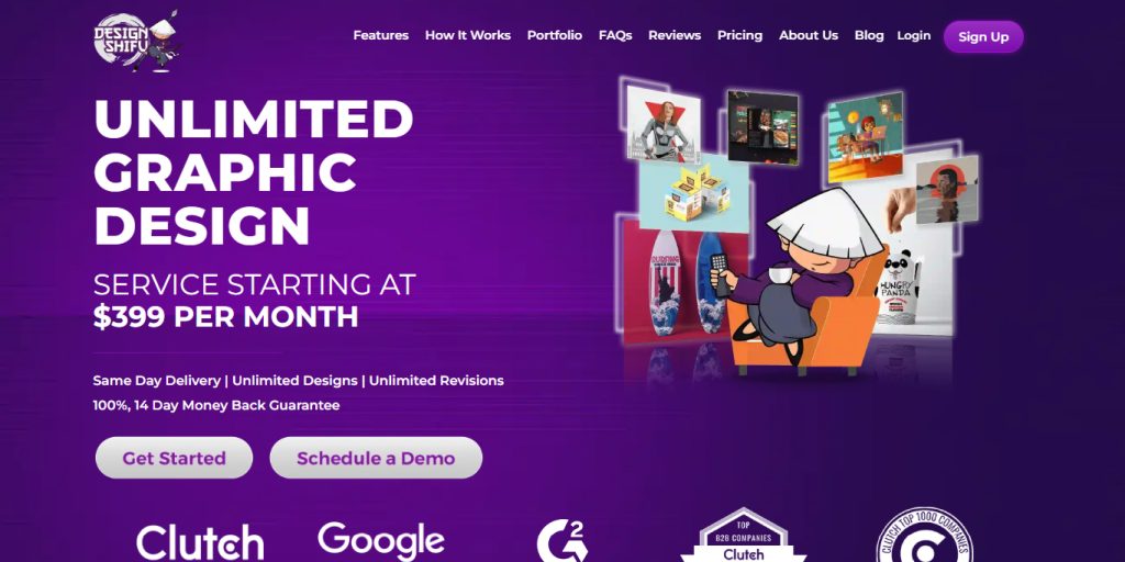
Finding this overwhelming? Why not get help from infographic design experts? At Design Shifu, we understand that the world of infographics can be vast and intricate, especially for small businesses juggling various priorities. 

Our unlimited graphic design subscription, starting at just $399 per month, not only simplifies the process but ensures that your infographics, be it for presentations, marketing materials, or social media, are not just visually appealing but also strategically crafted to convey your message effectively. Feel the weight lifted off your shoulders and book a demo today to explore how Design Shifu can be your trusted partner in turning complexity into captivating visuals.

Process Infographics

Source

Process infographics break down complex procedures or workflows into easy-to-follow steps. Flowcharts and diagrams simplify intricate processes, aiding comprehension. Businesses often use these infographics to explain workflows, project plans, or procedural guidelines.

Hierarchical Infographics

Source

Hierarchical infographics illustrate structures, rankings, or relationships between components in a system. Organizational charts and mind maps fall under this category, aiding in understanding hierarchical relationships in businesses, academic subjects, or project structures.

Informational Infographics

Source

Informational infographics present facts and details on a specific topic. They combine text with visuals to enhance understanding. Frequently used in educational materials, news articles, or blog posts, these infographics communicate information concisely and engage the audience.

Statistical Infographics

Source

Statistical infographics, or charts and graphs, are ideal for presenting numerical data. Bar graphs, pie charts, and line graphs visually represent statistics, making comparisons and trends easily discernible. Use them in reports, presentations, or articles where quantitative information needs to be highlighted.

Timeline Infographics

Source

Timelines organize events chronologically, offering a historical or sequential overview. These infographics are valuable for showcasing project timelines, historical developments, or biographical information. They provide a clear visual narrative of events unfolding over time.

Infographic Design Ideas to Communicate Effectively

Infographic Design Ideas to Communicate Effectively

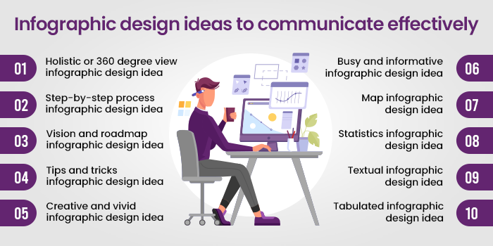
Holistic or 360-degree view infographic design idea

Source

This infographic adopts a Bird’s Eye View perspective, providing a comprehensive overview of a subject or topic. In this example, it’s used for a portfolio of an individual, the same could be used for the business while designing presentations as well.

With a captivating iconography, it efficiently communicates the broader context of the information, ideal for strategic planning, corporate summaries, or any content where a holistic understanding is crucial.

Step-by-step process infographic design idea

Source

The Step-by-Step guide infographic is perfect for leading audiences through a sequential flow of information. Here, the infographic is an ultimate guide in itself when it comes to app development. This infographic idea is successful in balancing text and icons perfectly.

The design is effective for instructional content, procedural guides, or any information that requires a clear and organized presentation of steps to follow.

Vision and roadmap infographic design idea

Source

This visionary infographic design illustrates a Roadmap, offering a clear trajectory for the future. Incorporating a timeline format, it’s excellent for business plans, project timelines, or any content where outlining future goals and milestones is essential. The use of clouds, boats, parks, etc., make it stand out while simultaneously conveying the required information.

Tips and tricks for infographic design idea

Source

This Tips and Tricks infographic design is an engaging way to share valuable insights or advice. Utilizing visually appealing icons and concise text, it’s well-suited for sharing quick, actionable tips. 

This design is effective for content related to life hacks, productivity tips, or educational quick guides.

Creative and vivid infographic design idea

Source

This infographic design bursts with color and innovative visual elements. This style is perfect for capturing attention and conveying imaginative concepts. The infographic is Ideal for showcasing creative projects, artistic processes, or any content where a vibrant and dynamic presentation is desired.

Though it does not capture much textual information but conveys context through thoughtful and creative visuals. If you want to design a minimal infographic for your small business, you can use it.

Busy and informative infographic design idea

Source

Most people would find this infographic to be too much, but the amount of information it’s carrying is impeccable. It’s not always advisable to fill the infographic with so much text, but if it’s necessary, this is a great infographic design idea to draw inspiration from.

It can further be used for data-heavy content such as market trends, statistical analyses, or any topic that requires a comprehensive yet organized display of information.

Map infographic design idea

Source

If you have several offline stores and want to display the same on your website or presentation deck, this is the best way to display it.

The infographic in the above example creatively incorporates geographic elements to convey information spatially. This design is ideal for presenting regional data, demographic trends, or location-specific details, providing a visually appealing and informative way to present geographic information.

Statistics infographic design idea

Source

When you have loads of data to display, use something like the above example. This infographic example effectively communicates numerical information through charts, graphs, and visual elements. This is perfect for annual reports, research findings, or any content where statistical data plays a key role.

Textual infographic design idea

Source

This Text-Rich infographic design strikes a balance between visuals and detailed information. It’s suitable for content that requires in-depth explanations, industry analyses, or textual content that benefits from visual enhancement. The design in the example keeps the audience engaged with a harmonious blend of text and visuals.

Tabulated infographic design idea

Source

Tables have always been a great medium to showcase information in an organized way. That’s the reason, when you incorporate a table in the infographic, you get the best of both worlds. 

The design in the example is excellent for comparative data, feature comparisons, or any content where a systematic arrangement of details is essential. The tabulated layout ensures clarity and easy comprehension of information.

Partner with Design Shifu and get your infographics delivered at a lightning-fast speed

Come aboard with Design Shifu, where expertise meets innovation for your infographic needs. Our skilled designers are well-versed in the art of crafting visually compelling infographics that resonate with your audience. 

With same-day delivery, unlimited revisions, and a dedicated designer, we bring efficiency to the creative process. Book a demo to witness the seamless integration of expertise and speed with Design Shifu.

Frequently Asked Questions

What are infographics and why do small businesses need them?

Infographics are visual depictions of data or information. They present intricate data in an easy-to-read and interesting way, which is particularly useful for small businesses aiming to grab people’s attention and enhance communication.

How do I make a great infographic for my business?

To design a successful infographic, prioritize clarity of purpose, simplicity of design, accuracy of data, and compelling visuals. Make sure your infographic is a good story, logically structured, and optimized for mobile consumption.

What are the best infographics for small businesses?

Types of infographics that work well for small businesses include comparison infographics, process infographics, statistical infographics, and timeline infographics. These formats help in conveying information clearly, whether you’re comparing products or showcasing a process.

Can infographics help boost engagement on social media?

Yes, infographics are extremely shareable on social media. They receive more engagement because of their visually engaging mode and capacity to make complex information simple. Infographics created with clear communication and shareable material can increase visibility and reach

How do infographics contribute to marketing and communication for small businesses?

Infographics assist in breaking down complex information and delivering it in an interesting, easy-to-grasp format. They grab attention instantly, aid in brand recall, and are shareable, thus making them a great marketing and communication tool.

What Makes A Good Infographic? All Questions Answered

In the visually-driven world of today, infographics have emerged as one of the most effective means to present intricate information in simple and interesting form. But what makes a good infographic? In this blog, all questions surrounding the creation of effective infographics that not just grab attention but also deliver messages clearly and strongly will be addressed.

Regardless of whether you are a designer, marketer, or small business owner, knowing how to make an effective infographic is the key to utilizing this useful tool in your content strategy.

There are good infographics and there are bad infographics. They can communicate information efficiently within the shortest amount of time that separates them.

A carefully designed infographic goes beyond complexity, conveying a concise and impactful message. Join us as we explore the art of efficient information communication through infographics, where each pixel, color, and curve plays a crucial role in leaving lasting impressions at a glance.

What Is an Infographic?

An infographic is a graphic visual representation of information, data, or knowledge, aiming to convey complex concepts clearly and engagingly. 

Comprising concise text, vibrant visuals, and thoughtful design, infographics present information in a visually appealing and easily understandable format. By presenting facts, statistics, or processes in a visually intuitive way, they facilitate quick comprehension and retention. 

Infographics are versatile tools, used across various fields, from business and education to journalism and marketing. Their effectiveness lies in simplifying intricate ideas, enhancing understanding, and providing a compelling visual narrative that appeals to a broad audience, making information more accessible and memorable.

Why Are Infographics Useful?

Why Are Infographics Useful?

1. Visual Comprehension

Infographics use pictures and charts to help you understand things quickly. For instance, a graph showing how sales have changed over time is easier to get than looking at a bunch of numbers. This way, complicated ideas become simpler, making it easier for more people to understand.

2. Efficient Information Absorption

In a world where people quickly scroll through information, infographics are like shortcuts. Imagine a picture explaining steps or comparing things – it helps you get the main points quickly. This is super helpful when time is short, like when you’re browsing social media or in a quick presentation.

3. Memory Retention

Pictures stick in our minds better than words. So, if you see an infographic with cool pictures and short messages, you’re more likely to remember it. Think about an infographic summarizing science stuff – it can make it easier for students to remember things during tests.

4. Enhanced Storytelling

Infographics turn boring facts into interesting stories. For example, a picture timeline showing how technology has changed tells a story visually. It’s like a comic strip, but for information. This way, the info is not just useful; it’s also fun to look at and understand.

5. Shareability

Infographics are like shareable info cards. If something looks good and is easy to understand, people want to share it. Picture an infographic about easy ways to help the environment – it can quickly spread on social media, encouraging more people to do good things.

6. Catering to Diverse Learning Styles

Infographics are like learning tools for everyone. Some people like pictures, some like listening, and some like doing things. An infographic can have it all – pictures, explanations, and interactive parts. Think about a picture explaining a historical event with a short story and buttons you can click – it helps everyone learn in their own way.

What Makes a Good Infographic?

What makes a good Infographic?

1. Clear Purpose

A good infographic has a clear purpose. It should convey a specific message or information, whether it’s explaining a process, showcasing data trends, or providing tips. Like a roadmap, every element in the infographic should guide the viewer toward understanding the main point.

2. Simple Design

Simplicity is key. A good infographic avoids clutter and unnecessary details. It uses a clean layout with clear headings, minimal text, and vibrant visuals. Just like a well-organized room, a clean design makes it easy for the viewer to focus on the essential information.

3. Engaging Visuals

Visuals should be eye-catching and relevant. Colorful charts, icons, and images make information more interesting. Imagine a colorful picture book – that’s how visuals in an infographic should capture attention and make the content enjoyable to explore.

4. Readability

The text should be easy to read. The font size, style, and color should be chosen carefully to ensure readability. A good infographic is like a well-written story – the words are clear, and you don’t have to struggle to understand them.

5. Logical Flow

Information should be organized logically. Like telling a story, the flow of an infographic should guide the viewer from one point to the next. Whether a step-by-step process or a timeline, the sequence should make sense, helping the viewer follow along effortlessly.

6. Relevance to the Audience

A good infographic considers its audience. It presents information in a way that resonates with the people it’s intended for. It’s like tailoring a message to your friend’s interests – it makes the information more relatable and impactful.

7. Data Accuracy and Source Credibility

A good infographic relies on accurate information from credible sources. Like a trustworthy friend, it ensures that the data presented is reliable, contributing to the overall credibility of the infographic.

8. Consistent Visual Style

Consistency in visual elements is crucial. From colors to icons, a good infographic maintains a cohesive visual style throughout. This consistency is like a theme in a story – it ties everything together and creates a unified, professional look.

9. White Space Utilization

Effective use of white space is important. It gives the infographic breathing room, preventing visual overload. Like pauses in a conversation, white space allows the viewer to absorb information without feeling overwhelmed.

10. Mobile-Friendly Design

In a world where many people use smartphones, a good infographic is designed with mobile users in mind. It should be easily viewable and navigable on smaller screens, just like a mobile-friendly website adapts to different devices.

11. Accessibility for All

A good infographic considers accessibility. It ensures that people with different abilities can understand and engage with the content. This inclusivity is like making sure everyone can enjoy a good movie – it’s designed to be accessible to a diverse audience.

12. Call-to-Action (CTA)

If applicable, a good infographic includes a clear call to action. Whether it’s encouraging further reading, sharing on social media, or taking a specific action, a well-placed CTA is like the closing statement in a persuasive speech – it guides the viewer on what to do next.

13. Font Hierarchy

A good infographic uses font hierarchy to emphasize important information. Like bolding keywords in a text message, it guides the viewer’s attention and helps them understand the significance of different elements within the infographic.

14. Storytelling Elements

Incorporating storytelling elements makes a good infographic more engaging. It can include a narrative flow, connecting the information in a way that tells a story. This storytelling approach transforms the infographic from a mere display of data to a memorable experience for the viewer.

15. Icon Consistency

Consistency in iconography is crucial. Like characters in a story, icons should maintain a consistent appearance throughout the infographic. This ensures that symbols are easily recognizable, contributing to a cohesive and understandable visual language.

16. Testing and Iteration

A good infographic is often a result of testing and iteration. Just like refining a recipe, designers may create multiple versions, gather feedback, and make improvements. This iterative process ensures that the final infographic effectively communicates the intended message.

17. Integration of Trends

Staying current with design trends is important. A good infographic integrates contemporary design elements. Like updating a wardrobe, this ensures that the infographic doesn’t feel outdated and resonates with a modern audience.

18. Brand Alignment

If created for a brand or organization, a good infographic aligns with its visual identity. Like a character staying true to their personality in a story, the infographic reflects the brand’s colors, logos, and overall style, fostering brand recognition and cohesion.

What Will Make a Bad Infographic? Things to Avoid While Making an Infographic

What Will Make a Bad Infographic? Things to avoid while making an infographic

Several factors can contribute to a poorly designed or ineffective infographic:

1. Overcrowded Design

An infographic with too much information or a cluttered layout can overwhelm the viewer. Like a crowded room, it becomes challenging to focus on specific details, diminishing the overall impact.

2. Lack of Clear Purpose

A bad infographic lacks a clear purpose or a central message. If it’s unclear what the infographic is trying to convey, it’s like telling a story without a plot – confusing and uninteresting.

3. Inaccurate or Unverified Data

Using inaccurate or unverified data undermines the credibility of an infographic. Like spreading false information in a conversation, it erodes trust and can lead to misunderstandings.

4. Poor Visual Hierarchy

If the visual hierarchy is unclear, important information may be overlooked. Like a conversation without emphasis, the viewer may need help to distinguish key points from supporting details, diminishing the infographic’s effectiveness.

5. Inconsistent Design Elements

Inconsistency in visual elements, such as colors, fonts, or icons, can create a disjointed and unprofessional look. Like characters in a story suddenly changing their appearances, inconsistency makes the infographic less visually appealing and harder to follow.

6. Disregarding User Diversity

An infographic that ignores the diverse needs of users may exclude certain groups. Like a conversation that doesn’t consider different perspectives, it limits engagement for people with disabilities, reducing the overall impact and accessibility of the information.

7. Poor Font Choice and Readability

Choosing inappropriate fonts or neglecting readability can make the text difficult to understand. Like using confusing language in a conversation, poor font choices hinder effective communication and diminish the infographic’s accessibility.

8. Confusing Typography Choices

Selecting confusing or mismatched fonts can disrupt the flow of information. Like using jumbled words in a conversation, poor font choices hinder the ease of understanding and disrupt the overall harmony of the infographic.

9. Neglecting Multi-Device Compatibility

In a world where people access content on various devices, overlooking the adaptability of an infographic is like presenting a story that’s readable only in certain conditions. Failing to ensure compatibility across different devices restricts accessibility and user experience.

10. Ignoring Brand Guidelines

For infographics representing a brand, deviating from established brand guidelines can create confusion. Like a character behaving out of character in a story, straying from brand guidelines dilutes brand identity and recognition.

Tips to Make a Good Infographic that Stands Out

Tips to Make a Good Infographic that Stands Out

1. Go for a Unique Concept and Angle

Start with a unique concept or angle for your infographic. Avoid common or overused ideas. Just like telling a story from a fresh perspective, a unique concept captures attention and sets your infographic apart.

2. Make the most of Visual Storytelling

Use visuals to tell a compelling story. Create a visual flow that guides the viewer through the information. Consider the narrative like chapters in a book – each section should build on the previous one, keeping the audience engaged.

3. Use Bold and Vibrant Design

Embrace bold and vibrant design elements. Use striking colors, eye-catching fonts, and vivid visuals. Think of your infographic as a colorful poster that stands out in a crowd, drawing people in with its visual appeal.

4. Incorporate Interactive Elements

Make use of interactive elements, if applicable. This could be clickable sections, hover-over details, or links to additional content. Adding interactive features transforms your infographic into an engaging experience, making it memorable for the audience.

5. Always maintain Consistent Branding

If the infographic represents a brand, maintain consistent branding elements. Use the brand’s color palette, fonts, and logo. Like a recognizable character in a story, consistent branding fosters brand recognition and reinforces the infographic’s identity.

6. Clever Use of Icons and Symbols

Employ clever and memorable icons or symbols. Icons can simplify complex ideas and add a touch of creativity. Think of them as visual metaphors that enhance the storytelling aspect of your infographic.

7. Emphasise on Negative Space

Leverage negative space effectively. Don’t be afraid of empty areas; they can create emphasis and draw attention to key elements. Like pauses in a conversation, strategic use of negative space enhances the overall visual impact.

8. Make your Infographics Social Media Friendly

Optimize your infographic for social media sharing. Consider the platform’s requirements and dimensions. Craft a compelling title and description. Encourage sharing by making it easy for viewers to share the infographic on their social networks.

By incorporating these tips, you can create an infographic that not only conveys information effectively but also stands out in a crowded digital space, capturing the audience’s attention and leaving a lasting impression.

What is a good infographic size?

The ideal infographic size depends on the intended platform and usage. Here’s a breakdown of common dimensions for various platforms and purposes:

Social Media

  • Instagram: 1080px x 1080px for square posts, 1080px x 1920px for Stories
  • Facebook: 1200px x 628px for posts, 1080px x 1080px for Stories
  • Twitter: 1024px x 512px
  • Pinterest: 735px x 1102px (2:3 aspect ratio)

Websites and Blogs

  • General: 1000px to 1200px wide, with a height adjusted to fit the content
  • Long-form infographics: 1000px wide, with a height that can extend beyond the initial viewport (responsive design is recommended)

Print

  • Letter size (8.5 x 11 inches): Suitable for handouts and presentations
  • Legal size (8.5 x 14 inches): Ideal for posters and exhibits
  • Executive size (7 x 10 inches): Suitable for business documents and reports

What are good infographic font combinations and why?

What are good infographic font combinations and why?

In infographics, fonts are used in conjunction, and not every font complements every other font. Knowing what fonts go with which font would make the designer’s life a lot easier.

Montserrat (Header) + Roboto (Body): (Show fonts)

Montserrat’s bold and modern style draws attention to headers, while the clean and neutral Roboto ensures easy readability for body text. This combination provides a balanced and contemporary look suitable for various infographic themes.

Lato (Header) + Open Sans (Body): (Show fonts)

Lato’s warmth and rounded edges create a friendly tone for headers, complemented by the versatile and clean Open Sans for body text. This pairing maintains a professional and approachable appearance, enhancing overall readability.

Playfair Display (Header) + Source Sans Pro (Body): (Show fonts)

Playfair Display’s elegant and high-contrast serif style contrasts well with the modern and sans-serif Source Sans Pro. This combination achieves a sophisticated and readable design, making it suitable for infographics with a more formal aesthetic.

Futura (Header) + Raleway (Body): (Show fonts)

Futura’s geometric and bold design adds emphasis to headers, while Raleway’s elegant simplicity ensures easy reading for body text. This dynamic combination contributes to a modern and cohesive visual impact for the infographic.

Bebas Neue (Header) + Quicksand (Body): (Show fonts)

Bebas Neue’s uppercase and bold style creates emphasis for headers, complemented by the rounded and approachable Quicksand for body text. This combination adds a dynamic and engaging flair to the overall design.

Avenir (Header) + Poppins (Body): (Show fonts)

Avenir’s clean and versatile design pairs well with the modern and geometric Poppins. This combination offers a balanced and contemporary look suitable for infographics that require a professional and cohesive appearance.

Baskerville (Header) + Muli (Body): (Show fonts)

Baskerville’s classic and elegant serif style contrasts with the rounded and friendly Muli. This combination strikes a balance between traditional and approachable aesthetics, making it suitable for versatile infographic themes.

Merriweather (Header) + Nunito (Body): (Show fonts)

Merriweather’s traditional and readable serif design complements the friendly and modern Nunito. This combination achieves a balance between classic and contemporary, making it suitable for various infographic themes.

Best Tools to Create Infographics in 2025

Design Shifu

Design Shifu offers a subscription-based graphic design service, providing unlimited designs for a flat monthly fee. It not only provides you with infographics but every marketing collateral including brochures, social media creatives, presentations, etc. in a single subscription.

Features

  • Subscription-based unlimited graphic design.
  • Same-day delivery and unlimited revisions.
  • Integration with Canva, Trello, Slack, etc.
  • Dedicated designer for every design need
  • Intuitive dashboard to manage requests

Canva

Canva stands out with its user-friendly platform, featuring a drag-and-drop interface and a vast template library. It’s accessible across devices, making design accessible to a wide range of users.

Features

  • User-friendly with drag-and-drop simplicity.
  • Vast template library for customization.
  • Accessible across devices with collaboration features.
  • Free and premium plans for versatile design options.

Piktochart

Piktochart simplifies infographic creation with its easy-to-use maker and drag-and-drop interface. It offers a range of customizable templates, making it an excellent choice for various design needs.

Features

  • Easy-to-use infographic maker with a drag-and-drop interface.
  • Customizable templates and visual enhancement options.
  • Collaboration features for team projects.
  • Export options for sharing or embedding infographics.

Visme

Visme is known for creating interactive visual content and empowering users to design engaging infographics and presentations. With features like data visualization and animation, it offers versatility for dynamic designs.

Features

  • Interactive visual content creation.
  • Data visualization and animation features.
  • Versatility for infographics, presentations, and more.

Frequently Asked Questions (FAQs)

What are the 5 key elements of a successful infographic?

Clear Purpose and Message: An effective infographic must communicate a clear and focused message. Each element should contribute to a cohesive narrative.
Visual Hierarchy: Establishing a visual hierarchy using size, color, and placement guides the viewer’s attention for easy comprehension.
Simplicity and Clarity: Keep the design simple with concise text and clean visuals. Clarity is essential for effective communication.
Relevant and Engaging Visuals: Incorporate visuals that complement the content and enhance engagement, ensuring they add value and convey information efficiently.
Consistent Branding and Style: Maintain a consistent visual identity throughout the infographic with consistent colors, fonts, and style, fostering recognition and professionalism.

What are some ways to get better at designing infographics?

Study Successful Infographics: Look at the colours, layout, typography, and imagery to learn how to use design effectively.
Practice Regularly: Experiment with designs – layouts, colours, and images – before trying to create that perfect infographic!
Learn Graphic Design Basics: Colour theory, typography, and layouts are fundamental elements of design you should know.
Seek and Accept Feedback: Share your designs and get constructive feedback!
Stay Updated on Design Trends: Staying current with design trends will help you be sure that your infographics are fresh.
Use Design Tools Efficiently: Get to know design software so you can manage the design process quickly and easily.Know 
Understand Your Audience: Including your audience’s designs will help you engage your audience.
Stay Open to Iteration: Practice revising and improving your designs based on constructive criticism and on ultimately what you tested against your audience-based strategies.

10 Best AI Infographic Generators from Text

Seeking solutions to make infographics without the bother of design effort? Check out 10 best AI infographic generators from text. These software are ideal for small businesses, marketers, and content creators to quickly turn their ideas into eye-catching infographics.

There are several free and affordable tools that you can use to create infographics with generative AI. 

So without wasting your time let’s jump straight to the list of AI Infographic Generators from text tools. In addition to tools with generative AI capabilities, the list also includes tools that enable you to create stunning infographics without using AI. Let’s get started

7 Best AI Infographic Generators from Text that Use Generative AI

6 Best AI Infographic Generator from Text that Use Generative AI

Midjourney

MidJourney, a text-to-image AI, stands out for its emphasis on crafting aesthetically pleasing visuals. Unlike web applications, it operates through Discord, providing a unique interactive experience. Users engage with a bot, generating images by typing prompts in public channels during the free/trial phase. A $10/month subscription offers a more private user experience.

Midjourney- text-to-image AI

Features

MidJourney’s third-version model excels in creating ‘pretty’ images, prioritizing complimentary colors, artistic lighting, and sharp details. The generation process, visible in real-time, takes about 2x longer than DALL·E but offers an engaging experience. 

Unique features include creating variations of images, supporting different aspect ratios, and incorporating image prompts through URLs. The platform encourages visual consistency, making it ideal for projects requiring sets of coherent and visually appealing images.

Pricing

MidJourney offers a subscription starting at $10/month, providing users with 100 prompts and 100 upscales. 

For users seeking unlimited access, a $30/month plan allows unlimited use, albeit with a potential slowdown in generation speed. 

The pricing structure makes MidJourney an accessible and cost-effective tool for those focused on generating aesthetically pleasing images with ease. Combining MidJourney with DALL·E provides a comprehensive toolkit for diverse creative requirements.

Appy Pie

Appypie -AI infographic generator

Appy Pie stands out as a versatile AI infographic generator from text with a wide array of features. Its AI Magic capabilities cover text-to-image generation, logo creation, video and music generation, voiceovers, animations, and YouTube thumbnail design. The editor offers a user-friendly design tool and additional features like a no-code NFT generator and a quick photo editing tool. Appy Pie supports NFT generation, including Polygon and Ethereum minting. 

The personalization options include design templates, background removal, photo enhancement, and the ability to customize fonts, cliparts, and graphics.

Features

  • AI Magic Features
  • AI Text to Image Generator
  • AI Logo Generator
  • AI Video Generator
  • AI Music Generator
  • AI Voiceover
  • AI Animation Maker
  • AI Youtube Thumbnail Maker
  • Easy-to-use Design Tool
  • Design Templates, Background Remover, Photo Enhancer
  • Fonts, cliparts, and graphics
  • Custom Dimension for Your Design
  • Export options: JPG, PNG, PDF, Transparent PNG, SVG
  • 1 GB Storage, 24×7 Support, Team Sharing

Pricing: $8 per month

Canva

canva as powerhouse of design

Canva stands as a powerhouse in the world of design, offering a user-friendly platform that empowers individuals and teams to create stunning visuals, including infographics. Known for its versatility, Canva is not solely dedicated to infographic creation; it covers a broad spectrum of design needs, making it a one-stop shop for creatives. 

It also has a new AI infographic generator from Text that lets you create images using prompts. You can use the same for making other graphics like social media creatives as well.

The feature is still in development, but you can expect some great results in the months to come

Features

Free Version

  • Access to unlimited projects
  • Limited templates and design assets

Canva Pro ($14.99/month paid monthly or $119.99 billed annually)

  • All features in the free version
  • Unlimited access to premium assets
  • Generative AI from text
  • Advanced editing tools that use generative AI
  • Full downloading options, including PNG, JPG, PDF, and more
  • Enhanced support
  • Collaboration features

Canva Enterprise (Custom Pricing)

  1. Tailored for larger teams and enterprises
  2. All Pro features
  3. Additional security controls
  4. Advanced collaboration and workflow management

4. Piktochart

piktochart AI powered infographic maker

With a collection of free templates, Piktochart enables you to craft custom infographics in under 30 minutes. Whether you’re presenting data, explaining a process, or enhancing the visual appeal of your information, Piktochart provides a straightforward and intuitive design experience.

What sets Piktochart apart is its commitment to inclusivity. Collaboration features are available to all users, irrespective of their plan – even the free version. This means you can seamlessly work with others to refine your ideas and bring your vision to life using professionally designed templates.

In essence, Piktochart is more than just a tool; it’s a facilitator of visual communication, making infographic creation accessible to everyone.

Features and Pricing

Free

  • 100MB storage
  • 2 My Library assets
  • 5 visuals (projects)
  • 2 visual downloads
  • PNG & PPT downloads
  • Team collaboration

Pro ($14/month)

  • 100GB storage
  • 10 My Library assets
  • Unlimited visuals, downloads, and visual folders
  • PDF downloads
  • 5m+ Pro Icons, Illustrations, and 3D graphics
  • Password-protected visuals

Business ($24/month)

  • 250GB storage
  • Unlimited My Library assets
  • Unlimited Brand Colors, Fonts, and Logos
  • Reusable Brand Templates
  • Transparent Background Downloads
  • Enterprise (Custom Pricing):
  • Advanced security, SSO
  • Custom templates
  • Dedicated Account Manager
  • Personalized onboarding program

Infographic Ninja

Infographic Ninja AI generator

Infographic Ninja distinguishes itself with an emphasis on customization and ease of use. It provides a range of templates for infographics, allowing users to customize icons by name, colour, or gradient. AI-driven question-and-answer generation simplifies the content creation process. 

The tool supports social media sharing, and WordPress embedding, and offers a variety of fonts and colours for branding. Infographic Ninja’s pricing starts with a $1 trial and includes options like the Starter, Lite, and Pro plans, catering to different usage needs with varying numbers of search credits.

Features

  • Many Infographic Templates
  • Customize icons by Name, Color, Black and white, or Gradient
  • AI-driven question-and-answer generation
  • Share on Social Media
  • WordPress embedding code
  • Customizable templates and colours
  • Preview Infographics

Pricing

  • $1 Trial (3 Credits for three days, then $5/month for 15 credits)
  • Starter – $5/month (15 Credits)
  • Lite – $15/month (50 Search Credits)
  • Pro – $55/month (200 Search Credits)

Knowledge Graph GPT

Knowledge Graph GPT

KnowledgeGraph GPT is a web application utilizing OpenAI’s GPT-3 model to convert unstructured text into structured knowledge graphs. This tool offers a seamless experience with minimal user input required. It excels at converting natural language data into a structured format, enhancing data analysis capabilities. 

The application is web-based, copyright-protected, and available as open-source code on GitHub. Although limited to GPT-3, its simplicity and ability to export knowledge graphs as JSON make it a valuable resource for those seeking structured data representation.

Features

  • Converts unstructured text to structured data
  • Generates knowledge graphs
  • Clears and exports knowledge graphs as JSON
  • Web-based application
  • Ease of use with minimal input
  • Copyright-protected and open source on GitHub

Pricing: Free

Scripted

Scripted AI

Scripted introduces a unique approach to content generation by combining both human and AI writing. With human subject matter experts handling sensitive or fact-checking tasks, Scripted’s AI-only starter package caters to those in need of concise, on-point content for infographics, social media posts, blogs, and ad copy. 

The tool focuses on working smarter by matching businesses with the best content creators, offering content briefs, and assisting in keyword sourcing. The free AI offering provides a valuable solution for businesses looking to enhance productivity and engagement across various content formats.

Features

  • Content generation platform using both human and AI writing
  • Human subject matter experts
  • Free AI-only starter package
  • Ideal for infographics, social media posts, blog ideas, and ad copy

Pricing: Free AI-only starter package

List of Other Infographic Generation Tools without Generative AI Features

Infographic Generation Tools without Generative AI Features

Design Shifu: Your Unlimited Graphic Design Partner

Design Shifu is not just a service; it’s your gateway to unlimited graphic design, simplified. With a straightforward monthly subscription, you gain access to a wealth of features, ensuring that your design needs are not only met but exceeded.

Design shifu without Generative AI Features

Key Features and Services

1. Dedicated Designer: Enjoy the expertise of a dedicated graphic designer committed to bringing your vision to life.

2. Project Manager: Streamline your design projects with the support of a dedicated project manager, ensuring smooth coordination and timely delivery.

3. Onboarding Manager: Benefit from a personalized onboarding process, designed to understand your unique requirements and preferences.

4. Stock Image License: Access a vast library of high-quality stock images, giving your designs a professional edge.

5. 24-Hour Support: Design Shifu understands that creativity doesn’t adhere to a schedule. Enjoy round-the-clock support to address your queries and concerns.

Design Shifu’s Versatile Offerings Include

  • Print & Digital Graphics
  • Logo & Branding
  • Infographics
  • Merchandise Design
  • Custom Illustrations
  • GIF Design
  • Presentation Decks
  • Landing Page Design

Pricing

Design Shifu’s pricing structure is transparent and inclusive. For a flat fee starting at $199 per month, you unlock unlimited graphic design services. 

This means unrestricted access to a dedicated designer, project, and onboarding managers, stock image licenses, and 24-hour support. Whether you need print graphics, digital designs, or a complete branding overhaul, Design Shifu is your all-inclusive graphic design solution. Is this interesting? Book a Demo to get started.

Animaker

Animaker without Generative AI Features

Animaker is a dynamic cloud-based platform designed to empower users in crafting captivating animated content. The company provides a user-friendly environment that caters to individuals and businesses seeking to bring their ideas to life through animation.

Animaker provides a comprehensive solution for creating engaging and professional video infographics.

Pricing and Features

Basic ($12.5/Mo or $150 billed yearly)

  • 5 mins video length
  • HD quality videos
  • 5 Premium Downloads/mo
  • Build 5 Custom characters/mo

Starter ($25/Mo or $300 billed yearly)

  • 15 mins video length
  • FHD Quality Videos
  • 10 Premium Downloads/mo
  • Build 15 Custom characters/mo

Pro ($39/Mo or $468 billed yearly)

  • 30-minute video length
  • 2K Quality Videos
  • 30 Premium Downloads/mo
  • Build 30 Custom characters/mo
  • Enterprise (Custom Pricing):
  • Unlimited video length
  • Unlimited Premium Downloads
  • 4K Quality Videos
  • Build Unlimited characters

Visme

Visme without Generative AI Features

Visme distinguishes itself as an infographic tool with a focus on collaborative design and customization. The Basic plan offers unlimited projects, while the Starter plan, priced at $12.25 per month, introduces premium assets and full template access. 

The Pro plan at $24.75 per month provides advanced downloading options, analytics, and privacy controls. Visme for Teams, with custom pricing, offers team collaboration, personalized training, and additional security features. With features like a brand kit, phone support, and extensive image uploads, Visme caters to individuals, professionals, and large enterprises alike, making collaborative infographic creation seamless.

Pricing and Features

Basic ($12.5/Mo or $150 billed yearly)

  • 5 mins video length
  • HD quality videos
  • 5 Premium Downloads/mo
  • Build 5 Custom characters/mo

Starter ($25/Mo or $300 billed yearly)

  • 15 mins video length
  • FHD Quality Videos
  • 10 Premium Downloads/mo
  • Build 15 Custom characters/mo

Pro ($39/Mo or $468 billed yearly)

  • 30-minute video length
  • 2K Quality Videos
  • 30 Premium Downloads/mo
  • Build 30 Custom characters/mo

Enterprise (Custom Pricing)

  • Unlimited video length
  • Unlimited Premium Downloads
  • 4K Quality Videos
  • Build Unlimited characters

Frequently Asked Questions

Is there an AI that can generate infographics?

Yes, there are AI-powered tools designed to generate infographics from text or data. Notable examples include tools like Infographic Ninja, which utilizes AI to assist in the creation of visually appealing infographics based on text or blog articles.

How do I create an infographic in ChatGPT?

You can use ChatGPT 4.0 to create infographics. It is a paid version of ChatGPT with limited prompts in a day. You can use generative AI features by using a chat feature to generate images through the tool.

How do you turn text into an infographic?

You can use dedicated infographic generators or design tools to turn text into an infographic. Tools like Piktochart, Canva, and Infographic Ninja allow users to input text, choose templates, customize elements, and generate visually appealing infographics. These tools often have features to make the process intuitive, even for those without extensive design skills.

What is Infographic Ninja?

Infographic Ninja is a tool that specializes in turning text, including blog articles, into visually engaging infographics. It offers features such as customizable templates, AI-driven question-and-answer generation, and the ability to share infographics on social media. It simplify the infographic creation process.

What is the best software to make infographics?

The choice of the best software for making infographics depends on individual preferences and needs. Some popular options include Canva, Piktochart, Visme, and Animaker. These tools offer a range of templates, customization options, and user-friendly interfaces to facilitate infographic creation.

What are some of the best websites to find infographics?

Websites like Visual.ly, Infogram, and Pinterest are known for hosting a variety of infographics on diverse topics. Additionally, many organizations and news websites publish infographics as part of their content.