In this blog

Need a design partner that scales with you?
See exactly how Design Shifu can become your on-demand design team. Book a free demo call.
In the visually-driven world of today, infographics have emerged as one of the most effective means to present intricate information in simple and interesting form. But what makes a good infographic? In this blog, all questions surrounding the creation of effective infographics that not just grab attention but also deliver messages clearly and strongly will be addressed.
Regardless of whether you are a designer, marketer, or small business owner, knowing how to make an effective infographic is the key to utilizing this useful tool in your content strategy.
There are good infographics and there are bad infographics. They can communicate information efficiently within the shortest amount of time that separates them.
A carefully designed infographic goes beyond complexity, conveying a concise and impactful message. Join us as we explore the art of efficient information communication through infographics, where each pixel, color, and curve plays a crucial role in leaving lasting impressions at a glance.
What Is an Infographic?
An infographic is a graphic visual representation of information, data, or knowledge, aiming to convey complex concepts clearly and engagingly.
Comprising concise text, vibrant visuals, and thoughtful design, infographics present information in a visually appealing and easily understandable format. By presenting facts, statistics, or processes in a visually intuitive way, they facilitate quick comprehension and retention.
Infographics are versatile tools, used across various fields, from business and education to journalism and marketing. Their effectiveness lies in simplifying intricate ideas, enhancing understanding, and providing a compelling visual narrative that appeals to a broad audience, making information more accessible and memorable.
Why Are Infographics Useful?

1. Visual Comprehension
Infographics use pictures and charts to help you understand things quickly. For instance, a graph showing how sales have changed over time is easier to get than looking at a bunch of numbers. This way, complicated ideas become simpler, making it easier for more people to understand.
2. Efficient Information Absorption
In a world where people quickly scroll through information, infographics are like shortcuts. Imagine a picture explaining steps or comparing things – it helps you get the main points quickly. This is super helpful when time is short, like when you're browsing social media or in a quick presentation.
3. Memory Retention
Pictures stick in our minds better than words. So, if you see an infographic with cool pictures and short messages, you're more likely to remember it. Think about an infographic summarizing science stuff – it can make it easier for students to remember things during tests.
4. Enhanced Storytelling
Infographics turn boring facts into interesting stories. For example, a picture timeline showing how technology has changed tells a story visually. It's like a comic strip, but for information. This way, the info is not just useful; it's also fun to look at and understand.
5. Shareability
Infographics are like shareable info cards. If something looks good and is easy to understand, people want to share it. Picture an infographic about easy ways to help the environment – it can quickly spread on social media, encouraging more people to do good things.
6. Catering to Diverse Learning Styles
Infographics are like learning tools for everyone. Some people like pictures, some like listening, and some like doing things. An infographic can have it all – pictures, explanations, and interactive parts. Think about a picture explaining a historical event with a short story and buttons you can click – it helps everyone learn in their own way.
What Makes a Good Infographic?
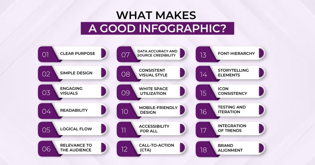
1. Clear Purpose
A good infographic has a clear purpose. It should convey a specific message or information, whether it's explaining a process, showcasing data trends, or providing tips. Like a roadmap, every element in the infographic should guide the viewer toward understanding the main point.
2. Simple Design
Simplicity is key. A good infographic avoids clutter and unnecessary details. It uses a clean layout with clear headings, minimal text, and vibrant visuals. Just like a well-organized room, a clean design makes it easy for the viewer to focus on the essential information.
3. Engaging Visuals
Visuals should be eye-catching and relevant. Colorful charts, icons, and images make information more interesting. Imagine a colorful picture book – that's how visuals in an infographic should capture attention and make the content enjoyable to explore.
4. Readability
The text should be easy to read. The font size, style, and color should be chosen carefully to ensure readability. A good infographic is like a well-written story – the words are clear, and you don't have to struggle to understand them.
5. Logical Flow
Information should be organized logically. Like telling a story, the flow of an infographic should guide the viewer from one point to the next. Whether a step-by-step process or a timeline, the sequence should make sense, helping the viewer follow along effortlessly.
6. Relevance to the Audience
A good infographic considers its audience. It presents information in a way that resonates with the people it's intended for. It's like tailoring a message to your friend's interests – it makes the information more relatable and impactful.
7. Data Accuracy and Source Credibility
A good infographic relies on accurate information from credible sources. Like a trustworthy friend, it ensures that the data presented is reliable, contributing to the overall credibility of the infographic.
8. Consistent Visual Style
Consistency in visual elements is crucial. From colors to icons, a good infographic maintains a cohesive visual style throughout. This consistency is like a theme in a story – it ties everything together and creates a unified, professional look.
9. White Space Utilization
Effective use of white space is important. It gives the infographic breathing room, preventing visual overload. Like pauses in a conversation, white space allows the viewer to absorb information without feeling overwhelmed.
10. Mobile-Friendly Design
In a world where many people use smartphones, a good infographic is designed with mobile users in mind. It should be easily viewable and navigable on smaller screens, just like a mobile-friendly website adapts to different devices.
11. Accessibility for All
A good infographic considers accessibility. It ensures that people with different abilities can understand and engage with the content. This inclusivity is like making sure everyone can enjoy a good movie – it's designed to be accessible to a diverse audience.
12. Call-to-Action (CTA)
If applicable, a good infographic includes a clear call to action. Whether it's encouraging further reading, sharing on social media, or taking a specific action, a well-placed CTA is like the closing statement in a persuasive speech – it guides the viewer on what to do next.
13. Font Hierarchy
A good infographic uses font hierarchy to emphasize important information. Like bolding keywords in a text message, it guides the viewer's attention and helps them understand the significance of different elements within the infographic.
14. Storytelling Elements
Incorporating storytelling elements makes a good infographic more engaging. It can include a narrative flow, connecting the information in a way that tells a story. This storytelling approach transforms the infographic from a mere display of data to a memorable experience for the viewer.
15. Icon Consistency
Consistency in iconography is crucial. Like characters in a story, icons should maintain a consistent appearance throughout the infographic. This ensures that symbols are easily recognizable, contributing to a cohesive and understandable visual language.
16. Testing and Iteration
A good infographic is often a result of testing and iteration. Just like refining a recipe, designers may create multiple versions, gather feedback, and make improvements. This iterative process ensures that the final infographic effectively communicates the intended message.
17. Integration of Trends
Staying current with design trends is important. A good infographic integrates contemporary design elements. Like updating a wardrobe, this ensures that the infographic doesn't feel outdated and resonates with a modern audience.
18. Brand Alignment
If created for a brand or organization, a good infographic aligns with its visual identity. Like a character staying true to their personality in a story, the infographic reflects the brand's colors, logos, and overall style, fostering brand recognition and cohesion.
What Will Make a Bad Infographic? Things to Avoid While Making an Infographic
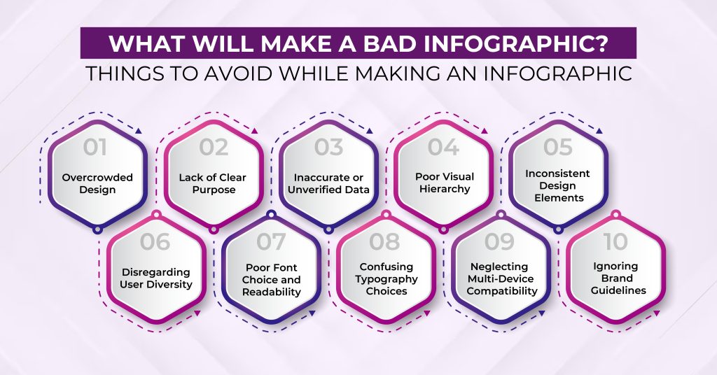
Several factors can contribute to a poorly designed or ineffective infographic:
1. Overcrowded Design
An infographic with too much information or a cluttered layout can overwhelm the viewer. Like a crowded room, it becomes challenging to focus on specific details, diminishing the overall impact.
2. Lack of Clear Purpose
A bad infographic lacks a clear purpose or a central message. If it's unclear what the infographic is trying to convey, it's like telling a story without a plot – confusing and uninteresting.
3. Inaccurate or Unverified Data
Using inaccurate or unverified data undermines the credibility of an infographic. Like spreading false information in a conversation, it erodes trust and can lead to misunderstandings.
4. Poor Visual Hierarchy
If the visual hierarchy is unclear, important information may be overlooked. Like a conversation without emphasis, the viewer may need help to distinguish key points from supporting details, diminishing the infographic's effectiveness.
5. Inconsistent Design Elements
Inconsistency in visual elements, such as colors, fonts, or icons, can create a disjointed and unprofessional look. Like characters in a story suddenly changing their appearances, inconsistency makes the infographic less visually appealing and harder to follow.
6. Disregarding User Diversity
An infographic that ignores the diverse needs of users may exclude certain groups. Like a conversation that doesn't consider different perspectives, it limits engagement for people with disabilities, reducing the overall impact and accessibility of the information.
7. Poor Font Choice and Readability
Choosing inappropriate fonts or neglecting readability can make the text difficult to understand. Like using confusing language in a conversation, poor font choices hinder effective communication and diminish the infographic's accessibility.
8. Confusing Typography Choices
Selecting confusing or mismatched fonts can disrupt the flow of information. Like using jumbled words in a conversation, poor font choices hinder the ease of understanding and disrupt the overall harmony of the infographic.
9. Neglecting Multi-Device Compatibility
In a world where people access content on various devices, overlooking the adaptability of an infographic is like presenting a story that's readable only in certain conditions. Failing to ensure compatibility across different devices restricts accessibility and user experience.
10. Ignoring Brand Guidelines
For infographics representing a brand, deviating from established brand guidelines can create confusion. Like a character behaving out of character in a story, straying from brand guidelines dilutes brand identity and recognition.
Tips to Make a Good Infographic that Stands Out
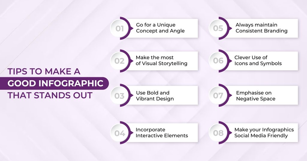
1. Go for a Unique Concept and Angle
Start with a unique concept or angle for your infographic. Avoid common or overused ideas. Just like telling a story from a fresh perspective, a unique concept captures attention and sets your infographic apart.
2. Make the most of Visual Storytelling
Use visuals to tell a compelling story. Create a visual flow that guides the viewer through the information. Consider the narrative like chapters in a book – each section should build on the previous one, keeping the audience engaged.
3. Use Bold and Vibrant Design
Embrace bold and vibrant design elements. Use striking colors, eye-catching fonts, and vivid visuals. Think of your infographic as a colorful poster that stands out in a crowd, drawing people in with its visual appeal.
4. Incorporate Interactive Elements
Make use of interactive elements, if applicable. This could be clickable sections, hover-over details, or links to additional content. Adding interactive features transforms your infographic into an engaging experience, making it memorable for the audience.
5. Always maintain Consistent Branding
If the infographic represents a brand, maintain consistent branding elements. Use the brand's color palette, fonts, and logo. Like a recognizable character in a story, consistent branding fosters brand recognition and reinforces the infographic's identity.
6. Clever Use of Icons and Symbols
Employ clever and memorable icons or symbols. Icons can simplify complex ideas and add a touch of creativity. Think of them as visual metaphors that enhance the storytelling aspect of your infographic.
7. Emphasise on Negative Space
Leverage negative space effectively. Don't be afraid of empty areas; they can create emphasis and draw attention to key elements. Like pauses in a conversation, strategic use of negative space enhances the overall visual impact.
8. Make your Infographics Social Media Friendly
Optimize your infographic for social media sharing. Consider the platform's requirements and dimensions. Craft a compelling title and description. Encourage sharing by making it easy for viewers to share the infographic on their social networks.
By incorporating these tips, you can create an infographic that not only conveys information effectively but also stands out in a crowded digital space, capturing the audience's attention and leaving a lasting impression.
What is a good infographic size?
The ideal infographic size depends on the intended platform and usage. Here's a breakdown of common dimensions for various platforms and purposes:
Social Media
- Instagram: 1080px x 1080px for square posts, 1080px x 1920px for Stories
- Facebook: 1200px x 628px for posts, 1080px x 1080px for Stories
- Twitter: 1024px x 512px
- Pinterest: 735px x 1102px (2:3 aspect ratio)
Websites and Blogs
- General: 1000px to 1200px wide, with a height adjusted to fit the content
- Long-form infographics: 1000px wide, with a height that can extend beyond the initial viewport (responsive design is recommended)
- Letter size (8.5 x 11 inches): Suitable for handouts and presentations
- Legal size (8.5 x 14 inches): Ideal for posters and exhibits
- Executive size (7 x 10 inches): Suitable for business documents and reports
What are good infographic font combinations and why?
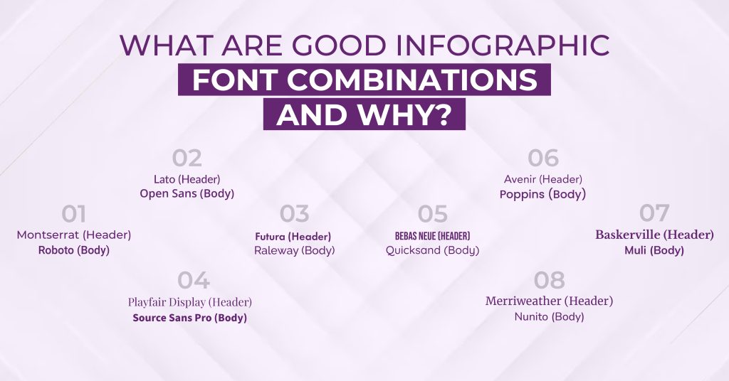
In infographics, fonts are used in conjunction, and not every font complements every other font. Knowing what fonts go with which font would make the designer's life a lot easier.
Montserrat (Header) + Roboto (Body): (Show fonts)
Montserrat's bold and modern style draws attention to headers, while the clean and neutral Roboto ensures easy readability for body text. This combination provides a balanced and contemporary look suitable for various infographic themes.
Lato (Header) + Open Sans (Body): (Show fonts)
Lato's warmth and rounded edges create a friendly tone for headers, complemented by the versatile and clean Open Sans for body text. This pairing maintains a professional and approachable appearance, enhancing overall readability.
Playfair Display (Header) + Source Sans Pro (Body): (Show fonts)
Playfair Display's elegant and high-contrast serif style contrasts well with the modern and sans-serif Source Sans Pro. This combination achieves a sophisticated and readable design, making it suitable for infographics with a more formal aesthetic.
Futura (Header) + Raleway (Body): (Show fonts)
Futura's geometric and bold design adds emphasis to headers, while Raleway's elegant simplicity ensures easy reading for body text. This dynamic combination contributes to a modern and cohesive visual impact for the infographic.
Bebas Neue (Header) + Quicksand (Body): (Show fonts)
Bebas Neue's uppercase and bold style creates emphasis for headers, complemented by the rounded and approachable Quicksand for body text. This combination adds a dynamic and engaging flair to the overall design.
Avenir (Header) + Poppins (Body): (Show fonts)
Avenir's clean and versatile design pairs well with the modern and geometric Poppins. This combination offers a balanced and contemporary look suitable for infographics that require a professional and cohesive appearance.
Baskerville (Header) + Muli (Body): (Show fonts)
Baskerville's classic and elegant serif style contrasts with the rounded and friendly Muli. This combination strikes a balance between traditional and approachable aesthetics, making it suitable for versatile infographic themes.
Merriweather (Header) + Nunito (Body): (Show fonts)
Merriweather's traditional and readable serif design complements the friendly and modern Nunito. This combination achieves a balance between classic and contemporary, making it suitable for various infographic themes.
Best Tools to Create Infographics in 2026
Design Shifu
Design Shifu offers a subscription-based graphic design service, providing unlimited designs for a flat monthly fee. It not only provides you with infographics but every marketing collateral including brochures, social media creatives, presentations, etc. in a single subscription.
Features
- Subscription-based unlimited graphic design.
- Same-day delivery and unlimited revisions.
- Integration with Canva, Trello, Slack, etc.
- Dedicated designer for every design need
- Intuitive dashboard to manage requests
Canva
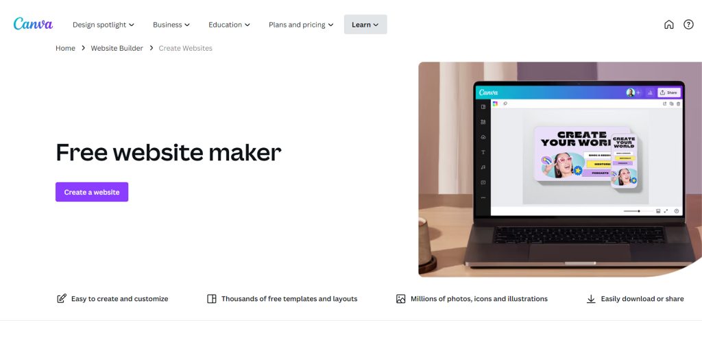
Canva stands out with its user-friendly platform, featuring a drag-and-drop interface and a vast template library. It's accessible across devices, making design accessible to a wide range of users.
Features
- User-friendly with drag-and-drop simplicity.
- Vast template library for customization.
- Accessible across devices with collaboration features.
- Free and premium plans for versatile design options.
Piktochart
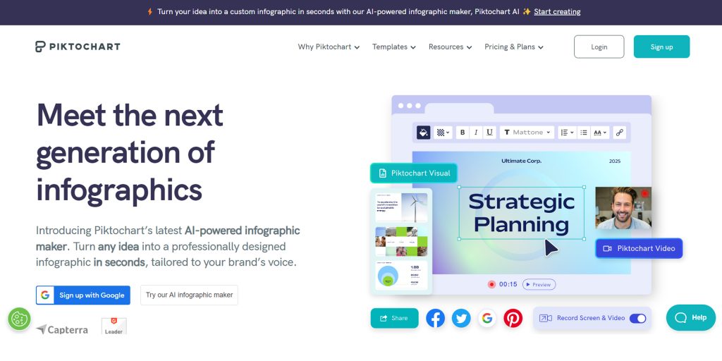
Piktochart simplifies infographic creation with its easy-to-use maker and drag-and-drop interface. It offers a range of customizable templates, making it an excellent choice for various design needs.
Features
- Easy-to-use infographic maker with a drag-and-drop interface.
- Customizable templates and visual enhancement options.
- Collaboration features for team projects.
- Export options for sharing or embedding infographics.
Visme
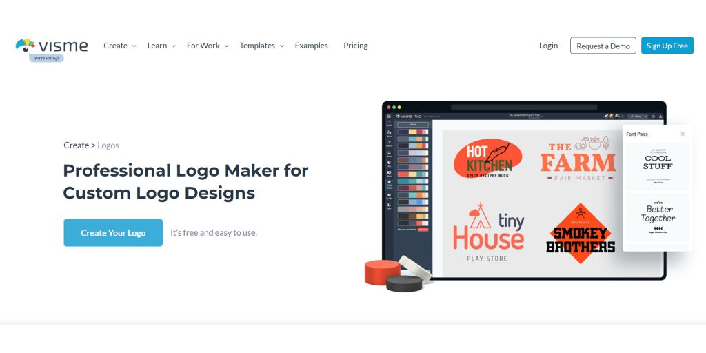
Visme is known for creating interactive visual content and empowering users to design engaging infographics and presentations. With features like data visualization and animation, it offers versatility for dynamic designs.
Features
- Interactive visual content creation.
- Data visualization and animation features.
- Versatility for infographics, presentations, and more.
FAQ
What are the 5 key elements of a successful infographic?
An effective infographic combines several key design principles. Start with a clear purpose and message so readers immediately understand the main takeaway. Use a strong visual hierarchy by organizing content with headings, colors, and spacing that naturally guide the eye. Keep the design simple and easy to read by limiting text and avoiding clutter. Choose relevant visuals such as icons, illustrations, or charts that support the information rather than distract from it. Finally, maintain consistent branding by using the same colors, fonts, and visual style throughout the infographic to create a polished and professional look.
What are some ways to get better at designing infographics?
Improving your infographic design skills takes practice and a willingness to learn. Study successful infographics to understand how professionals use color, typography, layouts, and visuals effectively. Practice regularly by experimenting with different design styles and compositions. Learn the basics of graphic design, including color theory, typography, and visual hierarchy, to build a strong foundation. Seek constructive feedback from colleagues or clients to identify areas for improvement. Stay updated on design trends to keep your infographics modern and engaging, and master your design tools to work more efficiently. Most importantly, understand your audience so your visuals resonate with the people you're trying to reach, and be open to iteration, refining your designs based on feedback and real-world performance.
About the author
Sameena is an Organic Growth Specialist and Content Writer at Design Shifu, crafting SEO-driven content that boosts visibility, builds brand authority, and drives meaningful organic growth.