Author | Design Shifu

10 Best Tips to Create High-Quality Business Brochure for Your Company

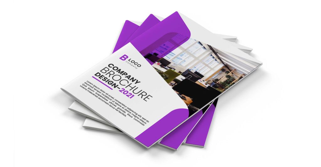
Your brochure isn’t just paper—it’s a pitch, a brand ambassador, and sometimes your first impression. To cut through a crowded market, you need to create high-quality business brochures that not only look great, but also convert.

A well-designed and compelling brochure is an effective promotional tool and offers a powerful way to reach out to your potential customers. A detailed, informative, and vibrant representation of what you have to offer, business brochures can be used to keep existing customers updated and also introduce your business to new clients.

Highly versatile, brochures offer endless possibilities. They can be used to support an existing marketing campaign, distributed to interested customers during exhibitions, or shared during business events. Even though the current marketing landscape is more online, brochures continue to be an integral component of any campaign.

Whether you are a start-up or an established brand, brochures can be the key to keep the communication flowing with your audience. If you are keen to create an excellent business brochure design that grabs attention, it is vital to design it meticulously.

There are several factors that require consideration to come up with a professional business brochure that stands out and keeps recipients engaged. Read on to discover design tips and business brochure ideas to create something that sets a lasting impression.

Related


Brochure Design in 2021 – The Ultimate Guide

What is a Business Brochure?

A business brochure offers summarized information about a company, its offerings, or the launch of a new product or service. It is used to introduce a business to prospective clients or to inform existing customers about new aspects of the service. It serves as a guide to raise awareness and boost the visibility of a brand. 

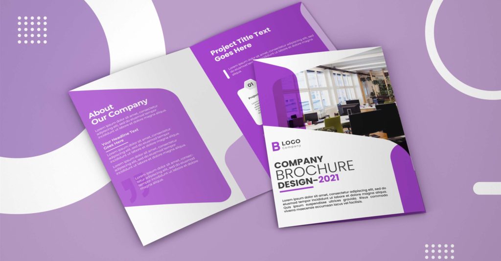
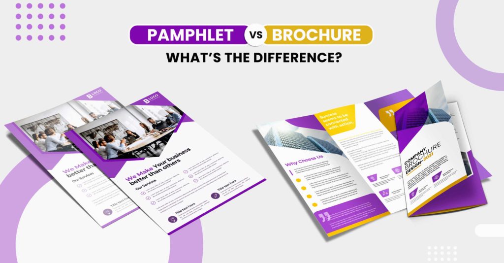
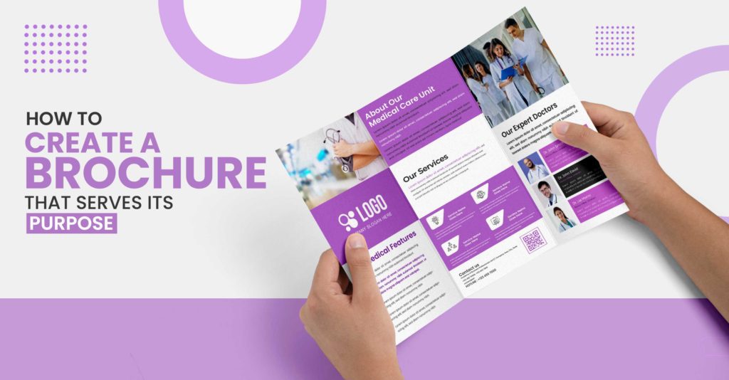
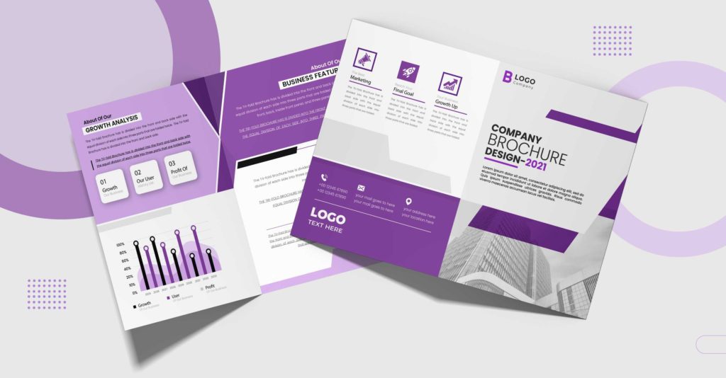
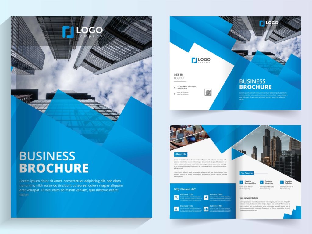
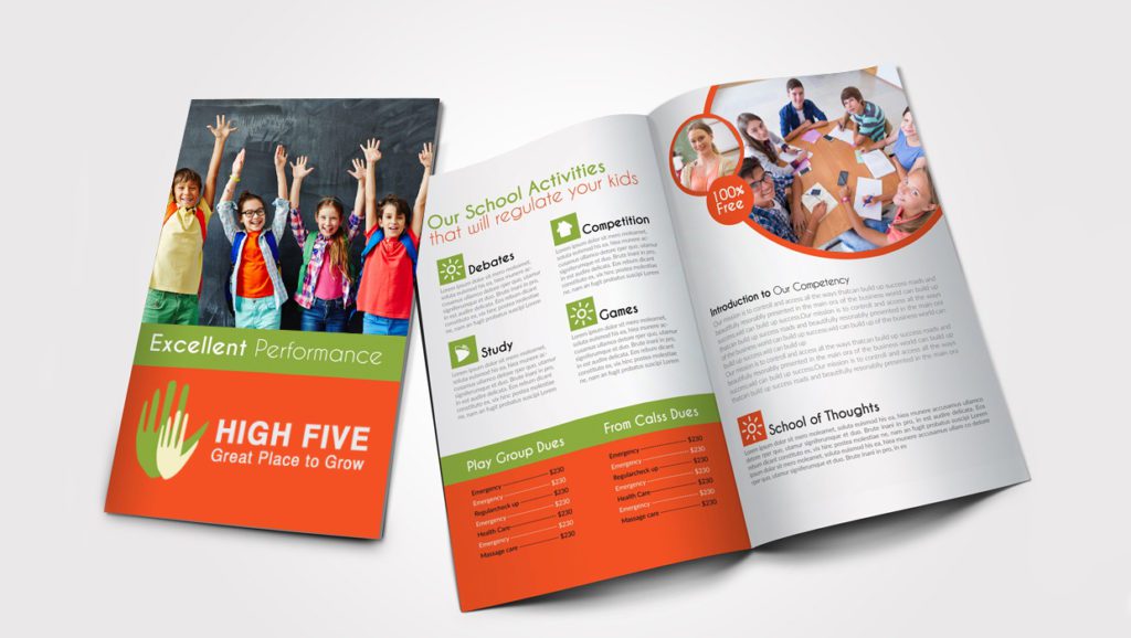
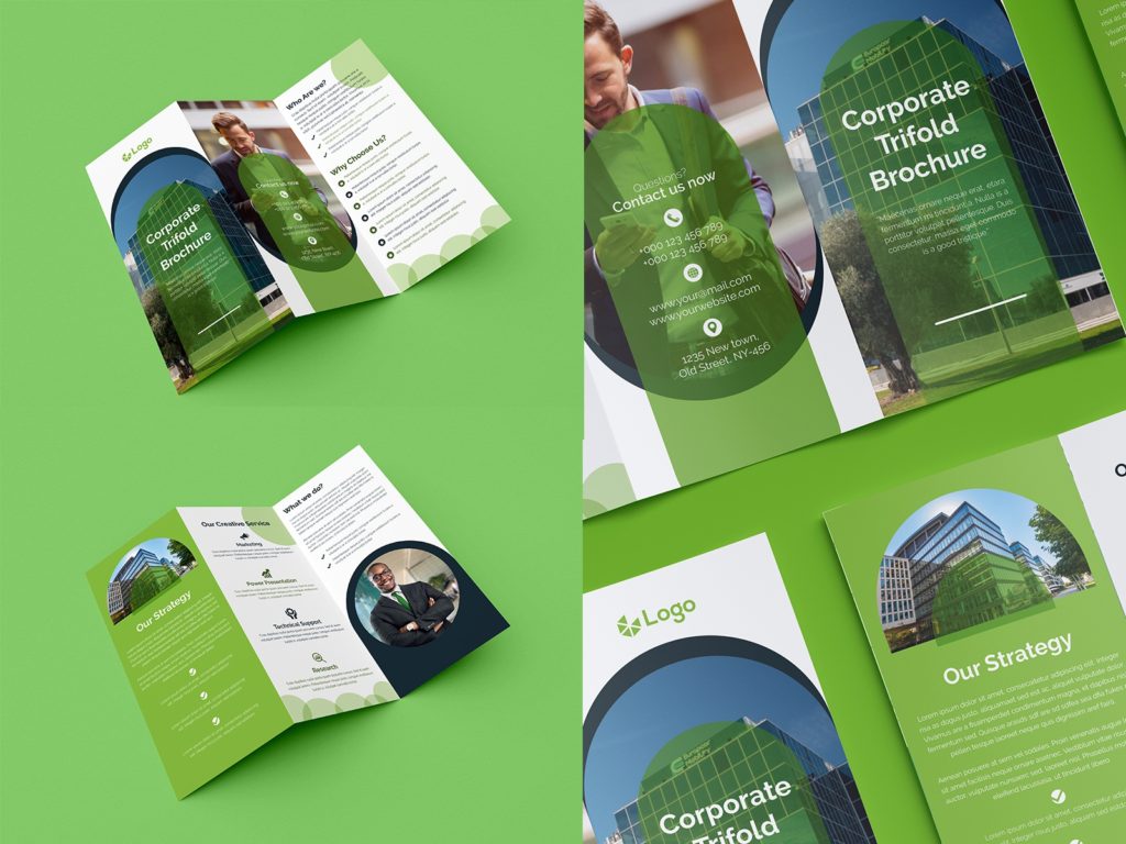
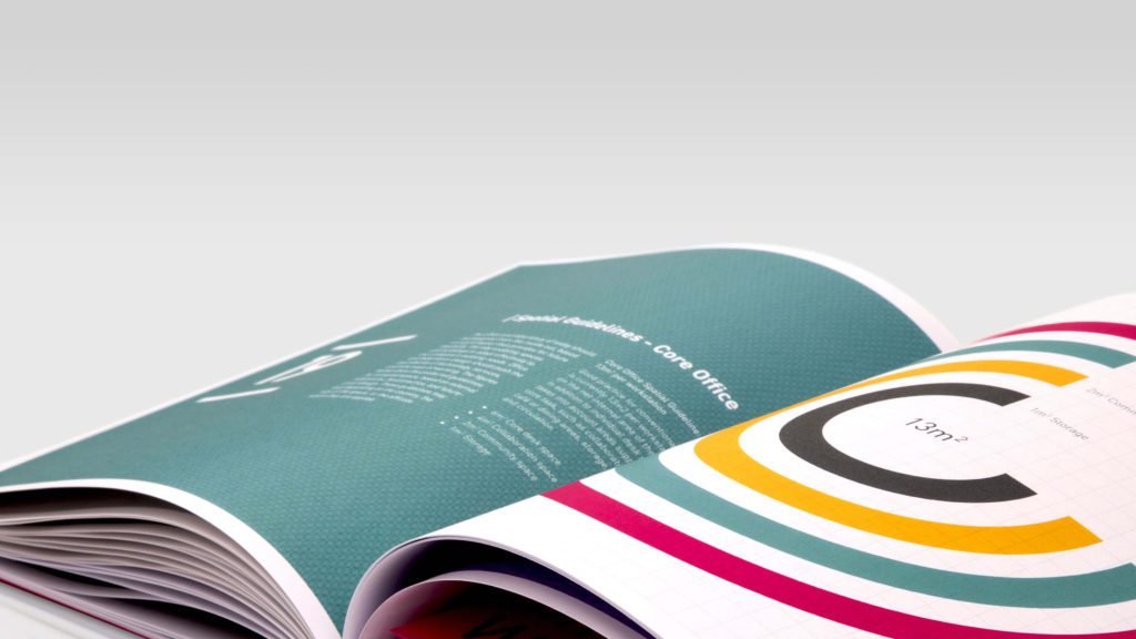
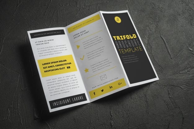
Business brochures are of different types like single fold or tri-fold, depending on the amount of information that needs to be conveyed. A business brochure must adhere to the voice of your brand and exude a professional finish to elevate the image of your brand.

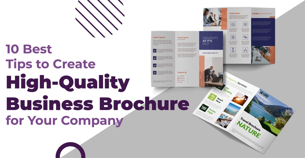
Tips for Designing High-Quality Business Brochures

Exploring business brochure designs to come up with the right one for your brand? When creating a business brochure, it is essential to abide by certain key principles and best practices to create one that enables you to accomplish your business goals. Let us look at some of the business brochure ideas to simplify it for you.

Identify the Purpose of the Brochure

Unsure about the company brochure content? The first step is to identify the information that you intend to communicate through the brochure. This will help you determine the amount of content that the brochure will include. Drawing a preliminary strategy for the brochure is important and will give you an idea about what the finished product will look like. The brochure needs to align and be in harmony with your brand. Taking the time out to organize your ideas and have a vision for a brochure will make the designing process easier.

Company Brochure Content

A vital initial step is to plan the content that goes into the brochure. This includes images, copy, or infographics. Creating a basic draft will help in designing a layout that is clear and has every piece of information that you want to communicate.

Know Your Audience

The next step is to figure out your audience. Keeping your target audience at the forefront will enable you to create an effective brochure. By gathering information about the demographics, you can craft a business brochure design and create content that engages your audience.

If you wish to share the brochure with existing customers, you can have a brochure with minimal content and a lot of attractive images and offers. However, if you are introducing your business, you may want to add details that will encourage readers to find out more about your company.

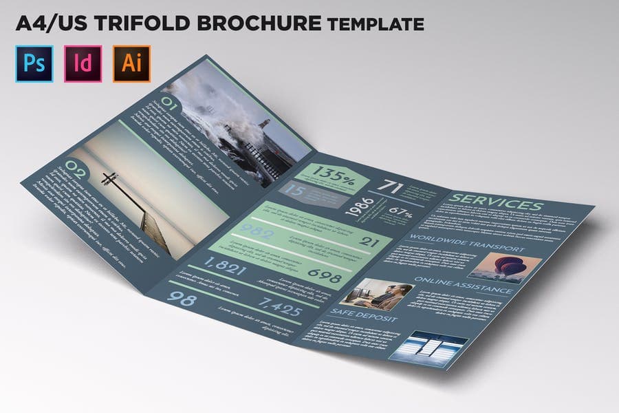
Understand the Business Brochure Styles

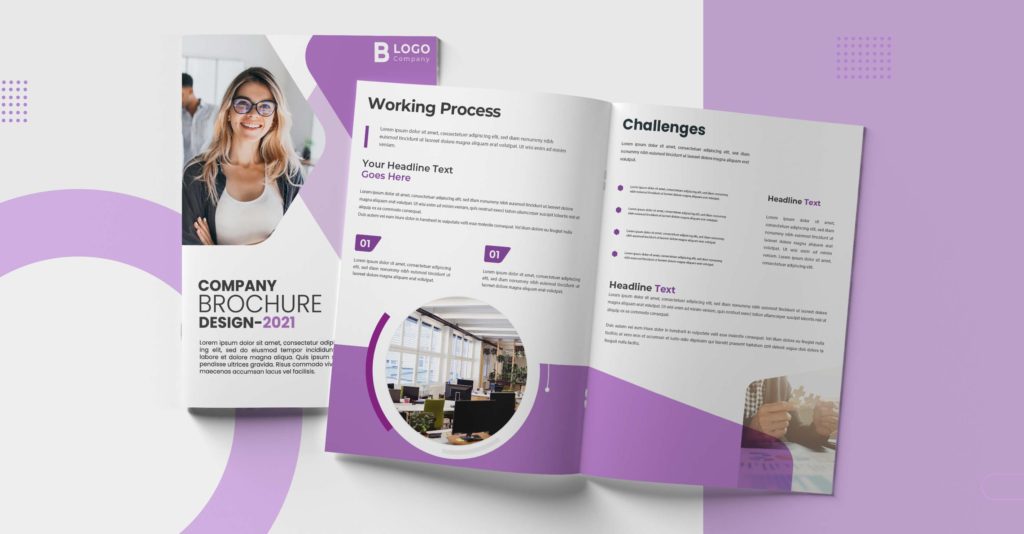
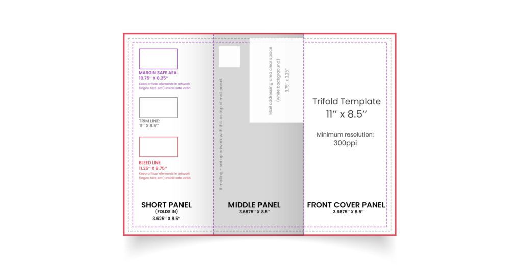
After you have an idea about the amount of content, you can determine the brochure style. You can choose to opt for a bi-fold or tri-fold brochure. If you are considering a tri-fold brochure, you can add an element of surprise in the final panel. You can also span the content across the panels to create a unique look. 

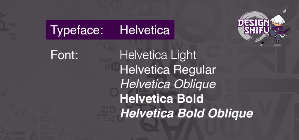
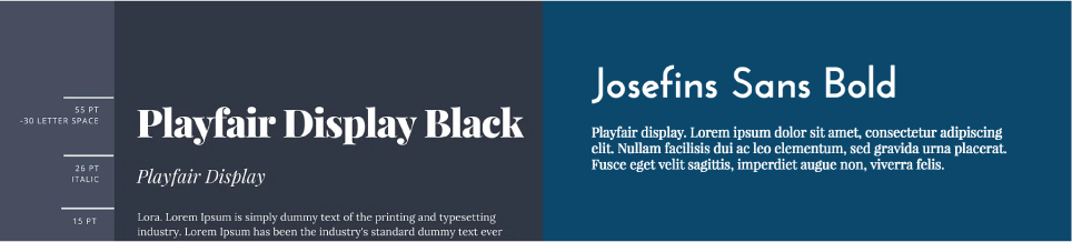
Choose the Right Font

When designing high-quality business brochures, ensure that you have the same font that is used by your brand in the logo or in other promotional materials. Maintaining consistency is important and makes a huge difference in the way your brand is perceived by customers. The choice of color and font must make sure that the copy is legible. 

Create a Comprehensive Design

By unifying the different elements of the design, you can add the perfect professional finish to the brochure. From planning the flow of content, the color palette or the images, every component needs to be in line with the voice of your brand. This phase is vital and perfecting the design at this point will ensure that the brochure rolls out smoothly.

Maintain a User-Friendly Flow for your Business Brochure

The purpose of the brochure is to engage, inform and invoke curiosity. This implies that creating a brochure design that has the perfect balance of visuals and text will help accomplish your purpose. View the flow of content from the perspective of the reader and ensure that the information is arranged in a way that the readers would want to receive. With unique business brochure ideas, you can give your business the edge it needs.

business brochure design
Source

Use Bullet Points and Headlines

Readers usually skim content to look for relevant information. You can make it easy for your readers by including headlines and bullet points. The fact that the brochure is easy-to-read and attractive will generate interest in your business. By including captivating headlines, you can hold the attention of your readers and guide them to the action that you want them to take.

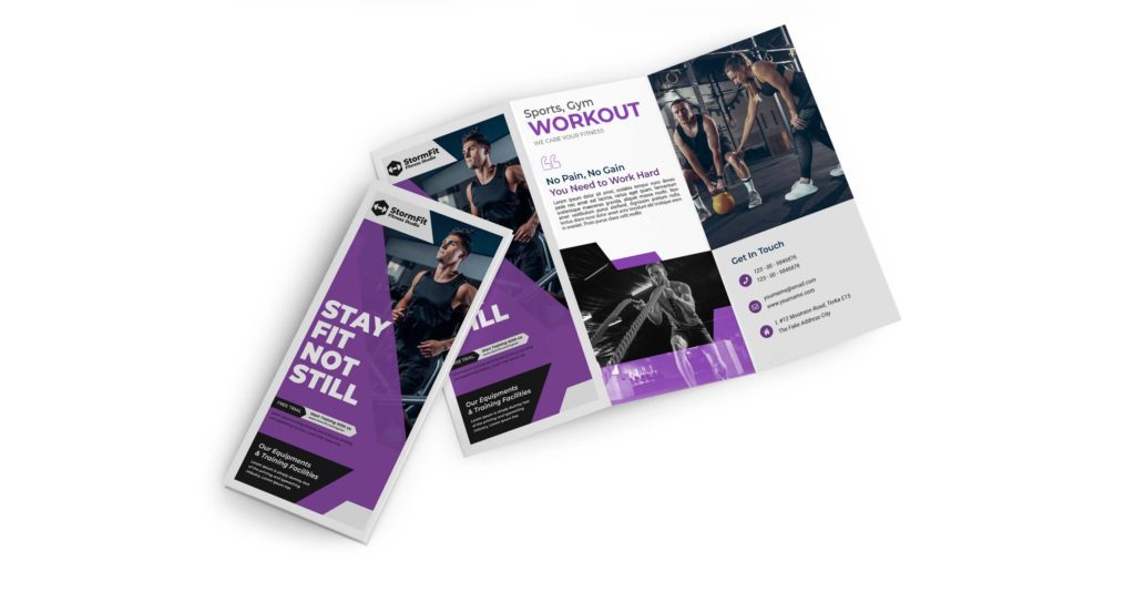
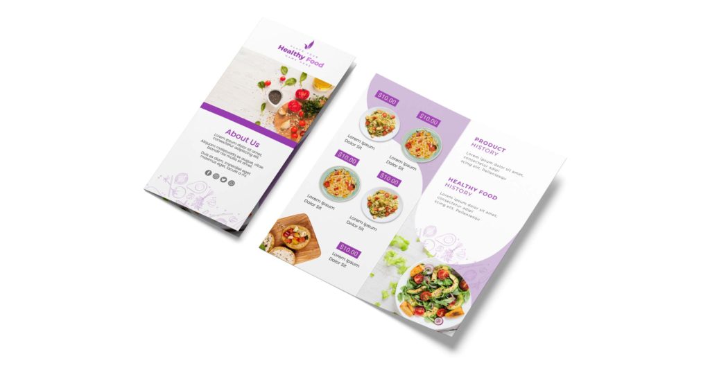
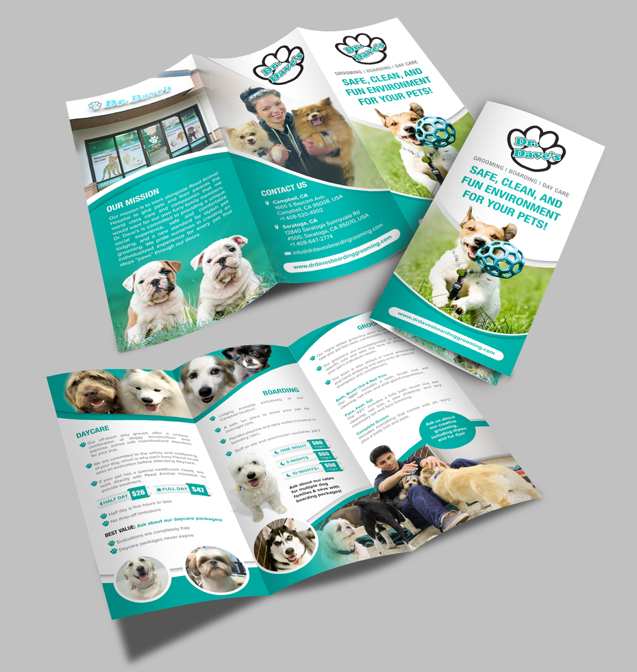
Use High-Quality Images in your Business Brochure

Visuals are an indispensable part of brochures but often overlooked. Not only will images make your brochure attractive, but also offer a quick way to convey your message. After you have picked the right image, ensure that the resolution is high and will not lead to pixelated prints. The overall quality and design of the brochure impact the image of your brand.

Add a Call to Action

The final step is to include a clear call to action and guide your readers. Make this section of the brochure bold and difficult to miss. Offer your readers a reason to act right away. Readers may have doubts or would be interested in knowing more about your products. By adding the website, email, phone number, social media pages, you can direct them to online channels and build trust. 

After you have perfected the design, you need to choose the right material and printing company to ensure that the professional look is maintained. Designing a brochure that your recipients would want to keep is a challenging task. However, with an emphasis on even the smaller details and putting the needs of your readers first, you can design brochures that get the message across and give you the best return on your investment.

Exploring business brochure ideas?

Creating a well-thought-out business brochure design is a time-consuming task. If you are unsure about the creatives and need help, feel free to get in touch with us at Design Shifu. We can assist you with unlimited design requests with a turn-around time of 24-48 hours. Check out our pricing page to pick a plan that works for you.

How to Design a Logo: A Step by Step Guide

Logos are very crucial from the branding perspective for any business. When you are creating a logo on your own, there are many things that need to be considered including layouts, colors, symbols, and fonts. Wondering how to design a logo yourself? Let us help.

How to Design a Logo?

Designing logos is all about creating an iconic design by capturing the essence of your business and brand. Although it may seem like a lot of work, this step-by-step guide can help you create an impressive logo for your passion project, business, or side hustle.

Step 1: Understand and define your brand identity

Understanding and defining your brand’s core personality is very crucial when it comes to communicating your brand’s identity to your audience. To get to the bottom of this, you need to have the answers to the following questions.

  • Why did you start the business?
  • What values and beliefs does your brand represent?
  • What sets you apart from your competitors?
  • What are the three words that best describe your business or brand?

Step 2: Look for inspiration

Looking for logo inspiration can be a pretty tedious task. Don’t worry! With the help of the tips below, you can learn how to design a logo.  You can start with conceptualizing the logo by brainstorming inspirational ideas. Be mindful of the following pointers while doing so.

– Identify your ideal customers and the brands they like

When you figure out your target customers and their needs, it becomes easier for you to understand the vision of your logo. If you already have a few ideal customers, talk to them and know more about their buying decisions, lifestyle, favorite brands, and insights relevant to your services or products.

– Research the logos designs of competitors

Make a list of all your competitors and divide them into two groups based on the logos you like and the logos you dislike. This will not only help you understand how to begin designing your logo, but also how to design a unique logo that sets you apart from competitors.

– Decide where you would be using your logo the most

As a rule, keep your logo simple so it can be used both online as well as offline on marketing collaterals, T-shirts, business cards, packaging, etc.

Step 3: Pick the type of logo you wish to design

Once you are clear about your brand identity and have also looked through a few inspiring logos designing ideas, it is time to start translating this into your brand logo. One of the first things to do when you’re wondering how to design a logo from scratch is, pick the type of logo that is ideal for representing your brand. Although there are many different types of logos, given below are the three most important logotypes you can choose from:

– Wordmark logo type

Such a logo will only have your business name and nothing else.

– Monogram logo type

This type of logo will have 1-3 letters as company initials along with the full name of the company below this.

– Combination logo type

Such logos are a combination of wordmark and monogram logos.

These are a few examples of the different styles of logos that you can experiment with. If you want more inspiration, you can take a look at our recent blog in which we talk about the top modern logo design trends of 2021. Click here to read

Step 4: Choose a suitable logo shape

The shape of your logo will play a major role in determining the aesthetics of your logo. These shapes could be in the form of symbols or containers. 

A container element is used in a logo to keep your brand logo confined in a specific space.

The different logo types based on shape are listed below.

  • Circular logo design for businesses with short names, movement, and direction.
  • Rectangular and square-shaped logo design for corporations with larger names.
  • Triangular shapes can be used to represent “A” and “V” in a logo and are generally used to depict movement and direction.

Step 5: Finalize the layout of the logo

The layout of the logo also plays a crucial role in how it is perceived visually. 

A popular layout option is the stacked text layout where the logo elements are stacked vertically

A symbol can also be used as an additional element in a logo design to bring out the best in a logo.

If your company has a slogan, you can consider including it in your logo design.

Step 6: Get creative ideas for font and color

Choose the right font

Each font type conveys a different meaning. Here are a few commonly used font types and how their visual differences can impact your final logo design.

  • For a modern and clean look in your logo, go for Sans-Serif font.
  • If you wish to attract a mature demographic, you must pick Serif fonts like the Times New Roman font.
  • To make your logo iconic, distinctive, and formal, Script fonts can be used.
  • Display fonts are more futuristic and edgy and can bring out your brand’s personality to the fullest.

Pick the right color

Different colors in a logo tend to evoke a different and unique kind of feeling. To help you decide which colors would suit your brand logo, here are a few well-known colors with the emotions they evoke.

  • Warm colors like red, orange, yellow, and pink depict optimism, positivity, happiness, and joy.
  • Cold colors like blue and other pastel shades display success and professionalism.
  • For a more elegant vibe, go for colors like black and grey that ooze sophistication and class.
  • For serene vibes, different shades of green would be ideal.

Step 7: Make the logo and test it

Once you know how to design a logo from scratch, it is now time to design the logo. There are many different ways in which you can design your logo.

  • You can use software like Photoshop or Adobe Illustrator to design your logo.
  • You can purchase a premade logo template and customize it according to your likes.
  • You can make use of an online logo maker service.

If these options seem too time-consuming and tedious, and you want your logo designed quickly, you can try Design Shifu’s graphic design service. You can get your logo in 24-48 hours!

Once you have designed the logo using the above guide for how to design a logo, it is now time to test the logo by asking yourself the following questions.

  • Is my brand logo scalable enough?
  • Is my logo visually appealing on all the applications or platforms where it would be used (online and offline)?
  • Will my logo look good in all white or all black?
  • Can I have different logo variations for different end uses?

If you’re still worried about how to design a logo from scratch and you’re finding it cumbersome, you can always try Design Shifu. Design Shifu offers graphic designs for both businesses as well as individuals, and delivers your designs in 24-48 hours, for a flat-monthly fee. There’s absolutely nothing to lose because Design Shifu offers a 100% money-back guarantee if you aren’t satisfied with the work. Simply choose a plan that best suits your requirements and get started with some of the best logo design ideas as the first step to build your brand identity. Sign up with Design Shifu today!


Brochure Design in 2023 – The Ultimate Guide

Looking for inventive brochure design ideas that grab attention and get your message across?

Brochures are an effective marketing tool and enable businesses to showcase their offerings in a detailed and attractive way. You can create brochures for every purpose you can think of.

Whether you are launching a new product, introducing a new company, or informing prospective customers, a brochure expands your company’s visibility. However, in a competitive marketing landscape, it is vital to come up with brochure designs that stand out and create a lasting impression. Moreover, the way visual content is consumed changes over time. So, why not do away with outdated ideas and explore ingenious brochure designs for 2021? How about pushing the boundaries and discovering design schemes that give your business an edge? 

What is a Brochure Design? 

A brochure is a highly-adaptable visual marketing tool and is used to put forth the services or products offered by a company. While there are pdf versions of brochures available, they are also usually printed and distributed at business events, exhibitions, conferences, trade fairs, or promotional events. 

Brochures can be designed in all shapes and sizes to convey and reflect the identity of your business. Through impactful and professional brochures, you can create the right first impression and reflect the high standards of your business. By creatively working on every aspect of the brochure design, you can ensure that your message is relevant and memorable. Be it the color, images, or text, every detail counts and can make a significant difference to the way your brand is perceived by your audiences.

In terms of design and function, the possibilities are endless. There are various brochure dimensions and styles like single-fold and tri-fold. Based on the length of information you want to add, you can pick the most appropriate format. If you wish to include information about multiple products or services, you can benefit from opting for more folds. A brochure design can include both text and visual elements in a creative way to spark curiosity and encourage readers to find out more about your business. 

What is a Brochure Design?


Difference between a Pamphlet and Brochure Design  

Wondering what makes a brochure different from a pamphlet?

You may have noticed that the terms are often used interchangeably. However, there exists a difference between the two. Pamphlets are single-paged documents and differ from brochures in terms of form and function. Brochures may consist of multiple pages depending on the amount of information that the business intends to convey. Moreover, while pamphlets are designed to offer information, brochures are created to promote a product or a service. Since brochures consist of several pages, they are bound while pamphlets are unbounded.

Difference between a Pamphlet and Brochure Design

How to Create an Attractive Brochure Design

If you are daunted by the thought of how to make a brochure, let’s simplify it for you. First and foremost, let us delve deep to understand the purpose of designing a brochure, the elements that require emphasis, and how you can go about designing a brochure that captivates and boosts the visibility of your business. Let us look at some of the steps to create a brochure.

  • A brochure must draw attention and invoke the curiosity of your potential audience. On the first page, you can make use of eye-catching images and a headline or crisp copy. 
  • The next challenge is to ensure that the interest level of your audience is maintained. You can do so by adding content that assures that the promise made by you on the first page is maintained. Communicate your message in an easy-to-understand and convincing way.
  • After your brochure has succeeded in capturing interest, you need to encourage people to take an active interest in what you have to offer. You can do so by offering relevant information along with attractive images. This section of the brochure can be followed by a call-to-action which will include details of your website, store, and e-mail id.

By following the above structure, you can create brochures that give your business a competitive advantage and makes it truly stand out.

How to Create an Attractive Brochure Design

Create a Brochure Design That Converts Readers into Customers

Need ideas for a successful brochure design?

When creating a brochure, every aspect of the design requires careful consideration. From the brochure dimensions, images, colors to the text, each element plays a vital role in shaping the final design. If you are exploring ideas about how to make a brochure, the following steps will surely make the process easier for you.

Understand Your Purpose and Target Audience

You need to define the purpose for which you intend to create the brochure. Do you want to sell a new product, promote your service or want to convey the new offers you have come up with?

The next step is to determine the specific segment of the audience you wish to target. You can do so based on age, location, or the buying cycle.

Based on these two parameters, you can pick images and craft a crisp copy to engage and inform. If you want to launch a new product, you can consider adding a coupon for the product that can be redeemed when making a purchase. Similarly, if you want to promote a new website, you can add a promo-code for first-time visitors. With a clear purpose, you can successfully design brochures that enable your business to accomplish its marketing objectives.

Craft a Thoughtful Message for Your Brochure

The next step involves writing the copy. This placement of the copy should be determined by the design and structure of the brochure. You need to figure out what needs to be included in the front, middle, and back of the brochure.

The copy that you frame must directly address your customers and convince them about how your products or services are beneficial. Keep the copy short and choose your words well. You can consider adding questions to make readers feel intrigued. You can support the content by including graphs, charts or images wherever required.

Add Meaningful and Unique Images

To drive visual interest, you can collect relevant and enticing images to add to your brochure. If the brochure is about the products offered by your business, you can include flawlessly captured shots that convey how your products are unique and worth buying.

Brochure Design - Add Meaningful and Unique Images

Design a Brochure that Aligns with Your Brand

When creating a brochure, ensure that you adhere to the guidelines of your brand. This is especially true if the brochure is part of a bigger campaign. Use fonts, colors, and images that are consistent and in line with the brand.

Brochure Design - Design a Brochure that Aligns with Your Brand

Adjust the Layout of the Brochure

The next step involves scanning through every element of the brochure and making adjustments to add a professional and flawless look. This process includes adjusting colors, cropping images, fixing issues with the content placement, adding background colors if required, defining sections of the brochure, and ensuring that it has an easy-to-follow flow.

Review and Print the Brochure

The final step involves reviewing the brochure by getting a copy printed to see if it is as per your expectations. You can share the copy with team members and see if it is exactly the way it was meant to be.

Brochure Design - Review and Print the Brochure

Still unsure about how to make a brochure design that will set your business above the rest?

At Design Shifu, we have been helping businesses around the globe to make ideas a reality. We can cater to all your design requirements to enable
you to create persuasive brochures that inform and inspire.

We are passionate about translating ideas creatively and have worked with businesses of all sizes. Connect with us to get unlimited graphic designs at an affordable monthly subscription fee.


What is Modern Logo Design and Top Modern Logo Design Trends in 2023

The art of designing a modern logo has come a long way from its vintage avatar to the sleek lines, minimalist lettering, and subtle colors that we see today. In fact, you can make a splash with your branding if you get a modern logo design right. 

What are modern logo designs?

Just in case you are wondering what modern logo designs are all about, experts identify their uniqueness by how fresh they look and feel to your eyes, which is achieved through an amalgamation of elements: both classical and contemporary. Modern logo ideas take the ‘less is more’ route but use striking (and simple) color palettes, fewer words, clean layouts, and almost obsessively, lines! 

Examples of Modern Logo Designs in 2021 

While most startups have intuitively hopped on to the modern logo wagon, what’s intriguing is that many established businesses too are looking to redesign their branding by reinvigorating their logos and moving towards minimalist logos instead of the complex overwhelming designs of the past. 

After the pandemic overhauled our lives and lifestyle at the beginning of the decade, most businesses too had no choice but to swiftly adapt or get left behind. So, what better time than now for businesses to take inspiration from modern logo ideas and rebrand, in keeping with the fresh energy that has been infused into them.

Given below are some examples of modern logos themes and ideas that are likely to be in vogue this year:

1. Logos with 3D and isometric shapes

Specific shapes like squares and circles are the building blocks of imagery and have been common with modern logo enthusiasts for some time now. However, our experts visualize 2021 to be the year when 3D images will make a breakthrough with their modern cutting-edge design. This is a perfect way to take your already existing logo to the next level and all one has to incorporate modern logo ideas like highlights, shadows, and shading.

2. Logos with Analogous Colour Palettes

Colour Schemes are undoubtedly one of the most simple and yet genius ways to transform a modern logo for any organization. Analogous schemes are a topic that student designers are exposed to in their very first year of color theory and it essentially means pairing colors that are adjacent to each other on the color wheel. The outcome is the result of a scientific approach that creates harmony between colors, rather than contrasting.

analogous modern logo design
Credit: Pinterest

3. Logos with Quirky Lettering

Another example of timeless modern logo design entails imbibing quirky typography within your logo. In fact, the latest spin on this trend that is making the news is using a font style that reflects the times. Divergent lettering is being used by many designers as well, where you play with the positioning or even invert a few letters to add an X-Factor to the overall design. You can check out our portfolio to witness the kind of magic we have created with lettering in our logos. One of the most popularly appreciated logo examples that employ this technique is the CNN logo. 

4. Inspiration from Stained Glass

The sheer innovation that designers employ while making a modern logo makes this domain as exciting as none other. One of the most recent trends that have caught our attention at Design Shifu is incorporating elements similar to the stained glass windows from the past. When we apply this concept to modern logo designs, the fragmentation of images into shards of colors transforms an ordinary object into something magical. After spending a year inside our houses, we look forward to more stained glass elements in logo designs of 2021. 

5. Logos with Portraits and Caricatures

Human beings are social animals and the same philosophy extends to elements of design as well. There is no other reason why humans seek out other faces when they look at advertisements and even logos! One of the most popular logo examples that come to our mind when we think of this trend is the KFC Logo and the face of Mr. Colonel Sanders who is happy to feed us his crispy fried chicken! 

caricature modern logo design
Credit: Wikipedia

6. Logos with Balance and Symmetry

Balance and Symmetry are indeed two of the most crucial aspects of any field in the design and can lend an unparalleled level of sophistication making them an important part of any modern logo design. Symmetrical logos are identical on both halves if split down from the middle and add strength to your design. After all, we associate strength with towers and buildings and how they stand their ground in all conditions, achieving this from symmetry and balance. It’s always advisable to hire professionals to create your logo so they can infuse their expertise and experience.

symmetrical logo design
Credit: 1000logos

7. Hand-Painted Logos  

2020 saw the growth of hand-drawn and hand-painted elements in all facets of design, from stationary to walls and we see this design taking the world of modern logo by storm as well! This trend requires a great deal of skill and someone to make a logo that is whimsical, but definitely not haphazard. Many small businesses have internalized this trend in a matter of no time and produced logos that make us sit back and watch in amazement! We see this beautifully done in logos such as the ones below:

painted logo in modern logo design
Credit: Logodix

8. Classic Black and White

There are some things that never go out of style and a black & white design is definitely one of them. We envision this to be a big trend in 2021 where the classic font is used as an incredibly adjusting layout that can be then experimented with a plethora of contemporary and cool effects. Minimum fuss and Maximum Jazz, what more can you want from a modern logo? 

Credit: Wikipedia

While these are the 8 trends on top of our minds in the realm of logo designing, we’re excited to see what this year holds for the industry and which logo will take the world by storm! 

If you feel the creative tingle and want to design a logo, we have recently published a step by step guide on how to design a logo. You can read it here

To scale and grow your business, branding is imperative, and having a creative yet meaningful modern logo can make all the difference to stay ahead of the pack. However, it’s best to take the help of experts when it comes to brand design. For instance, Design Shifu is a subscription-based graphic design agency that can help you with your logo design as well other graphic design needs on a budget. You simply need to choose a plan based on your requirements to get started. Above all, you get your designs within 24-48 hours and can ask for unlimited revisions. Not to forget, our money-back guarantee!  Click here now to get started with your logo.


Top 10 Illustration and Graphic Design Trends of 2021

The year 2020 sure was a tough one and just like many other industries, the graphic design and illustration industry also faced more challenges than anticipated. 2021 comes rolling in like a breath of fresh air with an opportunity to reset and improve the creative ideas that form the foundation of graphic design and illustration.

While most of the trends in the past concentrated on a more futuristic approach with the new-age sci-fi ideas, this year is more about connecting with the audience with creative graphic design and illustration. Let us have a look at these trending graphic design and illustration ideas one by one.

1. Line Art

Line Art Illustration
Source

The graphic design and illustration trend that tremendously evolved in 2021 is ‘line art’. The popularity of such designs soared this year as a result of people being instantly drawn to sophisticated and clean outline typography and graphics. Businesses can now be seen integrating such graphic illustration into web design, branding and printed stuff.

2. Tranquility And Calm

Designs that bring in calm and tranquility.
Source

Meditative graphics, neutral colors, and minimal layouts are some designing elements that are currently trending in 2021. This year, there is an increased focus on designs that bring in a sense of calm and tranquillity. With this trend currently ruling the graphic design and illustration industry, expect to see several designs inspired by the 90s minimalism with natural textures and earthy palettes.

3. Grain And Blur

The inclusion of gradients is a popular trend that has sparked tremendous interest among graphic designers in the past year. When the gradients are touched thoughtfully, they add depth to the design and make it look unique. This year the designers are opting to take this trend up a notch by introducing more blended and blurry backgrounds in the graphic illustration and design. When the grain filter is added to such designs, they start seeming real-to-the-touch and transitory.

4. Fantasy Interiors And Landscapes

Fantasy Interiors and Landscapes-illustration and graphic design trends 2023
Source

Fantasy interiors and landscapes are all set to become the biggest trend this year. With the recent developments in the field of virtual reality and 3D CAD, it is now possible to see yourself amidst a virtual setting of your choice. Since this is something that attracts a lot of end-users, brands are starting to use the fantastical style of virtual reality and gaming in their logo designs and illustrations. 

5. Primitivism Vibes

Primitivism Vibes-illustration and graphic design trends 2023
Source

The primitivism vibe is a great way to add classical art to a design or illustration. Understanding this particular direction of art while making it fun and enjoyable is something that not everyone can quite grasp. If done right, elements of primitivism integrated with digital illustrations can do wonders for your brand.

6. Polished retro

Polished Retro -illustration and graphic design trends 2023
Source

Designs inspired by vintage elements will always remain in style as they have a way of bringing a nostalgic comfort and vibe to the brand identity of a business. This year you can expect to see polished versions of vintage designs across graphics and topography. You can see more and more designers using contemporary palettes of colors and clean defined lines for curating some of the most effective graphic design and illustration.

7. Using Negative Space

Use of negative space in illustration
Source

The use of negative space in illustrations and design has great potential. However, it requires supreme skills that are pretty challenging to tame. Such an idea is trending this year, in both, illustrations as well as logo designing. This makes visuals and brand identity unique, artistic, and eye-catching. 

8. Optical illusions

Optical illusions-illustration and graphic design trends 2023
Source

Optical illusions have a way of bringing a mystical mood to an illustration. Such a design trend blends certain psychedelic elements with a clean and classic style. In 2021, the trend of using optical illusion in graphic design and illustration would be at an all-time high. Optical illusions in a design spark a sense of individualism and fun. However, be mindful of the fact that optical illusions need to be incorporated with a legible design for the end result to be as effective as expected.

9. Shadows And Contrasts

Shadows and Contrasts-illustration and graphic design trends 2023
Source

Another trending digital illustration idea is using visual expressions with exaggerated shadows and high color contrast. The digital artwork created using this idea is always atmospheric and catchy. Such an approach is generally presented with illustrations of architecture, landscapes, and interiors. Many feelings like isolation, wintery vibes, melancholy, autumn feels, etc., can be evoked by playing with color accents, contrasts, shadows, and lights in illustrations. 

10. Geometric Motifs

Geometric Motifs-illustration and graphic design trends 2023
Source

Geometric patterns and shapes seem very clear and harmonic to the human eye. A trending graphic design and illustration idea in the past year, the geometric motifs trend is here to stay in 2021 as well as an integral entity of digital branding and art. You can attempt creating an emotional mood and background by effectively incorporating creative patterns and lovely combinations with the psychology of shapes in mind.

Conclusion

Each year, there are different trends when it comes to graphic designing. Let us enter the new creative year with hopes of smarter, brighter, and beautiful spheres of digital art, graphic design, and illustration. The integration of most of the above trends need expert interference.

When it comes to creating truly unique and innovative graphic design and illustration, Design Shifu can help. You can pick any of the subscription plans that suit your needs and get the design or illustration you need within 24-48 hours. If you are worried about paying for the subscription plans, you would be happy to know that Design Shifu offers a 14-day money-back guarantee! Get your graphic designing requirements attended to by contacting us now!


Social Media Image Size Cheat Sheet 2023 Complete Guide

Social media platforms like Instagram, Facebook, LinkedIn, and others are constantly bringing about scalable changes in the size and dimension requirement, layout, and other specifications for the uploaded images.

These changes are so frequent that it becomes a challenge to keep track of them. However, we understand that you cannot shift your focus from your work to keep a tab on the latest social media image size changes every now and then.

This is exactly why we have consolidated the below social media image size cheat sheet 2021 for you, hoping it’ll come in handy when you work on your social media channels.

What Is The Best Facebook Image Size 2021?

No matter how big or small your business may be, posting relevant images of high quality and the right dimensions on a platform like Facebook makes your audience feel that your business is reputable and legitimate.

Facebook tries to prevent all the advertisers from posting spammy and over-promotional content by providing some specific Facebook image sizes that you must adhere to. This social media image size cheat sheet 2021 will tell you about these Facebook image dimensions in detail below.

– Facebook cover photo and profile picture

While uploading cover photo images on Facebook, you need to keep in mind the following safe zones so that the displayed image is compatible on a mobile phone as well as desktop screens.

  • On mobile screens, 24 px needs to be visible on both the bottom and top of the image.
  • On desktop screens, 90 px needs to be visible on both the left and right sides of the image.

Facebook cover photo

Facebook cover photo dimensions
DOWNLOAD NOW Free Facebook Cover Photo Template PSD

– Facebook profile picture (company logo)

DOWNLOAD NOW Free Facebook Profile Picture (Company Logo) Template PSD

– Facebook shared image

Such an image appears on your timeline and also in the news feed of your fans. Here is the social media image size cheat sheet 2021 for Facebook shared image.

Facebook shared image dimensions
DOWNLOAD NOW Free Facebook Shared Image Template PSD

– Facebook shared link image

Facebook shared link image dimensions
Facebook shared link image template
DOWNLOAD NOW Free Facebook Shared Link Image Template PSD

– Facebook highlighted image

Facebook highlighted image dimensions
Facebook highlighted image template
DOWNLOAD NOW Free Facebook Highlighted Image Template PSD

– Facebook event cover image

Facebook cover event image dimensions
Facebook cover event image  template
DOWNLOAD NOW Free Facebook Event Cover Image Template PSD

– Facebook group cover photo

Facebook group cover photo dimensions
DOWNLOAD NOW Free Facebook Group Cover Photo Template PSD

– Facebook business cover photo

Facebook business cover photo dimensions
Facebook business cover photo template
DOWNLOAD NOW Free Facebook Business Cover Photo Template PSD

– Facebook post image 

Facebook post image dimensions
Facebook post image template
DOWNLOAD NOW Free Facebook Post Image Template PSD

– Facebook stories image

Facebook stories would be covering the entire screen of the viewer’s device and this is why it is recommended that you stick to the social media image size cheat sheet 2021 for Facebook stories image given below. Make sure that you do not add any text, symbols, or characters at the top and bottom part of the image as it becomes hard for the viewers to read it.

Facebook stories image dimensions
Facebook stories image template
DOWNLOAD NOW Free Facebook Stories Image Template PSD

– Facebook “Our Story” cover image

This is an extended version of the “About Us” section for businesses.

 Facebook “Our Story” cover image dimensions
 Facebook “Our Story” cover image template
DOWNLOAD NOW Free Facebook “Our Story” Cover Image Template PSD

– Facebook catalog image

Facebook catalog image dimensions
Facebook catalog image template
DOWNLOAD NOW Free Facebook Catalog Image Template PSD

Struggling to figure out the right Facebook ad sizes?
This guide will help you optimise your Facebook ads across all devices and run successful campaigns.

Related

“Facebook Ad Dimensions in 2021 – The Ultimate Guide”

What Is The Best Instagram Image Size 2021?

Instagram is a social media platform where visuals are given prime importance. This means that high quality images are a must. The photos on Instagram are no longer limited to square photos. In fact, you can now post portrait or landscape-oriented pictures or videos and even prepare a carousel of around 10 images.

When it comes to Instagram business pages, you need to be mindful of the Instagram image sizes of the profile photo and the Instagram image dimensions of the images that you post on the business page. Check out the social media image size cheat sheet 2021 for Instagram below.

Instagram image dimensions template - cheat sheet

– Instagram business page profile photo (business logo)

Instagram business page profile photo (business logo) dimensions
DOWNLOAD NOW Free Instagram Business Page Profile Photo Template PSD

– All other images posted on this page

Instagram post size dimensions
DOWNLOAD NOW Free Template PSD For All Instagram Images

– Instagram image dimensions with respect to the layout

Instagram image dimensions with respect to the layout

DOWNLOAD NOW Free Instagram Image, With Respect To The Layout Template PSD

Wondering how to leverage the power of Instagram ads to attract new customers? Check out this complete guide to Instagram ad sizes.

Related

“Instagram Ad Specs and Sizes in 2021 – The Ultimate Guide”

What Is The Best LinkedIn Image Size 2021?

LinkedIn is a platform that has been specifically designed to facilitate interaction amongst professionals. It is a great resource for different businesses to connect with industry leaders, other businesses and prospective employees. 

You can either choose to have a business page or an individual profile on LinkedIn based on your preferences. The profile can either be paid or free. Here is the social media image size cheat sheet 2021 for both types of LinkedIn profiles.

– LinkedIn personal profile

Apart from adhering to the Linkedin image dimensions given below, it is important that you upload a professional-looking and respectable photo of yourself as a profile picture.

LinkedIn profile photo dimensions
LinkedIn personal profile dimensions
DOWNLOAD NOW Free LinkedIn Personal Profile Template PSD

– LinkedIn business page

LinkedIn business page dimensions
DOWNLOAD NOW Free LinkedIn Business Page Template PSD

LinkedIn business cover photo

LinkedIn business cover photo dimensions
LinkedIn cover photo dimensions
DOWNLOAD NOW Free LinkedIn Business Cover Photo Template PSD

This is the image that stretches across your business profile right above your company’s profile picture. The social media image size cheat sheet 2021 below outlines the dimensions for LinkedIn business cover photo.

– LinkedIn custom modules

 LinkedIn custom modules dimensions
DOWNLOAD NOW Free LinkedIn Custom Modules Template PSD

– LinkedIn company photo

LinkedIn company photo dimensions
DOWNLOAD NOW Free LinkedIn company Photo

LinkedIn shared image

LinkedIn shared image dimensions
DOWNLOAD NOW Free LinkedIn Shared Image Template PSD

What Is The Best Twitter Image Size 2021?

Popularly known for creating a real-time buzz online, Twitter is an incredible platform that drives customer experience and service for several businesses. For the profile photo on Twitter, stick to using your company logo. 

For the cover photo, you can display a new product that you have recently launched, describe what your brand represents, or use it for advertising. Also, when you are tweeting something, try including an image that adheres to the given Twitter image dimensions. This increases the chances of a higher response rate. All the necessary Twitter image sizes are given in the social media image size cheat sheet 2021 below.

Twitter image dimensions

Twitter profile image

Twitter profile image dimensions
DOWNLOAD NOW Free Twitter Profile Image Template PSD

– Twitter cover photo

Twittercover photo dimensions
DOWNLOAD NOW Free Twitter Cover Photo Template PSD

– Twitter timeline photo

Twitter timeline photo dimensions
DOWNLOAD NOW Free Tweeted Image Template PSD

– Tweeted image

Tweeted image dimensions
DOWNLOAD NOW Free Tweeted Image Template PSD

Twitter card image

Twitter card image dimensions
DOWNLOAD NOW Free Twitter Card Image Template PSD

Twitter moment

Twitter has not outlined or set any particular dimension for the images you post as Twitter moments. You can include any video, image, or even GIFs in Twitter moments. However, when talking about the social media image size cheat sheet 2021 for Twitter moments, an aspect ratio of 9:16 is highly recommended.

What Is The Best Pinterest Image Size 2021?

Pinterest is one of the most valuable search platforms where several users look for products and services. This platform does not feature a cover photo, which means that the focus should be on picking the best profile picture. It must adhere to the Pinterest image dimensions given in the below social media image size cheat sheet 2021.

Pinterest image dimensions

On Pinterest, vertically placed pins perform better since this platform’s layout is portrait-oriented. When deciding the Pinterest image sizes, create a pin that represents your brand vision aptly. 

– Pinterest Profile Picture

Pinterest profile picture dimensions
DOWNLOAD NOW Free Pinterest Profile Picture Template PSD

– Pinterest standard pin

Pinterest standard pin dimensions
DOWNLOAD NOW Free Pinterest Standard Pin Template PSD

– Pinterest square pin

Sharing this type of pin is not recommended unless you are reposting from another social media platform like Instagram since such images cannot be resized the way you want. Check out the social media image size cheat sheet 2021 for Pinterest square pin.

Pinterest square pin dimensions
DOWNLOAD NOW Free Pinterest Square Pin Template PSD

– Pinterest long pin

While creating long pins, make sure that the text is placed in the center of the image.

Pinterest long pin dimensions
DOWNLOAD NOW Free Pinterest Long Pin Template PSD

– Pinterest infographic pin

For infographics, make sure that the pin is simple and easy to grasp.

Pinterest infographic pin dimensions
DOWNLOAD NOW Free Pinterest Infographic Pin Template PSD

– Pinterest carousel pin

This is a great way to advertise when you have more than one product to introduce to your audience.

Pinterest carousel pin dimensions

DOWNLOAD NOW Free Pinterest Carousel Pin Template PSD

– Pinterest collection pin

Here, the first image you use will be the Hero image and it should have an aspect ratio of 2:3. You can add up to 24 additional images in your collection and they can have an aspect ratio of 1:1.

Pinterest collection pin dimensions
DOWNLOAD NOW Free Pinterest Collection Pin Template PSD

– Pinterest story pin

Pinterest pin story size
Pinterest story pin dimensions
DOWNLOAD NOW Free Pinterest Story Pin Template PSD

– Pinterest Video pin

Pinterest video pin dimensions

What Is The Best Snapchat Image Size 2021?

Snapchat is a popular platform that offers businesses a way to visually engage with their audience with the help of filters, lenses, ads, and other tools. While posting an ad image on Snapchat, there are certain Snapchat image sizes that you need to be wary of. 

The social media image size cheat sheet 2021 given below lists out all the Snapchat image dimensions.

Snapchat image

Snapchat image size dimensions

video

Snapchat video dimensions

– Snapchat geofilter

Snapchat geofilter dimensions-Social Media Image Size Cheat Sheet 2021

Conclusion

With several businesses emerging in 2021, it is crucial to building a strong social media presence. This is exactly why you need to keep up with the current social media image size cheat sheet 2021 and optimize your image ads on different platforms accordingly.

The above social media image size cheat sheet 2021 can prove to be very useful for all those professionals who cannot spare too much time looking for the currently approved image ad sizes on different social media platforms. Moreover, should you need any further assistance with creating customized images for your social channels, you may explore Design Shifu’s subscription-based design services starting at only $299 per month. You also get a 100% money-back guarantee just in case the services don’t meet your expectations. Click here to view the pricing plans.


Typeface vs Font differences: How different are they and does it really matter?

Typography is one of the crucial elements of graphic design. Professional designers are well aware of the impact of typography in design. Understanding the typeface vs font differences is essential for creating impactful designs. Typography can dictate the mood of the design depending on the choice of fonts, and the choice of different typefaces, etc. Oh, Yes, we know.

The font vs typeface debate is an infamous one in the graphic design community. And yes, there is a difference between the two.

Interestingly, it is not uncommon to use the terms typeface and font interchangeably, but professional designers know the difference between the two.

Font vs Typeface has always been an ongoing topic of discussion in the community, so let’s settle it once and for all.

The major difference between typeface and font is that font is a part of the typeface. For example, Helvetica is a typeface, and Helvetica Bold, Helvetica Light, and Helvetica Regular are all fonts.

A simple analogy to understand the difference between typeface and font is to look at it as if it’s coffee. We have coffee, as in coffee beans and then we have different types of coffee, like a pour-over, or a french press, or an espresso.

Coffee then is the typeface and the different ways of making coffee are the fonts. 

The real difference between Typeface and Font

Font Vs Typeface

A typeface is basically a type family, a collection of a set of certain related fonts.

Fonts, on the other hand, are the style, effect, or weight of a typeface. Each font has a specific condensation, italicization, width, etc. 

The word font comes from the French word ‘fonte’ which means cast in metal. Printers cast complete sets of metal letters that make up a font. 

The whole font vs typeface debate became a thing because typeface and font began to be used interchangeably as desktop publishing emerged, where various applications used the term “font” in their menus instead of “typeface.”

Typeface vs Typography

We have already discussed typeface, so let’s move on to typography. Typography is the design and arrangement of typefaces on a page to create an effective composition. It can be broadly classified into two categories:

Display Typography

Designers use display typography to grab attention rather than for printing an entire document. Designers use display typography in logos and headlines to highlight key elements of the design and marketing message.

Text Typography

Text typography is mainly used for large volumes of text where clear communication is prioritized over creative visual design. For eg: magazines, books, documents, etc.

What is the difference between typeface and typography?

Typeface and typography are two different things, but they are related in a significant way. 

In a document, a typeface is the lettering, while typography is how the type is arranged on the page. For example, Helvetica is a simple typeface, while Arial offers various weights and styles suited for different document types.

A typeface can be simple or complex, but typography should be well-designed for an overall appealing look. A great way to improve your typography skills is to study how fonts are applied across industries like advertising, logos, and packaging. 

Once you understand the basics of typeface and typography, you can start to design your own typesetting projects more effectively.

Why should you care about the difference?

Ideally, if you have designers that can handle everything for you, like our designers at Design Shifu, you don’t need to care about the difference.

However, if you’re working with a designer or creating something yourself, knowing the difference becomes essential. This understanding is also useful when coding for a specific display type or working on product or web design.

It is also important to understand font psychology before you choose a typeface. Choosing the wrong font can change the feel of your design and incite a different reaction from your audience than intended.

In brief, Serif fonts are classic and make your audience feel like your brand is trustworthy and respectable, Bold fonts are powerful, and can grab attention easily, and script fonts are special and elegant if implemented easily.

Similarly, choosing too many typefaces can also make your design look unprofessional and more so, make it illegible. 

Pro tip – Don’t use more than two typefaces together in any design. Stick to two. Three is a crowd here too.

If you don’t want to go through the trouble of understanding the basics of graphic design, you can let Design Shifu handle all your design requirements. We offer unlimited design requests and unlimited revisions. Check out our portfolio and our subscription plans and get flyers, brochures, banners, logos, t-shirts, and much more with a 24 to 48 hour turnaround time.

Top Tips For Effective Brochure Design

Looking to create a brochure that takes attention and has an impact? Learning the design tips on making a brochure which balances creativity and functionality is most crucial to create an impact. Be it launching a product or giving your brand a revamp, the given crucial design tips will make it easier to write a brochure not just to impress the senses, but one which can clearly put forward its message. So let’s get it done!

Follow these helpful tips to design a brochure that stands out from the crowd.

1. Define its purpose

The first step is to decide what you want the brochure to do. Is it to highlight a specific product or service? Is it more of a ‘look book’ to visually showcase what you do? Who is your target audience and what information would they expect to see when they open it?

Keep the end purpose in mind and design for the reader, not for yourself. The key is to ensure the brochure design reflects the message you are trying to convey and is not diluted by including too much information.

2. Choose your fonts wisely

Whether you are starting from scratch or using a template, when it comes to brochure design, it is important to keep fonts simple and clear. You do not have to try and find a font that nobody else has used before. If you already have brand guidelines in place, then they will guide your design.

However, if you are designing something completely new, try sticking to just heading, sub-heading, and body copy fonts. Incorporating too many fonts can detract from the brochure design and make it hard for the design to flow throughout the entire publication.

3. Choose your print stock

Once you have your brochure design artwork finalized, you will need to choose what kind of paper it is printed on. There are so many to choose from so it would be a good idea to collect samples of various other brochures and see which one has the right ‘feel’ for your brochure.

You will need to consider several things such as paper density, finishes and color. Your front and back covers can also have different finishes to the internal pages.

Here’s a helpful brochure fold comparison chart from PrintPlace

4. Proof it and then proof it again

Whilst a picture can speak a thousand words, typos and grammatical errors can say a lot about your business too. Good copy is often the most undervalued element in brochure design. If writing is not your strong point, consider getting a copywriter to assist you.

A good copywriter can take your basic ideas and concepts and turn them into a compelling story. Once the copy is agreed, ask a fresh pair of eyes to read it through for you; someone else reading text for the first time can often spot things you might miss.

5. Get to the point

As a business owner, your gut instinct may be to try and tell readers absolutely everything that you do. People very often only skim through the text, so be sure to make a very literal statement about what you want to say.

Strong headings and sub-statements in brochure design should make it easy for the reader to quickly understand what it is you do. Strong images can also accompany the text to get a point across.

6. Do not try to reinvent the wheel

Whilst you may want to make your brochure design distinctive, trying to be too different or unconventional may have an adverse effect. There is a reason why many of the same fonts are used repeatedly in brochure design worldwide; for example, Helvetica and Roboto are popular for body copy whilst Garamond and Rockwell are trusted options for headlines.

7. High resolution images

Poor quality images have the power to undo all your hard brochure design work. Fact. Images should be easy to interpret, sharp and clear. If you cannot afford a photoshoot yourself, then stock images may be your only option. However, try to avoid ones that have been overused by other businesses in the past and focus on those that do not look like staged images.

If designing a brochure from scratch still feels like an uphill task, then why not contact the professional team at DesignShifu? We are ideal for individuals and businesses of all sizes. Our flat rate graphic design service offers affordable, fast, and professional brochure design, supported by a 14-day 100% money-back guarantee.

Click here to find out more about our various subscription plans.

How To Design A Flyer

Top tips for creating the perfect flyer design

Considering designing a flyer that really makes an impression? If you’re looking for tips on how to design a flyer that grabs attention and gets results, you’re in the right place. Whether it’s for an event, a sale, or a new launch, a well-designed flyer can be a powerful tool to communicate your message quickly and creatively

At DesignShifu, our dedicated professional designers are dab hands at creating eye-catching flyers that entice and grab attention; they achieve this using their years of combined experience in graphic design.

In this article, they share some of the secrets they use to help create the perfect flyer design.

1. Sort your Strategy

When submitting a brief for flyer design, it is important to have a clear strategy on what you want the flyer to achieve. Where will it be distributed? Who is the target audience? What message does it need to convey?

Only once you have these questions answered, can you decide what size and shape of flyer is required to best showcase the content you want to include in the most meaningful way. It is likely that you will not be able to include everything you wanted to say on the flyer.

The key is to focus on the core elements and messages that fit with your flyer design objectives and will resonate most with your target audience.

2. Opposites Attract

Using plenty of contrast in your flyer design will help in getting key messages or images to stand out. Flyers need to have a strong pull to attract attention and encourage people to gravitate towards it. One idea to test the contrast levels is to hold the flyer at a distance.

Do the various elements hold their own alongside the others or do they all blend into one? Does it draw you in to want to find out more? Explore color contrast tools to refine your design.

3. Focus on Keywords

Depending on your strategy, it can help to emphasize certain keywords on your flyer design to communicate the core message immediately. Are you offering something for free? Is it a limited time offer? Is the product or service new? Are you hosting an event at a certain time or place? Making these words bigger, bolder or brighter can really help to boost the impact of your flyer design and get your point across faster.

4. Final Position

Another factor impacting your choice of flyer design is the viewing distance. As mentioned above, testing out the viewing distance for your flyer will help you to ascertain if certain design elements are having the impact you desire. Will it be hung in a window? Handed out to passers-by? Or a flyer that will be picked up or mailed out to people? Everything in the design should be scaled appropriately for its final use.

5. Call to Action

As part of your initial strategy stage, one element should be your desired call to action. What do you want the flyer make people do? It may not have a clickable link like an email or a website page does, but that does not mean your flyer design cannot prompt your audience to take action.

Do you want them to call you, visit a website or show up at a certain place? Whatever action you want people to take, make it as easy as possible for them to work out what they need to do.

6. Professional Printing

While printing your final design yourself may be an option you consider (depending on time constraints and budget), many office and home printers cannot print full bleed. Full bleed is when the flyer design goes all the way to the edge of the paper, with no border.

Using a professional printer can help you achieve a more professional look, rather than looking like it has been printed at your home or office.

7. Top to Bottom

Just as you would read the pages of a book, flyers are also read from top to bottom so your flyer design should reflect that. Place the most important information at the top of your flyer, with less important information progressively further down. As mentioned above, putting emphasis on certain keywords can also help draw attention, so you could use both the size and placement of certain text to reflect how important they are.

8. High-Resolution Images

This may sound obvious, but nothing makes a flyer design look more professional than high quality imagery. However, it is important to ensure the image chosen reflects your strategy and does not dilute your message. Images should be easy to interpret, sharp and clear.

9. Make it your Own

While the focus of your flyer design may be to promote a product, service or event, ensure that your audience knows it is by you. If they do not already know your business, over time, people will come to recognize your marketing as distinctively yours by using your logo, brand colors, fonts and overall style.

10. Templates

Most standard flyers can be designed using set printer templates. These will show trim lines, bleed lines as well as the safe areas for printing. Sticking to these guides can help ensure that certain elements of your flyer design are not cut off when printed.

If you have been considering flyer design yourself, why not speak to the experts at DesignShifu? We are ideal for individuals and businesses of all sizes. Our flat rate graphic design service offers affordable, fast and professional flyer design, supported by a 14-day 100% money back guarantee.

Click here to find out more about our various subscription plans.

Flat Rate Graphic Design agency Design Shifu named as the Global Graphic Design Leader 2019 by Clutch

We are excited to be featured among the top flat-rate graphic design agencies in the US by Clutch.  The globally recognized review and rating firm Clutch collects verified ratings and reviews for B2B service providers, helping clients choose an agency that fits their requirements. After being compared to more than a thousand graphic design companies in the US, we were ranked among the top 50. We are also awarded a perfect 5-star rating based on our client reviews on Clutch.

Our recognition by Clutch is the result of the awesome reviews we received from our clients. We would like to thank our clients who have taken the time to speak with the firm about our creative designs. Clients have rated us for the design concepts & quality of graphics they received.

See what some of our clients have to say about us :

I’ve been most impressed with the speed and quality of Design Shifu’s design work. They’re also very professional. The quality of our design work has truly increased. This helps with client retention.”

  • Wynand Holtzhausen, Managing
    Director, Fun Things SA.


You can also refer to the complete list of client reviews by clicking here.

For those who aren’t aware of Design Shifu and would like to know more then you can do so by clicking here.  If you are looking for more information, check out our profiles on The Manifest. The Manifest is a business educational site that equips buyers with information to navigate the B2B market.

Design Shifu is a one-stop shop for all your daily design requirements such as designing of Event banners, Flyers design, Social Media posts, Web Banners, Blog Images, Brochure design, etc. The prime advantage of choosing Design Shifu as your unlimited graphic design agency partner is that you can now make unlimited design requests and unlimited revisions each month based on the plan selection.