Despite being in the modern digitization age, where the first thing you would share with the other person is your Instagram handle, the tradition of exchanging business cards has not died out. Indeed, social media sites and web pages add another dimension to your brand, but the first ever impression or communication of your brand to the potential customer is always through a business card.
A business card represents the owner, employee designation, contact information, and other essential details to the interested person or a potential customer. It is a concept drawn out of 15th century China when “visiting cards” were popular and acted as self-promotion brochures. Nothing much has changed since then, and the importance of business cards remains intact.
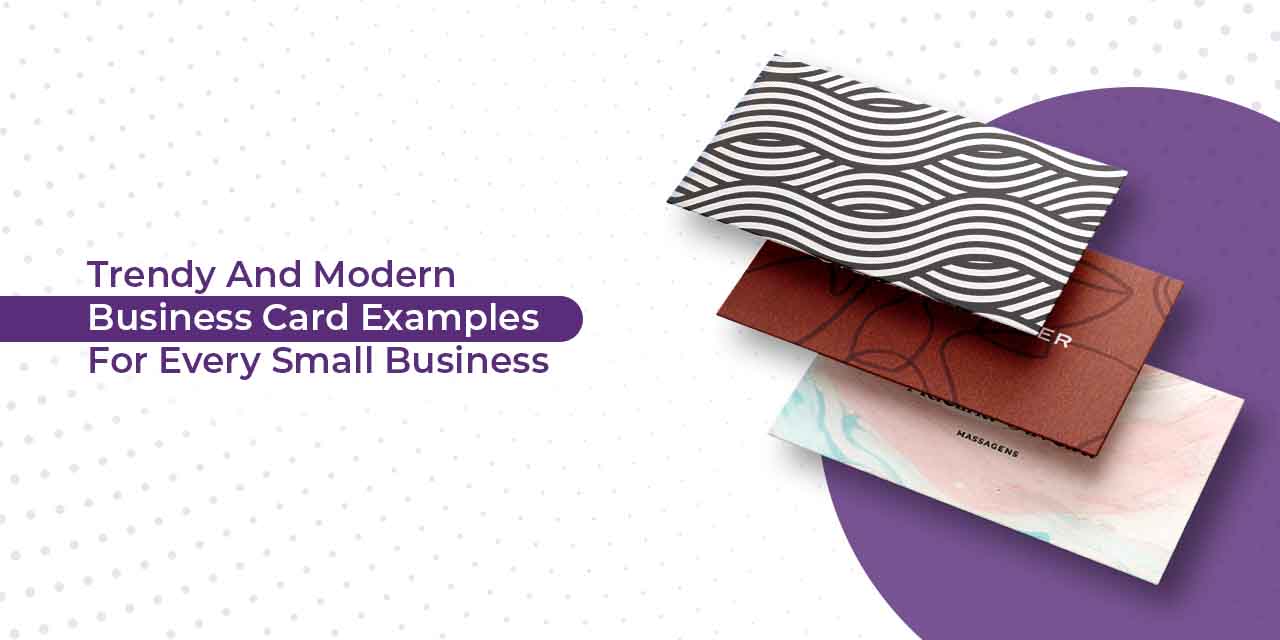
Brands, these days, often get confused with what kind of design would suit best for their brand. Be it striking visuals or a bold color palette, the design you choose must resonate with your brand personality. In this blog, we have listed down a few modern business card examples and approaches you can consider while designing your business card.
Business cards examples for every business
There are endless possibilities and designs to explore that will inspire you toward your perfect business card. Check out these 23 modern design examples for various types of businesses that will win you clients and calls.
Retail businesses
As of 2022, more than 1 million brick-and-mortar retail stores run in the United States, selling a wide range of products to consumers. The result is saturation and more competition. However, with smart marketing tactics and genius branding, your storefront can become the talk of the town.
Grocery store business cards
Think about your audiences when you design business cards for your grocery store. For example, this bright yet minimal print card that judiciously used its brand colors exudes a fun-friendly neighborhood grocery store vibe.
More than direct consumers these cards would benefit the networking of suppliers who may want to sell through your store, thereby expanding your inventory. Use the back of business cards to fill in essential information like the store address, email, phone number, or link to any social media community you may have.
Highlight key USPs of the store, such as free home delivery, discounted pricing, etc. to attract more customers.
Drug-store business card examples
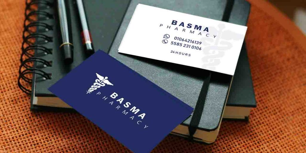
Look for modern templates with enough negative spacing to jot down essential details. For a drug-store brand, use primary shades of blue and white as they convey healing energy to customers. Keep the fonts lighter with minimal typography. Restrict to precise information. Most drug stores avoid quirky content to highlight the important details in their cards.
Auto detailing business cards
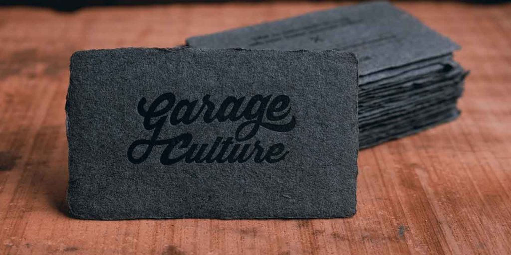
Do you want your auto detailing business to stand out? Then use different materials other than paper or cardboard for your business cards. This fantastic card by Garage Culture combines a cotton paper stock base with its logo in the center of the card.
You can use other materials that are used in automobiles, like tiers, seat fabrics, etc. to show your brand and services. Check out more auto-detailing business card ideas here.
Massage therapist business cards
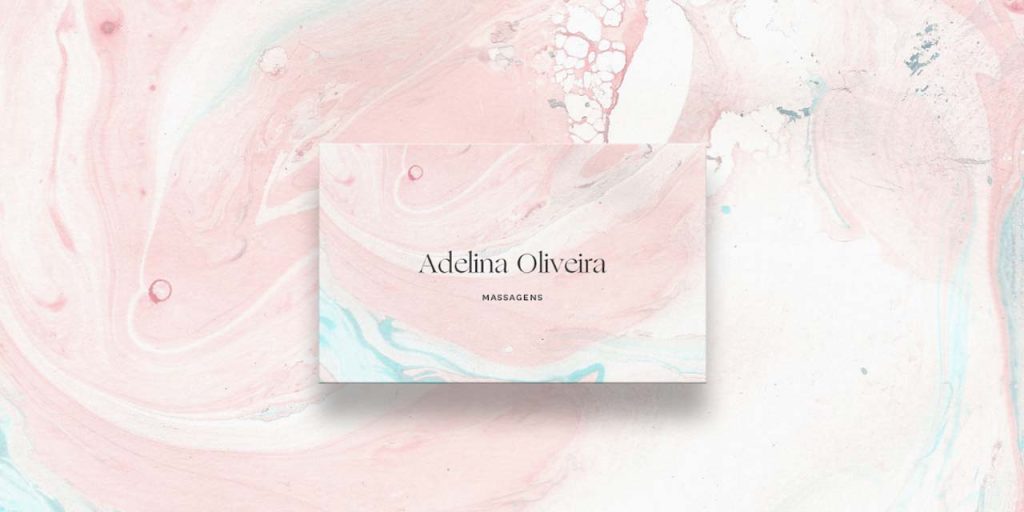
Source by Adelina Oliveria
Use similar patterns and color schemes as this muted pastel color business card which is bold yet elegant in terms of design. The intricate patterns and soothing typography looks creative and balances out the complexity of the background.
These patterns can be compared with calming stones and rocks, which are an essential part of massage therapy. Such a beautiful design will assure your customers that they are in for a relaxing session at your store.
Plumbing business cards
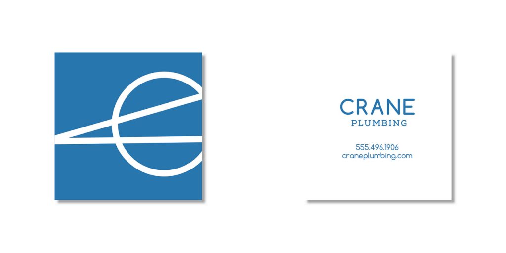
Think fair and SQUARE with your new plumbing store business cards. There is no hard and fast rule or standard size for business cards. It can be any shape or size, as long as it complements your brand aesthetics.
This modern and minimal square business card by Crane Plumbing is a perfect example of how you can add a simple twist to your visiting card designs. The front of the card highlights the company logo/monogram, while the back of the business card has the complete information your customer requires.
Roofing business cards
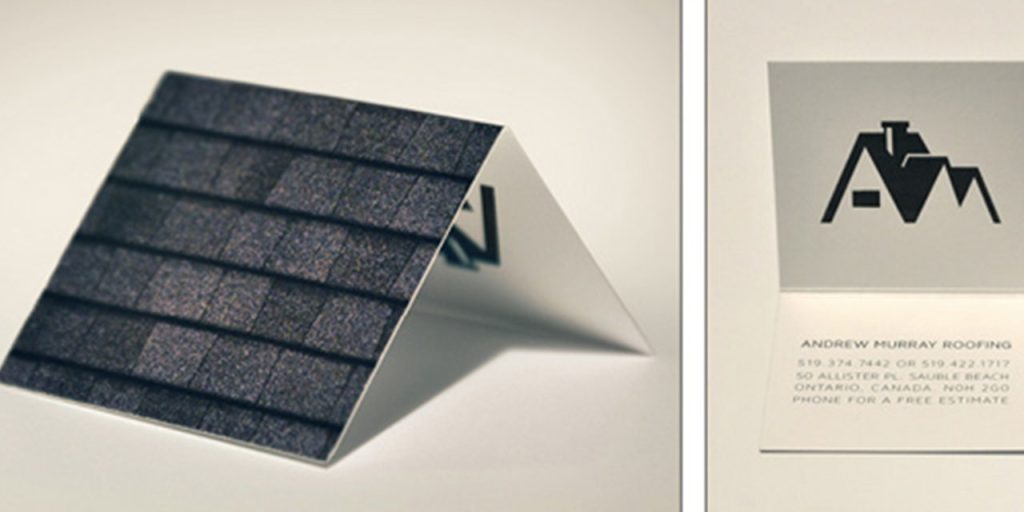
There are more interesting ways to showcase your roofing business than a plain rectangle business card. Try out perforated cards that split or fold in half and form the shape of a roof. It provides a fun activity for the customer and allows you to spell out your brand without giving textual details. Keep one side of the card plain with only a roofing textured background and include details on the other side of the card.
Paparazzi business cards
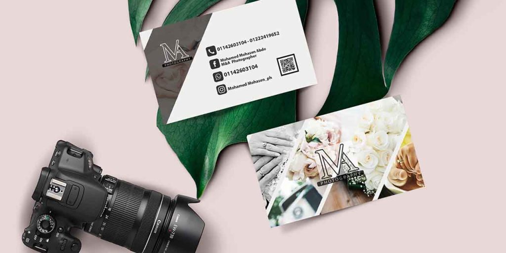
Get on your paparazzi game starting from your business card. You can use these cards to create a mini portfolio of your work to ignite interest in the potential customer. Create a collage of your previous work to show off your photography skills. Win hearts from the first interaction.
Moreover, using your work on your business cards will give you an edge to stand out from other photographers.
Floor and decor business cards
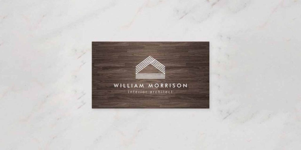
As a flooring business, you must have plenty of materials to design your business card, then why not take the more sustainable route and develop wooden material business cards?
They are sleek, modern, and extremely creative. You can opt for various typography options and experiment with text as well. Get your brand name carved out on the wood, or simply, get it printed or embossed, the possibilities are endless, and the material will give your customer a glance at the quality you offer.
Creative professionals
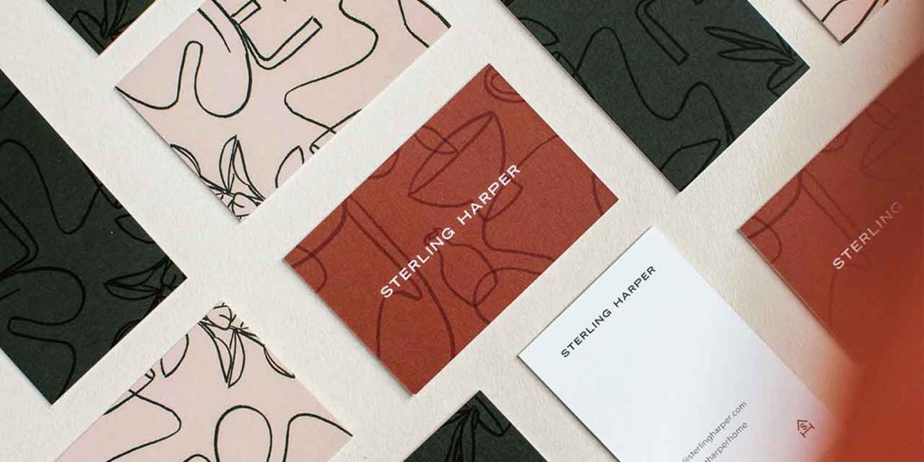
Provide an interactive visual experience to your customers through your business cards. If you are a freelance creative professional, use icons and illustrations to map your brand vision. Line art on a pastel background gives your design depth and meaning that receivers of your card will spend time exploring.
The more artistic ability you show in your business card design, the higher the chances are for your potential customers to take your work seriously. You can weave your design story in your cards and create a lasting impression.
Daycare business cards
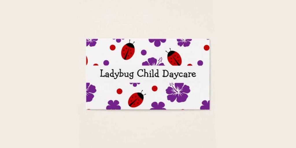
Use bright colors and cartoon illustrations to tie up with the core values of a daycare business and establish trust with your potential customers. Maybe take out the most popular painting from the last children’s competition and print it out on your cards with playful fonts. If you want your daycare business card to be a hit amongst the parents, ensure playfulness, trust, love, and care in each interaction.
Architect business card examples
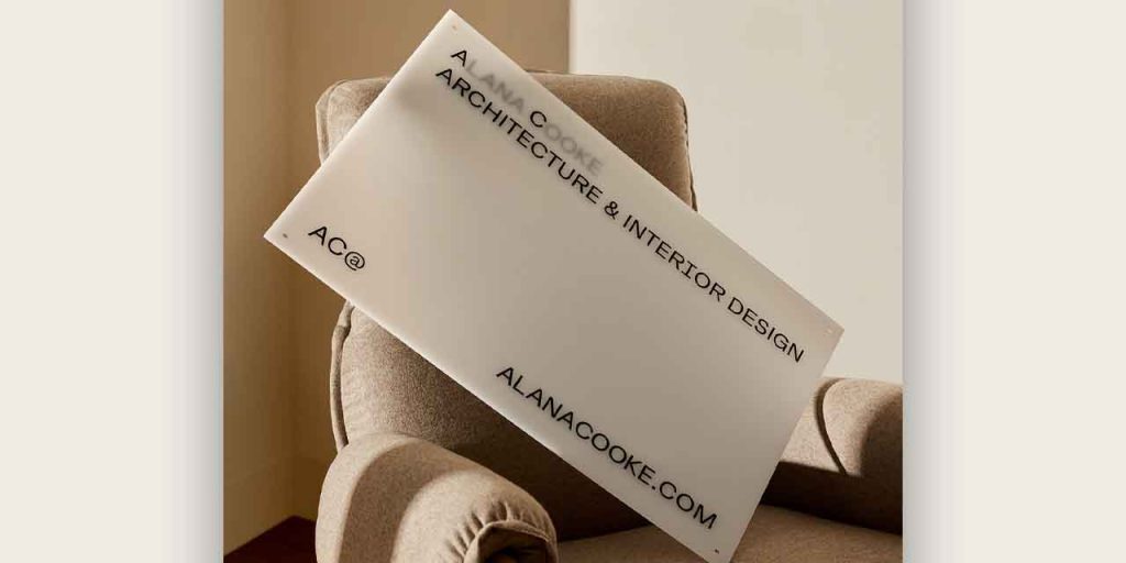
This subtle and minimal card design from Alana Cooke Architecture shows exemplary branding, exactly what an architecture business needs. The use of translucent plastic material instead of paper and clean fonts elevates the brand’s level of elegance. Since the initials of the brand are actually the logo itself, they cleverly blurred out the rest of the letter to highlight the logo.
Business cards for pet grooming
Pet grooming centers can try out illustrations, images, or quirky typography, depending on your business voice. The illustration of the dog on the business card is so large that it actually wraps around the front of the card to the back. This funky illustration provides an unexpected look to your pet grooming business card.
Personal trainers & fitness industries
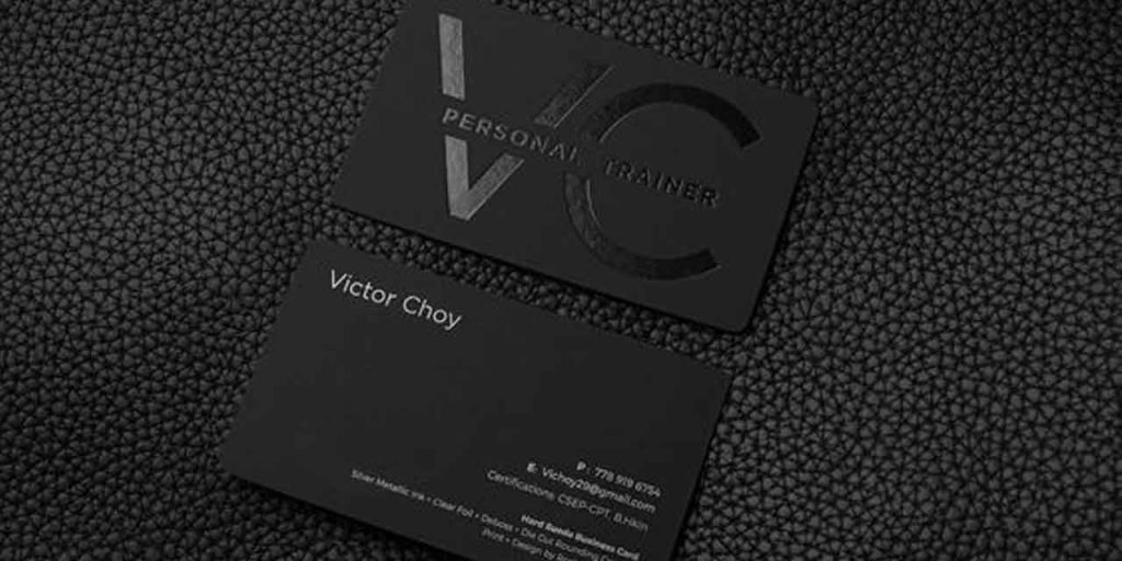
Most businesses would avoid using black since the color overpowers the design. However, with an ever-evolving profession, using various shades of black complements the brand tonality.
Use the darkest shade of black in the background and create the logo with a shinier material of a lighter shade of black. Here the blend and the difference in texture create the contemporary effect. You can use the back of the business card to share business details.
Bakery business cards
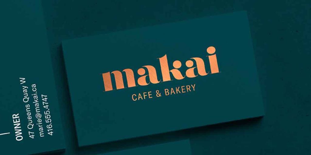
Bakeries should evoke the senses of the receivers through their cards. Use images, textures, and typography to attract customers.
If you are a home baker, opt for minimal illustrative logos and fonts which look more handwritten than printed. Use edgy materials like craft papers that look recycled, to give your business a rusty and homely edge. Let the creases and crooked corners of the material provide a textural finish to the business cards.
Fast food restaurant business cards
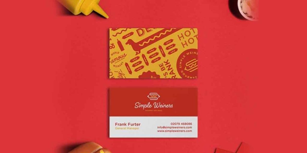
Think about your customers and the food you serve. Is it teenagers or adults or school-going kids? Do you serve Chinese or Italian? Highlight these aspects in your business card.
For example, the business card of Toko Downtown in Dubai, one of the best Japanese restaurants, spells out the culture and modern art that the interiors of the restaurant carry. The marbling painting technique and modern subculture create a bright and rich visual for the restaurant brand. You can use a similar approach for your high-fashion store.
You can also use custom-made flat illustrative designs with peppy colors to make them look more tempting. Don’t know how to design illustrations? Get a dedicated designer and unlimited graphic designs for just $399 per month from Design Shifu. Don’t shy away from funky-looking graffiti that resonates with your audience. Most brands stick with red and yellow because these colors evoke hunger.
Photography business cards
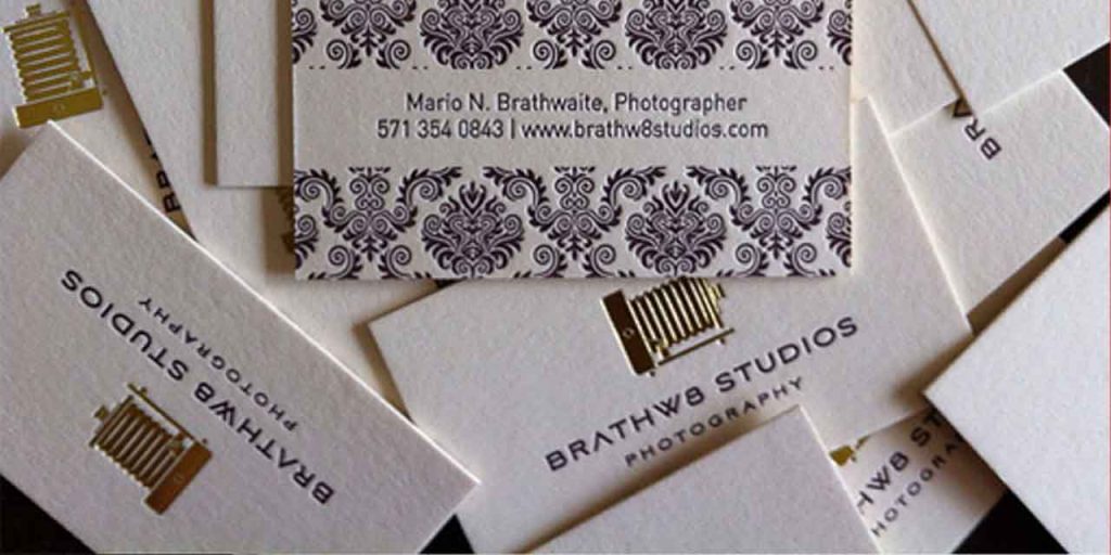
Use a gold foil business card for your professional photography business. Using canvas material gives depth to the textures you print on these cards.
This business card is a great example of how textures and patterns can marry each other to create simplicity and style. The middle of the card has a clean cut to create a blank canvas for the contact information.
Real Estate Business Card Examples
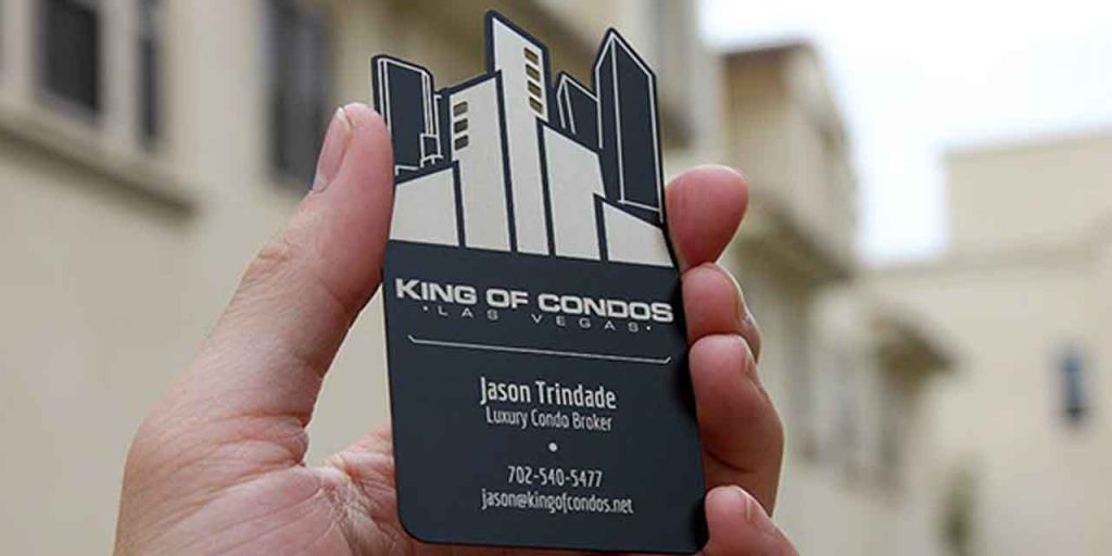
The design output of the business cards completely depends on what persona you create for the brand. For something as versatile as real estate, you can opt for a clean, sleek, and professional-looking card that depicts luxury and finesse. Or you can stand out with an unusual cut-out business card just like the ones from King of Condos to leave a mark on your potential customers.
Personal Business Card Examples
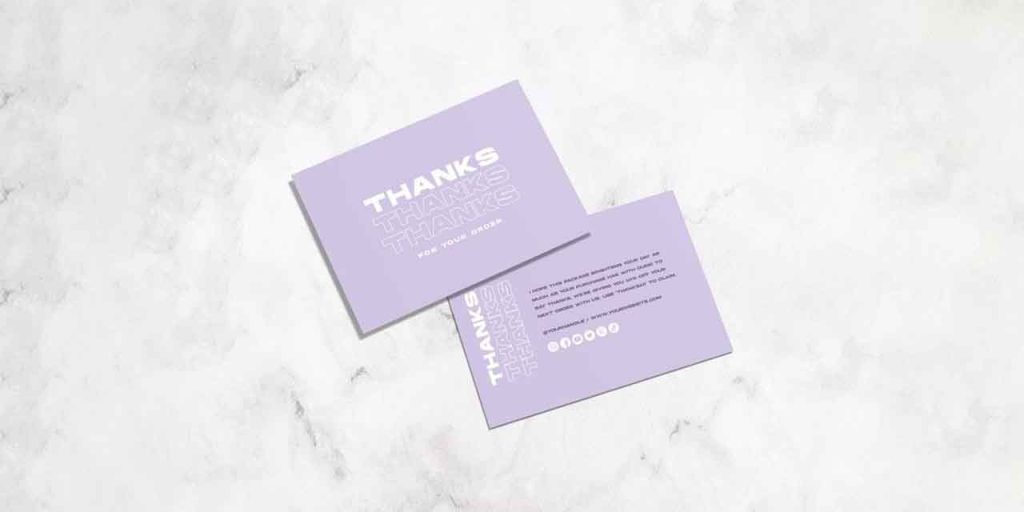
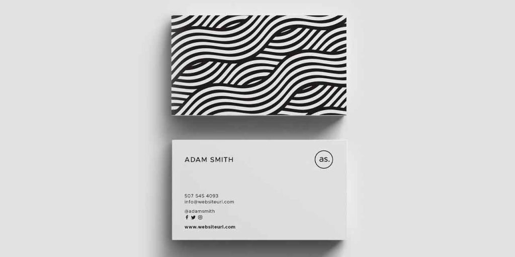
If you are an independent creative professional, such as a florist, photographer, designer, decorator, or baker, your business card must depict your style. Add personalized messages or content on your business card to create a first-person interaction with your consumer.
You can add depth to these visit cards by creating a repeating background with your logo. Give a glimpse of your talented portfolio to build more trust. When you design a personal business card, make sure to include your name.
Professional Business Card Examples
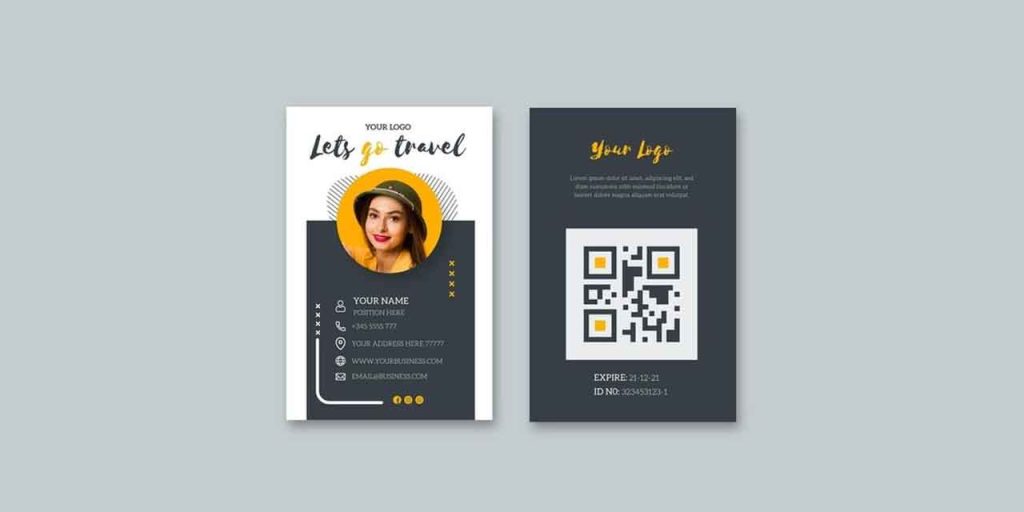
Welcome your customers to the new age of digital business cards. Stand out from the rest and create a customized digital card that will take your marketing game to the next level. These cards are easy to design. The best part is you can change them anytime you want without discarding a batch.
Add a QR code and showcase your social media pages or an existing online portfolio for potential customers’ reference.
Artist Business Card Examples
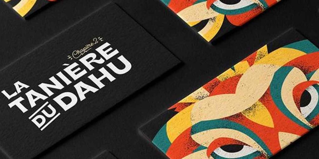
Create dramatic and eye-catching designs in your preferred genre of art to wow your potential customers. Give them a taste of your work by making your business card one of your masterpieces.
Boutique business card examples
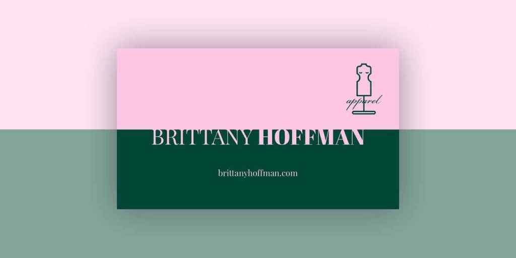
You would be surprised to see what two contrasting colors can do to a design. The mix of the soft pastel pink with the deep earthy green gives a Yin-yang element to the design and makes it look more cohesive. The synergy of the color pairing is unreal. You can adopt the approach to create your own color combinations and templates.
Business Card Etiquette
You cleared the first step in communicating your brand’s message to your potential customer, however, the several seconds you spend while sharing the business card and the actions you take in this tiny span of time, speak volumes about the kind of impression you want to leave.
A lot of things can be taken into consideration and not a lot of preparation is required, but following some basic etiquette while sharing or receiving business cards, can help you build an excellent rapport and network.
- Always carry extra: While trying to expand your business you never know when the opportunity strikes, hence make sure you don’t embarrass yourself in a situation where you might actually be introducing yourself to a potential network/customer but you forgot your business card at home!
- Keep the cards within reach: You must be swift and smooth while exchanging cards. You don’t want to fumble or rifle through a dozen things looking for your business card. It hampers your positive and confident impression.
- Have fresh cards: Do not share cards that have faded out, are crinkled, or are old. Your business cards are the sole communicator of your brand/store; hence they need to look fresh and new. A little attention to detail can take you a long way.
- Maintain eye contact and don’t interrupt: You are likely to have a conversation with the person you exchange your business cards with. A good rule of thumb is 50/70 where you keep eye contact 50% of the time that you speak and 70% when listening. Do not interrupt the other person’s line of thought or speech. It is considered rude.
- Send cards with products: If you are to hand over certain samples of your products or other brand materials to a client, make sure you always include the business card in the package.
How can you design your own business card?
It is not rocket science to develop your own business card designs. However, a few tips can amplify the design:
Design a template
Several online design software are available for free. You can create your own template or edit an existing one from the software library to design your business cards. However, we recommend you design your own templates to keep them unique.
- Choose an appropriate font for your business card. The endless number of options can be overwhelming but always stick to your brand bible.
- Include imagery/graphic elements/illustrations etc depending on your brand aesthetics, services, and products.
- Include essential details like the name, contact information, address, email, logo, and social media page links.
- If you are confused, do not have much time, and require help, connect with professional brand designers and digital artists. These professionals will analyze your brand from top to bottom and provide you with the best creative solution and design for your business cards.
Alternatively, you can also subscribe to Design Shifu and get unlimited graphic designs made by a dedicated designer to take care of all your design needs.
Wrap Up
Making your business card personal to you and your branding is one of the unique ways of leaving powerful and memorable impressions in your first interaction. Before you pick and choose from the plethora of business card examples, brainstorm and define your brand.
You can keep it as simple as you want or go crazy with the design; it depends on the message you wish to deliver to your audience. We have done our part by providing you with the best possible examples of the designs that are in trend. The next step is yours!

