For several brands around the world, brochures are a marketing goldmine for reaching their target audiences and influencing their behavior.
It is possible, however, that you are just redirecting your potential customers into the arms of your competitors if your message doesn’t get across well. Brochures can get through any communication to your customers, be it research data, product information, brand awareness, and even promotions. Your company’s brochure acts as a word of mouth for the audience in places where you cannot physically advertise yourself.
Brands struggle a lot when it comes to finding the right brochure design. Designing an effective brochure that represents the brand’s vision, mission, and aesthetics is of utmost importance. We have gathered tips and inspiration to help you put together a strong product promotion brochure that brings conversion.
How to make an effective product brochure?
Prerequisites before designing your product promotion brochure
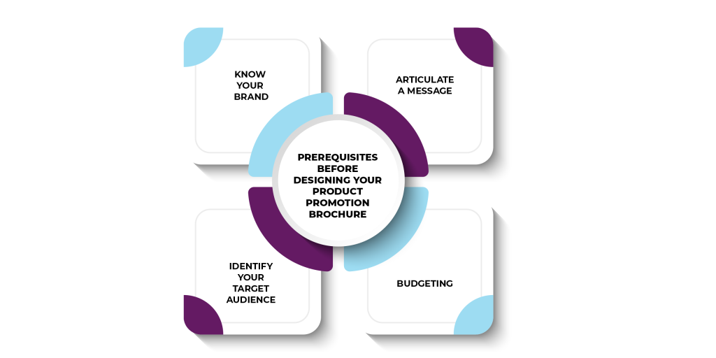
Know your brand
Identify who you are and what the brand stands for. In the absence of identity, none of the marketing tools will align with your brand.
Identify your Target Audience
Ask yourself, who am I designing for? Once you define the audience you want to target, you will make the right choices in terms of design, communication, message, and other design elements.
Articulate a message
Spend time writing the content for your brochure. You do not want to confuse the audience; you want to persuade them. Having a strong, clear message in the language can make or break a sale.
Budgeting
Brochures are usually printed, which accounts for some marketing budget. Starting from design to which paper you want to choose for your brochure, will require you to set a budget and work accordingly.
Designing your brochure
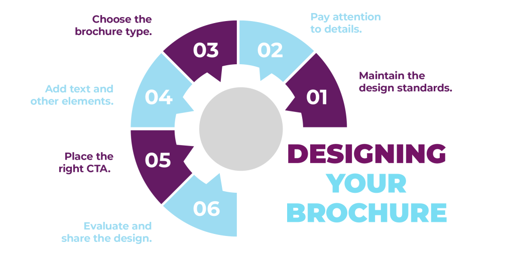
Maintain the design standards
You need to remember your brand identity and use elements and styles that match your brand. It doesn’t matter what type of brochure you’re making as long as the design is consistent and aligns with your brand personality.
Pay attention to details
Think about the reader when you are redesigning. You want to pay attention to details like keeping big blocks of text without overwhelming them and using relevant visual elements for the readers.
Choose the brochure type
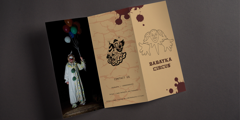
There is no set rule for the type of brochure you should design. As per Printaholic, there are at least 15 ways you can fold your brochure. For example, tri-fold, z-fold, bi-fold, parallel-fold, roll-fold, half-fold, etc.
Add text and other elements
Get your text and images ready for placing once you have set everything else. Make sure you choose a template according to your text to avoid spacing issues. Use headlines, sub-headers, headers, descriptions, and relevant visual elements to grab the audience’s attention.
Place the right CTA
Encourage your readers to take action. Include your CTA where it simply becomes hard to miss. You don’t need to put your CTA only in one place, it can be added in multiple sections. The goal is to add a relevant call to action based on your communication agenda.
Evaluate and share the design
Proofread your brochure, and ask for inter-departmental opinions before you decide to print the lot. The design must be evaluated before reaching your audience.
Why not take help from Design Shifu to design an effective product brochure for you? You get unlimited graphic designs and a dedicated designer to take care of all your design needs.
Product promotion brochure ideas and tips
Knowing your audience
The key to having a successful brochure design is to first understand your marketing objective or goal. First, determine your customer type. Knowing your customers will allow you to choose key elements in design accordingly. For example, the message for senior citizens will not be panned out the same way for Gen Zs. Your graphics and copy will rely on your target audience. Using colorful elements, drawings, funky fonts, and imagery would attract a younger crowd.
Mapping out your goals
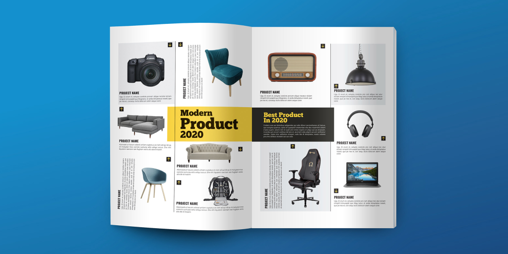
Be clear about what exactly you want your product promotion brochure to do. Whether you want to create brand awareness by asking the audience to visit your website, you want them to come to your SALE offer, or you simply want to highlight the best products of the year. Your goal will help you determine which message to highlight and craft a clear conversion-oriented CTA.
Working on structuring your message
Once you have figured out what and who your focus should be, the next step is developing a copy and creating a layout. The only way to do this is by knowing what will go in the front, middle, or back of the brochure.
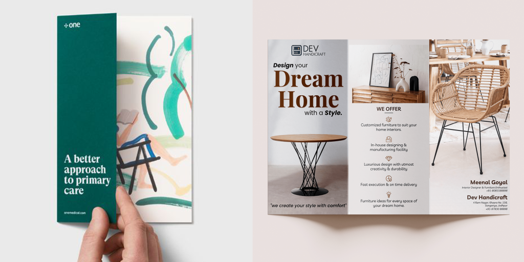
Use bold headlines in the front
You must capture the audience’s attention and lead them with a perceived problem followed by a solution. Compel them with a strong headline. Use headers when you write the main content and then back them up with short descriptions about products. These headers act as visual maps for the readers and help you skim through irrelevant points without using big words.
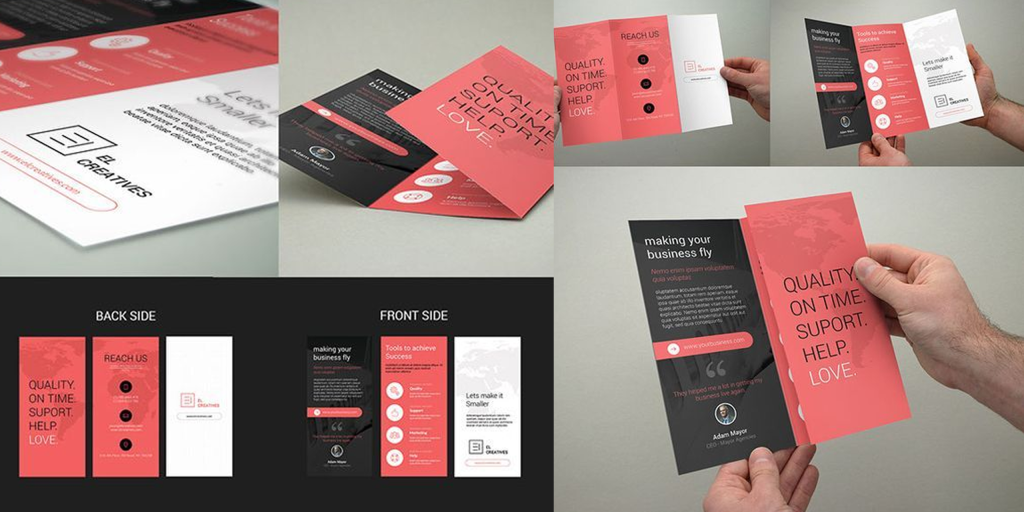
Include the necessary details
Along with catchy headlines, include the brand logo, tagline, contact information, address, website, and social media handles in a readable format. Add taglines, brief text to explain the products, and focus on benefits to keep the audience intrigued.
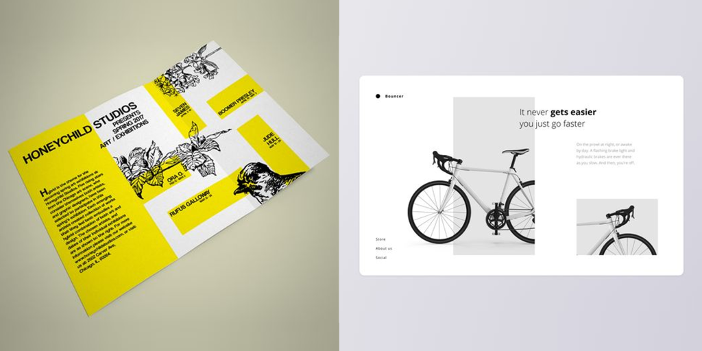
Adding high-quality images
While one large high-resolution featured product image does the work, the number depends on the products and layout of your product promotion brochure. Let the products speak for themselves.
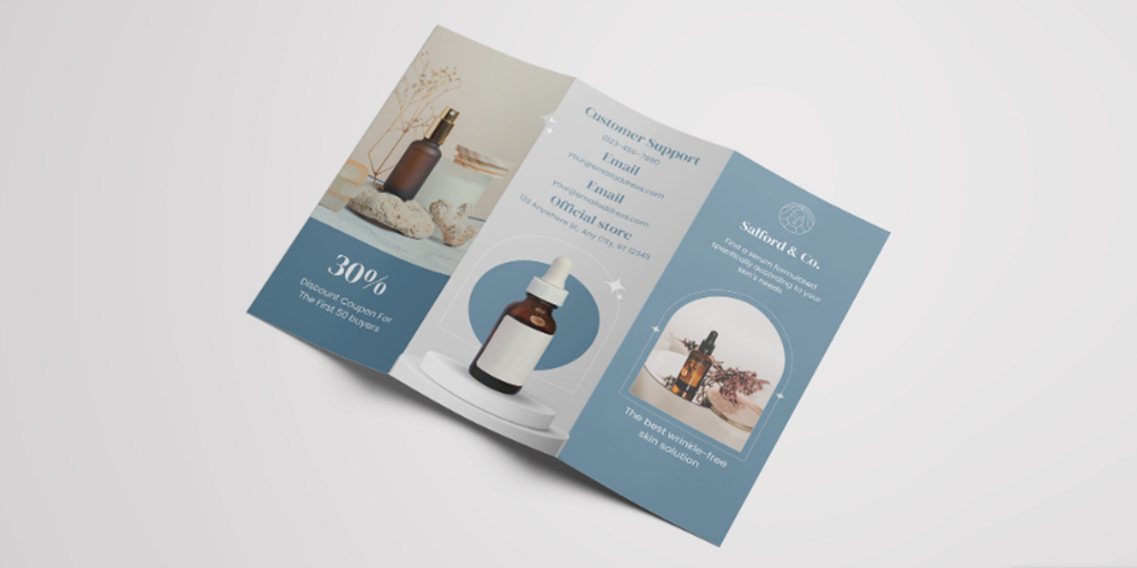
Now, it is important to note that your business may not have the marketing budget for a professional product photoshoot. You might get tempted to use stock images in your brochure, but it is not recommended at all. Especially while making a product promotion brochure, try to use authentic images of your products alone.
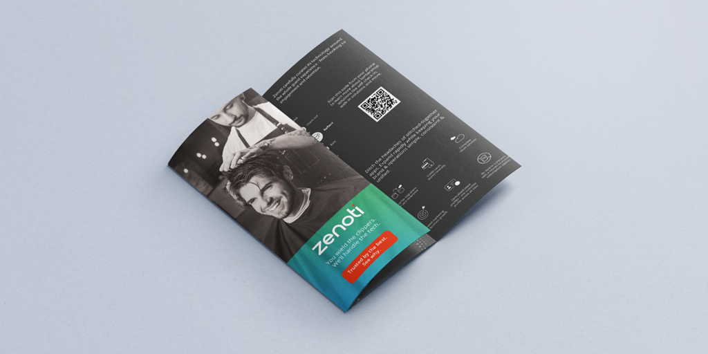
If you are short of your product images, use the owner’s power and make your face the main highlight of your brand. This works well for bakeries, beauty brands, independent service providers, etc. You can also use custom illustrations and icons.
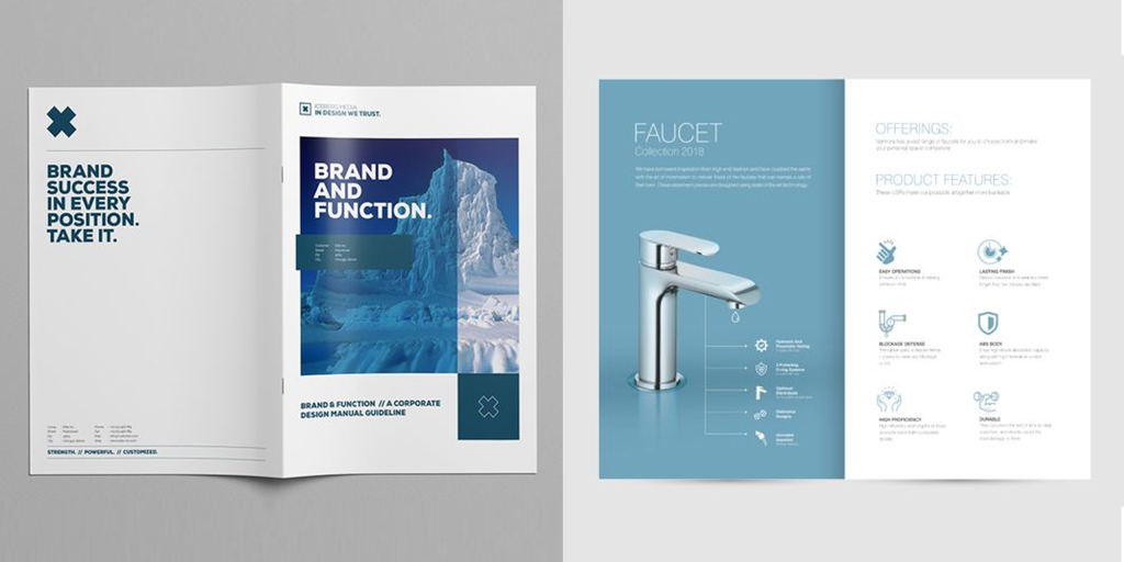
Picking the right layout
Once you have your text and images in place, it is time to design the layout. A clean and neat layout can be read effortlessly. Any friction in reading efforts can land your brochure in the trash. So, your goal is to not just fit your content, but also to structure your product promotion brochure around it. Consider alignment and brand aesthetics.
You can resize, crop, and structure your images based on the template to make them look cohesive and creative.
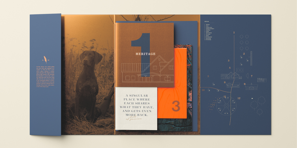
Or, you can let the whole image take up the space, so it overflows to the next page without cropping them, and add supporting elements alongside.
Text can be placed alongside the image allowing more negative space to fill the design. This gives out a clean, minimalist look to the brochure.
Using the right colors
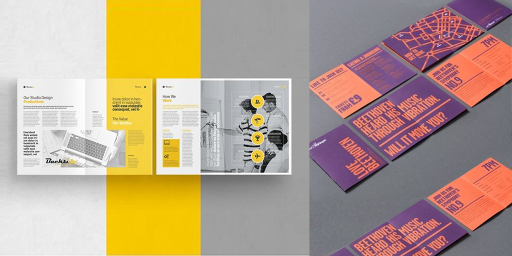
While we understand colors evoke emotions, do not overdo it by adding more than two or three colors. The principle is the same as font; you do not want to confuse the reader visually. Include brand colors to strengthen brand recall, or use solid colors if you are yet to decide on a color palette.
Repurposing your design
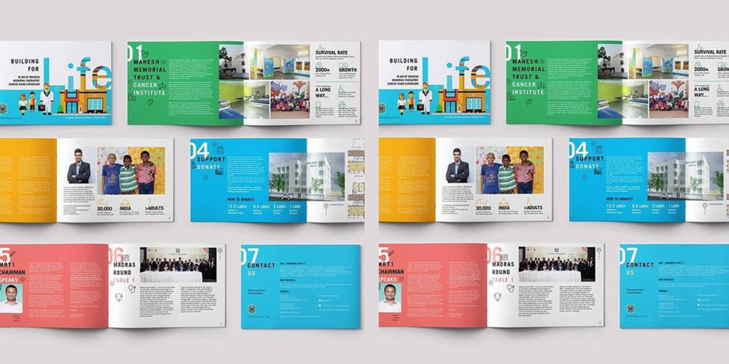
The final tip of the day is to repurpose the design. You have come so far with your brochure that we want you to maximize the use of the design. Your brand can have more products and categories that may not be relevant in a single brochure. Hence, tweak the colors, the images, and the text while keeping the same design, and you have brand new brochures for different products for every new launch.
Let’s design a product promotion brochure!
No matter how big or small your brand is, the above tips will ensure that you create the perfect product promotion brochure for your brand. In case, you need an expert to do this for you, Design Shifu can help you. You get unlimited graphic designs for a flat monthly fee of $399. You also get a dedicated designer to work on your design requests.

