In this blog

Need a quality design at scale?
Subscribe to receive the latest blog posts to your inbox every week.
Who has not seen website banner ads? If you are not living under a rock or have been extremely out of the digital era (though it seems very unbelievable), you would have come across a website banner ad.
There are times when we get fascinated by the ad more than the actual product and the reason is website banner ad design! So we thought of taking you through a list of website banner ad ideas you can use on your website and third-party sites to get maximum clicks, let's get started:
Key elements of a website banner ad design
What are the key elements that should be added to your website banner ad design:
Brand
That’s a no-brainer unless it’s a teaser toward a major launch.
CTA
The target audience, if intrigued by the website banner a./d design would want to know more about the product and hence the banner should lead them to some website or a sign-up page.
Keywords
Amidst millions of banner ads, how would you ensure your ad reaches the intended customer? Through your keywords. Hence, the banner ads should include keywords specific to your brand.
Visuals
Aesthetic quality design will instantly interest the target audience and hence, high-quality images and designs have to be used.
Relatability
Be simple and to the point. We have to take into consideration the demographics of our target audience and accordingly keep the communication relatable to the target audience.
In case you are interested, get unlimited graphic designs for just $399 per month from Design Shifu, You can also refer to advertisement poster ideas examples.
Let us look at some examples of website banner ads and give a lowdown on each of them.
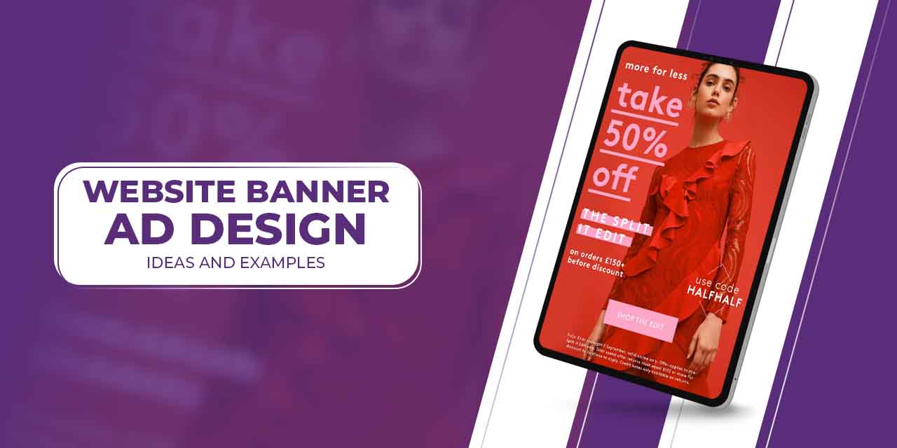
Best Website banner Ad design Ideas and Examples
E-commerce Website Banner Ad Design
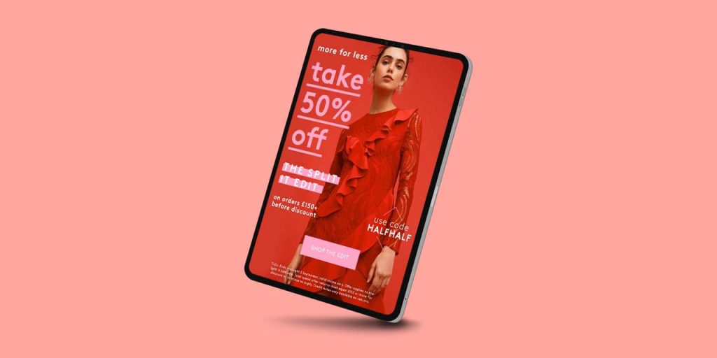
This website of the fashion label, Edit The Brand is extremely aesthetic looking and even the copy, “More For Less” is such a simple and powerful copy. The CTA, “Shop The Edit” is so unlike the ones we are used to seeing. Without using the standard practice of the logo, they have mentioned the brand name twice and at such critical places that it instantly catches the eye. So, this website banner ad design is something that can be used as an inspiration by fashion labels.
Netflix Banner Ad Design
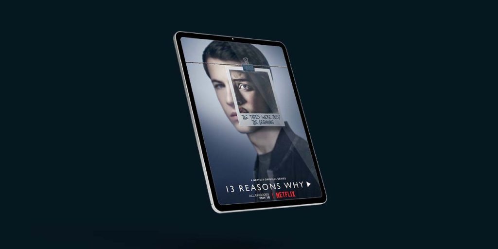
This website banner of the Netflix show “13 Reasons Why” relies only on the poster of the show. Fans of this series would have a strong recall value of the characters and hence, the play button that is next to the word “Why” acts as a good CTA, despite it not being highlighted. A stellar ad design and less copy make this ad extremely effective and successful for the brand.
But can you pinpoint one thing that this ad is missing? Not able to reach out to the new target audience of Netflix. If this is a retargeting ad, then it is excellent, however, to repurpose the same ad for a new target audience, the brand could use the CTA offering some discount to the new Netflix target audience or probably give some benefits for the first-time target audience.
Food Delivery Website Banner Ad Design
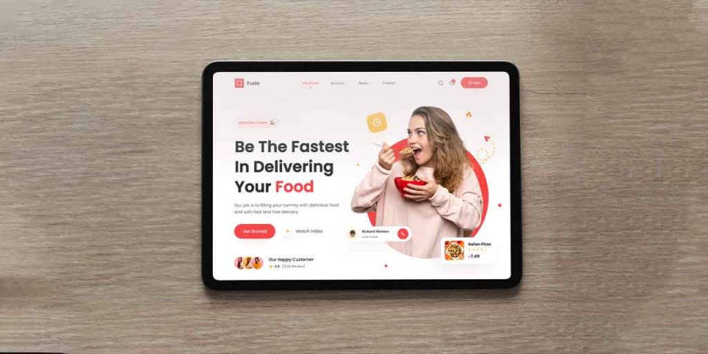
This food delivery app website banner ad design aims to satiate the gastronomical needs of the target audience. The message is clear that they are the fastest in delivering your food. The banner also has 3 CTAs’ that give the brand a chance to cater to different audience sets and also for the customer the choice to select their favored option. The only thing that is missing from the banner is the food variety. If that could have been added, the banner would be more effective.
If you are looking for some cool restaurant design logos, check out: Tempting New Restaurant Logo Ideas to get inspired
Nike Banner Ad Design
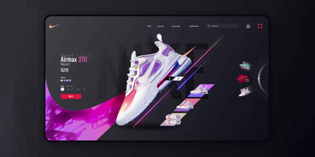
This animated web banner/ video banner of Nike showcases a list of sneakers that customers can buy with a simple CTA, “Buy”. A video banner gives the brand huge scope to showcase its product range without compromising on the quality of the banner. This banner is from the Nike website, so you will find other menu options too. However, if you have landed on this website through some other website banner for cool sneakers, then this website ad banner does the job.
Beverages Brand Website Banner Ad Design
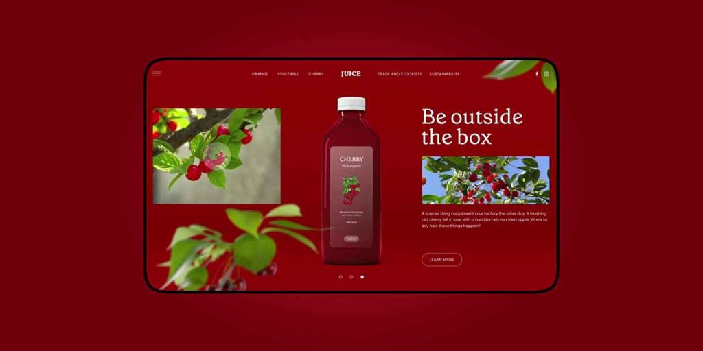
This website banner showcases the variety of juices provided by the brand. What stands out in this banner is that the brand uses both benefits as well as the ingredients that assure the customer of the quality of the product as well as the testimony that the brand delivers as per the promise. However, the CTA “Learn More” doesn’t stand out much, which could have been improved. Overall, the design is aesthetic and will catch the eyes of the target audience.
If you are a brand in the physical product space and are looking for some cool packaging ideas, then you can get inspired from
Marketing Agency Website Banner Ad Design
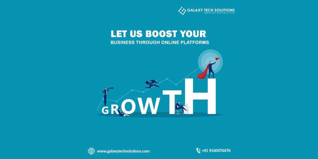
The image is effective; however, the copy is very broad. What this brand could have done is provide some testimonials. For eg: “Let us boost your business through online platforms as we have done with our 100+ clients.” How this helps is that it gives a quantifiable testimonial to the target audience and they know that they can rely on this brand for their business growth. Also, the CTA could have been much more action specific like, “Learn how to grow your business” or “Get started on your dream journey!”
Design Agency Website Banner Ad Design
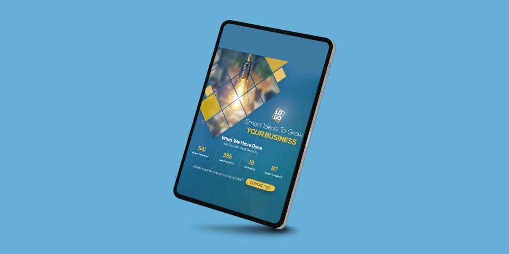
This website banner ad design fulfills what the website banner above couldn’t fulfill and gives you exact statistics of how they have provided their services. They also give their company structure and achievements that will satisfy the user that they are dealing with a good brand. Even though the CTA, though simple “Contact Us” could have been better, this ad would have led to more clicks than the previous one.
Freelancing Services Website Banner
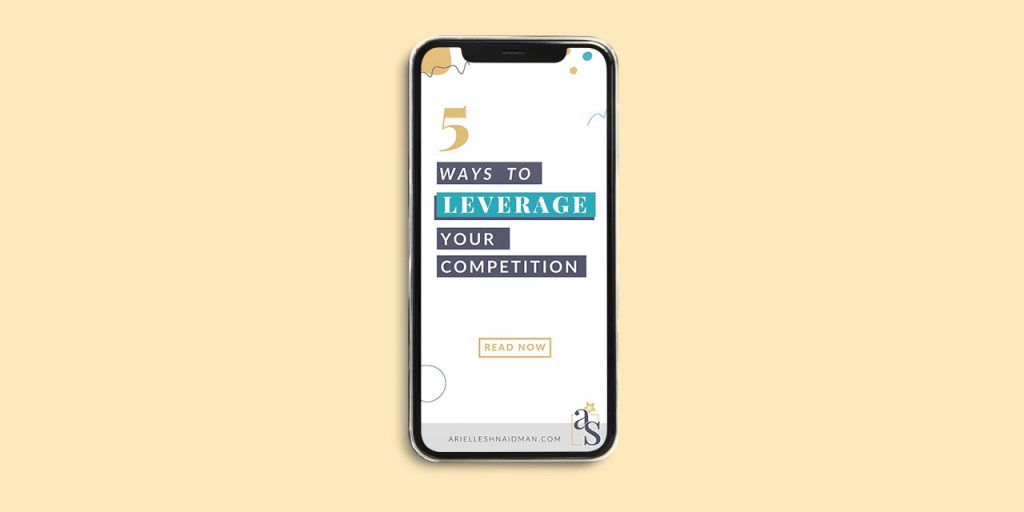
This is a curiosity gap in copywriting. We all want to stay ahead of the competition and if someone gives some real quick tips to achieve that, then the human psyche is to immediately grab it all. And hence, the user will click on “Read More” to get the tips.
A simple design highlighting only the copy makes it an effective web banner ad. Also, the brand understands that a simple banner ad will not lead to sales, so why not entice the target audience with some freebies and gain their trust, before pitching the brand services? This is a perfect way to create a website banner ad.
Home Decor service Brand Website Banner
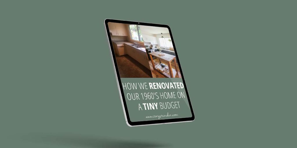
A classic before-after scenario. Here the brand brings out a personal achievement on how they transformed their own home at a modest budget. They also showcase it with before and after pictures. However, the only thing lacking is a good CTA instead of their website link. They could have used the CTA as “Click here for your home transformation”. This ad strikes the emotional connection of the target audience and hence, is a very effective ad for homeowners looking for makeovers.
Betting Website Banner Ad Design
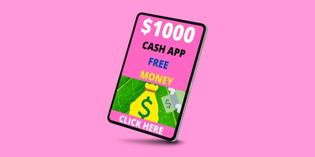
The word “Free” has the most clicks for sure. This one is a classic example of a good aesthetic website banner ad design, along with a customer benefit approach copy. The colors used are bright with a dollar sign that easily attracts the user’s eyes. A doable design that will lead to good clicks because it checks all the boxes.
If you are looking to create unlimited designs like these, why not go through this article and choose Design Shifu?
Real Estate Agency Website Banner
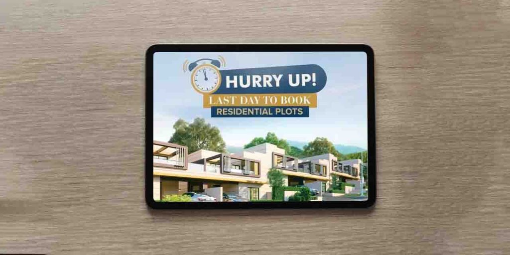
What stands out in the ad? This real estate ad showcases urgency. Time’s running, and you have to book your plot now. The only thing that the brand could have added is some features of the plots as well as a base price of the plots. That could have been an added advantage for the target audience to click and take a decision. Focusing on outcomes and being time-bound is a great approach for writing an effective website banner ad copy. It’s always a great idea to let the target audience know that the promotion has an expiry period.
One more element that the brand could have added is: “X no. of plots have been sold… Last few left.” This also leads the target audience to believe that not just time, even the supply is very limited.
Using Testimonial as a Banner Ad
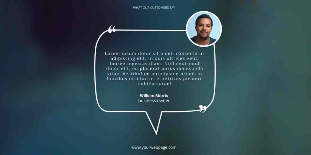
Customer testimonial resonates deeply with the target audience. Because somebody also has used this particular product and has good feedback on it, why not try it for ourselves and give the brand a chance? This is the psyche of human minds and hence, customer testimonial banners always lead to good clicks for the brand. Yes, the testimonial should be from a reputable source and should be relatable to the target audience rather than just using flowery words.
Conclusion
These are some of the website banner ad design examples that you can use for your brand. But, keep in mind that your ad copy should be relatable to your target audience and the design has to be aesthetic.
In case you are finding this overwhelming, why not reach out to Design Shifu to provide you with a dedicated designer and unlimited graphic designs for just $399 per month?
FAQ
About the author
Sameena is an Organic Growth Specialist and Content Writer at Design Shifu, crafting SEO-driven content that boosts visibility, builds brand authority, and drives meaningful organic growth.