
Poster design for your business doesn’t have to be difficult. If you have a clear message and a crazy idea to roll out, all you need is to get the fundamentals right to publish a poster that brings results. A successful poster campaign grabs the passersby’s attention and draws viewers in with a simple, uncomplicated layout so the reader can grasp information effortlessly.
A successful poster grabs the viewer’s attention instantly and communicates information through a clean, eye-catching layout. Let’s walk through the essentials of effective poster design to help you create visuals that are not just beautiful but memorable and impactful.
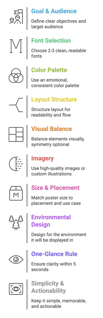
TL;DR
- Define a clear goal and audience
- Use 2–3 readable fonts
- Stick to a consistent and emotional color palette
- Structure layout for readability and message flow
- Balance elements visually (even if asymmetrical)
- Use high-quality visuals or custom illustrations
- Match size to environment and use case
- Ensure clarity with the one-glance test
What Is Poster Design?
Poster design is the art of using graphics and text to produce attention-grabbing posters that inform, advertise, or persuade. It brings together creativity and communication, employing layout, color, and typography to convey a clear message with a glance.
Whether promoting an event, launching a product, or raising awareness, posters are designed to catch attention and communicate quickly often in crowded or fast-moving environments.
But a great poster doesn’t happen by accident. That’s where the fundamentals come in.
What are fundamentals of poster design
A poster that looks good but fails to connect with its audience or one that’s hard to read, cluttered, or confusing won’t serve its purpose. Understanding the core principles of poster design helps you make informed creative choices around typography, color, layout, imagery, and messaging. These principles ensure that your poster isn’t just attractive but also effective.
Mastering the basics allows you to:
- Make a strong first impression
- Guide the viewer’s eye to what matters most
- Communicate your message in seconds
- Build trust and professionalism through cohesive design
In short: great design is built on great fundamentals. Let’s explore the essentials that make a poster not just visually appealing, but results-driven.
1. Determine the Goal of Your Poster
What sets a good poster apart from a bad one? thats Clarity and relevance with the target audience.
Start by identifying the goal behind your poster marketing effort:
- Are you raising brand awareness?
- Promoting a product?
- Inviting people to an event?
Knowing this will help you tailor the design, copy, and graphic elements to guide the viewer toward a clear action.
2. Know Your Audience
Designing blindly leads to missed opportunities. Understand who you’re designing for their interests, behaviors, and preferences.
Once you know your audience, use tone-appropriate language, color psychology, and design elements that appeal to them. This ensures your message lands exactly where it should.
3. Typography: Choose Wisely
Typography is one of the most underrated design tools, but it can make or break a poster.
- Stick to 2–3 fonts max to keep things readable and cohesive.
- Avoid overly decorative typefaces unless they enhance the message.
- Experiment with bold, wide fonts that demand attention from a distance.
Pro Tip: Use popular font pairs to save time while keeping your design polished.
4. Use the Right Color Scheme
Your color palette sets the emotional tone of your poster.
- Stick to your brand colors for consistency.
- Use color psychology to guide viewer emotions:
- Blue = trust and professionalism
- Green = growth and sustainability
- Red = urgency and passion
Avoid using too many colors limit your palette to 2–4 main shades for a clean, modern design.
5. Layout: Choose Wisely
A great layout guides the reader through your content effortlessly.
Popular layout styles include:
- Vertical or horizontal columns
- Contrasting fields
- Centered graphic focus
- Asymmetrical or radial balance
Choose a structure that aligns with your poster’s purpose. For instance, if you’re comparing two offers, use contrasting sections with clear dividers.
Need inspiration? Start with a poster template and tweak it to match your brand’s voice.
Simple Graphic Design Posters
A simple poster design focuses on clarity and impact. By using clean lines, plenty of white space, and a clear visual hierarchy, the message stands out without unnecessary distractions. Minimalist and abstract styles are especially effective, as they highlight only the most essential elements making the poster visually striking and easy to understand at a glance.
6. Balance- Keep It Visually Stable
Balance doesn’t always mean symmetry. You can also achieve balance with size, color weight, and positioning.
Examples
- Keep spacing even and uncluttered to make content digestible.
- Balance a large element on one side with multiple small elements on the other.
- Use radial balance for designs that draw attention to the center.
7. High-Quality Images & Custom Illustrations
Low-resolution visuals = low-quality perception.
- Use 300 DPI or higher images for print posters and custom illustrations
- Make sure visuals are relevant to the message, including your logo, are large enough to be visible to someone standing 5 feet away
- Avoid cliché stock imagery that lacks impact.
Bonus Tip: Want scroll-stopping visuals? Get custom illustrations from Design Shifu’s unlimited design service for standout branding.
8. Poster Size: Bigger Isn’t Always Better
Besides the size of your design elements, Select the poster size based on:
- Placement (indoor vs. outdoor)
- Viewing distance
- Content density
Typical sizes
- 11×17 inches: Ideal for indoor posters (e.g., cafés, clinics)
- 24×36 inches: Works well for high-traffic outdoor areas or events
The right size ensures your poster looks professional and is easily readable.
9. Consider the Environment
A poster’s success heavily depends on where it’s displayed.
Ask yourself
- Will it be hung on a colored wall or glass panel?
- Will it compete with other visuals?
- Is it meant for pedestrians, drivers, or social media users?
Example: If your poster will be placed on a green wall, avoid green-heavy designs that might blend in.
10. Apply the One-Glance Rule
Your audience has seconds (if not milliseconds) to take in your poster’s message.
Test your design by showing it to someone for 4–5 seconds. Ask them what they remember.
- Was your CTA visible?
- Was the headline clear?
- Did the visuals enhance understanding?
A poster that works in one glance is a poster that works.
Key Takeaways
- Begin with a specific objective: Know what you need your poster to do: awareness, conversions, or event registration.
- Know your audience: Adapt the message, design, and tone to reach the people you’re appealing to. Tailor.
- Typography is important: Employ bold, clear fonts (maximum 2–3) to make it easy to read even at a distance.
- Utilize strategic color schemes: Adhere to brand colors or apply color psychology to sway emotions and interaction.
- Balance and layout dictate where attention goes: A clear, well-designed layout improves message clarity and visual interest.
- Design with context: Correspond poster size, contrast, and layout to the physical or virtual space where it will be displayed.
- Pass the glance test: Your poster needs to be comprehensible in less than 5 seconds to really work.
- Invest in professional images: Utilize clear images or bespoke illustrations to enhance your brand presence.
Final Thoughts: Get Set, Design!
By now, you’ve got the tools to create visually stunning, goal-driven posters that capture attention and drive action. From layout and typography to size and placement each element contributes to a cohesive design strategy.
Need help turning your vision into reality? Get a dedicated designer + unlimited poster designs for just $399/month with Design Shifu. Start creating business-ready visuals without breaking a sweat.
FAQs
1. What is the best size for a business poster?
The optimal poster size is based on the application. Indoor areas are perfect for 11×17 inches, and outdoor or highly visible locations use 24×36 inches. Always take into account where it will be placed.
2. How many fonts should I use in a poster?
3. Can I use any image I find online for my poster?
4. What colors work best for poster design?
5. How do I make sure my poster stands out?
6. Should I hire a designer or use a DIY tool?