Graphic design and art do not simply mean decorative patterns and adding a splash of colors. Certain rules, called the principles of design, must be considered and applied to a design. Proper implementation of these principles is what distinguishes a bad design from a good one.
Andrew Wyeth, one of the great maestros of art, once said that “It’s all in how you arrange things…” and decades later, these principles of design are still in practice. Wyeth believed in the balance of design, he understood that the desired effects in art can only come out through the careful placement of objects on the canvas. Balance is one of the most important principles in design and you don’t need to be a graphic expert to understand it.
Let us explore how balance in graphic design creates equilibrium and how to effectively utilize it to achieve maximum results.
TL;DR
- Balance in graphic design is about distributing visual elements so that no part of a design feels too heavy or distracting.
- It creates stability, harmony, and rhythm in a composition.
- Balance can be symmetrical, asymmetrical, radial, mosaic, or even discordant, each with its unique impact.
- Designers use attributes like size, color, shape, and position to achieve balance, making designs look professional, clear, and visually appealing.
What is Balance in Graphic Design?
Balance in graphic design is the principle of arranging elements so the composition feels stable, harmonious, and easy on the eyes. It’s about creating visual balance, where no single element looks too heavy or distracting. Designers achieve this by playing with size, space, shape, and color to ensure all elements work together smoothly.
There are different types of balance in graphic design. Balance doesn’t always mean things must look the same on both sides:
- Symmetrical balance creates a formal, evenly weighted look.
- Asymmetrical balance uses different elements that still feel balanced and is often more dynamic.
- Radial balance arranges elements around a central point, like a sunburst.
The concept of balance isn’t new, it has been used since prehistoric art and was perfected during the Renaissance. Artists like Leonardo da Vinci applied balance in their paintings to guide the viewer’s eye. Today, balance remains one of the core principles of design, essential in everything from posters to digital art.
Why is balance an important design principle?
Our eyes like to see things in a structure. Graphic design balance is used in storytelling and advertising because it creates clear focal points throughout the image, allowing it to convey the message in the hierarchy.
With the help of balance in design, artists have the freedom to direct viewers’ eyes through composition and draw extra focus on areas of utmost importance.
When there is balance in designs, it is aesthetically appealing because of the rhythm it creates. In the absence of graphic design balance, the entire composition may look messy and confusing.
Having this balance does not mean that everything in the design has to be the same or symmetrical. Designers also use asymmetry, contrast, focal points, and dissonance ( the lack of harmony), to establish the right impact. The key is to understand the foundation of balance.
What are the types of balance?
To understand how to create the balance you must first be aware of the types of balance in design to effectively utilize them to serve your design purpose. Let us explore the types of graphic design balance.
Symmetrical balance in graphic design

Symmetry is a visual quality of an object to appear similar across an axis, a path, or around the center. A symmetrical balance is quite common. Many designers prefer compositions with equal visual weight on each side of an axis. This line can be drawn from the middle in any direction of the design and the image will be equally distributed because of its even visual weight.
McDonald’s logo is a perfect example of symmetry, have you ever noticed this before?

Symmetrical balance adds order and structure to the design and is easy on the eyes. Sometimes, adding complete symmetry to a composition can make it look flat and basic. To avoid this certain changes can be made such as adding contrast in the form of unique elements or colors.
Asymmetrical balance in graphic design

An asymmetrical balance in graphic design can be created when one large focal point on one side is balanced by other less important focal points on the other side. If the symmetrical balance uses mirrored images to create equal visual weights across the composition, asymmetrical balance is used to create more noise, tension, movement, and dissonance in the design.
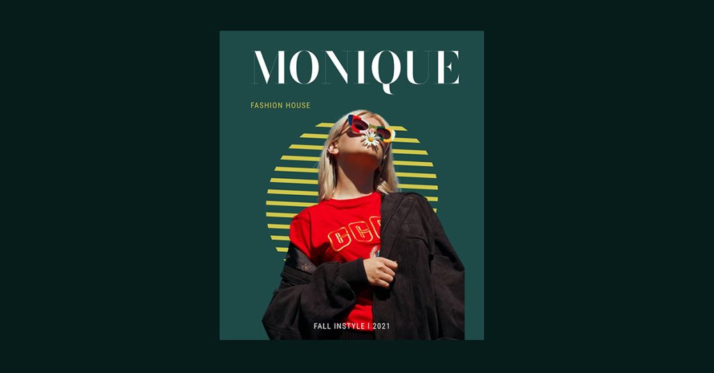
If you develop an asymmetrical balance, you must alter the composition by making one part of the image visually heavier than the other while still maintaining a strong sense of balance through other design components. The unequal distribution ignites visual interest and attracts eyeballs.
A quick example is a brochure design where several elements with unequal sizes are combined to compel prospects. Using asymmetry in your design makes it bold and creative.
Radial graphic design balance

Imagine the sun rays that spread in all directions but come together to meet at a common point. This common point is the center.
Similarly, a radial balance is created when all the visual elements radiate from a center point. For example, the three points on the logo of Mercedes resemble universal motorization; the three points of the land, sea and air that come together at the center to form the brand suggest its dominance in the field.
Technically speaking, when multiple axes on the composition meet together at one point, it is considered a radial balance. The visual weight of all the elements across the axes is distributed equally within an equal distance, thus creating symmetry. The goal is to direct the focus to the center of the composition.
Mosaic graphic design balance

Think of a Van Gogh painting where the first thing that comes to your mind is abstract.
Everything in his paintings seems chaotic, but this chaos creates a sense of harmony. This type of balance is called Mosaic balance or crystallographic balance, where all the elements in a composition, without a focal point, seem chaotic but create balance on their own. No single element shares an emphasis, nor do they dominate the composition as a whole.
Discordant graphic design balance

Also known as off-balance, a designer can use the discordant balance in composition where none of the elements or images have a visual appeal, but they still create a balance.
Let’s not mistake an asymmetrical design for an off-balance design.
In an asymmetrical balance, the elements in the compositions are manipulated to change the image’s perspective. In an off-balance design, however, the elements deliberately create a sense of unrest. It can be risky to ace, so use it cautiously. This poster reflects postmodernism and is a perfect example of discordant graphic design balance.
How to use balance in design?
Understanding balance and knowing how to use symmetry and asymmetry is the key to communicating your message effectively through graphic design.
Balance in graphic design is usually found in layout. All the elements in the composition are responsible for telling us how balanced the design is. Your brochure design, for example, may look balanced in the beginning, but as you move more into the design, it can be off-putting.
Balance can help you maintain consistency and aesthetics, and create delightful designs every time despite the format.
Other ways to achieve balance
Once you learn how to manipulate and distribute elements in your design, you can skillfully manage to create balanced designs.
Till now, we have talked about the balance that can be achieved with the combinations of various visual weights. However, sometimes, because the design is filled with a lot of elements, each having its visual weight, it becomes difficult for designers to segregate them accordingly.
Be it a website, an ad, a poster, or any other form of art, no matter where you want to utilize it, the following ways to apply balance are going to help you immensely.
Balance from color
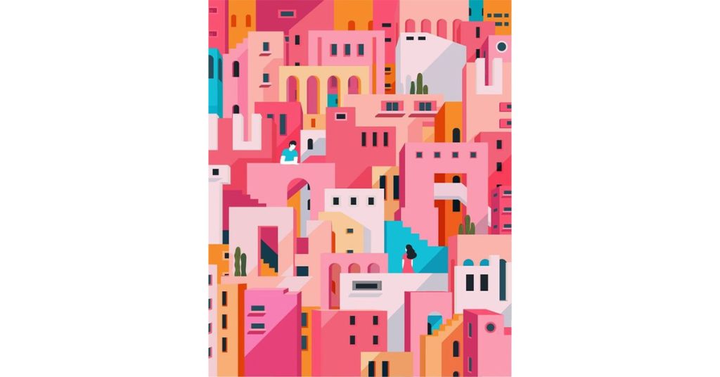
In design, when small areas of bright colors are brought together with larger areas of dark colors, it creates a sense of balance. However, to execute this effect, you must be equally aware of color psychology.
In the above example, the illustrative work has geometric patterns in shades of pink and orange throughout the design. Despite the noisy pattern, the contrast in color of the shapes makes it easier for you to spot the subjects making it a balanced work of art.
Balance from shape
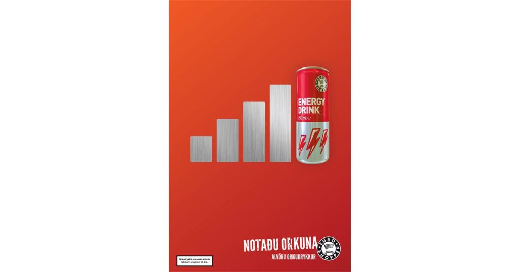
When complex shapes are combined in a flat and plain composition, the combination creates a sort of contrast, and the intricate details of the elements fall into balance with the flat field. Take a look at the above example, this particular creative ad uses a lot of shapes in one single composition, but because the background is plain and flat with the help of a solid color, the whole artwork seems to have a certain sense of balance.
Balance from position
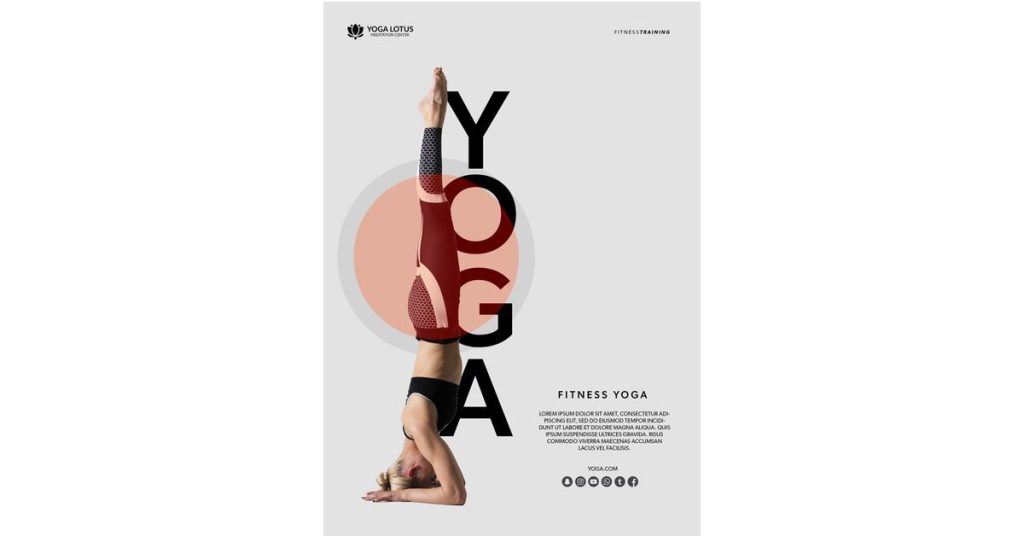
Balance from a position can be achieved in a design when you see tiny elements that are distributed all around the composition in such a way that it balances out the larger element of the design. This type of balance is an example of asymmetrical balance.
In the poster above, you can see how the letters are arranged following the human image in the design. This creates visual harmony and reinforces the importance of positioning in a design.
Balance from size
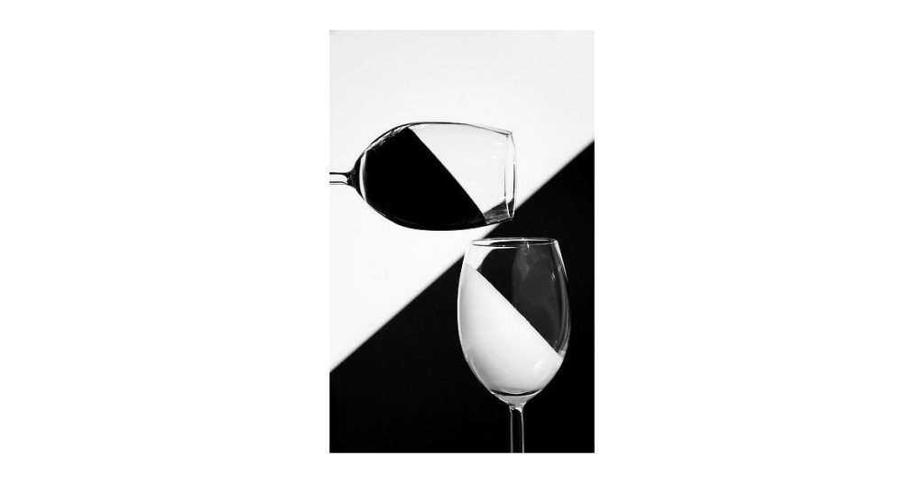
Size is another way to add balance to the design. The larger the size of the elements, the heavier their visual weight will be. Increase and decrease the size of elements in the composition to achieve balance.
The abstract design by Elli Montero uses an equal amount of space and shapes, balancing the visual weight of each element.
Additional tips to balance like an expert
Practice with templates.
If you are a beginner designer, use templates with a balanced composition. Because you already have a pre-existing balanced design, it will become easier for you to work with, and over time you will understand the difference between a balanced and an unbalanced design.
Grids are your best friend.
Grids are like guides for design. They make sure that each section of the composition is equally distributed so that you can have a better idea of a layout. If you are unsure how to achieve balance in your design, grids will help you judiciously.
Practice makes perfect.
The universal tip is applicable in any field! Once you have worked with several set templates, created designs on your own, and experimented with various ways to achieve graphic design balance, nobody can stop you from being a pro.
So, experiment your heart out!
Key Takeaways
- Balance = stability: It ensures designs feel structured and harmonious.
- Types of balance: Symmetrical (formal), asymmetrical (dynamic), radial (centered), mosaic (chaotic yet harmonious), and discordant (deliberately off-balance).
- Balance guides the eye: Helps viewers focus on key areas and understand hierarchy.
- Not always symmetry: Balance can come from contrast, positioning, or color distribution.
- Practical tools: Use grids, templates, and practice to build balanced layouts.
- Design history: From Leonardo da Vinci to modern ads, balance has always been a core principle of visual art.
On balance
We hope you have a fair idea of balance as an essential design principle and how it works. Observe designs around you, play with different ways to create balanced compositions in your next project, and see the wonders. Keep following our content for more design tips.
FAQs
1. What is balance in graphic design?
Balance is the even distribution of visual weight in a composition, creating stability and harmony so no single element feels overpowering.
2. Why is balance important in design?
4. How do designers achieve balance?
5. Can asymmetry still be balanced?

