Designing your business logo has never been this easy, you can simply open a logo maker tool, type in your business’s name, select a few elementary shapes, press create, and Voilà! It’s done. You know that creating a good logo is not that simple, especially if you’re looking for a modern logo design or a modern minimalist logo design.
A logo isn’t just an ornament to your brand. It is the face of the brand. Your logo talks to your customers when you’re not present, subtly making your brand’s place in your customers’ minds.
So, how do you create a modern logo that’s timeless, memorable, and attractive and stands out from the noise?
With so many tasks for your attention, it’s hard to scour the internet to take ideas and inspiration. So, we’ve done some heavy lifting for you and pulled together everything you need to know about designing a modern logo, along with successful logo ideas and tips.
Let’s dive in!
But before we start, let’s understand what a modern logo is.
What is a modern logo design?
The term ‘modern’ translates to ‘contemporary’; however, when we talk about ‘modern’ in design or any creative industry, it is often associated with the aesthetic movement of the late 19th century emphasizing functionality over beauty.
A modern logo design embodies the adage ‘Less is more.’
By that definition, a modern logo design is not only a design that is relevant in contemporary times but also a fuss-free visual that communicates the brand’s voice, mission, and identity using clean lines and shapes, striking colors, and clear fonts.
How to make a modern logo design?
A good logo should be
- Timeless
- Memorable
- On-brand
- Scalable
- Striking
And a good modern logo should be everything mentioned above and below (in the coming sections).
A modern logo follows certain design principles that set it apart from other styles. When you follow these principles, you can accelerate your creation process and achieve a better outcome.
Also Read: How To Get A Custom Logo Designed ASAP for your Business
Principles of a modern logo style
Color
Modern logo designs restrict to minimal color palettes and hues. These logos have bold colors, usually primary and concentrated tones, paired with black or white. They typically stick to a palette of 1-2 colors.
Since each color evokes a different emotion, be careful while selecting your color palette.
Pro tip: If you decide to add a bit more color, keep the elements simple.
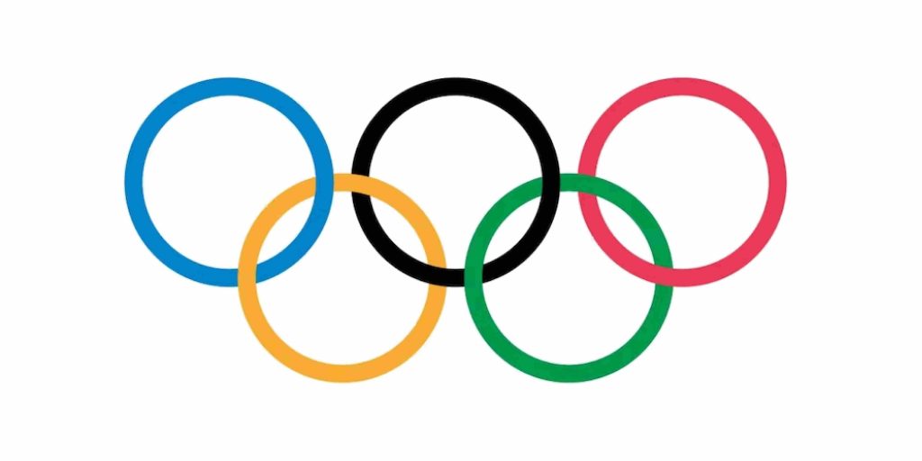
For example, check out the Olympics logo, which has five colors. However, it is perfectly balanced with its symbols — circles representing rings.
Layout
Pro tip: Pick each element and try to remove it. If you can do without it, then do so. The idea is to boil it down to its simplest form without losing the essence.
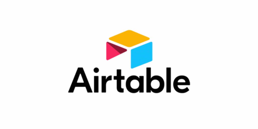
For example, Airtable‘s logo comprises three geometric figures — two parallelograms and one triangle to form a stylized table using three colors followed by a wordmark. Also, see how the logo uses space to create the icon.
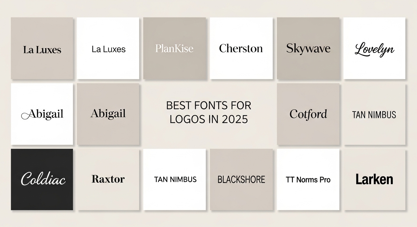
Typography: Best font for modern brand logo design
Since it’s all about keeping things tidy, sans serif fonts tend to work the best — bold clean lines with no swirls and swoops.
You can choose from the vast range of sans serif fonts. A classic traditional sans serif would align with an old vintage company, but a modern sans serif like Helvetica would be a wise choice if your company is a young lifestyle brand. So before picking up a font, consider your brand. How do you want to be viewed by the customers? Are you old and traditional? Young? Classic?
Choose your fonts and experiment with weight, space and slant to create a visual effect. However, stay away from adding ornamental flair.
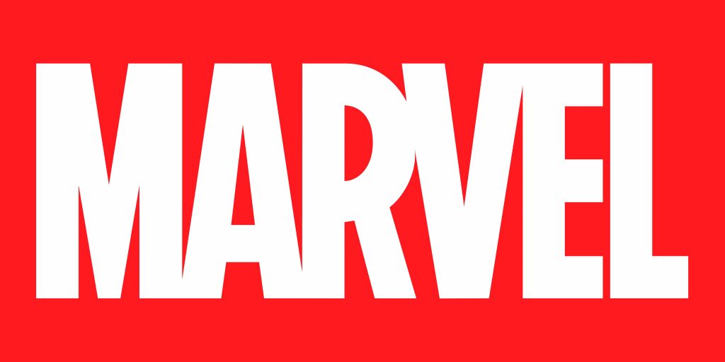
Check out Marvel’s logo — a typographic logo composed of only two colors. The bold white letters of the logo are placed closely together to create a sense of movement, implying the urgency and hurry that is symbolic of heroes.
Pro Tip: If you don’t have enough time to find a font, choose something similar to Helvetica, Futura, or Open Sans. These fonts have proven to be successful over time.
Shapes, Symbols & icons
Visuals are easy to remember. So if you can use shapes to illustrate your business, that’s great. Shapes, symbols, and icons are the best way to show what you do to your audience. For instance, a pair of glasses would illustrate that the business deals in eyewear.
When you’re creating a modern logo, remember to use elementary shapes and symbols to communicate your message. Shapes and symbols should be less detailed and are generally more geometrical in their form.
Also Read: 10 Famous Cool Logo Designs And Their Hidden Messages
Pro tip: Incorporate familiar and recognizable symbols so viewers can instantly comprehend your logo and business without much effort.
See how Pentagram designed the logo for Salt Lake City Public Library using rectangles to show a stack of books.
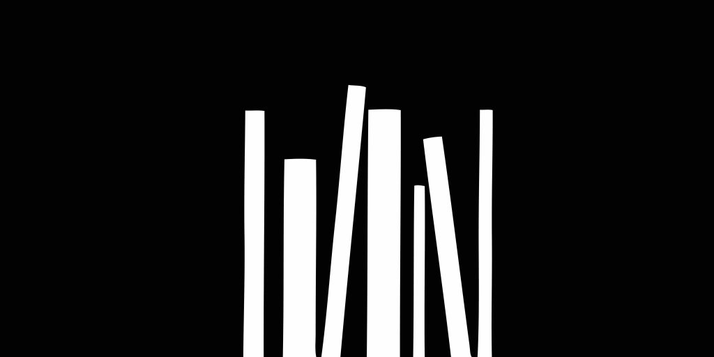
Notice the clever use of negative space in this logo which brings us to our next design principle.
Negative space
Negative space is an underrated design element brands can use to spice up visual effects. Instead of using it as background, make it an integral element of your design, just like how Pentagram used it in the above logo.
Another example is IBM’s logo. The negative space elevates the design and communicates the brand’s two core values: speed and dynamism.
Balance
Do not confuse balance with symmetry. Gone are the days when balancing was creating symmetrical designs. Instead, balance refers to creating a visually appealing logo that looks uniform from all angles. It can be achieved using weight, space, proximity, and colors. So if you have a hefty bold icon, balance it with a lighter type or vice versa.
For example, Slack’s logo uses primary and secondary colors paired with white. It doesn’t contain too many lines or shapes. Asymmetrical logo with basically two shapes repeated. The design on the right is balanced with the type on the left.
If it’s overwhelming for you, consider professional help. Subscribe to Design Shifu and get your logo designed at a flat rate.
Also Read: How to Design a Logo: A Step by Step Guide
Now that we have covered the essential design principles of modern logos, let’s move on to see stylistic logos so you can decide on the style that best speaks to you.
Modern Minimalist Logo Designs
Modern logos generally follow minimalist logo design principles.
What is a modern minimalist logo design and why should you go minimalist?
A modern minimalist logo strips down the decorative flair to their basic shapes, capturing the brand’s spirit in the truest form. A modern minimalist logo can be geometric, typographic, or both.
When creating a modern minimalist logo, adhere to lines and clean elements.
Think of ways to visualize your idea in basic shapes. Or do reverse engineering. Create a picture or your design, then think of ways to simplify it. See if you can remove any elements. If yes, do so. But be wary of not going overboard. You don’t want to lose the core message.
Uber’s logo is a great example of modern minimalism. It uses a simple font and never makes us feel like anything is missing. This is could be a great inspiration for a modern minimalistic logo design for your brand.
Geometric modern logo designs: Best for Contemporary Logo Design Inspiration
“You can’t criticize geometry, it’s never wrong.”
— Paul Rand
Geometry is foundational to design and us. Flowers, trees, leaves, animals, architecture, and everything around us follows geometric patterns and principles. We’re intrinsically drawn to geometry.
Besides mathematical precision, accuracy, and its profound presence in nature, shapes are versatile and tap into human emotions.
Four-sided shapes like rectangles and squares convey trust, stability, and reliability, whereas rounded shapes like ovals and circles convey eternity, love, and completeness. Spirals symbolize creativity, religion, and spirituality.
Identify the predominant values of your business and the emotions you want to inspire in your prospects. Then, use the relevant shapes in your logo. You can even combine different shapes as long as it preserves the neatness in the design.
Also Read: 10 Free Logo Design Ideas for 2022
Check out this modern geometric logo for inspiration and ideas.
Modern creative logo design
A creative modern logo goes beyond the general styles and takes a creative edge to represent business and its values in exciting ways. You often play around with different logo styles to create a unique combination. Mix up literal with metaphorical or type with icons. Play with colors and weight.
Check out the logos of Iron Duck, Guitar Studio, and PlayStation below.
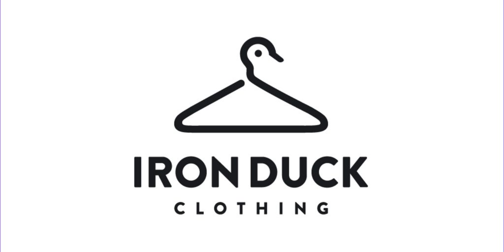
The Iron Duck Clothing’s logo combines simple lines to create a hangar and duck, conveying the business name’s literal meaning and what they do.
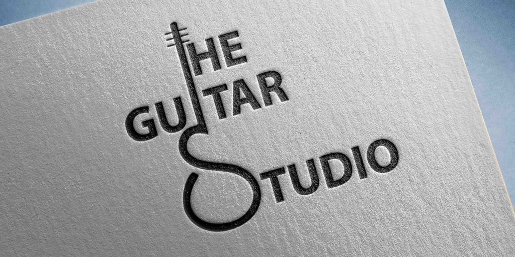
The guitar studio plays with typography to create a shape of a guitar. It uses ‘i’ of Guitar, ‘s’ of Studio, and negative space to form the visual of the guitar without cluttering.
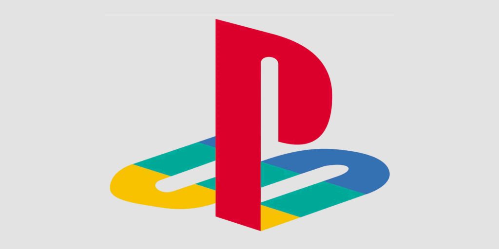
Playstation’s logo is an upright P with a flat-laying S designed with primary colors: red, blue, and yellow, with green as a soft transition. It takes an interesting take on its vision: innovation and tech.
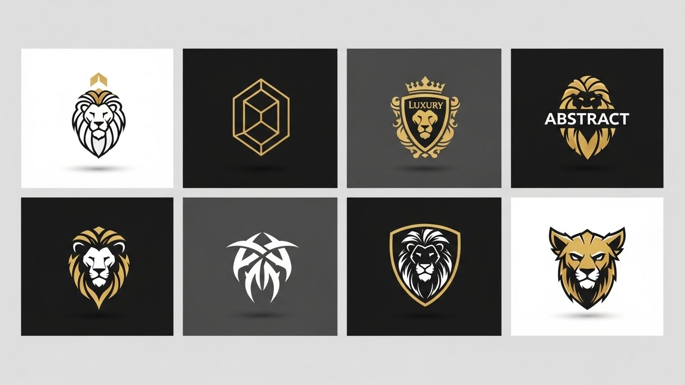
Modern luxury logo design
A modern logo design style may give you the impression that the style would not work for a luxurious brand; however, iconic brands like Chanel have their logos built on the same principles to impart a sense of affluence, elegance, and grace.
Luxurious brands embody perfection. Legibility, symmetry, and balance are the linchpins of a modern luxury logo.
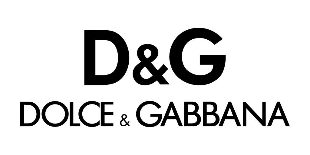
The logo of Dolce & Gabbana is a monogram logo formed from the combination of the initial letters of its founders using sans serif font, bold lines, and no twirls. It’s plain and distinct.
Chanel is another luxury brand with a modern logo. Designed by the founder Coco Chanel, the logo is a monogram formed by a pair of mirrored and intertwined C’s. It is clean, balanced, and symmetrical.
Abstract modern logo design
An abstract logo is worth more than a thousand words. Popular among startups and new businesses, abstract modern logos imagine objects with new meanings. They pack multiple concepts into one symbol. So if you have a lot to say to customers, try an abstract logo.
Also Read: 10 Best Tips to Brainstorm Logo Design Ideas for a Startup Business
The Airbnb Logo is a perfect example to take inspiration from.
It symbolizes experiences, accommodation, and community. The inner loop is the location icon. The outside lines form the shape of hands. While the entire logo is an inverted heart that makes A.
So far, we believe you have picked up the style that aligns with your business. If not, here are a few things you must consider to understand your brand and narrow your want list.
Know the brand.
Whether you’re building a logo for yourself or a client, understand the business. What do you do? What is your mission and vision?
Research the industry.
See how top brands communicate themselves. Then, identify the cliches to avoid in your design.
Define the values
Think of how you want people to perceive your brand. What do you want your customers to say about you? Then, use it to define the values. For example, do you want to be young and friendly or classy and luxurious? Write down 3-5 values.
Some other tips for designing:
Have a mood board.
A mood board is like a small inspiration file for your reference. Whatever interests you, add it. Add pictures, colors, visuals, and texts to it. A mood board will help you formulate a loose concept and give a sense of what you want to build.
Get out your sketchbook.
Nothing beats a pen and paper. Draw without constraints, judgment, and pressure. Get your ideas out as fast as possible. Set a timer and keep going.
Subtract unnecessary elements.
View each element critically. Narrow it down to the basic shape. Play with it and see how to boil it down to the essentials while keeping it visually interesting. See if you can preserve the aesthetics by losing an element or two, and do so.
Keep it scalable
Scale is often neglected while designing. A logo is placed on business cards, social media posts, billboards, merchandise, brochures, documents, and other places. So scale your logo to ensure it looks good at every size and doesn’t lose any details. Use vector-based design software and download mockups to do so.
And that’s a wrap. We’ve covered everything you need to know about creating an eye-catching, memorable modern logo design & modern minimalist logo design that pulls in your audience along with a range of styles from modern minimalist logos to luxury logos and examples. So define your business, identify the style you want to model, and start creating.
We hope it helps you. However, if you still feel stuck, you may rely on experts at Design Shifu, offering complete design services at a flat rate.

