One of the most important components regarding impactful online presence is homepage design. Homepage design across industries to draw inspiration, can present helpful examples of how different industries approach user experience, aesthetics, and functionality strategies.
When looking for new users online, your website acts as the primary representation of your brand, making a strong first impression essential. But more than a ‘good’ website is needed to stand out and convert visitors into dedicated customers and brand champions.
This blog focuses on superior homepage designs across various industries, providing ideas and inspiration to help you transform your site into one that attracts and converts visitors.
Are you ready to enhance your website from simply ‘good’ to truly outstanding?
Let’s create an informative website that also inspires and connects.
What is the Importance of Homepage Design?
The homepage is much more than just the first page of a website; it’s a strategic tool for branding, user engagement, and online marketing.
Its design and functionality play a crucial role in how effectively it communicates the brand message, engages users, and drives conversions.
First Impression
Gateway to Brand Perception: The homepage acts as the gateway to how potential customers perceive your brand. A well-crafted design can captivate visitors instantly, creating a lasting positive impression.
Sets Expectations: The design quality sets the expectations for the rest of the user’s journey. A professional and appealing homepage design suggests a high-quality service or product offering.
Brand Representation
Visual Identity and Values: The homepage is a canvas for your brand’s visual identity and values. Every element, from color palettes to typography, communicates aspects of your brand personality.
Professionalism and Credibility: A polished and up-to-date homepage design signifies a professional and credible business, encouraging trust from the outset.
Engagement and Conversion
Interactive Elements: Including interactive elements like sliders, videos, or animation can make the homepage more engaging, encouraging users to interact with your content.
Conversion-Focused Design: Strategically placed calls-to-action (CTAs), testimonials, and special offers on the homepage can significantly boost conversion rates.
The Role of Homepage Design in Branding
The homepage design plays a crucial role in branding by serving as the digital ‘first impression’ of a company. It reflects the brand’s identity, values, and professionalism.
A well-designed homepage establishes brand credibility, engages visitors, and communicates key messages effectively, setting the tone for the entire user experience.
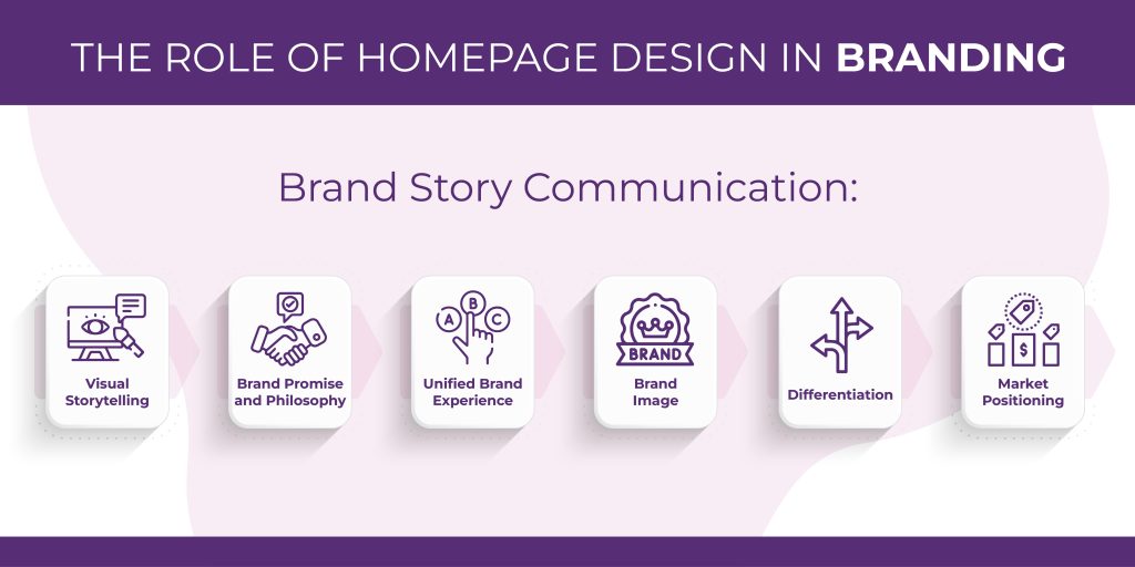
Brand Story Communication

Visual Storytelling: Through thoughtful design, the homepage can visually narrate your brand’s story, mission, and values, creating an emotional connection with visitors.
Brand Promise and Philosophy: The design can subtly communicate your brand promise and philosophy, aligning with the expectations and needs of your target audience.
Consistency
Unified Brand Experience: Consistency in design across the homepage and other pages creates a unified brand experience, which is crucial for building brand recognition and recall
Do you want a homepage that reflects your brand’s essence?
Then you are at the right place. Let Design Shifu craft your perfect homepage, ensuring a unified brand experience across all pages.
With our unlimited design requests and rapid turnarounds, we specialize in creating consistent, memorable designs that connect with your audience. From engaging graphics to cohesive layouts, our dedicated team is here to transform your online presence.
Experience seamless brand integration with Design Shifu, where each design reflects the heart of your brand.
Brand Image: Exposure to consistent brand elements (like logos, colors, and fonts) reinforces your brand image in the minds of visitors.
Differentiation: Stand Out from Competitors: A unique and creative homepage design can differentiate your brand from competitors, highlighting what makes your offerings special.
Market Positioning: The design can help in positioning your brand in the market, whether it’s luxury, budget-friendly, innovative, or user-centric.
Impact of Intuitive Navigation on User Experience
Ease of Use
User-Friendly Interface: Simplifying the navigation makes the website more user-friendly, accommodating a wider range of internet users, including those who are not tech-savvy.
Quick Access to Information: Efficient navigation ensures that visitors can find the information they need quickly and easily, enhancing user satisfaction.
Reduced Bounce Rate: This ease of use reduces the likelihood of users leaving the site quickly, thereby lowering the bounce rate and improving overall user engagement.
Encourage Exploration: When users find the navigation intuitive, they are more inclined to explore the website in depth, leading to lower bounce rates.
Positive User Experience: A positive navigation experience can lead to repeat visits, as users remember the ease of finding information on your site.
Increased Engagement
Guided Journey: Well-planned navigation guides users through a journey, from understanding the brand to taking action, like making a purchase or getting in touch.
Strategic Content Placement: Placing key content along navigational paths can enhance engagement and interest in your offerings.
The Significance of Mobile-Optimized Homepages
Wider Reach
Increased Audience: As mobile usage continues to rise, a mobile-optimized homepage allows you to reach a broader audience, including those who primarily use mobile devices for internet access.
Inclusive Design: It ensures that your website is accessible and appealing to all users, regardless of their device preference.
Improved User Experience on Mobile
Adaptive Design: Mobile optimization involves creating a responsive design that adapts to various screen sizes and orientations, ensuring readability and usability.
Touch-Friendly Interfaces: Optimizing for mobile includes designing for touch navigation, making it easier for users to interact with your website on touch-screen devices.
Search Engine Ranking
SEO Benefits: Mobile-optimized websites are favored by search engines like Google, leading to better rankings in search results.
Faster Loading Times: Mobile-optimized sites often load faster, which is a critical factor in both user experience and search engine optimization.
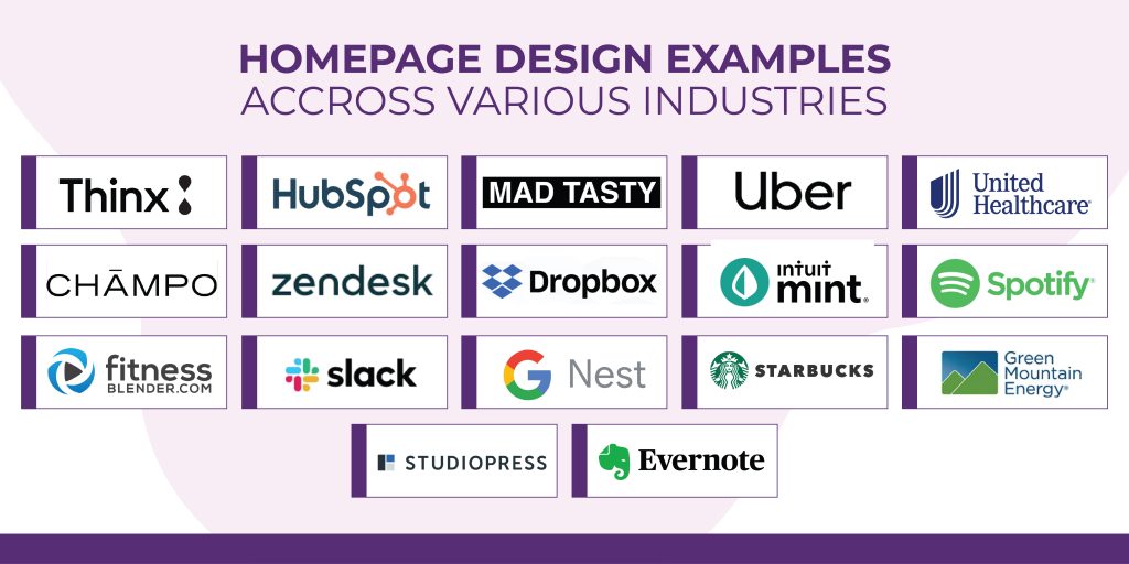
17 Homepage Design Examples Across Industries

Each of these companies has a homepage that not only reflects their brand identity but also addresses the specific needs and expectations of their target audience.
They combine aesthetics, functionality, and strategic design elements to create engaging and effective homepages that enhance user experience and drive business goals.
1. Thinx
Inclusive Imagery and Messaging: Thinx uses inclusive imagery and messaging, resonating with a diverse audience. The design is clean, modern and focuses on educating visitors about their products.
Clear Call-to-Action (CTA): Their CTA is clear and compelling, guiding users towards purchasing or learning more about their products.
2. HubSpot
Intuitive Navigation: HubSpot’s homepage features intuitive navigation that directs visitors to a variety of resources, from products to educational content.
Interactive Elements: The use of interactive elements like chatbots provides a dynamic user experience.
3. Mad Tasty
Bold Visuals and Colors: Mad Tasty Homepage design’s vibrant colors and bold visuals immediately grab attention, reflecting the brand’s energetic and youthful vibe.
Product-Focused Layout: The homepage focuses on showcasing products upfront, with an easy path to purchase.
4. Uber
Dual CTA: Uber smartly caters to two distinct audiences – riders and drivers – with dual CTAs on the homepage.
Clean and Simple Design: The design is straightforward, emphasizing ease of use – a key aspect of their service.
5. United Healthcare
Information Accessibility: The homepage is designed for easy access to a wide array of information, crucial for a healthcare provider.
Trust Signals: Including customer testimonials and accreditations builds trust in their services.
6. Chämpo
Elegant and Premium Design: The homepage exudes elegance and premium quality, aligning with their high-end haircare products.
Engaging Product Displays: Users are encouraged to explore more by engaging product displays.
7. Zendesk
Minimalistic and Functional: Zendesk’s homepage is minimalistic yet functional, reflecting their focus on efficiency and clarity in customer service solutions.
Interactive Demonstrations: Demonstrations of their software in action help visitors understand the product’s value.
8. Dropbox
Simple and User-Friendly: Dropbox’s homepage is simple, mirroring the user-friendliness of their service.
Clear Messaging: The value proposition is communicated clearly and concisely.
9. LiveMint
Financial Trust and Security: The homepage design conveys a sense of financial trust and security, crucial for a finance management tool.
Easy Start Process: The process to get started is made evident, encouraging new users to sign up.
10. Spotify
Lively and Dynamic: The homepage is lively and dynamic, reflecting the vibrancy of their music streaming service.
Personalization Highlight: They highlight the personalized experience in music discovery.
11. Fitness Blender
Health and Wellness Focus: The design focuses on health and wellness, with motivating imagery and testimonials.
Easy Access to Workouts: Direct links to various workouts make it easy for users to start exercising.
12. Slack
Collaborative Feel: The design emphasizes collaboration and efficiency, core aspects of their messaging platform.
Interactive Tour: An interactive tour of the app’s features enhances understanding for new users.
13. Nest
Sleek and Modern: The sleek and modern design reflects their innovative home products.
Product Features and Benefits: A clear display of product features and benefits aids in customer decision-making.
14. Starbucks
Brand Experience: The homepage extends the Starbucks brand experience online, with familiar colors and imagery.
Engagement with Offers: Promotions and offers are prominently displayed, engaging customers immediately.
15. Green Mountain Energy
Eco-friendly Design: The design aligns with their eco-friendly brand ethos, using natural imagery and green color tones.
Educational Resources: They provide educational resources about renewable energy, adding value to the user experience.
16. StudioPress
Clean and Professional: The design is clean and professional, appealing to their web development audience.
Showcase of Themes: The homepage effectively showcases their WordPress themes, demonstrating versatility and quality.
17. Evernote
Clarity and Simplicity: The design emphasizes clarity and simplicity, key features of their note-taking app.
Benefits-Oriented: The homepage focuses on how Evernote makes life organized, directly addressing user needs.
How to Apply These Inspirational Ideas to Your Own Homepage Design
Drawing inspiration from other companies’ homepage designs involves a mix of studying the best in your field, exploring creative ideas from diverse sources, and staying updated with the latest design trends.
Explore Design Portfolios and Communities
Design portfolios and communities showcase a wide range of styles and innovative approaches. They can offer a wealth of ideas about layout, color, typography, and user interface.
Visit websites of well-known design studios or join online design communities. Platforms like Behance, Dribble, or Awards feature top-notch design work.
Pay attention to how these designs use space, color, and typography.
Analyze Competitor Websites
Learning what your competitors are doing can give you insights into what works (and what doesn’t) in your specific industry. Look at the websites of direct competitors or industry leaders.
Note the layout, the way they present information, and how they guide the user’s journey. Identify elements that make their sites appealing or unique.
Draw Inspiration from Different Fields
Looking outside your industry can provide fresh perspectives and innovative ideas that haven’t been overused in your field. Explore websites in unrelated industries or check out general design showcases.
Notice how different sectors tackle design challenges and think about how these approaches can be adapted to your project.
Utilize Photography and Image Resources
Images play a crucial role in web design. High-quality, compelling imagery can significantly impact a homepage’s appeal.
Visit photo stock websites to understand how professional imagery is used in web design. Look at the composition, subject matter, and mood of these images.
Stay Updated with Blogs and Resources
Web design is an ever-evolving field. Staying informed about the latest trends, tools, and technologies is crucial. Regularly read blogs, follow web design influencers on social media, and subscribe to design-related newsletters.
Websites like Smashing Magazine, Web Designer Depot, and UX Designs offer great resources.
Remember the Difference between Inspiration and Imitation
While it’s great to learn from others, it’s important to avoid outright copying. The goal is to gather ideas and then adapt them to create something unique and fitting for your project.
Use the ideas you gather as a starting point. Mix and match different elements, experiment with new layouts or color schemes, and always try to add your personal touch or the brand’s unique identity.
What Makes a Good Homepage?
A good homepage is like a welcoming front door.
It should not only look appealing but also make it clear what lies beyond and how to step inside.
Let’s break down the essential qualities of a good homepage
Clear Identity and Purpose
Who You Are: The homepage should instantly communicate the identity of your brand or organization. This could be through a logo, a tagline, or imagery that aligns with your brand.
What You Do: It’s essential that visitors understand what your business or organization offers. This can be conveyed through concise text, imagery, or even video content that explains your products, services, or mission.
Visitor Engagement
The design should guide visitors on how they can interact with your site, whether it’s shopping, subscribing, learning more about services, or contacting you for more information.
Target Audience-Resonant Design
This should align with the website’s look, feel, and messaging with the specific needs and preferences of its intended audience.
This involves custom content, intuitive navigation, and visual elements that resonate with the users, ensuring an engaging and effective user experience.
Understanding Your Audience
A good homepage design speaks directly to its intended audience. This means using language, imagery, and cultural references that resonate with them.
Emotional Connection
The design should connect on an emotional level, reflecting the values and aspirations of the audience.
For instance, a luxury brand might use elegant fonts and minimalist design, while a kid’s educational site might use bright colors and fun graphics.
Unique Selling Points (USPs)
Highlight what sets your product or service apart. This could be quality, price, innovation, or user experience.
Benefits Over Features
Focus on how your product or service improves lives or solves problems. People are more interested in benefits than the technical features.
Optimized for Multiple Devices
Ensure that the website is responsive and functions seamlessly across various devices, like smartphones, tablets, and desktops.
This adaptability enhances user experience, accessibility, and engagement, catering to the diverse ways people access the internet today.
Responsive Design
With the variety of devices used to access the internet, from smartphones to desktops, a good homepage must look great and function well on all screen sizes.
Is Your Homepage Ready for Every Screen?
Experience the best responsive design with Design Shifu. We ensure your homepage looks stunning and functions flawlessly on any device, from smartphones to desktops.
With our commitment to unlimited design requests and quick turnarounds, we adapt your brand to the dynamic world of multi-device users. Let’s create a homepage that not only catches the eye but also works perfectly everywhere.
Subscribe to Design Shifu, where adaptability meets artistry. Your online presence is optimized for every screen!
Load Time and Performance
Optimization also means ensuring the site loads quickly and runs smoothly on different devices, which is crucial for user experience and search engine rankings.
Up To Date Design
The design of the homepage should be up-to-date and align with the latest trends.
Trend Awareness
Stay aware of current design trends, but also ensure that your design has a timeless quality so it doesn’t feel outdated quickly.
Regular Updates
Keep content fresh and update the homepage to reflect any new products, services, or company news. This shows that your site is active and well-maintained.
Clear and Direct Call to Action (CTA)
CTAs should be prominent and easy to find without overwhelming the visitor.
Clarity in Language
Use clear, action-oriented language for your CTAs like ‘Buy Now’, ‘Learn More’, ‘Contact Us’, or ‘Sign Up’.
Strategic Placement
Place CTAs in logical spots where visitors are likely to make decisions, such as after an impressive product description or testimonial.
Frequently Asked Questions
Understand Your Audience: Understand their needs and desires.
Define Your Purpose: Clearly define the purpose of your homepage or website, whether that is to sell, inform or showcase.
Sketch a Layout: Create a simple wireframe outlining of the homepage structure, including important elements such as header, calls to action, and footer. Select Color and Typography: Select colors and fonts that best reflect your brand. Add Engaging Content: Incorporate quality images, compelling copy, interactive elements, and any other engaging elements you see fit.
Need Intuitive Navigation: Have it easy to find what they (your readers) need; easy navigation.
Test and Gather Feedback: Test the design on various devices, and gather feedback in order to refine.
This depends on your industry and audience. Generally, a balance is key. Visual elements grab attention, but text is needed to convey key information.
Responsive Design: Make your homepage responsive to different screen sizes and orientations.
Simplify Navigation: Employ a hamburger menu for mobile users to conserve space.
Optimize Pictures and Videos: Ensure they upload fast and render on mobile displays.
Touch-Friendly: Make buttons and links large enough to be easily tapped.
Test on Multiple Devices: Test your homepage on a regular basis for compatibility and ease of use.
A crowded site with too much information can overwhelm visitors. Unclear CTAs make it hard for users to take action. Lack of mobile optimization affects users on mobile devices. Slow load times hinder user experience—optimize images and scripts. SEO shortcuts hurt visibility; follow best practices for better rankings. Inconsistent branding creates confusion—ensure your homepage reflects your brand identity.
Seek Inspiration: Look to sites you enjoy, especially within your niche. Follow Design principles: Balance, Contrast, Unity, and Emphasis need to be your foundation.
Be User-Centered: Design for the user before anything else.
Keep it Simple: Start fresh and clean—add things as you see fit.
Stay Current: Stay informed to the latest design trends and technologies.
Iterate: Don’t try to hit a home run on your first design—iterate based on feedback and data.


