Your Packaging Is Your First Pitch, Make It Count!
In today’s crowded food market, packaging isn’t just protection, it’s persuasion. Whether you’re selling snacks, drinks, or organic goods, your packaging speaks before your product does.
So how do you stand out on a shelf full of competitors?
Creativity is key. From minimalist styles to eco-friendly innovation and bold storytelling, the right design can attract attention, build trust, and boost sales. In this blog, we’re sharing 10 standout food packaging design ideas, pulled from across industries, to inspire your next packaging upgrade.
If you’re ready to turn ordinary packaging into a powerful brand statement, let’s dive into the world where design meets appetite.
Packaging Design Process: Seven Key Steps to Consider
1. Define Objectives
Defining clear objectives is the foundational step in creating successful food packaging design. Start by aligning packaging goals with your brand’s overall strategy. Identify the target audience, product positioning, and the message you want to convey through the packaging. Make sure the objectives are Specific, Measurable, Achievable, Relevant, and Time-bound (SMART).
Consider conducting workshops or brainstorming sessions involving key stakeholders to ensure a collective understanding of the objectives. Also, analyze past packaging successes and failures to inform your objectives. Remember, a well-defined objective serves as a guiding light throughout the design process, ensuring that the end result resonates with the intended purpose.
2. Conduct Market Research
Market research is the cornerstone of informed decision-making in packaging design. Dive deep into your target market to understand consumer preferences, trends, and competitors. Analyze similar products and packaging designs to identify gaps and opportunities.
Conduct surveys, focus groups, and online research to gather valuable insights. Additionally, study emerging technologies and advancements in the packaging industry.
Stay updated with evolving consumer behaviors and their impact on packaging choices. By knowing your market inside out, you’ll be able to tailor your design to meet the desires and expectations of your consumers.
3. Create a Design Brief
The design brief is the blueprint that sets the course for the entire design process. It should encapsulate a thorough understanding of the brand, the product, the target audience, and the desired outcome.
Clearly define the design parameters, constraints, and key messaging that must be incorporated. Collaborate with the design team to ensure a shared understanding of the brief, encouraging them to ask questions and seek clarifications.
A well-crafted design brief not only acts as a roadmap but also inspires creativity and innovation by providing a solid foundation for the design process. Use visual aids and storytelling in the design brief to vividly convey the brand’s essence and the desired emotional response from consumers.
4. Conceptualize
Conceptualization is where creativity takes center stage. Brainstorm ideas and concepts that align with the defined objectives and design brief.
Encourage team members to think outside the box and explore unconventional approaches. Sketch rough designs, create mood boards, and develop visual prototypes to give form to the concepts. It’s crucial to involve diverse perspectives and cross-functional collaboration during this phase to ensure a comprehensive exploration of design possibilities.
Aim for originality and uniqueness that sets your product apart on the shelf. Use mind-mapping techniques to visually organize ideas, aiding in better conceptualization and exploration of design directions.
5. Work on Design and Prototyping
In this step, bring the chosen concepts to life through digital design tools and physical prototypes. Collaborate closely with packaging designers, and material experts to optimize the design for both aesthetics and functionality. Experiment with different color schemes, typography, and layout options to find the most impactful combination. Simultaneously, develop prototypes to test the practicality and user experience of the packaging.
Keep refining and iterating until you achieve a design that seamlessly merges creativity with practicality. Utilize 3D modeling and virtual reality tools to visualize the packaging in a simulated retail environment for a better understanding of its impact.
6. Test and Gather Feedback
Testing the designed prototypes with a select group of target consumers is crucial to gaining valuable insights and feedback. Use focus groups or usability testing to observe how consumers interact with the packaging.
Pay attention to their reactions, preferences, and any usability issues they encounter. Incorporate their feedback to fine-tune the design, making necessary adjustments that enhance the overall appeal and functionality of the packaging.
Conduct A/B testing with different design elements to scientifically determine the most effective design choices based on consumer preferences.
7. Finalize and Production
After incorporating feedback and making necessary adjustments, finalize the design. Create detailed production-ready files and collaborate closely with printing and packaging vendors to ensure seamless production.
Maintain a keen eye on quality control throughout the production process to guarantee that the final product aligns with the envisioned design.
Regular communication and coordination with the production team are vital to achieving a successful transition from design to market-ready packaging. Create a comprehensive production checklist to ensure every detail, from color accuracy to material selection, is meticulously verified before production begins.
By following these seven key steps, you can effectively navigate the food packaging design process, ensuring that your final product surpasses consumer expectations and stands out in the competitive market.
Minimalist Food Packaging Design Ideas
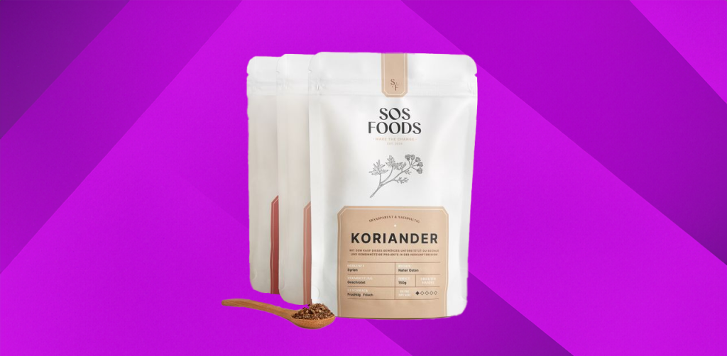
The elegance of minimalistic food packaging lies in its ability to communicate simplicity and sophistication. Take, for instance, the sleek pouch-like packet adorned in a subtle palette of white, cream, grey, and black.
The minimal color palette evokes purity and modernity, while the top logo anchors brand identity. A smart locking mechanism blends function with clean, seamless design.
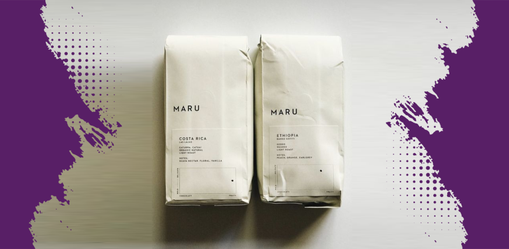
Embracing understated beauty, this light grey packet captures the charm of simplicity in food packaging. Its paper-like texture and eco-friendly feel appeal to conscious consumers, while the flat base ensures a clean, crafted structure.
Minimal black text adds elegance, featuring the brand name “MARU” and concise product details. A subtle rectangular slip below the logo offers key information in a structured, uncluttered layout.
You can draw inspiration from this design by embracing the beauty of simplicity, thoughtful functionality, and a balanced interplay of form and utility.
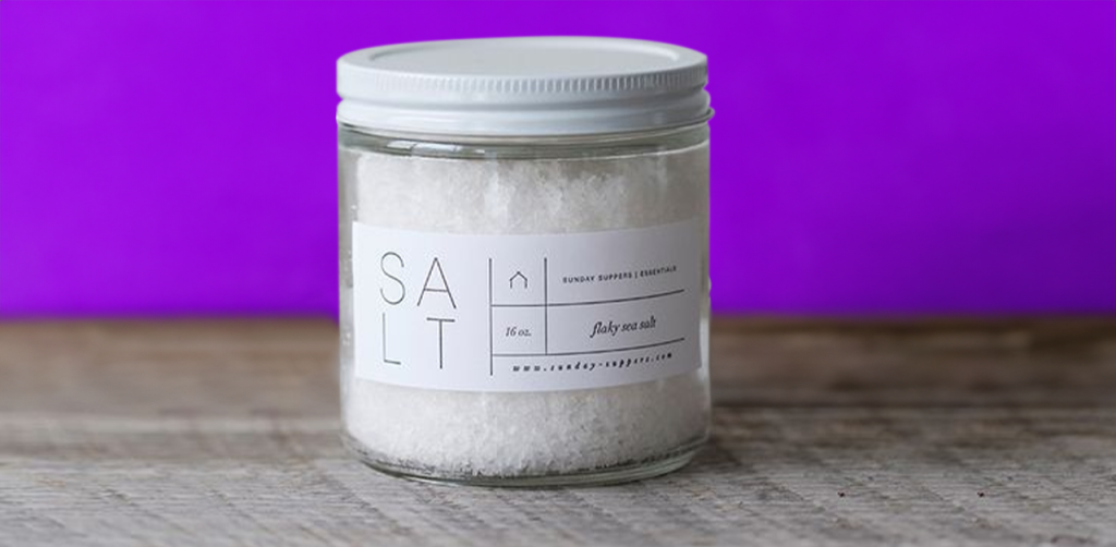
This minimalist packaging design uses a clear jar to showcase the product and express purity and honesty. The white metal cap and the black typography on the white label offer very good visible contrast a readable.
The functional cap markings are a clever practical consideration. The intentional line-break in “Salt” gives a decidedly contemporary artistic feel to the design.
The minimal use of color, focusing on black and white, complements the simplicity, letting the product and typography take center stage.
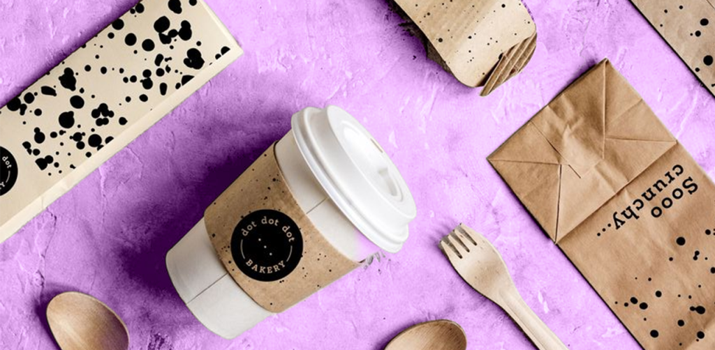
Elegance meets simplicity in this minimalist coffee packaging. A white paper cup with a soft grey label creates a clean, sophisticated look. Strategically placed dots add subtle playfulness, reflecting the coffee experience and the brand name, “Dot Dot Dot Bakery.” The refined black typography ensures clarity, while the understated color palette evokes purity and calm.
Vibrant, Colorful Food Packaging Design ideas
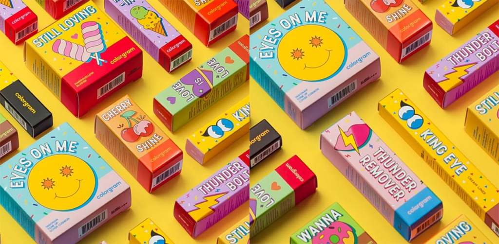
The world of vibrant, colorful food packaging designs beckons with its playful allure. Specifically curated to capture the hearts of young consumers. Imaginative and animated illustrations of food items, objects, and whimsical elements adorn these lively packaging. The riot of colors not only appeals to children but also invokes a sense of excitement and joy. It is eventually making mealtime an enjoyable adventure.
The clever use of thick borders at the bottom, housing the brand name in a contrasting color, stands as a testament to strategic branding. This technique ensures that the brand identity is both bold and prominent, catching the eye amidst the lively and dynamic design.
You can draw inspiration from this lively packaging by embracing creativity, vivacious hues, animated elements, and smart branding strategies creating an unforgettable and delightful packaging experience for young consumers.
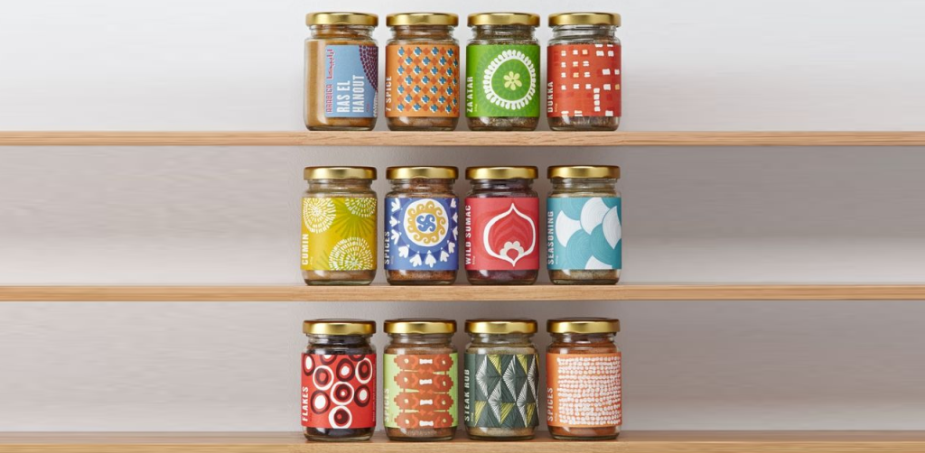
The allure of this glass jar lies not only in its contents but also in its distinctive packaging. The choice of a non-shiny gold-colored metal cap adds a touch of elegance and sophistication, setting the tone for a premium product.
The thick label, asymmetrically designed, hints at the enigmatic nature of the product within. The deliberate use of white for writing ensures clarity and easy readability against the label’s intricate, multi-colored designs.
This fusion of colors and asymmetric shapes adds an artistic dimension, capturing attention and conveying a sense of uniqueness. The limited insight into the product contents on the label entices the consumer, inviting them to uncover the delightful surprise within.
You can find inspiration in this packaging’s blend of elegance, artistic design, strategic use of color, and a touch of mystery, resulting in a truly captivating packaging experience.
Eco-Friendly Food Packaging Design Ideas
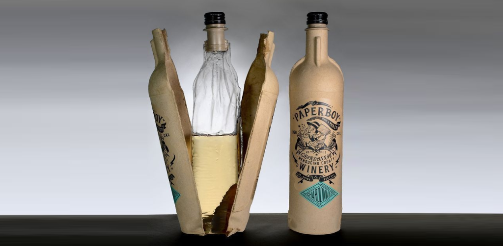
This eco-friendly alcohol bottle design embodies the essence of sustainable elegance. Crafted from molded pulp paperboard, the bottle’s natural, paper-like color resonates with the ethos of environmental responsibility.
The intentional use of a monochromatic palette, with brand name, product name, and logo elegantly presented in black, exudes a sleek and minimalist aesthetic. This approach not only emphasizes the brand identity but also showcases the power of simplicity. The bottle’s shape, mimicking a conventional glass alcohol bottle, retains a sense of familiarity while embracing an eco-conscious material.
The amalgamation of an eco-friendly composition and sophisticated branding underscores the potential for sustainable packaging in the alcohol industry.
You can find inspiration in this design’s commitment to sustainability, minimalist branding, and the seamless fusion of form and function, offering a glimpse into a more environmentally responsible future for alcohol packaging.
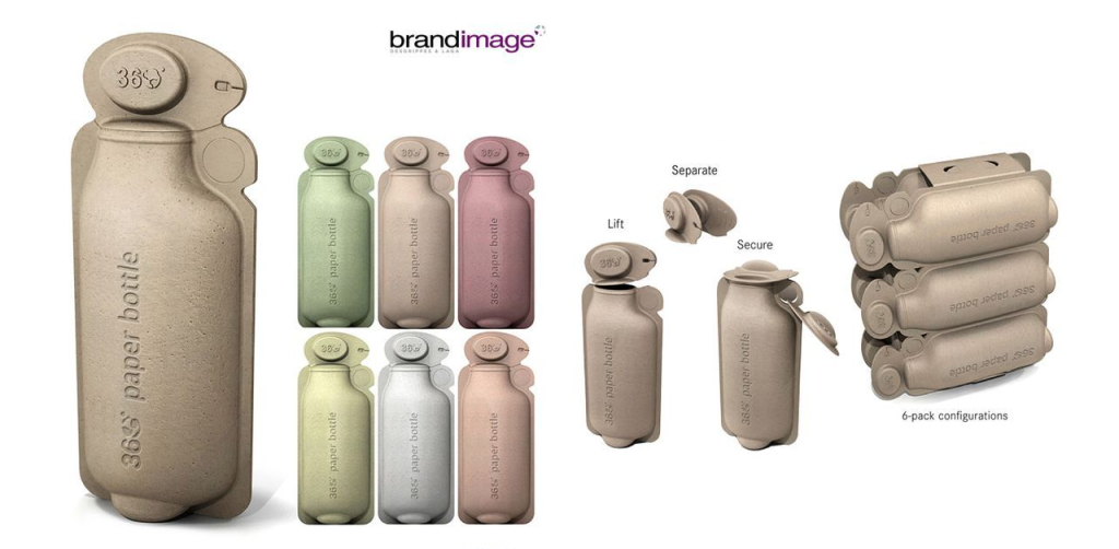
Made from uncolored or subtly colored paper, they seamlessly marry environmental responsibility with functional design. The paper’s natural hues create a sense of purity and sustainability, promoting a conscientious approach to packaging.
The integration of a holder not only enhances the ergonomic design but also encourages reusability, aligning with eco-friendly values. The use of an engraved product name displays an understated, yet artisanal branding, showcasing a commitment to minimalism and eco-friendliness.
Additionally, the innovative paper cap with its lift-and-close mechanism speaks to the product’s practicality, ensuring ease of use while minimizing waste.
This packaging combines sustainability, functionality, aesthetics, and utility thoughtfully, making way for greener, more mindful packaging.
Creative Food Packaging Design Ideas
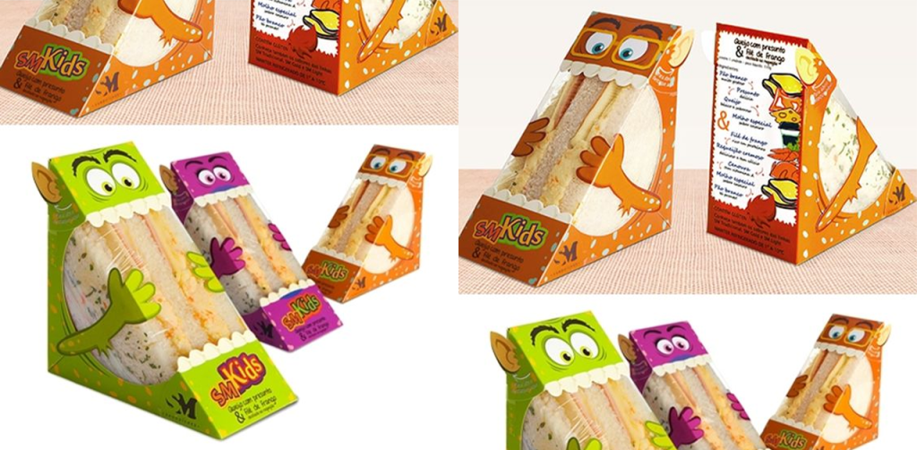
This ingenious food packaging concept transforms the humble sandwich into a delightful, interactive experience. The packaging cleverly mirrors the triangular shape of the sandwich, immediately capturing attention and adding a playful twist to the dining affair. The incorporation of whimsical elements—eyes, jaws, teeth, and cheese slices—lends a charismatic personality to the packet, making it visually engaging, especially for a younger audience.
The transparent plastic portion cleverly imitates a tongue, enhancing the delightful illusion. The integration of hands holding the sandwich exudes a sense of interaction and playfulness, encouraging a delightful unboxing experience.
The vibrant, animated elements at the back further reinforce the creative narrative, ensuring a captivating and memorable encounter with the brand. You can find inspiration in this concept’s playful narrative, interactive design, and clever use of shape and visual elements to elevate food packaging into a delightful adventure.
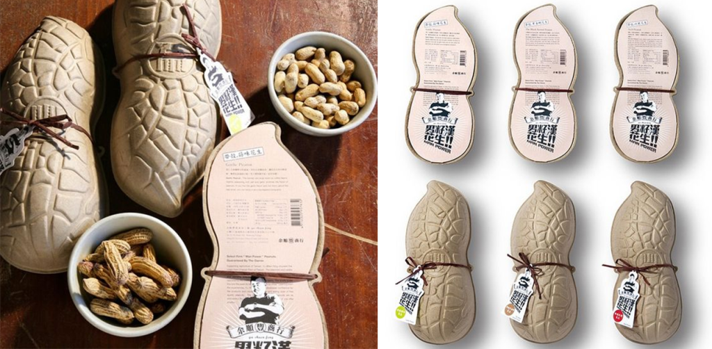
This inventive peanut packaging design harmoniously marries form and function, mimicking the very essence of peanuts. Made from environmentally friendly paperboard, the packaging takes on the distinct shape and texture of a peanut, immediately establishing a unique and cohesive identity.
The engraved designs meticulously replicate the texture of a peanut shell, adding a tactile element that enhances the overall sensory experience. The clever integration of a thread, akin to the natural seam of a peanut, not only visually complements the design but also provides a delightful nod to the product it houses. The branding on the thread, reminiscent of a label on clothing, adds a playful touch and subtly communicates the brand identity.
The flat back of the packaging effectively accommodates essential product information, ensuring a balance between creativity and informative clarity.
You can draw inspiration from this concept’s seamless fusion of natural form, creative detailing, and functional design, exemplifying the potential for innovative packaging solutions.
Design Shifu’s Food Packaging Designs
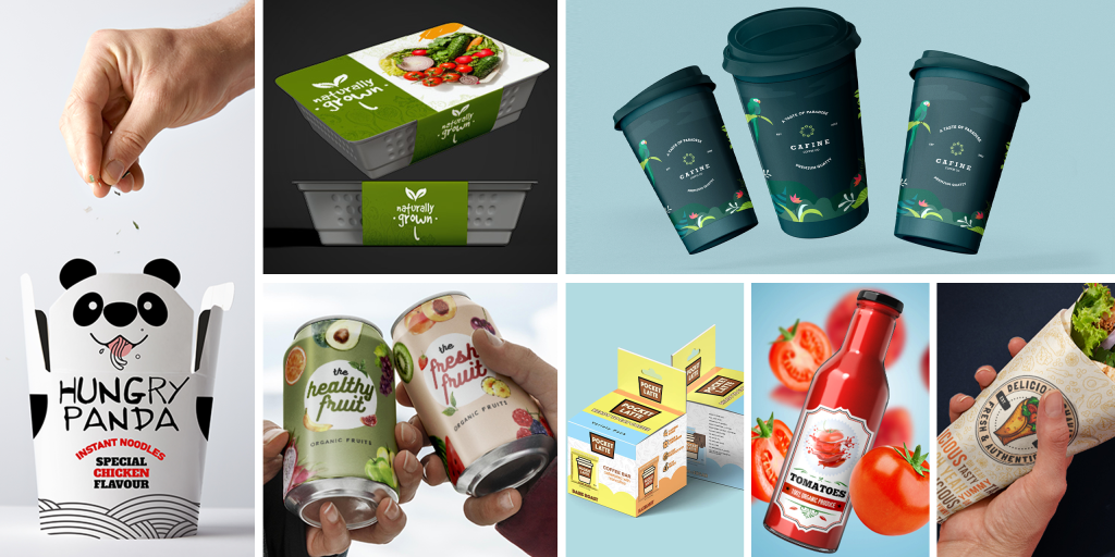
The above designs are a narrative in itself, aiming to captivate and resonate with consumers.
We believe that food packaging is a canvas for storytelling, blending creativity with practicality. Take, for instance, our fruit juice can design—a burst of nature’s vibrancy captured in subtle, yet vivid, hues.
Then there’s our playful ‘Hungry Panga’ brand for noodles, where the packaging itself embodies the brand name. A lovable panda graces the packaging, immediately captivating the audience, especially younger consumers, making the act of choosing noodles an engaging and delightful experience.
Lastly, in line with our commitment to sustainability, we’ve crafted eco-friendly packaging using earthy paper tones. These designs emphasize our dedication to minimizing environmental impact while maintaining an aesthetically pleasing and functional product presentation.
Each design reflects our meticulous thought process, ensuring it aligns with the brand’s identity and product message.
Summing up
At Design Shifu, we believe that exceptional food packaging design transcends mere functionality—it’s an artful blend of strategy, creativity, and consumer-centricity. Our team is dedicated to crafting packaging solutions that resonate with your brand, captivate your audience, and elevate your product on the shelves.
Whether you’re seeking minimalist elegance, eco-conscious innovation, vibrant visuals, or interactive engagement, we’re here to bring your vision to life. Let’s embark on a transformative journey, where your brand’s story meets compelling design.
If you’re eager to witness the power of impactful packaging firsthand, reach out and book a demo with us today. Let’s design a future where your packaging isn’t just a wrapper, but a captivating experience

