Why do some bakeries excel while others don’t? Is it just the flavor of their artisanal pastries, or is there something else going on?
Offering mouthwatering treats is one thing, but creating an eye-catching logo is another. A bakery must distinguish itself in a sea of pastry shops before the clients choose to return for more.
It is possible through a powerful and friendly brand logo. Pastries today need eye-catching graphics to go with the flavor, making the bakery distinctive. A well-designed logo inspires thought and piques your interest.
Ultimately, the logo should be distinctive and tempting, letting the target audience know about the brand.
Examples of Bakery Logos for Inspiration
Creative Bakery Logo
A sophisticated bakery logo requires a lot more effort than just baking. You can come up with alternative visuals to entice the taste buds of your potential clients in place of the traditional cupcake, rolling pin, or cookie icon, or you can choose a script font or another that can substitute for messages and mood.
Consider coming up with a rhyme, and use a simple design to make your brand name stand out in the logo. Why not make your bakery’s logo look like a house or building? You can add a relatable text to your cupcake image or wheat to give your logo a more authentic feel if you want it to inspire a sense of belonging.
Cute Bakery Logo
Many individuals highly value food aesthetics. The tongue only follows the eye for them. To weigh their appetite, use adorable illustrations and colors while designing a bakery logo. If you offer cakes and other pastries, choose a logo that depicts them. Designers typically use quirky details and pastel colors for adorable bakery logo ideas.
Some adorable logos also feature cartoon drawings! This logo design encourages your items to be prepared uniquely and with love.
Cool Bakery Logo
Enticing logos help draw in hungry customers; some bakeries add features like bread, wheat grains, windmills, and baskets of baked cupcakes.
The color scheme is yet another crucial component of an awesome bakery logo. Color impacts our emotions and actions; did you know that? Use it now to create a visually appealing bakery logo.
There’s a good reason why certain cupcake businesses identify themselves with pink hues. Pink soothes us and conjures up happy memories.
Simple Bakery Logo
Why is simplicity in design still essential? It may sound cliche, but when it comes to design, less is more, especially regarding logos. The minimalist aesthetic is still prevalent worldwide; young individuals are becoming less materialistic and choosing it as an aesthetic. It is safe to claim that you can choose a simple style for your bakery logo!
We all know what a typical bread ingredient is, and looks excellent in a simple logo design. Contrary to cakes, pies, cupcakes, and other sweets, wheat is a little less prevalent and has a simple interface.
Your logo should be unique, creative, and simple to comprehend to draw customers. Here are some examples of bakery business logos that you can consider as you choose the name of the company you want your people to remember. It might have something to do with the menu you’ve picked, something personal, or even something to do with you!
Best Bakery Logo Examples
Baked Rituals
Rituals are a solemn sequence of actions carried out in a predetermined order. However, Baked Rituals is a bakery dedicated to creating a line of everything baked! Their logo, which features two wheat grains reminiscent of numerous golden-colored bagels, immediately conveys this.
The logo elegantly conveys the ease with which fresh goods can be made, leaving you to consider the fresh and clean food that Baked Rituals will serve you.
Home Cake
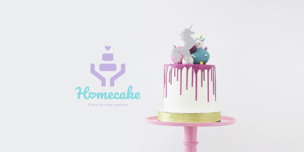
The logo for Homecake calls attention to that forgotten detail, making the baking process homely and enjoyable. You can enter the building and check what delectable goodies they have created with the fun colors and charming graphic style.
In this simplistic logo, a cake is held in the hands of drawn figures, and a light-hearted phrase surrounds the logo. The use of pastel hues aims to express the harmony and sweetness of freshly baked cakes.
CakeDay
CakeDay is a company that specializes in designing and marketing customized desserts, bento cakes, cookies, and other sweet treats.
The logo is a fusion of chic elegance and delectable whipped cream writing. A warm and enduring experience was created by carefully choosing the color palette to convey celebration and emotion.
You can sense the welcoming environment in this bakery from the wooden design and its definitive text. The logo gives a clear picture of what happens in the kitchen and entices you to try some of their freshly baked delicacies.

PAINPAIN – Unique Examples of Bakery Logos
Is there anything better to enjoy a croissant than a high-end Parisian bakery? PAINPAIN is a self-explanatory brand whose name translates to “bread” in French.
With this logotype, the designers accomplished an excellent job. The golden shadows stylishly complement a straightforward but impactful blue text, highlighting the brand’s elegance.
Sugar Bakery
With a rolling pin and an expressive logotype, this Seattle-based bakery chose to use a clear message for its logo. Customers are transported by the aesthetics back in time to a quiet day at their grandparents’ house, where they may watch them bake pastries and then breathe in the aroma of freshly sweet treats when the oven is opened. Looking at it, you can tell you’re in for a tasty treat.
Wrap up
Do you need to design a brand new logo for your new bakery or update the existing one? In any case, Design Shifu is here to help! You can get your new logo by subscribing to Design Shifu!
Why not subscribe to Design Shifu and get an unforgettable and unique logo? Start your journey with Design Shifu by subscribing here.

