Not every brand needs to adopt modern design trends while weaving its corporate strategy. Who said vintage and retro wouldn’t tie in with your audience?
As industries expand and more players enter the market, businesses need to play on different specialties. One can be its long history and years of experience; the other can be its relevance with culture and belongingness. Vintage logos allow brands to connect with their history to attract the right audience.
The first move for a brand to successfully tell its story starts with its logo. Each design trend represents an era. You’d be surprised when you notice how, for example, psychedelics brsing you back to the sixties and bubble letters look like seventies signage, whereas pixel art will transport you straight to the eighties and nineties.
Retro design and vintage logos give the brand a classy look and uplift its originality, advocating a history of experience and expertise and instilling trust in customers. In this blog, we’ll learn more about vintage logo design inspiration, its types, needs, and how you can design a vintage logo for your business.
Let’s get started.
TL;DR
Vintage logo design blends nostalgia with brand identity. In 2025, businesses use retro aesthetics, textures, handwritten fonts, mascots, and badges to communicate authenticity, history, and trust. Whether you’re reviving heritage or building a timeless identity, vintage logos remain a powerful design choice.
Why Vintage Logo Design? Is It A Good Choice For Your Business?
A vintage logo is a design style inspired by elements from the past often from the early 1900s to the 1980s, as noted by Zoviz. Its purpose is to evoke nostalgia, authenticity, and a sense of connection to earlier eras.
“Vintage design is highly emotional because it belongs to the history of each of us. It evokes nostalgia in people of all ages,” says Olimpio, a 99designer.
Brands usually decide on going for a vintage design for their logos either to position themselves as an experienced player in the market or to provide the customer with the experience of a specific era.
If a barbershop wants to capture the essence of a 20th-century tonsorial parlor, or if a theater company wants the customers to remember drive-in theaters of the 60s, all they need to do is go back to the design trends of that era and incorporate them into their brand design.
Choosing vintage for your business depends on the feelings you want to evoke in your potential and existing customers. A vintage logo is not just about selecting an old design. You must go back to your research zone and learn about the colors, media, print prowess, visuals, and design details popular back in the day.
For example,
Vintage logos tap into nostalgia to create instant emotional connections with your audience. While legacy brands stick to familiar designs for consistency, modern brands can use retro visuals to spark trust and familiarity like hearing a favorite old song.
Before choosing a vintage logo, know your audience, clarify your brand story, and decide if nostalgia aligns with the emotions you want your brand to evoke.
Vintage logo design inspiration
Texture logos
A textured logo uses visual interest from elements that resemble a surface such as wood, metal or fabric; which adds depth and personality to the logo. Textured logos can achieve similar aesthetic results to flat logos, but while flat logos are limited to clean lines and solid colour, textured logos are able to create something deeper and can assist in igniting emotions similar to those you later want affiliated with your brand.
Textures add depth to the design, which automatically evokes the touch sensation. Customers are attracted to the images you present to them physically and psychologically, and adding even the basic texture grabs the viewers’ focus.
Many F&B and apparel brands that want to provide an immersive experience to the customers incorporate texture into their branding. When it comes to vintage logos, adding a little bit of texture gives them a whole new personality and your customers are immediately drawn to their authenticity.
Take a look at these few examples of vintage logos used by brands.
Dough Works
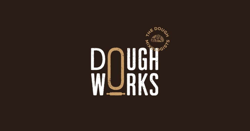
This vintage logo design of Dough Works highlights muted shades on darker backgrounds, and faded textures in the typography are pretty self-explanatory. The crumb textures on the typeface and the precise detailing on the dough emblem alone convey the message that the brand gives you the best-baked goods in town.
The Farmers Union
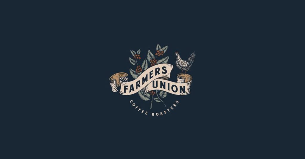
Apart from text, detailing certain elements of your vintage logo helps the design pop, much like this logo from Farmers Union Coffee roasters. It has textures in the leaf element of the coffee plant drawn behind the typography as well as in the animal character.
Compared to a flat design, it adds a unique touch to the logo especially because of subtle color tones and textures to bring out the brand vibe.
Handwritten typeface logos
Handwritten typeface logos bring out simplicity and authenticity. Adding only text to your brand face is indeed a bold move because, as easy as it looks, the most minute details are examined to ensure effective communication with the audience.
Handwriting typeface logos were widely popular in the 60s, 70s, and 80s be it in 3D, flowy serifs, heavy chunks of content, etc. If you want to picture it, think about 60s pop album art in flashy colors. Although some brands have adapted a flatter version of the logos, you can see that they have retained the handwritten format and structure. The best example is Coca-Cola.
Revolution Roasters
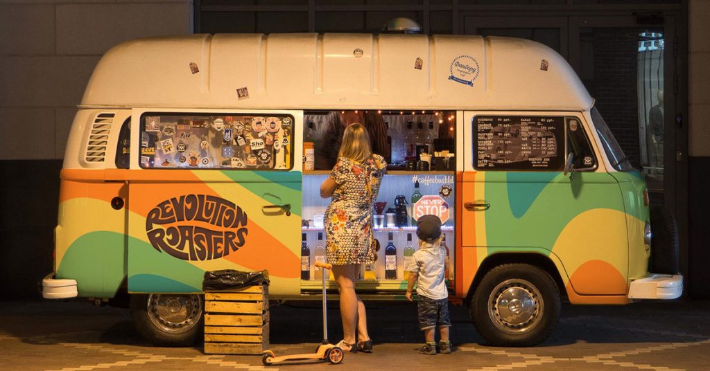
Carrying forward the grove, this 70s-inspired vintage typeface logo for Revolution Roasters sends out an immense hippie vibe. The custom hand lettering shaped like a coffee bean brings out the progressive, quirky and dynamic nature of the brand, something that truly defines Revolution Roasters and inspires you and other businesses to design vintage logos.
Typography Vintage Logos
If you are not a designer yourself, typography logos are the best and the simplest type of logos to create. All you need is a bold, progressive brand that does not require intricate details to convey its message and choose a typeface that resonates with this message.
Vintage logos are the epitome of typographic logo inspiration. Several brands opt for typography to highlight the brand name.
Cabela’s vintage logo design inspiration
Cabela’s logo screams Canadian, and we might as well call it the Canadian icon. This vintage logo gives us the 70s vibe of a perfect summer retreat, wooden porches, iced tea, and all-you-can-do outdoor activities. The subtle font, bright yellow color palette, and cursive typography give the brand the vintage feel it deserves.
Frankowitsch Delikates Seit 1932
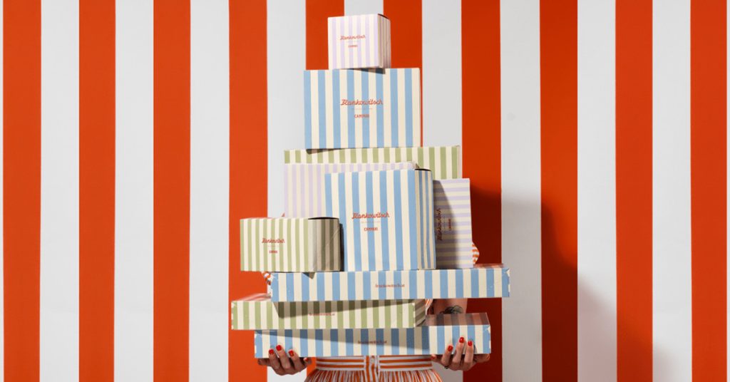
Pastel palettes have found their way to the current design trends. Back in the 40s; however, when the actual use of these subtle shades originated, it captured a joyous picture for the brands and their existing audiences.
The simple red cursive font combined with pastel shades of green, blue, red, white, and stripes gives the grocery brand, Frankowitsch, the perfect European summer vibe. If you are thinking about opening a European-themed cafe or retail store, check similar vintage logos like Frankowitsch, to get inspired.
Illustration Vintage logos
Custom illustrations and typography add character to your brand logo. They bring out the liveliness in the design and encourage your audience to form a connection that prompts them to buy from you. Illustrative logos ignite visual triggers.
You can go for minimal illustrations, mascots, or cartoon-style illustrations while retaining the vintage aesthetics. It all depends on the products and brand guidelines. Why not take help from Design Shifu to design custom illustrations for you? You get unlimited graphic designs and a dedicated designer to take care of all your design needs.
Hes Burger’s vintage illustration logo inspiration
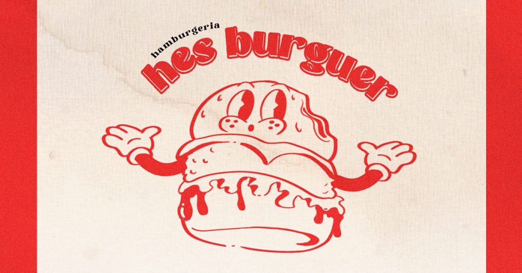
The cartoon-style illustration for Hes Burger triggers nostalgia. The character design of the hamburger with a welcoming face and hands that cover up the length of the typography and the use of white and red without overpowering the design together attracts its targeted customers, who are probably toddlers, teens, and young adults.
Cartoon illustrations are a great way to attract a younger crowd especially if you are a fast food joint.
Pictures Animation Studio illustration logo
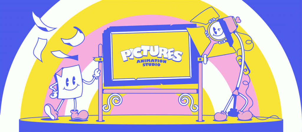
Pictures Animation Studio’s logo is based on a vintage character, Pipa, who originated at the beginning of the animation industry. The use of bright color palettes provided with white brings out the contrast in the design. The cartoon illustration gives the brand a perfect retro feeling. The typography is consistent with other elements of the logo and ensures readability.
Noise logos
Adding noise to designs has been the mark of retro. It is a kind of imperfection that adds details and depth to the design. Old-fashioned films/videos, and designs are famous for having speckles and pieces of various colors in places where they should not be. But this imperfection is something that was adapted by design trends nonetheless.
Century Coffee Club
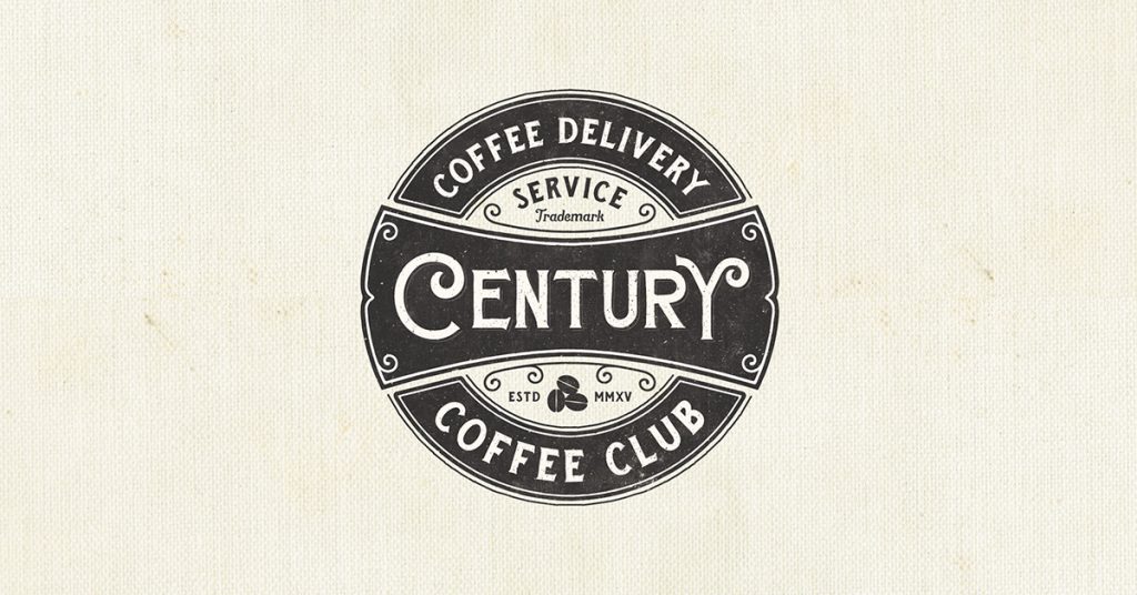
The detailing of Century Coffee Club’s vintage emblem logo is impeccable. In the 70s and 80s, the medium of marketing was primarily print. Since print technology was evolving, it had grains and imperfections in color.
Newer brands imitate the print style to reflect the printing style of the time. Notice the pixels on the negative space of the emblem. You can also add noise to your vintage brand logo to give it a retro feel.
The Brewski Textured by Kurt Harahap
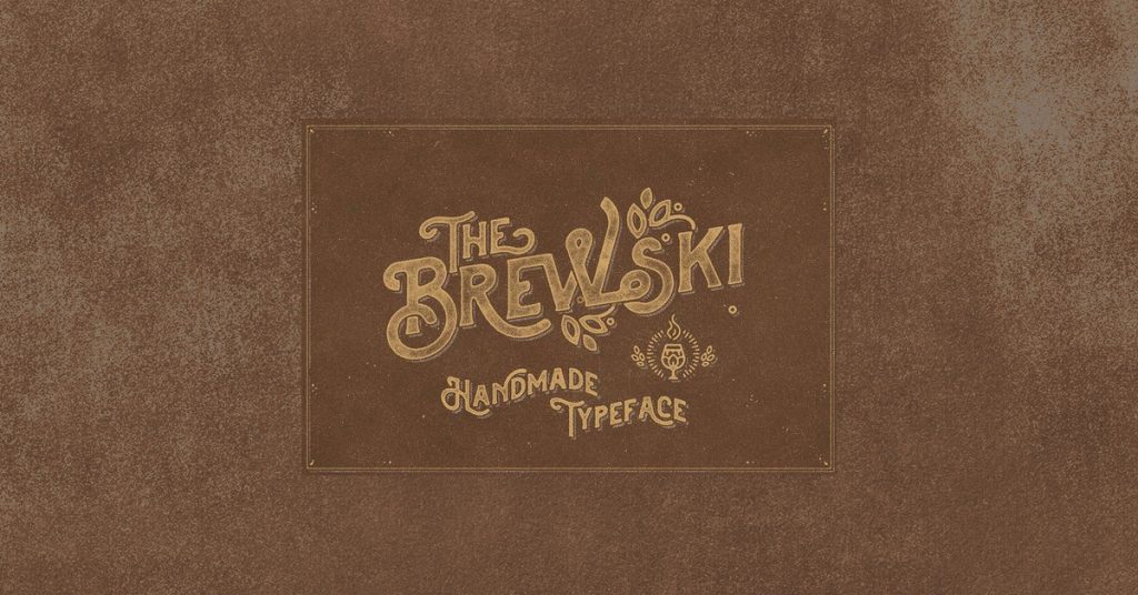
Hand-crafting your vintage logo design gives a traditional touch to your business and product portfolio. The noisy texture behind the hand-drawn monogram; gives it an intentional 3D effect, a perfect example to show how flaws in designs actually accentuate their personality.
Scout badges vintage logo designs
Imagine you are a tour & travel company specializing in taking teams on adventurous hikes. What is better than designing your brand logo shaped like a scout badge? Connecting certain design elements to the core USP (unique selling point) of the brand helps the audience decode brand communication effortlessly.
Scout badge logo designs enclose elements in your logo. You can choose from a plethora of badge shapes. Check out a few examples of Scout badge vintage logos.
Yellowstone National Park
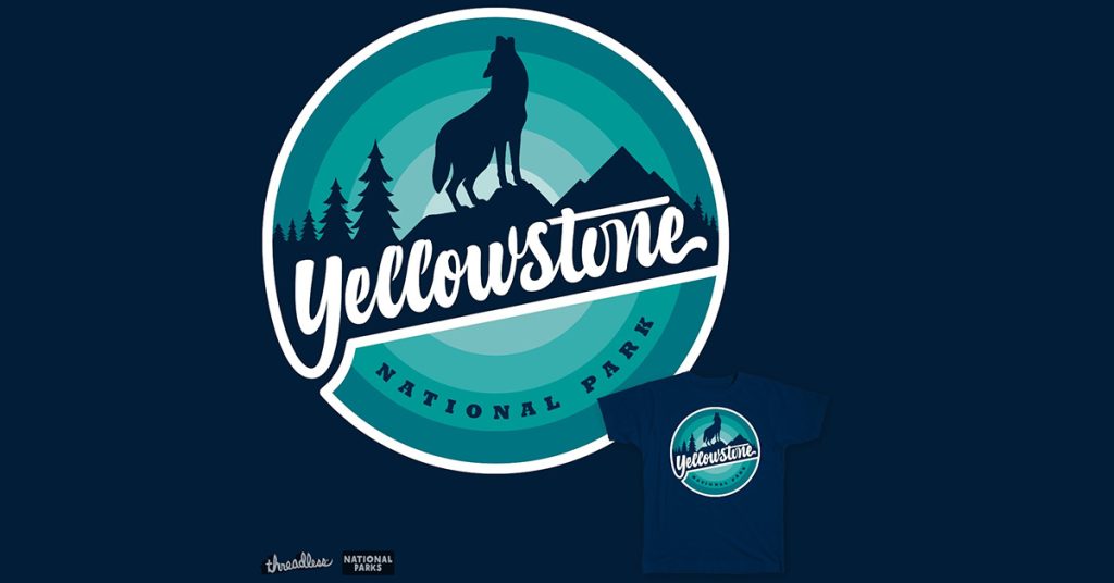
This authentic badge-style logo from Yellowstone National Park originates from the old Jurassic Park themes. The gothic colors and the silhouette of the wolf adds to brand authenticity. The park became one of the three recovery areas for the Northern Rocky Mountain wolf, a species almost on the verge of extinction.
V-House Steak bar scout logo design inspiration
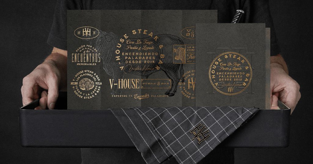
This utterly beautiful golden embossed logo will remind you of an 80s Hollywood party, where the room is filled with the icons of the century drinking champagne and stories of glory. This chic vintage look goes very well with luxury brands much like the premium eatery V-House Steak and Bar.
Retro mascots Vintage Logo Design
Using characters and mascots in logos and branding develop a unique brand personality. It has been a long-standing tradition in marketing. Look at Duolingo and KFC. More brands are experimenting with mascots to amplify personalization and customer engagement.
Nellie’s
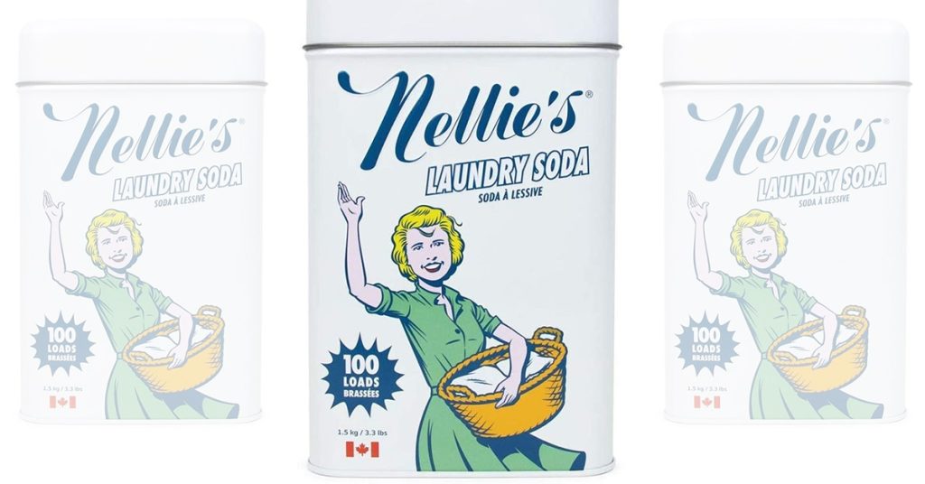
Nellie represents a simplistic way of clean living with the mascot of a cleaning lady. Take note of the vintage color palette — blue outlines and bright yellow color gives it a television commercial look from the 1950s. The use of a simple cursive font and the cleaning Nellie mascot will do the vintage trick for your brand.
ISRO mascot logo
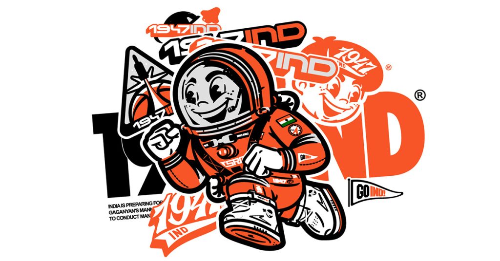
Observe this mascot representing the 1947 brand ISRO which recently developed the Gaganyan, which makes India the fourth space superpower to independently carry out manned space flight. The mascot transports us back to the arcade and the era when NASA had just launched the Apollo program.
Using mascots for brands and projects creates a sentimentality in the customers, which is beneficial in terms of marketing and sale.
Most Popular vintage logos
Plush
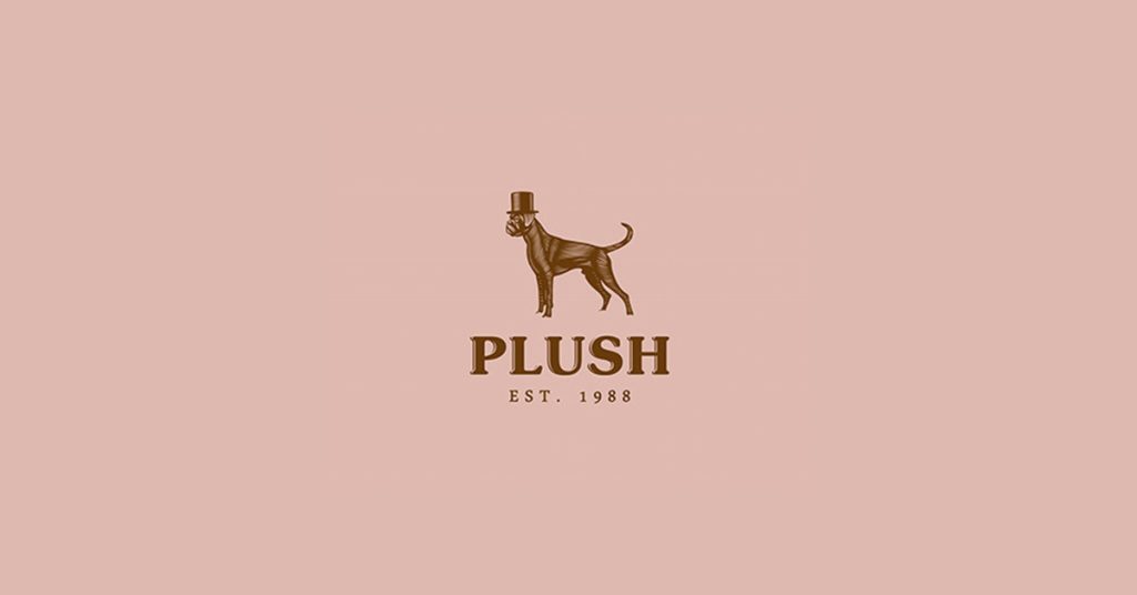
Designed by Jacob Light, Plush logo gives us a glimpse of minimalism in the 80s design. It uses serif fonts and an illustration of a dog, all designed using one color.
Ben and Jerry’s
You can give your brand the perfect artisanal look much like the vintage brand logo by Ben & Jerry’s. This rugged hand-crafted logo communicates the brand’s authenticity and promises to deliver world-class ice cream from their homemade recipe and ingredients that grow in their own backyards.
Jack Daniel
Jasper ‘Jack’ Newton Daniel’s famous charcoal-mellowed whiskey will transport you to heaven with its product and brand design. This Jack Daniel’s logo looks like a simple pen illustration, yet it successfully represents the brand.
Red Wagon Diner
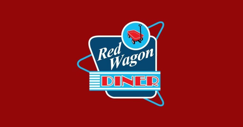
The retro logo of Red Wagon Diner combines vintage fonts, color palettes, imagery, and shapes to create an old harmony. See how elements combine together for the restaurant brand logo.
Coca Cola
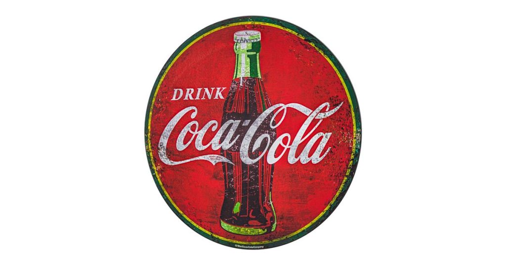
The use of the classic red-white and the fishtail sign is something that has remained intact over the years of Coca-Cola’s swirly transformation. Observe the calligraphic typeface used in the logo of Coca-Cola. The edges of the letters pose a similarity to a handwritten calligraphy note. Currently, Coca-Cola has a more minimal logo; however, the roots of the original are easily recognized.
We have another list of 30 Best Vintage Logo Design Ideas for Timeless Branding in 2025
for you to check out for more inspiration.
Key Takeaways
- Nostalgia sells: Vintage logos instantly connect audiences emotionally.
- Texture, fonts, and colors matter: These elements set the tone of your brand story.
- Mascots & badges are back: Great for storytelling and personalization.
- Balance modern & vintage: Keep designs timeless but readable for today’s audiences.
- Versatility is key: Vintage logos work across industries food, fashion, lifestyle, or heritage brands.
It’s time to change your logo!
Vintage logos effectively communicate your brand voice and history to your audience and evoke a sense of familiarity. Your logo can be anything from a handwritten mark to a mascot. Decide on the brand voice to find the unique logo that your brand deserves.
Once you have decided on the vintage trend for your brand, figure out how to strike the right balance between the modern and vintage elements in your design. A perfect blend between the two will uplift your visual cues and successfully engage with your existing audience.
Research the design style, color palettes, fonts, and construction associated with your chosen style. Combine custom illustrations, typography, colors, and layout to achieve the look that you are looking for.
Do you want help designing a vintage logo for your business? You can always count on Design Shifu for all your logo design requirements. Not to forget, you can always pick from our subscription packages that best meet your needs and budget. What’s more, these subscriptions come with 24×7 support, unlimited revisions, and a 100%, 14-day money-back guarantee!
FAQs
1. What is a vintage logo design?
A vintage logo design draws inspiration from past eras (1900s–1980s) and uses retro elements like textures, old fonts, or mascots to evoke nostalgia and authenticity.
2. Why should I consider a vintage logo for my brand?
3. Which industries benefit most from vintage logos?
4. Are vintage logos still relevant in 2025?
5. How do I create a vintage logo for my business?
6. Can vintage logos work in digital-first branding?

