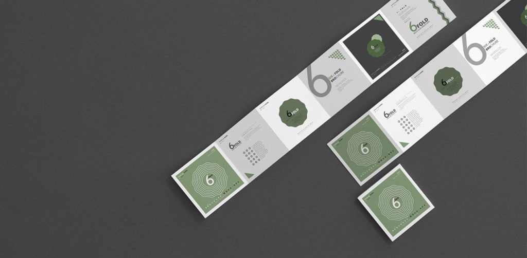
Imagine a situation: You have a lot of information to talk about your product. But you are confused that how to put all of it in a brochure, without making it too cluttered. And then you stumble upon a 6-panel brochure of a brand and you experience a moment of euphoria. Because: Now you can display your humungous information systematically and effectively. Also, aren’t you happier that the messaging that you wanted your end customer to listen to is communicated clearly? However, if you are not looking for 6-panel brochures, here are some examples that you can refer to for other brochure ideas.
Elements of a 6 Panel Brochure
Before looking at some great examples of 6-panel brochures, what should a good brochure contain?
Effective title
The first page of the brochure will make the first impression about the company in front of the reader. And hence that can’t go wrong. Look at this example:
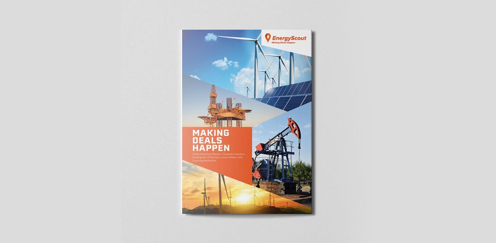
Isn’t this putting out the messaging straight? If you have a solid idea in mind on how to crack a good brochure, but falling short of a designer, why not reach out to Design Shifu for some great designs? Check out our portfolio. We shall also give you unlimited designs at only 399$ per month.
Content
Of course, this is important, because that will decide whether the end customer is interested in your offering or not. Just ensure that the content you give is crisp and clear and provides a solution to the problem of the end customer. Also ensure that the CTA is displayed at the most accurate place of the brochure, and which cannot be missed by the customer.
Layout
Just because you have a 6-panel brochure doesn’t mean that the information can be displayed haphazardly. Ensure a good layout is kept in mind before the brochure is designed. Avoid these mistakes in your designs.
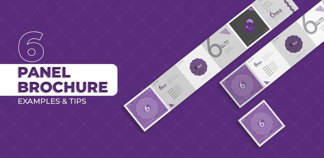
Examples of 6 panel brochures
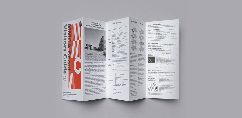
6 Panel Brochure of a Car Brand
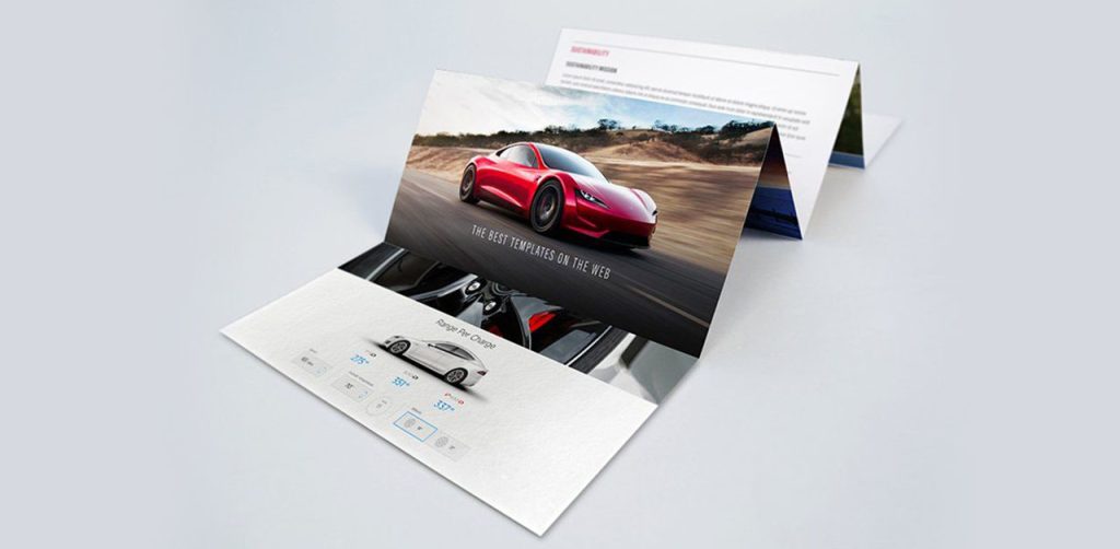
If you look at the brochure, the brand has dedicated 3 sides entirely to the pictures and the remaining 3 sides to content. This type of brochure looks sleek and very elegant. Because it is a car brand, visual delight is a must apart from technical specifications. So the brand has driven home the point through their car. Such types of brochures can be also made by beauty companies who can use model pictures applying the products on one side of the page and the content used in the beauty products on the other side. The only care that needs to be taken here is that the images used should be hi-res and look very appealing and justify the dedication of an entire side of the brochure to it.
Another view of such type of brochure.
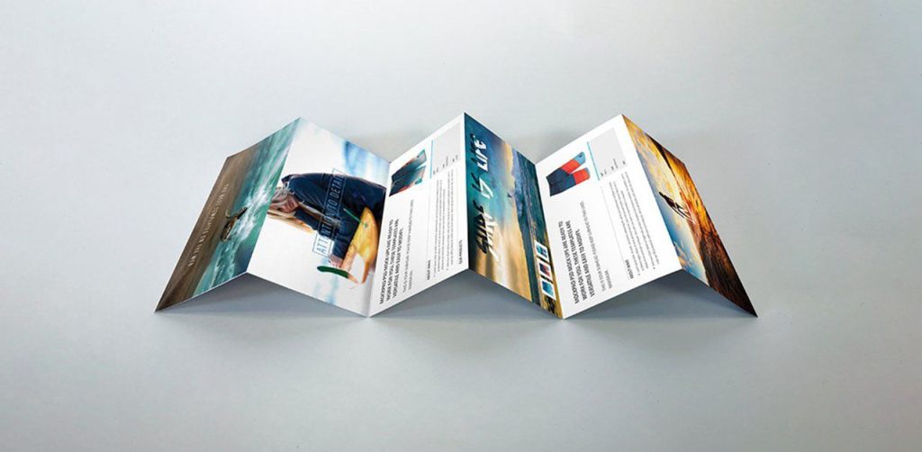
An advantage of this kind of brochure is that the brand can give a lot of pictorial references to the content used in the brochure.
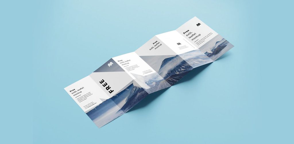
Text Centric 6 panel Brochure
Such a type of brochure has a lot of content written. Those brochures may or may not have too many images. Such type of brochures requires a lot of detailing and content curation because any excess content can make it unreadable and might miss the attention of the end customer.
It’s like a microsite about the company with the company information, services, achievements, and CTA. One should ensure that the text should be arranged properly with a lot of emphasis given to bullet points and sub-headings etc. Images can be added or completely avoided too in such types of brochures.
Such types of text-heavy brochures should also concentrate on the color schemes used. The same color family should be used to ensure uniformity in text and design.
Restaurant menus, mall visit documents, etc. can be made using Text-Centric 6 panel Brochure.
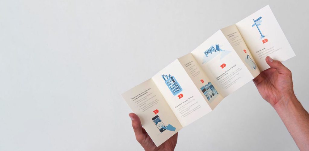
Another example is this.
Here, images aren’t used but this is a text and illustration-heavy brochure. Looks clean and aesthetic and also doesn’t become too bulky for the reader. Like this.
Too many text-heavy brochures will lead to a drop in customer interest and will not lead to solid conversions.
By the way, do not get confused between a pamphlet and a brochure. Refer here to know the exact difference.
Also, if you want help designing a brochure for your business, then get a dedicated designer and unlimited graphic designs for just $399 per month from Design Shifu.
Story Based 6 panel Brochure
Such types of brochures create a story through imagery or content. When you open the 6 folds, it looks like a storybook reading and that makes it very interesting and a hit with the audience. Like this.
This brochure has a scenery picture spread throughout the 6 folds with some content written on each fold. Though it’s a sample brochure, you can create your own story that can tug the hearts of your end customers and that will lead to more eyeballs. These types of brochures can be explored with travel companies and décor companies who are out to provide an experience of a lifetime to their customers. The stories have to be unique to the brand and make the customer fall in love with the brand.
Merch brands have a very good opportunity to create stories for their products. So, do try out story-telling brochures. And if you want to create your merch ideas, then refer to this.
Conclusion
Creating a 6-panel brochure requires a lot of skill and understanding of your business. Even if one of the virtues is missing, it would lead to a bad brochure design and that is something none of us want, don’t we? So, hire a design partner like Design Shifu to create a beautiful brochure for you and make your life easier.
Design Shifu is an unlimited graphic design service that can help you create not only professional-quality designs but the best brochures for you. Our services are at a fixed monthly rate of as low as $399 per month.