Struggling to create a logo for your finance business?
Successful companies invest millions of dollars in their brand identity to develop strong brand recognition and association. Logos act as the “face” of the business because they are memorable and recognizable. We have covered several logotypes along with examples to unblock your creativity and get you designing.
Scroll down to find our list of financial services company logo design ideas.
Financial services company logo design ideas
Financial Monogram Logo Design Ideas
A monogram logo combines the initials of the business name to create an interesting design, which may or may not form a new shape or an icon. The advantage of a monogram logotype is it is device responsive, which means it can be placed on a medium of any size effortlessly.
The logo created for the Bank of Cashton is the perfect example of a monogram design idea. This logo is the integration of two alphabets B and C. It has a solid font and subtle color palette, which goes well with the motto of any financial service provider. It appears robust and professional.
Financial Brand Mark Logo Design Ideas
A brand mark logo combines image and text for quick identification of the business. By simply removing all letters, phrases, and other information from a logo, brand marks allow your business to visually communicate its meaning to audiences. Just like the MasterCard logo.
The MasterCard logo is a vibrant geometric design made up of two overlapping orange and red circles. The color scheme of the sign stands for growth, vitality, and mobility, while the circles represent collaboration and unity.
ING, a global financial institution of Dutch origin, incorporates its Dutch heritage and culture — the national animal of the Netherlands (lion) and the nation’s official color (orange) — into its logo. The lion used in the logo denotes power, bravery, and force. ING promotes its brand through its emblem, which features a lion icon to demonstrate that they have a firm foundation.
The Chase Bank logo has one of the best financial logos. The brand mark is a blue geometric pattern, which depicts cash flow. In a world, which is becoming increasingly digital, the logo still thrives because of its presence on almost every business asset and merchandise.
Customers are familiar with it via online and mobile platforms, as well as from millions of credit and debit cards and thousands of ATMs and locations. Chase adopted the solid blue color octagon in 2004; it continues to be a strong, instantly recognizable sign for the Chase brand.
Financial Wordmark Logo Design Ideas
Wordmark logos prioritize text and typography. Usually, the organization’s name is the only element included; no mascots, symbols, or badges.
The Berkshire Hathaway logo is a simple wordmark logo in New Times Roman typeface. It is both straightforward and effective. The logo has a professional air to it and is comprehensible, trustworthy, and memorable.
The mobile bank, Allies logo, is another wordmark logo. Despite being straightforward, the fun circular curve in the letter “a” is an interesting detail.
Deloitte has a custom sans-serif typeface with some of its corners chopped diagonally. Along with the bold title case, the solid lime-green dot provides distinction to the black logotype and symbolizes growth, riches, and advancement.
Financial Combination Logo Design Ideas
A combination mark is just a logo that combines both the logotype and the logomark. Combining text and image or icons improves the branding message and makes it clearer what a company is all about.
Just like in the case of the Bank of America logo. Changes to the American flag represent the bank’s affiliation with American ideals. In addition, the rectangles resemble a farmer’s field, which communicates directly to their primary audience of farmers.
Similarly, an English business called Prudential focused on offering financial and insurance services. A simple, classy emblem is the central focus of the design, which is surrounded by a wordmark. The woman seems gazing into a mirror in her hand.
A coiled serpent on the left is an ancient symbol of wisdom. The woman’s face, as the company’s website claims, humanizes the company in the faceless world. The emblem symbolizes core values: Prudence, Justice, Fortitude and Temperance. It also stands for understanding of the past, present, and future.
Emblem Logo Design Ideas
Financial institutions adopt emblem logos to convey a vintage feel and to appear dignified and well-established. This kind of logo is a great option for organizations today who wish to portray assurance, dependability, tradition, and legacy.
Some emblem logos also include text inside the symbol. You can also consider badges, seals or crests if you want to accentuate the history and legacy and design a vintage logo for your finance business.
The UBS logo consists of a three-key emblem in black next to the red lettering “UBS.” The intricate design of the keys stand for the core values of the business — confidence, security, and discretion. The decorative components at the lower ends of the keys are reminiscent of old coats of arms, while those at the upper ends of the keys demonstrate a higher level of security. The UBS emblem therefore symbolizes the long history and tradition of the bank.
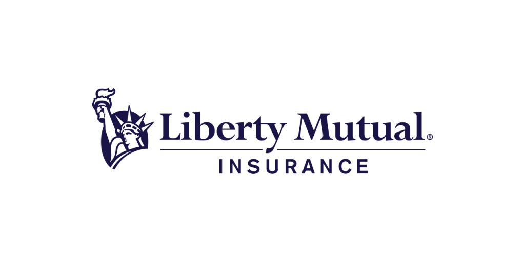
Liberty Mutual Insurance plays around with the Statue of Liberty as its emblem in the logo. The company’s trustworthiness and accountability are reflected in the emblem, which gives clients a sense of security. The use of such a powerful symbol in a company’s visual design communicates trust, experience, professionalism and responsibility.
Mascot Logo Design Ideas
Mascot logos often have comical exaggerations. They portray the personality of the brand with interesting faces and characters. Brands like Duolingo have extended their mascots into other aspects of their marketing to establish their position in the industry. Mascots add a touch of personalization to your brand.

Understand your audience, brand messaging and mission while designing your mascot. For example, this mascot logo template, with a man holding a bag of cash, would resonate well with an Indian audience.
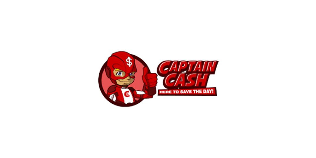
Captain cash is another example of a perfect mascot logo design. Captain Cash presents itself as a personal company by having an upbeat-looking mascot in their logo. They aim to reduce the fear associated with borrowing money.
The fact that Captain Cash incorporated humor and enjoyment in its financial logo sets it apart from other online cash loan providers in Canada.
Abstract Logo Design Ideas
The versatility of abstract logos makes them a popular choice among firms who have a lot to say. Abstract designs enable businesses to convey more ideas and emotions through one sign. These logos may be minimalist with a line-drawn image that conveys a brand’s message or have complex non-literal imagery using symbols, forms, patterns, or pictures.
Abstract logos that stand out are simpler to recall like the logo of Airbnb. If you use a basic or well-known symbol, your logo will be easy to forget and blend in with thousands of others. So, play with shapes and typography to create an original symbol.
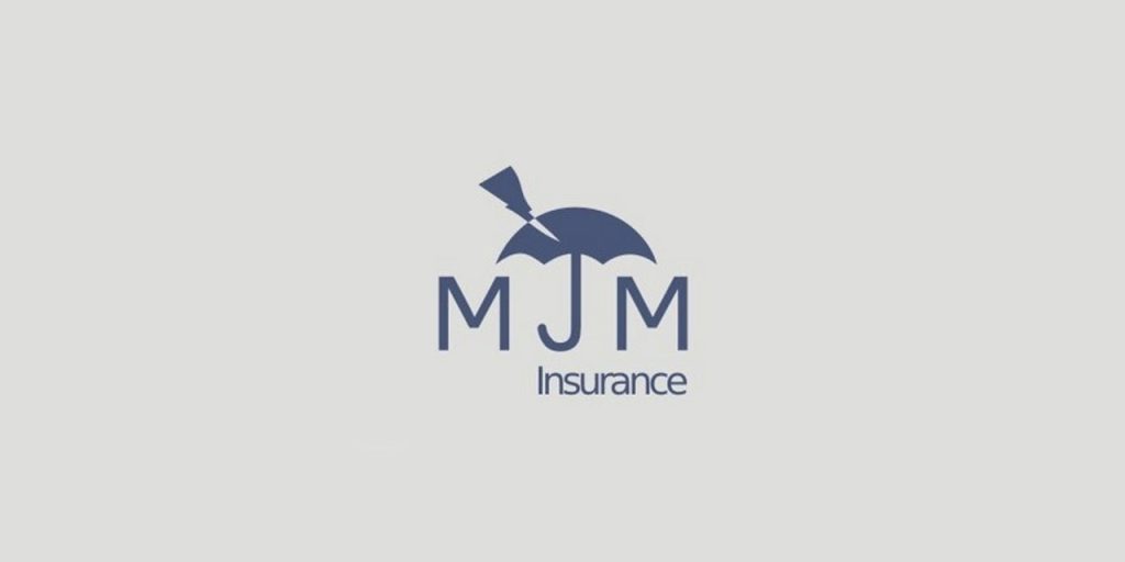
For example, the MJM logo has an umbrella that is saving the letter from lightning. This is such a clear message to showcase the business ideology. This is what an abstract logo is all about. It speaks a ton for your business.
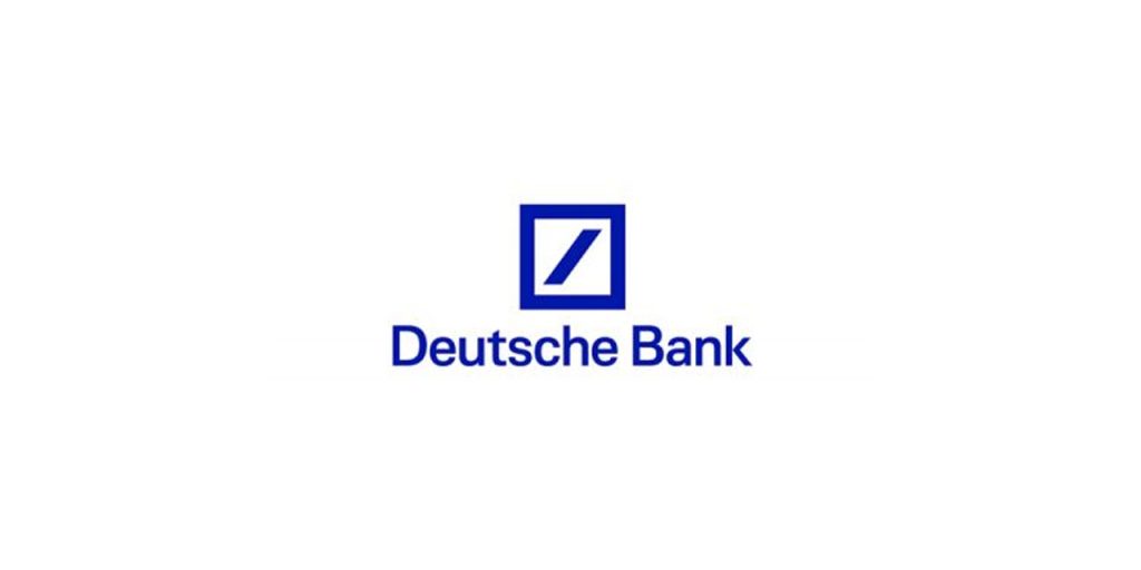
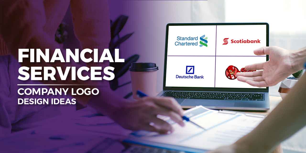
Deutsche bank’s logo is also a great example of abstract logo design. The emblem draws attention to the distinctive position that the Deutsche Bank occupies. Even in a difficult economic climate, the diagonal line suggests that Deutsche Bank is committed to executing its own line and competing in the financial sea. The square represents steadiness.
Illustrative Logo Design Ideas
Logos with illustrations often have intricate design components. Typically, pictures of a small segment of what the business does, a picture of the company name, or even a mascot or figure that is used to symbolize the nature of the business.
To expand the brand internationally, Nova Scotia bank changed its name to Scotiabank in 1975. A logo with this term and the recognizable symbol of a stylized “S” simultaneously appeared. A globe, a representation of the fact that the global corporation has a network of branches all over the world, was placed in front of the letter.
White was the secondary color, and red was the dominant color. This illustrative logo design made various headlines back in the days.
Two blue and green vertical spirals make up the renowned Standard Chartered logo. The spirals, which are intertwined to create a three-dimensional impression, represent a strong and dependable cooperation between the bank and its clients. The bank stands out because of its distinctive, easily recognizable illustrative spiral Standard Chartered logo.
Best practices to create a financial services company logo
A creatively balanced logo design draws positive attention and makes a great first impression. A well-designed company logo will bring all the elements of your brand together and spark dialogue with your clients and customers. Here are some design components you must consider while designing your logo:
Color
Colors evoke different emotions. Several meanings are attached to each color. Many financial institutions choose one color in their logo, leaving the remaining elements in either black or white. You certainly don’t have to use just one color.
You can combine more than one color to create a cohesive brand color story. A good practice is to pick your brand colors. If you don’t have defined your brand identity yet, observe your company assets, materials and social media pages.
What colors do you majorly use? Define the emotions you want to evoke. Create a palette out of those colors. Stick to 2-3 colors.
Symbol
Our brain takes only 13 milliseconds to process an image. Using icons and symbols that illustrate what you do enables your target audience to decipher your business message quickly. A corporation that specializes in long-term investment may select a tree or mountain, while an international finance company might use a globe or map.
Design a symbol that captures what makes your organization unique rather than the overused coins, dollar signs, and charts icons. Avoid using stock illustrations.
If it’s overwhelming for you, consider professional help. Subscribe to Design Shifu and get your logo designed at a flat rate.
Layout
A well-designed logo communicates professionalism, trust, and credibility encouraging visitors to stick around and contact you in times of need. A cluttered layout may speak otherwise. Ensure that the elements are balanced and have uniformity. Do not cram elements into your logo that your audience is unable to decode it.
Typography
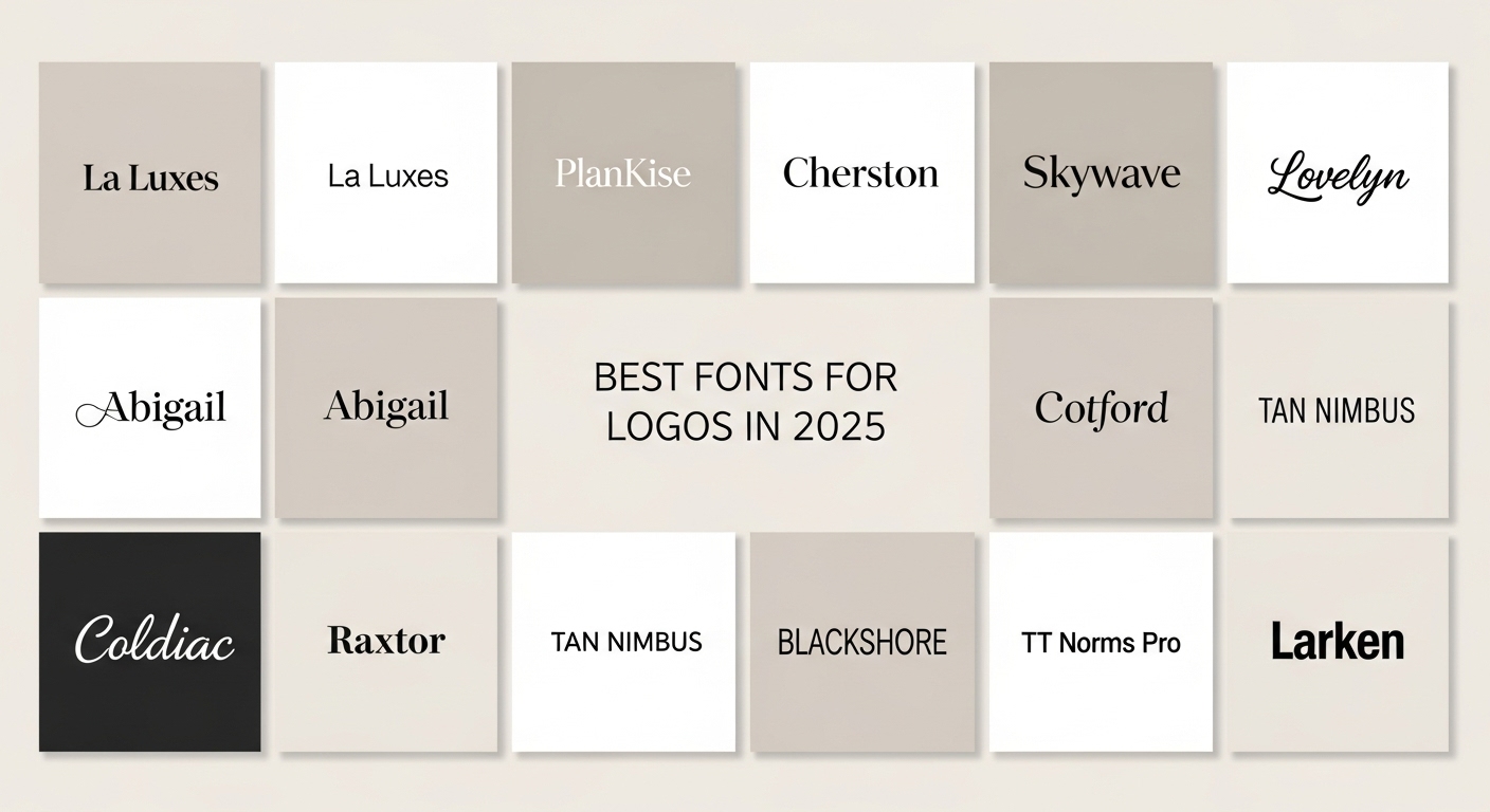
If you use typography in your logo design, be careful of the typeface, font size, and colors. You can download new fonts from websites or create an original font too. Financial institutions can choose from sans-serif to serif range of fonts depending on your brand messaging.
While companies with a long history opt for serif fonts, newer tech-led financial companies go for sans-serif fonts like Futura to communicate their modernity and futuristic vision.
Lastly, prioritize fundamentals over design trends because your logo will stick with your business for years to come, unlike a trend that fades away within months.
Wrap Up
A company’s logo encapsulates the brand’s complete story a visual, forming a crucial aspect of the company’s brand identity. People start recognizing your logo as your brand expands, and familiarity promotes trust and credibility in your business. So, invest your energy and time wisely to create a memorable visual identity for your business.
Follow the tips and create an instantly recognizable logo that distinguishes you from your competitors. Want help designing a logo for your finance business? Get a dedicated designer and unlimited graphic designs for just $399 per month with Design Shifu.

