When we come across a graphic design, our minds don’t automatically deconstruct the different elements of graphic design used to create it, unless we actually already know them.
That is why sometimes you think you can create a design that looks seemingly simple but when you look at the end result you’re like…
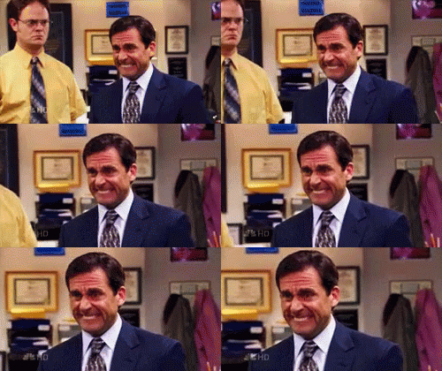
“I don’t hate it. I just don’t like it at all and it’s terrible.”
– Michael Scott – You when you look at your design attempt
That’s because graphic designers have an in-depth understanding of the principles of graphic design that makes their design look professional. Even with the right tools, it is difficult for amateurs to create a polished professional looking graphic design.
The thing about graphic design is that there is always something new to learn, the newest software or program to master, the latest design trend and style to follow and sometimes this can be overwhelming to keep up with when your foundations are not as strong as they should be.
So let’s take a step back and go back to basics for a while because today we’re going to talk about the different elements of graphic design and how to apply them.
1. Lines
Lines are a versatile element of graphic design. They can be used to highlight something in a design, divide the design, or add angles to it as well. Lines can also be used to evoke certain ideas or convey the emotion that the design intends to convey.
Straight lines can evoke a sense of order, while curvy lines or slanting lines can emphasize movement. You can also use two different types of lines in one graphic design to add contrast.
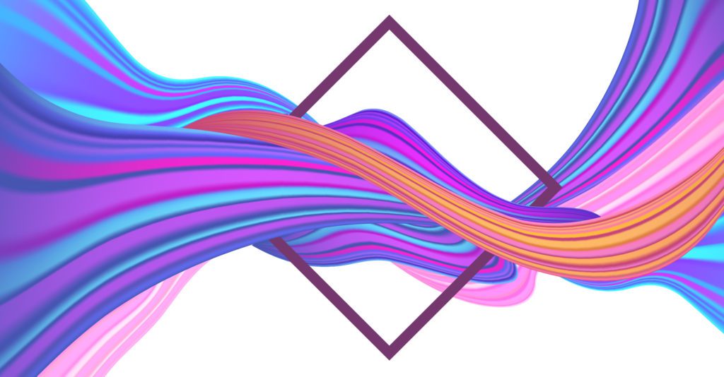
Look how curvy lines are being used to evoke the idea of a flow and straight lines are used to emphasize the focal point, in the following design.
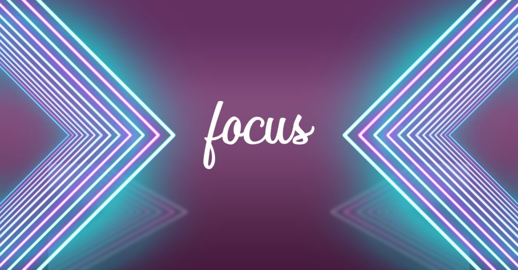
Another effective use of lines is the concept of ‘leading lines’. The term leading lines means exactly what it does. Leading lines are used to lead the eye of the reader to the focal points in the design creative. Take a look at an example of how these lines lead the eyes of the audience to text in the center.
2. Scale
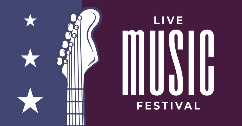
Scale is the deliberate sizing of individual elements of graphic design. However, it does not refer to the size of the design itself. Scale refers to the direct relationship between the elements of a design. It helps us make sense of designs and navigate to the focal point through the design elements.
For example, there is a reason why designs have the scale of the headline larger than the scale of the text of the article.
3. Color
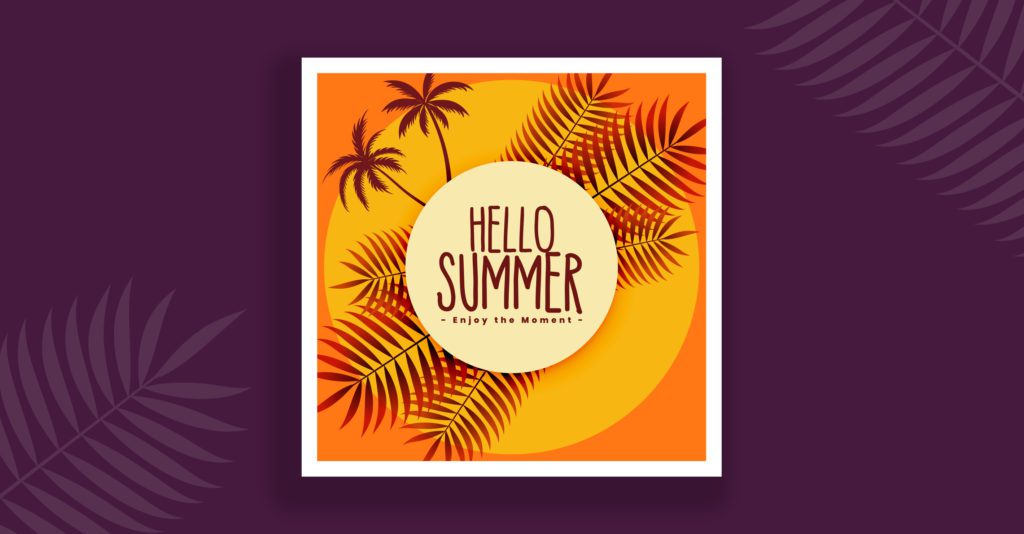
Color is one element that can make or break your design. Each shade of color has its own connotations and much like lines, they also channel and evoke certain emotions. Warm colors like red, yellow, orange, and variations of these three, emphasize and evoke happiness, energy, and positivity.
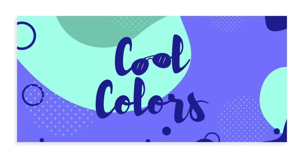
Cool colors, like green, blue, purple, and variations of these, on the other hand, evoke calm, relaxed, and reserved emotions.
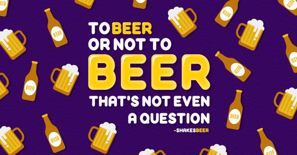
Colors can be used to establish a tone in the design as well. Strong vivid colors create contrast in the design and add drama. Take a look at what Design Shifu created for International Beer Day. The colors stand out against each other creating a vibrant energetic look.
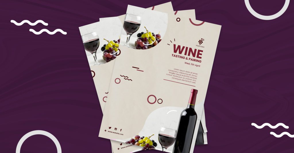
On the other hand, light, soft and pastel tones create a calm and elegant effect on the eyes of the audience.
4. Repetition
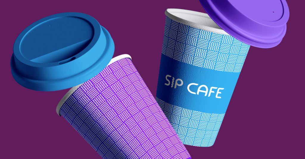
Repetition not only ties together your entire design but also your brand identity through consistency. Brand-specific designs that come to your mind as soon as someone mentions the brand name is an example of repetition.
Through repetition of elements like brand color schemes, general tones of the brand, etc, you establish your brand identity in your design. This makes your brand recognizable and memorable.
5. Negative Space
Do you see this manipulation of space?
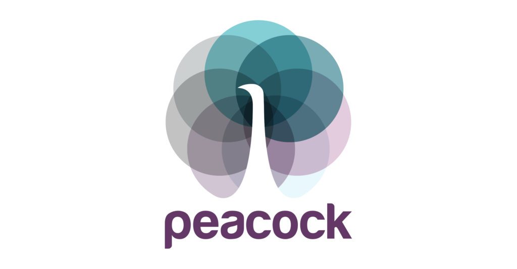
Negative space is just that. The strategic and clever incorporation of empty space in your design. One of the most clever design principles, negative space is like an optical illusion. The human mind can identify similarities or familiarities in order to make sense of a thing.
For example, we know there is no peacock in the above design, but the shape in between the colorful circles led us to see the peacock in the design as a whole. This is one of the Gestalt Principles of Psychology.
6. Alignment
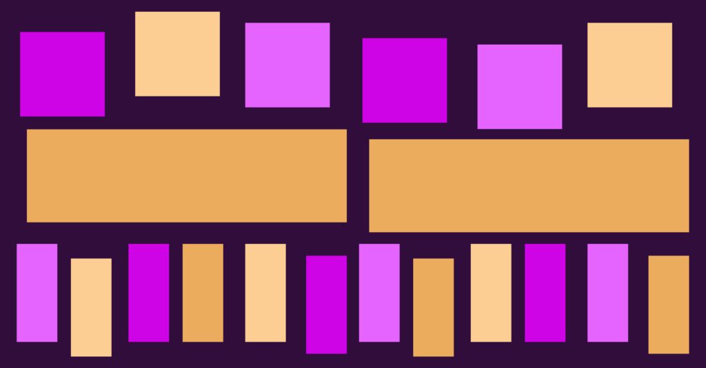
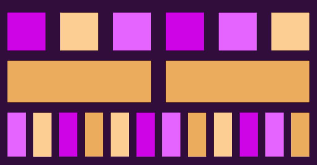
All the elements of your design have to be aligned by their edges as well as by their axis. An orderly composition of a design ensures a neat look and a symmetrical balance in the elements of the design.
For instance, this would give a designer or your audience a stroke
And this wouldn’t
7. Contrast
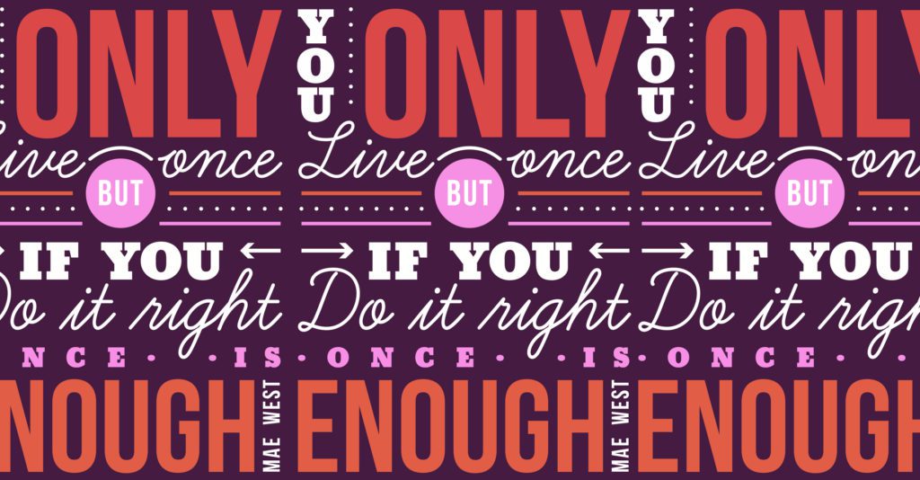
The juxtaposition of different elements in a design is to create contrast. Creating contrast in your graphic design has a great impact on readability and legibility. Contrasts such as dark vs light elements, thick vs thin elements, etc create visual interest and draw attention to particular elements in the design.
Take a look at how well the yellow text and the lights inside the house stand out from the rest of the poster. This is a great example of contrast when it comes to color.
Similarly, check out how contrast comes into play when thick text is juxtaposed against thin text.
8. Randomness
Until now, we’ve been talking about order and alignment. But there are some designs that require you to throw all these concepts out of the window and still come up with a design that is trendy, fun, and professional at the same time.
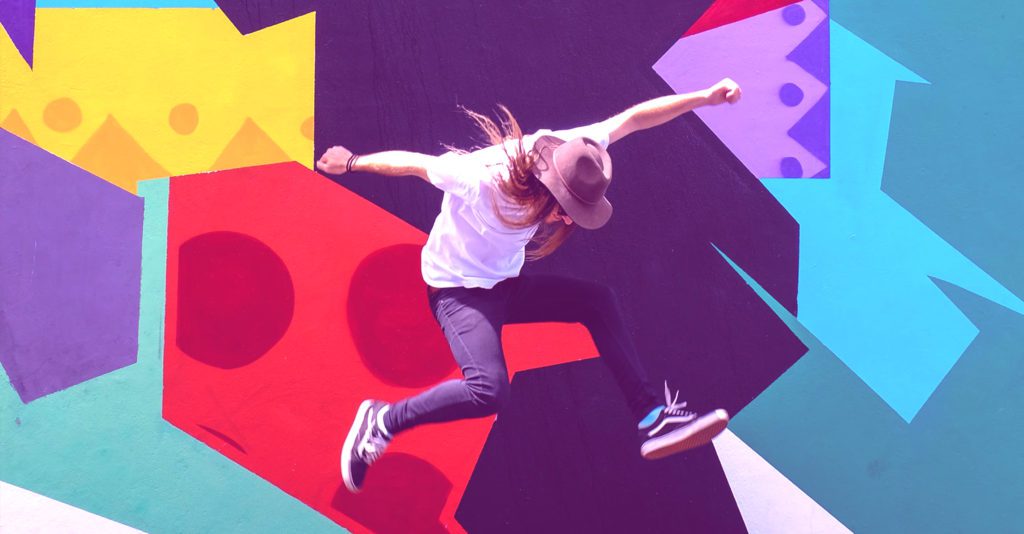
Randomness is an element in graphic design that can be a great tool if executed properly. Take a look at this poster, the randomness of the colors and the shapes make a brilliant background for the subject to be in.
Or this poster, that contrasts the text with the randomness in the color scheme in the design.
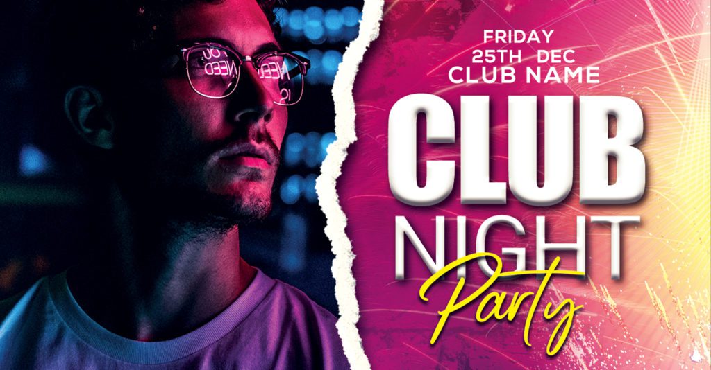
While these designs don’t overthrow every rule or design principle, they do twist and turn them to their preference to create a new and fresh look.
9. Depth
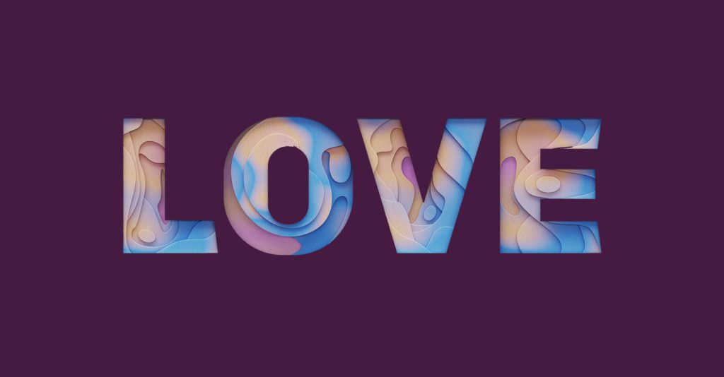
Depth is a fantastic way to create illusions of different kinds in your graphic design. Through depth, you can add dimension, texture, shadows, and even 3D effects in your design.
Check out how this design uses depth to create a shadow to the text
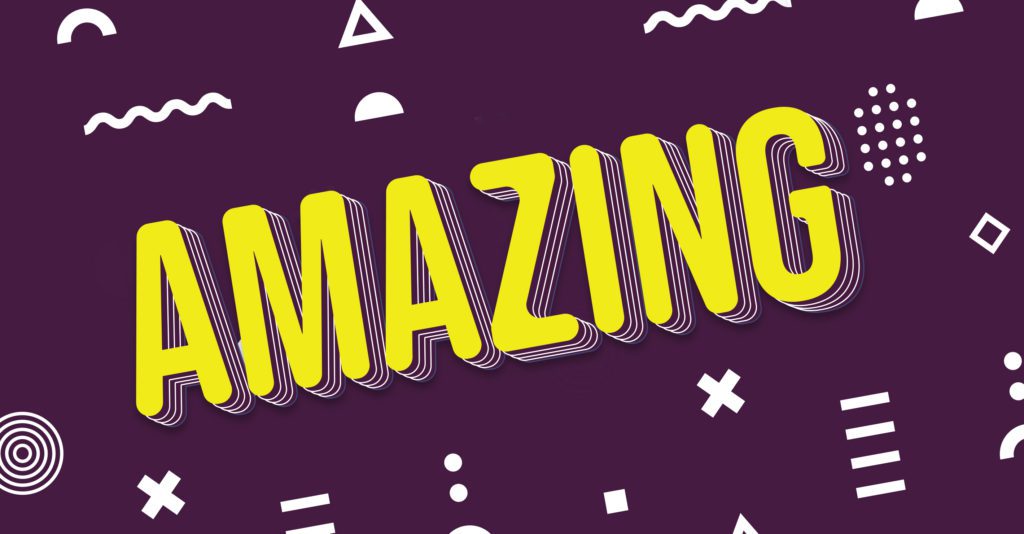
Or this design that creates a depth like dimension by adding variants of colors in the text.
10. Composition
The composition is simply all the elements and principles of graphic design coming together. This is where you get to experiment with these elements, by systematically arranging them and creating great layouts for your graphic design.
Let’s look at some examples. In the following design notice how type is used in a random order and yet the eye catches it as “smart” not only because it is in close proximity but also because of the contrast it creates against the yellow.
Similarly, notice how a combination of a warm color and a cool color is used to create drama in the poster.

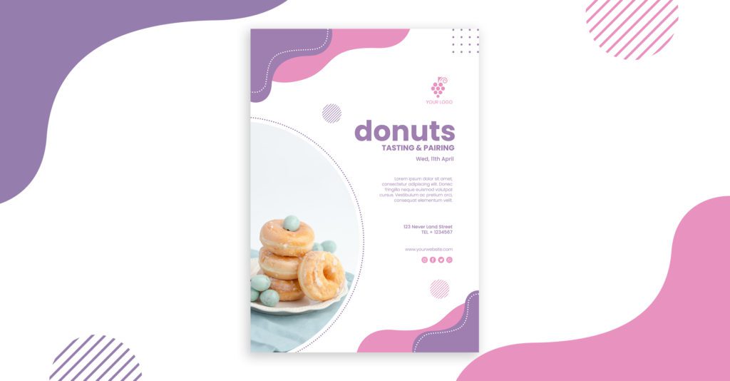
Notice the scale that is used for the text “Donuts” that is meant to be the focus of this poster, and the scale of the text “Tasting and Pairing”
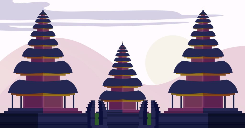
Check out the alignment and the different uses of line to create various shapes in the next design.
And that’s that.
Design is complicated and overwhelming sometimes but it is a discipline that is always evolving, and with it, you should too. There is always something new to pick up and always something old to say goodbye to. But more importantly
Creativity is the backbone of design!
So, don’t forget to get creative. Follow the rules, but twist em’ when the opportunity calls for it!
Do you still think creating a professional-looking graphic design is complicated? Don’t worry. We can handle it for you.
At Design Shifu, we celebrate creativity by creating designs as per your request at a flat rate! We offer unlimited designs requests and unlimited revisions. Check out our portfolio and our subscription plans and get flyers, brochures, banners, flyers, logos, t-shirts, and much more with a 24 to 48 hour turnaround time!

