The internet is full of advertising banners. It’s like you can’t escape them no matter where you go on the internet. Ad banner designs are so much a part of our lives that they hardly ever bother us anymore.
That’s exactly what the best banner ad designs are supposed to do – blend in. Their purpose is to seamlessly get the message across and urge the viewer to click. They are advertisements after all. They can be on any corner of a website. Top, bottom, left, or right, you can put these banner ads wherever you please.
The usage of banners goes way back to medieval times. Back then, digital marketing or even the internet didn’t exist. They were simply a tool to alert the public or armies about where exactly your loyalties lie. Their only purpose was to be noticed by others, and to this day it remains unchanged at its core.
In this article, we’ll be covering ad banner design ideas in depth. Along with some very helpful examples of what the best ones look like. It will help you get a complete idea of everything you need to make the best banner ad.
But before that, let’s deep dive into a very important question.
Looking for new ideas on your for your next flyer? Our in-depth article 21 Flyer Design Ideas that will make your brand fly high will definitely sort you out.
Why are Ad Banners so successful?
There’s a reason ad banners aren’t dead even after being used for centuries – they simply work. Ad banners are a very solid and efficient way to promote and grow your business. Advertisements are a key investment for every type of business, especially small ones.
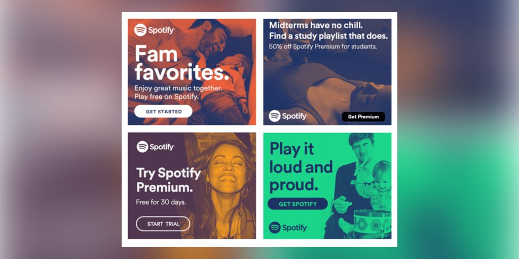
Ad banners don’t just help you attract new customers, but they also increase your brand’s visibility and awareness. People recognizing your brand and your products, even if they aren’t buying or using them is equally important.
What makes an ad banner design tick?
The success of banner ads lies in their design and ability to garner attention. You have to remember that people are surfing the internet for reason. If your ad banner is being shown on a website, the viewer must be visiting it for something.
Your ad banner should hold enough value to garner their attention and drive them away from their current website. What is important is that your ad makes a bold statement in as few words as possible. No one likes ads that are too text-heavy, or unpleasant to look at. Let us have a look at an example.
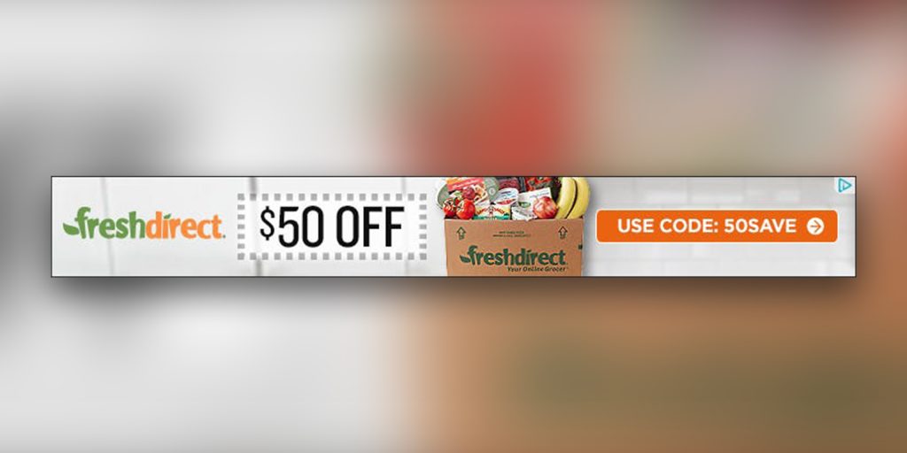
Do you see how basic yet appealing this ad looks? It is very clear that this ad will direct you to a brand that delivers daily groceries. The cherry on top is the offer this ad banner highlights so prominently.
Do you want help designing ad banners for your business? Get a dedicated designer and unlimited graphic designs for just $399 per month from Design Shifu.
What makes this ad tick is that it doesn’t tell you about the brand or the kind of groceries they sell. Instead, it tries to reel you in with a very attractive offer. They also give you the promo code to use and avail this offer within the 5-word text.
Using color to your advantage in an ad banner design
The colors used in your ad banner are just as important as the message inside it. You should always use colors that are contrasting and true to your brand’s identity.
For example, you would never see an ad for McDonald’s that doesn’t use a combination of bright yellow and red. Can you imagine their logo to be pink instead of yellow? No? Well, let me help you.
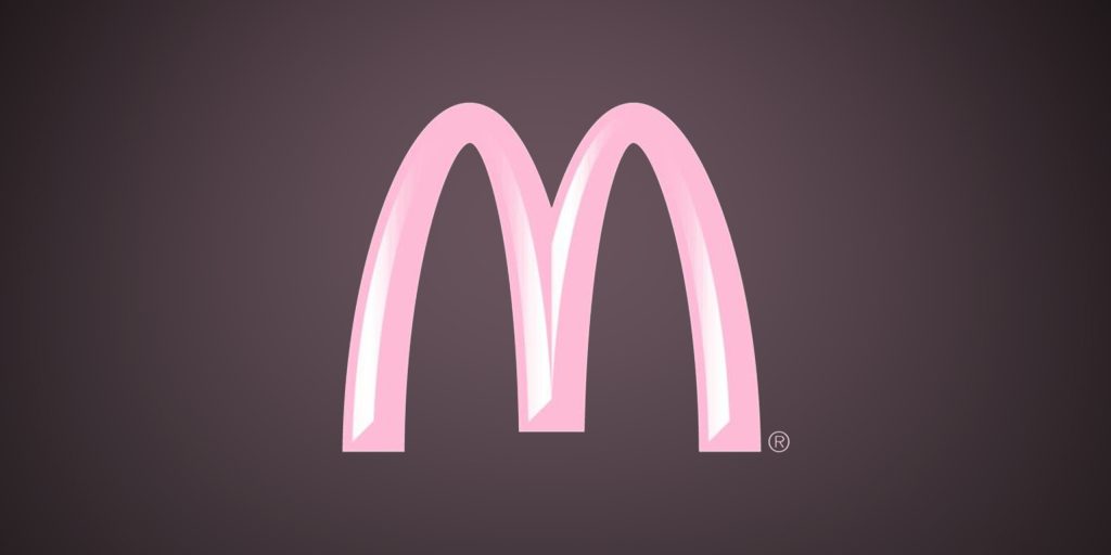
Feels wrong, doesn’t it? This is exactly why your brand’s identity is important and you should never let it go.
It is also important that your ad banner blends well with the websites of today. It is safe to use colors and texts in accordance with modern designs.
Using only an appropriate amount of text
No one likes text-heavy ads, we already mentioned that above. It is as true as it gets. Let me present you with an example.

Observe how simple this ad banner is. There’s just a three-letter text, that’s it. The text here also cleverly acts as a call to action. The brand logo sits on a corner with the talent in between. It feels very attractive to look at, doesn’t it?
An ad only needs to give the viewers a reason to click on it. You don’t need to give them a plethora of information through the ad. Try to make a statement, that’s it. If they’d actually want additional information, they would click on the ad themselves.
Using the power of strong call-to-action
Transparency is appreciated everywhere. Use your ad banner to tell the viewer what exactly is it that you want them to do. Buy? Click? Find out more. Sign up? Become a member? Start a free trial? Tell them! Don’t be afraid about it. Make sure the ad isn’t misleading the viewers about your intentions, no one appreciates that.
Remember to make your call to action stand out. Make it bolder, or give it a different color.
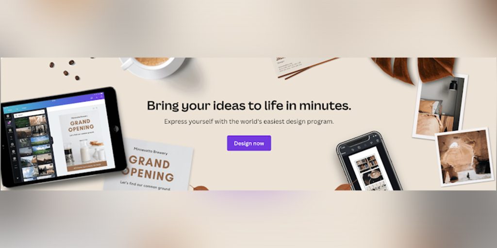
Take this ad banner from Canva for example. Focus on the color of the background and the call to action. What happens when you click on that CTA? It takes you to a platform where you can start designing with the help of Canva’s tools. The CTA “Design Now” stands out because it is much more contrast to the rest of the ad.
Attractive, contrasting colors, appropriate usage of text, and a relevant call-to-action are the main elements that make up a successful ad banner.
Not every trend is a good trend when it comes to marketing. To learn more read our article Graphic design trends to avoid in 2022: Examples of bad graphic designs.
Best banner ad designs
Now that we understand what makes banner ads so successful, let’s look at some of the best banner ad designs, and discuss what made them work.
Apple Gift Card Ad banner
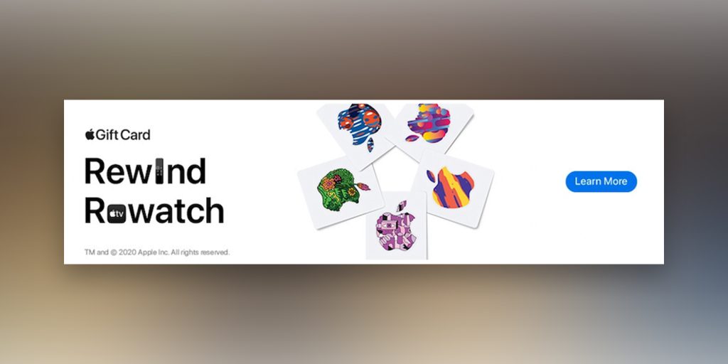
Apple as a brand needs no introduction. Fun fact – When you Google the word “Apple”, the information on first the page will only be about the Apple brand and not the fruit.
This banner ad’s text consists of a copy of only four words and a two-word CTA. That’s it. What grabs your attention is the different colored logo cards in the middle.
It is clear that the ad would lead you to more information about how to get and use Apple’s gift card. Notice how the CTA sits on the right side of the ad banner inside a bright blue button. It’s unmissable.
Ridge Wallet Ad Banner
Source
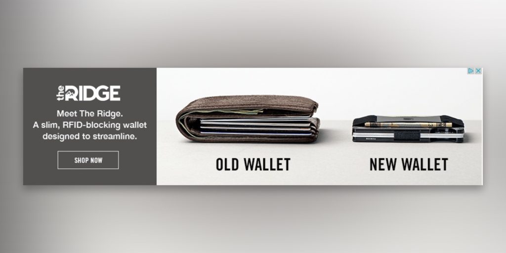
This ad banner by Ridge wallet is a classic example of letting your product speak for itself. It clearly demonstrates that getting the Ridge wallet would help you trim down the bulkiness of a wallet.
The call-to-action “SHOP NOW” in capital letters sits on the left inside a white box. It’s clear that clicking this ad will take you to Ridge wallet’s product page where you would be able to buy their product.
Disney+ Ad Banner
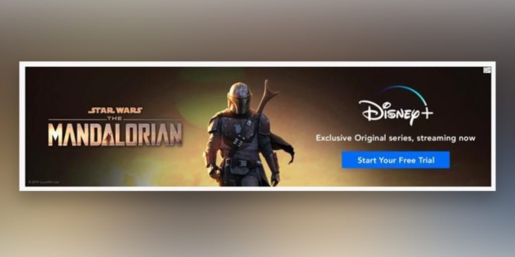
What makes this particular Ad banner effective is the usage of the word “exclusive”. It clearly tells you that you will not be able to find this show on any other platform apart from Disney+.
Those who would be interested in watching it will simply click on the “Start Your Free Trial” button present in blue. It will lead them to instructions on how they can start their free trial and watch the exclusive show.
DocuSign eBook Ad Banner
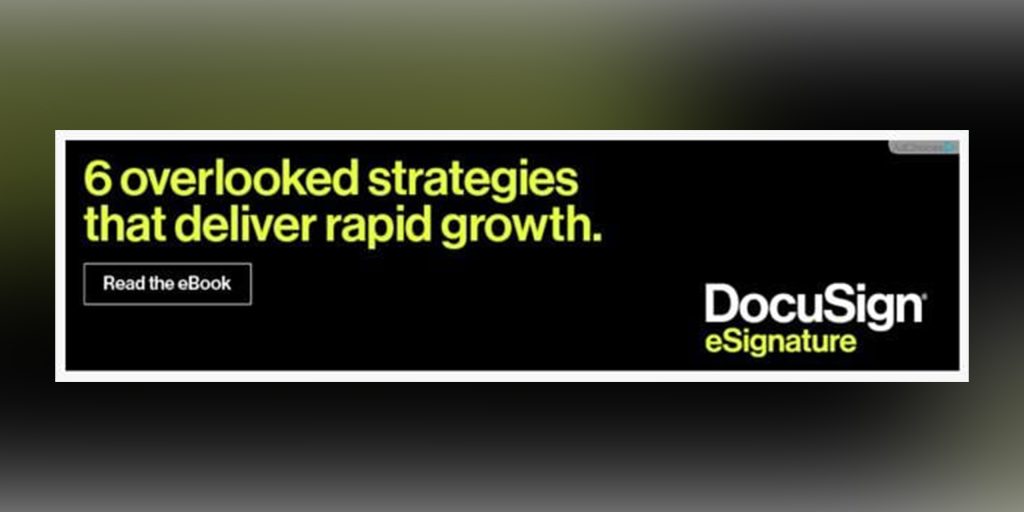
This ad banner is the perfect example of how to generate curiosity inside the viewer. Imagine seeing this ad banner not knowing what DocuSign is or what they do. All you can understand from this ad is that it has something to do with eSignature. Still, you’re bound to wonder what exactly are the 6 overlooked strategies that deliver rapid growth.
How do you find out? You simply read the free eBook they are offering. It’s hard to get someone to buy something just with an ad banner. Offering them something valuable for free might help you reel them to your website. Eventually, leading them to learn about your brand and your product.
Apple Card Ad Banner
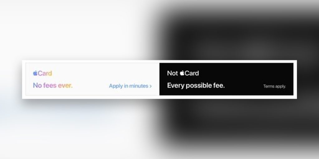
Here’s another example from our beloved trusted brand Apple. They play on the trust their brand has built over the years they’ve been in business. With this banner they also communicate a very clear message that Apple Card will never have any fees – It will forever be free.
They cleverly use the black-and-white analogy to showcase that Non-Apple Cards will have every possible free. The clear “Apply in minutes” CTA also plays in their favor. It tells the viewer that they’ll be saving their precious time, and will never have to pay a single Dollar in fees to Apple.
Types of banner design
There are mainly two types of ad banner designs – Standard and Adaptive.
Standard Banner ads
These banner ads come in different shapes and sizes. But every size has very specific dimensions. You should choose one according to your ad and its inside content.
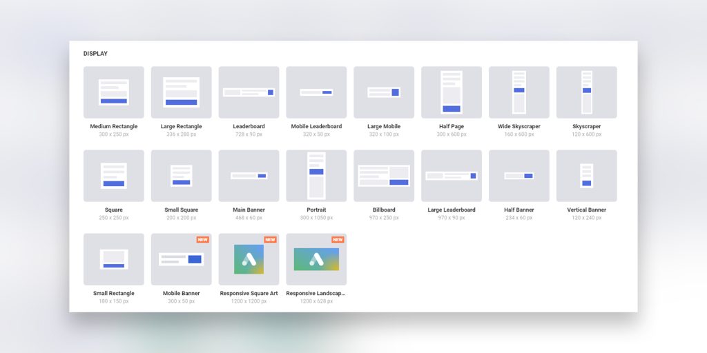
Be it Google or any other ad network, they created specific sizes for standard banner ads. You can refer to the image above or visit this website to learn more about the exact sizes of the banner ads.
Adaptive banner ads
As the name suggests, these banners are adaptive in nature. They can either be placed on the top and bottom of the screen and be fixed there, or they can be inline, and be a part of the content.
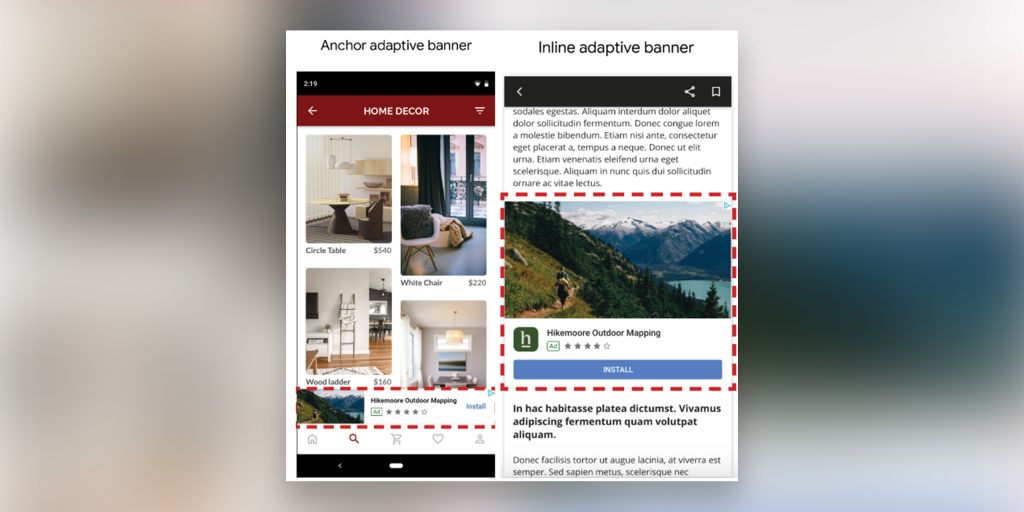
Learn more – Overview of Banner Ads
The logo is a very important thing for every brand. It’s a representation of your brand’s entire identity. Here are 5 Cool Logo Design Ideas You Can Use For Creating Striking Logos.
Best Banner ad placement
By now you understand what makes ad banner designs tick, and what are their types. Now another question arises – Where to place them exactly?
How you position your ad banners has a very big impact on their effectiveness. It’s observed that ads placed near the content work better than those that are placed further. How many ads are present along with your ad banner also plays a very vital role. No one like a platform that’s brimming with advertisements – it’s too distracting.
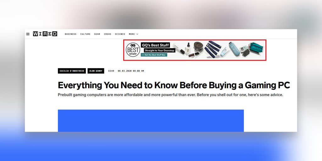
It’s important to optimize your banner ads according to your target audience and where is it that you want to display them. It’s no surprise that larger ad banners garner more attention than smaller ones. But they also cost more.
In the end, it all comes down to your ad’s content, target audience, and marketing budget. Keep your ad banner design to be precise, contrasty, and as close to the content as possible. This will give you the best results possible.
Product banner design
Product banner ads are all about showcasing a product. They are a very effective way to boost sales and increase brand and product awareness.
Let’s look at some examples and talk about why they work.
Handbag Ad Banner
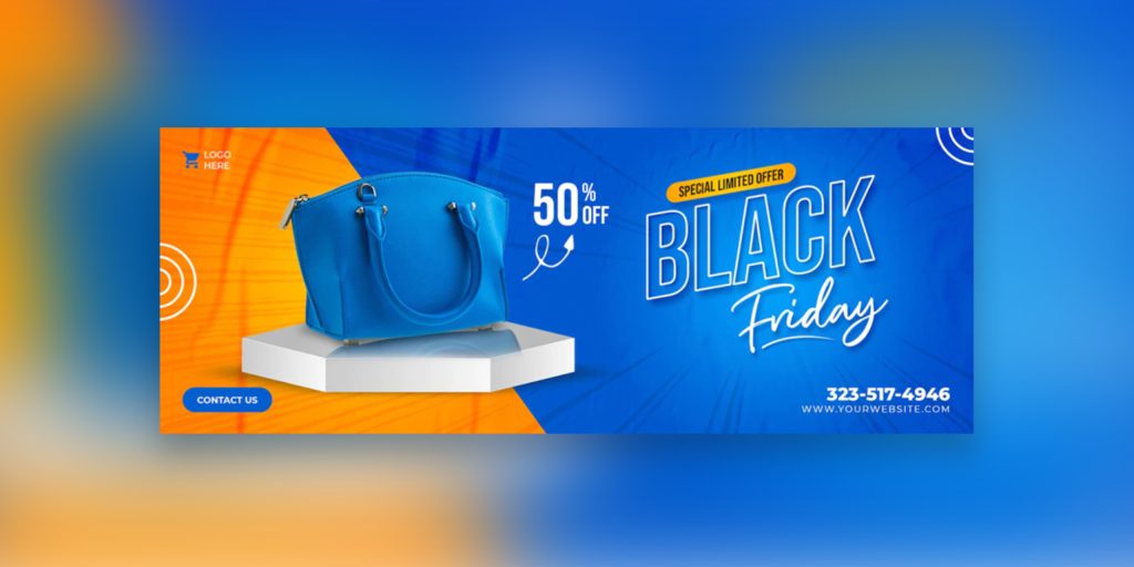
This ad banner is all about that bright blue bag and the urgency of a limited Black Friday sale offer. It uses text, color, product, and numbers altogether. If a viewer likes the product enough to consider buying it, they’ll click on the “Contact Us” call to action immediately.
Charlet Tyrwhitt Shirts Ad Banner
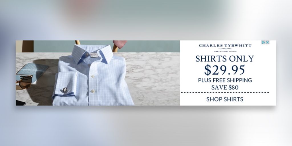
Here also, the product (a shirt) takes center stage in the ad banner. This banner clearly communicates the product, its price, free shipping, and the potential saving you can have. This makes the call-to-action “Shop Shirts” as attractive as it gets.
Facebook ad banner design
Since Facebook is a social media platform, you can use it to target ads better. You filter your audience by location, gender, interests, behavior, and connections. Facebook also gives you the option to add a caption and description to your ad banner.
It might be useful in helping you to target your audience in a better way. Let’s look at some examples of Facebook ad banners and talk about why they work.
Monday.com Ad Banner
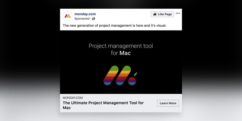
This ad is clearly targeting users who use a Mac. The product is also clearly to be a project management tool with more emphasis on visuals. People interested in looking for such a tool to use on the Mac platform would love to click on the call-to-action “Learn More.”
NatureBox Ad Banner
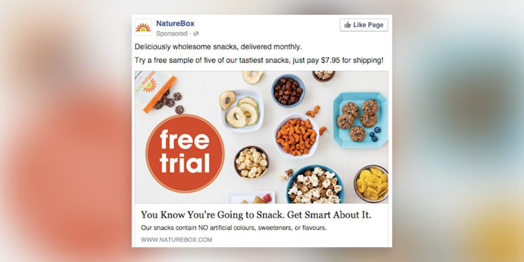
This Facebook ad banner is a perfect example of appealing to people’s daily habits. Everyone likes to snack every now and then. In fact, just looking at this ad is making me want to get myself a snack.
First, the snack food attracts your attention, then soon as you see the “free trial” logo, you get to urge to click on it. Everyone likes free stuff, and it really wouldn’t hurt to just pay for the shipping charges to try out their product.
If people like the product, they are sure to come back to the website and order more of their snacks. A very clever yet effective strategy.
Website banner ad design
As the name suggests, website banner ads are displayed on various websites. These websites can be running on either a PC or a mobile. Most websites these days are optimized to run efficiently on all platforms and screen sizes. Your ad banner should be too.
Let’s look at some examples and talk about why they work.
Kayak website banner ad
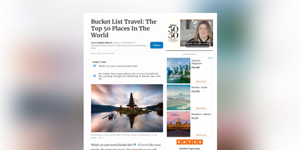
This particular website ad banner works because it shows you attractive flight rates for popular destinations. If you’re someone who’s looking to make traveling plans, you sure are to be interested in finding a better flight deal. The ‘Book Now” call-to-action repeats three times for every separate deal.
Honey Ad Banner
Source
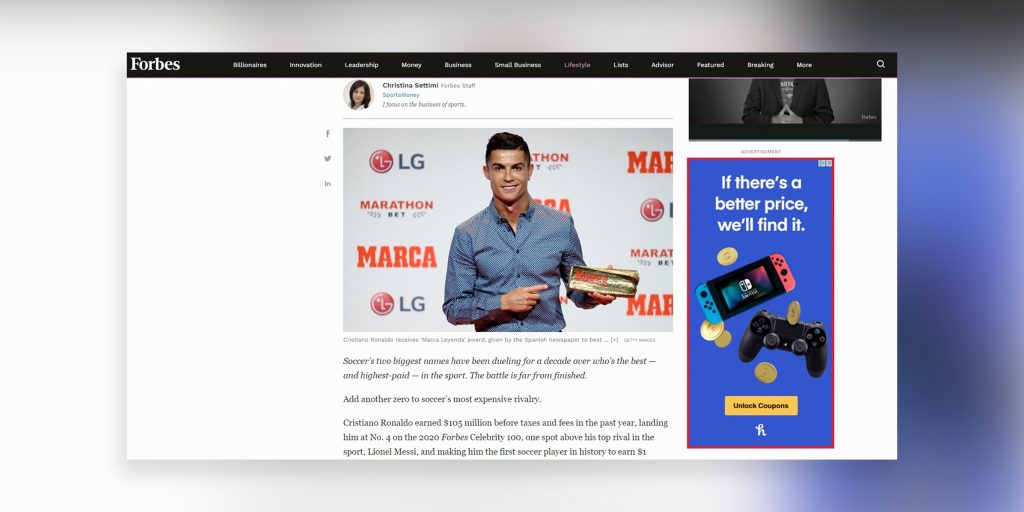
You might not know what Honey is, but if you come across an ad banner that claims to find you a better price for the desired product, you’d be interested. The call to action here is cleverly unconventional. CTA says “Unlock Coupons” because that’s exactly what the product does. It unlocks discounts and offers coupons on various websites just before you check out. Also, it assures that you actually are paying the best price possible.
Remarketing banner ad design
Remarketing (also known as Retargeting) ad banners are those which are targeted only toward people who have previously visited your website. Data says that retargeted ads are 76% more likely to get a click. This makes it one of the most successful ways of advertisement.
Let’s look at some remarketing ad examples and talk about why they work.
Nike Ad banner
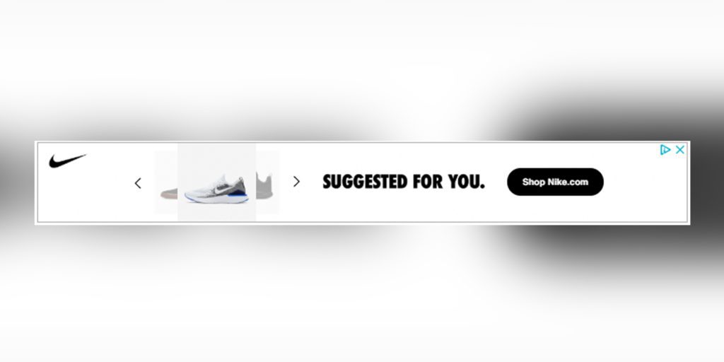
Without saying too much, this ad banner makes it very clear to the user that it is suggested they visit Nike’s website. They are clearly targeting people who have visited Nike’s website before. They are likely to do it again. Additionally, it urges the viewer to “Shop” on the website, and not simply visit it.
Frand And Oka Shirt Ad Banner
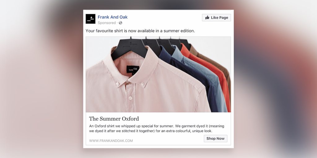
The beauty of this ad is that it’s speaking to the viewer personally – “Your” favorite shirt. This ad clearly is targeting a person who has previously made a purchase on their website. Now they are coming back to the person with a different version of the product. Who wouldn’t want to make another purchase of something they love?
PPC banner ad design
PPC or Pay-Per-Click ads are not very different from regular banner ads. The difference is that in PPC you only have to pay when someone clicks on your ad. General ads have a set amount you need to pay to run your ad for a certain time or a certain reach.
Brita Bottle Ad Banner

This is an example of a very simple ad banner. The copy is clear and has only four words, the product is visible on the right, and the call-to-action is in contrast to the product. As a PPC ad banner, it is very likely to get clicked. It intrigues the viewer to find out how exactly can they have less wastage with this water bottle. Weather they make a purchase or not depends on the landing page.
Final Straw Ad Banner
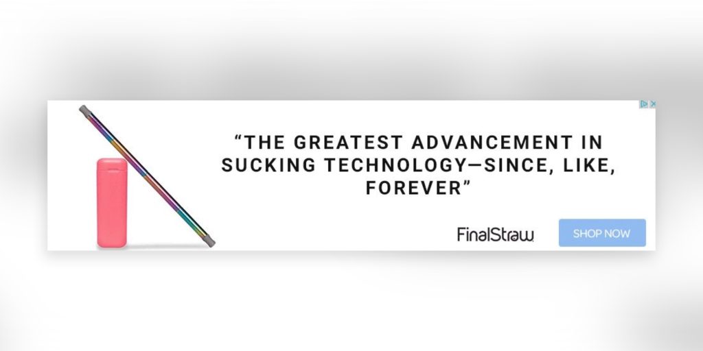
The revolution to get rid of plastic straws is at an all-time high these days. This PPC ad banner here is clearly hinting at a straw that is great and advanced. “Final Straw” as the brand name is a no-brainer. The goal of the product is to end your need to get separate straws every time you need one. A viewer is likely to be intrigued to click the ad and find out more about the straw.
A high-quality brochure can be a very effective promotional tool for your brand and advertising. Here are 10 Best Tips to Create High-Quality Business Brochure for Your Company.
Final Thoughts
Ad banner designs are very effective in getting viewers to click on the ad. They drive engagement and brand awareness more than anything else. Best banner ad designs are crisp, and they work well when they are targeted to the right audience.
Why not take help from Design Shifu to design ad banners for you? You get unlimited graphic designs and a dedicated designer to take care of all your design needs.
We hope these examples would help you design better and more effective ad banners for your brands. Remember, ad banners are simply the greatest marketing tool at your disposal.

