How does a company recruit the right candidate? They look at the CV of the candidate. Similarly, when a customer wants to choose whether they would like to go for a particular brand, the best way to judge is: Look at their marketing collaterals, like the Brochure. Also, a brochure and a pamphlet both serve different purposes, to comprehend the difference between a pamphlet and a brochure, refer to this blog.
Let’s start with some understanding of company brochures and then we will move on to company brochure examples so that you can make one for yourself.
Contents of a Company Brochure
A good company brochure needs to take into consideration the following points:
Headline
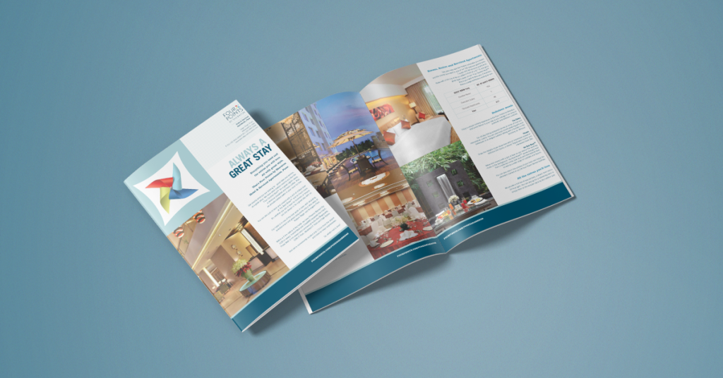
A powerful headline captures the reader’s attention immediately and offers the user a solution to his problem. Nonetheless, the headline should be brief and prompt the reader to read the rest of the article. Check this headline by Four Points by Sheraton’s brochure: Always A Great Stay!
Source
Looking at the headline, the reader knows that he will have a great stay in this hotel, albeit a stylish one. The reader is prompted to move on to the next page by this word with style.
If you have already decided on a great headline and want it to be implemented beautifully in a brochure, take help from Design Shifu to design it for you.
Content
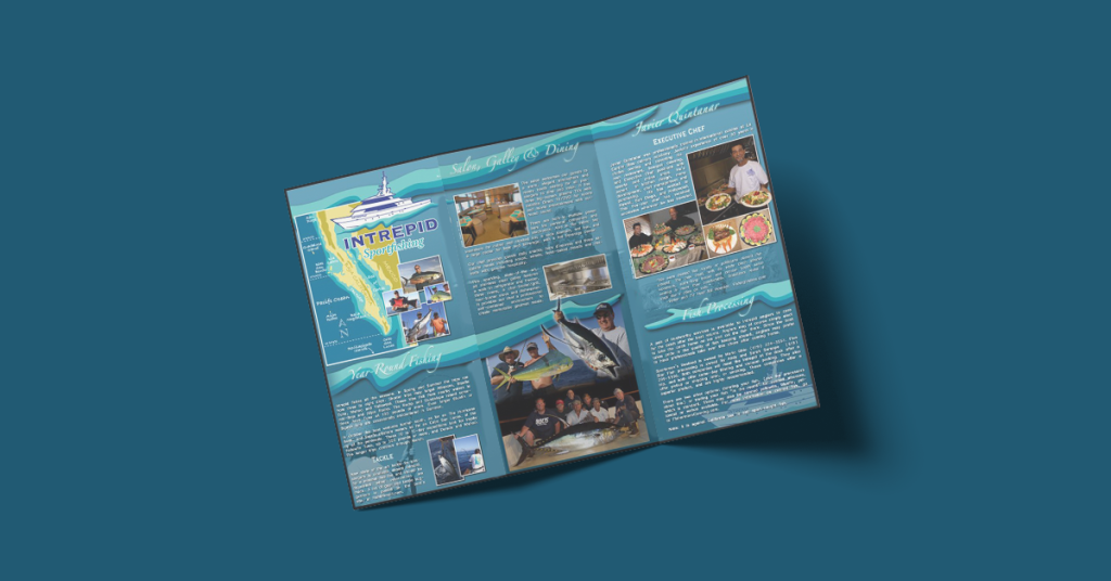
The content includes the company name, details about the product like features, benefits, product specifications, pricing charts; founder names (if it’s a high-end product), and of course, the CTA. One major point to note here is that the brochure shouldn’t be more than 4-5 pages and the information provided in it should be brief. Too much information will exhaust the reader and will take away their attention. Check out this example of a fishing company where too much information is disseminated in the brochure.
Never compromise on quality
After keeping in mind the headline, content, and CTA, PLEASE use only hi-res images. Internet images or pictorial representations of the products wouldn’t do justice either to the reader or your company. Also, if you plan to print the brochure, please use high-quality paper (matte or glossy is a personal choice) for printing.
You can also refer to these tips for effective brochure design
Best Company Brochure Examples
To make your company brochure, let’s delve into some company brochure examples.
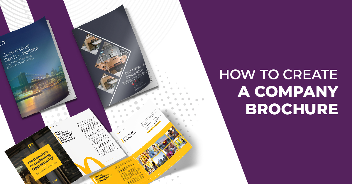
McDonald’s Franchisee Brochure
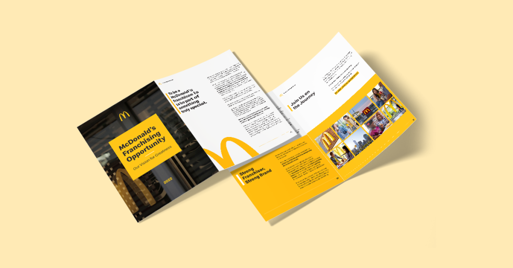
The brochure is a bit long for inviting the readers to have a McDonald’s franchisee, but the design, the way of content representation, advantages for the readers, and a clear CTA.
Disney Dining
The best way to make the world happy is through food and entertainment. Disney has been topping the entertainment charts for more than 50 years now, they have presented their dining brochure in a very delectable way. So, for the parents who bring their kids to Disneyland and want some good food to give themselves an added incentive to join the kids in the wonderland, here’s an interesting take on their dining experience.
Company Brochure examples and Ideas
After looking at good company brochure examples, let’s comprehend some ideas for a company brochure.
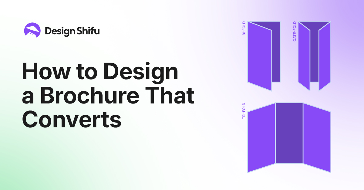
Fold-type brochure
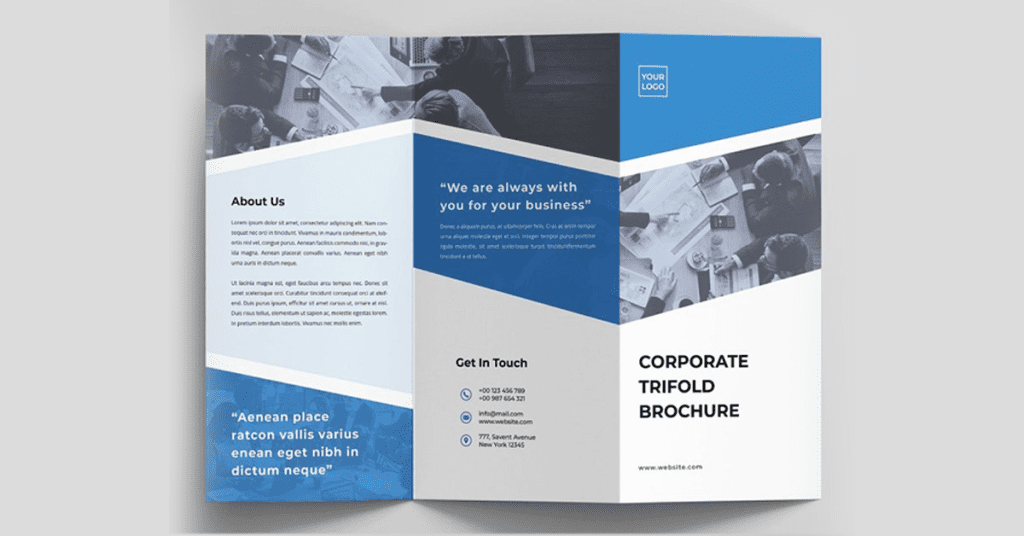
Folding the brochure into 2 or 3 equal parts is one of the common ways of creating a brochure. It is usually found in restaurants, spas, or multi-product businesses. Check this trifold brochure example which is sleek, structured, and commonly found.
Accordion Brochure
Similar to fold-type brochures, this one has more pages, similar to an accordion. It gives the company more space to present its content.
Die-cut Brochure
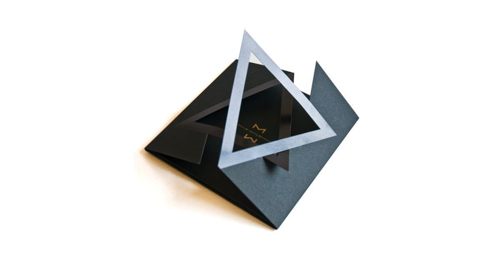
A creative brand will always look for creative ways to present its ideas. As they say, the chef pays equal, if not more amount of attention to the presentation of the food he is serving. Similarly, die-cut brochures are very attractive to look at. However, those are not always cost-effective, due to the unique ways of presenting them. Check out one example.
Digital Brochure
The pandemic has changed the way we look at the world. And marketing is no different. A digital brochure is interactive with the addition of many design elements. It can be kept up to date, cost-effective, and can reach the masses. So, this is a must now for a company.
But, before you decide on the type of brochure you wish to design for your company, check out the brochure design trends of 2022
Advertising Company Brochure Examples
An ad agency will have too many company brochure examples to present to their client. But what should an ad agency brochure look like?
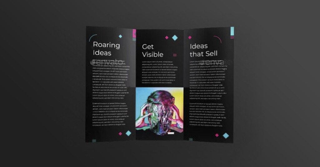
- It should have different creative elements. It is the first impression of the agency for prospects and that should be quite impressionable. So the creativity has to be stupendous.
- It should have an excellent copy. Ad agencies thrive on good copywriting. That should reflect how effective the communication has been in the brochure to the readers.
- It should have testimonials and some of the major clients the agency has worked with. That earns the agency some brownie points.
- Finally, these printing design errors have to be kept in mind while designing your brochure. Since if the agency falters in messing with its brochure printing, how would it do a good job for its clients?
Architecture company brochure
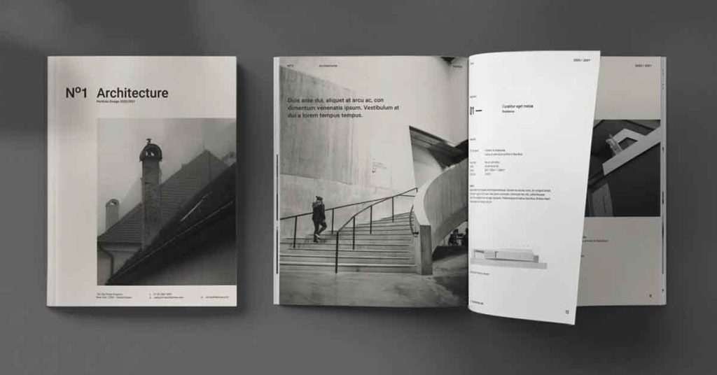
An architect is responsible for setting your mood for the next few years. And to ensure your dwelling matches your temperament, it is important to choose the right architect. So, it’s a huge responsibility of an architect to present their best work in the most suitable way to their clients. Some tips that an architect can follow to make a good impression through their brochure:
- Content should be relevant to the current trends
- Less is more: Show more pictures and less text
- How environmentally friendly is your thought process?
- Testimonials from brands
- Create different types of brochures for clients looking for apartments, commercial spaces, etc.
Brochure design for a software company
A brochure for a software company has to be technically sound along with being aesthetically good-looking. The points mentioned in the subheading Contents of a Company Brochure have to be included, in addition to the below tips:
- Create a sense of urgency in the copy. Business processes are complex and hence they need a system to be addressed properly
- Case studies on how the solution provided by you arising other companies
- Use phrases that promise a better future with the solutions
- Give a time limit by when the problem will be solved
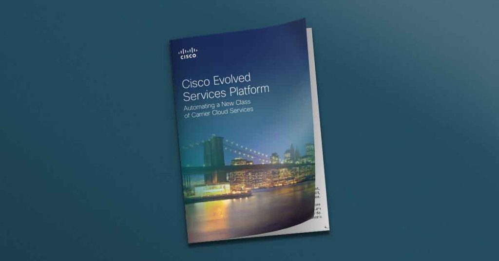
Check out this Cisco Evolved Services Platform Brochure. The headline is crisp and uses words like automating and new class. So the target audience knows what problem this particular solution by Cisco will provide.
Brochure for an interior design company
The toughest job is to find that perfect mix of hues for your furnishings coupled with the feng shui tips that you want in your personal space/ commercial spaces. To achieve this, the interior designer must be able to satisfy the reader’s tastes and preferences. So the brochure has to be excellent.
Some of the good corporate brochure examples of interior designing firms are:
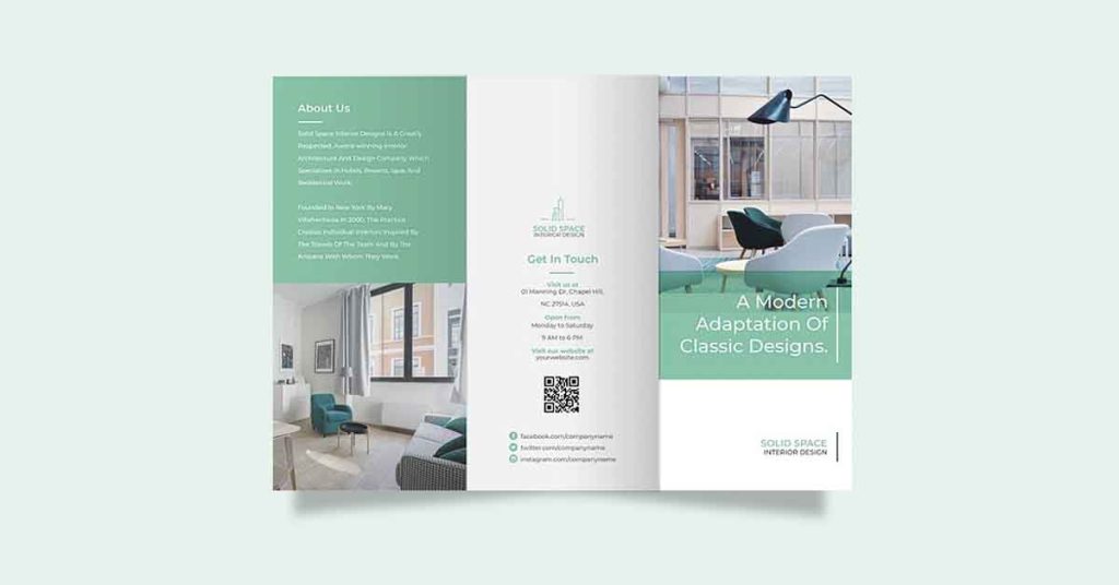
A classy and structured design is the above example. The images are neatly presented with an equal amount of text spread across the tri-fold brochure.
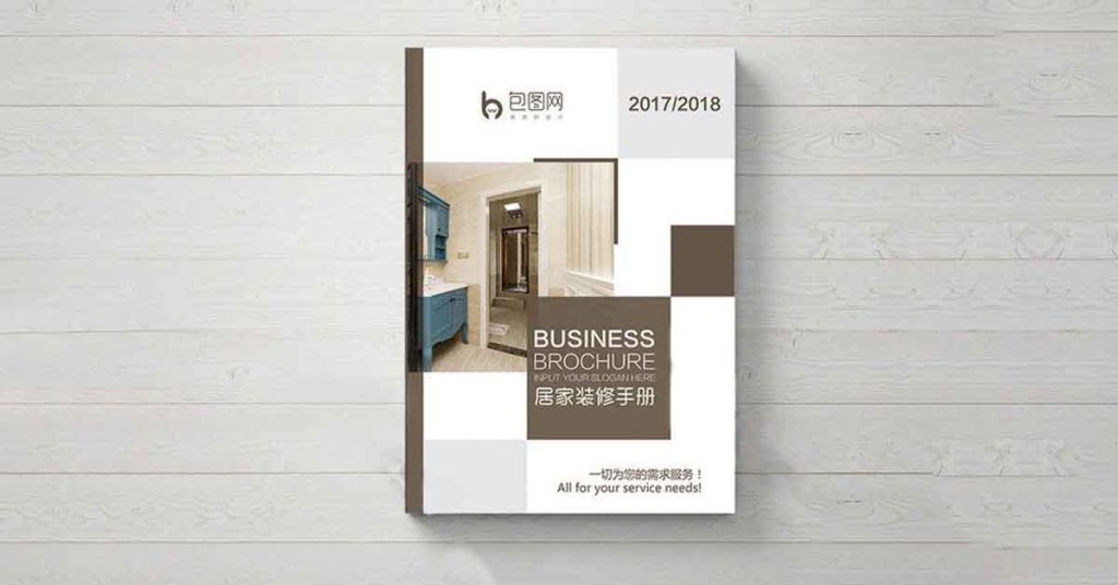
This one gives a very different look to the brochure with a lot of thought going behind the design of the brochure and placement of the images.
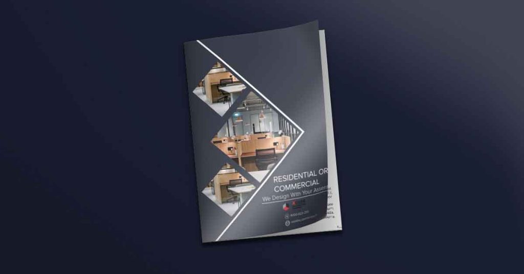
The headline of this brochure is catchy, that shows collaboration and not authority, which instantly makes the reader warm up to the idea of vetting this particular interior designer.
Conclusion
A brochure is a carefully designed document that serves as your case study in front of prospects. It can’t be done by just anyone. You got to have a brilliant internal design team or a design partner like Design Shifu to create a beautiful brochure for you, just like the various company brochure examples we referred to in the article.

