What Keeps Changing All the Time? Graphic Design Trends!
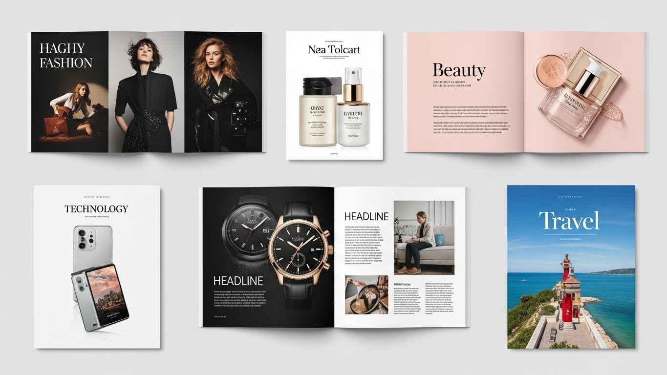
Current graphic design trends feature the growing use of AI-powered tools, the coexistence of bold minimalism and maximalism, and a strong focus on 3D design and motion graphics. Other prominent trends include retro and nostalgic styles, personalized and abstract designs, and expressive, experimental typography and animation.
Trends in design are like fingerprints, unique to industries and deeply influenced by brand personality. Some trends dominate the landscape for years, while others make a splash and quickly fade. But in a world overflowing with visual content, staying relevant is non-negotiable.
Take the rise of digital collectibles and AI-generated artwork. What started with NFTs has now exploded into entire ecosystems of virtual fashion, interactive 3D packaging, and personalized design content. This isn’t just digital art, it’s digital identity. And brands that understand this are leveraging cutting-edge visuals to spark engagement like never before.
Graphic design in 2025 is no longer about “how it looks,” but about how it feels, functions, and fits. It’s storytelling, UX and brand equity. Whether you’re a startup founder or a creative director, design is how you shape perception and ultimately, action..
The graphic design trends you must avoid in 2025
Keeping up with trends is critical to success; however, not every graphic design trend helps the brand grow. If a trend goes wrong, it can damage a brand’s reputation and user experience. At times, we lose sight of the brand’s objective when we focus on trends.
As a graphic designer, you must evaluate trends to determine their applicability. Trends can assist in developing a solid brand identity. They also help devote following when appropriately used.
Some of the graphic design trends you must take a look at and why you must avoid using them:
Broken Grids That Confuse Users
Asymmetry can be beautiful when used right. But in 2025, broken grid layouts without structure or flow are losing favor, especially for mobile-first UX where consistency matters.
It certainly sounds appealing to disregard symmetry and order. Asymmetry has always been a source of inspiration for designers who seek to create ground-breaking products. Web and graphic designers have come across design elements that were misaligned, crooked, overlapping, or unbalanced.
In asymmetrical layouts, the designs often lose the text or substance. The user experience is particularly delicate if you show crucial information in a specific way. Customers anticipate seeing it there each time they interact with your company. The design loses a piece of information as asymmetrical layouts induce users to deviate from this well-known behavioral pattern.
Modern consumers have limited attention spans, making time an expensive currency. When switching between tabs at the speed of light, users want information delivered at the right time and place. Asymmetrical layouts challenge the user, and not all users will be up for the effort.
Take a look at the poster from Swissted
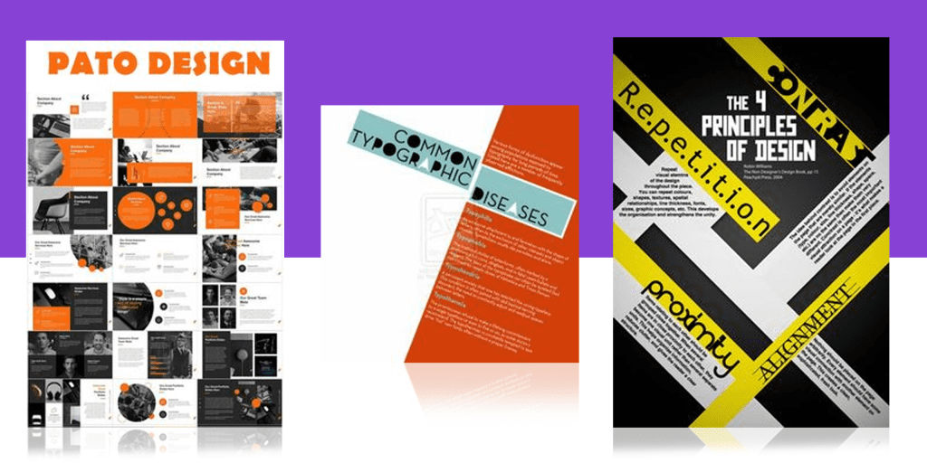
The above example helps us understand how inconvenient this layout is from a consumer’s point of view.
Absence of White Space
White space isn’t dead but 2025 emphasizes intentional spacing. Designs that feel empty or disconnected can hinder storytelling. Balanced spacing with visual hierarchy is what audiences now expect.
Designers were famous for utilizing every blank inch of a project. Creating something entirely without white spaces was considered novel and intriguing. Any piece of graphic design must be cluster-free if we want to produce designs that make a statement in the year 2025.
Attempting to fill in blanks will only make the designs packed and uneven. But it’s worth the risk if you know just how to make it seem out of the ordinary and not clustered.
Improper Typography
Typography can be challenging to read. Humans are visual creatures, and while we are getting better at reading and understanding written language, attractive pictures will always win the attention war over words.
The designer can creatively use bold or twisted typography to transform the text into visuals. What does this indicate for the buyer? That they must simultaneously read, evaluate, and understand visuals. It can undoubtedly increase their attention to the design, but that spike won’t last long. If you still wish to use it, know more about typography and then go for it.
An example would help you understand the concept better
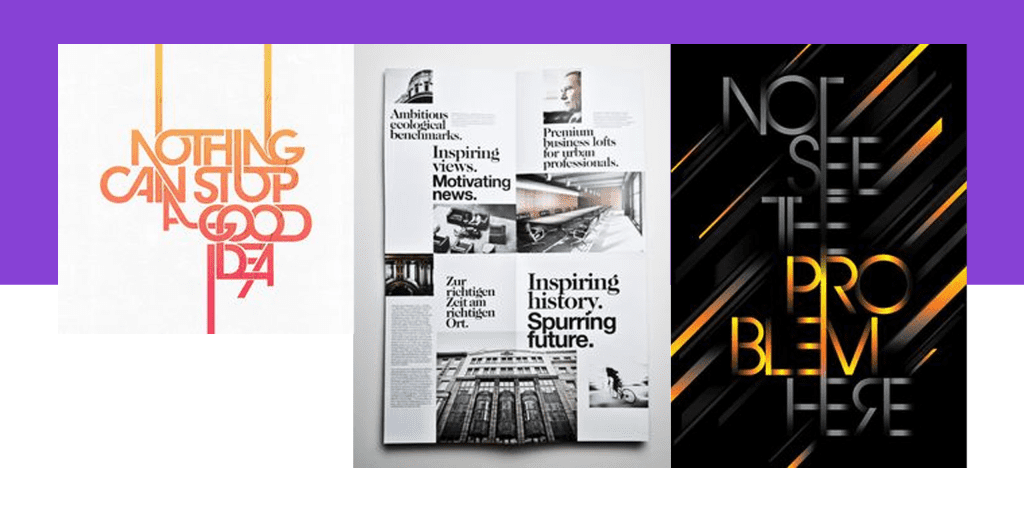
The example given is a failed typography, hard to read and not pleasing to the user’s eyes, thereby diverting the user’s attention.
What are the popular graphic design trends of 2025?
3D Design
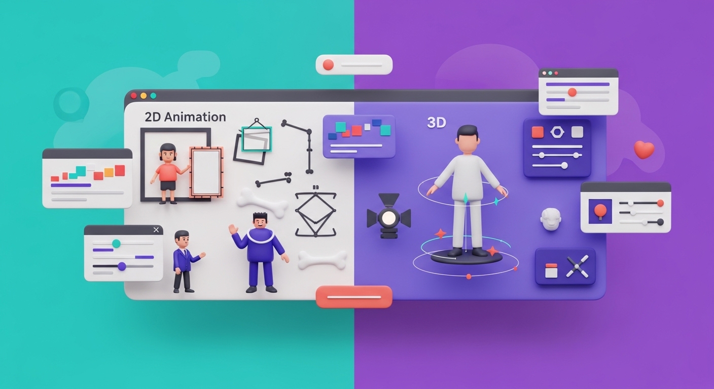
3D designs give a realistic touch to your artwork. It looks as if the user can touch the object in reality. The design seems to stand out from the background. The trend is all about experimentation and moving away from flat design elements. It focuses on depth, detail, and dimension.
The designers focus on a mixed-media approach with an attention-grabbing approach, combining animation, photography, and illustration. The designs are playful and powerful.
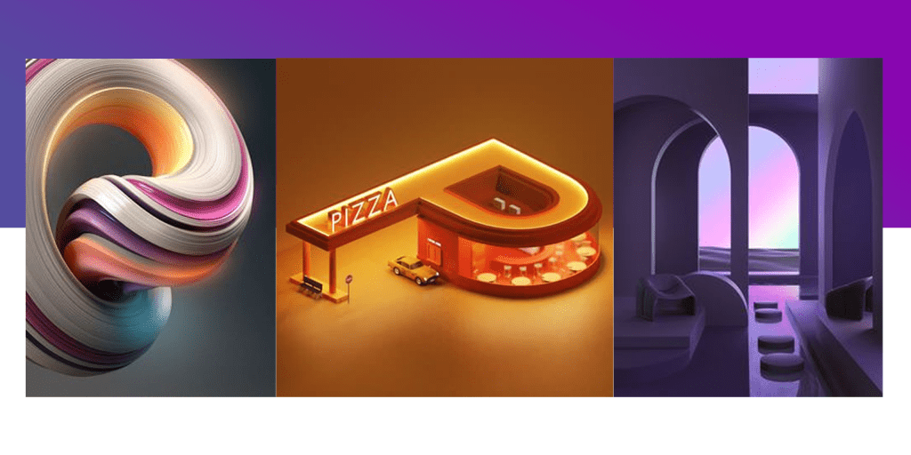
The examples above show precisely what 3D designs look like—incredibly lifelike and abstract while blurring the physical and digital boundaries. Start including 3D designs in your and stay up to the trends.
Candy Colored Artwork
It takes a lot of effort to stand out from the sea of digital content creation. Graphic designers have consequently started developing innovative ways to leverage color to catch our attention as we explore.
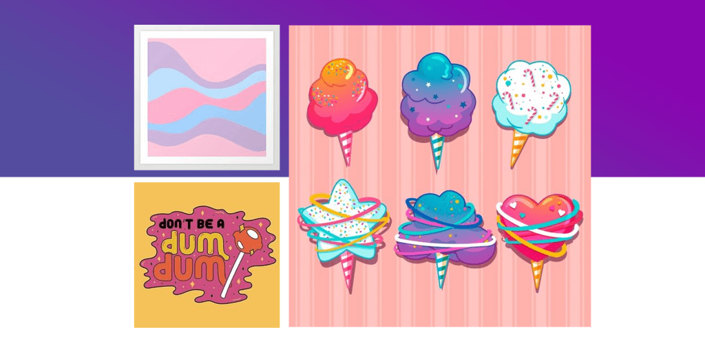
All over the internet, bright scenes in candy colors are becoming increasingly popular. The candy color artwork makes your designs funky and subtle at the same time. It all depends on the choice of color that you make for a piece of artwork.
This trend inspires the idea of choosing opposite colors from the color wheel and creating something outstanding. The designs from Marta Veludo Studio are a perfect example of using colors in the right way.
Crypto Art
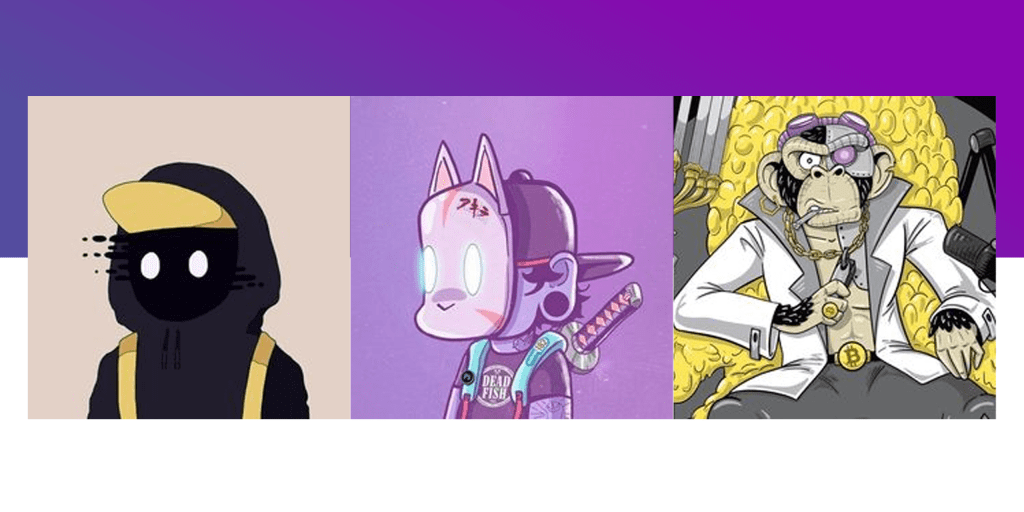
Virtual reality is on the verge of replacing our current reality. NFTS & the crypto world has got significant attention around the world. Similarly, crypto art has been popular recently, and it’s time you must explore it. NFTs are design works published directly on the blockchain with proof of origin. NFTs can be 2D,3D, candy-colored, or anything the designer wishes to make.
To understand better, look at how this gentleman turned crypto art into a significant growth opportunity with his designs. People around the world love recent artwork.
Flat Minimalism That Lacks Depth
While minimalism still reigns in 2025, flat and lifeless layouts are being replaced by dimensional, tactile, and interactive minimal designs. Adding depth with soft shadows, glassmorphism, or microinteractions improves user experience without clutter.
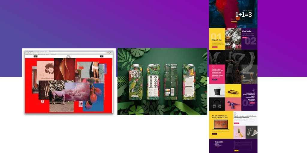
In contrast to minimalism, Maximalism is about making adventurous and outgoing choices. It is coming out of your comfort zone to create something outstanding. Although minimalism is trendy in modern design, it may be a creatively constricting approach. Maximalism uses various graphic components to communicate with the same clarity as minimalism.
It’s about going over the top, bold colors, combinations, contrasting patterns, layered images, and repeated motifs. For design as a field to move beyond its current reliance on minimalism, exploring Maximalism is essential. If we dare to defend our right to experiment, perhaps the digital environment will change into something more luscious and fascinating.
Bug collection designs showcase the magic of Maximalism.
Back in the 90s
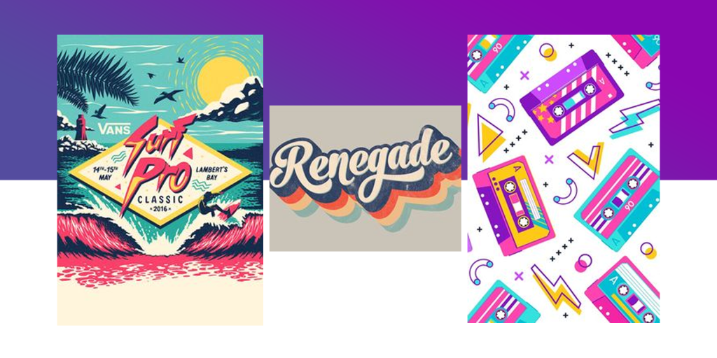
Cobra Kai and Stranger Things on Netflix, among countless others, have recently revived nostalgia for the 1980s and ushered in a time of vaporwave landscapes, neon colors, and Gothic serifs. And in 2025, the 1990s will finally see a comeback!
Many of the patterns on this list show a return to the 1990s. However, the nostalgia tendency shows romanticized nostalgia. The designs are majorly helpful for business logos and product packaging.
To that purpose, basic emojis, ancient internet frames, geometric forms, and scribbly images allow us to relive the 1990s. Childhood favorites like drippy slime and vivid color blocks are still rulers.
Australian design agency Date of Birth came up with a design that is a visual identity of nostalgia and freshness for this toothpaste brand;
While you are stunned by the above logo, do check our logo design ideas article for some ideas and inspiration.
What’s Hot in 2025: Emerging Graphic Design Trends
1. AI-Generated Design Elements
AI tools like Midjourney and Adobe Firefly are changing the game. Designers now use AI for ideation, variation, and even final deliverables, speeding up workflow while staying creative.
2. Immersive Motion Design
Microanimations, hover effects, and parallax scrolling are in. They elevate web and app experiences and keep users engaged.
3. Y2K 2.0 and Digital Nostalgia
2000s-inspired color schemes, pixelated icons, and cyber textures are back, with a refined, Gen Z twist.
4. Sustainable and Eco-Visual Design
Green branding isn’t just a message, it’s now a visual aesthetic. Designers are embracing earthy tones, recycled textures, and ethical sourcing in visuals.
5. Dark Mode–Optimized Design
With dark UIs becoming mainstream, 2025 designers are prioritizing contrast, accessibility, and layered visuals that shine in low light.
Key Takeaway
If you want to become a standout graphic designer in 2025, staying inspired is key. Explore work from other designers, follow design blogs, and keep an eye on trend-forward platforms but always trust your creative instincts.
While trends help guide your creative direction, great design comes down to knowing what works visually. If something feels right and aligns with your goals, chances are it’s headed in the right direction.
Do you want help with graphic designs for your business? Try Design Shifu’s unlimited graphic designs for just $399 per month with Design Shifu and get on-brand visuals that stay ahead of 2025 trends.
Frequently Asked Questions
Why should businesses follow graphic design trends in 2025?
Staying updated with graphic design trends ensures your brand visuals feel fresh, relevant, and competitive. In 2025, with so many AI-driven and immersive experiences dominating consumer attention, using outdated design elements can make your business appear behind the times.
What are the top graphic design trends in 2025?
Some of the biggest trends include generative AI art, 3D design, sustainable and minimal branding, hyper-personalized visuals, interactive infographics, and mixed media collages. These trends blend technology with storytelling to elevate brand experiences.
How do I know which design trends are right for my brand?
Not every trend suits every brand. The best way to choose is by understanding your audience, brand personality, and industry. Align your visual strategy with what resonates emotionally and visually with your target market, don’t just chase trends for the sake of it.
Are AI tools replacing graphic designers in 2025?
No, but they are changing the landscape. AI tools can accelerate workflows, generate concepts, and assist with repetitive tasks. However, human creativity, strategic thinking, and brand alignment remain irreplaceable in delivering powerful design.
How often do design trends change?
Design trends typically evolve annually, but micro-trends can pop up mid-year based on tech, pop culture, or social media shifts. Following design blogs, platforms like Behance or Dribbble, and working with professional designers helps you stay ahead.
What design elements are outdated in 2025?
Overused stock imagery, cluttered layouts, generic icons, and overly complex typography are falling out of favor. Consumers today value clean, bold visuals, motion graphics, and designs that feel authentic and tech-forward.

