
If you’re wondering how to build a billboard that generates never-ending inquiries, this blog is all that you need! The ultimate guide to creating real estate billboards that work.
While you might think that, with the whole world switching to digital means for everything, how can an old-school billboard hanging in a random skyscraper build never-ending inquiries? That’s what makes it unique.
How could a real estate billboard be impactful?
Not all billboards generate the expected impact on their target audience. While there are only 10 seconds for an individual to grab the attention, make them read the billboard, and take the desired call to action, it is not as easy as you think to make a real estate billboard that can create an impact.
So could they be impactful? As they say, you should never underestimate the power and appeal of a classic. Even though billboards are an old-fashioned way of advertising, they have their benefits such as:
- Nobody can skip your billboard like they can skip ads in the digital space.
- Unlike the digital campaigns specified to a particular group of the target audience, with billboards you get a wide range of audiences that come under and out of your target audience.
- They get to see your billboard a lot of times as they are on all the time. People cannot switch it off like the tv commercials.
This is why, even if there are several online options available in the market nowadays, old-school billboards are the most effective and trusted source to reach out to new customers for buying or selling real estate.
How to make the best realtor billboards?
Here’s a step-by-step guide to make the best realtor billboards and stand out from the crowd.
Keep it easy to read
When we say easy to read, here’s what we mean:
- Your text shouldn’t be too tiny. There shouldn’t be too much text either.
- Don’t make it seem cluttered. Get right to the point.
- Keep the information big and concise. The brand message, call to action, and company name is more than enough to buy or sell million-dollar properties.
- Provide only a single call to action. Multiple calls to action can confuse the readers and leave your billboard stranded.
- Match the message with your target audience. Finalize who your target audience is, say, home sellers, property buyers, etc before drafting the billboard copy.
- Keep the messaging about the target audience and not just about yourselves.
To learn more about what to write in a design brief, you can check out the blog! Click here to read.
Make the design intact
Every minute detail of your billboard design serves its purpose. So never take the design light. It’s the design that lets you convey the right message to your target audience. The design can make or break your billboard’s success rate.
Also, one main thing to keep in mind is that your billboard should match your branding. Your branding is what makes the readers recognize you easily. This also lets them know that you’re consistent which builds trust in what you do for them.
You can check out our blog to learn about the design trends to avoid while creating your billboard.
Less is more
Do not overboard your board with too much context. Chances are that the readers get confused with too much information. So always ensure that the content on the billboard is precise. Start with a question that creates attention, and give an immediate and actionable call to action, say, for example, display the phone number, insert your company name and a tagline if you want at the very bottom.
That’s all you need to display on your billboard. To market yourself in a way that excites people, you should focus on telling a particular story instead of having too much going on in your billboard.
Create a connection
A shock does not mean that you have captured the readers’ attention. Negative content in your messaging can cause readers to ignore the whole point of the billboard, thus having no impact. Of course, you can use shock to grab attention. Make sure it’s a positive reinforcement rather than a negative one for the readers.
Placement counts
Location is everything! The location of your billboard plays a major role in determining whether or not it is successful. Your efforts will be in vain if you place a perfectly designed, eye-catching billboard in the wrong location.
For a billboard to serve its purpose, the placement matters a lot. Place your billboard where everyone sees it repeatedly. This is why you find billboards most commonly on highways with more traffic.
Check out our blog on print design mistakes to avoid while making your billboard.
Indulge in creativity
The standard sizes of billboards in the US include 14′ high 48′ wide, 10′ high 40′ wide, and 10’6 high 36′ wide. However, this doesn’t mean you only have to stick with these standard sizes. They can be whatever you want them to be. You can pick up an unconventional size, get as much creative as possible and still be one of the most impacted billboards.
Here’s an example of how you can get creative within the standard size.
But you don’t have to stick to the standard sizes if you don’t want to.
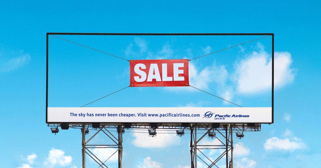
As you see on this billboard, there’s nothing written except the word “Sale” inside a red box. The rest of the design matches the skyline which makes it look as if nothing’s there around. This billboard even though comes under the standard size of a billboard stands out extraordinarily through its more than brilliant design.
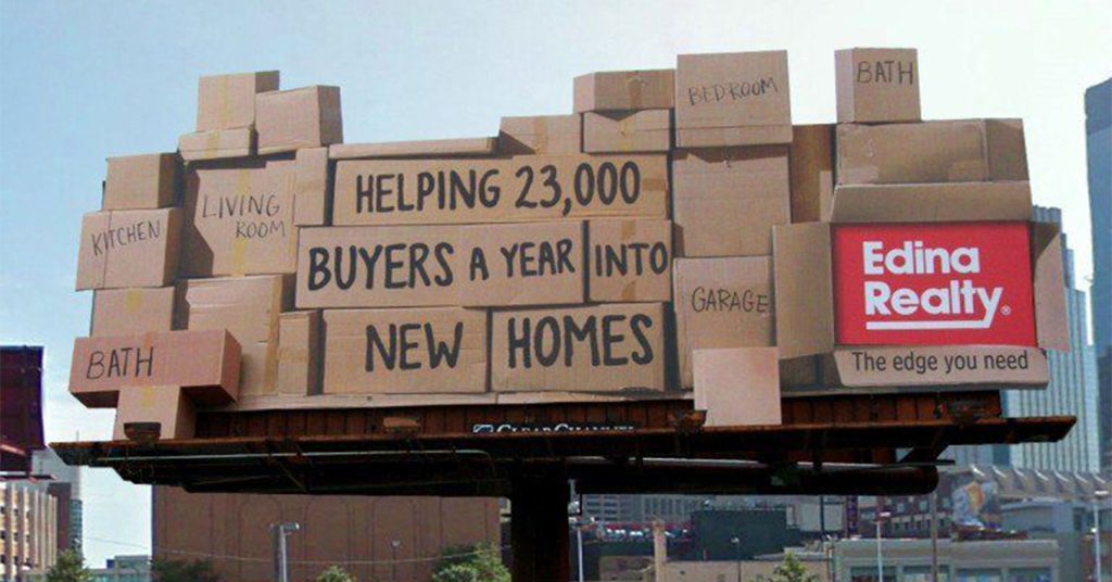
This billboard from Edina Realty aced creativity by designing the billboard as if it were all cardboard boxes stacked up on each other. In the middle of the cardboard, they have their message “Helping 23,000 buyers a year into new homes” which shows their expertise in the realtor industry.
In the down left corner, they have the brand name in red to differentiate from the cardboard boxes with the tagline “the edge is what you need”. To add more detail to the design, they have also added what to expect from the house in different boxes around their messaging. What more do you need?
You can also visit our website to read more about how you can design your real estate business cards to make more impact!
Best real estate billboards
According to a survey conducted by the National Association of Realtors, around 87% of buyers purchase their homes through realtors.
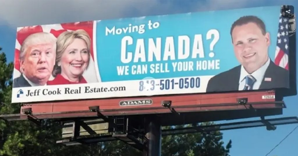
This billboard has clear messaging, a CTA, a website URL, and a picture of the owner. Also, the design differentiates every billboard element, making it easy for the audience to read.
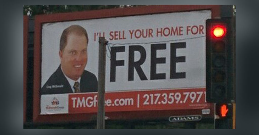
This billboard design above grabs the attention of the passerby by telling that they sell your home for free followed by an immediate call to action and an image of the owner putting everything together.
Catchy real estate billboards
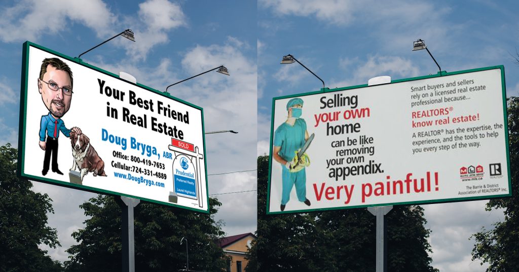
This billboard has a picture of a surgeon holding an axe. The copy of the billboard is also very relatable and catchy for the audience. The billboard also has a quick CTA for further inquiries which makes it perfect!
A dog can be a human’s best friend! This billboard explains how their brand can be the reader’s best friend when buying or selling real estate. An anime illustration shows a dog and its owner saying the same thing. In addition, there is a short URL for the website, as well as contact information for further inquiries.
Funny real estate billboards
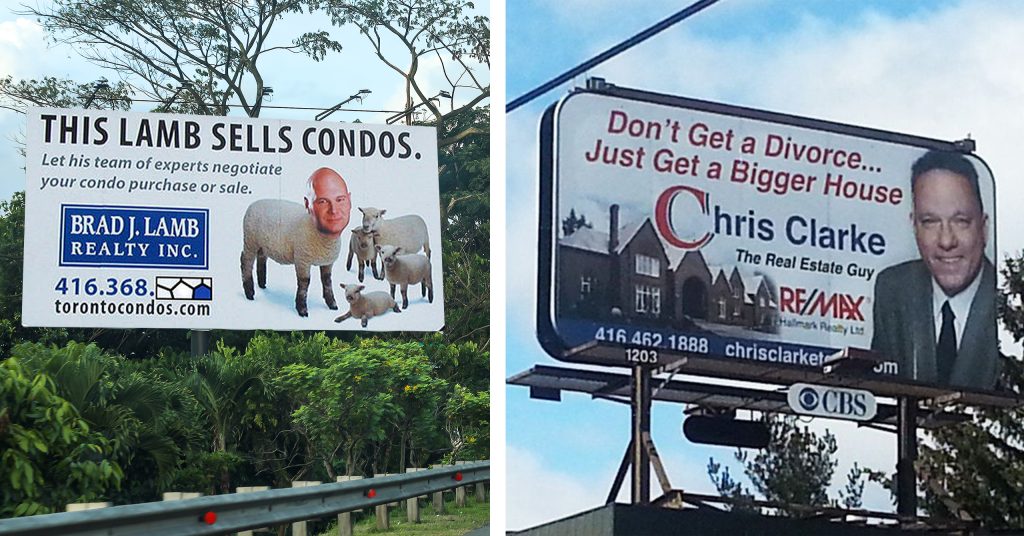
“Don’t get a divorce… Just get a bigger house” This is a very funny hook to catch the attention of the passerby. It also has a CTA and image of the owner and the house to build credibility.
This billboard has a funny illustration where the owner Brad J Lamb’s head is attached to the body of an actual lamb. It’ll be a good attention grabber accompanied by a good CTA and tagline.
Clever real estate billboards
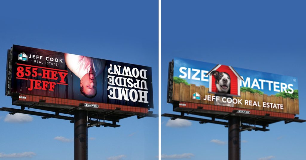
This billboard has a huge text that says “size matters.” This acts as an attention grabber here. It also has an illustration of a dog that’s popping its head from a kennel too small. This illustration again emphasizes their messaging “size matters”. Then, they have a logo and the brand name which makes it a perfect billboard.
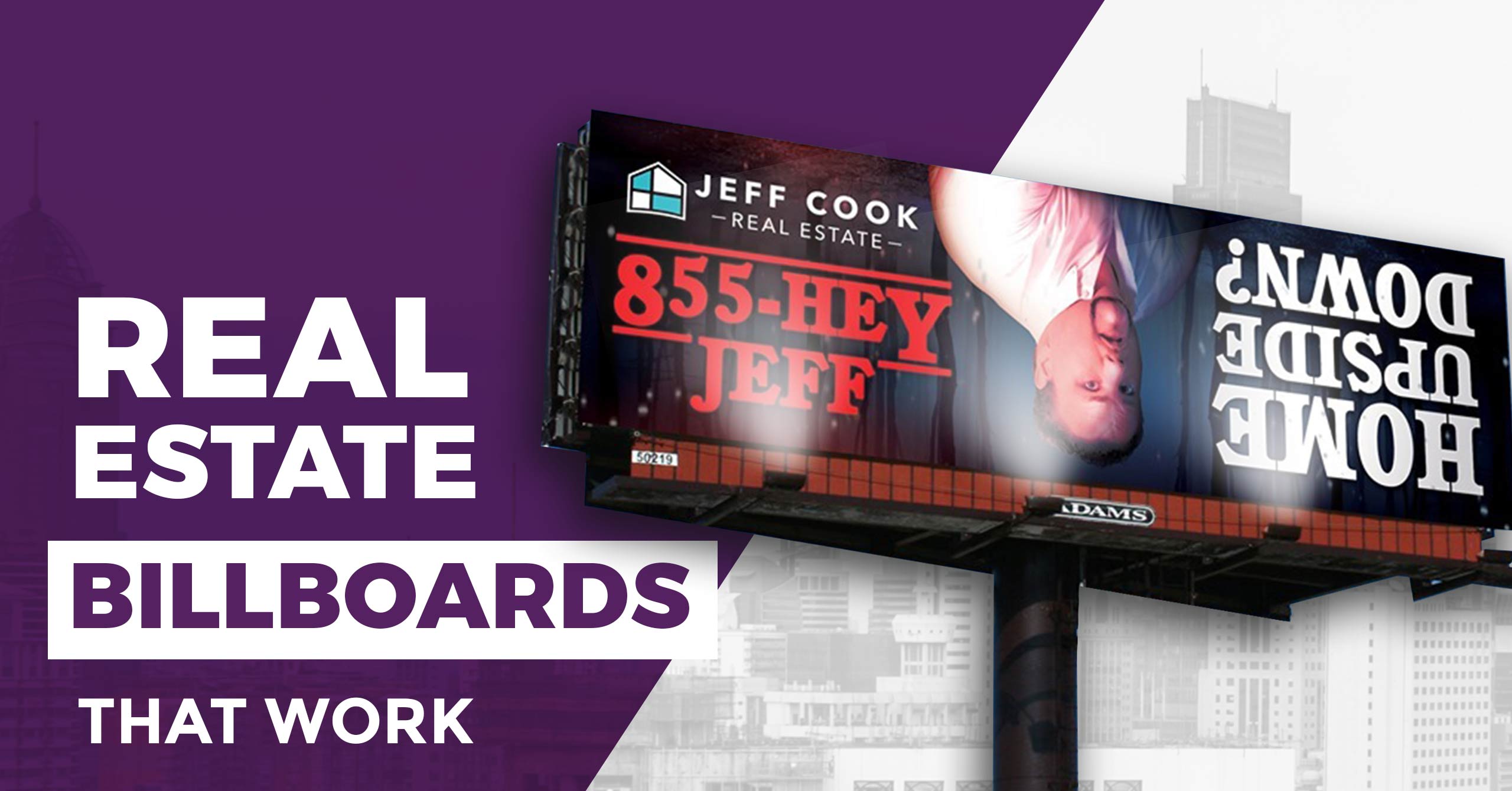
Passersby are drawn to this billboard because the text is upside down, making them pause and take a closer look. Then there is strong messaging that keeps the reader engaged until the end. Lastly, they have added a call to action which summarizes the entire brand message.
Takeaway
Want to create a billboard design that works? The billboard experts at Design Shifu can help you with that! Get unlimited graphic designs for just $399 per month where you get a dedicated designer who can help you with your designs. Not sure if subscription-based graphic design is best for you? You can find out here!
Whatever your design needs are, Design Shifu is here to help you out! Grab the offer now!
FAQs
Are there any graphic design services available for a flat fee that will specialize in marketing materials for real estate?
Yes, some providers offer flat-fee graphic design services specializing in real estate marketing. With unlimited monthly design requests, real estate agents and agencies can get high-quality marketing materials consistently. For example, Design Shifu creates custom designs that align with your brand and grab the attention of potential clients.
How do I make my real estate billboard really pop when there is so much competition?
How can I select an ideal flat-rate graphic design provider for my real estate business?