

Did you know users form an opinion about your website in just 50 milliseconds? If your layout feels cluttered or confusing, they bounce fast. In fact, 38% of people stop engaging if the design isn’t visually appealing. And it doesn’t stop there, over 70% of online shoppers abandon their carts because of poor usability and design friction.
That’s where visual hierarchy comes in. Think of it like being a movie director for your design, deciding what the audience should notice first, what comes next, and what quietly stays in the background. If done right, it makes your layout feel effortless, draws attention to the stuff that matters most, and gives your conversions a serious lift.
Let’s break it down with practical tips
TL;DR
Visual hierarchy is the secret sauce that makes designs intuitive and engaging. By strategically using size, color, typography, spacing, alignment, and eye-movement patterns, you can guide users effortlessly to what matters most. whether it’s a headline, a product image, or a “Buy Now” button. Get it wrong, and your design feels chaotic; get it right, and you’ll see better engagement, readability, and conversions.
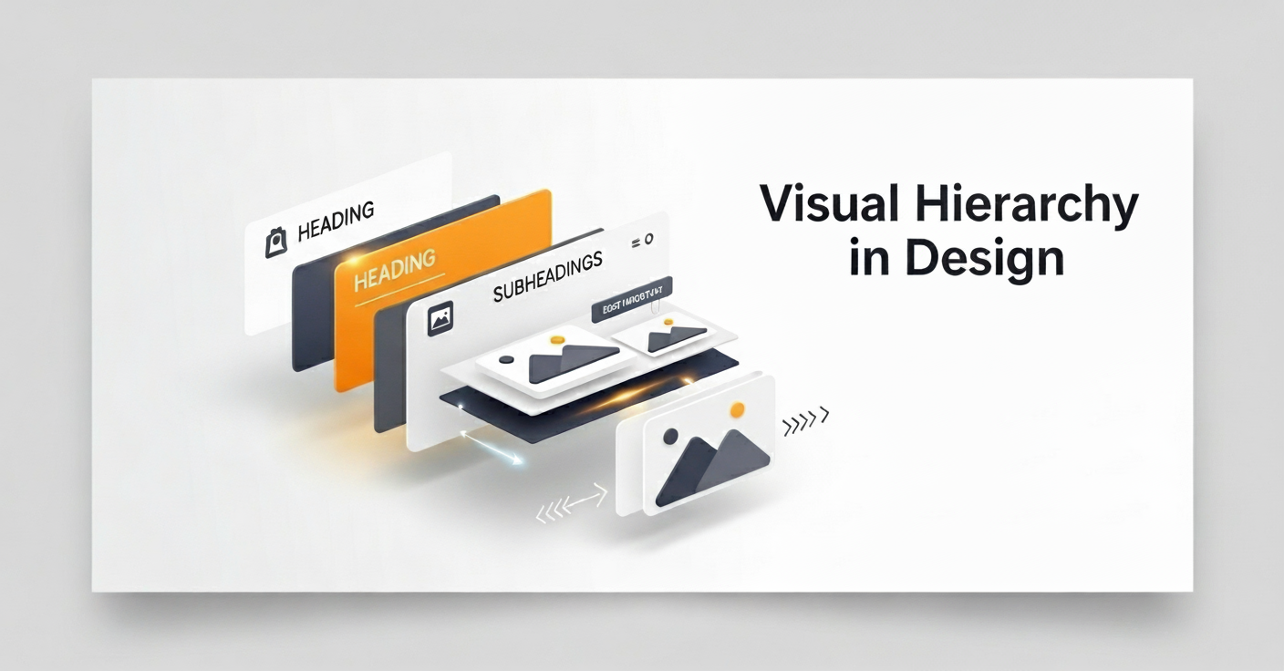
What Is Visual Hierarchy, Anyway?
Visual hierarchy is all about organizing your design elements-text, images, buttons, so the most important stuff grabs attention first. It’s like setting up a roadmap for the eye, making sure people see what you want, in the order you want.
Get it right, and your design just flows, people know exactly where to look, they stick around longer, and yes, they’re more likely to click or even buy. But mess it up? Total chaos.
I learned that the hard way back in my freelance days. I had a client’s blog where the headline blended so badly into the page that readers bailed almost instantly. A few tweaks to the hierarchy later boomed, people were staying on the page 30% longer. That’s how big of a difference it makes.
Why It Matters
Users decide in seconds whether to stay or leave. A strong hierarchy ensures they notice your key message like a “Buy Now” button or a catchy headline before getting distracted. It’s not just pretty; it’s functional, guiding people naturally, whether they’re on a website, app, or flyer.
According to research by the Baymard Institute, small UX improvements like better hierarchy and layout can dramatically reduce cart abandonment in e-commerce
A strong hierarchy doesn’t just look good, it boosts engagement and sales. If you want to see how visuals directly impact performance, check out our guide on how landing page design drives conversions.
How Eyes Actually Work
Our eyes don’t wander randomly. In English, we scan left to right, top to bottom, influenced by culture and habits. Ever notice how you spot a big, bold headline first on a news site? That’s hierarchy playing off our natural scanning patterns, like the F or Z shapes we’ll cover later. It’s psychology, not magic.
Core Principles to Lead the Eye
Okay, so how do you make this happen? It’s all about using design tools size, color, spacing like instruments in an orchestra. Each one plays a role to create harmony. Let’s break down the big ones.
Size and Scale: The Attention-Grabber
Bigger elements scream, “Look at me!” That’s why headlines dwarf body text or why a hero image takes up half the screen. Use size to spotlight your top priority, like a product title or CTA. But here’s a trap I fell into once: if everything’s huge, nothing stands out. I blew up all the fonts on a poster, and it looked like a shouting match. Lesson learned, scale down supporting elements to create contrast.
Color and Contrast: Emotional Cues
Colors aren’t just pretty; they’re emotional. Red says “urgent,” blue says “trust.” High contrast, like a bright button on a muted background, pulls the eye instantly. Think Airbnb’s pink “Book” button against clean grays, it pops.
Pro tip: Check contrast ratios for accessibility (WebAIM’s tool is free and quick). Oh, and fun fact: warm colors (reds, yellows) seem closer, while cool ones (blues) recede. Use that to add depth.
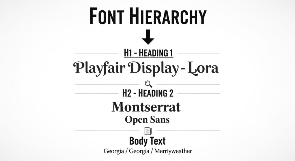
Typography: Fonts with Purpose
Fonts set the mood of your design. Bold text draws attention, while lighter fonts work better for details. Keep a clear hierarchy, H1 for the main idea, H2 for section titles, and smaller text for the fine print. Sans-serif fonts feel modern and clean, while serifs are great for long reading. Mixing fonts can work, but don’t go overboard. Stick to two, max.
Spacing and White Space
Now, about spacing and white space: think of it as giving your design room to breathe. Empty space isn’t wasted, it makes everything cleaner and easier to take in.
Apple’s website is a perfect example: everything feels polished because nothing’s squished together. Proximity plays a role here too, keeping related elements close, like form labels and fields. Our brains naturally group things that sit together, so use that to your advantage. (fancy, I know, but it just means we love patterns).
Alignment and Grids: Keeping It Tidy
Alignment creates order. Left-align text for easy scanning in English; center for emphasis. Grids think Figma or Bootstrap are your best friend for structure.
They keep elements from floating randomly. We redesigned a client’s signup page using a grid, tightened spacing, and conversions jumped 20%. Small tweak, big win.
Repetition and Movement: Flow and Familiarity
Repeat styles like the same button shape throughout for consistency. It’s like teaching the eye a pattern it can follow. Movement’s subtler: lines, arrows, or even a curved image can guide the gaze, like a path leading to a garden fountain. Use it to point to your CTA.
Eye Movement Patterns: F and Z Layouts
Our eyes follow predictable paths, and smart designers use them. Two big ones: F and Z patterns.
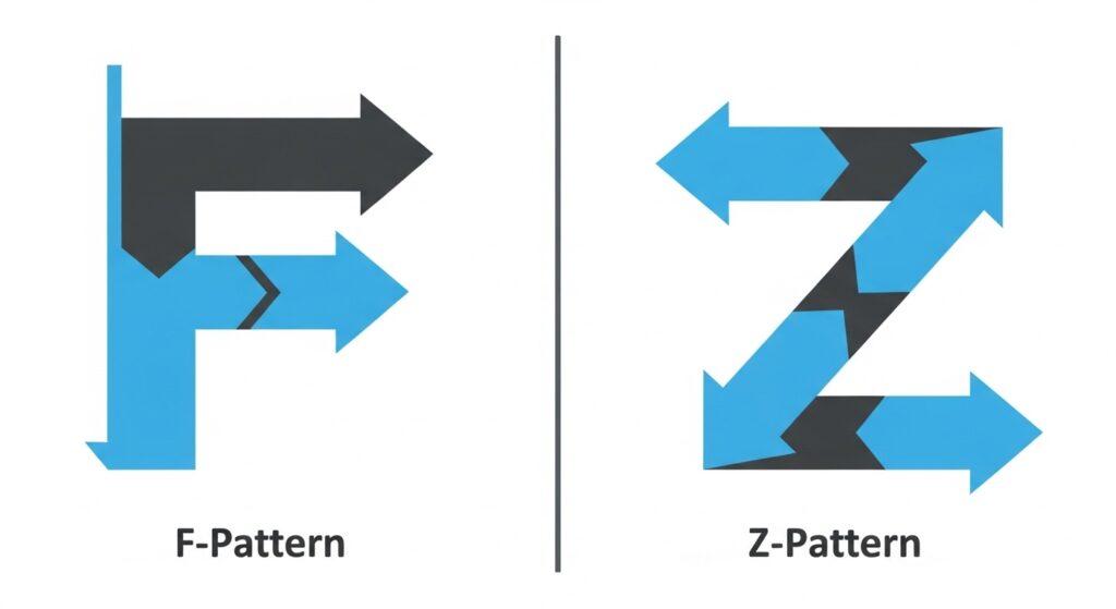
F-Pattern: For Text-Heavy Designs
On blogs or articles, eyes start top-left, skim right, drop down, repeat forming an F. News sites lean into this, placing headlines and images along the top and left. If your content’s wordy, put key stuff (titles, subheads) along this path to catch skimmers.
Z-Pattern: For Simple, Visual Pages
For landing pages or image-heavy designs, eyes zigzag: top-left to top-right, diagonal to bottom-left, then right Z shape. It’s great for guiding attention fast. I shifted a CTA to the bottom-right of a Z-path on a promo page, and clicks spiked because eyes landed there naturally.
How to Build Visual Hierarchy: A Step-by-Step Guide
Ready to try this? Here’s a simple process to nail hierarchy in your next project.
Step 1: Plan Your Priorities
Decide what matters most.
- Level 1: The must-see (main headline, CTA).
- Level 2: Supporting info (subheads, images).
- Level 3: Details (fine print). Sketch it out pen and paper or Figma works.
This sets your roadmap.
Step 2: Layer the Principles
Apply the tools we covered. Make Level 1 big and bold, add a pop of color. Space out Level 2 for clarity, align Level 3 neatly. Think of it like layering a cake each element builds on the last.
Step 3: Adapt for Context
On mobile, keep things stacked and simple so it’s easy to scroll. The desktop gives you more room to spread things out. Think about your audience too, if you’re designing for kids, go bold and colorful; if it’s for professionals, keep it clean and subtle. And whatever you do, always test on different devices to catch any layout issues before your users do.
Step 4: Test and Tweak
Show your design to a friend and see how quickly they notice the most important part. You can even try the blur test yourself, squint until the layout looks fuzzy and check what still pops out. If nothing does, you’ve got work to do.
And if you want to get fancy, tools like EyeQuant can mimic eye-tracking to show you where people’s attention goes. The key is to keep testing and tweaking until the right things stand out.
Common Pitfalls and How to Avoid Them
Even with the best intentions, it’s easy to mess up visual hierarchy. Here are a few traps I’ve fallen into, and how you can avoid them:
1. Overloading with clutter
If everything on the page is bold and oversized, nothing really stands out. It’s like everyone shouting at once, you just tune it out. Keep it simple. Highlight the essentials and let the rest take a step back.
2. Ignoring accessibility
Tiny fonts or low-contrast colors don’t just look bad; they lock people out. I’ve learned to always run designs through a contrast checker (WebAIM has a great free one) to make sure everyone, including color-blind users, can actually read and engage.
3. Forgetting mobile
Half your audience is probably on their phone. If buttons are too small or layouts aren’t responsive, people bounce in seconds. I learned this the hard way when one our designs tanked on mobile fixing the spacing and touch areas made all the difference
Neglecting mobile design is a surefire way to lose visitors. With most users shopping on phones, designing mobile-first is non-negotiable. Our post on top e-commerce design trends for 2025 explains why.
Key Takeaways
- Visual hierarchy directs the eye, ensuring viewers see your most important elements first.
- Core tools include size, color contrast, typography, spacing, grids, and repetition.
- Eye movement patterns like F-patterns (text-heavy) and Z-patterns (visual pages) guide where people look first.
- Hierarchy isn’t just about style, it impacts usability, conversions, and accessibility.
- Testing and iterating (blur tests, eye-tracking tools, feedback) ensure your design actually works.
Wrapping Up: Design with Empathy
Visual hierarchy isn’t about following some strict rulebook, it’s about empathy. It’s putting yourself in your audience’s shoes, thinking about how they see, feel, and move through your design, then guiding them without making it obvious.
When you get it right, your design doesn’t just look good- it connects, it converts, and it feels effortless. Start small, maybe make that headline a little bolder or give your layout some breathing room. Tiny tweaks can have a big impact.
Want designs that guide the eye and convert seamlessly? With Design Shifu’s graphic design subscription service, you can get professional layouts created on demand, no guesswork, just results.
FAQs
What is visual hierarchy in design?
Visual hierarchy is the arrangement of elements in a design so viewers notice the most important information first. It helps guide attention in a logical order, improving usability and conversions.
Why is visual hierarchy important in web and UX design?
What are the main principles of visual hierarchy?
How does visual hierarchy affect conversions?
How can I test if my design has a strong visual hierarchy?


