slide design Archives - Design Shifu

How to Create Stunning PowerPoint Graphics

We’ve all been there – staring at a blank PowerPoint slide, wondering how to transform boring bullet points into eye catching visuals that actually engage your audience. Whether you’re preparing for a crucial business presentation or designing slides for a classroom, creating compelling powerpoint graphics can feel overwhelming. 

You don’t need a design degree or expensive software to create graphics that make people stop scrolling and start paying attention.

This isn’t your typical “insert clip art and call it a day” tutorial. We’re talking about transforming you from a slide deck amateur into a PowerPoint graphics ninja – someone who can turn data into visual stories that stick, ideas into images that inspire, and presentations into experiences people actually remember.

TL;DR: Quick Wins for Better PowerPoint Graphics

The Essentials

  • Use PowerPoint’s built-in Designer and Icons library for instant professional looks
  • Stick to 2-3 colors maximum and maintain consistent fonts throughout
  • Replace text heavy slides with visual elements like icons, shapes, and SmartArt
  • Embrace white space – overcrowded slides kill engagement
  • Test your graphics on the actual presentation screen before showtime

2025 Trends to Try

  • Bold, oversized typography as graphic elements
  • Custom illustrations instead of generic stock photos
  • High contrast color combinations (think black/gold, white/orange)
  • AI-generated visuals for unique, on brand content

Instant Upgrades

  • Convert icons to shapes for unlimited customization options
  • Layer basic shapes with transparency for professional depth effects
  • Use the rule of thirds for better visual composition
  • Group related elements to maintain clean organization

Why PowerPoint Graphics Matter More Than Ever

Let’s be honest – attention spans are shorter than ever. In our visual first world, people process images 60,000 times faster than text. That means your slides have just seconds to make an impact. Great graphics aren’t just decoration; they’re essential tools for communication that can:

  • Make complex information easier to understand
  • Keep your audience engaged throughout your presentation
  • Enhance your credibility and professionalism
  • Help your key messages stick in people’s minds
  • Set you apart from competitors using generic templates

The PowerPoint Graphics Toolbox

Before diving into advanced techniques, let’s explore what PowerPoint offers right out of the box. Modern versions of PowerPoint are surprisingly powerful, and you might be amazed at what you can create without ever leaving the application.

Built-in Design Tools

  • PowerPoint Designer: This AI-powered feature automatically suggests professional layouts based on your content. Simply add your text or images, and Designer will offer multiple design options that you can customize further.
  • Icons and Illustrations: PowerPoint’s built-in icon library contains thousands of customizable icons across various categories. These aren’t just simple clipart – they’re professional quality graphics that you can resize, recolor, and modify to match your brand.
  • SmartArt Graphics: Perfect for creating flowcharts, organizational charts, and process diagrams. While they might seem basic, SmartArt graphics can be heavily customized with colors, effects, and styles.
  • Shapes and Drawing Tools: The foundation of custom graphics creation. These simple tools can be combined to create complex illustrations, infographics, and custom designs.

Step-by-Step: Creating Your First Custom Graphic

Let’s walk through creating a simple but effective infographic element – a process flow diagram that you can adapt for any presentation.

Step 1: Plan Your Visual Story

Before opening PowerPoint, sketch out what you want to communicate. Ask yourself:

  • What’s the main message?
  • What information is most important?
  • How does information flow logically?

Step 2: Set Up Your Workspace

Create a new slide and go to View > Gridlines to help with alignment. This invisible grid will be your best friend for creating professional looking graphics.

Step 3: Build with Basic Shapes

Start with simple shapes from the Insert > Shapes menu:

  • Use rectangles for main content areas
  • Add circles for bullet points or icons
  • Connect elements with arrows or lines

Step 4: Apply Consistent Styling

  • Choose 2-3 colors maximum from your theme
  • Use the same font throughout
  • Maintain consistent spacing between elements
  • Apply subtle shadows or gradients for depth

Step 5: Add Icons and Visual Elements

Insert relevant icons from the Icons library or create simple illustrations using basic shapes. Remember, less is often more – don’t overcrowd your graphics.

2025 PowerPoint Graphics Trends You Need to Know

The design world is constantly evolving, and staying current with trends can make your presentations feel fresh and modern. Here are the key trends shaping PowerPoint graphics in 2025:

Bold Typography Takes Center Stage

Large, impactful text can grab the audience’s attention and make key points stand out. Instead of small, timid fonts, embrace oversized headlines that command attention. 

Think of your text as a graphic element itself – it should be bold enough to read from the back of the room and interesting enough to serve as visual anchors for your slides.

Custom Illustrations Over Stock Photos

Stock photos are no longer the go-to for presentations in 2025. Instead, custom illustrations and icons are taking over. This shift toward bespoke visuals means your presentations can have a unique personality that reflects your brand or message. 

You don’t need to be an artist – simple line drawings, abstract shapes, and customized icons can be incredibly effective.

AI-Generated Visuals

With the right prompts, AI will generate specific images that match your content. While PowerPoint’s built-in AI tools are expanding, you can also create custom graphics using external AI tools and import them into your presentations.

Bold Color Contrasts

Bold, contrasting colors dominate presentation design trends in 2025, ensuring maximum visibility and engagement. Think black and gold, white and orange, or other high-contrast combinations that make your content pop off the screen.

Interactive and Dynamic Elements

Modern audiences expect more than static slides. Subtle animations, hover effects, and interactive elements can transform your presentations from passive viewing experiences into engaging journeys.

Advanced Techniques for Professional Graphics

Once you’re comfortable with the basics, these advanced techniques will elevate your PowerPoint graphics to the next level.

Creating Custom Icons

You can transform PowerPoint’s built-in icons into completely custom graphics:

  1. Insert an icon from the PowerPoint library
  2. Go to the Graphics Format tab and select Convert to Shape
  3. Right–click the icon and select Group > Ungroup
  4. Now you can edit individual elements, change colors, and combine parts from different icons

Building Complex Infographics

Layer basic shapes to create sophisticated infographics:

  • Use transparency to create depth
  • Overlap shapes for interesting visual effects
  • Group related elements to maintain organization
  • Apply consistent color schemes throughout

Working with Data Visualizations

Data visualization tools are the most effective way to convey crucial information in the most clear and impactful way. Instead of presenting raw numbers, transform your data into:

  • Interactive charts and graphs
  • Icon-based comparisons
  • Timeline visualizations
  • Geographic representations

Tools and Resources Beyond PowerPoint

While PowerPoint is surprisingly capable, sometimes you need external tools to create truly custom graphics. Here are some user-friendly options:

Free Design Tools

  • Canva: Perfect for creating custom illustrations and backgrounds
  • Unsplash: High-quality photos that you can customize
  • Flaticon: Thousands of free icons in various formats
  • Google Fonts: Expanded typography options

Professional Design Software

  • Adobe Illustrator: For complex vector graphics
  • Photoshop: For photo manipulation and custom textures
  • Figma: Collaborative design tool that’s free for personal use

AI-Powered Solutions

  • Midjourney: For creating custom illustrations and backgrounds
  • DALL-E: Another AI option for unique visual content
  • ChatGPT: Can help brainstorm visual concepts and design ideas

Common Mistakes to Avoid

Even with the best intentions, it’s easy to fall into design traps that make your graphics look amateurish. Here are the most common mistakes and how to avoid them:

  • Overcrowding Your Slides

Just because you can add multiple graphics doesn’t mean you should. White space is your friend – it helps your key elements breathe and makes your message clearer.

  • Inconsistent Styling

Mixing different fonts, colors, and graphic styles makes your presentation look unprofessional. Stick to a consistent visual theme throughout.

  • Low-Quality Images

Pixelated or stretched images instantly destroy credibility. Always use high-resolution graphics and maintain proper aspect ratios.

  • Ignoring Your Audience

Design choices should always serve your audience and message. A playful, cartoon style might work for a children’s educational presentation but would be inappropriate for a board meeting.

  • Forgetting About Accessibility

Ensure your graphics work for everyone by using sufficient color contrast, including alt text for images, and avoiding color as the only way to convey information.

Quick Tips for Immediate Improvement

Ready to start creating better PowerPoint graphics right away? 

Here are some actionable tips you can implement in your next presentation:

  1. Start with a clear hierarchy: Make sure viewers know where to look first, second, and third on each slide.
  2. Use the rule of thirds: Align important elements along imaginary lines that divide your slide into thirds, both horizontally and vertically.
  3. Embrace negative space: Don’t fill every inch of your slide. Empty space makes your content more impactful.
  4. Keep it simple: One main idea per slide, supported by clear visuals that enhance rather than compete with your message.
  5. Test on different screens: What looks great on your laptop might not work on a projector. Always test your graphics in the actual presentation environment.
  6. Use consistent alignment: Everything should line up properly. PowerPoint’s alignment tools are your friends.
  7. Choose colors with purpose: Each color should serve a function, whether it’s highlighting important information, creating mood, or supporting your brand.

The Future of PowerPoint Graphics

As we look ahead, several trends are emerging that will shape how we create and use graphics in presentations:

  • Increased AI Integration: PowerPoint is likely to offer more sophisticated AI tools for automatic graphic generation and layout optimization.
  • Interactive Elements: Expect more built-in tools for creating interactive graphics that respond to user input.
  • Real-Time Collaboration: Enhanced collaborative features will make it easier for teams to work together on graphic-heavy presentations.
  • Mobile-First Design: As more presentations are viewed on mobile devices, graphics will need to be optimized for smaller screens.

Key Takeaways

  • Strategy First, Design Second Your graphics should serve your message, not overshadow it. Before touching any design tools, clarify what you want your audience to remember and feel.
  • Master the Built-in Tools PowerPoint 2025 is more powerful than most people realize. The Designer feature, extensive icon library, and customizable SmartArt can handle 80% of your graphic needs without external software.
  • Consistency Beats Creativity A cohesive visual theme using limited colors and fonts looks infinitely more professional than a rainbow explosion of different styles, even if individual elements seem less “creative.”
  • Mobile-First Mindset More presentations are viewed on phones and tablets than ever. Design graphics that work on small screens – bold, simple, and high-contrast.
  • Embrace AI Integration AI tools for generating custom graphics are becoming essential. Start experimenting now with built-in AI features and external tools to stay ahead of the curve.
  • Less is More, Always Every element on your slide should earn its place. If you can remove something without losing meaning, remove it. White space is your friend, not your enemy.

Your Next Steps

Creating stunning PowerPoint graphics isn’t about having expensive software or years of design training – it’s about understanding your audience, planning your visual story, and using the tools at your disposal effectively. Start with simple projects and gradually build your skills.

Remember, the best graphics are those that serve your message and connect with your audience. Whether you’re using PowerPoint’s built-in tools or incorporating external resources, focus on clarity, consistency, and engagement.

Don’t be afraid to experiment and iterate. Every presentation is an opportunity to refine your graphic design skills and discover new techniques that work for your style and audience.

The PowerPoint graphics world is more fun and within reach than ever. Armed with the methods and trends described in this guide, you’re ready to produce presentations that not only educate but really engage your audience. So go ahead – launch PowerPoint and begin designing graphics that make your message impossible to resist.

Ready to transform your presentations? Start with one simple graphic technique from this guide and build from there. Your audience will notice the difference, and you’ll gain confidence with each presentation you create.

Frequently Asked Questions

Q: Can I really create professional graphics using just PowerPoint?

A: Absolutely! Modern PowerPoint includes Designer AI, thousands of customizable icons, advanced shape tools, and sophisticated formatting options. While external tools can add polish, PowerPoint alone can create graphics that rival expensive design software for most business needs.

Q: What’s the biggest mistake people make with PowerPoint graphics? 

A: Overcrowding slides with too many visual elements. The most impactful presentations use generous white space and focus on one main visual idea per slide. Think of a billboard, not a newspaper – your message should be clear from across the room.

Q: How do I choose the right colors for my graphics? 

A: Start with your brand colors if you have them, or choose 2-3 colors maximum that create strong contrast. Use tools like PowerPoint’s built-in color themes or external resources like Adobe Color to ensure your combinations are both attractive and accessible.

Q:Should I use animations in my PowerPoint illustrations?

A: Use animations judiciously and intentionally. Gentle entrance effects can guide attention, but steer clear of showy transitions that grab attention away from your message. The aim should be to promote understanding, not amuse.

Q: How do I get my graphics to be the same on each slide?

A: Build a master template with your color scheme, fonts, and most frequently used graphic items. Make use of the Slide Master capability of PowerPoint to ensure consistency, and perhaps develop a small repository of your own custom graphics that can be reused and modified.

Q: I’m not a creative person – can I still create good graphics?

A: Definitely! Effective PowerPoint graphics are less about artistic ability and more about adhering to established principles (contrast, alignment, repetition, proximity).

Best Presentation Software Beyond Powerpoint & Keynote

Seeking presentation software other than the typical PowerPoint and Keynote? You’ve come to the right place! In this blog, we’ll discover the best presentation software [aside from PowerPoint & Keynote], providing new alternatives that can assist you in making amazing, interactive, and engaging presentations.

Whether you’re getting ready for a business pitch, a creative presentation, or an educational presentation, these tools offer special features to make your slides pop.

Presentations have become a staple in the corporate world, but using the same software over and over again can get monotonous. If you’re tired of using PowerPoint or Keynote for your presentations, there are many other options available in the market that offer more features and customization.

From Canva to Zoho Show, these presentation tools offer diverse options that cater to different needs. We will delve into their features and benefits so you can choose which one is right for you. So why limit your creativity when there are plenty of presentation tools out there waiting to be explored?

Also Read: 35+ Creative Presentation Ideas and Tips to Ensure a Captivating Delivery

The Role of Presentation Software

The Role of Presentation Software

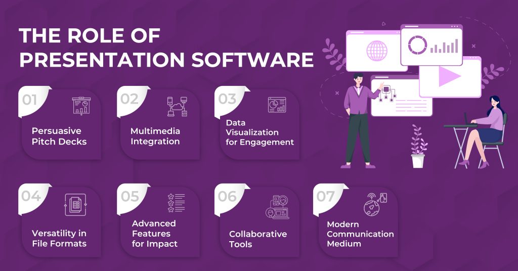
Presentation software is a powerful tool that plays a crucial role in various aspects of communication and storytelling. Its multifaceted capabilities make it an indispensable asset for creating compelling pitch decks, integrating multimedia elements, and enhancing audience engagement.

Persuasive Pitch Decks

Presentation software is vital for creating persuasive pitch decks, allowing users to organize information visually for compelling presentations.

Multimedia Integration

Facilitating seamless integration of audio and video files, presentation software enhances presentations by adding dynamic multimedia elements, captivating the audience.

Data Visualization for Engagement

With intuitive tools, presentation software excels in data visualization, making complex information accessible and engaging through visually appealing charts and graphs.

Versatility in File Formats

Support for various file formats, including PDF, makes presentation software versatile, accommodating different content types for diverse needs.

Advanced Features for Impact

Beyond basic functionality, presentation software offers advanced features, empowering users for seamless and impactful future presentations.

Collaborative Tools

Featuring collaborative tools and customization options, presentation software fosters real-time teamwork, contributing to effective team communication and project development.

Modern Communication Medium

Adaptable across platforms and devices, presentation software has become an indispensable tool in modern communication, ensuring effective message delivery to diverse audiences.

Evolution of Presentation Tools

With the evolution of presentation software, AI and smart blocks have become integral features, revolutionizing how presentations are created. The ability to create and edit presentations using mobile devices has given users newfound flexibility. 

Collaboration features embedded in the software enable seamless teamwork in presentations. Online presentation software allows real-time access and editing, promoting efficiency and convenience. Moreover, the integration of social media features has enhanced the reach and impact of modern presentation tools, making them more dynamic and interactive.

Diverse Options in Presentation Software

From PowerPoint to Haiku Deck, today’s presentation software offers stunning templates, built-in collaboration tools, and easy customization. Most platforms offer free trials, so you can test the interface before committing. Whether you’re on Windows or Mac, these tools make it simple to build impactful presentations—fast and fuss-free.

Tired of doing everything on your own? Why not get help from a design partner? Design Shifu offers unlimited graphic designs for a flat monthly fee, which also includes unlimited presentations starting at $399. You get a dedicated designer, an intuitive dashboard, and even a Canva integration to make small changes to the deck at your convenience.

Moving beyond PowerPoint and Keynote

Moving beyond PowerPoint and Keynote

Presentation software has advanced beyond traditional templates, offering unique design features. It supports the use of stock images, enhancing visual appeal. Users can create distinctive presentations with ease, saving time. 

The mobile device support facilitates on-the-go presentation creation, catering to modern work dynamics. This versatile software serves various use cases beyond office presentations, making it a valuable tool for different scenarios. 

Embracing these advancements can significantly enhance the overall presentation experience.

Best Presentation Software Other Than PowerPoint & Keynote

Best Presentation Software Other Than PowerPoint & Keynote

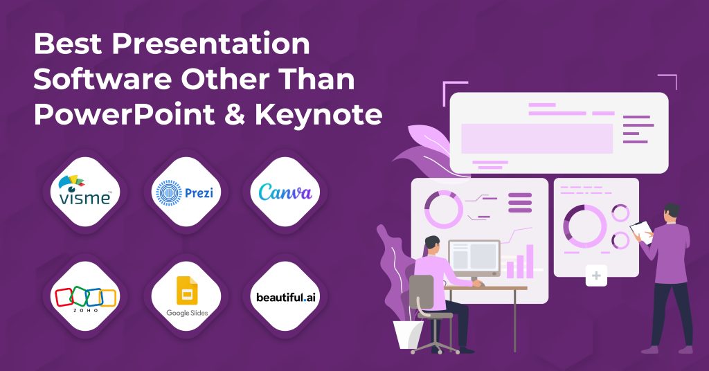
The landscape of presentation software has expanded significantly, offering users a wide array of options beyond the conventional choices. New players in the presentation software domain boast user-friendly interfaces, catering to both desktop and web users. 

These platforms are equipped with powerful data visualization tools and offer an extensive range of design options, allowing for captivating and creative presentations. With support for various design elements, these new presentation software options have redefined the way users approach and engage with creating presentations, providing top presentation software features and benefits.

Visme – A Comprehensive Tool

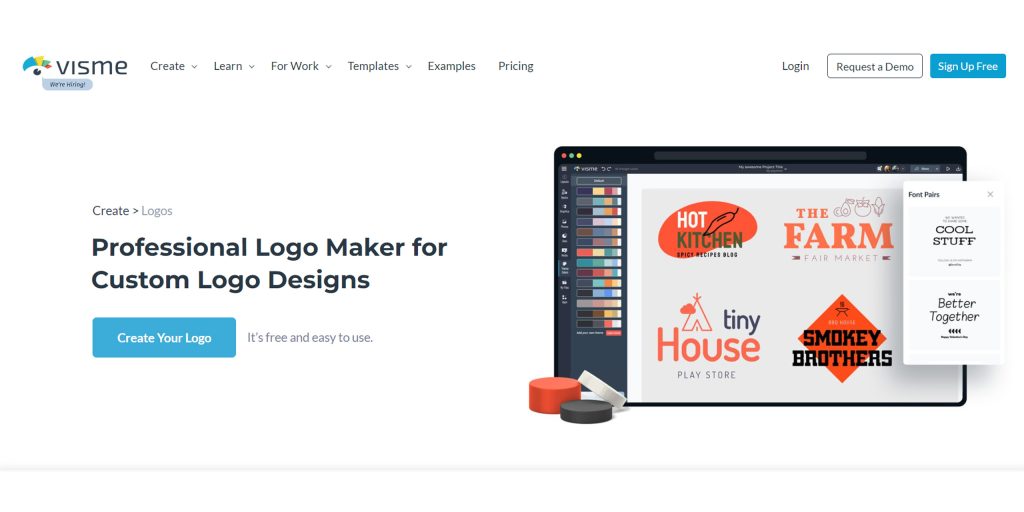
Visme presents a wide array of design templates and unique presentation design elements for customization, enhancing collaboration through real-time editing and sharing. 

This top presentation software supports advanced features for interactive presentations, making it ideal for both individual and team use. Visme’s features align with the evolution of presentation tools, catering to the diverse needs of users beyond traditional office presentations. 

With its seamless interface and powerful data visualization tools, Visme stands out as a comprehensive and user-friendly presentation program, suitable for both Mac and Apple device users.

Features and Benefits

Visme’s free version provides limited features, while the premium plans offer advanced design options. It supports the creation of presentation slideshows and features a user-friendly interface for design, making it ideal for both beginners and experienced users. Additionally, Visme offers a wide range of graphic design elements, ensuring that users have ample creative resources at their disposal. 

These features make Visme a top presentation software choice for individuals and team collaborations, providing much-needed support for Mac users and Windows users alike.

Price Tag and Usability

Visme presentation software offers a complimentary plan with fundamental design features, allowing users to access it through a Google account. The software also facilitates extensive customization, both for the presentations and the user interface. It caters to both desktop and mobile users, reflecting its versatility and accessibility. 

Additionally, Visme provides interactive presentation templates, enhancing the overall user experience. 

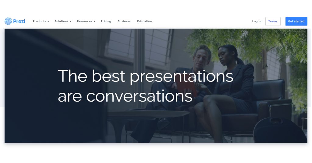
Prezi – The Conversational Presenter

Prezi, as a presentation software, offers a complimentary trial enabling users to explore its functionalities. It empowers the creation of dynamic and interactive presentations, boasting a user-friendly interface for design. The software presents a ton of design options and templates, integrating features for data visualization and storytelling. 

This sets Prezi apart from conventional platforms like Microsoft Office and Apple Keynote, providing a unique experience for Mac users and teams collaboratively working on slide decks. The top presentation software also sets itself apart in saving much time for the creators, unlike traditional PowerPoint presentations or even Google Docs.

Unique Aspects of Prezi

Prezi stands out with its non-linear presentation format, allowing zooming in and out of the presentation canvas. It offers a unique way of structuring information, creating dynamic and visually appealing presentations. 

Users can engage their audience with more interactive presentations, setting Prezi apart from traditional PowerPoint presentations. Prezi’s innovative approach to presentation design emphasizes storytelling and data visualization, making it a top presentation software choice for those looking to create impactful slide decks.

How Prezi Stands Out

Prezi stands out by reducing audience fatigue and enabling seamless content navigation. It enhances viewer retention and encourages a conversational presentation style, fostering storytelling. Prezi offers a fresh take on traditional slide presentations, providing a unique, memorable experience for audiences. 

Its non-linear format and zooming capabilities create more engaging and interactive presentations. With Prezi, users can craft visually dynamic presentations that captivate and resonate with viewers, making it a top presentation software for those seeking a more impactful and immersive presentation program.

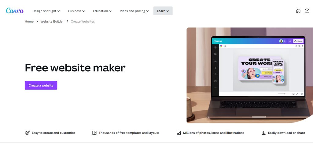
Canva – The Creative’s Choice

Canva, a top presentation software, offers a user-friendly interface with customizable templates and a wide range of design elements. It allows for the creation of visually stunning presentations suitable for diverse use cases. Users can access stock images and design options, making it ideal for Mac users and Apple device owners. 

Canva stands out as a time-saving option, eliminating the need to spend much time creating slide decks. With its intuitive features, it presents a fresh alternative to traditional presentation programs like PowerPoint, Google Docs, and Microsoft Office, positioning itself as a strong contender amongst top presentation software.

Exploring Canva’s Interface

Canva’s user-friendly interface caters to users with diverse design skills. The platform simplifies the creation of presentations through its drag-and-drop design elements. Users can seamlessly integrate audio files and access an extensive library of fonts and design elements. 

Customizing slide layouts within Canva is effortless, making it a top presentation software choice for many. With features like these, Canva stands out as a versatile presentation program that offers a streamlined design experience for both Mac and Microsoft Office users.

Pros and Cons

Canva’s free version boasts an extensive array of design features, catering to various presentation needs. The platform also facilitates seamless collaboration among team members, enhancing the collective creative process. On upgrading to premium plans, users gain access to advanced design and collaboration features, further elevating the presentation experience. 

Additionally, Canva presentations are easily accessible and editable on mobile devices, ensuring convenience and flexibility. Moreover, the option to export presentations as PDF files simplifies the sharing process, adding another layer of practicality to the platform’s offerings.

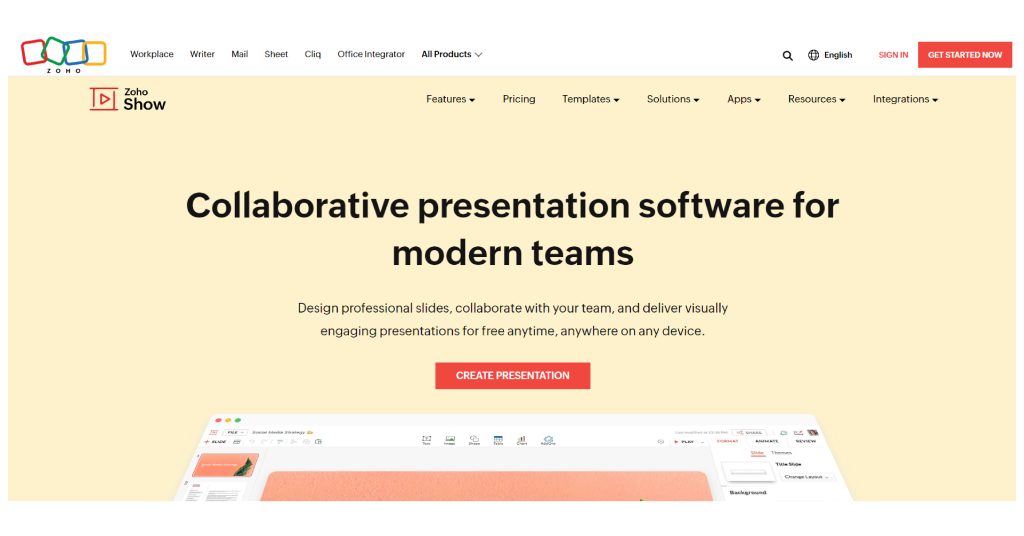
Zoho Show – The Collaboration Hub

Zoho Show serves as a collaboration hub for real-time teamwork on presentations, enabling simultaneous slide editing and offering diverse customizable templates. Seamless integration with other Zoho applications streamlines workflow, while interactive presentation creation enhances audience engagement. 

The platform’s facilitation of teamwork and customization options aligns with NLP terms such as “team plan” and “top presentation software,” making it an ideal choice for users seeking efficient collaborative capabilities in their presentation program. 

Zoho Show’s emphasis on real-time collaboration and customizable templates distinguishes it from traditional presentation tools like Microsoft Office and Apple Keynote.

Collaboration Features

Streamlining the collaboration process, Zoho Show offers suitable presentation design options for future use. 

With a minimal learning curve, users can easily comment and edit slides in real-time, enhancing teamwork and productivity. Integrating seamlessly with other Zoho applications, Zoho Show ensures a smooth workflow while allowing the creation of interactive presentations for audience engagement.

Zoho Show in Action

Zoho Show empowers users to infuse presentations with impactful data visualization, enhancing the clarity of information delivery. The platform’s robust features enable seamless integration of videos, elevating the quality of presentations. 

With offline access capabilities, Zoho Show ensures that presentations can be delivered without dependency on internet connectivity. Users benefit from a plethora of customizable templates, enabling unique and personalized presentation designs. The user-friendly interface optimizes the presentation creation process, making it efficient and intuitive.

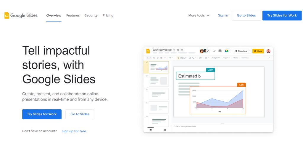
Google Slides – The Accessible Option

Google Slides provides accessibility through a Google account and internet connection, fostering real-time collaboration with robust presentation features. Users can seamlessly share and collaborate on presentations via Google Drive, across desktop and mobile. 

Embracing the NLP terms, Google Slides stands out as the top presentation software for team collaboration, surpassing traditional PowerPoint presentations. Its free version rivals Microsoft Office, Apple Keynote, and Haiku Deck, saving users much time. 

The platform is an ideal choice for Mac users and Apple device aficionados, offering the convenience of Google Docs integration and a user-friendly slide deck creation experience.

Why Google Slides?

Google Slides stands out as a top presentation software due to its extensive range of tools and features. With a free plan, customizable templates, and collaboration capabilities, it offers a user-friendly app for various use cases. Seamlessly integrated with G Suite, Google Slides provides a comprehensive solution for creating impactful presentations.

Exploring Google Slides Features

Exploring the features of Google Slides reveals its commitment to enhancing collaboration and flexibility. With real-time collaboration features, teams can seamlessly work together, boosting productivity and efficiency. 

The platform’s accessibility from any device with an internet connection provides unparalleled flexibility for users, allowing them to create and edit presentations on the go. 

Additionally, the wide range of customizable templates caters to diverse presentation needs, ensuring that users can find the perfect design for their content. Furthermore, the ability to convert and share presentations as PDF files streamline communication, while the data visualization tools empower users to craft engaging and informative presentations.

Beautiful.ai – The AI-powered Designer

Streamlining the Design Process with AI-powered Beautiful.ai

Beautiful.ai stands out by offering unique presentation templates, simplifying the design process for users. 

By embracing artificial intelligence, the software automates the creation of visually appealing slides, saving users much time. Its intuitive user interface and smart blocks enable the effortless creation of interactive presentations, reducing the learning curve for users. 

Beautiful.ai’s AI-powered design tool truly enhances the user experience, making it a top presentation software choice beyond Microsoft Office and Apple Keynote. For Mac users looking to move beyond traditional PowerPoint presentations, Beautiful.ai offers a refreshing alternative to creating engaging slide decks.

Embracing AI in Presentations

Embracing the potential of AI in presentation design significantly enhances the visual appeal and impact of slides. Beautiful.ai, an AI-powered presentation software, offers an array of advanced features that seamlessly facilitate the creation of captivating presentations. 

The integration of artificial intelligence optimizes user workflow, leading to improved efficiency and time savings. Leveraging AI in presentations enables an effortless generation of unique and professionally designed slides, while also providing customization options to cater to diverse user requirements. With Beautiful.ai harnessing the power of AI, users can effortlessly create visually stunning presentations, elevating their overall presentation experience.

Reviewing Beautiful.ai

Evaluating Beautiful.ai reveals a user-friendly interface allowing easy navigation through presentation design. The free version enables exploration of features before opting for a paid plan, catering to various needs. 

Advanced design features in premium plans offer customization and versatility, while customizable templates empower impactful presentations. Users benefit from time-saving design elements, simplifying the presentation creation process. 

Beautiful.ai’s diverse design options and user-friendly nature make it a top presentation software choice, enhancing the overall presentation experience.

Deciding the Right Software for You

Considering the variety of presentation software available, ease of use and collaboration features play a key role in decision-making. Customization options must align with specific presentation needs, ensuring a tailored approach. 

Evaluating the learning curve is essential for seamless software adoption. Design elements and user interface should match the user’s preferences for a smooth experience. Ultimately, the chosen software should align with the user’s unique use cases, intended audience, and design skills, providing a cohesive platform for impactful presentations.

Which Presentation Software Should You Choose?

When deciding which presentation software to choose, consider the number of templates and design options available. 

Assess the collaboration features, keeping in mind your team’s requirements. Look for interactive features like real-time collaboration for enhanced user engagement. 

Customizable templates and design elements are crucial for future presentations. Test different software using free trials to ensure compatibility with your presentation needs.

Frequently Asked Questions

Which is the best software for making presentations?

When it comes to making presentations, there are several great software options besides PowerPoint and Keynote. Popular alternatives include Prezi, Canva, and Google Slides. Each software offers unique features and benefits, such as non-linear storytelling or design templates. The best presentation software for you will depend on your specific needs and preferences.

Is PowerPoint or Prezi better?

PowerPoint or Prezi? The answer depends on your presentation needs and personal preferences. PowerPoint is widely used with a familiar interface, while Prezi offers dynamic visual effects but has a steeper learning curve. Consider your content and choose the software that suits you best.

What is better than Microsoft PowerPoint?

Looking for alternatives to Microsoft PowerPoint? Consider Prezi, Google Slides, and Canva. Prezi offers a unique non-linear presentation style with zooming effects, while Google Slides allows for easy collaboration and integration with other Google apps. Canva has a user-friendly interface and a wide variety of templates and design options.

What are the best interactive presentation software products?

Looking for the best interactive presentation software? Consider these options:
Prezi allows non-linear storytelling.
Mentimeter and Slido engage audiences with live polls and quizzes.
Emaze offers visually-appealing templates and designs.
Google Slides is a free alternative to PowerPoint with collaborative features.

Dump the Software – Get a Partner Instead

Ready to revolutionize your design process? Design Shifu is not just a software; we’re your design partner! Imagine unlimited graphic design at your fingertips, starting at just $399 per month. Need it fast? We offer same-day delivery. 
Unlimited revisions and a 100% 14-day money-back guarantee ensure your satisfaction. With a dedicated designer, seamless integrations with Canva, Trello, Slack, and more, plus our intuitive dashboard simplifies it all. 
From print to digital, logos to landing pages, our services cover it all. Why settle for software when you can have a design ally? Click now to book a demo and let Design Shifu transform your design experience!