
Welcome to the new Design Shifu, a fresh coat of color, a sharper voice, and the same mission that’s powered us from day one. Over the years, we’ve grown alongside brilliant marketers, startups,and dev agencies.
What started as a scrappy design subscription has evolved into a full creative partner trusted by teams that move fast and expect excellence.
So, it was time our brand looked and sounded the part. This rebrand isn’t just a facelift. It’s a louder expression of who we are and what we stand for: creativity without chaos, design without delays, and partnership without friction.
Let’s walk you through the why, the what, and (yes) the wow of what’s changed and what’s never going to.
TL;DR
Pressed for time? Here’s the fast-forward version of what’s new (and what’s not) at Design Shifu
What Changed
- A bold new logo with a sharper icon and clean logotype
- All-new illustrations and iconography, expressive, not excessive
- A vibrant new palette: Shifu candy (#7F4DED), Golden flax (#F3D074), Slime G (#010101), Coco Black: #1C1C1C, White: #FFFFFF
- Digital-first typography (Inter Display) that’s clean, clear, and consistent
- A refreshed tone of voice- calm, confident, and human
- A sleeker, faster website experience at www.designshifu.com (coming on 15th May 2025)
Why We Rebranded
- We’ve grown and our brand needed to grow with us
- To better connect with agile teams like dev agencies, startups, and marketers.
- We needed to stand out in a sea of “meh” design solutions
What It Means for You
- A more expressive, imaginative, and modern service experience.
- Smoother navigation and faster design request workflows. (coming soon)
- Still the same promise: 24-hour delivery – 6 days a week, unlimited requests, and zero headaches.
Before the Glow-Up: What We Looked and Sounded Like
Every great makeover starts with a little honesty. Ours? It began with a logo that worked… until it didn’t.
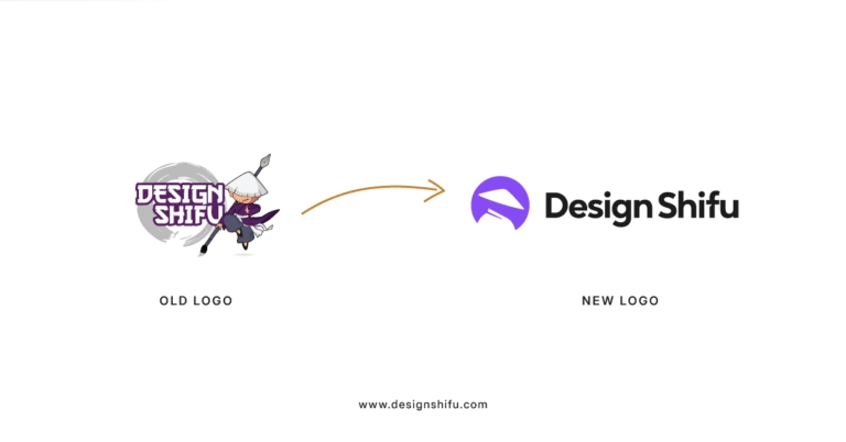
Original Logo & Visual Identity

- Our first logo was a simple wordmark in a muted blue palette with a generic pen icon, reflecting a straightforward design approach.
Issues With the old Logo

- Not legible at small sizes: The intricate character and detailed brush elements blur out when the logo is reduced in size.
- Too many visual elements: The figure, brush, shadow, and background create visual noise and reduce clarity.
- Lack of modern balance: The combination of cartoon illustration with bold text doesn’t scale well for digital interfaces.
- Inconsistent weight: The logo’s stroke weights and character proportions feel unbalanced when placed alongside other brand elements.
- Difficult to apply on dark/light backgrounds: The logo lacks a flexible version for use on different backgrounds, making placement tricky.
- Not optimized for square or favicon use: The horizontal layout with extended visuals makes it unsuitable for small square applications or favicons.
- No clear focus: Your eyes don’t know where to look first, illustration, brush, or text each element competes instead of working together.
Brand Voice & Positioning
- We used to sound more like a service provider than a true partner.
- Our tone was formal, full of technical terms, and didn’t feel warm or helpful. The language we used was stiff and hard to relate to.
- This made it tough to connect with fast-moving teams like developers and marketers—people who really need a creative, friendly design team they can count on.
What Worked Well and What Didn’t
- Our 24-hour delivery model and unlimited requests were a hit, giving clients the speed and flexibility they needed.
- However, our visual identity didn’t reflect the quality of our designs, and our formal tone created a disconnect, making us feel less approachable than we wanted to be for creative teams
Why the Change? Because Growth Deserves a Better Outfit
We didn’t wake up one day and decide to change our logo for fun. This rebrand was years in the making rooted in the way our customers changed, how we evolved, and what we’re building next.
Here’s what nudged us forward
We’ve Grown, A Lot
- What started as a scrappy design subscription is now a creative engine supporting agile dev teams, startup founders, and fast-paced marketers around the world. The old look didn’t match the scale or the ambition.
Our Clients Got Sharper, So Did We
- The people we serve move fast, think big, and expect clarity. We needed a brand that felt as dynamic and human as the teams we work with approachable, not generic; confident, not cold.
Our Vision Got Crisper
- We’re doubling down on simplicity, speed, and creative partnership. Whether you’re requesting a one-off graphic or streamlining your full pipeline, we’re here to take the design weight off your plate.
The Market Changed, Too
- Design services started blending into one another. Our rebrand is a clear signal: we’re not here to blend in. We’re here to deliver standout creative that feels effortless because it’s built for how real teams work today.
This rebrand may feel new, but our mission stays the same: making quality design easy, fast, and built for how real teams work today.
The Process: How We Approached the Rebrand
Rebranding isn’t just about creating a new logo it’s about realigning with who we are and where we’re going. Here’s a behind-the-scenes look at how the new Design Shifu identity came to life:
Research & Inspiration
- The rebrand began with deep research, references, and early sketch explorations. Ali, our senior brand identity designer, led the creative charge bringing bold ideas and sharp design sense to the table.
- He teamed up with Mohsin, our founding designer, and worked closely with the leadership team to shape a look that’s both true to our roots and ready for what’s next.
Collaboration Across Teams
- This wasn’t a solo mission. Our design team worked hand-in-hand with marketing, customer support, and leadership to make sure the new brand captured who we are and how we work.
- Every sketch, color choice, and line of copy came from thoughtful collaboration and plenty of back-and-forth across teams.
Values & Themes Explored
- We asked: What does Design Shifu stand for?
The answers shaped our direction speed, reliability, creativity, and friendliness. These values became the core of our visual language and messaging.
Challenges Faced
- Rebrands aren’t always smooth. Narrowing down from 34+ logo sketches and staying true to our roots while modernizing was a balancing act. But it made the final outcome stronger and more meaningful.
Sneak Peeks & Design Explorations
From early mood boards to logo concepts and typography tests, we explored a wide range of directions. Here’s a glimpse of what you didn’t see because the journey is just as important as the destination.
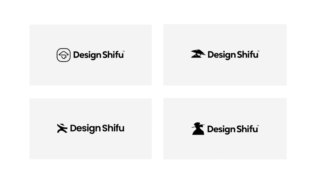
Our Logo Evolution
Design isn’t magic it’s methodical. Our new logo didn’t appear overnight. It took dozens of sketches, sharp eyes, and bold ideas.
These four frames capture the visual journey from rough ideas to the refined mark you’ll soon see everywhere.
1. Sketch Exploration
Pencil, paper, and raw ideas. We started with freeform sketches testing shapes, motion, and personality.

2. Concept Variations
From abstract to literal, we explored countless directions. This phase was all about pushing boundaries.

3. Design Refinement
After narrowing in on a concept, we fine-tuned every line and angle for balance, clarity, and uniqueness.

4. Final Concept
The result? A logo that’s clear, confident, and instantly recognizable as Design Shifu. It’s made to be quick to identify and easy to trust.

The New Logo

Before we landed on the final concept, our team explored 30+ variations—each one chasing a different angle of what “Design Shifu” could look like.
These rough sketches capture that early-stage thinking: fast, and full of possibility.
Before and After- The Difference

What’s New? Just About Everything You Can See (and Some You Can Feel)
This rebrand isn’t just skin-deep. It’s a full-on creative refresh from how we look to how we speak to how you experience us across every touchpoint.
Here’s what’s changed
Logo & Visual Identity
We’ve introduced a bold new logo with a refined icon and logotype, designed to stand out and embody our creative energy.

The logo uses our primary Shifu candy (#7F4DED) and Coco Black (#1C1C1C) for clarity, with white space rules ensuring it remains clean and uncluttered.

Expanded Visual Elements
Our rebrand introduces a vibrant system of icons and illustrations to bring our creative spirit to life.
- Our icons are sleek and purposeful, designed for categories like social media, presentations, digital ads, blogs, print design, freebies, and video editing making it easier for you to navigate our services and resources on www.designshifu.com.

- The illustrations, infused with our imaginative flair, add a friendly, approachable touch to our blogs, freebies, and print materials, often featuring subtle accents in Golden flax (#F3D074) and Slime G (#010101).

Together, these visuals reflect our passion for design while keeping things clear and functional for busy teams.
Colors: Our new palette is vibrant and versatile
Primary Colors
- Shifu candy (#7F4DED)- Use for primary buttons, highlights, and core brand elements.
- Coco Black: #1C1C1C- Use for headings, logo, and text on light backgrounds.
Secondary Colors
- Golden flax (#F3D074)- Use for accents, backgrounds, and subtle highlights.
- Slime G (#010101)- Use for callouts, infographics, or visual balance.
- White: #FFFFFF- Always use for light backgrounds and the logo on dark backgrounds.

Typography
- We’ve adopted Inter Display for both headings and body text, using sentence cases for consistency.
- Bolder weights highlight headings, while regular weights keep body text legible, ensuring a clean, digital-first experience.
Tone of Voice
Our Tone
From onboarding emails to blog intros to “Oops, something broke” messages you’ll hear the same personality throughout: calm, helpful, and just human enough to make you smile; it always stays
- Clear: Easy to read, understand, and act on. No fluff.
- Supportive: We sound like a design partner who’s got your back.
- Grounded: Confident in what we do, but never boastful or exaggerated.
- Encouraging: Especially when speaking to busy agency owners, founders, and marketers—we keep things frictionless.
The New Website
(Launching 15th May 2025)
The revamped www.designshifu.com is intuitive and user-friendly, making it easier for dev agencies, startups, and marketers to submit unlimited design requests and get high-quality results in 24 hours.
We’re here to help businesses move fast without compromising on great design. That shows in every word we choose.

Old Website vs. New Website
The old Design Shifu website was bold and vibrant but packed with dense visuals and less intuitive navigation. It focused heavily on pricing and service listing upfront, which often overwhelmed first-time visitors.
The new website reflects clarity, speed, and simplicity. With a clean interface and strategic copy, it’s designed for today’s fast-moving dev agencies, startups, and marketers.
It guides users seamlessly from submitting unlimited design requests to booking a demo while reinforcing trust through clear CTAs and testimonials.
It’s more than a redesign, it’s a smarter user experience built to convert

The Why Behind the Design Choices
The new Design Shifu website is more than a visual upgrade it’s a reflection of who we are and where we’re headed.
What the New Visuals Represent
- The clean, minimal layout paired with soft gradients and playful micro-illustrations symbolizes clarity, efficiency, and creativity are core values of our service.
- The updated typography and whitespace give the content room to breathe, guiding users effortlessly through their journey.
How It Aligns With Our Mission
- Our mission is to help businesses move fast without compromising on great design.
- The new interface removes distractions, simplifies interactions, and makes it easy for dev agencies, startups, and marketers to submit unlimited requests and get results fast. Every design element supports this promise.
Emotional and Symbolic Meaning
- The subtle icons and illustrations reflect the creative partnership between us and our clients supportive, dynamic, and human.
- The shift from a darker, intense theme to a brighter, open space conveys trust, modernity, and transparency.
What’s Not Changing
Though our appearance and tone have changed, the essence of Design Shifu hasn’t.

Here’s what you can expect
Our Core Values
- We’re still motivated by the vision of making great design accessible, quick, and hassle-free to dev agencies, startups, and marketers.
- Speed, simplicity, and quality are still at the core of what we do.
Our People
- The same dedicated team is here for you, ready to turn your ideas into stunning designs.
- You’ll still work with designers who care deeply about your vision and success.
Quality of Service
- Expect the same high-quality, on-brand designs delivered in 24 hours, with unlimited requests, no contracts, and a 14-day money-back guarantee.
- Our commitment to excellence hasn’t wavered.
Our Promise to You
- We’re as excited as ever about being your go-to design partner, supporting you in moving fast without sacrificing on good design.
- You can still find us at www.designshifu.com, eager to help your creative requirements.
This rebrand is about elevating your experience, not altering what you already love about us. Let’s keep creating together!
What’s Next: Our Vision for the Future
Our rebrand isn’t just a new look, it’s a foundation for growth, unlocking exciting possibilities for dev agencies, startups, and marketers like you.
Here’s a sneak peek at what’s coming
New Services to Streamline Your Work
- We’re expanding beyond design into web development support with platforms like WordPress, Webflow, and Framer, so you get fully functional sites ready to launch.
- Plus, we’re adding video animation and brand explainer videos to help you tell your story across social, landing pages, and pitch decks.
Our Future Roadmap
- At Design Shifu, we’re focused on becoming your all-in-one creative partner. Our goal is to take creative production off your plate completely, whether it’s static designs, motion graphics, or interactive sites, all under one subscription.
- More seamless support, less stress for your team.
We’re excited to keep evolving, so you can focus on what you do best while we handle the creative heavy lifting. Stay tuned for more!
Join the Celebration
We’ve launched a new look and it’s built with you in mind. Explore the fresh, faster, more intuitive Design Shifu experience and see how seamless design requests can be.
- Take a tour: Visit the new site
- Share your thoughts: We’d love your feedback, what do you think?
- Join the fun: Use our hashtag #NewDesignshifu and tag us to celebrate with us
Let’s shape the future of design together.
A Message from Our CEO
When we started Design Shifu, our goal was simple, make high-quality design easy and accessible for everyone. Over time, that mission has only grown stronger, and this new website is a reflection of that evolution. It’s faster, clearer, and built entirely around our users.
This rebrand is our promise to keep innovating, listening, and improving, so your ideas always have a world-class design partner.
Thank you for being part of the journey.
Suvin Shetty, CEO- Design Shifu
FAQs
1. Why did Design Shifu rebrand?
We rebranded to reflect our growth, upgraded services, and modern approach to creative design. It’s a visual and strategic evolution to better serve our clients.
2. What’s new in Design Shifu’s brand identity?
3. Are your services still the same after rebranding?
4. Will current clients be affected by the rebrand?
5. What does the new logo represent?
6. When will the new services like web dev and video launch?
7. How can I explore the new brand and services?