
Pastel colors are everywhere right now. From Instagram posts to website designs, these soft colors are taking over.
But here’s the problem: most designers get pastels wrong. They either make designs that look too childish or so washed out that nobody notices them.
To get it right, you need to understand the fundamental elements of graphic design like color, composition, and contrast
This guide will show you exactly how to use pastel colors like a pro. You’ll learn when to use them, how to combine them, and the mistakes to avoid.
TL;DR
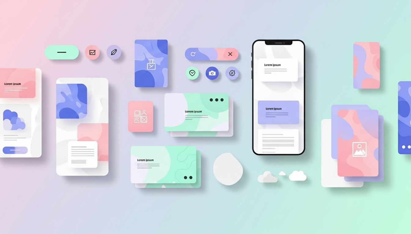
- Pastel colors are soft, low-saturation hues that make designs feel calm, friendly, and approachable. Use them in backgrounds, gradients, UI elements, social media posts, infographics, and packaging.
- Pair pastels with bold typography and dark accents for contrast. Stick to 2-3 colors per palette, test on devices, and align colors with your brand personality.
- Avoid overusing pastels or applying them to serious or urgent topics.
What Are Pastel Colors?
Pastel colors are soft, light versions of regular colors. Think of them as colors mixed with white.
Instead of bright red, you get pale pink. Instead of deep blue, you get baby blue.
Common pastel colors include:
- Mint green
- Baby pink
- Powder blue
- Lavender purple
- Peach orange
- Lemon yellow
- Pale coral
These colors have low saturation. That means they’re not bright or intense. They’re calm and gentle on the eyes.
Why Pastels Work in 2025
Pastel colors aren’t just trendy. They actually make people feel good and many leading brands use them to create approachable, modern identities, as highlighted in Pastel Colors in Branding & Graphic Design.
Research shows that soft colors create feelings of:
- Calmness and peace
- Trust and safety
- Comfort and friendliness
- Cleanliness and freshness
Major brands use pastels for these exact reasons. Look at these real examples:
- Glossier built their entire brand on millennial pink and soft peachy tones. Their pastel packaging makes customers feel like the products are gentle and safe.
- Spotify uses pastel gradients in their playlist covers and marketing. The soft colors make music discovery feel fun and relaxing.
- Headspace chose light orange and peach tones for their meditation app. These colors instantly make users feel calm before they even start meditating.
- Airbnb switched to softer coral and pink tones in their recent rebrand. The pastels make travel feel welcoming instead of stressful.
The pattern is clear: pastels make brands feel approachable and human.
10 Ways to Use Pastel Colors in Your Designs
1. Create Soft Backgrounds
Pastel backgrounds are perfect when you need something that doesn’t fight with your content.
Instead of harsh white, try:
- Pale pink for beauty brands
- Light blue for tech companies
- Mint green for health products
- Soft yellow for food brands
Real example: Notion uses extremely light grays and beiges as backgrounds. This lets their content stand out while keeping the interface calm.
Pro tip: Use pastels at 10-20% opacity over white. This gives you color without overwhelming the design.
2. Make Gradients That Actually Work
Pastel gradients are huge right now. But most people mess them up.
Here’s the secret: only blend colors that are next to each other on the color wheel.
Good combinations:
- Pink to purple to blue
- Yellow to peach to pink
- Blue to purple to lavender
- Mint to pale blue to lavender
Bad combinations:
- Pink to green (creates muddy brown in the middle)
- Yellow to purple (too much contrast)
- Orange to blue (fights each other)
Real example: Instagram’s logo gradient works because it goes from warm yellow to pink to cool purple. All colors flow naturally.
3. Pair Pastels with Bold Typography
Soft colors need strong shapes to balance them out.
Use thick, bold fonts when working with pastel backgrounds. The contrast makes your text pop without needing bright colors.
Typography rules for pastels:
- Use sans-serif fonts (they’re cleaner)
- Make text at least 18pt for body copy
- Go extra bold for headers
- Add more spacing between letters
- Keep lines short and easy to read
Real example: Mailchimp pairs their soft yellow background with chunky, bold text. The combination feels friendly but professional.
4. Add Dark Accents for Contrast
All pastels and no contrast makes designs look flat and boring.
Add small amounts of dark colors:
- Deep navy instead of black
- Dark gray for text
- Charcoal for icons
- Rich brown for borders
The 80-20 rule works best: 80% soft pastels, 20% dark accents.
Real example: Casper (the mattress company) uses mostly soft blues and whites, but adds dark navy for important buttons and text. Your eye knows exactly where to look.
5. Use Pastels for UI Elements
Pastel colors work great for buttons, cards, and interface elements.
But here’s what most designers miss: you need to adjust the shade for different elements.
- Buttons: Use slightly darker pastels that people can see
- Background cards: Use very light pastels
- Hover states: Make pastels 20% darker
- Active states: Add a thin dark border
- Disabled buttons: Make pastels even lighter with 50% opacity
Real example: Asana uses pastel colors for task tags and project categories. Each color is soft enough to not distract, but clear enough to organize information.
6. Create Pastel Color Palettes (Not Just One Color)
Don’t use just one pastel color. Build a palette of 3-5 colors that work together.
Here are proven palette formulas:
The Monochrome Method: Take one pastel color and use different shades of it.
- Light pink
- Medium pink
- Darker pink
- Very pale pink
The Analogous Method: Use colors next to each other on the color wheel.
- Mint green
- Pale blue
- Soft lavender
The Neutral Plus Method: Combine pastels with neutrals.
- Beige
- Soft pink
- Pale peach
- Warm gray
Real example: Canva’s color palette picker shows pre-made pastel combinations. Their “Sweet Dreams” palette (lilac, pink, and cream) is used in thousands of designs daily.
7. Use Pastels for Infographics
Data doesn’t have to look boring and corporate.
Pastel colors make information easier to digest. They’re perfect for:
- Pie charts
- Bar graphs
- Process diagrams
- Timeline graphics
- Statistical comparisons
The soft colors don’t compete with each other, so viewers can focus on the data.
Real example: The New York Times often uses pastel color schemes in their data visualizations. Their COVID tracking charts used soft blues and pinks instead of harsh reds and greens.
Pro tip: Still use different shades within your pastel palette. If everything is the same lightness, people can’t tell sections apart.
8. Design Social Media Graphics with Pastels
Pastel posts stop the scroll.
In a sea of bright, screaming ads, soft colors stand out by being different.
Social media tips:
- Use pastels for quote graphics
- Create templates with pastel backgrounds
- Add your logo in a darker shade for contrast
- Keep text simple and bold
- Use white space generously
Real example: Later (social media scheduling tool) uses pastel pink and blue gradients for their Instagram tips. Their feed looks cohesive and professional while still being eye-catching.
9. Combine Pastels with Photography
Pastels and photos can work together, but you need to be careful.
Best practices:
- Use pastels as overlays at 60-80% opacity
- Choose photos with neutral or complementary colors
- Add pastel borders or frames around photos
- Use pastel color filters on black and white photos
- Create split designs: photo on one side, pastel on the other
Real example: Pinterest uses pastel backgrounds behind product photos. The soft colors frame the images without competing for attention.
Warning: Don’t put pastels over colorful photos. The colors will clash and look muddy.
10. Design Packaging with Pastels
Pastel packaging sells products. For more examples of how pastels are transforming online shopping experiences, see our ecommerce design trends guide
These colors work especially well for:
- Beauty and skincare
- Baby products
- Organic foods
- Wellness items
- Handmade goods
- Gifts and stationery
Real example: Glossier’s pink bubble wrap pouches became so popular that people collected them. The packaging itself became part of the brand experience.
Real example: Dollar Shave Club uses soft blues and creams for their packaging. It makes shaving products feel less aggressive and more approachable.
The Biggest Mistakes with Pastel Colors (And How to Fix Them)
Using Too Many Pastel Colors
- The problem: Your design looks like a baby nursery exploded.
- The fix: Stick to 2-3 pastel colors maximum. Use neutrals (white, cream, gray) for the rest.
Not Enough Contrast
- The problem: People can’t read your text or find important buttons.
- The fix: Always test your designs in grayscale. If you can’t see the difference between elements in gray, you need more contrast.
Wrong Colors for Your Brand
- The problem: Using pink pastels for a law firm or mint green for a steakhouse.
- The fix: Match pastel colors to your industry
Mistake 4: Making Everything Pastel
- The problem: The design has no focal point. Everything blends together.
- The fix: Use the 80-20 rule mentioned earlier. Let pastels be your base, then add darker elements where you want attention.
Mistake 5: Using Pastels for Serious Topics
- The problem: Your message doesn’t match your colors.
- The fix: Pastels work for friendly, approachable, calm brands. If you’re designing for emergency services, law enforcement, or serious news, choose different colors.
Tools to Help You Use Pastel Colors
You don’t need to guess which pastel colors work together. These tools do the hard work for you:
Coolors.co
- Generate pastel color palettes instantly
- Lock colors you like and generate new companions
- Export palettes for Photoshop, Illustrator, and more
Adobe Color
- Use the “pastel” filter to see only soft colors
- Test color accessibility (can people read your text?)
- Save unlimited color palettes
Canva Color Palette Generator
- Upload any image and extract pastel colors from it
- See pre-made pastel combinations
- Free to use, no account needed
Muzli Colors
- Browse thousands of pastel color combinations
- Filter by mood or industry
- One-click copy hex codes
Khroma
- AI learns which pastel colors you prefer
- Generates unlimited custom palettes
- Shows you real design examples using those colors
How to Test If Your Pastel Design Works
Before you finalize your design, run these tests:
- The Squint Test: Squint at your design. Can you still see the important parts? If everything blurs together, you need more contrast.
- The Phone Test: Look at your design on a mobile phone in bright sunlight. Pastels can disappear on screens outdoors.
- The Print Test: If your design will be printed, order a sample first. Pastels look different on paper than on screens. They’re usually lighter when printed.
- The Colorblind Test: Use a tool like Coblis to see how colorblind people see your design. Some pastel combinations look identical to people with color vision deficiency.
- The Target Audience Test: Show your design to 5 people in your target market. Ask them what feelings the colors create. Do their answers match what you want?
Real Brands Doing Pastel Colors Right
Let’s look at more examples of pastel success:
- Duolingo uses soft green as their main brand color. It makes learning a language feel less scary and more fun.
- Calm App built their entire brand on deep blue and light lavender. These colors literally make you feel calmer when you see them.
- Reform Kitchen (UK company) uses mint green and soft pink for their website. The pastels make kitchen renovations feel exciting instead of stressful.
- Outdoor Voices (athletic wear) uses peach and mauve tones. These soft colors separate them from the aggressive reds and blacks most sports brands use.
- Bumble (dating app) chose bright yellow with pastel accents. The soft colors make online dating feel safer and friendlier.
When NOT to Use Pastel Colors
Pastels aren’t right for every project. Avoid them when you need to:
- Create urgency (use bright reds and oranges instead)
- Show strength or power (use deep, bold colors)
- Target a serious, corporate audience (use navy, gray, and white)
- Design for restaurants serving heavy foods (use warm, rich colors)
- Stand out in a market already full of pastels (do the opposite)
Know your audience. If your target customer is 60-year-old men buying power tools, pastels probably aren’t the answer.
Key Takeaways
- Pastel colors mixed with white; calm, gentle, and approachable.
- Best for brands emphasizing friendliness, calmness, or modernity.
- Use 2-3 pastel colors + 1 dark accent for balance.
- Perfect for UI, social media graphics, infographics, packaging, and photo overlays.
- Avoid pastels for urgent, aggressive, or highly corporate designs.
- Test designs for contrast, colorblind accessibility, and mobile/print visibility.
Start Using Pastel colors Today
Pastel colors make designs feel calm, modern, and approachable. Stick to 2–3 colors, add dark accents for contrast, pair with bold typography, and test across devices.
Start with one pastel, build your palette, and watch your brand feel friendlier and more memorable. Your next viral post or best-selling product might just need a softer touch.
If you want to bring these principles to your brand, Design Shifu can help you create visually stunning, pastel-inspired designs that connect with your audience.
FAQs
What colors are considered pastels?
Pastels are soft, light colors like baby blue, mint green, lavender, peach, and pale pink. They have low saturation and are easy on the eyes.
Can pastels work for professional brands?
How do I create a pastel gradient?
Are pastel colors suitable for social media posts?
Do pastel colors print differently than on screens?
Which tools can help me pick pastel colors?