Visual branding in the construction industry is overcrowded with logo marks and emblems of buildings and helmets.
For small businesses, it becomes a challenge to create a unique brand identity through their logo that gives them a competitive edge. Business owners struggle to find time and energy to create a logo while handling other administrative tasks.
So, at Design Shifu, we have created a curated list of creative modern construction company logo ideas for you.
Learn everything you need to create stunning, modern logos for your small business to represent your brand effectively and stand out from the competition.
What is a modern logo design?
Often, people confuse modernism with minimalism. Modern logo design is a combination of design principles and the latest trends. It doesn’t necessarily mean a monochromatic logo with an abstract shape. From flashy, neon design to abstract line art, it could be anything. The key is the ‘popular’ art form.
While traditional designs emphasized the right colors and shapes, modern designs focus on alignment between the elements. In a nutshell, modern designing is not only about the colors, illustrations, or typography but also about alignment, balance, and symphony between the elements that evoke the intended emotion in the viewer.
A classic and easy-to-understand example is the famous swoosh of Nike, which is impossible to not recognize. A logo born in 1971 can teach a lot about modern design. The swoosh represents action, subconsciously capturing the sense of movement — exactly what Nike stands for. It communicates the brand’s tagline and messaging, “Just Do It.”
Ultimately, modern designs prioritize messaging over decorative design elements. Usually, the aim is to create an easy-to-remember design without compromising brand identity. Let’s explore popular construction logos to understand them in a better light.
Modern construction company logo design ideas
Urbanity
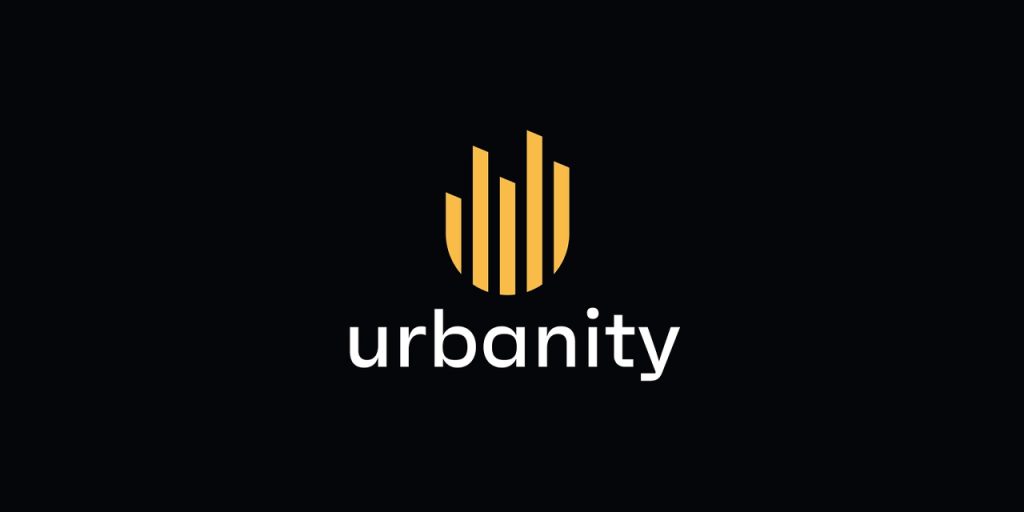
Not all logos are enclosed in a solid shape, like a rectangle or square. Experiment with various colors and symbols, or blend the brand initials with a general shape to explore new possibilities.
For instance, the Urbanity logo. The logo appears to play with a solid shape and the brand’s initial letter “U” to find a unique form. The straight lines represent skyscrapers which symbolize urbanism.
Wonder Real Estate
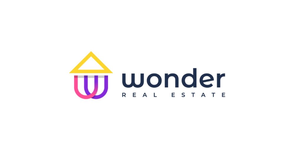
How can a logo help you build trust in your customers’ minds? You illustrate exactly what you do and let them see what they can expect. Although the house icons are overused, you can find new ways to distort and recreate them in a new way to communicate.
For instance, check out these logo concepts that blend the commonly used house icons with unique typography to create visual interest.
Averox Construction
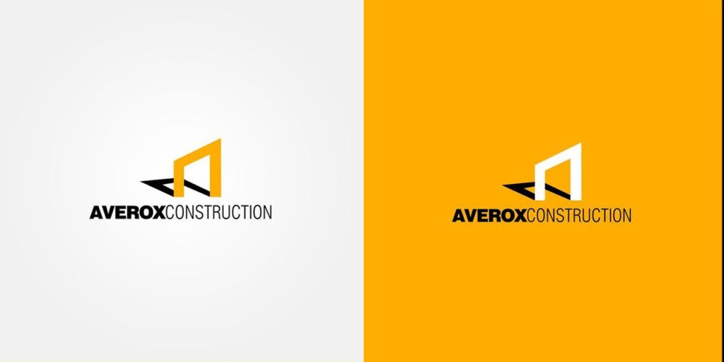
Yellow is a popular choice in the construction industry. But what distinguishes this logo is the 3D appearance. The three bold lines that give an appearance of an architectural structure with a shadow offer a 3D appeal. Moreover, it uses an unusual combination of bold and regular font, which draws the viewer’s attention to read the company’s name.
You can also experiment with different font combinations for your brand, especially if you wish to focus on typography.
Combination modern construction company logo
Another combination logo that cleverly uses lines to create a structure and engulf the company’s initials inside it. Many modern designs use word art to stand out. The reason is that it incorporates text and icons into a single imagery. Customers can easily identify your company with these unique logo designs.
Geometric modern construction company logo
Dexson Construction’s logo is a combination logo with a geometric shape and Sans-serif font. If you look closely, you would see a house carved out of a square. The clean lines and squares denote strength, authority, and elegance.
Mascot modern construction company logo
While many would argue whether mascots can be modern, it truly relies on how you wish to portray your brand and establish yourself in the market. Mascots are notoriously difficult to remember and comprehend at first glance and take time to build a reputation among your audience, but they are excellent choices for establishing a distinct identity.
Design a character with the right tools to convey what you do. To keep it modern, simplify the details like eyes and nose. Why not take help from Design Shifu to design a mascot for you? You get unlimited graphic designs and a dedicated designer to take care of all your design needs.
Homeland
If there is one characteristic associated with modernism, it is aesthetics. It is about stylishly presenting complexity. Rather than demonstrating the house and building separately, the logo blends the two symbols together to create a distinct appearance. The design also incorporates the initials of the company’s name, ‘l’ and ‘h’. The colors, lines, and symbols clearly communicate the kinds of construction projects the company undertakes.
Greymax
Overlays are an excellent way to amplify visual interest. This logo, for instance, plays with straight lines and symmetrical geometric shapes. The color palette comprises just one color to maintain minimalism in the design.
Silver modern construction company logo idea
While silver color is associated with steel and other construction materials, it also evokes a sense of mystery and exclusivity. This logo creates relevance and familiarity using clean silver beams that appear like a row of buildings inscribed in a circle. According to shape psychology, a circle illustrates stability and completeness, thus building on trust with its audience.
Konstruct
Designed by Nikas Geisleris, Konstruct’s logo is a combination of symbols and typography. The symbol constructed from straight lines resembles the letter ‘k’, the building plan, and the beams. It would also work as an effective brand mark for the company.
Ferry Construction
Ferry Construction’s logo is a monogram with block lines. The letters ‘F’ and ‘C’ are positioned such that the final output resembles a construction plan. The logo accompanies the company’s tagline, clearly communicating its core values to its audience.
Pyramid Builders
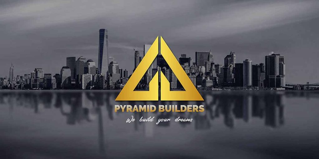
Pyramid Builders logo is an elegant, minimal logo made of a triangular shape. It conveys the brand tagline and its literal and metaphorical values. Besides being a symbol for the pyramid, the triangle pointing up denotes stability, power, strength, and uniqueness.
You can also use triangular shapes in your logo or position your elements in a triangular layout to convey similar values.
Typography modern construction company logo
Another typography logo that uses colors, slants, and positioning to win customers’ trust. The modern typeface Helvetica Neue Black font, with no swoops and superfluous details, gives it a neat touch. The green color creates distinct highlights drawing the viewers’ attention.
Modern construction company logo ideas
Modern logos usually experiment with typography, like Whiting-Turner’s logo. The bold and vibrant orange color of the bold typeface contrasts with the white background. While orange conveys warmth, safety, and shelter, white communicates firmness, balance, and steadiness.
Skanska is one of the world’s largest construction companies. The logo is well-known for its stunning blue color and plain typography that joins k and A. The logo conveys modern thinking, and authority trust. The reason why Skanska gets away with a simple typography logo is its wide popularity and reputation. The purpose of the logo, then, becomes to build a brand recall rather than communicating its brand messaging.
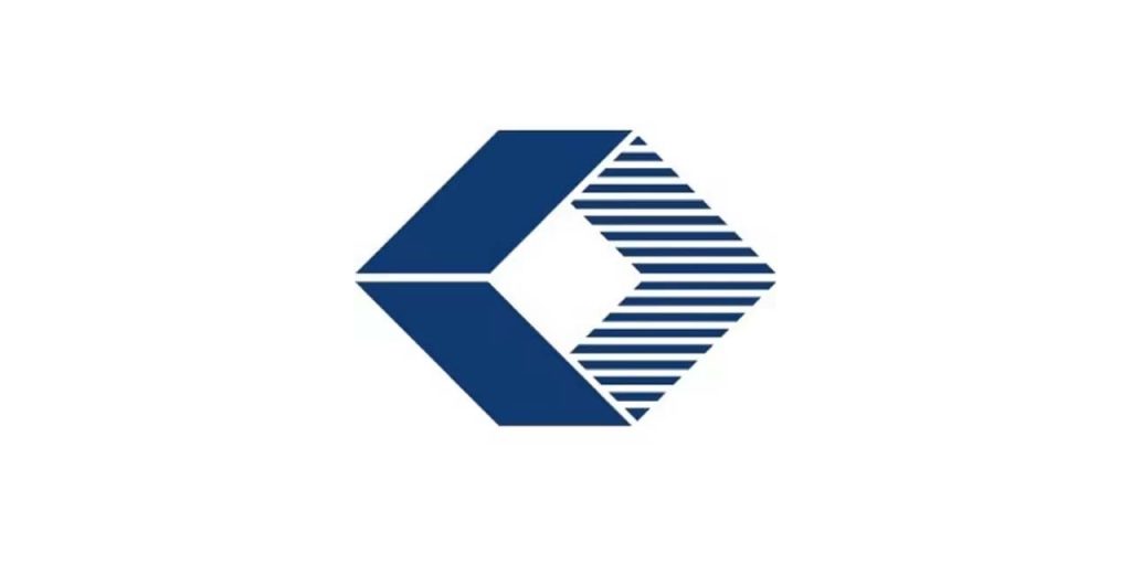
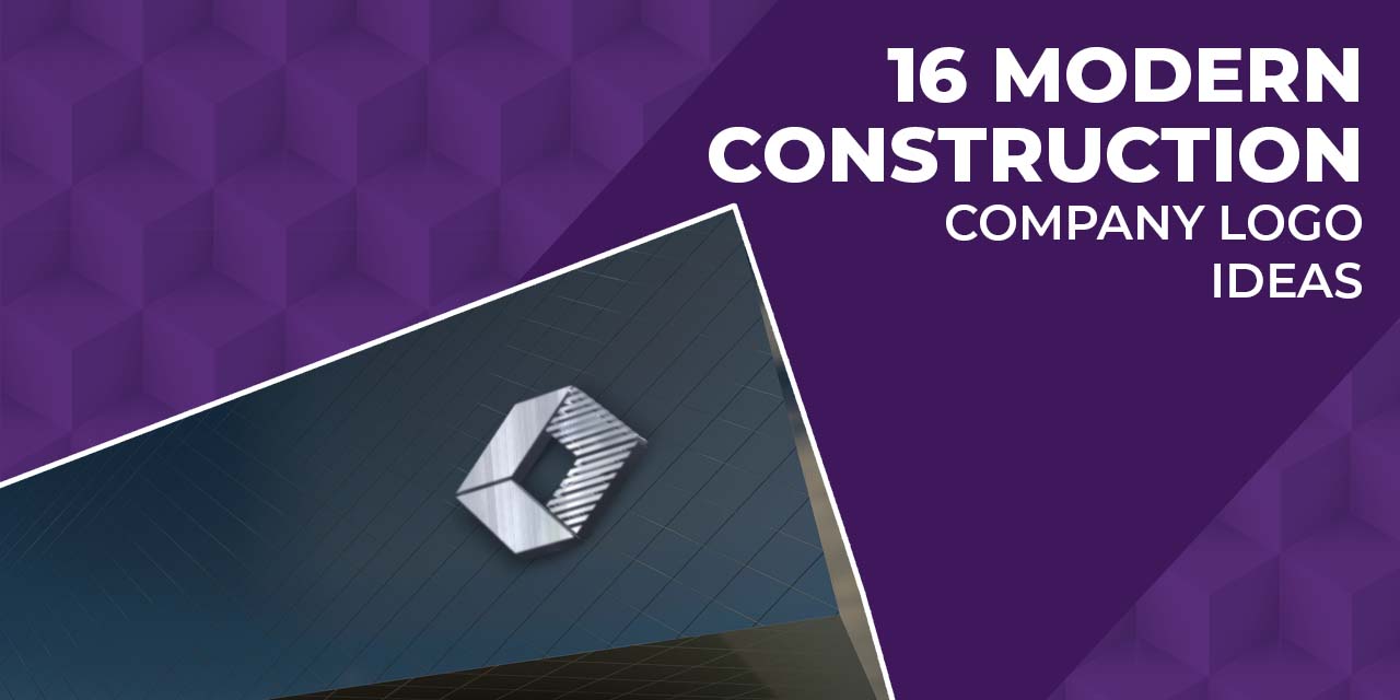
Structure Tone is one of the premier interior and renovation companies. And its minimal logo conveys its values. The rhombus with a solid color on one side and lines on another makes up a nice brand mark logo that can be easily scaled to fit different brand assets like business cards and social media profiles. The straight lines depict honesty, trust, and uniformity. Additionally, they also create a sense of moving forward.
How to modernize your construction company logo?
If you’re not a designer, it is normal if you don’t know how to design a logo. Unlike trends, logos do not change with recent fades. You have to create a timeless logo that stays even after the trend fades for years to come. However, logos for big brands like Google and Facebook too undergo changes to stay relevant to their audience.
If you are creating the logo for the first time or have a logo that looks outdated and irrelevant, here are a few tips to help you update your logo:
Limited bold colors
Limit your color palette to one or two bold colors paired with black or white. If you wish to have more colors, tone down other elements to create clean impressions.
Clean Typography
Modern design cherishes clean lines of Sans-serif fonts with no swirls and twirls. Check out typefaces with different weight, space, size, and slant to find the best match.
Minimal symbols and icons
While many modern logos drop the visual icons to simplify their design, you can opt for minimal icons and geometric patterns if you wish to include symbols in your logo.
Simply layout
With the ever-reducing attention span, keep the layout of your construction company logo clean, spacey, and simple so a viewer can memorize it within a glance. Avoid intricate details.
While bold lines and colors can easily grab attention, design your logo such that it can scale to fit any medium, from digital to print, like business cards and giant billboards.
Wrap Up
Being relevant and creative is no longer an option for brands they may neglect. To build strong brand recall and recognition, invest in your visual identity and create a logo that is appealing, timeless, and memorable. A logo that establishes your credibility and attracts new business. Define your brand messaging, values and guidelines, and determine the type of logo you want. Use our list of modern construction logos to design your own. Experiment with a few designs before selecting one. And flaunt it proudly on every document, marketing material, flyers, and card to have maximum impact.
If design is not your strongest suit, consider professional services like Design Shifu to share the load. Get a dedicated designer and unlimited graphic designs for just $399 per month from Design Shifu.

