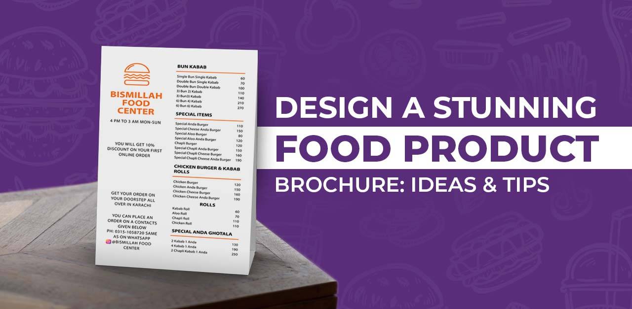

Brochures remain a powerful marketing tool in 2025, even in the digital age. Understanding how to design a brochure that converts is crucial for businesses looking to make a lasting impression and drive action.
For those looking to align design with strong branding, check out our guide on building a cohesive brand identity. And if you’re searching for inspiration or the latest industry trends, thisAdobe Express’s 14 Brochure Ideas for Design Inspiration offers excellent visual references from top designers.
In this post, we’ll dive into the key elements of designing brochures that not only grab attention but also drive conversions. From mastering design basics to crafting persuasive content, you’ll learn the essential strategies for creating brochures that sell.
Understand the Purpose First
Before you choose colors or fonts, the first step in designing a brochure that converts is knowing why you’re creating it. What’s the goal? Are you trying to generate leads, inform existing customers, launch a product, or drive foot traffic to a store?
Clearly defining the brochure’s purpose helps shape every design decision—from the layout and copy to the call-to-action (CTA). For example, a product brochure may need space for technical specs, while an event brochure should highlight schedules, speakers, or venues in an engaging format.
Ask yourself:
- Who is the target audience?
- What action should they take after reading it?
- Where and how will the brochure be distributed?
Answering these questions will ensure your brochure serves a specific function—making it far more likely to convert.
Choose the Right Layout to Maximize Results
When it comes to designing brochures that convert, layout isn’t just about aesthetics—it’s about impact. A well-structured layout helps guide your audience through your message while reinforcing your brand’s professionalism and credibility.
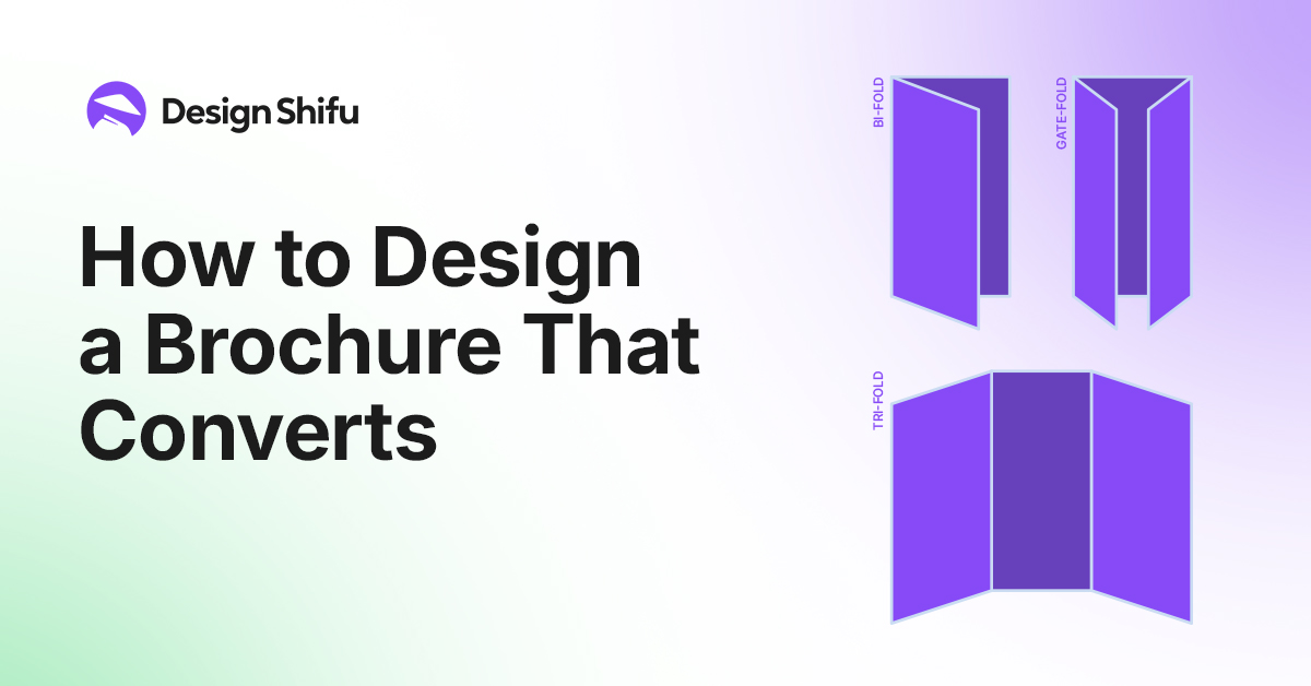
Start by selecting the right brochure format based on your campaign goals. Whether you need a tri-fold for service highlights, a bi-fold for product launches, or a custom fold to stand out at trade shows, the format should match your content strategy and target audience.
Smart layout design doesn’t just look good—it boosts readability, encourages action, and elevates your offer. Use clear sections, bold headlines, strategic imagery, and well-placed calls-to-action to lead the reader toward the next step—whether that’s booking a consultation or visiting your website.
If you want brochures that look sharp and perform even better, partnering with a professional design team can make all the difference.
Focus on a Compelling Headline
Your brochure’s headline is your first (and sometimes only) chance to grab attention. It should be clear, benefit-driven, and crafted to make the reader want to know more.
Tips for Writing Attention-Grabbing Headlines:
- Address a pain point: Speak directly to a problem your audience faces.
- Use numbers or stats: Headlines like “5 Ways to Save on Home Insurance” perform well.
- Create curiosity: Tease a benefit or outcome without giving it all away.
Typography & Font Size Matter More Than You Think
The typography you choose influences readability and perception. Stick to 1–2 professional fonts, and make sure your headline stands out with a larger font size (e.g., 24–36pt), while body text should be easy on the eyes (10–12pt for print).
The Strong contrast, spacing, and alignment help guide the reader through the content naturally and keep their attention where you want it.
Strong vs. Weak Brochure Headlines
Strong
- Boost Your Sales with Our Proven Digital Marketing Strategy”
- Say Goodbye to High Energy Bills – Here’s How”
Weak
- Welcome to Our Company
- Information About Our Services
Always aim to inform, entice, and convert—right from the headline.
Nail the Design Basics
Before your brochure can persuade, it must first be easy to read and visually appealing. This starts with a strong foundation in design.
Use of Whitespace, Grid Layout & Hierarchy
Effective use of whitespace prevents clutter and draws attention to key messages. A clean grid layout ensures alignment and balance, while visual hierarchy—using font sizes, colors, and spacing—guides the reader’s eye from headline to call-to-action.
Consistent Branding
Brand recognition builds trust. Stick to your brand’s color palette, logo placement, and font choices throughout. Consistency not only looks professional but also reinforces brand identity across every touchpoint.
Mobile & Print-Ready Design (2025 Standards)
Design with flexibility in mind. Ensure your brochure is:
- Print-ready (CMYK color, 300 DPI, bleed settings)
- Responsive for mobile viewing (especially if it’s part of a digital campaign)
- Compatible with interactive elements like QR codes and scannable links
Your brochure should look just as polished on a smartphone screen as it does in someone’s hands.
Craft Persuasive Messaging that Drives Action
Design catches the eye, but it’s the content that converts. In 2025, brochure content must be strategic, concise, and persuasive.
Keep It Minimal and Persuasive
Less is more. Skip the fluff—focus on benefits, not just features. Use clear, value-driven language that speaks directly to your audience’s pain points and goals.
Use Bullet Points, CTAs & Scannable Formats
Structure your content for quick readability:
- Short paragraphs and bullet points
- Bold headlines and subheadings
- Clear, compelling calls-to-action (e.g., “Book a Demo,” “Get a Free Quote”)
These elements increase engagement and guide your reader through the journey—from interest to action.
Emotional vs. Logical Appeal
Know when to tap into emotion (for lifestyle, luxury, or nonprofit brands) and when to rely on logic (for B2B, SaaS, or financial services). The best brochures strike a balance—trigger emotion, then justify with logic.
Choose the Right Format and Fold
In brochure design, choosing the appropriate format is most crucial to its success. Bi-fold, tri-fold, and gate-fold choices all have different merits. A bi-fold is uncomplicated and portable, ideal for simple messages, whereas a tri-fold has additional room for information. A gate-fold creates a dramatic reveal, ideal for focusing on a compelling message or product.
The layout also affects the readability and the flow of your content. Take, for instance, tri-fold brochures, which suit step-by-step instructions, while gate-folds are ideal for high-impact images. Decide wisely depending on the sophistication level of your message and the wanted user experience.
Visuals Matter
Good-quality images and graphics are necessary to make your brochure look good. They must convey the professionalism of your brand and reinforce the overall message. Infographics and charts can be especially useful for presenting complex information in a quick and easy-to-understand manner.
Don’t forget, visuals are a key component in reinforcing your call-to-action (CTA). Carefully selected visuals can draw attention to your CTA, making conversion more likely by directing the reader’s attention where it is most important.
Turn Great Design Into Real Results
An eye-catching brochure doesn’t just inform—it converts. Whether you’re promoting a service, launching a product, or driving event registrations, the right design can make all the difference.
Ready to impress your audience and boost your ROI?
Partner with expert brochure designers who understand strategy, not just aesthetics. Get compelling visuals, strong messaging, and print-ready files that deliver results.
Let’s create a brochure that works. [Contact Us / Get a Quote]
Test & Optimize
Even in 2025, A/B testing brochures remains a powerful strategy. Testing different versions of headlines, layouts, images, or CTAs helps you discover what resonates best with your audience. Just like digital marketing campaigns, printed materials benefit from data-driven decisions.
Key metrics to measure success include conversion rates (brochure recipients who take action), the number of leads generated, and engagement levels such as time spent reading or inquiries received. Testing and tracking these elements ensures your brochure continues to perform—not just sit pretty.
Conclusion
Brochures still hold incredible value—when designed right. We’ve covered everything from choosing the best format and using strategic visuals to writing compelling content and testing for performance.
Take a fresh look at your existing brochures. Can they convert better? Apply these tips and give them a second life.
Need help designing a brochure that converts? Let us handle it!
Frequently Asked Questions
1. What is the ideal brochure format?
Bi-fold and tri-fold brochures are the most popular. Your decision should be based on how much content you have and your design style.
2. How do I create attention-grabbing headlines?
Use action words, speak to a pain point, or emphasize a benefit to grab the reader’s attention right away.
3. Why is whitespace so crucial in brochure design?
Whitespace enhances readability and also highlights important elements such as CTAs and headlines.
4. What images do I use in a brochure?
You want high-resolution, pertinent images that enhance your message and reflect your brand.
5. How much content do I put in?
Briefly do it. Utilize bullet points, brief paragraphs, and compelling CTAs to lead the readers nicely.
6. Do I put prices in my brochure?
If pricing is a competitive selling point or included in the CTA, yes. Otherwise, lead them to a landing page or contact point.
7. What are good fonts for brochures?
Use clean, legible fonts consistent with your brand. Don’t use more than several styles within one design.
8. Can brochures be viewed on a mobile device?
Yes. Design electronic brochure versions that are responsive and simple on mobile devices.