
In a sea of thousands of books, readers often judge a book by its cover, whether we admit it or not. Great content alone isn’t enough. If your cover doesn’t catch attention, spark curiosity, or speak to your target audience, it won’t sell no matter how brilliant the writing inside. That’s why it’s crucial to understand how to design a book cover that sells, one that stops the scroll, draws readers in, and reflects the heart of your story.
Whether you’re self-publishing or launching through a traditional route, the right cover can mean the difference between “add to cart” and “keep scrolling.”
Let’s break down exactly how to design a book cover that doesn’t just look good, but sells.
Need a cover that sells your story as powerfully as your words?
Let Design Shifu’s experts craft a cover that captures attention, aligns with your genre, and drives sales.
Why Book Cover Design Matters
First Impressions Are Everything
You have 3 seconds to catch someone’s eye. That’s it. A great cover helps readers instantly know your genre, tone, and quality before they read a single word.
The Psychology of First Impressions
- People make instant judgments based on visuals and those first impressions shape how they view everything that follows, including your writing.
- A well-designed cover doesn’t just look good, it signals quality, professionalism, and genre fit.
Covers Drive Clicks and Conversions.
According to The Book Smuggler, well-designed covers can increase online sales by up to 35%. Why? Because we buy with our eyes.
Covers Influence Purchase Decisions
- You might think readers buy books based on blurbs or reviews and while that’s partly true, the cover often comes first. Studies show that up to 79% of people say the cover plays a decisive role in their book-buying decisions.
- And in online stores where scrolling is fast and attention spans are short, a compelling cover can mean the difference between a click and a scroll-past.
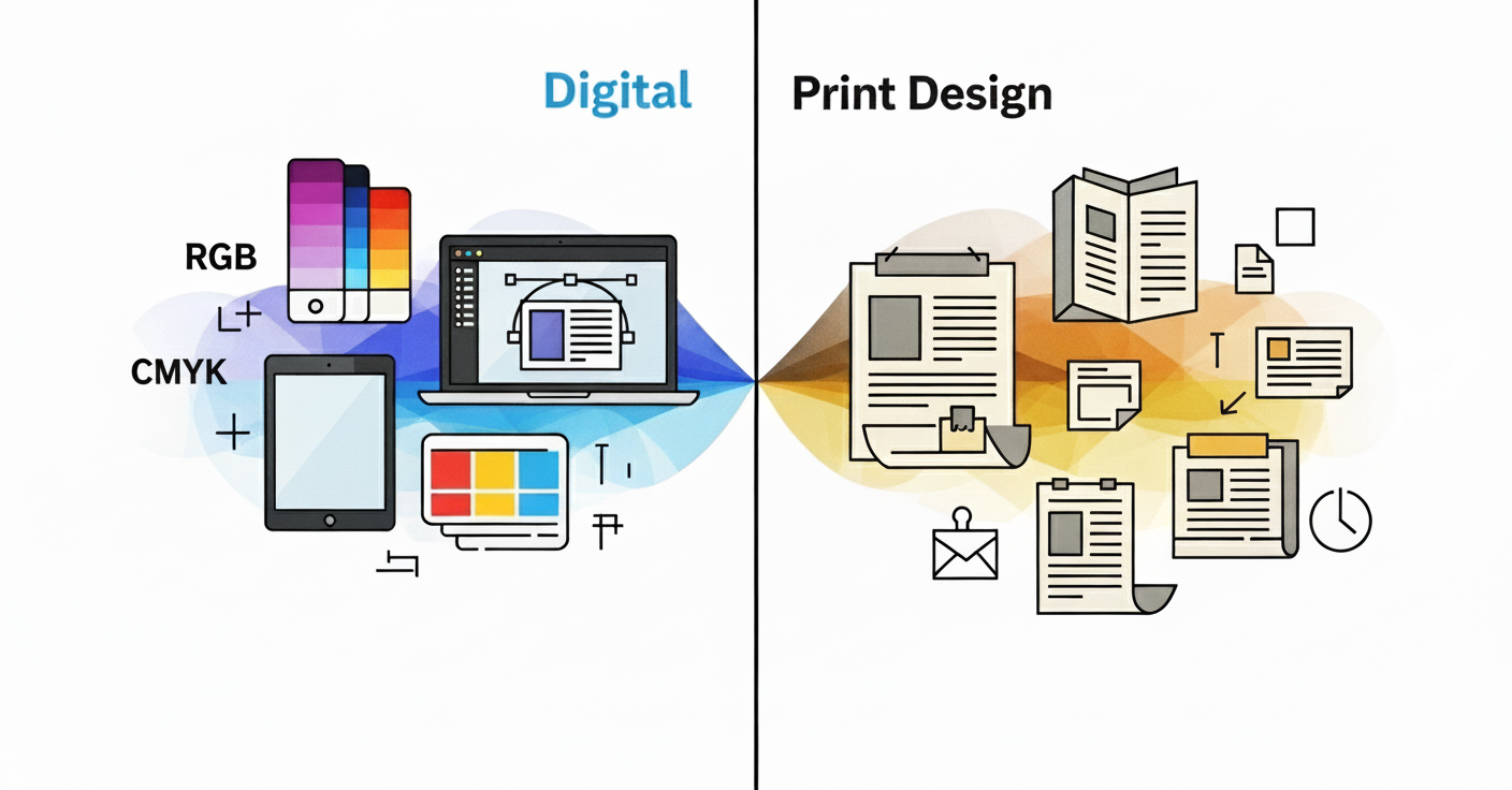
Physical vs. Digital: The Cover’s Dual Role
- In brick-and-mortar stores, your cover has to pop on crowded shelves. In digital marketplaces like Amazon or Apple Books, it’s all about how it looks as a thumbnail.
- That means your design needs to be versatile eye-catching at a glance and readable even at small sizes. Whether on paper or pixel, your book cover acts as your best marketing tool.
Now that you understand why covers matter, let’s break down what makes a cover truly sell
6 Key Elements of a High-Selling Book Cover
An effective book cover is more than a nice image, it’s a well-thought-out design designed to grab, inform, and convert.
Here’s what distinguishes top-performing covers from the forgettable ones
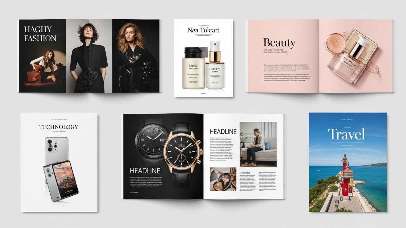
1. Match the Genre (Or Confuse and Lose)
Your cover should immediately tell readers what kind of story or content they’re getting. Each genre has visual conventions that help readers spot what they love.
Examples
- Romance: Soft lighting, script fonts, warm or pastel tones
- Thriller: Dark palettes, bold sans-serifs, high contrast imagery
- Business: Clean layouts, confident typography, minimalistic color schemes
Why it matters: Readers have expectations. If your design breaks genre norms too much, you risk confusing or repelling your ideal audience even if the content is a perfect fit.
2. Typography That Speaks
Fonts do more than spell out your title, they carry emotion and set the tone. Choose typefaces that reflect your genre and brand.
- Font hierarchy: Prioritize your title, then subtitle, then author name.
- Readability at thumbnail size: A fancy font that’s unreadable when small will cost you digital sales.
3. Color Psychology
Colors evoke emotions and influence buying behavior. Make sure your palette reinforces your book’s mood and message.
By genre
- Romance: Pinks, reds, golds
- Thriller: Black, red, icy blues
- Self-help/Business: Blue (trust), green (growth), orange (energy)
Pro tip: Use 2–3 key colors max for clarity and visual impact.Explore How colors trigger emotional response
4. Visual Hierarchy
A well-structured cover guides the viewer’s eye naturally from the most important element to the least.
- Start with a strong title- make it pop.
- Place your subtitle and author name strategically to support the design, not clutter it.
- Use white space, balance, and alignment to create a clean, engaging layout.
5. Imagery That Matches the Message
The right imagery creates an emotional hook.
- Custom illustrations can convey a unique tone or character voice.
- Stock photos work if chosen carefully and edited to fit your brand.
- Make sure the image supports your story not just fills space.
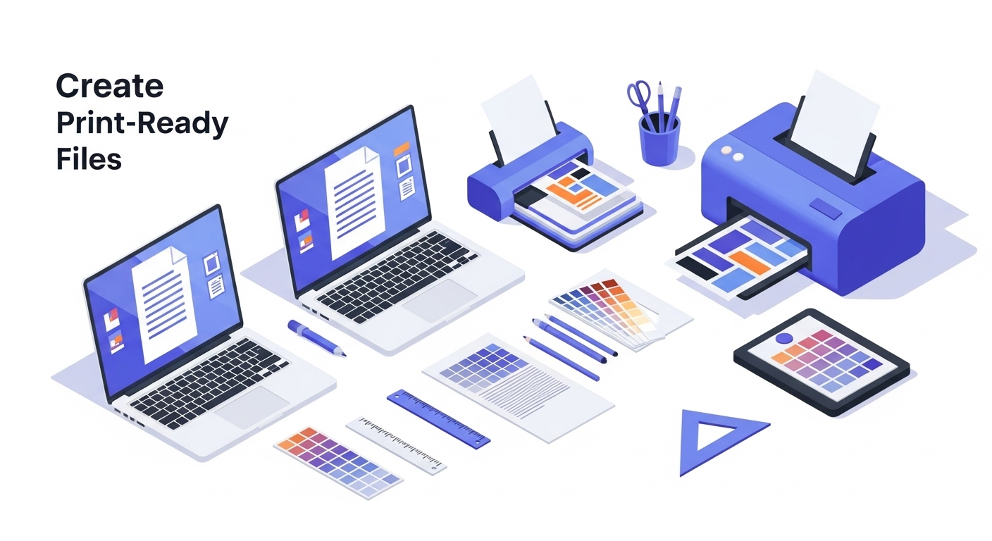
6. Professional Layout & Print-Ready Specs
Designing a cover isn’t just creative, it’s technical, too.
- Print covers need bleeds, spine width, and back cover layouts.
- eBook covers must be optimized for screens, especially thumbnails.
- Your design should look consistent across formats from paperback to Kindle.
See how our design team helps authors stand out on shelves and screens. View our portfolio →
Common Book Cover Mistakes to Avoid
Even great content can be held back by poor design choices. Avoid these all-too-common pitfalls that can make your book look amateur and cost you sales:
1. Overcrowded Design
Trying to cram too much onto the cover? It’s a fast way to lose readers. Simplicity is key. Every element should have a purpose and breathing room.
- Avoid: Too many images, blurbs, or design flourishes
- Do it: Focus on a single visual concept with clear hierarchy
2. Using Too Many Fonts
Mixing multiple typefaces can make your cover feel chaotic and unprofessional. Stick to two fonts max usually one for the title and another for subtitle or author name.
- Avoid: Five fonts fighting for attention
- Do it: Consistent typography that reinforces your genre and tone
3. Ignoring Genre Standards
Your book should fit in with your genre, so it can stand out in the right way. Disregarding reader expectations can cause confusion or turn off potential buyers.
- Avoid: A romance novel that looks like a horror story
- Do it: Design cues that feel familiar (yet fresh) to your target audience
4. Poor Contrast or Color Choice
If your title blends into the background or your palette feels off, your cover won’t catch attention especially at thumbnail size.
- Not Recommended: Light gray text on a white background.
- Recommended: High contrast that enhances readability and emotion
Want to avoid all these mistakes from the start? Explore color psychology in design and Let Design Shifu create a professionally designed book cover for you that’s clean, compelling, and conversion-ready.
Real-World Examples of Covers That Sell
Sometimes the best way to understand what works is to see it in action. Let’s look at how smart design choices can transform a book’s marketability and the visual strategies behind some of the most successful covers out there.
Before vs. After: The Power of a Redesign
| Before | After |
| Cluttered layout | Clean hierarchy |
| Outdated fonts | Genre-aligned fonts |
| Low contrast | Bold, eye-catching |
A redesign can boost visibility, signal professionalism, and reposition a book to the right audience sometimes even doubling sales.
Famous Covers That Nailed It
- “Gone Girl” by Gillian Flynn
Dark, mysterious, with minimalist typography that screams “thriller.” The stark cover mirrors the tone and hooks the right reader. - “Atomic Habits” by James Clear
Soft white background, clean gold serif type, and dotted texture that reflects small changes adding up over time. Subtle but strategic.
These covers aren’t just pretty, they’re perfectly in tune with their genre, tone, and target audience.
Want to give your book the same strategic edge?
Design Shifu can help you create a book cover that’s built to sell, from concept to final polish.
Should You DIY or Hire a Professional?
Designing your book cover yourself can be tempting especially with so many DIY tools and templates out there. But when it comes to selling your book, your cover is often the single most important marketing asset.
So what’s the best route? Let’s break it down.
| DIY Design | Professional Design | |
| Pros | Budget-friendly, full creative control | Strategic design, genre alignment, print-ready files |
| Cons | Risk of amateur look, technical issues | Higher cost, requires clear communication |
| Best For | Small projects, keepsakes | Serious authors, wide-market reach |
If you want your book to compete on the shelves or on Amazon you need a cover that looks the part. A professionally designed cover not only boosts credibility but can directly influence conversion rates and reader perception.
Let Design Shifu handle your book cover design so you can focus on what you do best: writing.
How to Work with a Book Cover Designer
Hiring a designer is a smart investment but to get the best results, clear communication is key. Here’s how to set your project up for success from the start:
1. Prepare a Solid Design Brief
Before your designer gets to work, you’ll want to share the essentials:
- Book title, subtitle, and author name
- Genre and tone (e.g. romantic, gritty, inspiring)
- Target audience (Who are you writing for?)
- Short book summary or blurb
- Examples of covers you like (and dislike!)
- Any must-have elements (colors, imagery, fonts, etc.)
- Print or eBook specs (trim size, spine width, etc.)
The more details you provide upfront, the smoother the process and the closer the result will be to your vision.
2. Give Clear, Constructive Feedback
Design is collaborative! Once you receive your first draft:
- Focus on what’s working and what’s not be specific.
- Use terms like “I’d love to see more contrast” or “Can we try a cleaner font for the subtitle?”
- Keep your audience in mind design choices should appeal to them, not just to your personal taste.
Good feedback is honest, focused, and respectful it helps your designer make magic.
3. Know the Timeline
Every project is different, but here’s a general idea:
- Initial draft: 3–7 days
- Revisions: 1–2 days per round
- Final delivery: 1–2 weeks total
Make sure to communicate any deadlines early especially if you’re working with a launch date or pre-order timeline.
Great design takes collaboration, not just direction. Trust your designer’s expertise, but don’t be afraid to speak up about your vision.
Need a reliable design partner? Design Shifu offers unlimited design services with quick turnarounds and a seamless revision process
Our unlimited Design Services
Ready to create a book cover that turns heads and drives sales? At Design Shifu, we specialize in crafting stunning, market-ready book covers that align with your vision, your genre, and your audience.
What’s Included
- Professionally designed front cover (print + eBook formats)
- Custom layout, typography, and imagery
- Genre-specific design strategy
- Multiple initial concepts to choose from
- Print-ready files with proper bleeds, margins, and spine
- Unlimited revisions—until you’re 100% satisfied
Your Satisfaction, Guaranteed
We don’t stop until your cover looks exactly how it should. Every design includes unlimited revisions and full commercial rights, so you can publish and promote with confidence.
Let’s turn your manuscript into a shelf-worthy masterpiece. Start your custom book cover design with Design Shifu today
Conclusion: Don’t Let a Weak Cover Undermine a Great Book
Your book cover is more than a design, it’s your first impression, your silent pitch, and your most powerful marketing tool. We’ve covered the key elements that make a cover sell, from genre alignment to typography, color psychology, and working with a pro.
A strong cover builds trust, captures attention, and sets the stage for what’s inside.
Need a cover that sells your story as powerfully as your words?
Let Design Shifu’s experts craft a cover that captures attention, aligns with your genre, and drives sales.
Book Cover Design Checklist
- Matches your genre’s visual expectations
- Clear typography and hierarchy (title readable at thumbnail size)
- Effective use of color psychology
- Balanced imagery that supports the story
- High contrast and readability (especially at small sizes)
- Consistent layout across print and digital formats
- Professionally optimized for publishing specs (bleed, spine, margins)
FAQ
What is the average cost to design a book cover?
Prices can range from $100 for a basic eBook design to $500+ for premium print covers. With Design Shifu, you get unlimited custom designs under one flat subscription no surprises.
How do I know if my cover is good?
Should I design my own book cover?
What size should a book cover be?
Do I need a different cover for the eBook and the print version?
How can I test if my book cover is effective?