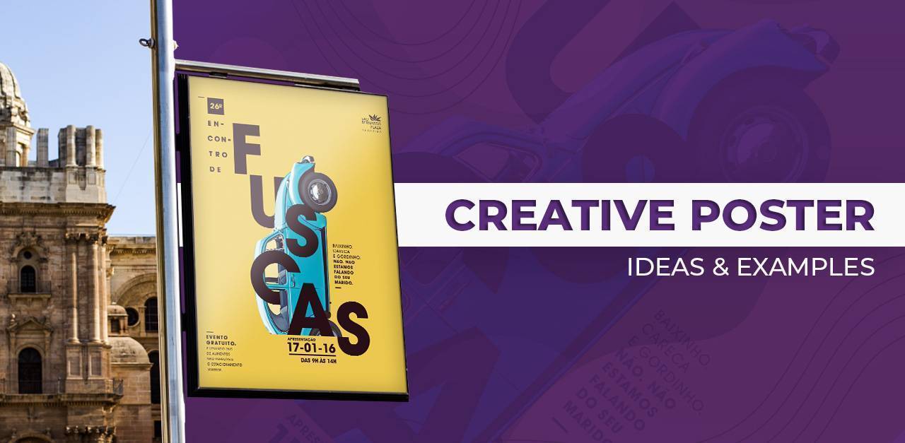
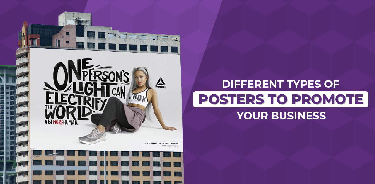
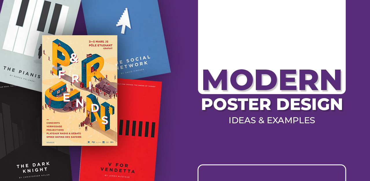
Posters have been an effective marketing vehicle for a very long time, pairing visual style with compelling messages to inspire action. In our blog, Creative Campaign Poster Ideas & Examples for Maximum Conversions, we examine how to develop compelling posters that not only generate interest but achieve tangible results too.
Whether selling a product, hosting an event, or creating awareness for a social cause, these ideas and examples will get you creating posters that actually convert.
Businesses and advertising agencies have been using creative posters for decades now. They might not be as centric to the marketing efforts as earlier, but they are still instrumental in reaching the masses and creating impact in target locations.
The power of creative poster advertising crosses many industries, from restaurants and music fests to film releases and athletic events. With digitization and an increasing number of billboards, ads, and posters, it becomes imperative to take a unique and creative approach to stand among the crowd to grab your audience’s attention.
We have curated some great tips and examples for creative posters to help you design one for your business.
Experiment with layers for Creative Campaign Poster Ideas
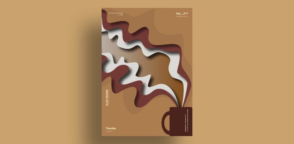
One way to make posters stand out from the crowd is by layering, which adds dimension and creates an immersive 3D experience for the viewers. Overlap backgrounds, gradients, and graphic elements to create layers and add depth. You can also turn the opacity up and down.
Get artsy
You can add colors, geometric shapes, pencil illustrations, and crayons to give a cheerful and playful look. Avoid trying to do too much at once; instead, choose one or two dramatic decisions that will serve as the poster’s centerpiece. Just like this poster, where the designer combines illustration with a geometric pattern to create a unique and memorable theme.
Use collaging technique
“A picture is worth a thousand words.” If you have custom illustrations or images that would entice your audience to take action or they would create a better story than words, go for a collage poster. Pick visually appealing, emotion-evoking photographs.
However, avoid free stock images or illustrations because they wouldn’t resonate with your business, and hence, wouldn’t leave a strong impression on your viewers.
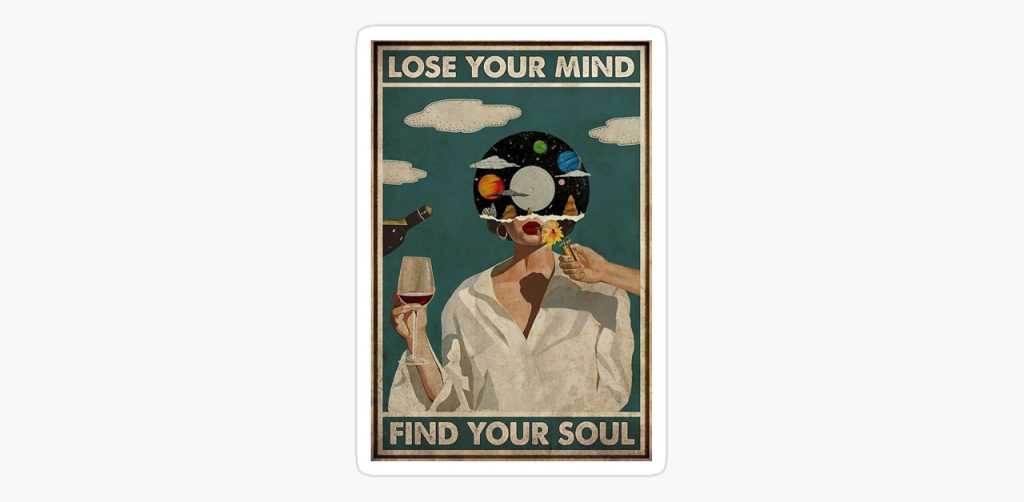
You can even pick scraps and clips of different images and illustrations to create an entirely new image that captures the essence of your message.
Use asymmetry to grab attention
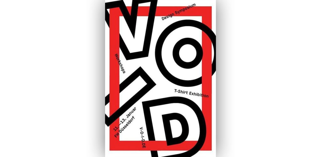
While symmetry appears to be a design fundamental, asymmetrical posters have become quite popular because they inspire visual interest. The key; however, is to maintain a balance between graphical elements in the overall layout. For example, balance out a large bold circle on top with a bold or large text on the bottom of the poster.
Play with Fonts for Campaign Poster Ideas
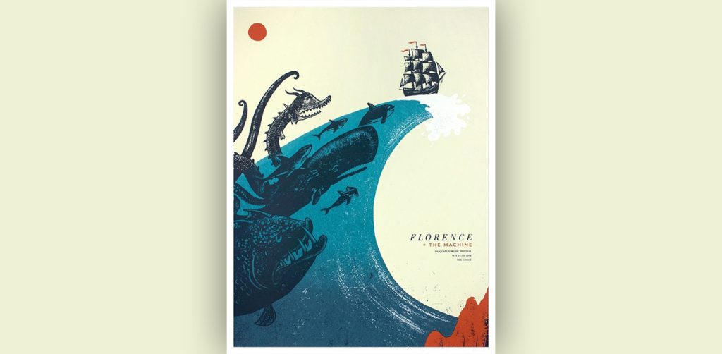
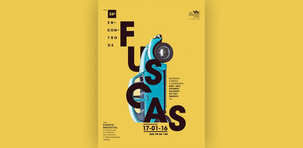
A good principle for font combinations is that opposites draw each other in. Select a primary font for catchy headlines that reflects the theme and tone of the poster. While selecting a secondary font for blocks of text or paragraphs, make sure it is clear and easily readable. Even a minor effort on the reader’s part would turn them away from your message.
A neutral serif or san serif secondary font is a good choice if your primary font is curved and handwritten. Do not go overboard with typography. Stick to 2-3 fonts. If you don’t know which pairs would be the best, a simple search would bring you hundreds of options.
If nothing works, go vintage
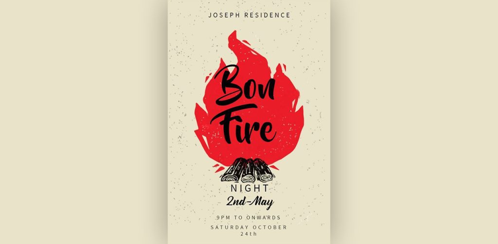
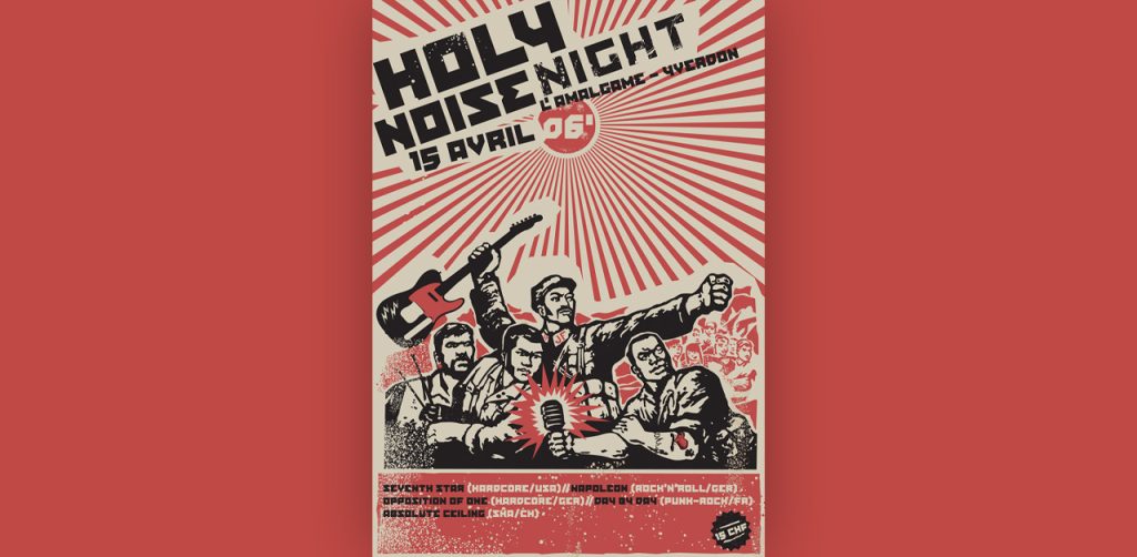
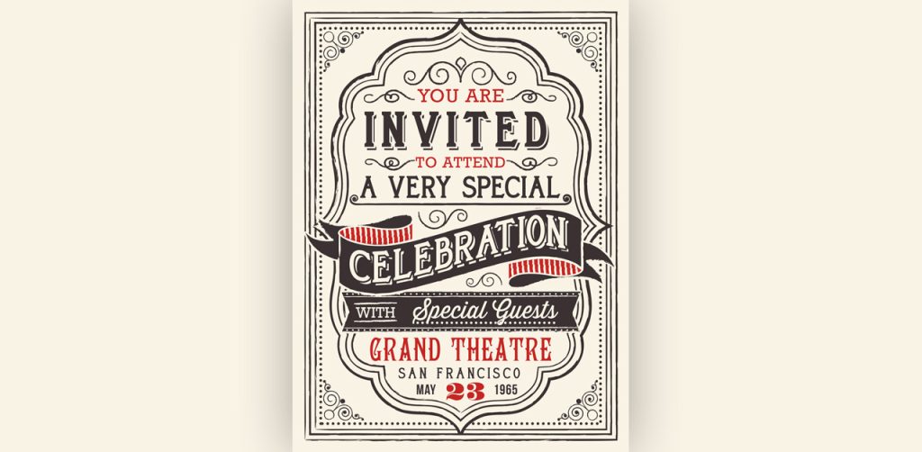
Vintage is the new black in the design industry — vintage clothing, vintage furnishings, vintage logos, and even vintage posters. There’s a wide range of fonts, logos, and elements to choose from. Select the era you want to model your design on and pick similar elements.
Generally, retro posters are great for pop and rock events. Choose Victorian design if you run a theater, or vintage fashion or furniture business.
Pictures can be used in intriguing and novel ways
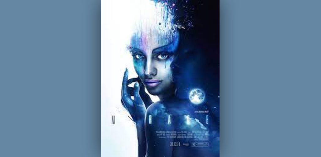
“A picture is worth a thousand words.” Including photographs in your poster in intriguing or novel ways is another method to make it more engaging. You can accomplish this with images, drawings, or infographics. Pictures that capture movement are more effective than plain static images. Blend typography, visual effects, and photography to produce unexpected results.
Less is more for Campaign Poster Ideas
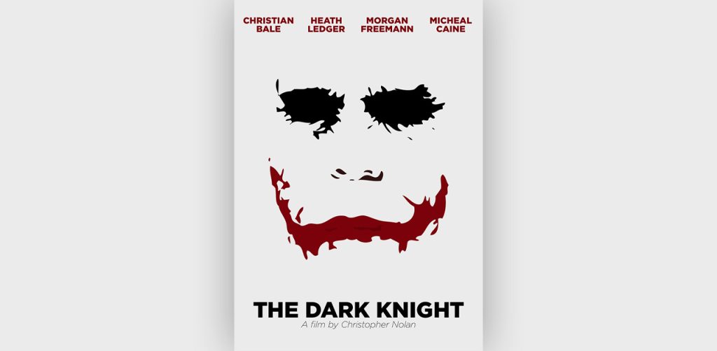
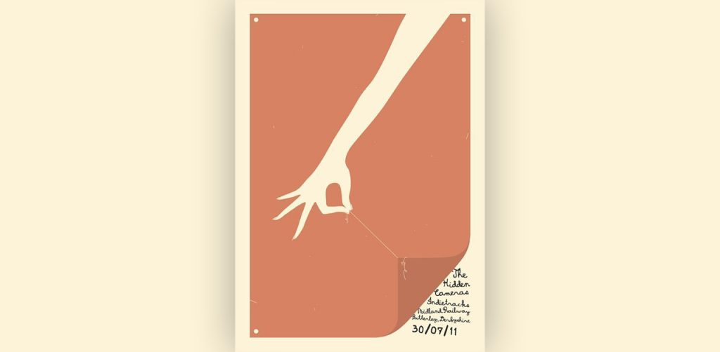
Minimalist designs work like a charm. Using negative space and simple, yet interesting, visuals, you can pique the viewer’s curiosity and compel them to read more. The challenge is, however, to pick and position the elements to create maximum impact.
While designing, assess each element you include and see if you can make the poster work without it.
Do you want help designing a creative poster for your business? Get a dedicated designer and unlimited graphic designs for just $399 per month from Design Shifu.
Establish a visual hierarchy
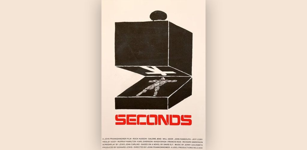
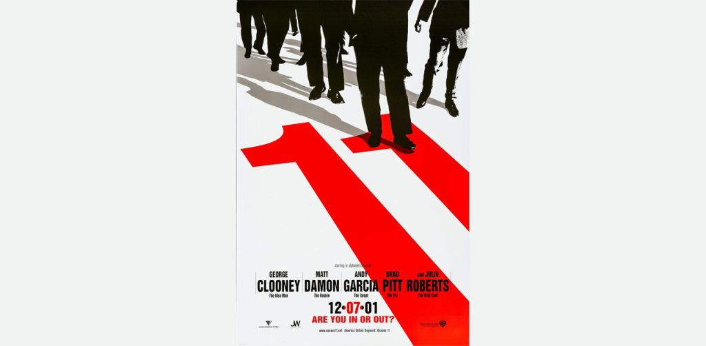
When design components are arranged to create a narrative through a logical progression from the most to the least important information, a visual hierarchy is formed.
Use size and color to highlight, bullet points and contrasting colors. Use negative space to give breathing room to specific elements.
Add a dose of humor
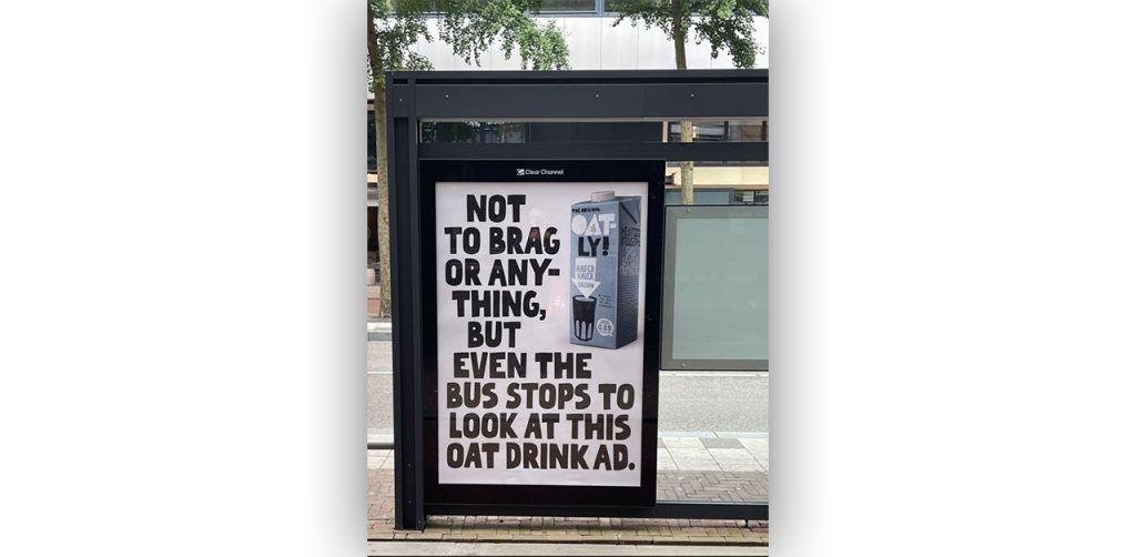
Most posters try to sell or propagate the message. Very few can bring a smile to the audience’s face. Depending on your audience, demographic, location, industry, and cause, see if you can add a bit of wit and humor to your poster to make it more memorable.
While humor may not work for all businesses and industries, you can still keep your posters interactive with a bit of conversation or dialogue.
Break the rules
Do some outside-the-box thinking and think of the sky as the limit when it comes to creativity. This poster has broken all the rules of a regular poster, which is why this poster has created so much buzz and received traction.
If you’ve time, budget, and resources, experiment with your crazy ideas.
What are some effective design elements to include in a campaign poster?
Effective design elements to include in a campaign poster are bold and clear headlines, eye-catching visuals, strong color schemes, concise and persuasive messaging, prominent call-to-action buttons or information, and a clean layout that allows key information to stand out.
Roll out your creative posters using the above ideas!
“Creativity doesn’t wait for that perfect moment. It fashions its own perfect moments out of ordinary ones.” —Bruce Garrabrandt
By now, you must have enough tips and tricks to play around with to produce new jaw-dropping creative campaign posters for your business. So, take out your notepads, start sketching out your ideas, and bring them to life using design tools.
If all this seems overwhelming to you then why not take help from Design Shifu to design a creative poster for you? You get unlimited graphic designs and a dedicated designer to take care of all your design needs. Along with poster design, you can avail of services like brochure design, website design, presentation design, etc. in the same package without paying anything extra.

