
Imagine opening a design and instantly knowing it was created by a professional. The colors flow seamlessly, emotions are triggered deliberately, and every element feels perfectly balanced. That’s the power of mastering color theory in graphic design and it’s about to become your secret weapon.
Whether you’re a design newbie wondering why your projects look “off” or an experienced designer ready to elevate your craft, understanding color theory will revolutionize how you approach every project.
From creating brand identities that customers can’t forget to designing interfaces that convert visitors into loyal users, color theory is the foundation that separates amateur work from industry excellence.
TL;DR – Color Theory in Graphic Design
- Color theory is the foundation of effective graphic design, combining science and psychology to create visually appealing designs.
- Master the color wheel (primary, secondary, tertiary colors), color harmony schemes (complementary, analogous, triadic), and color psychology (warm colors evoke energy, cool colors create calm).
- Use tools like Adobe Color, follow the 60-30-10 rule, and consider accessibility with proper contrast ratios.
- Modern trends include high-contrast combinations and sustainable color choices.
What is Color Theory in Graphic Design?
“Color is a power which directly influences the soul.” — Wassily Kandinsky
Color theory is the science and art of using color to its fullest potential in visual communication. In graphic design, color theory provides the roadmap for creating designs that not only look beautiful but also function effectively.
The Three Pillars of Color Theory
- 1. Scientific Foundation Understanding how colors interact, blend, and affect human perception at a neurological level.
- 2. Psychological Impact How different colors influence mood, behavior, and decision-making processes.
- 3. Practical Application Strategic implementation of color to achieve specific design and business objectives.
Why Every Designer Needs Color Theory Mastery
93% of consumers make buying decisions based on visual appearance alone
Professional designers leverage color psychology to
- Create instant brand recognition (think Coca-Cola red or Tiffany blue)
- Guide user behavior and improve conversion rates
- Establish clear visual hierarchy for better information processing
- Communicate complex messages without relying on text
- Stand out in saturated markets through strategic color differentiation
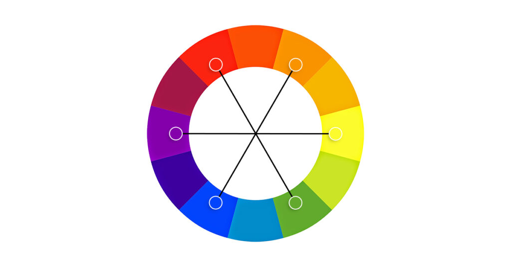
Understanding the Color Wheel
Colors, like features, follow the changes of the emotions.” — Pablo Picasso
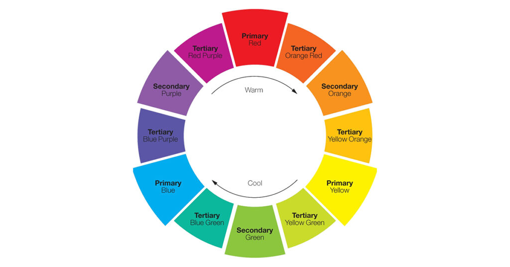
Primary Colors
Red, Blue, Yellow – The pure building blocks that cannot be created by mixing other colors.
Secondary Colors
Green, Orange, Purple – The perfect children of primary color marriages
- Red + Blue = Purple (passion meets trust = luxury)
- Blue + Yellow = Green (trust meets optimism = growth)
- Yellow + Red = Orange (optimism meets energy = enthusiasm)
Tertiary Colors
Six bridge colors that create smooth transitions:
Red-Orange, Yellow-Orange, Yellow-Green, Blue-Green, Blue-Purple, Red-Purple.
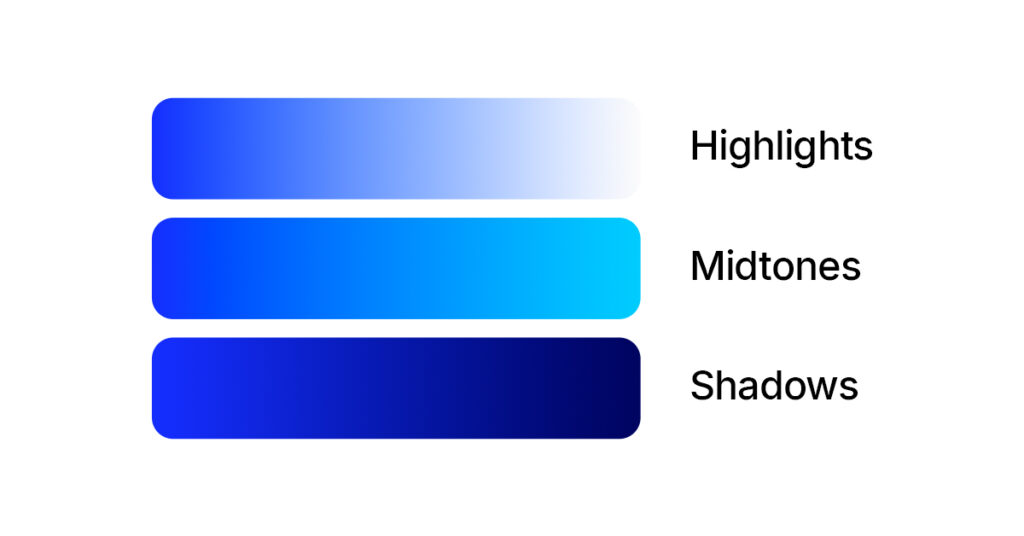
The Trinity of Color Properties
Understanding these three properties is like having X-ray vision for color
| Property | Definition | Impact on Design |
| Hue | The pure color name | Creates mood and meaning |
| Saturation | Color intensity/purity | Controls attention and energy |
| Value | Lightness/darkness | Establishes hierarchy and readability |
Pro Tip: Adjust saturation and value while keeping hue constant to create sophisticated monochromatic schemes.
Color Harmony: Creating Perfect Combinations
Harmony makes small things grow, lack of it makes great things decay. — Sallust
Color harmony is where color theory transforms from academic knowledge into design magic. These time-tested schemes are your blueprint for creating combinations that feel effortlessly perfect.
Quick Harmony Reference Guide
| Scheme Type | Colors Used | Visual Impact | Best For |
| Complementary | 2 opposite colors | High contrast, energetic | CTAs, sports brands |
| Analogous | 3-5 adjacent colors | Harmonious, natural | Backgrounds, wellness |
| Triadic | 3 evenly spaced colors | Vibrant, balanced | Children’s brands, playful designs |
| Split-Complementary | Base + 2 adjacent to complement | Sophisticated contrast | Professional brands |
| Monochromatic | 1 color in multiple values | Elegant, unified | Luxury brands, minimalism |
Complementary Color Schemes: Maximum Impact
Opposite colors create electric tension and guaranteed attention.
Complementary colors sit directly across from each other on the color wheel, creating maximum contrast and visual impact. This high-contrast relationship makes complementary schemes powerful but challenging to execute effectively.
Winning Examples
- Red & Green: Christmas campaigns, holiday branding
- Blue & Orange: Sports teams (Denver Broncos), action movies
- Yellow & Purple: Lakers branding, luxury children’s products
- Psychological Impact: Creates excitement, tension, and draws immediate attention
- Conversion Boost: Complementary CTAs can increase clicks by 21%
- Pro Design Tip: Use the 90/10 rule, 90% of one complementary color, 10% of its opposite for accent.
Analogous Color Schemes: Natural Harmony
Analogous schemes are like a beautiful sunset everything flows naturally together. Neighboring colors create effortless unity and visual flow.
Analogous colors are best friends on the color wheel they naturally complement each other because they share common undertones, creating designs that feel cohesive and pleasing.
Seasonal Applications
- Spring: Yellow-green, green, blue-green (fresh growth)
- Summer: Yellow, yellow-orange, orange (warmth and energy)
- Autumn: Red, red-orange, orange (cozy and rich)
- Winter: Blue, blue-purple, purple (cool and sophisticated)
Brand Examples
- Spotify: Various greens for natural, calming user experience
- Starbucks: Green family for environmental, organic associations
Triadic Color Schemes: Vibrant Balance
Three evenly-spaced colors create dynamic energy while maintaining visual balance.
Triadic color schemes offer vibrant contrast without the tension of complementary pairs. They’re perfect for brands that want to appear energetic yet approachable.
Classic Triadic Combinations:
- Primary Triadic: Red, Yellow, Blue (McDonald’s-inspired energy)
- Secondary Triadic: Green, Orange, Purple (creative and bold)
- Warm Triadic: Red-Orange, Yellow-Green, Blue-Purple
Industry Applications:
- Children’s Products: Natural appeal to young audiences
- Creative Agencies: Shows design expertise and boldness
- Sports Brands: High energy and team spirit
Balance Strategy: Choose one color as dominant (60%), use the other two as accents (20% each).
Split-Complementary Schemes
Base color plus two neighbors of its complement contrast without chaos. This scheme provides the visual interest of complementary colors but with less tension, making it easier to achieve balance while maintaining sophistication.
Professional Applications
- Corporate Branding: Trustworthy yet dynamic
- Healthcare Design: Calming but attention-grabbing when needed
- Educational Materials: Engaging without overwhelming
Monochromatic Schemes
Monochromatic color schemes can be subtle and sophisticated. These schemes use variations in lightness and saturation of a single color.
- Best Used For: Minimalist designs, professional branding, elegant compositions
Tetradic (Rectangle) Schemes
Tetradic harmony uses two complementary pairs, offering a rich, variable color scheme. These color schemes use 4 colors arranged into 2 complementary pairs.
- Best Used For: Complex designs, rich illustrations, diverse brand palettes
Color Psychology in Graphic Design
“I found I could say things with color and shapes that I couldn’t say any other way.” — Georgia O’Keeffe
Color psychology is where color theory meets human behavior. Understanding these emotional triggers allows you to design with intention, creating specific responses in your audience.
Warm Colors: Energy and Action
Warm colors advance toward the viewer, creating energy, urgency, and emotional intensity.
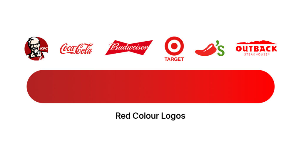
Red: The Powerhouse Color
Emotional Triggers: Passion, energy, urgency, danger, love, power, excitement
Performance Data
- 21% increase in CTA button clicks when using red
- Increases heart rate by 3-5 beats per minute
- Boosts appetite (why fast food chains love it)
Strategic Applications
- Sale banners and urgent notifications
- Food branding (McDonald’s, KFC, Coca-Cola)
- Entertainment (Netflix, YouTube, ESPN)
- Emergency services and warning systems
Brand Psychology: Red brands are perceived as bold, confident, and action-oriented.
Orange: The Enthusiasm Generator
Emotional Triggers: Enthusiasm, creativity, warmth, caution, affordability, friendliness
Conversion Psychology
- Perceived as more affordable than red or blue
- Increases creative thinking by 15%
- Appeals to impulsive buyers
Industry Champions
- Technology: Firefox, VLC Media Player
- Sports: Nike, Harley-Davidson
- Home Improvement: Home Depot, ING Bank
Design Strategy: Use orange when you want approachable energy without red’s intensity.
Yellow: The Attention Magnet
Emotional Triggers: Happiness, optimism, attention, intellect, caution, clarity
Cognitive Impact
- Most visible color from a distance
- Improves memory retention by 12%
- Stimulates mental activity and decision-making
Smart Applications:
- Highlighting key information without aggression
- Children’s brands (school buses, toys)
- Warning systems (construction, caution signs)
- Budget-friendly brands (Best Buy, IKEA accents)
Cool Colors in Graphic Design
Cool colors symbolize peace, calmness, and harmony. These include blues, greens, and purples.
Blue: Trust, reliability, professionalism, calm
- Graphic Design Applications: Corporate branding, healthcare, financial services
- Industry Usage: Banking, technology, healthcare, social media
Green: Nature, growth, harmony, freshness
- Graphic Design Applications: Environmental brands, health products, financial growth
- Industry Usage: Sustainability, finance, wellness, organic products
Purple: Luxury, creativity, mystery, sophistication
- Graphic Design Applications: Premium brands, beauty products, creative services
- Industry Usage: Cosmetics, luxury goods, education, spirituality
Neutral Colors: The Foundation
Gray, Black, White, Beige, Brown – The supporting cast that makes other colors shine.
Strategic Functions
- Create breathing space and prevent color overwhelm
- Establish professional credibility
- Allow accent colors to pop
- Improve readability and user experience
“The best color in the whole world is the one that looks good on you.” — Coco Chanel
Cultural Considerations in Color Theory
Color psychology varies significantly across cultures, making cultural awareness essential for global graphic design projects:
- Western Cultures: White symbolizes purity and cleanliness
- Eastern Cultures: White often represents mourning and death
- Middle Eastern Cultures: Green holds religious significance
- Latin American Cultures: Bright colors represent celebration and joy
Modern Color Theory Applications
Digital vs. Print Color Theory
Understanding the differences between digital and print color applications is crucial for modern graphic designers:
Digital Design (RGB)
- Additive color model (light-based)
- Wider color gamut
- Backlit displays enhance vibrancy
- Best for web design, social media, digital marketing
Print Design (CMYK)
- Subtractive color model (ink-based)
- Limited color gamut
- Paper and ink affect final colors
- Best for brochures, business cards, packaging
Accessibility and Color Theory
Modern color theory in graphic design must consider accessibility guidelines
WCAG 2.1 Standards
- Minimum contrast ratio of 4.5:1 for normal text
- Minimum contrast ratio of 3:1 for large text
- Color should not be the sole method of conveying information
Design Strategies for Accessibility
- Use high contrast combinations
- Include alternative indicators (icons, patterns)
- Test designs with colorblind simulators
- Provide multiple ways to distinguish elements
Brand Identity and Color Theory
Successful brands leverage color theory strategically
- Color Consistency: Maintaining exact color values across all touchpoints
- Color Ownership: Associating specific colors with brand identity (Coca-Cola red, Facebook blue)
- Color Evolution: Updating color palettes while maintaining brand recognition
Color Theory Tools and Techniques
Essential Color Theory Tools for Graphic Designers
| Tool | Best For | Key Features | Price | Learning Curve |
| Adobe Color | Creative Cloud users | Advanced harmony rules, trend analysis | Free with CC | Medium |
| Coolors | Quick inspiration | One-click generation, export options | Free/Premium | Easy |
| Paletton | Technical analysis | Accessibility testing, detailed info | Free | Advanced |
| Figma | UI/UX design | Real-time collaboration, design systems | Free tier | Medium |
| Canva Color Wheel | Beginners | Simple interface, trend suggestions | Free | Easy |
Professional Color Selection Techniques
60-30-10 Rule
- 60% dominant color (usually neutral)
- 30% secondary color (brand color)
- 10% accent color (calls-to-action)
Color Temperature Balance
- Warm colors advance (appear closer)
- Cool colors recede (appear further)
- Use temperature to create depth and focus
Simultaneous Contrast
- Colors appear different when placed next to other colors
- Test color combinations in context
- Consider surrounding colors in final applications
Common Color Theory Mistakes
Overuse of Bright Colors
Many novice designers use too many saturated colors, creating visual chaos. Professional approach:
- Limit saturated colors to 1-2 per design
- Use neutral colors as foundation
- Reserve bright colors for emphasis
Ignoring Color Context
Colors change appearance based on surrounding colors. Solutions:
- Test colors in final context
- Use color mockups before finalizing
- Consider ambient lighting conditions
Cultural Insensitivity
Using colors without understanding cultural meanings can alienate audiences:
- Research target market color associations
- Test designs with diverse focus groups
- Consult with local experts for international projects
Poor Contrast for Readability
Insufficient contrast reduces accessibility and user experience:
- Use online contrast checkers
- Test readability across devices
- Follow WCAG accessibility guidelines
2025 Color Trends and Future Applications
Emerging Color Trends in Graphic Design
High-Contrast Combinations: Bold pairings like neon pink with black, electric blue with white, or lime green with navy are dominating digital design in 2025.
- Brand Adoptions: Spotify’s neon campaigns, Discord’s high-contrast rebrand
- Psychology: Creates instant attention and modern, digital-native feel
Retro Revival: 1960s and 1970s color palettes making a comeback with faded, vintage-inspired tones.
- Examples: Muted oranges, avocado greens, burnt siennas
- Applications: Sustainable brands, artisanal products, nostalgia marketing
Digital Native Colors: Colors that look best on screens, including Brat Green (influenced by Charli XCX), electric purples, and cyber blues.
- Screen Optimization: Colors designed for OLED and HDR displays
- Gen Z Appeal: Colors that resonate with digital-first audiences
Technology’s Impact on Color Theory
- AI-Powered Color Selection: Machine learning algorithms suggest color palettes based on brand goals and audience psychology.
- Advanced Display Technology: HDR displays and improved color gamuts allow for more vibrant and accurate color reproduction.
- Augmented Reality Considerations: Color theory must now account for how colors appear in AR environments with varying lighting conditions.
Sustainable Color Theory
Environmental consciousness influences modern color choices:
- Eco-friendly Printing: Colors optimized for sustainable inks
- Energy Efficiency: Dark mode designs reducing screen power consumption
- Life Cycle Thinking: Color choices considering long-term brand sustainability
Key Takeaways: Mastering Color Theory
- Color Wheel Foundation: Primary (red, blue, yellow), secondary (green, orange, purple), and tertiary colors form the basis of all color relationships
- Harmony Rules: Complementary creates contrast, analogous creates unity, triadic adds vibrancy, monochromatic ensures sophistication
- Psychology Matters: Warm colors (red, orange, yellow) energize; cool colors (blue, green, purple) calm and build trust
- 60-30-10 Rule: Use 60% dominant neutral, 30% secondary brand color, 10% accent color for balanced compositions
- Accessibility First: Maintain 4.5:1 contrast ratio for text, test with colorblind simulators, don’t rely solely on color for information
- Cultural Awareness: Colors carry different meanings across cultures research your target audience before finalizing palettes
Conclusion: Mastering Color Theory in Graphic Design
Color theory as it relates to graphic design mixes art, science, and culture. It means more than just picking colors that look nice together; it’s an understanding of how color shapes user behavior, evokes emotion, demands accessibility, and is influenced by trends.
Strong color knowledge and awareness of the color wheel, psychological aspects of color design, and cultural considerations can transform average design work into unforgettable work.
No matter if it’s print, digital, or not-yet-known media, color theory will give you the skills and tools to create color palettes with emotional connections and strategic performance. Are you ready to enhance your designs? Use these principles to enhance your designs and stand apart from the competitors
Frequently Asked Questions
1. What is color theory and why is it important for graphic designers?
Color theory is the science and art of using color effectively in design. For graphic designers, it’s key to creating visually appealing work, evoking emotions, building brand identity, and improving user experience. It replaces guesswork with informed, strategic choices.
2. What are the basic color harmony schemes every designer should know?
Key schemes include:
- Complementary: Opposite colors (red/green) for contrast.
- Analogous: Adjacent colors (blue/blue-green/green) for harmony.
- Triadic: Three evenly spaced colors (red/yellow/blue) for balance.
- Split-Complementary: Base plus two adjacent to its complement.
- Monochromatic: Variations of a single hue.
3. How does color psychology affect design?
Warm colors (red, orange, yellow) create energy and urgency great for CTAs. Cool colors (blue, green, purple) promote trust and calm ideal for healthcare, finance, and wellness brands.
4. What’s the difference between RGB and CMYK?
RGB (Red, Green, Blue) is for digital screens, using light to create colors. CMYK (Cyan, Magenta, Yellow, Black) is for print, using ink to subtract light. RGB has a wider range; CMYK is limited by print media.
5. How do I ensure color accessibility?
Follow WCAG guidelines: contrast ratio of at least 4.5:1 for normal text, 3:1 for large text. Use contrast checkers, colorblind simulators, and add patterns or text so color isn’t the only visual cue.
6. What are common mistakes in color theory?
Overusing saturated colors, ignoring context, poor contrast, cultural insensitivity, and blindly following trends. Professionals test colors in context, prioritize readability, and align choices with brand values.