In a world that is constantly saturated with content and where your audience is perpetually distracted, keeping your brand relevant is essential. Strong branding is the key to establishing your business as relevant in the eyes of your audience, and to begin the process you can always start with a modern logo design.
A logo is more often than not, the first point of contact between your brand and your audience. It is the factor that establishes your brand identity visually for the audience. Needless to say, a logo has to be good enough to get imprinted in the mind of an onlooker. Modern logo designs can help in this aspect.
In this blog, we will take you through logos that are not only memorable but also teach you why they have been extremely impactful and relevant. But first, if you want to brush up on the concept of a modern logo and top modern logo designs in 2025, you can read about it in our recent blog here
The deal with modern logos is that no matter what style they are rooted in, they have to have certain qualities to make them impactful.
Why are some logos better than others?
Let’s look at some of the most common characteristics of modern logo designs
– Modern logo designs are impactful
Think about the time you were hungry on a long road trip, driving on an endless highway, and then… Voila, you see a yellow M sign at the corner of the road far ahead! You guessed it right. McDonald’s!
The moment of recognition of the brand is the moment when you subconsciously realize how ingrained the logo has been in your mind. That’s how impactful a good logo is.
– Modern logo designs are versatile and adaptable
One of the most important qualities of a good logo is its versatile nature. It can be used in creative ways for campaigns, ads, inclusivity, and more depending on the idea, and yet remain recognizable enough for the audience.
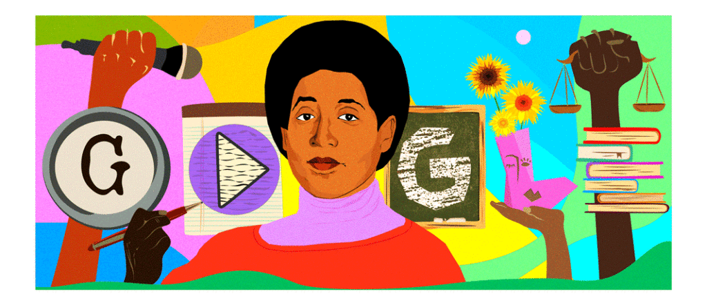
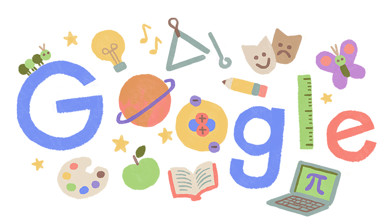
Take for example the way Google doodles with its logo. The adaptability that comes with the simplistic word logo of Google is unparalleled.
– Modern logo designs are representative of the brand message
Logos don’t really have to say anything, but they also have to! Modern logo designs are the art of being articulate without necessarily having to be.
The right visual representation is what helps the audience have its eureka moment in which they connect the brand’s message with the name of the brand.
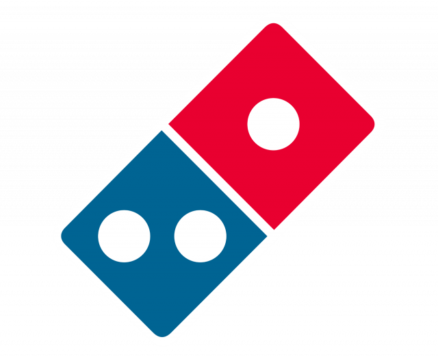
Take for example the way the idea of a domino that is incorporated in the Domino’s Pizza logo.
So having established the basics of logo making, what are some of the styles that you can incorporate while you create your modern logo design.
10 Types of Modern logo designs for 2025 that you can experiment with
Here we are going to give you the 10 best modern logo design examples but with logos that you can recognize so that we can dissect the ideas behind them, and learn from their styles!
1. Gradient Styled logo
Look at Instagram’s rebranded logo design and the way it incorporates the gradient style perfectly. It is neat, and the blend of colors is a bold statement for a color palette, creating a visual theme for the audience to remember.
2. Geometric logo
Another modern logo design that caught our attention this year was the creative geometric logo.
For example, this BTS logo that uses geometric shapes for a neat and classy effect. It is so versatile that it can be printed on merchandise or apparel even without the background and it would be still recognizable.
Another great example would be Avicii’s logo that is a combination of geometric and text
This brings us to the next type.
3. Text-based logos
Now we’re sure most of us can think of these off the hat, so we’re just going to go right ahead into examples.
Coca Cola has experimented with a cursive style of writing that we can recognize in our sleep.
Similarly, Vans is a great example of text-based logos to understand how a name can be incorporated into a modern logo.
Another recognizable example is the Canon logo
4. Symbol-based logos
Symbol-based modern logo design can go in many ways.
- Simple
The logo of Target literally the symbol of a target, how much more recognizable can it get, right? It’s simple, memorable and the use of the color red is clear a jab at the audience’s attention.
- Artistic
We all know how aesthetically pleasing the Starbucks logo looks. The branding through the logo is so strong that every picture of a cup from #Starbucks on Instagram is basically an ad campaign for the coffee brand in itself.
- To the point
How much more obvious can it get when we see the logo of apple as well, an apple? It is not only a no-nonsense logo, but it is also as impactful as it is simply due to its straightforward style. Apple’s branding is so strong that the logo is very well established as a premium, elite brand.
5. Portraiture or Caricature based modern logo
This one will bring back memories and hunger pangs.
Yes! The Kentucky Fried Chicken modern logo is a portraiture-styled logo that is based on the founder of KFC, Colonel Sanders, created in 1952, and it has been modified time and again since, although the portraiture concept always stays.
6. Cartoon styled logo
Remember Looney Tunes? Yeah, that’s one of the most famous cartoon-styled logos. Logo Designs that are based on cartooned characters or personas bring a fun element to the brand identity and induces a level of comfort with the audience.
Design Shifu had a lot of fun creating a cartoon-styled modern logo recently. Take a look.
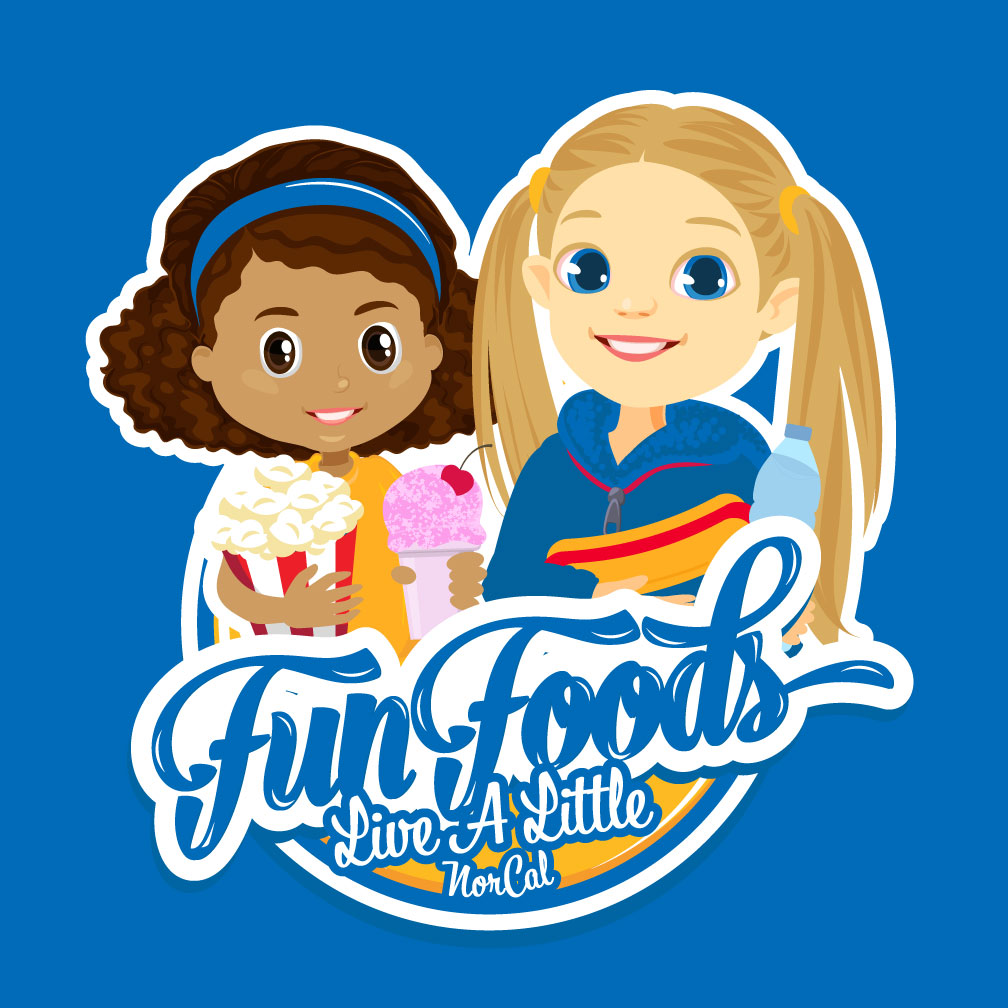
If you’re looking for a designer to create a fun-looking, yet professional logo for your brand, try Design Shifu. You can get your logo in 48 hours maximum.
7. Minimalistic logo
Airbnb’s minimalistic word-centric logo is quite creative. The A is curved into an infinity kind of loop to represent the inclusivity that the venture brings. It moves away from the typical wordmark concept to show how minimalism can bring in just as much creativity.
8. Perspective based logo
Getting creative with lines and adding perspectives to a logo is the new cool. Take a look at how the thirty-three has been represented by manipulating the perspective in this modern logo design. It gives off an effect that is 3D while being line art as well.
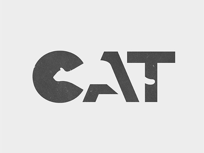
9. Cut-out logo
Incorporating shapes and text as a combination into a logo is a challenging task but once you pull it off, it brings great impact in your branding. This CAT logo creatively uses shapes inside the typography, playing with perspective.
And lastly
10. Abstract
Abstract logos are versatile enough to be either literal representations of the brand or visually vague representations of the brand identity. The good part is that if you pull off a great abstract modern logo design, it gets imprinted into the minds of the audience even without the contextual cue of the name of the brand.
Just like how we easily recognize the Adidas logo, the one with the tree lines or the leave like symbols
or even the Pepsi logo
We hope you found this helpful. If you want to look at some more trends and you want to know what exactly is trendy right now in logo designs, take a look at the article we just published here.
Designing a logo can be a tedious task if you’re new to it or don’t have a designer. If you want the perfect logo and you don’t want to wait a long while, just give Design Shifu a good brief and get your logo designed in 24-48 hours.
Our designers have created different types of logos for clients that you can check out here. With the range of experience and creativity, they have to offer, you can get a logo that is exactly how you envisioned it. Check out our pricing page here to know more.

