
Ever stumbled upon a website that made you want to close the tab instantly? Or used an app that felt like solving a puzzle just to find the menu? You’re not alone. These frustrating moments are prime bad design examples and solutions every designer should know
In this blog, we’ll uncover the biggest design slip-ups that sabotage user experience, along with smart, actionable solutions every designer should know to fix them.
Is your design driving customers away? Poor design doesn’t just annoy it deters users, confuses potential customers, and can even ruin your brand’s credibility.
We’ll reveal the 8 worst design mistakes you should avoid at all costs and show you how to fix them before they cost you more than just a bad impression.
Ready to turn your design from “meh” to wow? Let’s get started!
Too Complicated User Interfaces (UI)
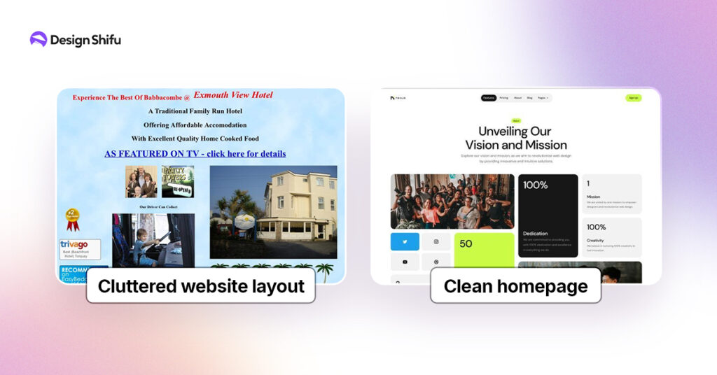
Example: Websites with Cluttered Layouts
- Picture attempting to look up something on a site where each area is packed with text, images, and buttons, making it difficult to get around.
- This overwhelming UI experience not only frustrates users but also causes them to leave the site in a hurry.
Why It’s Bad
- Users can’t quickly locate what they’re looking for.
- There’s no obvious hierarchy or organization.
- Overloading the interface with unnecessary items detracts from the primary message or objective.
How to Avoid It
- Prioritize simplicity: Prioritize clarity and eliminate the unnecessary.
- Create a clear hierarchy: Employ white space, typography, and visual cues to direct users to the most crucial elements first.
- Test with actual users: Perform usability testing to discover and fix points where users get stuck.
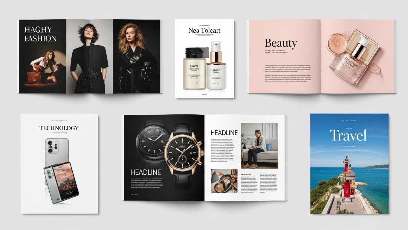
For a more user-friendly interface and professional tips on designing smooth designs, take a look at Design Shifu’s design.
Poor Typography Choices
Example: Too Many Fonts or Fonts That Are Hard to Read
Another design mistake is using too many fonts or fonts that are hard to read. This could be using decorative fonts for body copy or employing very small font sizes.
Why It’s Bad
- A lack of consistency makes the design appear messy.
- Users can’t easily read or absorb the information.
- It can be hard on the eyes, particularly on mobile devices.
How to Avoid It
- Restrict the number of fonts: Use one or two complementary fonts. Vary using different weights (bold, regular) or styles (italic).
- Make it readable: Select fonts that are readable, particularly for body text. Ensure font sizes are large enough to read comfortably.
- Consistency is key: Consistency is paramount: Use font consistency on all materials to build a seamless experience.
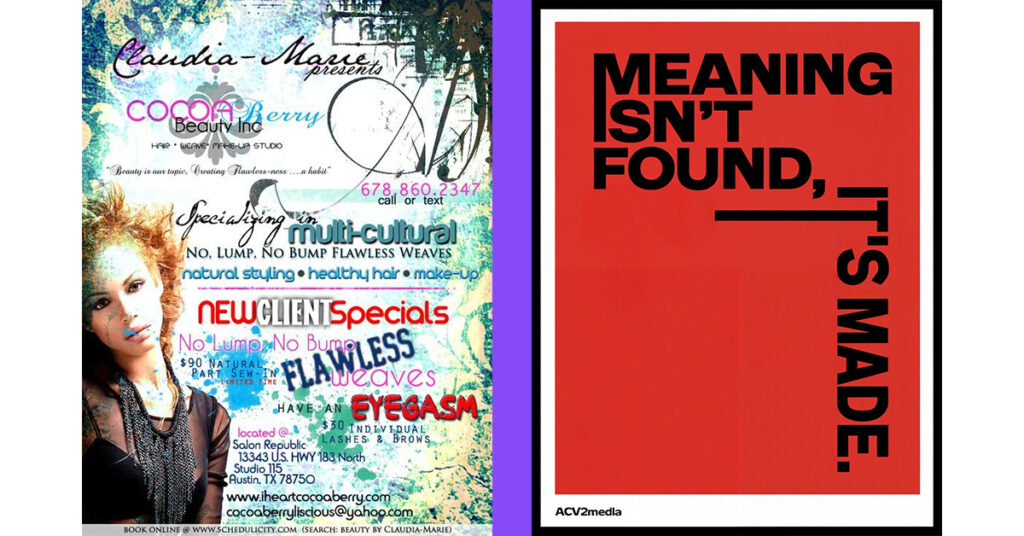
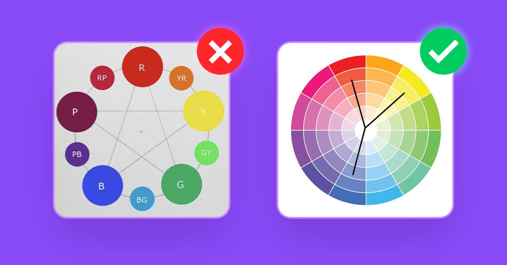
Poor Color Choices
Example: Using Clashing or Hard-to-Read Color Combinations
Have you ever come across a website where the background is vibrant red and the text is neon green?
Despite their individual vibrance, all of the colors together create a visual assault that eyes have difficulty processing and that ultimately limits the users’ continued engagement with the content.
Why It’s Bad
- Poor color combinations can be visually overstimulating, making it difficult for users to pay attention.
- Some color choices, such as red and green, may be an issue for users with color blindness.
- Using too many bright colors can also overwhelm the user and take away from something that is more important.
How to Avoid It
- Have a limited color palette: Choose colors that work together and that have a difference between text and background color.
- Be careful about accessibility: Make sure that color choices are accessible to all users, including those with color blindness, and use a color contrast tool to check colors.
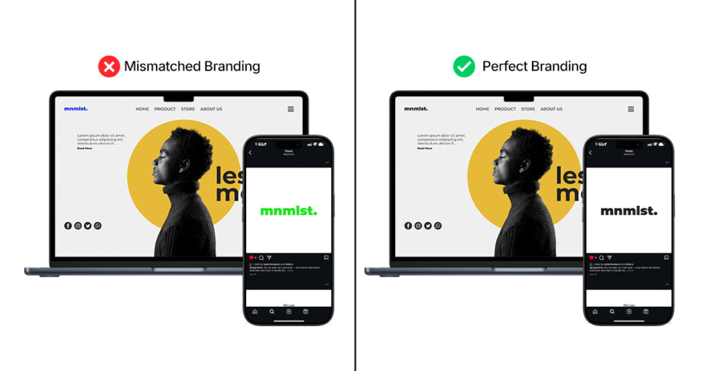
Inconsistent Branding
Example: A Company’s Website Doesn’t Match Its Social Media Branding
Suppose a company has a professional and sleek logo but then employs random fonts and colors on its social media sites that are not consistent with the original logo.
This inconsistency confuses customers and dilutes brand recognition.
Why It’s Bad
- It causes confusion and dilutes brand identity.
- Users might not identify the brand on different platforms.
- It diminishes trust and professionalism
How to Avoid It
- Create brand guidelines: All platforms should share the same fonts and colors, logos, and imagery.
- Ensure cohesiveness: All touchpoints – website, social, and packaging, all should align with the brand identity.
- Know your audience: The brand’s voice and visual identity should engage your audience while remaining consistent in every interaction
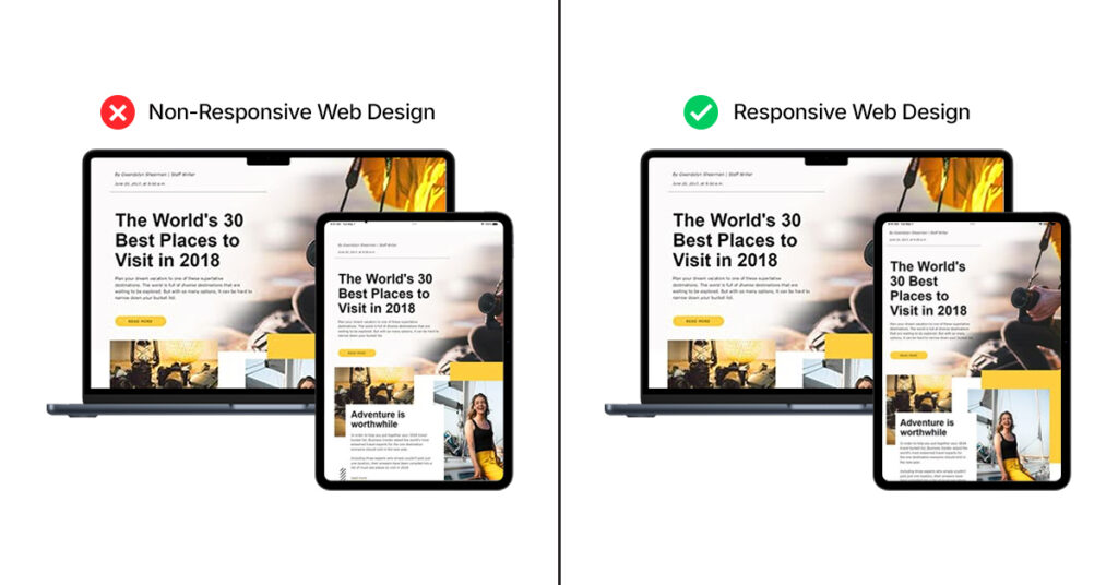
Non-Responsive Web Design
Example: Sites That Don’t Work on Mobile Devices
In a mobile-first world, a non-mobile-optimized website will lose users fast. If text is too small to read, buttons are difficult to click, or images don’t respond well on mobile, users will abandon the site in frustration.
Why It’s Bad
- Mobile users might have a horrible experience, which will drive high bounce rates.
- Not being mobile-optimized means you’re losing a big portion of your viewers.
- Google favors mobile-friendly sites, so this might negatively affect your SEO
How to Avoid It
- Adopt responsive web design: Make sure your site adjusts to varying screen sizes, from desktop to smartphone and tablet.
- Test your design on multiple devices: Check how your site appears and performs on different devices on a regular basis..
- Optimize load times: Mobile users will have slower internet, so make your site light and quick.
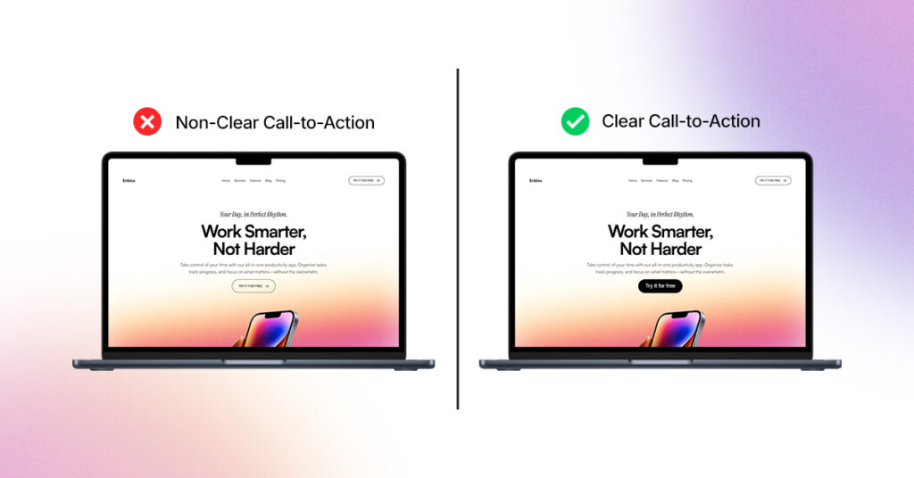
Lack of Clear Call-to-Action (CTA)
Example: A Website Without Clear Next Steps
One of the biggest issues of web design is an absence of explicit direction towards the user. A page, for example, that lacks any definite “Sign Up” or “Buy Now” button might make visitors puzzled over what action to take
Why It’s Bad
- No CTA tells users what they need to do.
- It invites confusion, causing them to abandon their visit and maybe lose the sale.
- Insufficient CTAs can result in lost chances for lead captures or conversions.
How to Avoid It
- Make CTAs simple and front-and-center: Employ buttons that have concise, action-oriented wording such as “Get Started,” “Learn More,” or “Subscribe Now.”
- Position CTAs strategically: Have them at places where users would likely glance anyway (e.g., at page tops or closer to the ends of blog entries).
- Test multiple CTAs: A/B test multiple versions to determine which works best.
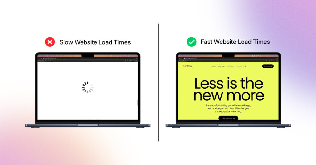
Slow Website Load Times
Example: Sites with Huge Images that Take an Age to Load
Picture waiting minutes for a website to load only to give up in frustration. Slow load times are an indicator of bad design decisions, such as large images or poorly optimized code.
Why It’s Bad
- People anticipate quick load times. Slow sites can cause high bounce rates and annoy visitors.
- Google penalizes slow sites in search results, damaging your SEO.
- It makes users feel that your site (and company) is amateur or behind the times
How to Avoid It:
- Optimize images: Utilize smaller file sizes and appropriate image formats (e.g., JPEG for photographs, PNG for transparent graphics).
- Use caching and compression software: These will lower load times considerably.
- Reduce unnecessary scripts: Restrict the usage of heavy JavaScript or third-party hooks that decelerate your site.
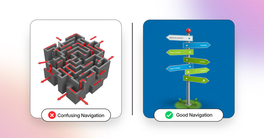
Confusing Navigation
Example: A Website with Hard-to-Find Menus or Links
A site with confusingly labeled or inaccessible navigation menus can render it extremely difficult for visitors to locate what they’re searching for.
For example, if crucial sections such as “Contact Us” or “Products” are placed several layers deep within submenus, visitors will be frustrated.
Why It’s Bad
- Visitors get lost or give up on finding what they need.
- Insufficient intuitive navigation causes low user experience and excessive abandonment.
- Your visitors might never return if they have trouble browsing your website
How to Avoid It
- Keep navigation simple and intuitive: Employ simple and clear labels. Restrict the number of alternatives in your top-level menu.
- Use sticky or floating menus: This makes key links available as the user scrolls down.
- Test your navigation: Have actual users perform tasks on your site to make sure they can get what they’re looking for without getting confused.
Conclusion
Bad design can detract from user experience, aggravate visitors, and damage your brand’s reputation, whether that means a confusing interface, inappropriate type choices, or inconsistent branding.
If design choices prioritize aesthetics over user needs, the likelihood of bad results is high. You can circumvent these issues by adopting researched best practices and being purposeful about simplicity, clarity, and user-centered design.
Following a few of these practices will increase the likelihood of impactful designs to engage your audience, and even delight them at times.
Keep in mind that good design is not so much about the looks, it’s about producing smooth experiences for a definite function. By remaining aware of such pitfalls and with a focus on user requirements, you can upgrade your designs and provide improved returns for your company and users in general.
Frequently Asked Questions
What are the signs of bad design on a website?
Bad design will have a very negative impact on the user experience. On a website, a disorganized layout, poor navigation, and text that is difficult to read. If a website is difficult to navigate, loads slow or has color combinations that are confusing, that is a bad design.
How can poor typography choices impact my website user experience?
Typography impacts how users feel about a website, and typography includes font choice, consistency or legibility, and size. All of these can frustrate visitors and will drive them away, which negatively impacts bounce rate and SEO.
What are the effects on my business of inconsistent branding?
Inconsistent branding can confuse your customers, dilute your brand identity, and can erode trust in your business.
Inconsistency in colors, fonts, or messaging on your website and social media can hurt your reputation and make it difficult for customers to recognize your brand.
Why do I need responsive web design on my website?
In our mobile-first world, a responsive web design is critical. Websites lacking responsive design can push away potential users that view your website from a mobile device.
Slow loading times, hard to navigate pages, and text that is too small to read, on a mobile device, can all contribute to potential users immediately bouncing off of your site.
How can I enhance the effectiveness of calls-to-action (CTA) on my website?
An effective call-to-action (CTA) should be straightforward, succinct, and located in a place that users will readily see. Phrases like “Subscribe Now,” “Get Started,” or “Learn More” can all encourage users to take the next step.
You also want the CTA to be visually identifiable and prominent. The CTA could be located in the header, at the bottom of a blog post, or integrated into the content.